logo design
7 Reasons to Hire a Professional Logo Designer
Hiring a Professional Logo Designer What makes a company stand out? Is it a unique product that no one else in the industry is selling? Is it dedication to providing round-the-clock customer service? Is it a history of contributing money…
Before and After Comparisons of Famous Logo Redesigns
A logo serves as the storefront of a company in the simplest way possible. Getting a logo done is indeed an intricate task, a logo designer puts their heart and soul in the process and strives to create an identity…
Portfolio Spotlight: Rock Medical Branding & Website
Go Media is so honored to have had the pleasure to work with Rock Medical, the premier Orthopedic Consulting Team here in Northeast Ohio, on their logo and website design. Over the past 16 years Rock Medical has served it’s…
How Do You Know It’s Time for a New Logo?
How to Know It Is Time for a New Logo One question we get all the time here at Go Media is: “How do I know it’s time for a new logo?” Today, our President, William Beachy, is addressing this…
3 Questions to Ask Yourself When Building a Strong Brand Presence
How to Build a Brand What is your brand? Who is your brand? And why should we care? Developing a brand is more than just your logo. A brand represents everything you are as a company. Everything that you say and…

Portfolio Spotlight: Très Chic Salon Branding
Très Chic Salon Branding Go Media was approached by stylist Katie Skillman, who was on a mission to turn her passion for hair education & styling into her dream business – a Cleveland local salon known as Très Chic. During…

Why You Should Increase Your Graphic Design Budget
Knowing when to increase your design budget The graphic design of your business is intricately tied to your overall company’s image and branding strategies. The last thing you want is to use outdated logos or designs that make you look…

All About Logos
I am passionate about branding and have learned a lot while helping businesses develop their brands. There is a lot more to a logo than just your company name and there are some important factors to keep in mind when…
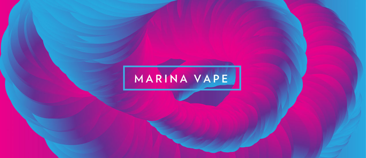
Portfolio Update: Marina Vape
Marina Vape – Product Line Branding Over the course of a year, we had the privilege of working with e-liquid company, Marina Vape. The name of the game for these projects was building a visual brand around different flavor concepts.…

Check out the CLEbaby Branding Project!
The Project: CLEbaby branding The team here at Go Media had an absolute blast working on the CLEbaby branding project. Please check out the work we did below and learn more about CLEbaby, Cleveland’s premier resource for birth and postpartum…
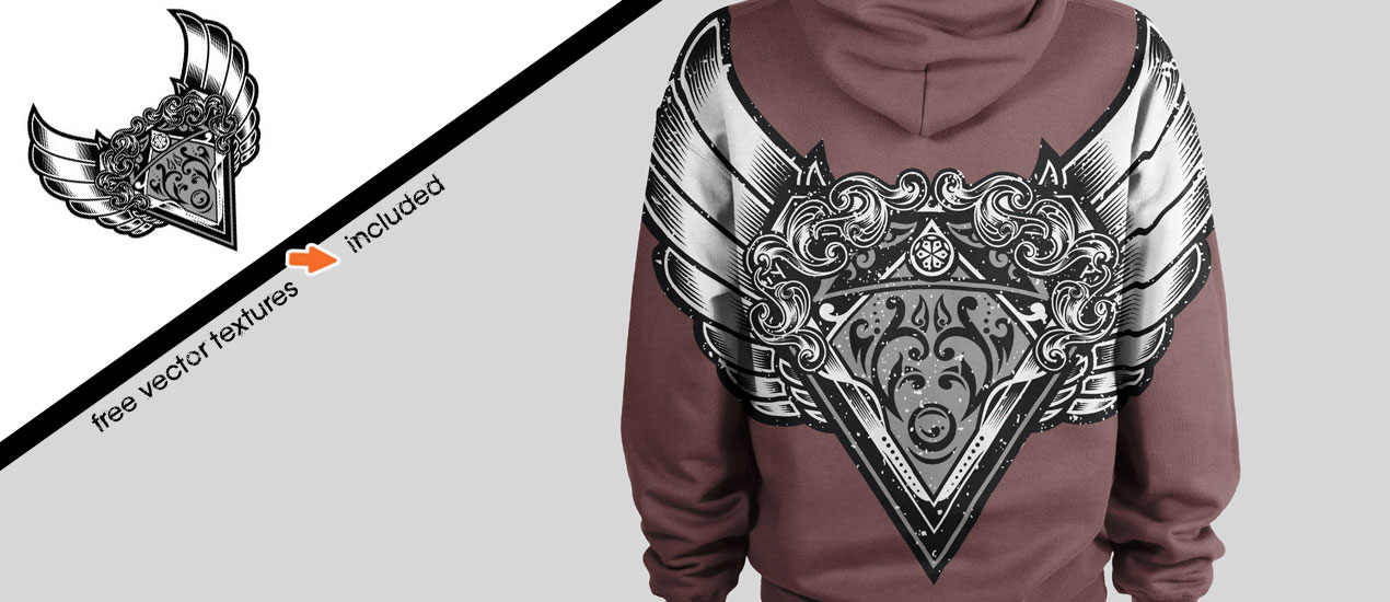
Tutorial: How to Use Vector Textures in Adobe Illustrator to Distress Your Logo/Design
Free Vector Textures + How to Use Them We are so excited to announce the release of a new vector set, the Fistful T-Shirt Design Graphic Vector Set. This new vector set was created by new Arsenal Artist, Dedda Sutanto,…
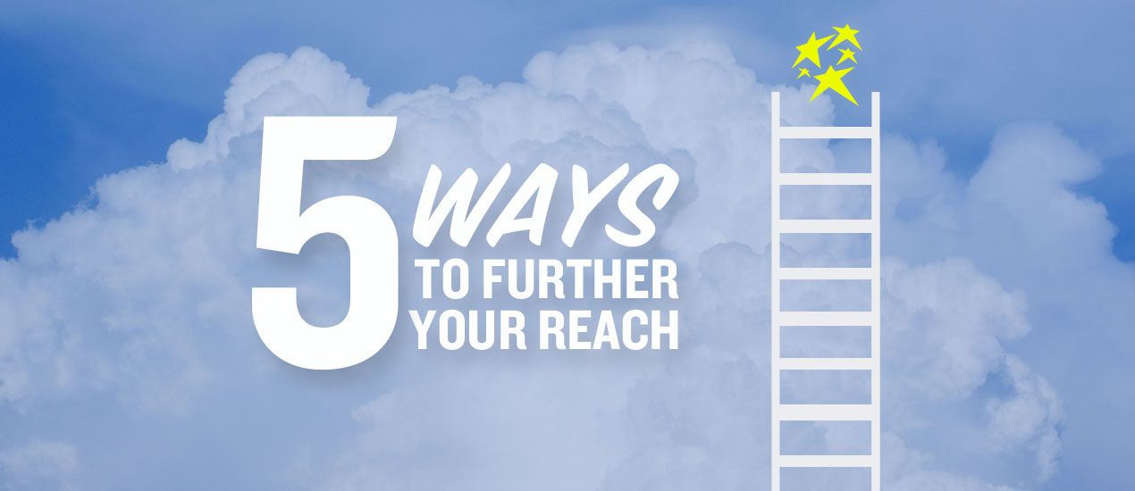
5 Ways to Further Your Reach
Expanding Your Brand Presence: 5 Tips Are you feeling a stagnant air in your business? Strategy planning is a key element of any business, so here are 5 simple ways to further your reach! How to Further Your Reach 1.…

Branding Cleveland’s Own Forest City Shuffleboard
Cleveland Design Firm Go Media helps to develop Forest City Shuffleboard brand Based on the success of their original shuffleboard business in Marblehead Ohio (the Erie Social), owners Jim and Kari looked to elaborate on their concept by venturing to…

The Art of the Marketing Makeover: Grooming Legacy Companies for Today’s More Dynamic Marketplace
You don’t have to be hip, trendy, or in an arrantly dynamic new market to pique our interest here at Go Media. We love the challenge of working with clients who have a long history in business but are in…

How Branding and Logo Design Can Instantly Transform Your Brand Identity and Recognition
Shell, Nike, Coca-Cola, Apple, Adidas. What do these four brands have in common apart from that the fact that they are behemoths in their respective industries? Distinct and instantly recognizable logos. These are just some examples from a plethora of…

Business Branding Strategy: What’s Your Name Again?
Those who study literature have heard the line, “A rose by any other name would smell as sweet.” But those who study branding know the real question is: Would the rose still sell? Branding truth: Monikers matter. The name of a company is either going…

Why we absolutely loved building this brand
Work Hard. Live Easy. We had way too much fun working with The Finch Group, local Cleveland real estate company, on their latest endeavor and we want to shout it from the rooftops, pun intended. Designer Chris Comella comments, “Innova…

Mascot Design Spurs Controversy – and Kanye Ire
Earlier this month, the L.A. Clippers hatched a new mascot design in the form of “Chuck the Condor,” to represent a team with two of the best leapers in the NBA. Sadly, the reception was foul. “Chuck is a schmuck,” blurted…

New Logo Design Unveiled to Jack Frost Confection-Loving Crowd
Jack Frost Donuts‘ new Cleveland Logo Design – and brand new building – was unveiled to the public in a grand, re-opening over the weekend, complete with green screen fun, a new menu display, festive red and yellow balloons and upbeat…
Designing a Kick-Ass Logo? Here are 7 Mistakes to Avoid
Mistakes to Avoid When Designing a Logo When you think of great products or companies, the visual image that forms in your mind is probably that of their mark; McDonald’s golden arches, Nike’s Swoosh and Coca-Cola’s wave. The inherent value…
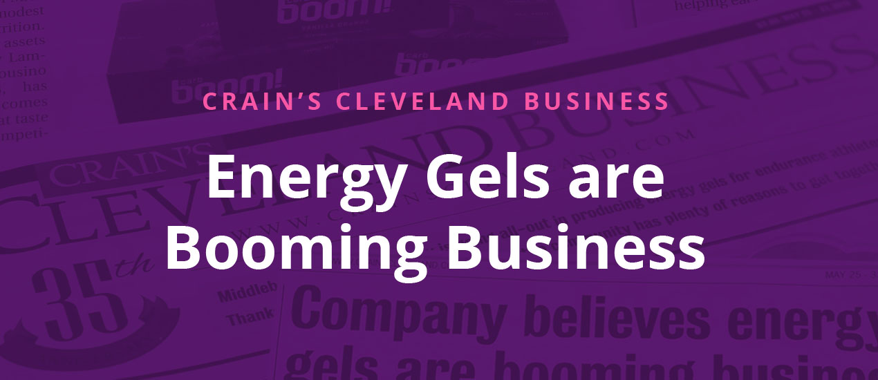
Energy Gels are Booming Business
Boom! Energy Gel Branding Carb Boom! Energy Gels, that is. Carb Boom Sports Nutrition Inc., founded in 2000, has recently developed Carb Boom! Energy Gels, a fruit-based, high-carbohydrate product that, according to CEO Lammers and partner Mike Cousino, had a…

The Branding Process: 4 Steps to Success
Steps involved in Branding Process Now that you’re fully educated on the difference between logo design and branding, you’re probably coming to a realization. And that understanding might be something like this, “Bill, I really need more than a logo. I…
Logo Design vs. Branding – what’s the difference?
Why do I hate my new logo?
Never fear, your Cleveland Logo design firm Go Media is here to explain!
Everyone knows what a logo is. It’s that shape companies use to represent their company; like Nike’s swoosh, McDonald’s golden arches (M) or Starbucks green mermaid. But what’s branding exactly? Branding is a more holistic perspective of how your customers experience your company. While a logo is only a small simple mark, a brand includes every single touch-point your customers have with your company.
Let’s use Nike as an example and consider the differences between a logo and a brand.
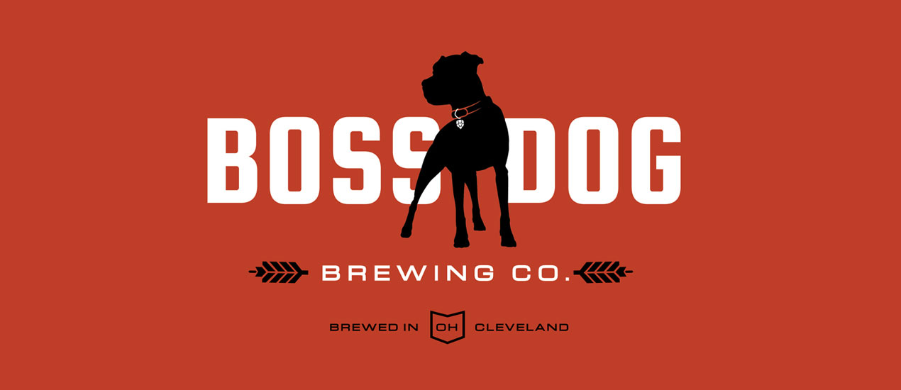
Design by Go Media: Boss Dog Brewing Co.
Brewing Company Branding: Boss Dog Brewing Co. Brothers Josh and Jason Czernek (and Mom) visited Go Media looking for a Cleveland design firm who could help bring their dream brewery to life. Their concept revolved around the name Boss Dog…