Tutorials

Crafting WCAG Compliant Articles
Crafting WCAG Compliant Articles: A Guide by Go Media, Cleveland’s Premier Website Design and Development Agency At Go Media, we believe in the power of inclusive digital experiences. In today’s article, we’ll delve into the world of WCAG compliance and…
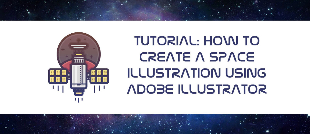
Tutorial: How to Create a Space Illustration Using Adobe Illustrator
Space has and will probably always be one of those things that man has long dreamt of conquering. From the darkest corners of the Milky Way to the farthest region of the known Universe we will always poses that urge…
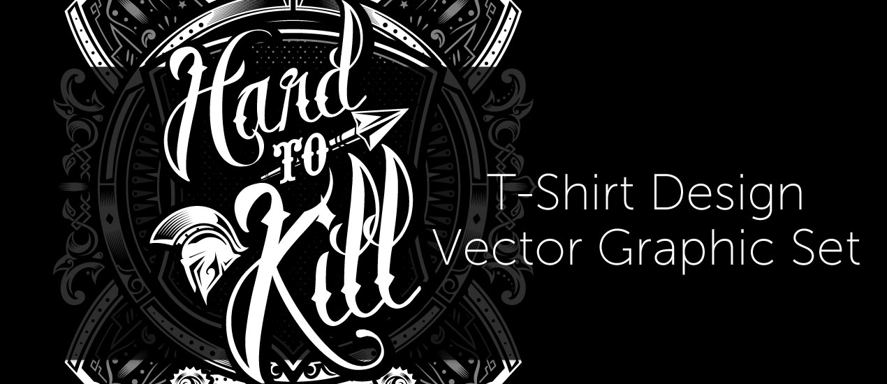
Let’s create a striking history book cover about antique war stories with the Hard to Kill Vector Pack
How to Create a Book Cover Design Well hello there dear readers! Simon here, ready to walk you through my process to create a striking book cover with our latest vector pack release, the hard to kill vector pack. We’ll…
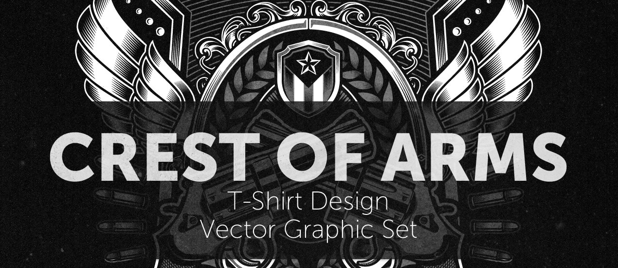
How to easily create a record release promo poster with the Arsenal’s Crest of Arms vector pack
Hello GoMediaZine/Arsenal blog readers! Simon here with a new step-by-step tutorial. We will be leveraging the contents of our brand new Crest of Arms vector pack to create a poster for the release of PWR.CLRS’ first, self-titled, album. We’ll talk…
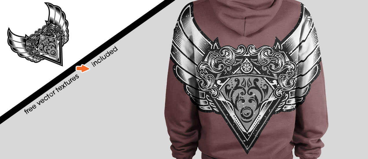
Tutorial: How to Use Vector Textures in Adobe Illustrator to Distress Your Logo/Design
Free Vector Textures + How to Use Them We are so excited to announce the release of a new vector set, the Fistful T-Shirt Design Graphic Vector Set. This new vector set was created by new Arsenal Artist, Dedda Sutanto,…
Introducing our newest Video Tutorial: Working with Photoshop’s Quick Mask Mode
Working with Photoshop’s Quick Mask Mode Go Media’s Arsenal proudly announces the release of a brand new video tutorial, “Digitizing Your Illustrations with the Quick Mask Mode in Photoshop.” In this video tutorial, Go Media’s Lindsey Meisterheim will be using…

11 WordPress Hacks and Blogging Tips for Newbies
Tools you can use today: In order to successfully navigate WordPress and reap its rewards, we all need to put the time in. After all, nothing compares to a little patience and perseverance when coming to understand this powerful CMS. But…
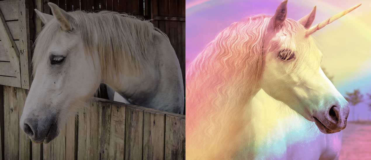
How to Create a Rainbow Effect in Photoshop (Freebie Included)
How to Create a Rainbow Effect in Photoshop Hello Everybody! It’s 2017 and this year, I don’t know about you, but I’m resolving to settle into my skin more than ever. This means saying “yes” to life more often, saying…

Design Tip of the Day: Creating your own Coloring Book in Photoshop
Creating your own coloring book using Photoshop > It’s time for the holidays! That means lots of relaxation time, including time spent curled up by the fire. If you’re like me, it’s hard to keep still when all you want…

Using Crumpled Paper Textures to Pimp out your Hang in There Cat Poster (Freebie Included!)
PS Basics Tut + Crumpled Paper Texture Freebie > What’s better than the old “Hang in there” cat poster? Not much in my book. But today, we’re going to add a little more character to one, just for kicks, using…
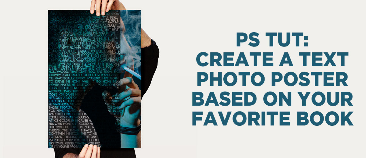
PS Tutorial: Create a text portrait poster based on your favorite book (Free mockup included)
Let’s Create a Text Portrait Poster! In today’s tutorial, we are going to be creating a text photo poster created by combining the image of our choice with related text. I’ll create mine based on my favorite book of all time, The…

How to Create Your Own Handwritten Font (in 30 minutes or less)
How to Create a Handwritten Font: If you’ve ever been too intimidated to make a font, please stand up!

Tutorial: How to Use Vector Graphics to Create a Repeating Pattern in Illustrator
Hey Arsenal Fans! Today we’re going to show you how to use vector graphics in Illustrator to create this repeating pattern using Vector Set 25, just released on our Arsenal.
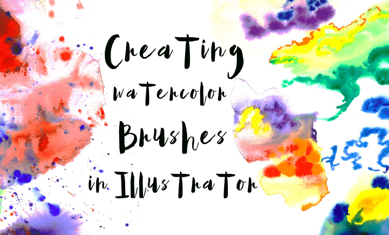
Tutorial: How to Create Watercolor Brushes in AI
How to Create Watercolor Brushes in AI If you’re like us, you’ve got art laying all around the studio just begging to be used in unique and wonderful ways.
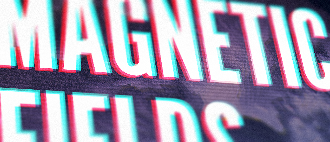
Getting our 1980s and VHS tape on with Dustin Schmieding’s cosmic fractal storm texture pack!
Introducing the cosmic fractal storm texture pack Hello everyone! It’s Simon again on this end of the keyboard. I’m returning for another tutorial, and boy, do we have a treat this week. Dustin Schmieding gifted us with yet another fantastic…

Video Tutorial: How to Create Your Own PS Brushes
How to Make Photoshop Brushes In this video tutorial, we teach you how to make your very own Photoshop Brushes. We create ours using coffee stains, but you can use paint, watercolors, or other fun materials you find around your studio.…
Tutorial: Rockin’ Some Radical Glitch Effects in PS (plus 4 Free TV Glitch Textures just for YOU)
TV Glitch Effects: Makin’ Em in PS (& Free TV Glitch Textures, Too!) So guys, we’re kind of obsessed with these tv glitch textures we’ve been seeing around town lately. So, we created some for you to use and apply to your…
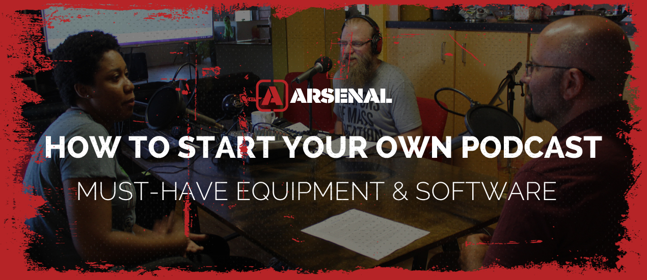
How to Start Your Own Podcast: Must-Have Equipment and Software
How to Start Your Own Podcast Hey, it’s Bryan from Go Media and today, we’re going to dip our toes into podcasting. You’ve probably heard there’s a ton of cash, arms full of lovelies, and loads of listeners just WAITING…
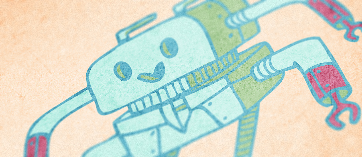
How to create a cute robot children book cover with Justin Will’s hand drawn Sci-Fi vectors!
Hello, dear Zine reader! It’s Simon on this end of the keyboard for a new tutorial. This time, we’ll have a close look at how to use Justin Will’s hand drawn Sci-Fi vector pack.
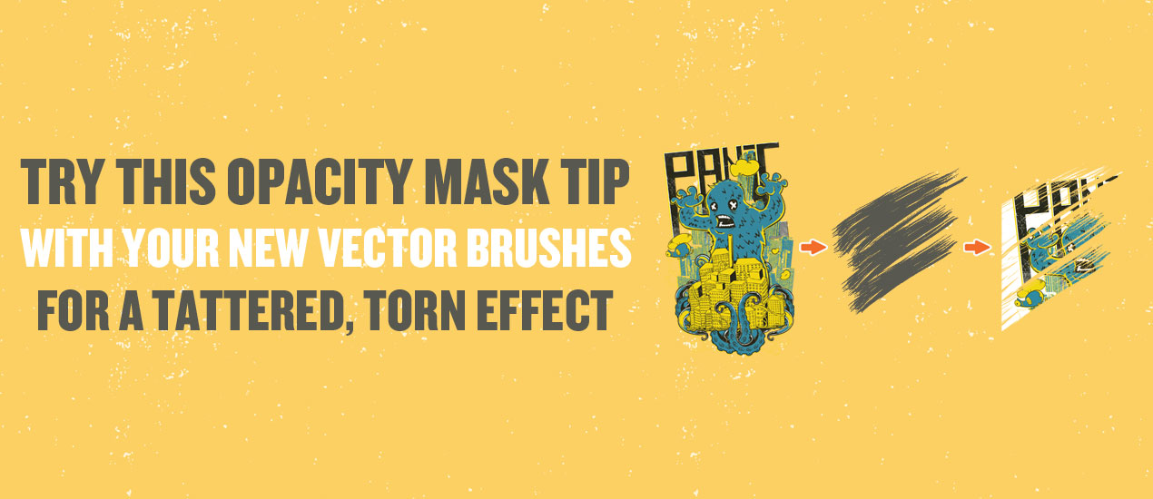
Try this Opacity Mask Tip with your New Vector Brushes for a Tattered, Torn Effect
Hey Fans of Go Media’s Arsenal, the best resources for designers on the planet. We’re here for a quick guide to using your new Brink Design Co. Industrial Vector Brushes, just released a day ago! These 100 handmade vector brushes were created with an unparalleled level of detail, made using a variety of different mediums and techniques to give your work that dirty, grungy, industrial look so many of you, our loyal customers, have been requesting.
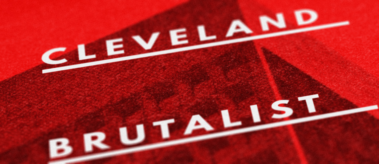
Tutorial: Building a brutalist conference poster with Jason Carne’s Texture Lot One (Free Poster Mockup Included)
Hello there! It’s Simon on this end of the keyboard. I’m very happy to make my return to the Zine with a poster design tutorial, that will explore the possibilities offered by Jason Carne’s Texture Lot One. The tutorial will have us explore texture use tips and tricks, but also customized black and white conversion, large scale sharpening, type pairing, layout building, and more.
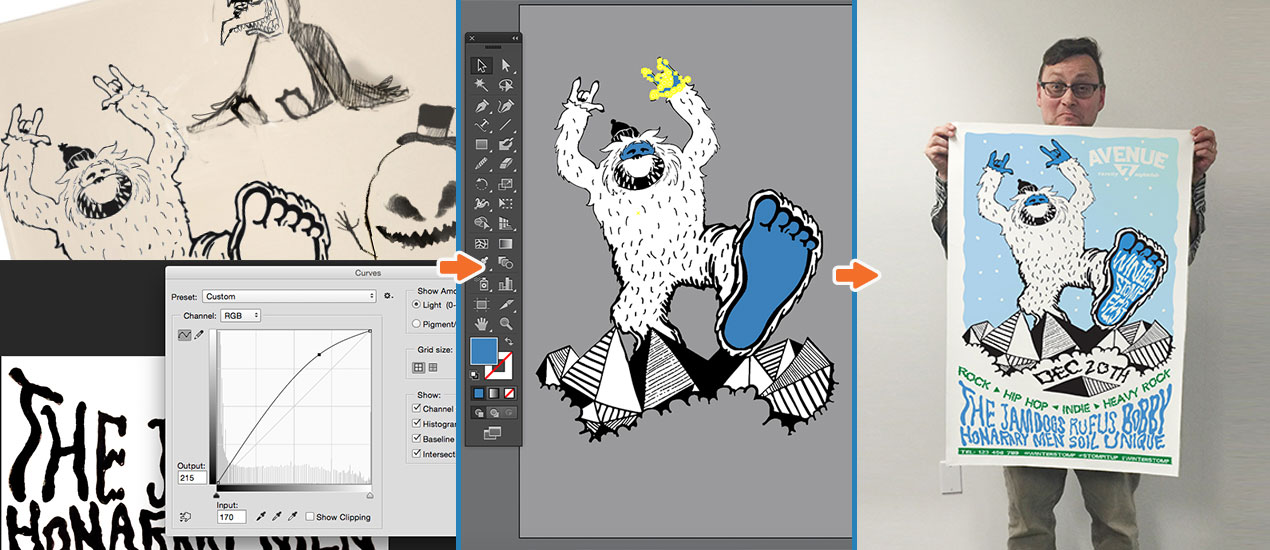
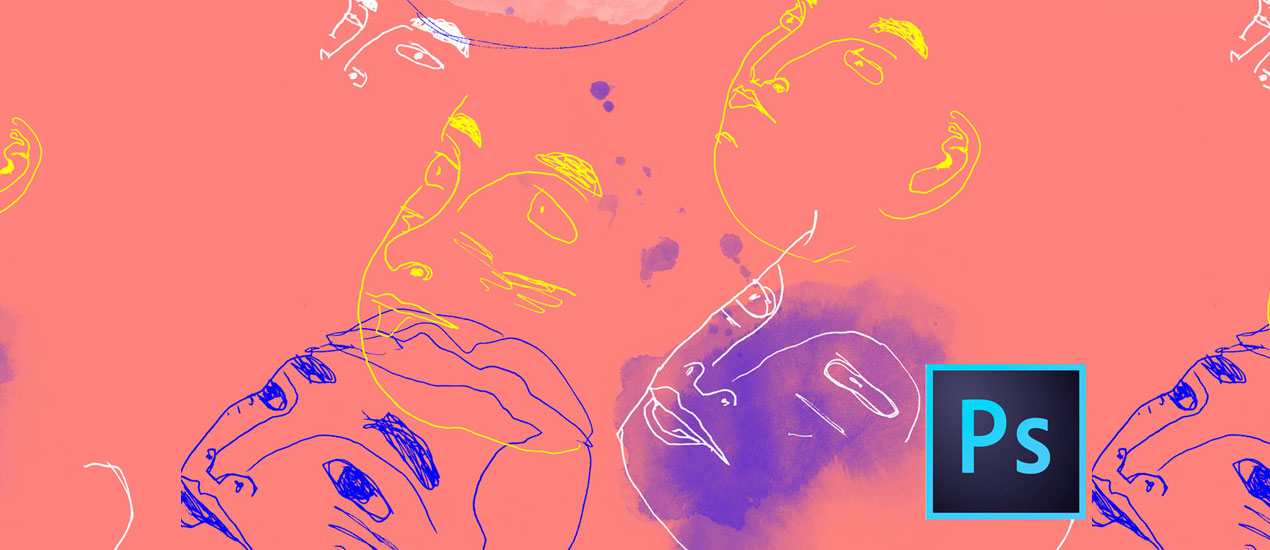
Print Poster Tutorial – Bringing Doodles and Sketches into Your Illustrator Workflow
Follow along as we create a print poster tutorial in Illustrator!
Tutorial: How to Create a Halloween Icon Pack Using Adobe Illustrator (Resources Included)
Since Halloween is just around the corner, we thought we should give you an early treat this year, in the form of a little icon tutorial. The idea was to show you guys how to create a cute set of three icons from scratch, using some of Illustrator’s basic tools such as the Shapes Tool, combined with the power of the Pen Tool and Pathfinder panel.
In terms of difficulty this course is aimed at those who have a basic knowledge of how Illustrator works, but that doesn’t mean beginners can’t give it a go, since every step is presented as explicit as possible.
So, assuming you have Illustrator up and running, let’s jump in and start creating!
Clipping Masks in Illustrator | Design Tip of the Week
Clipping Masks in Illustrator Hey, everyone! For this short and sweet Design Tip of the Week, I’ll show you how to use clipping masks in Illustrator. They are very to do, yet incredibly useful in creating backgrounds, making textured shapes…