illustration
Stop and Follow These Super Fun, Empowering Illustrators on Instagram
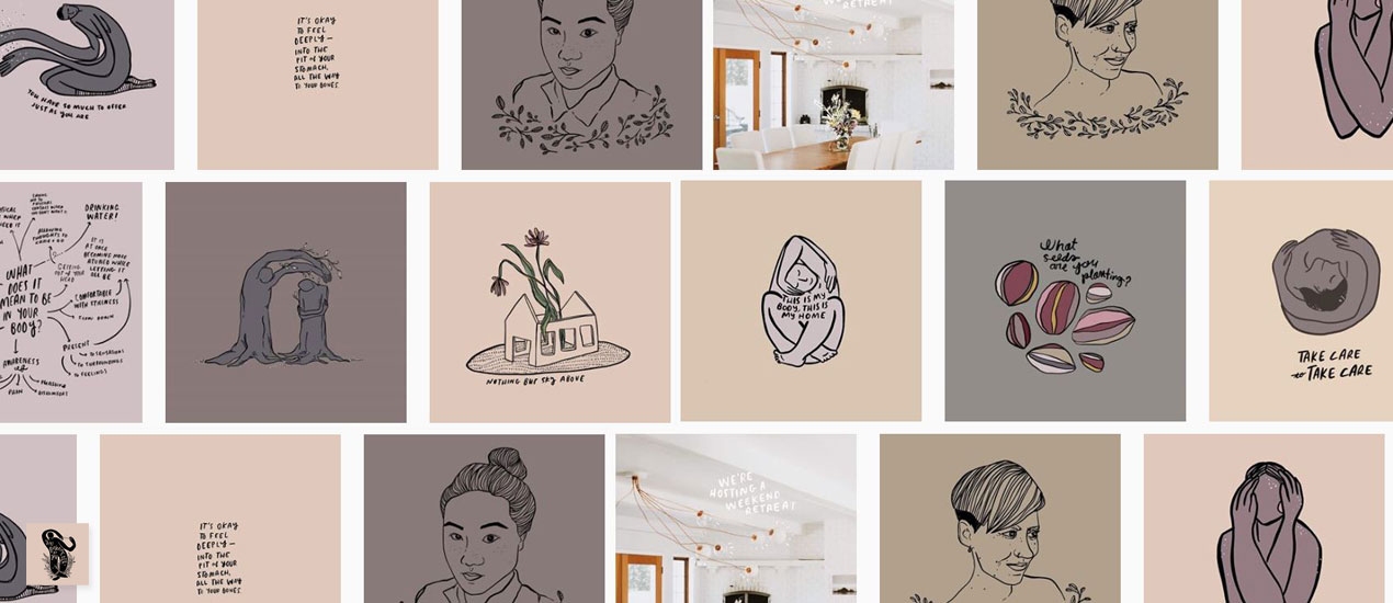
Follow these Illustrators on Instagram Hate social media bringing you down? Hate scrolling and slowly feeling down about yourself as the posts roll by? Follow these ten illustrators on Instagram we suggest below and you’ll perk right up. We promise!…
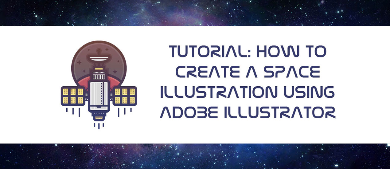
Tutorial: How to Create a Space Illustration Using Adobe Illustrator
Space has and will probably always be one of those things that man has long dreamt of conquering. From the darkest corners of the Milky Way to the farthest region of the known Universe we will always poses that urge…

WMC Fest Storytime: Meet Scotty Russell
Meet Scotty Russell of Perspective Collective It’s time for another video! This video is another in a line of shorts introducing you to the speakers who will be presenting at our design, art and music conference, Weapons of Mass Creation Festival. Today’s…

WMC Fest Podcast: BF Tag with Hey! Monkey Design’s Lenny Terenzi
Graphic Design Podcast with our Emcee, Lenny Terenzi We are beyond thrilled to announce that Lenny Terenzi, designer, illustrator, screen printer and founder, owner of Hey! Monkey Design Studio, is this year’s Weapons of Mass Creation Fest emcee.

Download of the Day: Abstract Grunge Vector Box Freebie
Abstract Grunge Vector Box Freebie Join us every Thursday, when your friends here at the Arsenal take over the Go Media blog to share insights, tips, freebies or other fun to brighten your work day. Today we’re sharing some hand drawn,…

Inspiration of the Day: 9/28/2016 – All the Kawaii
Kawaii Inspiration Every Wednesday, we scour the web for the best in inspiration from designers killing it at their craft. Please enjoy this incredible art and join us on Pinterest, where we’re dedicated to collecting our own work, as well…

Creating Learning Material
-Creating Learning Material: A Beginners Guide to Making Educational Content In 2014, back when I lived in Pittsburgh, I received the opportunity to be an art instructor at a community-focused arts organization known as Wash Arts (located in Washington county).…
Color Linework in Photoshop | Design Tip of the Week
Black and white linework is always nice, but sometimes a bit of color is needed to add a pinch of visual flavor to your delicious illustration soufflé . (Hooray cooking metaphors!) Let’s get into it and show you how to…
Positive and Negative Space in Illustrator| Design Tip of the Week
Positive and Negative Space in Illustrator We all know that Illustrator is great for creating dynamic linework and wonderful shapes, but what about creating lines WITH shapes? You know, positive and negative space? Get what I’m saying? Picking up what…

Watch our WMC Fest 6 Hype Video >> “The Road to WMC – Our Host’s Journey”
Behold the Weapons of Mass Creation Fest Hype Video …a little video inspiration to hold you over ’til we meet in 17 days… Watch Now >> Then purchase one of the last remaining tickets to one of the best design conferences in…

Line Variation in Illustrator | Tutorial
Line Variation in Illustrator Tutorial In a previous Design Tip of the Week, we mentioned the increasing trend of icons and simplistic, geometric illustration. While their minimal, clean aesthetic is perfect for some situations, there are other times when an illustration…
Making Perfect Curves in Illustrator | Design Tip of the Week
Making Perfect Curves in Illustrator Hello, hello! Last week, I gave some tips on designing faster in Illustrator, but this week, we’re going to focus more so on quality. In Illustrator (as you all know,) you have super-tight control over line weights, shapes, etc.…
Tips on Drawing Symmetry | Design Tip of the Week
Tips on Drawing Symmetry I have a hard time drawing things perfectly symmetrical. I mean, really, who doesn’t? Drawing symmetry is tough! We’re not robots with mathematical precision. No worries, here are some quick tips that will surely help. One trick…
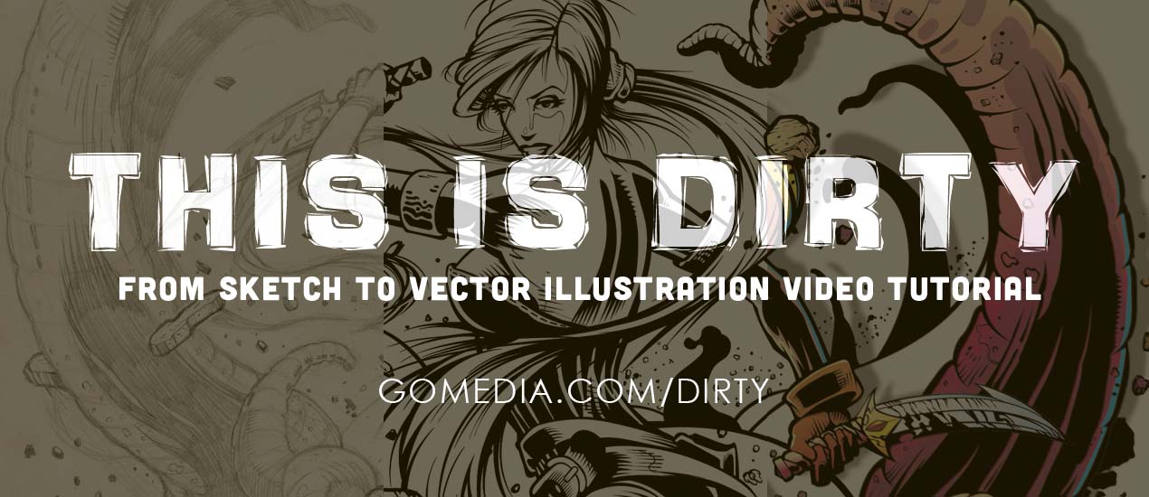
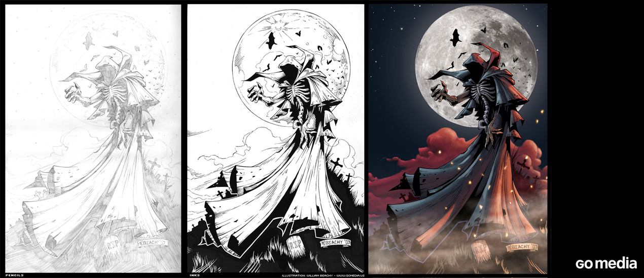
The Wait is over! This is Dirty: From Sketch to Vector Illustration Video Tutorial is Here!
From Sketch to Vector Illustration Video Tutorial The wait is finally over. The long awaited, highly anticipated video tutorial by Cleveland brand design services guru & Go Media President William Beachy, is finally here. Based on his wildly popular blog post, From…

WMC Fest 6 Poster Design Process: An Inside Look (Part II)
Hello, again! In Thoughts Behind the Weapons of Mass Creation Fest 6 Poster, I went over my process of researching, note taking, and inspiration hunting for the creation of this year’s event poster. Welcome to part II, in which I will go…
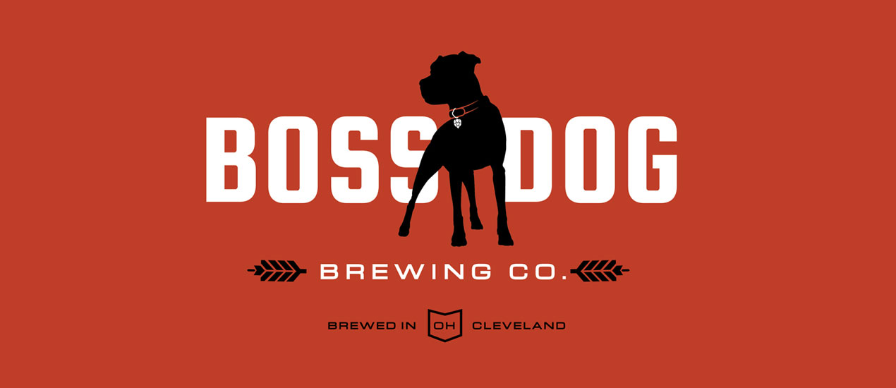
Design by Go Media: Boss Dog Brewing Co.
Brewing Company Branding: Boss Dog Brewing Co. Brothers Josh and Jason Czernek (and Mom) visited Go Media looking for a Cleveland design firm who could help bring their dream brewery to life. Their concept revolved around the name Boss Dog…
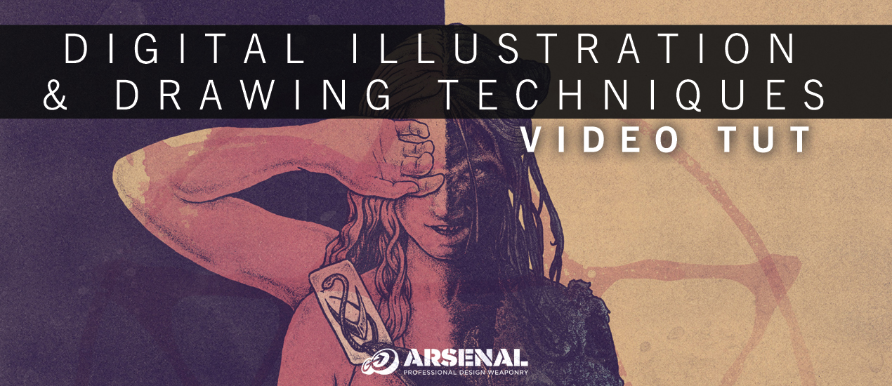
Photoshop Drawing Tutorial: Digital Illustration & Drawing Techniques Video Tutorial
Photoshop Drawing Tutorial New year’s resolutions are always thrilling for me. They breathe a sense of new life into both my personal and professional life. In 2015, I have one main goal – to throw every ounce of my soul into design. To dive into…

20+ Holiday Illustration Inspirations
Holiday Illustration Inspiration We’re all about getting into the holiday spirit here at our Cleveland design studio. From stockings to Secret Santa, we’re surrounded by Christmas cheer. But our love of the holidays isn’t limited to the office. It, of course,…

Top Graphic Design Tutorials: Improve Your Skills Now
Top Graphic Design Tutorials: a Quick Guide by Your Friends at Go Media Welcome to the Go Media’s Zine! Are you a passionate creative, student, designer, entrepreneur? You’re in the right place. Inside you’ll find the tools you’ll need to…
28 Dynamic Flyer, Poster, Print Illustration Inspirations: Vintage Design by Go Media
Paper & ink are woven into the fabric of Go Media. Dreamers and doodlers, our Cleveland Graphic Design staff believe illustration is one of the quickest, deepest, most meaningful ways to convey your message to the world. Custom Illustration is a…

Illustration Tutorial: “The Man Who Knew It All” Technical Process & Design Philosophy
Today I’m going to be sharing the process I usually go through in creating my illustrations. Not the conceptual process but mostly the technical process. For this tutorial I will be working on a recent illustration for a book on the subject of “The Man Who Knew It All”. I was given this brief and told I have carte blanche to do whatever I wanted. I thought this would be a neat chance to play around with the process itself and use that as the subject matter. In short, peeling back the creative process as the concept of knowledge.

LeBron’s Comeback: How Illustrator Robert Carter Designed the King’s Return to Cleveland
Interview with Robert Carter of Cracked Hat Design As you all well know, the Cleveland pride is bursting through the walls of Go Media, where we sit only 2 miles from Quicken Loans Arena, new (and old) home to LeBron James.…

Massive Drawn to Business Price Drop: Build A Million Dollar Business for Less with this Must-Have Resource
Massive Drawn to Business Price Drop As many of you know, we are incredibly proud of the content inside our newest eBook, Drawn to Business. Drawn to Business is a transparent look inside our business, a complete guide on the way to…
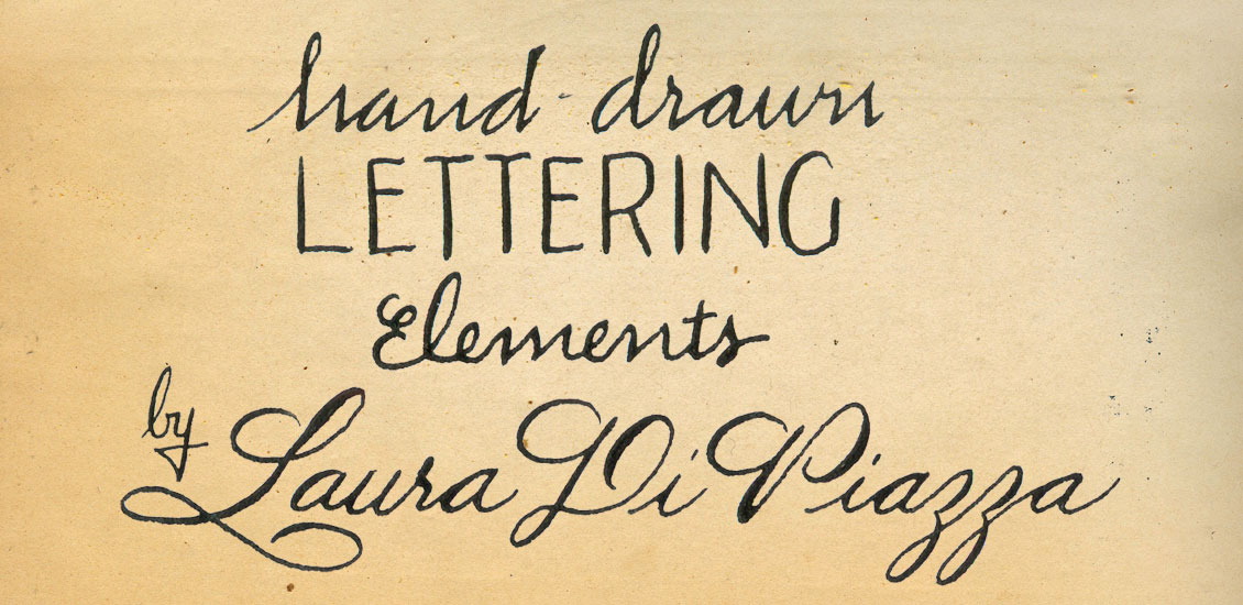
Introducing Hand Drawn Lettering Elements: All American Grit
Looking to deliver your client design filled with character and an organic quality only achieved with hand lettering? Lacking the tools or time to do so? You’re in luck. Calligrapher Laura Di Piazza’s first Arsenal product, Hand Drawn Lettering Elements:…