Blog
Before and After Comparisons of Famous Logo Redesigns
A logo serves as the storefront of a company in the simplest way possible. Getting a logo done is indeed an intricate task, a logo designer puts their heart and soul in the process and strives to create an identity that can be easily detectable from a branding expert to the 5th-grade student. In a nutshell, it’s a first impression that reflects the entire idea of a brand and sticks out a like a sore thumb.
A brand pulls out all the stops to make its logo as the face of their company, which is definitely not an overnight task. It requires constant repetition, perpetual promotions and many other efforts to acquire the desired goal. Then why does a brand have to retire their established custom logo design and go back to the canvas for redoing the strokes? Why don’t they just skip such a daunting task where they will have to go through the intimidating details all over again? Well, sometimes a fine-tune in the logo design gets inevitable. Whether you want it or not, you will have to take on the design journey for the sake of your brand replenishment. Except for the most iconic ones such as Nike swoosh, almost every brand’s symbol had to undergo some kind of reform in their original design.
Here we are going to look at some of the most famous logo designs journey – who have really raised the bar with their new and improved logo redesigns. Let’s delve into the before and after comparison of the well-known logo redesigns and see what we can learn from their tremendous success.
Pizza Hut

Logo History: Since the food chain’s opening in 1958, the company’s logo has undergone drastic redesigns several times. Started from a mascot logo in which Pete was holding the words “Pizza” and “Hut” in both the hands, the logo has come a long way to represent the slanted hut image as the central element of its brand identity.
New Logo- The Improvements: Pizza Hut decided to keep up with modern trends at the same time kept their design’s legacy intact. The logo has been known for its slanted roof not only in its logo design but also on their outlet’s building. Therefore they kept the primary identity untouched in the design. On the other hand, they took a smart move to simplify the color palette of the logo while emphasizing the color red which has a psychological connection with appetite and hunger. As compared to the older version, the logo has been tweaked to maintain the flat look and feel, which is quite trendy nowadays.
MailChimp
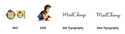
Logo History: A free and paid email marketing service started in 2001 with the monkey head as their original logo which was kept by the company until 2005. In 2006, the email marketing company decided to streamline their animated logo and went for a complete overhaul by replacing the monkey head with the typography ‘MailChimp.’
New Logo- The Improvements: The current logo redesign doesn’t even appear as an obvious redesign at first glance. However, upon close observation, you will be able to identify the subtle pinches in the design. The logo has been further simplified and has been given a lighter look. However, the original energy is kept the same as it used to be. But there is a clear difference in the typography which has been optimized over the years to improve the readability.
The logo is the prime example that tells us how one can breathe a new life into the brand identity without going overboard. Designer Jessica Hische has shown here how a low-key redesign is done while keeping the real essence unaffected.
Starbucks

Old Logo: Speaking of the iconic logos, you can’t skip mentioning the classic Starbucks logo and its redesign journey. 1987 Starbuck’s logo displayed a woodcut illustration inspired by the Greek pottery. The original version sported the Starbucks siren as fully topless holding the prominent fishtail. However, the logo underwent a drastic modification in 1987. In the 1987 version, the siren’s frontal upper body was covered by her long hair, however the fishtail was slightly cropped.
New Logo- The Improvements: For the new logo, the designers decided to get rid of the outer circle, and the name has also been dropped from the disc. Before the recent tweaks, designers opted for the symmetry until they realized that they don’t want the siren to be perfect as a Barbie. After numerous brainstorming sessions, Starbuck’s logo design team settled on one point that perfection is not something they want for this logo. Hence, they added a few rounder details and opted to keep the siren’s personality as it used to be; mythical, mysterious and worldly.
Target

Old Logo: Target came up with their unique logo in 1962. The logo initially kept 3 red and 3 white rings with the company name written boldly across the bullseye. In 1968, Target attempted to give a more contemporary look to the bullseye logo. However, in 1989 the company temporarily removed the bullseye image from the logo and kept the wordmark “Target” in bold Helvetica.
New Logo- The Improvements: Since the beginning, Target’s logo has managed to stand out due to its outstanding choice of color. Other than that, nothing can be wiser than representing a brand name ‘Target’ with the actual Target in its logo. As far as modifications are concerned, Target has reduced the number of rings, whereas the circle within the circle has always communicated effectively to the global audience. Not to mention the minimalist circle design creates an image of reliability, attention, trust, and strength. Besides, their perfect choice of color matches perfectly to the core values, vision, and purpose of the corporation.

Old Logo: Google original logo was designed in 1998. The designers used a standard font for the company name. Until 2009 the logo remained unchanged, after which the company decided to alter the shades in the letters. Fast forward to 2004, the company made a few subtle changes in the letter spacing.
New Logo- The Improvements: The simplicity of Google’s logo is the winning factor which makes its brand recognition game stronger than others. The sophisticated yet straightforward wordmark combined with the thoughtfully chosen primary and secondary colors gives the design a wow-factor that many other fails to adopt. The current logo is a flat design with sans serif typeface. Despite several minor changes, the logo has always owned and retained the classic feel with bold and playful colors and laidback typography.
Conclusion
Your logo is the face of your company. Sometimes, the face needs a makeover so that it can be conceived by the newer audience, at the same time, relate with the existing target audience. All the logo redesign examples mentioned above opted for the flat design trends with the bright colors. Not only this, but they decided to tone down the intricate details to modify the logo designs into a memorable yet timeless symbol that’s bold and recognizable from a distance. Remember, as your company grows, your logo should not remain the same as it used to be when the company was initiated. You will have to rebuild a consistent, robust and identifiable brand identity that resonates with the existing as well as potential customer base, which is only possible with an impactful logo redesign.