Articles by: Go Media

Crafting WCAG Compliant Articles
Crafting WCAG Compliant Articles: A Guide by Go Media, Cleveland’s Premier Website Design and Development Agency At Go Media, we believe in the power of inclusive digital experiences. In today’s article, we’ll delve into the world of WCAG compliance and…
WebP, the Rockstar of Image Files, Now Supported by Photoshop 23.2
The Google-developed WebP image formatting tool has long been a top choice for web image compression. Now, designers and photographers can more easily export and save Photoshop documents in the WebP file format – and there are many design &…

Why Hire a Professional Web Design Company?
Enterprising business owners are rarely daunted by new tasks. Diving right in is second nature to many entrepreneurs. When it comes to web design, there’s no denying the ample DIY resources available to help companies cobble together an online presence.…

Go Hosting Cloud Infrastructure Upgrade
For over a decade, Go Media has been proud to espouse the virtues of hosting with Amazon Web Services. Also known as AWS, this behemoth lapped every competitor in the space to become the preeminent provider of offsite cloud infrastructure.…
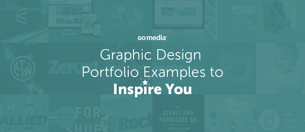
Graphic Design Portfolio Examples to Inspire You + Important Tips
Newly graduated? Actively seeking employment in the field? Super comfortable in your current position? No matter what your status, the Go Media team suggests you regularly work to keep your design portfolio up-to-date. Seasoned designers, we know that this task…

90’s Graphic Design Mood Board
The 90’s were a magical time – a time of the Docs, Game Boys, and the sweet, sweet sound of AOL dialing-up. As everything that was once old is new again, the 90’s are making a come back. Design trends…
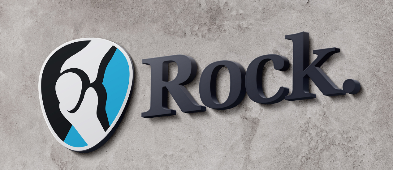
Portfolio Spotlight: Rock Medical Branding & Website
Go Media is so honored to have had the pleasure to work with Rock Medical, the premier Orthopedic Consulting Team here in Northeast Ohio, on their logo and website design. Over the past 16 years Rock Medical has served it’s…

Designer Face Off featuring Paper Cut Artist Reina Takahashi & Facebook Art Director Shiu Pei Luu
Welcome to Designer Face Off, where we ask two designers to go head to head, asking one another burning questions about their shared passions for design, entrepreneurship, and all things creative. Facing off today are two WMC Fest family members,…
How Do You Know It’s Time for a New Logo?
How to Know It Is Time for a New Logo One question we get all the time here at Go Media is: “How do I know it’s time for a new logo?” Today, our President, William Beachy, is addressing this…
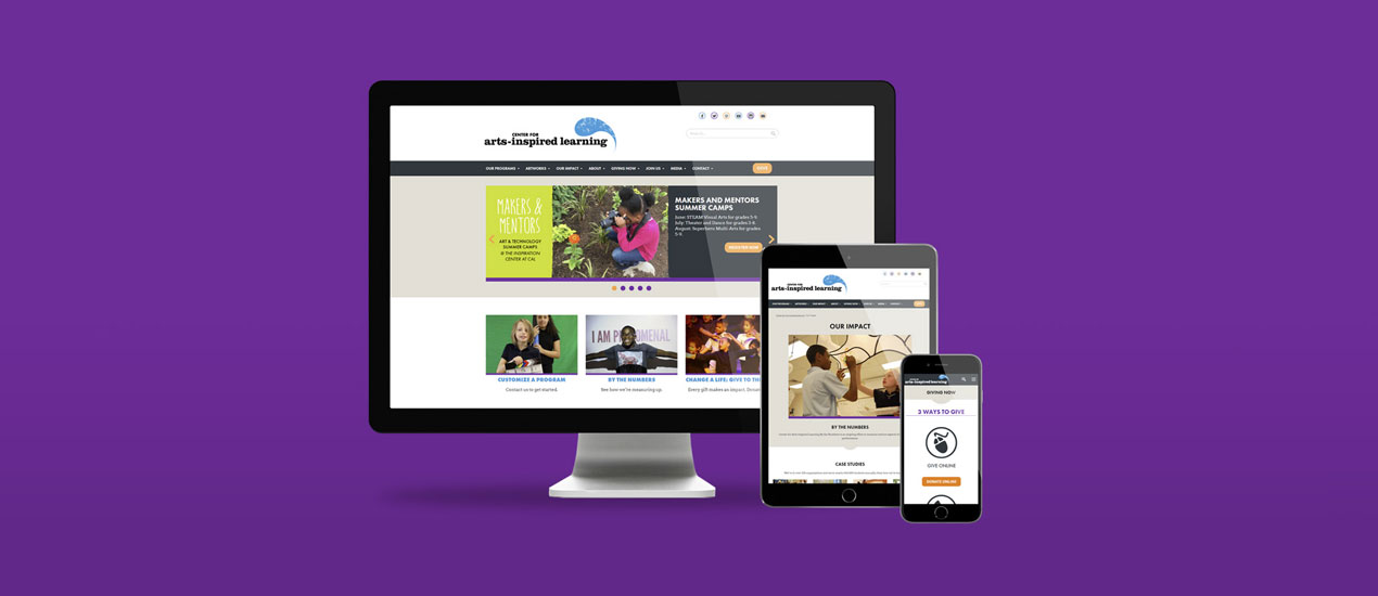
Portfolio Spotlight: Center for Arts-Inspired Learning Website
Go Media, your favorite Cleveland-based web design, branding and design firm, is so proud to have had the pleasure to work on the website for the Center for Arts-Inspired Learning. The Center for Arts-Inspired Learning is a non-profit organization that…

This Week’s Top Five Links (7/13/2018)
Here are five links, images or videos from the web that stood out to us this week. We thought we’d pass them onto you and share the love. We hope you enjoy them. Please tweet us and let us know…
3 Questions to Ask Yourself When Building a Strong Brand Presence
How to Build a Brand What is your brand? Who is your brand? And why should we care? Developing a brand is more than just your logo. A brand represents everything you are as a company. Everything that you say and…

Project Spotlight: Without Bounds
We are excited to share the website design we completed for Without Bounds Educational Services, a phenomenal education service that provides young students with the tutoring they need to master concepts and prepare for exams. They work with the most…

Project Spotlight: Scott Sheldon
Web and Infographics Design for Scott Sheldon We are excited to share the work we completed for Scott Sheldon, nationally recognized supply chain consultants based out of Detroit, Michigan. Scott Sheldon’s new website needed to convey the level of sophistication…
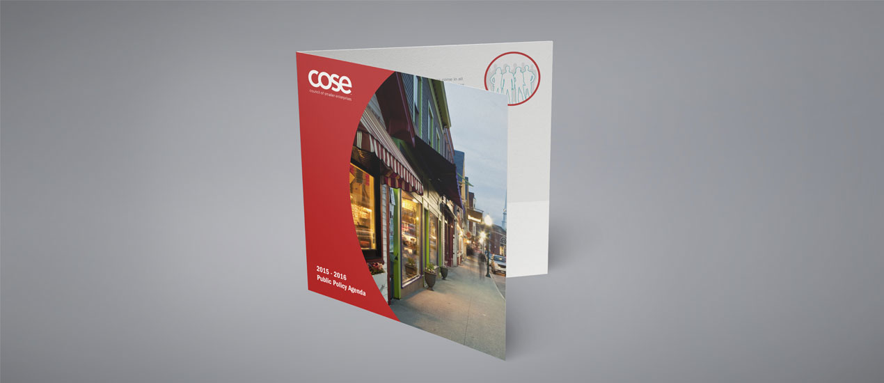
Portfolio Spotlight: COSE-PPA Print Design Piece
Print Design Piece by Go Media We are proud to spotlight a recent project we completed for COSE, the Council of Smaller Enterprises, a group that has supported and advocated for the small businesses in our region since 1972. This…

How to Get Hired to Do the Design Work You Want to Do
How to Get Hired as a Graphic Designer (to Do the Work You Want to Do) When going through the hiring process here at Go Media, we see a lot of portfolios. Some are good, some are bad, very few…

Portfolio Spotlight: Akron Welding Website and Branding Project
Akron Welding The Akron Testing Laboratory & Welding School is a family owned and operated business that has been in existence since 1965. ATW serves its local community with a goal of sharing the knowledge and expertise of master welders…

3 Tips for Designing Printed Apparel with Dan Byler
Tips for How to Design Your Own Apparel In today’s video, we introduce you to Dan Byler, Business Development Guru at Jakprints. Jakprints is a premier print shop here in Cleveland with over a decade of experience in online printing. They specialize…

3 Tips to Approaching Design Work with Jon Phenom
My Top Three with Jon Phenom Jon Phenom, apparel designer and brand director for BLVD Supply, has been advising entrepreneurs on how to create and grow their fashion and clothing lines for over ten years. You can find him doling out…

Tips for Designing Your Own Patches with Patch Superstore (+ How to Get a Free One)
This month, we are all about patches, as we are giving away incredible Arsenal patches to our current Arsenal subscribers and anyone who subscribes to the Arsenal membership in May ’18. If you don’t know about the Arsenal Membership, it’s…

Portfolio Spotlight: Zerust Website
Website Development & Product Photography – Zerust Portfolio Item Zerust, a company located in Twinsburg, Ohio, has a long history of developing, manufacturing and marketing rust and corrosion prevention products to a wide variety of customers across the globe. This…

Portfolio Spotlight: Très Chic Salon Branding
Très Chic Salon Branding Go Media was approached by stylist Katie Skillman, who was on a mission to turn her passion for hair education & styling into her dream business – a Cleveland local salon known as Très Chic. During…

Grab the March 2018 Arsenal Product Bundle
Graphic Design Bundle It’s a great month to be a member of Go Media’s Arsenal subscription. Not only do you have access to our entire library for only $15/mth, but you are able to download this month’s special graphic design…
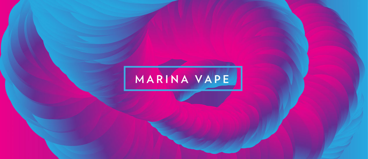
Portfolio Update: Marina Vape
Marina Vape – Product Line Branding Over the course of a year, we had the privilege of working with e-liquid company, Marina Vape. The name of the game for these projects was building a visual brand around different flavor concepts.…