Articles by Month: May 2015

WMC 6 Go Media Podcast Interviews: Michael Rivette, Christina Sharp, JP Boneyard, and Jordan Schiller of Real Thread
Go Media Podcast Time! In this episode, Bryan and Heather sit down with speakers Michael Rivette, Christina Sharp, and JP Boneyard, as well as sponsor and panelist, Jordan Schiller from Real Thread to talk about what they’re most looking forward…

The Branding Process: 4 Steps to Success
Steps involved in Branding Process Now that you’re fully educated on the difference between logo design and branding, you’re probably coming to a realization. And that understanding might be something like this, “Bill, I really need more than a logo. I…
Logo Design vs. Branding – what’s the difference?
Why do I hate my new logo?
Never fear, your Cleveland Logo design firm Go Media is here to explain!
Everyone knows what a logo is. It’s that shape companies use to represent their company; like Nike’s swoosh, McDonald’s golden arches (M) or Starbucks green mermaid. But what’s branding exactly? Branding is a more holistic perspective of how your customers experience your company. While a logo is only a small simple mark, a brand includes every single touch-point your customers have with your company.
Let’s use Nike as an example and consider the differences between a logo and a brand.

Your Favorite Mockup App Back: Mockup Everything’s May Templates are Here!
Your Favorite Mockup App Back Mockup Everything your favorite way to mockup designs in an instant (without fancy software like Photoshop) & Go Media, Cleveland’s best Graphic Design firm is here with 6 brand-new templates. After all, we promised. Yep,…
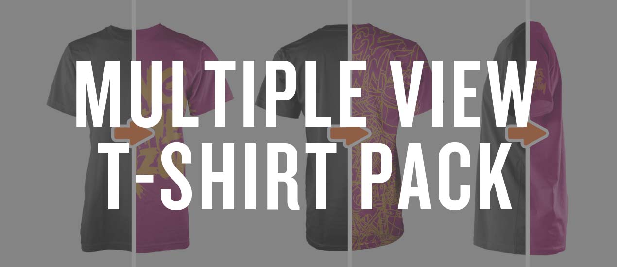
Front, Side & Back: Say Hello to the Multiple Views Men’s Ghosted T-Shirt Mockup Templates Pack
You have nothing to hide. Show them all sides. Our Multiple Views Men’s Ghosted T-Shirt Mockup Templates Pack includes front, back and side versions of 3 of your favorite men’s t-shirts, each set in its own Photoshop file. This allows…

Have an eCommerce Site? Make Sure it has these 3 Key Elements:
We all want to see more traffic and conversions on our ecommerce sites, right?
With numerous tricks and tips swarming the web, knowing what, when, and how to make those improvements can be overwhelming.
Today, let’s start from square one and make sure we all have these three fool-proof elements, all of which can be accomplished this afternoon. Let’s get to it!

The Wait is over! This is Dirty: From Sketch to Vector Illustration Video Tutorial is Here!
From Sketch to Vector Illustration Video Tutorial The wait is finally over. The long awaited, highly anticipated video tutorial by Cleveland brand design services guru & Go Media President William Beachy, is finally here. Based on his wildly popular blog post, From…
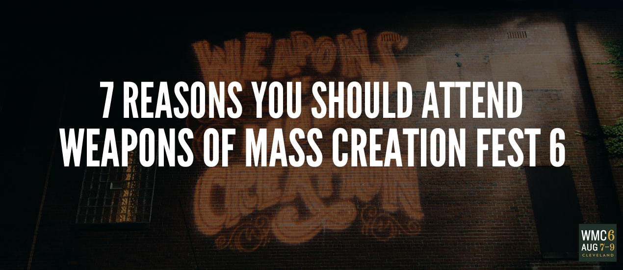
7 Reasons You Need to Attend Weapons of Mass Creation Fest 6
This, above all summers, is the one to head to our annual creative conference, Weapons of Mass Creation Festival. Why? Well, now that we’re in our sixth year, we feel like – more than ever – there’s something to prove. We want to tell the world that WMC Fest is indeed a movement in the making – one dedicated to providing opportunities for attendees to grow and challenge themselves at every turn. Not only are we upgrading our venue this year – but every aspect of our programming.
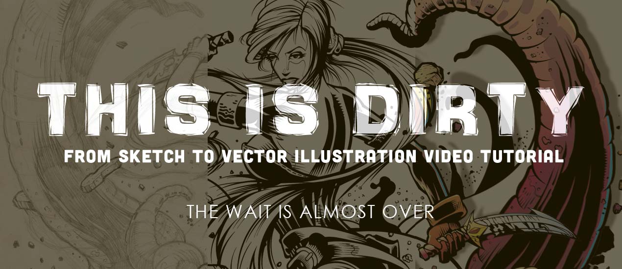
From Sketch to Vector Illustration Video Tutorial
Long awaited, highly anticipated.
Our newest Arsenal tutorial release is based on Go Media President William Beachy’s wildly popular blog post on our ‘Zine, From Sketch to Vector Illustration.
This is Dirty: From Sketch to Vector Illustration Video Tutorial is an intimate look into Bill’s design process.

WMC Fest 6 Poster Design Process: An Inside Look (Part II)
Hello, again! In Thoughts Behind the Weapons of Mass Creation Fest 6 Poster, I went over my process of researching, note taking, and inspiration hunting for the creation of this year’s event poster. Welcome to part II, in which I will go…

WMC Fest 6 Poster Design Process: An Inside Look
I had the honor of designing the poster for this year’s Weapons of Mass Creation Fest. For those who do not know, I am a recent addition to the Go Media and WMC Team, and when I started in February, I thought I would be working alongside the other designers in creating the promotional material for WMC. Nope. Instead: “It’s all you. We’re excited to see what you come up with.” Entrusting me with such important work had me both fired up and terrified. With the event poster being one of the first things needed done, I hit the ground running. One thought continuously played in my head: This poster needs to kick some serious ass.

Freebie: Vector Hand Drawn Elements
This hand drawn vector pack has so many small details to choose from (52 if you want to get technical), you’ll want to fill your next project to the brim with them. With line flourishes and plant details, this little freebie has plenty of things that you didn’t even know were missing from your repertoire.