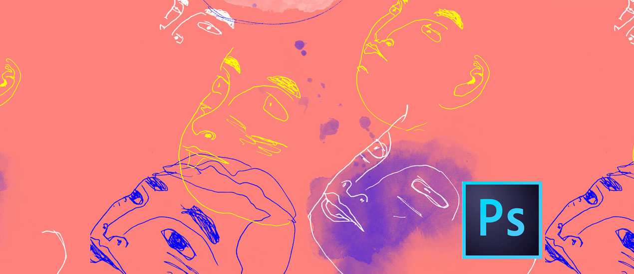
Photoshop
WebP, the Rockstar of Image Files, Now Supported by Photoshop 23.2
The Google-developed WebP image formatting tool has long been a top choice for web image compression. Now, designers and photographers can more easily export and save Photoshop documents in the WebP file format – and there are many design &…
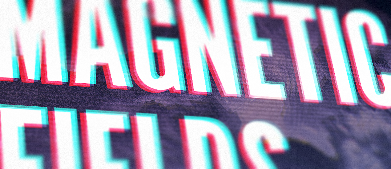
Tutorial: Making Totally Tubular Glitch Effects in PS (plus 4 Free TV Glitch Textures just for YOU)
TV Glitch Effects: Makin’ Em in PS (& Free TV Glitch Textures, Too!) So guys, we’re kind of obsessed with these tv glitch textures we’ve been seeing around town lately.
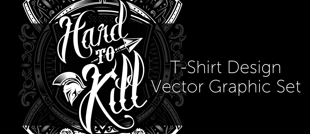
Let’s create a striking history book cover about antique war stories with the Hard to Kill Vector Pack
How to Create a Book Cover Design Well hello there dear readers! Simon here, ready to walk you through my process to create a striking book cover with our latest vector pack release, the hard to kill vector pack. We’ll…

Grab the March 2018 Arsenal Product Bundle
Graphic Design Bundle It’s a great month to be a member of Go Media’s Arsenal subscription. Not only do you have access to our entire library for only $15/mth, but you are able to download this month’s special graphic design…
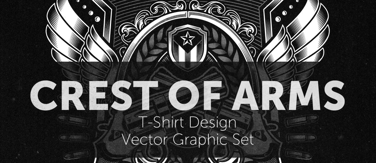
How to easily create a record release promo poster with the Arsenal’s Crest of Arms vector pack
Hello GoMediaZine/Arsenal blog readers! Simon here with a new step-by-step tutorial. We will be leveraging the contents of our brand new Crest of Arms vector pack to create a poster for the release of PWR.CLRS’ first, self-titled, album. We’ll talk…
Introducing our newest Video Tutorial: Working with Photoshop’s Quick Mask Mode
Working with Photoshop’s Quick Mask Mode Go Media’s Arsenal proudly announces the release of a brand new video tutorial, “Digitizing Your Illustrations with the Quick Mask Mode in Photoshop.” In this video tutorial, Go Media’s Lindsey Meisterheim will be using…

Men’s Crew Neck PSD Mockups featuring Displacement Maps
We are overjoyed to announce the premiere of a brand new mockup pack: Our Men’s Crew Neck PSD Mockups!
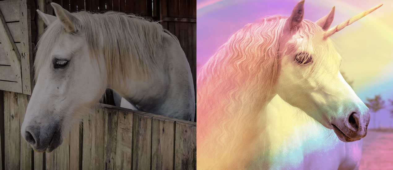
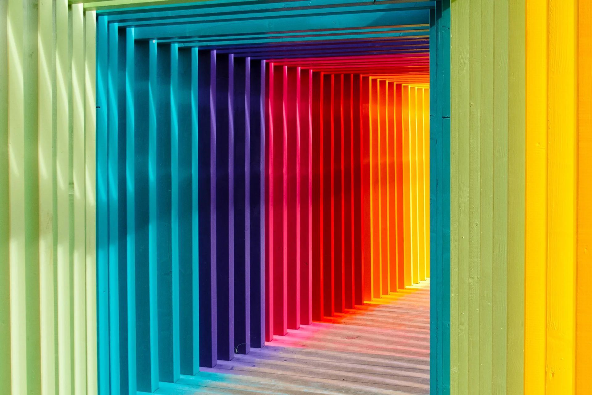
How to Create a Rainbow Effect in Photoshop (Freebie Included)
How to Create a Rainbow Effect in Photoshop Hello Everybody! It’s 2017 and this year, I don’t know about you, but I’m resolving to settle into my skin more than ever. This means saying “yes” to life more often, saying…

Design Tip of the Day: Creating your own Coloring Book in Photoshop
Creating your own coloring book using Photoshop > It’s time for the holidays! That means lots of relaxation time, including time spent curled up by the fire. If you’re like me, it’s hard to keep still when all you want…

Using Crumpled Paper Textures to Pimp out your Hang in There Cat Poster (Freebie Included!)
PS Basics Tut + Crumpled Paper Texture Freebie > What’s better than the old “Hang in there” cat poster? Not much in my book. But today, we’re going to add a little more character to one, just for kicks, using…
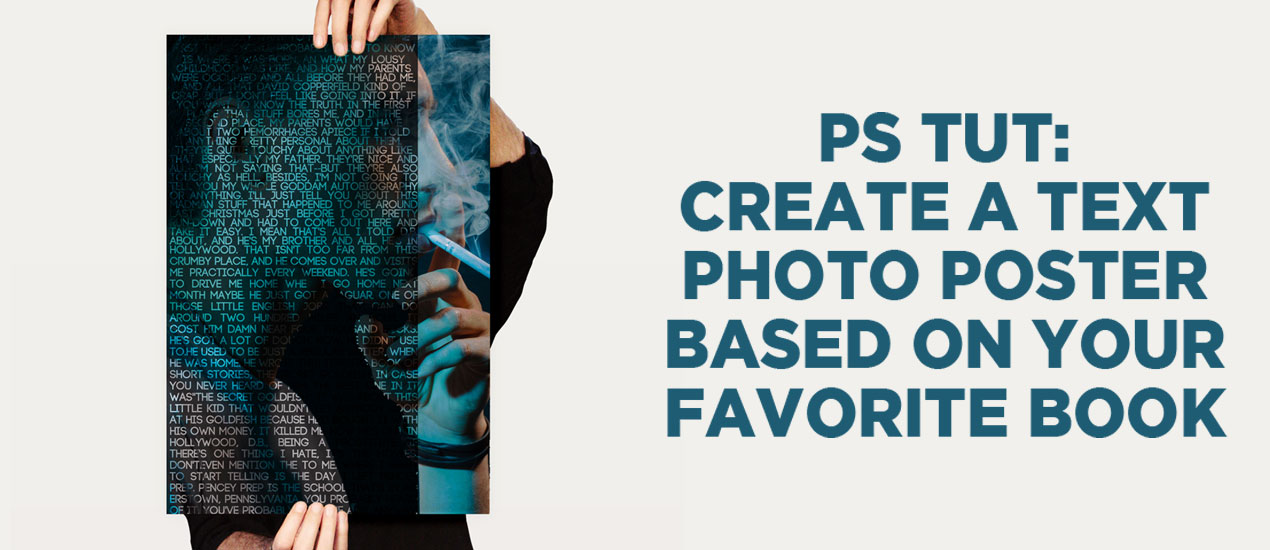
PS Tutorial: Create a text portrait poster based on your favorite book (Free mockup included)
Let’s Create a Text Portrait Poster! In today’s tutorial, we are going to be creating a text photo poster created by combining the image of our choice with related text. I’ll create mine based on my favorite book of all time, The…
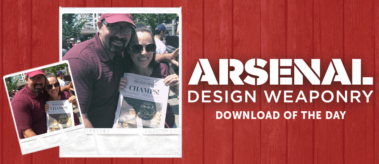
Download of the Day: Polaroid Photo Effect Template & How-To
Polaroid Photoshop Tutorial: Simplified! Join us every Thursday, when your friends here at the Arsenal take over the Go Media blog to share insights, tips, freebies or other fun to brighten your work day. Today we’re talking about how to…
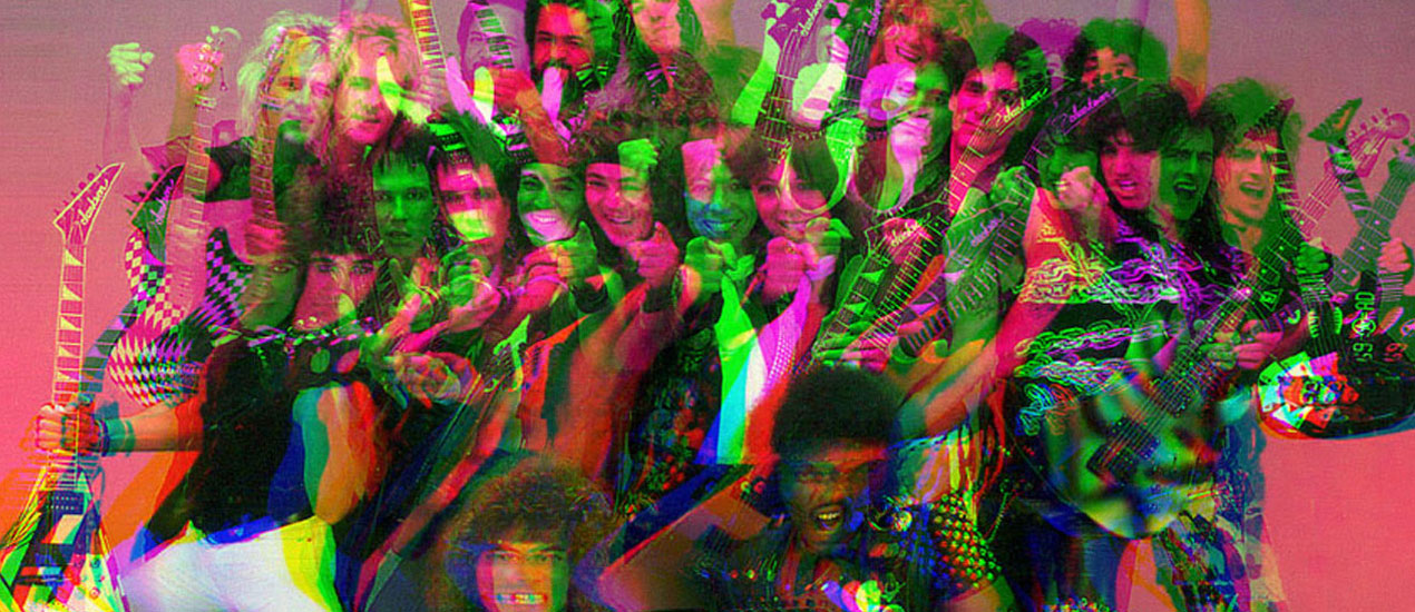
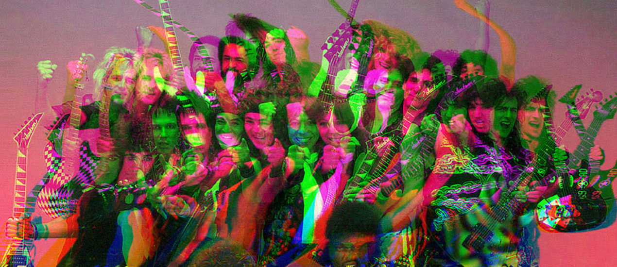
Getting our 1980s and VHS tape on with Dustin Schmieding’s cosmic fractal storm texture pack!
Introducing the cosmic fractal storm texture pack Hello everyone! It’s Simon again on this end of the keyboard. I’m returning for another tutorial, and boy, do we have a treat this week. Dustin Schmieding gifted us with yet another fantastic…

Video Tutorial: How to Create Your Own PS Brushes
How to Make Photoshop Brushes In this video tutorial, we teach you how to make your very own Photoshop Brushes. We create ours using coffee stains, but you can use paint, watercolors, or other fun materials you find around your studio.…
Tutorial: Rockin’ Some Radical Glitch Effects in PS (plus 4 Free TV Glitch Textures just for YOU)
TV Glitch Effects: Makin’ Em in PS (& Free TV Glitch Textures, Too!) So guys, we’re kind of obsessed with these tv glitch textures we’ve been seeing around town lately. So, we created some for you to use and apply to your…
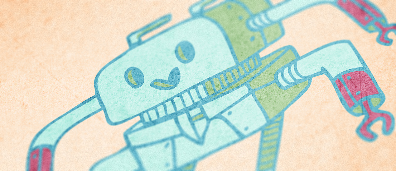
How to create a cute robot children book cover with Justin Will’s hand drawn Sci-Fi vectors!
Hello, dear Zine reader! It’s Simon on this end of the keyboard for a new tutorial. This time, we’ll have a close look at how to use Justin Will’s hand drawn Sci-Fi vector pack.
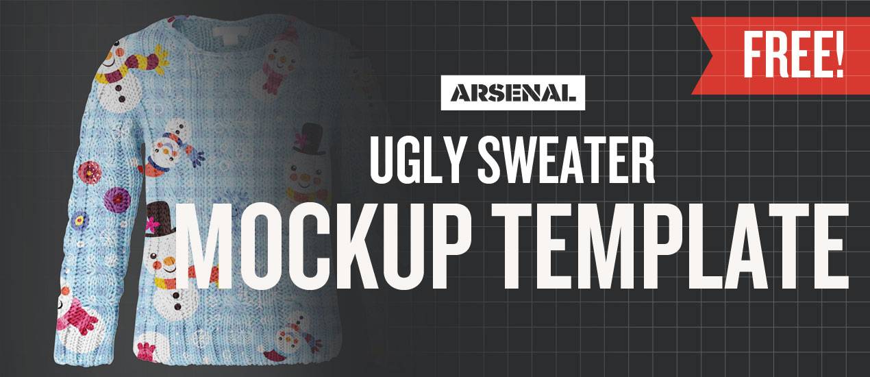
Just a free Ugly Sweater Mockup Template to get you through your day
We’re really getting into the Christmas mood here at Go Media. How do we express that? We create an ugly Christmas sweater mockup template, of course! We want to spread some joy, so please spin some soothing holiday jams and download this freebie with a hot cup of cocoa in your hands. Enjoy it and have a wonderful, safe and happy holiday season.
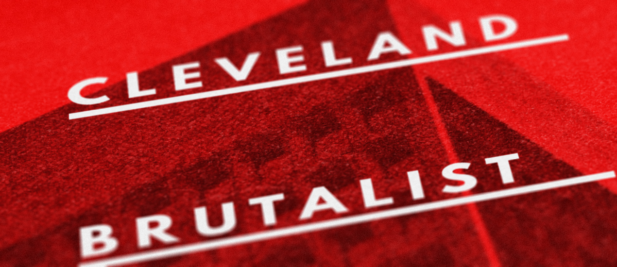
Tutorial: Building a brutalist conference poster with Jason Carne’s Texture Lot One (Free Poster Mockup Included)
Hello there! It’s Simon on this end of the keyboard. I’m very happy to make my return to the Zine with a poster design tutorial, that will explore the possibilities offered by Jason Carne’s Texture Lot One. The tutorial will have us explore texture use tips and tricks, but also customized black and white conversion, large scale sharpening, type pairing, layout building, and more.

Our Free Tool Will Help You Create Portfolio Worthy Mockups
Meet T-Shirt Mockup Tool Mockup Everything What’s better than a portfolio filled with your best work? Not much, we say. After all, you never know when opportunity is going to come a-knocking. But this, we know, is much harder than…
Color Linework in Photoshop | Design Tip of the Week
Black and white linework is always nice, but sometimes a bit of color is needed to add a pinch of visual flavor to your delicious illustration soufflé . (Hooray cooking metaphors!) Let’s get into it and show you how to…
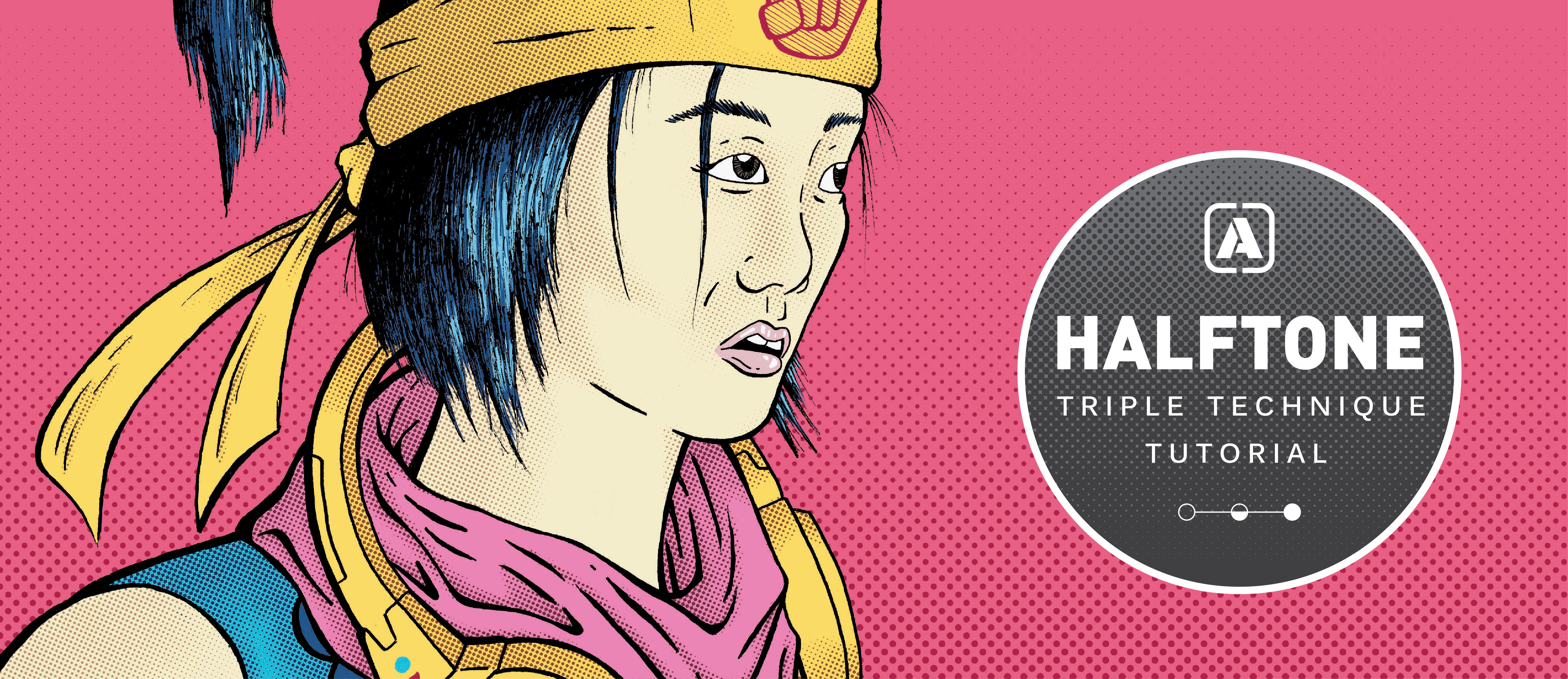
Introducing the Halftone Triple Technique Tutorial!
Say it three times fast…
Halftones: those cool little dots that create lovely tonal values, yet still maintain that flat, graphic look. If you search “how to do halftones” on Google or YouTube, you’ll find that there are a number of ways to achieve this effect. Here at the Go Media’s Arsenal, the best site for design resources on the planet, we tasked our designer Jordan Wong to find the best methods to share with you!
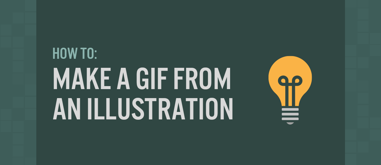
Tutorial: How to Make a GIF from an Illustration
How to Make a GIF from an Illustration Hey designers, attend our all-inclusive soul-fulfilling three-day design retreat, WMC: Off-The-Grid, this October 5 – 7th. To learn more, head to wmcfest.com. Are you interested in creating a simple animated GIF out of your…
How to Halftone Photos | Design Tip of the Week
Halftones are a fantastic method of achieving lovely tonal values through a flat, graphic look. From the time of Andy Warhol to the present, they are still being stylistically used in art, illustration and design. Don’t know how to do them? You’ll find this…
Sharpen Images in Photoshop | Design Tip of the Week
Sharpen Images in Photoshop It was actually Carly, one of the wonderful designers here at Go Media, who showed me this tip: using the High Pass filter to sharpen images in Photoshop. It’s real easy and super quick. Check it out!…