logo design
Branding: More Than Just a Logo
How to Build a Strong Brand Identity What is your brand? Who is your brand? And why should we care? When most people think of a ‘brand’ they think specifically about a logo (known by graphic designers as a ‘mark’)…
- Categorized: Graphic Design, Business Insights
- Tagged: go media, logo design, branding
Cleveland Browns Branding: Julia Briggs of Blue Star Design Weighs In
Updated Cleveland Browns Branding Our recent post, “New” Browns Logo Leaves Cleveland Graphic Designers Deflated” collected expert advice from local authorities on the matter including Julia Briggs, CEO and creative lead at Cleveland design firm, Blue Star. Julia is responsible for logo…
- Categorized: Graphic Design
- Tagged: cleveland, Cleveland graphic design, logo design, branding
Updated Cleveland Browns Logo Design 2015: Previous Dawg Pound Logo Designer Designer Todd Radom Weighs In
Updated Cleveland Browns Logo Design 2015 Our recent post, “New” Browns Logo Leaves Cleveland Graphic Designers Deflated” collected expert advice from local authorities on the matter including Todd Radom, independent graphic specializing in branding for professional sports franchises and events.…
- Categorized: Graphic Design
- Tagged: cleveland, Cleveland graphic design, logo design, branding
Cleveland Browns Branding: The New Logo – Chris Comella of Go Media Weighs In
Cleveland Browns Branding Our recent post, “New” Browns Logo Leaves Cleveland Graphic Designers Deflated” collected expert advice from local authorities on the matter including Chris Comella, Go Media Art Director, logo designer, brand expert and sports enthusiast. Chris’s full interview…
- Categorized: Graphic Design
- Tagged: cleveland, Cleveland graphic design, internet marketing, logo design, branding
New Cleveland Browns Logo Design: Aaron Sechrist, OkPants, Weighs In
New Cleveland Browns Logo Design Our recent post, “New” Browns Logo Leaves Cleveland Graphic Designers Deflated” collected expert advice from local authorities on the matter including Aaron Sechrist, Graphic Artist and Owner of OkPants and Made by Superior. Aaron’s full…
- Categorized: Graphic Design
- Tagged: logo design, branding
“New” Browns Logo Leaves Cleveland Graphic Designers Deflated
The New Cleveland Browns Logo – Cleveland Designers & Brand Experts weigh in. As anticipation swelled for the unveiling of the new Cleveland Browns logo two years in the works, buzz in the Cleveland graphic design community was especially palpable.…
- Categorized: Graphic Design
- Tagged: logo design, cleveland, internet marketing, go media, Graphic Design, branding
Tutorial: Pro Tips On Preparing Artwork For T-Shirt Printing
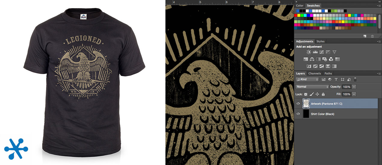
Pro Tips On Preparing Artwork For T-Shirt Printing Hey designers, attend our all-inclusive soul-fulfilling three-day design retreat, WMC: Off-The-Grid, this October 5 – 7th. To learn more, head to wmcfest.com. We are Go Media, Cleveland brand designers (and more), and we…
- Categorized: Graphic Design, Tutorials
- Tagged: logo design, Illustrator, Photoshop, apparel, Adobe Illustrator
5 Keys to Branding Your Apparel Line Like a Boss (+ 1 Top Secret to a Successful Launch)
How to Brand Your Apparel Line: Keys to Success “It’s a common misconception that a brand is a company’s logo,” Go Media Partner graphic designer extraordinaire Jeff Finley notes in his book, Thread’s Not Dead. “That’s just part of it. Some…
- Categorized: Graphic Design, Business Insights
- Tagged: logo design, Graphic Design, apparel, branding
20 Creative, Hand Drawn Logo Designs
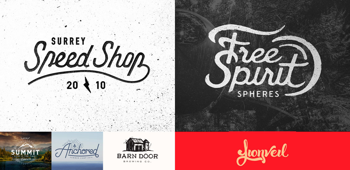
David works for Radley, who design beautiful handbags and purses. When he’s not working, he enjoys studying product and user interface design. Designing a logo is a delicate process. The entire tone and personality of a company can be affected…
- Categorized: Inspiration
- Tagged: logo design, inspiration
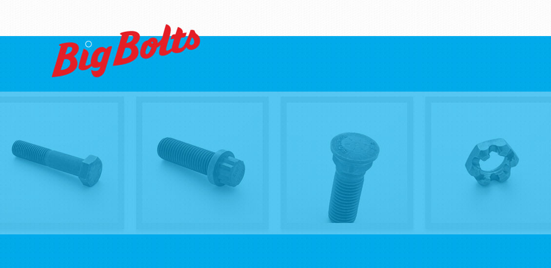
You’ll never buy big bolts the same way again
We had the opportunity to collaborate with the Umbrella Collective, providing planning, web design and front-end web development for BigBolts.com, the web’s first & only site for large-diameter bolts, screws, nuts, and washers and the first of a fastener family that, together, will form an online fastener purchasing destination!
- Categorized: Graphic Design
- Tagged: logo design, Graphic Design, cleveland
Beautiful Logo Sketches
Creating the perfect logo takes a lot of time and skill. It also takes practice – and one of the things that I find really interesting are the sketches of a logo before it’s been finalised. There are some extraordinarily talented designers out there who are as skilled at sketching out a logo as they are at creating one in Photoshop, and I wanted to bring together a post that showed off some of the best examples of their work.
I’ve always had an admiration for illustrators, and being able to combine calligraphy and beautiful lettering with logo design on paper is something that I’d love to be able to do myself. I hope you find these logo sketches inspirational, and that they get you thinking about practicing sketching too. As always, if you know of any other examples that deserve some recognition, I’d love to hear about them in the comments.
- Categorized: Graphic Design
- Tagged: logo design, illustration
20 Excellent Examples of Retro Logo Designs
The logo is the visual face of the company. It doesn’t just tell you the company’s name; it helps to give you an idea of the style, tone and personality of the brand behind it. The way in which a logo is designed can affect how the company is perceived – even on a very subtle level – and great designers can make use of that brilliantly.
I’ve always been impressed by logos that manage to create an elegant, stylish and retro look. A vintage style logo can be such a difficult style to pull off, and usually involves a tremendous amount of work around getting the typography just right. This is where hand-drawn scripts come in really well, as retro logos often make use of custom, hand-written lettering – or heavily adapted typefaces. Other elements that are common to retro logo designs include the use of textures to add a level of grain or noise to the artwork. Often, shapes such as ribbons and circles to create a badge effect can help to add a nostalgic air to a design.
- Categorized: Graphic Design, Inspiration
- Tagged: logo design, inspiration, go media's arsenal, Graphic Design
Examples of Simple & Elegant Logo Designs
There are so many different design decisions that you can make when creating a logo that – at first – it can be a little overwhelming. Do you want something attention grabbing, colourful and brash? Do you follow the long shadow trend, or will that appear tired and overused in 6 months time? Do you go for something understated and that looks good in black and white? There are countless directions that you can go in, but my personal favourite is a logo that’s simple, clean and has a tiny hint of the brand’s personality behind it.
- Categorized: Inspiration
- Tagged: logo design, inspiration, go media's arsenal, Graphic Design
How to Design an Iconic and Memorable Band Logo
My new (pop punk) band Campfire Conspiracy was gearing up to play our first show and I had two weeks to finally come up with a logo and get it stenciled or painted onto our bass drum. We had a demo…
- Categorized: Tutorials
- Tagged: logo design, Adobe Illustrator
30+ Beautifully Inspiring Logos
Your logo is a visual representation of everything your company stands for. And with a statement like that, who wouldn’t be overwhelmed. It can be an difficult undertaking to sum up you or your clients’ entire brand identity in just a image or logotype. So where do you begin? Inspiration is the 1st thing that comes to mind. Here at Go Media we often ask clients to send us some logos they like to get a sense of their aesthetic taste and of course we have an in-depth discovery meeting where we glean as much information about their company to create the most representative logo for their brand.
- Categorized: Inspiration
- Tagged: logo design
What is a “Brand”?
I read a lot of industry produced articles and papers on branding, all have one thing in common, the message is confusing, they use a plethora of “tech talk” and what I can only describe as gibberish, so let’s start…
- Categorized: Graphic Design
- Tagged: logo design, branding
Logo Design On A Budget
I am frequently asked to put together logos or promotional materials for independent bands, which is fantastic, except they don’t have the budget of a signed or sponsored band. Through the years I’ve found ways to cut corners to limit…
- Categorized: Graphic Design
- Tagged: logo design, Graphic Design, Photoshop, Adobe Illustrator
Create A 3D Vector Book Icon
We use icons every day, but usually they are made by others. So when we know exactly what we need, it is better if we make our very own icon. Here is how to make a 3D book icon, that…
- Categorized: Tutorials
- Tagged: logo design, Illustrator, Adobe Illustrator
Tutorial: Death Metal Logo
I have been creating extreme metal logos for over 4 years now for many bands all over the world. Being an extreme metal fan and a logo designer, it was only natural for me to start creating logos for the…
- Categorized: Graphic Design
- Tagged: logo design, Graphic Design
Print Indie: Logo Lounge 5
Last year I created a logo for silk screening company Print Indie into the annual Logo Lounge publication. I really didn’t think I had a snowballs chance in hell of getting in so you can imagine my surprise when I…
- Categorized: Inspiration
- Tagged: logo design, Graphic Design
Photoshop vs. Illustrator: Part 1
Photoshop Vs. Illustrator in a no-holds-barred battle to the death! WARNING! This blog post contains foul language and dirty underhanded insults. The (harsh) opinions expressed in this article do not reflect those of Go Media Inc. or Adobe Inc. Please…
- Categorized: Tutorials
- Tagged: logo design, Graphic Design, Illustrator, Photoshop, Adobe Illustrator
From the Portfolio: Swap Beats Logo
Client: Swap Beats Swapbeats.com is a hybrid social network and music marketplace that allows a user to connect with other musicians around the world and to collaborate on musical endeavors. Users are able to upload music tracks and swap, sell,…
- Categorized: Inspiration
- Tagged: logo design
The Making of the TweetBacks Logo
So around 4:30 pm yesterday, I had originally planned to catch up on my emails and starred items in my Outlook. I had been meaning to do that for a few days now. However, that didn’t happen. Such is the…
- Categorized: Graphic Design
- Tagged: logo design

