Articles by Day: February 12, 2014
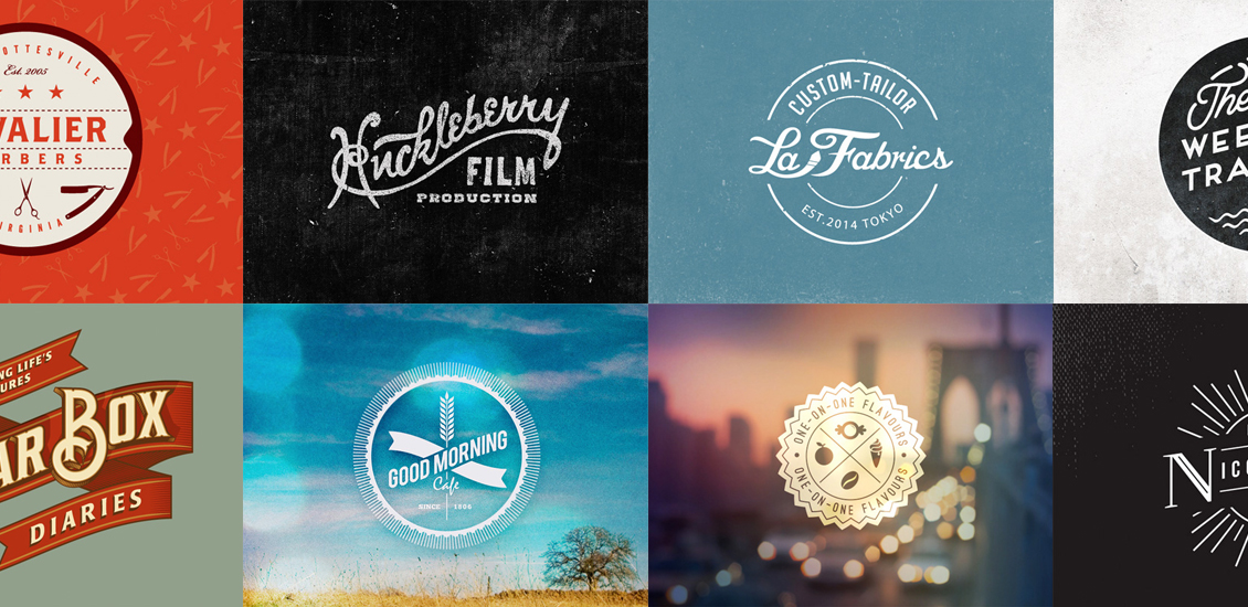
20 Excellent Examples of Retro Logo Designs
The logo is the visual face of the company. It doesn’t just tell you the company’s name; it helps to give you an idea of the style, tone and personality of the brand behind it. The way in which a logo is designed can affect how the company is perceived – even on a very subtle level – and great designers can make use of that brilliantly.
I’ve always been impressed by logos that manage to create an elegant, stylish and retro look. A vintage style logo can be such a difficult style to pull off, and usually involves a tremendous amount of work around getting the typography just right. This is where hand-drawn scripts come in really well, as retro logos often make use of custom, hand-written lettering – or heavily adapted typefaces. Other elements that are common to retro logo designs include the use of textures to add a level of grain or noise to the artwork. Often, shapes such as ribbons and circles to create a badge effect can help to add a nostalgic air to a design.