Articles by Month: March 2015
Type That’s Good Enough to Eat: An Interview with Danielle Evans
Cleveland graphics firm, Go Media presents An Interview with Danielle Evans
Tell us a little bit about your life growing up, creatively speaking. Did you always play with your food?
I had a very happy early childhood, and both of my parents encouraged me to try my little hands at everything. I had a wide variety of interests, but I was very keen on drawing and coloring. I knew I loved putting pencil to paper, and this manifested in many ways; I would draw the weather report and pretend to be a news anchor, I wrote stories for a fake newspaper but only ever finished the supporting photos/drawings, I made award certificates for my soccer teammates when we won the championship. My dad started college as an artist, and helped me paint a cheetah shaped car for the Pinewood Derby; it won best of show but got stuck halfway down the track. Neither of us were engineers.
As a small child, I only desecrated family dinner once- I had just seen Close Encounters of the Third Kind and was investigating the merit of the mashed potato mountain before my mom put a hard stop on my dinner table creation. However, I had several school projects where the two of us made food based social studies maps, such as the island of Japan out of cake or a local fort out of cookies and candy. These were always popular with my classmates for obvious, diabetes inducing reasons.
Who has been most supportive of your journey and how have they supported you?
I’ve heard it said that many people don’t wish to owe anyone else for their successes, but I honestly owe so many people. So many people have supported me in this journey that naming one person solely would be remiss. I’ve had great discussions with Tim Frame, Jeremy Slagle, Ron Mazellan, and other professional creatives when trying to decide if I wanted to freelance. My husband, Jarrod, has been the most constant contributor; he has dutifully served as a therapist, art director, unwelcome-but-correct art director, accountant, sidekick, fan, caretaker, and support. Several artists from the community have had a profound impact on my business model and sense of creative self; Allan Peters for my first big break, Jessica Hische on creative enterprise, Clark Orr for kickstarting my train of thought on multi-sensory design, These are Things for playful professionalism. Without the constant emotional support of various creative friends- Claire Coullon, Joseph Alessio, Mikey Burton, Scott Hull, Heidi and Asim Ahmed, Jonathan Vair– I don’t think I would have made much of myself. If anything, I’ve learned artistic endeavors are rarely made alone.
Did you have a moment when you realized that design was your calling?
I had always struggled with finding my calling, in part due to my moderate success at most of my hobbies. Passion was always a frustrating word as well because I never felt particularly inclined towards any of these endeavors, save illustration, but I wasn’t particularly gifted. School had broken me of my perceived skill, and in design I found shape based, typographic solace from messy strokes and the human form. However, I felt design could be soulless and longed to marry the two. When I discovered lettering, the world suddenly opened up and swallowed me. Handwriting had always been important to me, and this convinced both my husband and myself that this was a narrative and design-y way to focus myself and my portfolio. The calling came in a series of small epiphanies, really. I realized I could be happy for those finding success and not be consumed by jealousy because I had my own path to trod; I decided I would love doing this if I never became well known or published; I determined I wasn’t my business and therefore wasn’t a failure if I never made any money back. Once I became easy in my own skin, I found solace in my work and made confident strides.
What does a typical day look like for you?
My days vary wildly; sometimes I’m doing office related work- writing/responding to emails, filling out interviews, posting work to my site(s), etc. These days are occasionally spent in my underpants and are why I describe myself as “low maintenance”. Shoot days are far more exciting and vary based on location, but consistently I am wearing pants for these. I arrive early, around 8- 8:30am, and gather with the creative team to determine a shoot schedule and assess supplies. If the shoot is a still vs. video day, I’ll immediately begin working on the first piece. I usually request a specific item and brand that I’ve tested and a couple back ups, should we run into issues. I may be asked to do a test on the intended surface for lighting and camera placement, which allows me to warm up to the substance. The creation portion of the day is the most basic but often magical to others; I put my head down and make whatever I’ve set out to do without stencils or grids, and occasionally without sketches until the piece is finished. This part of the process can be most intensive, as the agency and client are usually present and wish to offer feedback during production. Once I’ve arrived in a finished place and everyone is satisfied with the lettering, I’ll begin propping and styling the final frame and ask the photographer to pop a couple of shots. These days can last between 9-16 hours, dependent on the number of pieces and amount of revisions; the marathon of my jobs is exhausting, but having a finished product(s) at the end of the day is extremely satisfying. Usually I’ll come home and stretch, as I’m often bent over a board for most of the day, occasionally balancing on a table top or kneeling on concrete.
What is your biggest fear as a working artist?
The real answer to this question is somewhat illogical but legitimately concerning: becoming commoditized. I’ve struggled to find my place in the creative community and develop my style, eventually succeeding after several years of anxiety and error. I’ve cobbled my job to include my favorite interests, strongest skill sets, and wildest dreams (ie. travel). The internet has aided me in achieving a small measure of success in spreading my unusual brand of work beyond my furthest circles, which is wonderful. Eventually my design reaches those with no knowledge of my personhood, process, or my struggle, becoming a trend. This is surreal, as I’ve lost jobs to other “food typographers,” a title and misnomer I created for myself. As my work becomes further removed from me, the sensibilities and techniques I use are deconstructed and reused without rhyme or reason by others, becoming part of a movement. This is both flattering and terrifying; if I want to remain ahead, I need to continue to evolve.
Secondarily, stagnation scares me, as it’s the slow, hospital bed death of creatives. I always want to better myself with each project, so either my type styles have to advance, or my substances have to evolve. I want to ensure I’m racing myself and topping my own accomplishments. If I continue to make strides with each piece, rather than padding a portfolio with repetitive work, I’ll always receive interesting inquiries and opportunities.
What is one risk that you’ve taken in your career that has paid off?
My greatest personal risks involve becoming courageous enough to test my own limits. I’ve learned to ask myself “Is this possible?” when brainstorming a new piece. The risk is so small, as the the answer is merely for my own satisfaction. To pad myself from expectation, I don’t broadcast what I’m working on online or in person until I know for certain the piece is working; if I screwed up and ruined everything, I’d either scrap the project entirely or start over from scratch. Once I became confident in the portfolio I had amassed, I felt comfortable asking others if it was possible to work together. My biggest break came from answering a call for freelancers tweet from Allan Peters simply because I asked to be considered. Asking others for a chance became so much easier once I proved to myself that I was worthy.
What is your favorite food to work with and why?
[Tweet “”The world is full of potential materials.” – Danielle Evans”]
I love working with food, but I’ve had such amazing experiences with other materials. Various ropes/strings have proven a fun challenge as they require twisting and monolinear treatments, fabrics look elegant in their own right, plants unfold in my hands and have a timetable before they wilt; the world is full of potential materials. Whatever I utilize, I like to suggest rather than dictate how the material works for me. I like my substances to remain true to themselves. My greatest satisfaction is walking up to a tree and plucking the bowl of a 5 out of a bough, spotting the perfect curve in the wild. I could reason this branch had grown for years at a perfect curve, waiting for me to pluck it off its tree, which blows my mind.
- Categorized: Interviews
- Tagged: become a master typographer, creative typography, danielle evans, font, food typography, typography
Introducing our Shop Sign Mockup Templates Pack!
Ever wanted to see your designs mocked up brightly and boldly on shop signs, just as they’d be in real life?
We have.
That’s why Go Media, your Cleveland brand design services specialists created a Shop Sign Mockup Templates Pack, dedicated to displaying your work just as it would appear in an everyday environment.
This pack includes 5 PSDs, including 1 Curved Shop Sign, 1 Oval Shop Sign, 2 Rectangle Shop Signs and 1 Round Shop Sign. As needed, some of mockup templates are smart object enabled, which means that with just double click on the smart object’s thumbnail in the layer palette, and a little bit of pasting and re-sizing, your art will automatically adopt the correct perspective, lighting, shadows, etc. Read more about smart objects here.
Here’s what you get in our Shop Sign Mockup Templates Pack:
- Curved Shop Sign
- Oval Shop Sign
- Rectangle Shop Sign 1 (Smart Object Enabled)
- Rectangle Shop Sign 2 (Smart Object Enabled)
- Round Shop Sign
- Smart Object Instructions
Take a Peek:
Curved Shop Sign
Oval Shop Sign
Rectangle Shop Sign 1
Rectangle Shop Sign 2
Round Shop Sign
______________________________________
You may also like our:
City Advertising Mockup Templates Pack
- Categorized: Go Media's Arsenal, News
- Tagged: arsenal, coffee shop, curved, oval, rectangle, restaurant, round, shop sign, sign, store
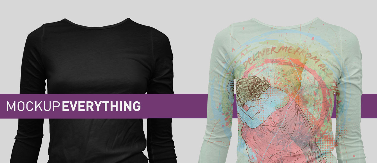
Mockup Everything Releases: March 2015 – Women’s T-Shirt, Crop Top and Hoodie Dress Templates
Women’s T-Shirt Mockups and More!
Hello Mockup Everything Faithful,
Thanks for stopping by to take a peek at our latest and greatest Mockup Everything templates. Cleveland logo designers, Go Media, is stepping up their game this year, now offering you Pro Users six new templates per month (as opposed to the five in previous years). We hope that this, among the other perks associated with our Pro Account, has you pretty pleased today.
Try our Pro Account
Not yet a Pro User? Not to worry. You can try our Pro account free for 7 days here >
Mockup Everything Pro with 7 Day Free Trial
We think you’ll be impressed. After all, Mockup Everything Pro offers users a super simple and efficient way to mockup their designs (without fancy software like Photoshop) and save them out as jpegs (or transparent pngs). Pro users also have access to hundreds of templates, larger image sizes and no watermarks.
Now, onto the Mockups!
Let’s check out the new mockups, available only to Mockup Everything Pro Users, shall we?
Hoodie Dress – Ghosted, Front
Women’s V-Neck Long Sleeve Ghosted Front
Women’s Long Sleeve T-Shirt Ghosted Front, Version 2
Women’s Long Sleeve T-Shirt Ghosted Back, Version 2
Women’s Triblend Short Sleeve Crop Top, Ghosted – Front
Women’s Triblend Short Sleeve Crop Top, Ghosted – Back
- Categorized: Go Media, News
- Tagged: crop top, hoodie dress, long sleeve, long sleeved, mockup, mockup everything, mockup templates, triblend, v-neck, vneck, womens
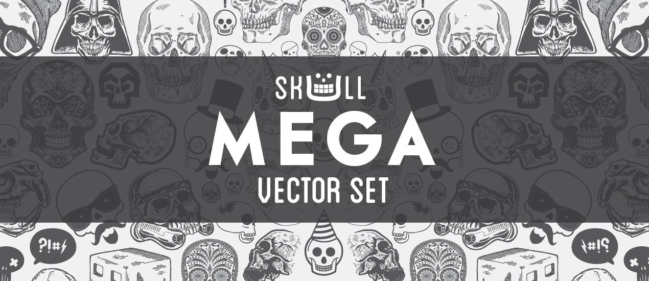
98 Skull Vectors You Need Now
Skull Vectors for Days
When we first thought to create a new skull vector pack, we thought we’d simply update some of our older stuff. Perhaps add a few new skulls, refresh them and polish them up like a shiny new pair of shoes.
After all, we have some great stuff and skulls never get old, now do they?
But here’s what happened – We reached out to some really great friends and kind of got carried away.
What came about was a…
BRAND. NEW. SET.
Ninety eight brand new skulls and related vectors. Yes, completely new content created by seven talented folks we know and love, including Jeff Finley, Steve Knerem, Blake Stevenson, Michael Hinkle, Justin Sobota, Scott Fuller and Go Media’s own internal designer Jordan Wong.
The Deets.
With this set, you’ll grab these must-have 98 vectors in total. Here’s how they shake out:
- 10 vectors from Steve
- 12 vectors each from Jeff, Michael, Scott and Jordan
- 20 vectors each from Blake and Justin
Don’t believe me when I say they’re incredible? Well let’s just let the visuals speak for themselves.
…See! Told you they were awesome!
DO. THIS. THING.
Looking for more awesome products? Hop on over to our Arsenal for more!
Go Media Podcast – Episode 28 – What’s the deal with Go Media and WMC6?
Go Media Podcast Episode 028:
Podcast for Graphic Designers
In this episode, Bryan talks about what Go Media (the go to team for professional web development in Cleveland) has been up to over the last few months, explains why the podcast has been a bit silent, and what we’ve got planned moving forward. Plus, he sits down with Heather to talk about WMC Fest 6.
- Categorized: Video and Podcasts
- Tagged: bryan garvin, go media podcast, heather sakai, podcast, weapons of mass creation fest, wmc, wmc fest
Branding: More Than Just a Logo
How to Build a Strong Brand Identity
What is your brand? Who is your brand? And why should we care?
When most people think of a ‘brand’ they think specifically about a logo (known by graphic designers as a ‘mark’) – Nike’s swoosh, McDonald’s golden arches, Coca-Cola’s wave. While a logo is certainly one very important part of a brand, it’s so much more than that. Let’s start with Brand 101: A brand represents everything you are as a company. Everything that you say and do shows your prospective customer who you are. It’s your “dress,” the way you talk, your slogan, your signage, your messaging, how clean your offices are, company uniforms, your collateral materials and so much more.
To figure out who you are as a brand, ask yourself these questions:
- What is my positioning statement? (Where is my space in all of this clutter? What does my company offer that no one else does? Why are we special?)
- What is my messaging platform? (Why should anyone care? What’s in it for my customers?)
- What’s my brand persona? (Who is my target customer? Who is my company?)
Positioning and messaging are a huge–and often underplayed–part of a company’s brand. They help you figure out how you can be a trusted company in what can often seem like a world of muck. Go Media is a creative firm that does Cleveland Logo Design, so in this post, we’re going to focus on the visual aspect of your brand, but we just want to make sure we stress the importance of messaging. The things you say are as important as how good your brand looks.
Close your eyes for a minute. If you had to talk about your company as a real person. Who would you see? Try to imagine your company as a movie star. Is your company Brad Pitt or Morgan Freeman? Someone young and hip? Old and stodgy? Middle aged and reliable? What about your customer? How do they communicate? How does your target customer like his coffee? You should live and breathe your brand persona so much that that answers to questions about your brand should roll off of your tongue. “Duh!” You should be telling me, “We’re an almond latte kind of company!” Or maybe you’re a tea company, or a pop company. We can’t answer that for you–only you can. This is the first question of many you should ask yourself about your brand persona.
Once you figured out your brand personality, it’s time to start working on the visual components of your brand. When creating your brand, it’s important to take its various components into consideration: logotype (the word), mark (commonly referred to as a ‘logo’,) and color scheme.
- The logotype is a distinct font that represents your company. It should be meaningful to your brand. Bold, curious, flirty, simple–fonts speak visually to your prospective consumer and should be an extension of your brand persona.
- The mark, or the symbol, supplements the logotype. If your brand is edgy, be edgy! If your brand is laced up, be more formal. However, always remember that your mark should (not too be too cheesey) help you make your mark on all things visual. It should work well in black and white, not just in color. Additionally, you should be able to use this mark on any design work–print or online. Think about how it will be displayed on social media, on eblasts, on brochures, on t-shirts, or on uniforms… just to name a few visual outlets.
- The color scheme. It should use one or two primary colors, one accent color, or colors of differing value. Creating a strong brand color scheme will facilitate your brand’s flexibility across print and online, and it will also help make your brand visually appealing.
If your logo is good enough, you’ll be remembered. I suppose if it’s bad enough, you’ll be remembered too–but certainly no customer will trust you.
We’re going to get on our soapbox right now and tell you that for the love of all that is good in this world, please don’t think that once you have created a logo, you are done. So many brands focus on just this one part of their visual identity. While the logo is vital to a brand’s identity, it isn’t the only visual piece of the puzzle that helps set you apart from your competitors. Your logo, my friend, is just the beginning of your visual brand identity.
[Tweet “”Your logo is just the beginning of your visual brand identity.” – Go Media”]
Let’s say, for example, you want to create a brochure so that you can tell the world how amazing your company is. Where should your logo appear on the brochure? What kind of header will you use? What kind of typeface will follow? What size font do you plan to use? What kind of photography or imagery will be included? What’s your white space/copy ratio? What kind of voice are you using in the copy? Does the piece feel simple or intricate, casual or fussy? You see, it’s not as easy as you might think to release a brochure. Just like your logo, this brochure should exemplify who you are as a brand–it’s an extension of who you are. Your customers should immediately see and feel the synergy between your logo, your chosen imagery, your words, and YOU. This thought process holds true for every single piece of collateral that you release…no matter how big or how small.
It seems daunting to live up to your brand persona in each and every piece you release. That’s probably why, time and time again, we see a brand that looks and feels different on various pieces of collateral. Maybe you’re using different designers or firms or heck!, maybe an in-house designer is adding his or her flair to your logo, or whatever piece you’re currently creating. Creating a Brand Standards Guide can help keep things consistent. On the Brand Standards Guide, include an example of the mark and logotype. Include fonts. Include colors in RGB, CMYK and Pantone. Include best practices such as uses and spacing. And finally, include example designs. Sometimes, we even see sample copy on a Brand Standards Guide. A solid Brand Standards Guide helps ensure that no matter who is helping push your brand, you’re all pushing the same brand–not spin offs of one another.
In no way are we saying that each piece has to look identical. We’re a creative firm–we’d never tell you to go for visual boredom, or ask you to turn into a boring machine spitting out identical pieces, one after the other. Instead, we’re saying that visual consistency is vital to your brand. By following these tips, your customers will create a stronger connection with your brand that they can trust. Trust = repeat business, which, at the end of the day, is what we all want.
Questions? Get in touch! We’d love to help you no matter what stage of the brand process you are in. We can’t get enough!
______________________________________
And check out our Brand Guidelines Template, now available over at Go Media’s Arsenal!
When you design a logo for a client, are you including a Brand Style Guide? You know, a document that tells the client how to use their new logo? If not, you should be. A well done Brand Style Guide provides tremendous value to your client and can earn you more money on logo design and branding projects.
But how do you know what goes into your Brand Style Guide? And designing it takes up a ton of extra time, so wouldn’t it be nice if someone like us did all the work for you so you just have to replace all the content with yours and be done with it? Yes, that’s what we did! Learn more now
- Categorized: Business Philosophy, Graphic Design
- Tagged: brand standards, branding, company identity, go media, logo
Design Firm How-To: Writing Your Company Story
How to Write Your Company Story
An excerpt from Drawn to Business by Go Media President William Beachy
Who are you? What do you do? What makes you different? Who is your ideal customer? What problem are you solving for them? All of this needs to be communicated in a simple story. People love stories. People remember stories. How compelling is yours?
[Tweet “People love stories. People remember stories. How compelling is yours?”]
Simply telling a customer “We’re a design firm that does branding, print design and web development,” is not enough.
You’ve only categorized your business. You’ve given them no reason to hire you over any other design firm.
Here’s Go Media’s story: concise and compelling.
_______________________________
Go Media was started by illustrators. While we all had degrees in design, our background was drawing.
In the first six years of the company we didn’t care about making money. We only took on projects that were highly artistic. We lived on Ramen Noodles and worked insane hours designing apparel, gig posters and marketing for the entertainment industry. Our uniquely artistic design style led to incredible demand from corporate America. In turn, their needs led us to put together a robust team of web developers. That gave us the technical skills to back up the creativity of our designs. Today, 80% of our work is web development. One constant with Go Media has been our passion for professionalism. While artists are known for being emotional and unreliable, Go Media’s creative team takes great pride in delivering every project on time, on budget, with a smile on our faces.
_______________________________
That’s it. That’s our Cleveland design firm’s story in less than one minute. That’s commonly referred to as your elevator pitch.
Write yours, memorize it, tell it with passion. Make sure that it’s short and compelling.
Nobody wants to hear you drone on for an hour.
For more about how to build a million dollar business, purchase William Beachy’s book, Drawn to Business.
- Categorized: Business Philosophy, Graphic Design, Small Business, Tutorials
- Tagged: building design firm, company story, customer, design firm how-to, elevator pitch, go media, story
Announcing our WMC Fest 6 Host: Aaron Sechrist, OkPants
Cover Image by The James Douglas Studio | on Instagram
Announcing our WMC Fest 6 Host: Aaron Sechrist, OkPants
Thrilling news upon thrilling news. Our venue and date have been announced, our site has been launched and now this. Yes, we’re even surprising ourselves.
It’s a great week!
Go Media, the universe’s source for responsive web design from Ohio is proud to announce that Cleveland design legend Aaron Sechrist, OkPants, has graciously accepted the position of WMC Fest 6 host. He’ll be emceeing the event, happening August 7 – 9th at the Allen Theatre in the heart of downtown Cleveland.
Here’s a little bit about our esteemed host, in his own words >
“My name’s Aaron Sechrist, a freelance graphic designer and illustrator that enjoys working on projects that pull from both disciplines under the moniker OkPants. After cutting my teeth in various jobs in the music and publishing industries and yelling for various fruitless Cleveland-area DIY bands, I made the move to freelance and found happiness as well as actual income working with good people, creators and brands within the entertainment, music and apparel industry.
My gig posters sleep with the Boss and Prince in The Rock and Roll Hall of Fame & Museum and I enjoy participating in art shows across the country. I also like to design things for myself and sell them through the OkPants Web Store as well as through Made By Superior.”
Learn more about OkPants on his Official Site, as well as his Twitter | Tumblr | Facebook | Instagram | Dribble | Shop
- Categorized: Graphic Design
- Tagged: aaron sechrist, cleveland, event, okpants, Weapons of Mass Creation, wmc, wmc6
The Characteristics of Excellent Website Design: Experts Weigh In
The Characteristics of Excellent Web Design
Options for building a website are plentiful, but finding a team to deliver a creative custom solution on time and on budget is not easy. Here at Cleveland based graphic and web design firm, Go Media, we take great pride in our reliability, delivering robust websites that function flawlessly. We’re passionate about creating excellent web design and know it when we see it. As our own web developer Dave Romsey simply states, “In my opinion, excellent web design allows the content of the site to be consumed as effortlessly as possible.”
But how do we know that we’re creating it? And how do we know it when we see it? Today some of my favorite web developers are answering the question, “What are the characteristics of excellent web design to you?”
Enjoy the advice, and please share yours in the comments section below.
David Sieren, Creative Director
One Design Company
What makes for a good website? That’s such a loaded question—the answer will vary wildly depending on who the website has been designed for. Add to that the countless facets inherent to the concept of “good” and we’re headed down one heck of a rabbit hole. But I suppose that leads us to the best all-encompassing answer we can give you.
In our opinion, a great website—or any interactive experience for that matter—thoughtfully takes into account the goals and needs of the final user from both a functional and emotional standpoint.
At One Design we underline the last part of that statement, emphasizing the importance of emotion in every interactive experience. Our users are humans, and humans have an innate need to connect. The strongest interactive experiences understand and embrace this. Technology that winks back at us—often at the most unexpected moments—defines the difference between tools we own and products we covet. It’s the wink that leads to conversations about our work over coffee, links being passed at the dinner table, and fierce loyalty at the end of the day. A wink is the difference between a good interactive experience and a great one.
One Design Company on Twitter | Facebook
________________________________________________________
Rob Davarnia, Senior Full Stack Developer
Giga Savvy
Websites have been changing so rapidly. They get reinvented every year. However, the core traits of a perfect website rarely change. In addition to a great design, the following will set apart a website:
- Smooth and well-thought out User Experience
- Minimalism. Less is more.
- Testing funcitonality before launch
- Testing
- Solid page load time and consistent uptime
- Security
- Clean code
GigaSavvy on Twitter | Facebook
________________________________________________________
Nick Haas, Creative Director
Orbit Media Studios
Great question. For us, excellent web design should put the user first. Most importantly, we design to convert visitors. The site should clearly establish “who they are” and “what the user can do”. Using white space, color, and other visual elements, we can direct attention to calls to action or other focal points. Of course, good design only gets us so far. Images and copy, optimized for the web, is going to draw the user further down the funnel. It needs to all work together. And, obviously, it is a must to support multiple screen sizes so the design holds up on any device.
Orbit Media on Twitter | Facebook
________________________________________________________
Wilson Revehl, Web Developer
Go Media
The glaringly obvious on today’s web would have to be responsive design & development. Taking a mobile first or desktop first approach to the design isn’t as important as simply taking the time to implement both. I won’t get into the nuances of more breakpoints, although taking advantage and considering more will get you closer to a mark of excellence. To at least be a good design, you should have a design for primary and secondary menu systems, the content above the fold, below the fold and the footer of the homepage, all for mobile and desktop. If you want to achieve excellence, you’ll take time to consider responsive breakpoint design for key interior pages and for general defaults as well. We realize this is a lot of work. Fortunately, there are excellent responsive frameworks like Twitter Bootstrap and Zurb’s Foundation which provide a ton of the heavy lifting on the development front. They also offer tremendous resources to help guide you along the way.
Go Media on Facebook | Twitter
________________________________________________________
Andrew Ruditser, Lead Technology Coordinator
Maxburst
In my opinion, the characteristics of excellent web design consists of four things:
- Tuning into new trends
- Understanding our clients identity image
- Making every project personal
- Always delivering in style
We follow these four principles across all of our design projects in order to produce the most effective and compelling websites like our newest client launch, Lark Tattoo.
Maxburst on Twitter | Facebook
________________________________________________________
Traci Guthrie, Director of Marketing
Blue Laser Design
Excellent web design begins with the capability to captivate the audience. The design should feel effortless and work hand-in-hand with the brand to serve a purpose. When websites interact with an audience meaningfully, the design encourages users to take action and leaves a lasting impression.
Blue Laser Design on Twitter | Facebook
________________________________________________________
Bryan Garvin, Front End Developer
Go Media
An excellent website design starts before you dive into Photoshop. It’s all about making sure you’re understand the content, the goals of the site, and the way a user should be interacting with the site. Start with sketches or wireframes. Sit down with the client to talk about how the site should work, not just about how it should look.
An excellent website design:
- Provides the best presentation for the content that we have, not the content we wish we had.
- Makes it clear what route a user should take to access the content that they’re looking for.
- Remembers that not every user comes in through the home page.
- Can be easily understood and accessed without the need of a 1900px-wide monitor.
Go Media on Facebook | Twitter
________________________________________________________
Carla Rosemarino, Digital Marketing Manager
Blue Archer
Web design, like social media, needs to be a conversation between you and your audience. A successful website supports a brand’s unique business goals and prioritizes user-experience and accessibility. Design is different from art. It’s about creating a solution.
Blue Archer on Facebook | Twitter
________________________________________________________
Harshal Shah, Web Designer
DotcomWeavers
One of the most important things that makes top notch web design is clean and easy user interface. There have been so many times when a user, including myself, gets confused on how the site works or where the call out buttons are. One way to solve that issue is bright colored buttons and hierarchy font size and colors. Using the right technology and updated current design style is also important. Mainly using fonts that reflect the site. For example, if the site is about selling military clothing, like Battlefield Collection, we analyzed who the target audience is and then decided upon using large bold fonts, as their majority of the user will be age of 40 plus.
Using icons and heavy visual such as images and banner help creates a visual flavor. It also entices the customer to be engaged. Great use of visuals from our line of work is Laura Jayne. It highlights the product and is used with elegance. Overall clean and easy to use with a little BAM of visuals and eye candy will get you a top notch web design.
Responsive website is the new mantra; it is important that the usage of elements like Bootstrap and fonts are done effectively. As websites are used across multiple channels today, ensure sure that the fonts comply to the Google fonts and the framework aligns with HTML5
In effect, the design starts with the homepage but it is essential that you maintain the language and feel across all the pages.”
DotcomWeavers on Facebook | Twitter
________________________________________________________
What characteristics do you believe make near-perfect web design? Share with us in the comments below!
- Categorized: Graphic Design, Interviews
- Tagged: excellent web design, homepage design, web design, web designers
Cleveland Browns Branding: Julia Briggs of Blue Star Design Weighs In
Updated Cleveland Browns Branding
Our recent post, “New” Browns Logo Leaves Cleveland Graphic Designers Deflated” collected expert advice from local authorities on the matter including Julia Briggs, CEO and creative lead at Cleveland design firm, Blue Star. Julia is responsible for logo development for Ohio Lottery: Keno; Classic Lotto; Pick 3, 4 and 5, and more, Ronald McDonald House of Cleveland and the State of Ohio: Red Treehouse, Dwellworks, and more.
Julia’s full interview is included below. Enjoy and be sure to catch the full story, featuring fellow experts William Beachy, Wilson Revehl, Chris Comella, Aaron Sechrist, and Todd Radom here.
Cleveland Browns Branding Interview with Julia Briggs
The new Cleveland Browns logo design has been harshly derided in some circles for being underwhelming or, as some have put it, “just oranger.” Do you think that kind of criticism is unfair?
I do think it is fair criticism at this point because the Browns set themselves up for this issue. Regardless of whether the new look is good or bad, the execution of the project and reveal wasn’t done well at all…and that is too is part of the organization’s brand. Brand doesn’t just stop with the logo and color way.
Is there anything about the new logo that “works”? If so, explain.
The logo isn’t bad – because ultimately it’s the same logo we’ve had for — forever. So I can’t really say it doesn’t work.
I do credit the Browns organization for taking care to listen to the fans who asked them to push the look and feel forward while respecting the tradition — with a lot of emphasis on NOT changing the helmet.
But then there comes that moment where you stop listening and call on experts to help make the right decision. There’s that quote by Henry Ford — “If I had asked people what they wanted, they would have said faster horses.”
I wonder how Henry Ford would have handled the logo change for the Cleveland Browns.
Is there anything you would have done differently if you had tackled this project?
I wouldn’t have announced this reveal as a new logo. I would have had my PR team announce it as a refresh or an update. Using the term NEW LOGO sets up the expectation that you will be releasing a NEW LOGO.
You will always have a group of people who won’t like the change regardless, because change is hard. However, now the Browns have a group of people who don’t like the change AND another group of people who are dumbfounded by the lack of change. That’s a lot of disappointed people.
Do you think this logo design change was ultimately the best decision for the team?
Personally, I believe change and trying to grow and stay relevant is always good.
But my in this case, my concern is that Cleveland will have to live with this new change for five years. NFL rules state: Once a team does change their logo they are under the NFL’s five-year rule which prohibits any other uniform changes for the first five years after an initial change.
Someone in this town had the opportunity in their hands to make a bigger impact and couldn’t make it happen – again. I think that’s what this Logo Change represents to Clevelanders today.
Anything to add?
It’s moments like these that make me cringe. The design agency tapped to do this work is at the mercy of the people who cut their check. But they get to go down with the sinking ship — when and if the ship sinks. The public may see it as a lot of time and money spent on little return. And then the rest of the design community gets tethered to that ship, too, by association.
Let’s hope the Cavs win the NBA championship this year and we can just forget about this whole fiasco. For more Browns branding info, be sure to check out other interviews by our Cleveland graphic design team!
More from Julia and Blue Star: Official Site | Twitter
- Categorized: Graphic Design, Interviews
- Tagged: blue star design, branding, cleveland, cleveland browns, julia briggs, logo, logo design
Cleveland Browns Logo Redesign 2015: Wilson Revehl of Go Media Weighs In
Cleveland Browns Logo Redesign 2015
Our recent post, “New” Browns Logo Leaves Cleveland Graphic Designers Deflated” collects expert advice from local authorities on the matter including our own Wilson Revehl, Go Media Vice President, web developer, brand expert and sports enthusiast.
Wilson’s full interview is included below. Enjoy and be sure to catch the full story, featuring fellow experts William Beachy, Chris Comella, Todd Radom, Aaron Sechrist and Julia Briggs here.
The new Cleveland Browns logo design has been harshly derided in some circles for being underwhelming or, as some have put it, “just oranger.” Do you think that kind of criticism is fair or unfair? If so, why?
I think it’s fair. They played it safe, probably too safe. It is indeed virtually the same mark. It’s the helmet. The changes of the helmet are so miniscule you really can’t discern much of a difference. No one was going to see this and be shocked or even form much of a new opinion because it’s hardly new. The changes are so subtle.
The team has stated the goals were to “honor tradition and provide a modern edge,” partially by incorporating a move from the traditional block lettering to a “cleaner, simpler, elegant” font and making the helmet “brighter and richer to match the passions of our fans.” Do you think those goals were accomplished?
The type face they went with is high impact. It is modern. You got to give them that. It’s not your classic, university block lettering that they had been using for so long that has been seen so often. The concern about the orange is kind of like them “catching up” with the fact that most of the apparel manufacturers never printed in their specific orange color pallet. Most apparel manufactures bumped it up to the very bright, classic orange that they’ve now officially adopted. It’s kind of like the fans were the cart and the old logo was the horse.
Had the team gone for a more adventurous approach, what kind of elements could/should the designers have incorporated?
A big change done right would have created big excitement. It would have been thrilling and viral in the sense of all football fans would have been talking about it and taken notice. This is the new Cleveland Browns, shedding the baggage of legacy problems we’ve had over 35 years and given us a fresh restart. When done right, it could have been absolutely thrilling.
Is there anything about the new logo that “works”? If so, explain.
I do like the new dog pound logo. Even though he’s supposed to look tough, it’s a little cuter than maybe I would have preferred. I think they could have gone with something a bit more fierce. This is the most violent sport in America. These guys are warriors, and I think the new dog could have been a lot tougher looking. It’s a little too cute for my taste. I think it could have been and should have been more badass.
Is there anything you would have done differently if you had tackled this project?
Rumors have it this was done in NY. If that’s true, it’s borderline shameful. Cleveland is a hot bed of phenomenal graphic design and branding talent. There was no reason for them to farm it out. You would have many people not only good but very passionate about a project like this.
- Categorized: Graphic Design, Interviews
- Tagged: branding, cleveland, cleveland browns, logos, Wilson Revehl
Updated Cleveland Browns Logo Design 2015: Previous Dawg Pound Logo Designer Designer Todd Radom Weighs In
Updated Cleveland Browns Logo Design 2015
Our recent post, “New” Browns Logo Leaves Cleveland Graphic Designers Deflated” collected expert advice from local authorities on the matter including Todd Radom, independent graphic specializing in branding for professional sports franchises and events. Todd has designed everything from Super Bowl logos to All Star Game logos and has created the graphic identities for multiple franchises as well as over 50 team anniversary marks. His two decades of work with the NFL, NBA, and Major League Baseball have resulted in some of the most familiar icons of our popular culture. Todd’s work includes the previous dawg pound logo.
Todd’s full interview with Cleveland logo designers, Go Media is included below. Enjoy and be sure to catch the full story, featuring fellow experts William Beachy, Wilson Revehl, Chris Comella, Aaron Sechrist, and Julia Briggs here.
Interview with Todd Radom
The new Cleveland Browns logo design has been harshly derided in some circles for being underwhelming or, as some have put it, “just oranger.” Do you think that kind of criticism is unfair?
In my opinion the criticism is fair—and partially due to the fact that the team has been readying the fan base for a logo change for two years. An already cynical constituency has been discussing the kind of change that was coming, and was given a primary logo that represents a lateral move. Fairly or otherwise we have been hearing “well, that’s such a Browns move” since the announcement, and that gets your customers wondering if this confused messaging extends to other aspects of the franchise. I have likened it to this scenario—it’s Christmas morning and the Browns had a present for the fans. They gave them a gift card. Disappointing.
Is there anything about the new logo that “works”? If so, explain.
If nothing else, it defends the status quo. There is a very vocal portion of the fan base that wanted no change at all—this placates those concerns (although we’ll have to wait until the new uniforms are unveiled in April before we collectively make a truly informed judgement.) I’ve been trying to emphasize the fact that any team logo is one single piece of a series of visual assets. All of these need to work in unison in order to properly amplify the message that the Browns want to send. If we were marking this in a traditional way I’d give it an “incomplete” as of right now.
Is there anything you would have done differently if you had tackled this project?
Wow. I’d have loved to have seen the creative brief on this one. There are lots of stakeholders here and I suspect that the design team pushed it far out there at the outset of the process, only to see it fall back to what ultimately emerged. The process of branding a professional sports team is incredibly complex and multilayered. Creating bulletproof assurances and holding hands is often as important as execution. What is the franchise DNA of the Cleveland Browns? Who do they aspire to be? I’m certain these questions were asked at the outset of the project—but I’d be very interested to hear what transpired along the way.
Do you think this logo design change was ultimately the best decision for the team?
Time will tell. The success or failure of most sports identity projects has a lot to do with the success or failure of the team making the change. Also—if the new uniforms represent a real change—preferably one that builds upon the past in some relevant way—then the logo becomes a single asset among many that can be deployed in strategic ways. If I were king I would have introduced something, anything, other than another helmet—even if it never was meant to appear on the real helmet.
Anything to add?
This had to be a difficult project to work on. The Browns are a weird, weird case in many respects. This is a team that hasn’t won a championship in over a half century. A team that was shifted from Cleveland to Baltimore after the 1995 season and reborn as an expansion team several years later. Putting a logo on the helmet has been declared a non-starter for years. They are a team frozen in visual amber with little opportunity to renew their look in a meaningful way. Some teams can blow it up and start from scratch, the Browns cannot do that, which had to have made this a challenging assignment.
More from Todd: Official Site | Twitter
- Categorized: Interviews
- Tagged: branding, cleveland, cleveland browns, logo, logo design, tom radom
Cleveland Browns Branding: The New Logo – Chris Comella of Go Media Weighs In
Cleveland Browns Branding
Our recent post, “New” Browns Logo Leaves Cleveland Graphic Designers Deflated” collected expert advice from local authorities on the matter including Chris Comella, Go Media Art Director, logo designer, brand expert and sports enthusiast.
Chris’s full interview is included below. Enjoy and be sure to catch the full story, featuring fellow experts William Beachy, Wilson Revehl, Todd Radom, Aaron Sechrist and Julia Briggs here.
Interview with Chris Comella
The new Cleveland Browns logo design has been harshly derided in some circles for being underwhelming or, as some have put it, “just oranger.” Do you think that kind of criticism is fair or unfair? If so, why?
The fact they called it a new logo, I feel, opened them up for a certain level of negative criticism. When you have a fan base like Cleveland, people are looking for literally anything to hone in on and either love or tear apart.
The team has stated the goals were to “honor tradition and provide a modern edge,” partially by incorporating a move from the traditional block lettering to a “cleaner, simpler, elegant” font and making the helmet “brighter and richer to match the passions of our fans.” Do you think those goals were accomplished?
Sure, having seen what we have so far, it would be fair to say the edits are working towards these goals. Now, do I think at the beginning of the project they wrote out, “Goal: Edit the orange so that it more closely represents the passion of our fans”? Absolutely not. I think the color changes were a product of the uniform tweaks we’ll be seeing shortly, they then translated it to the logo, and voila – “We have a new logo! Let’s tell the world.” Now, of course, when your team is known for not having a logo, people come to their own conclusions.
The Browns are currently the only NFL team whose primary logo is a helmet. Do you think there is value in that, or do you think there could have been a benefit to pushing beyond that “traditional” image?
I mean, you look at the helmet and it is undoubtedly boring. I think this idea of honoring and sticking with tradition by virtue of keeping what we’ve had for a long time, is kind of simplistic. I think the concept of tradition, as it relates to the Browns, has much, much more to explore than that. Though, I will say, this version here, I prefer 10x over the current primary logo.
In what ways do you think the team would have benefited from a more daring design change?
There’s the obvious marketing and sales-hype angle at work here, but this is how I tend to approach this question: A lot of people associate the current design with a long running feeling of mediocrity and lackluster performance on the field. “Why honor tradition and our past when our past is nothing to celebrate?”
That’s a valid question for sure, but before we even talk about what the design is and how it looks, the idea of changing our look without having ‘earned’ it in someway is always where I end up personally. I feel like addressing the identity should go hand in hand with the performance on the field, not in spite of it. Because, let’s face it, winning games is what it comes down to. Fans are looking for the optimism and excitement where they can find it. But if we blow up our identity now, and come next season we start hearing “Browns muster another losing season – But how about them new unis!”… I don’t want to make losing look good, I want to make winning look good… while at the same time patting the new school-football-look toting teams on the head and smirking.
Had the team gone for a more adventurous approach, what kind of elements could/should the designers have incorporated?
In our current sports world, where that stupid robot welcomes you back from every commercial, where the popular sports channel motifs can be described as ‘Iron Man’s nuclear reactor fortress’, and the teams are trying to look more and more like the X-Men, I’m in favor of our design speaking to the sport of football and how the character of Cleveland, Ohio uniquely contributes to it.
Is there anything about the new logo that “works”? If so, explain.
Honestly, this isn’t a new logo. It’s an updated logo. Again, if the Browns organization wants to honor a sense of tradition by virtue of keeping what we’ve had for a long time, then yes, this works. I think the concept of tradition, as it relates to a proper team logo, has more to explore than what we’ve seen.
What are your thoughts on the new Dawg Pound design?
The perception of the ‘Dawg Pound’ is pretty Chuckie Cheese in my world right now… It’s clear from a marketing standpoint they want to leverage the, ‘Hey we got a wacky section where you dress up!’ as some sort of unique identifier to Cleveland. To me, that doesn’t really float my boat in particular. Though I will say, seeing that dude shoving that Bengal brought it back to a place where an attitude was prevalent, not just costumes.
In terms of the dog illustration – I think it’s an update for update’s sake. It’s less functional than the previous incarnation, and the attitude / tone of dog caters to the family-friendly end of the spectrum. Goal of the client: Seemingly accomplished… Conveying from an authentic point of view what the Dawg Pound is about: Not so much.
That said, do you think this logo design change was ultimately the best decision for the team in this case?
There was no real decision made here… they updated the helmet to reflect the design of the new uniforms, which we’ve yet to see. In terms of the logo, I’m 100% neutral on what they did.
Is there anything you would have done differently if you had tackled this project?
I would love to spend some time figuring out what it is I’d do differently for the Browns, or how I would talk to them about design’s ability to accomplish their needs moving into the future. It seems most of the new design work we’re seeing in the sport leans towards the Oregons and Seahawks of the football world. I think that trend in looks presents a real opportunity to create an identity that sets itself apart, and convey a contemporary, yet classic view of the game of football. Shifting the perspective from ‘Traditional’ to ‘Classic’ is a small but powerful tweak. Traditional is a bit restrictive. Classic is rooted in the ideals of tradition, but not limited to what’s been done in the past.
| Talk design with Chris: email | @Chris_Comella |
- Categorized: Graphic Design, Interviews
- Tagged: branding, browns, chris comella, cleveland, cleveland browns, logo, logo design
New Cleveland Browns Logo Design: Aaron Sechrist, OkPants, Weighs In
New Cleveland Browns Logo Design
Our recent post, “New” Browns Logo Leaves Cleveland Graphic Designers Deflated” collected expert advice from local authorities on the matter including Aaron Sechrist, Graphic Artist and Owner of OkPants and Made by Superior.
Aaron’s full interview is included below. Enjoy and be sure to catch the full story, featuring fellow Cleveland Design Agency experts William Beachy, Wilson Revehl, Chris Comella, Todd Radom, and Julia Briggs here.
Interview with Aaron Sechrist
The new Cleveland Browns logo design has been harshly derided in some circles for being underwhelming or, as some have put it, “just oranger.” Do you think that kind of criticism is unfair?
Nope. I think the decision to build hype and create any kind of “event” around a pantone number shift is being fairly knocked. A lot of fans were expecting something exciting and new in regards to a logo in the context of this huge, publicized uniform re-design project that has been going on in the background with Nike for 2 years. It was a great opportunity to replace the helmet icon with a strong, exciting secondary mark that could get fans excited about our team. It’s confusing at best. I do, however, think brighter is better for orange, as I think darker is better for the brown. With that said, I’m VERY excited to see the new uniforms, as I think that brighter orange is going to really scream, especially with these space-age textures and materials Nike uses on their uniforms & helmets.
Is there anything about the new logo that “works”? If so, explain.
I’m assuming we’re talking about the helmet logo. I mean, they could have at least re-drawn or updated the vector drawing of the helmet. It’s just deflating and feels like an afterthought in the big picture of this massive uniform design project the team has been working on with Nike, which I’m excited to see the results of. I’ll admit it “works,” in the sense that the Browns are the only team in the league that does not have a logo, but as a logo designer I’ve always hated that. I’ve only ever seen that orange helmet as a missed opportunity to slap something AWESOME on. I have no idea how the “Dawg Pound” graphic is supposed to work within the overall team identity or the uniforms if at all. It’s all still pretty confusing to me.
Is there anything you would have done differently if you had tackled this project?
I’ve thought for years the team should completely rebrand—name, colors, everything, especially when the team returned to the city in 1999. I’ve been a Browns fan my entire life and I can’t ever remember a time I looked at the uniforms and helmets and thought ‘Boy those look cool’. So I suppose my answer is I would have done “everything” differently. I’ve always been an anarchist when it comes to the design of the Cleveland Browns.
Anything to add?
The Cleveland Browns look like Thanksgiving on the field. I own no Browns merchandise. But make no mistake, I LOVE the Cleveland Browns. They taught me at a very young age to persevere through disappointment, frustration and misery. I saw my first adult fistfight at a Browns game at age 8. When I was a kid my dad spray painted all of our family’s shoes orange when Webster Slaughter was getting fined for it. They are as intertwined into my life as art itself. I am a lifer fan.
- Categorized: Graphic Design
- Tagged: aaron sechrist, branding, browns, logo, ok pants, okpants
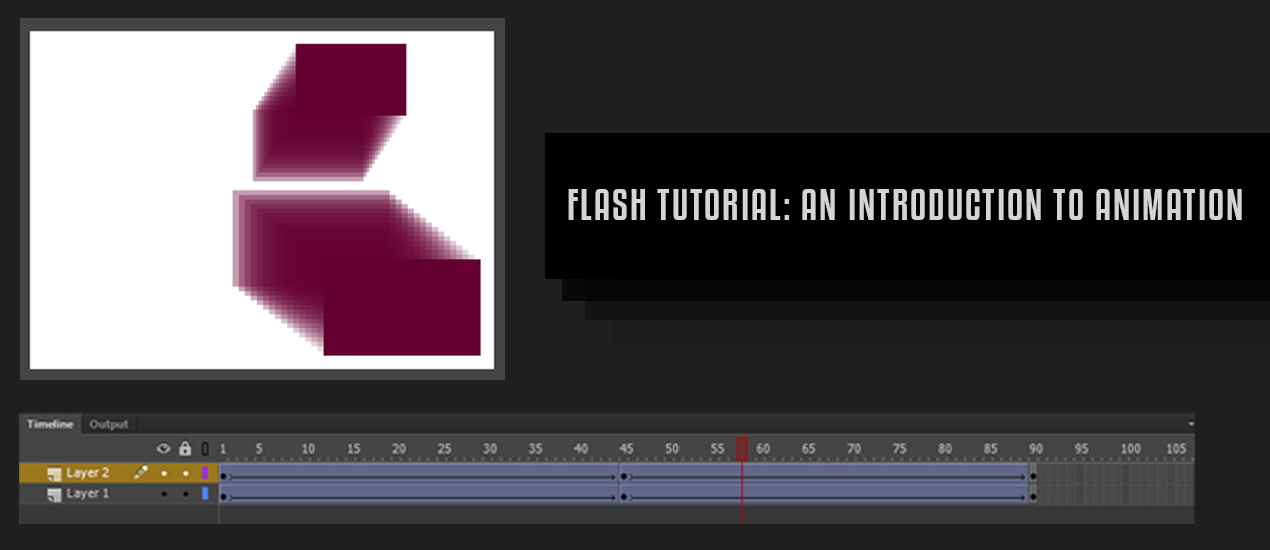
Flash Tutorial: An Introduction to Animation for Newbies
Introduction to Flash Animation
Now, I only know a handful of the multiple software programs that Adobe has to offer, but, in my opinion, Flash is one of the more difficult to learn. Jumping into a project with Flash takes a lot of time and effort, so I want to go over the absolute basics with you. After all, it was quite difficult for me to find anything that helped me in my introduction with Flash. So for our first project, we’re going to make some rectangles move.
So, first things first. We have to open Flash.
The type of file that I typically open is an ActionScript 3.0, which is the most recent version of ActionScript. It’s the best for what you want to do for a lot of technical reasons we don’t need to go over right now. But just know that Flash files that use ActionScript 3 cannot include earlier versions of ActionScript.
Okay, so we’ve opened our program and now we are at the workspace. The big white space in the middle here is called the stage. If you want something to be seen, make sure that it is within the white space, otherwise, it is unseen offstage.
You will note that my workspace has all of my tools situated on the right hand of the screen. Flash mostly uses the same kind of tools that are used in most of the Adobe suite.
One important thing to note: when you are making shapes with a stroke, the stroke tends to act as a separate component from the shape you originally drew it with, so I tend to make shapes without a stroke.
The main aspect of Flash is that it contains a Timeline that is typically affixed to the bottom of your screen workspace. The timeline is where you keep track of your layers and animation. The timeline is divided into separate frames that can be selected and keyframes inserted.
A Keyframe is a frame where content appears on the Timeline. Typically, Flash’s default setting for speed is 24 frames per second, so it takes 24 frames of animation to create a second of active content.
This is an example of a blank keyframe, which would be 6 frames long if played in Flash Professional. Notice the empty circle at frame 1 indicating there isn’t any content.
This is an example of a blank keyframe, but has actions attached to it. Notice the a above the keyframe. Actions are the coding in Flash (we won’t get into coding in this post).
Pictured above is an example of a keyframe with content. Notice the filled in circle on the first keyframe.
This is what a tween looks like when applied to a keyframe with content, more specifically, this is a shape tween. Tween comes from the words “in between.” A tween helps to create movement in your animation.
There are 3 different types of tweens. There are classic tweens (creating a tween that can change size, position, and skew of almost anything), motion tweens (applied to symbols and text fields), and shape tweens (drawing a vector shape on one keyframe and then drawing another shape in a second keyframe).
This is an example of what the timeline looks like when you are using keyframe animation. Each frame is a keyframe, so instead of using tweens, you are creating each motion within each frame.
So now that we understand the timeline, keyframes, and tweens, let’s draw some shapes.
What I did here is pick my color with the color picker (no stroke!) and use the rectangle tool to draw a shape on Layer 1 in frame 1.
Before we get much further, I want to make sure that you know that there are two defaulted tabbed spaces that can be very helpful to you. Libraries are going to be used later in this post, but Properties is also very useful to you.
Properties will tell you what kind of content you have selected, can let you name instances (not shown), and you can change your positioning, size, color, and all kinds of other useful tools that are necessary to the creation process in Flash.
Continuing on, since I want this shape to move, I’m going to insert a keyframe at frame 45, which will make this animation less than 2 seconds long. To insert the keyframe, I simply right click so this menu will pop up.
With the keyframe at frame 45 highlighted, I take my shape and move it into the position I would like my shape to end up at the end of the animation.
Now that we have our shape in the positions we want, we’re going to click anywhere between the two keyframes and create a classic tween. Now, the shape will move within the 45 frames.
Now, let’s make a copy the same shape to move in a different direction as the original shape. So to do that, we’re going to use the library panel.
The library stores shapes, animations, sounds, and even photos where they can easily be clicked and dragged out onto the stage.
To make our current shape an aspect of the library, we must convert it to a symbol.
In this new menu, we are going to make this a movie symbol, and name this object “Purple Rectangle” and then click on Okay.
The symbol now appears under the library tab as Purple Rectangle. We are going to add a new layer and then drag our new symbol out.
Next, we’re going to position out our second shape where we would like it to initially appear when the animation begins.
After we have our initial position, we’re going to insert a keyframe on layer 2 under frame 45 and move the shape to where we would like the shape to end when the animation is complete.
Now that we have our two positions, we are again going to create a classic tween so that our shape moves.
Now let’s preview our hard work by going under the Control Panel, to Test Movie, to In Flash Professional.
Congrats! You’ve made your first Flash movie! Brought to you by the patron saints of responsive web design Ohio, Go Media.
Cleveland Browns New Logo 2015 Branding: William Beachy of Go Media Weighs In
Cleveland Browns New Logo 2015 Branding
Our recent post, “New” Browns Logo Leaves Cleveland Graphic Designers Deflated” collects expert advice from local authorities on the matter including our own William Beachy, president of Cleveland Design Firm Go Media, designer, brand expert and sports enthusiast.
William’s full interview is included below. Enjoy and be sure to catch the full story, featuring fellow experts Wilson Revehl, Chris Comella, Todd Radom, Aaron Sechrist and Julia Briggs here.
Interview with William Beachy
The new Cleveland Browns logo design has been harshly derided in some circles for being underwhelming or, as some have put it, “just oranger.” Do you think that kind of criticism is fair or unfair? If so, why?
I think the criticism is appropriate. The Browns need to learn a little showmanship. The way they presented the changes was quite underwhelming. The icon of the helmet is BORING. They aren’t even using a modern helmet design with slick angular ear and vent holes or a fancy face mask. If I was going to roll out the new Browns brand, I’d show athletes in full uniform in dramatic lighting. At Go Media we present our brand ideas in context. Show me that logo on a flag, in the stadium, under the Monday night lights with cheering crowds in the background!
The team has stated the goals were to “honor tradition and provide a modern edge,” partially by incorporating a move from the traditional block lettering to a “cleaner, simpler, elegant” font and making the helmet “brighter and richer to match the passions of our fans.” Do you think those goals were accomplished?
Well, they’re certainly honoring the past. And yes, I think the new font is a natural progression from a more collegiate serif font to a strong clean modern look.
The Browns are currently the only NFL team whose primary logo is a helmet. Do you think there is value in that, or do you think there could have been a benefit to pushing beyond that “traditional” image?
I like tradition. And I think, Cleveland being a no-nonsense, blue-collar working man’s town can strangely identify with a logoless team brand. We may not look fancy, but we’re going to humbly show up to work every day and do our job. (Translation: We’re going to kick your ass and skip the post touchdown celebration dances.) Unfortunately, when your team isn’t winning, a boring brand is just adding insult to injury – it’s not a badge of honor to be worn, it’s a mark of shame.
In what ways do you think the team would have benefited from a more daring design change?
How you dress can affect the way you feel about yourself. Back when I had hair, I always felt much better about myself after a fresh haircut. And when you’re feeling better, you’ll probably perform a little better. I’m not suggesting a fancy uniform can turn a loser into a winner, but sometimes it can help – even if just a little.
Had the team gone for a more adventurous approach, what kind of elements could/should the designers have incorporated?
I’m not sure that we’ve even seen the complete redesign yet. All we’ve seen is a logo, color and typeface. So much of a team’s brand is in the complete uniform – what does the striping look like? Brown pants or white? What types of materials are being used? Do they have subtle patterns on them? What about the helmet? If it made with a matte finish paint like some colleges are using? Even within the constraints of Cleveland’s traditional brand aesthetics, there is a lot of room to create a bad-ass design. Personally, I would have loved to see the stripe on the helmet get much thicker. In 2012, The Ohio State Buckeyes had a special uniform with an extra wide metallic helmet stripe, and it looked awesome. This is a good example of how you can take the boring traditional and spice it up with color, material, texture, and design etc.
Is there anything about the new logo that “works”? If so, explain.
Nothing in particular is amazing or different or better… It’s just kind of the same thing.
Do you think this logo design change was ultimately the best decision for the team in this case?
Football is entertainment. And if you’re going to be an effective entertainer over the long haul, you’ve got to embrace reinvention. The NFL changes their marketing, logos, rules, etc. constantly. As an NFL team the Browns also need to constantly reinvent themselves. Ya gotta make it fresh! In my opinion, this was an okay step in the right direction, but certainly I would have gone further with it and presented it with a little more glitz and glam!
Is there anything you would have done differently if you had tackled this project?
I would have hired Go Media. ;)
- Categorized: Interviews
- Tagged: branding, cleveland, cleveland browns, william, William Beachy