Articles by Month: February 2014
Adding to our over 175 Mockup Templates!
We are obsessed with making you look good.
Here at Mockup Everything, we are proud to provide you, our users, an easy-to-use online platform for applying your graphic designs to a growing variety of print products.
We offer mockup templates in categories including technology, apparel, print, outdoor and food & beverage, with over 175 templates in our library to date.
Each month, lucky Pro Users* are treated to at least 5 new templates and this month is no different.
* A free version is available too, whoo-hoo!
Adding to new templates, including:
- long and short sleeved t-shirt templates
- tank top templates
- raglan templates
- sports jersey templates
- active wear templates
- hoodie and outerwear templates
- headwear and accessory templates
- baby and youth templates
- packaging and branding templates
- billboard templates
8 New Templates!
We’re excited to announce that we’ve added 8 new templates to the MockupEverything.com library! Take a peek at this month’s additions.
We’ve shown some of the templates mocked up with designs by the talented Jeff Finley. You can grab Jeff’s vectors on the Arsenal, where we are selling his Awakened T-Shirt Design Pack.
Cuffed Beanie, Flat Version
Cuffed Beanie, Ghosted Version
Snowboard
Crew Neck: Front and Back
Sweatpants, Front
Sweatpants, Back
Hockey Jersey, Back (Ghosted Version)
Men’s Triblend (Version 2)
Keep in mind, as a Mockup Everything User, you’ll be treated to a jpeg snapshot of your work.
Want a PSD file? Head straight on over to the Arsenal, where you can purchase Mockup Template packs like these:
What are you waiting for? Let’s Mockup Everything!
- Categorized: Go Media, Go Media's Arsenal, Graphic Design, News
- Tagged: apparel, apparel design, mockup everything, mockupeverything.com, mockups, t-shirt, t-shirt design
How to Make (and Save) Money as a Graphic Designer
One question we get asked with great frequency is simple, yet profound: “How do I make money as a graphic designer?”
Jeff did a fantastic post about this very topic in September of 2012 called, “Side Income Strategies for Designers.” Check it out. Awesome, creative tips there.
We thought we’d take a different slant on the post this time, with wisdom coming from Go Media President William Beachy’s book, Drawn to Business. While Jeff went into side strategies, we’ll discuss strategies directly related to your growing business.
If you haven’t been introduced yet to the greatness that is Drawn to Business, it’s a nuts and bolts guide to how Bill built Cleveland Graphic Design Firm Go Media from the ground up. In it Bill outlines a 15 year journey, including years of struggle and growing pains, all bringing him to create the best agency in Cleveland web design, custom branding and print.
If you haven’t picked it up yet, what are you waiting for? It unlocks all the mysteries of our success.
The Profitability Equation.
First, let’s agree to this. You’re agreeing you actually want to be profitable, right?
As Bill notes, “If you don’t accept the perspective of “YOU DESERVE TO BE PROFITABLE,” then you’ll probably give it away. Now that we’ve gotten that straightened out, let’s go.
1. Figure out how to be profitable.
First, you have to do a budget.
What does it cost you to be in business? For this equation, let’s assume we’re dealing with a one-month time-frame. Most of your expenses are billed monthly, so this should cover most things. Your budget will include things like electricity, internet service, phone line, advertising, your salary (yes, you get to decide what to pay yourself), heat, and office supplies. That’s your monthly operating expense. That’s what you have to earn to break even.
Next we get to decide on the profit you want to make. You simply add how much you want the company to profit to the operating expenses. This is the total that you need to bring in each month.
Now, how do you figure out how much to charge to accomplish that goal? Simple, you need to figure out how many hours you can bill your clients each month. A safe bet is about four hours a day per employee. This may not seem like much, but remember all the things you have to do each day—answer phone calls, write estimates/proposals, design advertising, deal with freelancers, invoice customers, email files to the printer, etc. At the end of the day, you’ll see that four hours a day of billable time is a reasonable goal. Now we multiply that times five to get 20 hours a week times 4.3 (average weeks in a month) to get 86 billable hours per month.
The last step is to divide the total you need to earn by the billable hours you can work.
Simply writing out a math equation on a piece of paper won’t make you profitable. Writing down a salary of $90K in this equation will not make it come true. But this is a handy little way to think through what you’re charging, how many hours you’re working, and if you’re not profitable— why.
2. Write up your business plan.
Writing a plan is a great way to get your brain to start thinking about all aspects of your business. If you don’t write a business plan, it might not occur to you to consider how much money you have to pay to Social Security as part of your payroll and you might not consider what will happen if your company scales up quickly. Maybe your office is only big enough for two employees. What happens if you suddenly need to grow in year two? You should be thinking about where you expect your business to go, and develop plans for that.
BUT—and here’s the important part, a business will rarely go as planned, so it’s important to not get tunnel vision. When things start to go in directions you weren’t expecting, you need to be agile and flexible. You need to be able to identify opportunities and run with them. Also, you need to recognize quickly when something isn’t working and make a dramatic change if necessary, and quickly. I suggest writing the plan because it’s an important learning tool. By mapping it out, you’re setting goals and expectations. These are benchmarks that will allow you to make comparisons. You should invest real energy on it.
3. Pay yourself as little as possible.
Obviously, your payroll as owner is an expense to the company. It must be budgeted just like anything else. If you pay yourself too much, you’ll soon find yourself broke. So, for the benefit of the business, it’s important that you pay yourself as little as possible. At Go Media there have been many years where the partners paid their employees more than we paid ourselves. Occasionally when we’ve fallen on extremely hard times, the partners have skipped payroll.
4. Do not quit your day job.
If you have a day job and are considering starting a design firm —DON’T QUIT YOUR DAY JOB. Hold onto that day job as long as possible. That’s income. That’s your first client! They might be a bad low-paying client, but they’re still your only source of income. Go to your day job, then work on your business at night. Spend as much income from your day job as possible on your business. When you start landing clients, do that work at night and on the weekends. You should only quit your day job when you’re so slammed with work from your business that it justifies quitting.
Oh, and if you feel like you don’t have the energy to work on your own business after you’ve worked a full day at your regular job, you might seriously consider how committed you are to building your own company. Starting a new business requires well more than eight hours a day.
5. Stay in business.
It doesn’t have to be pretty or comfortable. You don’t need a fancy office or a catering service to bring you lunch. Staying in business means you have electric for your computer and a working phone line. If your idea of being in business means that you have fancy desks, embroidered shirts and a big neon sign, you need to adjust your expectations because things may get tough— very tough. And when they take away your neon sign, If you think you need it to be in business, then you’ll probably quit.
6. Avoid borrowing at all costs.
As outlined, frugality is key to survival in the early years of your business. You want to make it as difficult as possible to spend.
Borrowing does three things. First, it takes pressure off you to sell! If your rent payment is coming up and you have no money in the bank, guess what—you are going to feel a ton of pressure to go sell something. That’s a very good thing! Second, borrowing money makes it easier to spend. As mentioned previously, frugality is key to survival in the early years of your business. You want to make it as difficult as possible to spend. Third, borrowing money puts you in a worse financial position and saddles you with interest payments as well as possible emotional debts. Owing money to your family can be a terrible burden to carry.
“But Bill!” You say. “It does take some money to start a business. If I don’t already have it, how do I get it?”
7. Buy only on need, not want.
It’s simple. Only buy equipment based on need, not excitement. If possible, hold off on buying equipment until you can justify its purchase in the cost of the project.
One word on technology, I’ve always been quick to make investments in technology and equipment. If some technology or equipment can make your company run more efficiently, I recommend making the investment. If you’re uncertain about the ROI of some new technology or equipment, you can easily do a quick cost vs. benefit analysis. Generally, a design firm’s wages are by far the largest expense. Anything you can do to maximize the efficiency of your staff is typically going to be a winner. I do like to hold off on buying equipment until I’ve landed a project that justifies the purchase.
8. Get slammed. Then raise your rates.
Work hard until you’re slammed, raise your rates, repeat. This is what I did over the first few years of my business. My logo design pricing for instance, went from $300 to $500 to $900. But I was holding steadfastly to my flat rate, upfront pricing system. Admittedly it was becoming more difficult. A customer would ask for a logo design, I would quote $900 and they would say: “$900?!? But I already did a sketch. I just need you to refine this letter ‘C’ I made. It should be very simple. Really? $900? That doesn’t seem fair.” In this scenario it would have only taken me a couple of hours to do what the client was asking for; that wasn’t fair. A flat rate system just didn’t seem to account for the variables in design projects. One price didn’t fit all cases.
For more on our pricing systems, see:
A Designer’s Guide to Pricing
How to Charge For Your Graphic Design Work (& Get What You Deserve)
More than anything, remember to keep the faith. Go Media was not an overnight success. Money was terribly tight for at least the first five years. Remember that as long as you are in business, you’re being successful. And so long as you’re learning, given enough time, you’ll eventually figure it out.
Good luck.
For more on how to make (and save money) as a graphic designer, pick up Drawn to Business!
And check out our Graphic Designer’s Pricing Guide Tool Kit, which contains a bevy of resources to show you what we’ve learned about pricing and billing since opening our now million dollar company over a decade ago.
- Categorized: Business Philosophy, Graphic Design, Graphic Design, Small Business
- Tagged: business, design, design tip, Drawn to Business, William Beachy
Introducing the Awakened T-Shirt Design Pack by Jeff Finley
How to Design a Great T-Shirt:
We’re proud to introduce a brand new product to the Arsenal today: the t-shirt design pack.
This product includes everything you need to design a great t-shirt. The pack includes vector illustrations, a tri-blend t-shirt mockup PSD and the completed original vector design. As a bonus, we’re including a free chapter of our popular ebook Thread’s Not Dead: The Designer’s Guide to the Apparel Industry.
The first pack was created by our very own Jeff Finley. Jeff’s pack, Awakened, focuses on sacred geometry and enlightenment. We think it’s pretty darn divine. Check out what’s included.
For more great products, such as mockup templates and vectors, head over to the Arsenal!
Love the t-shirt and need it NOW?
Buy it on Society 6!
For more on t-shirt design, check out these GoMediaZine posts –
The Fundamentals of Great T-Shirt Design
Newbie’s Guide to Beautiful T-Shirt Mockups
Starting Your Own T-Shirt Line. Part I: Start Up
Starting Your Own T-Shirt Line. Part II: The Creation of Your Art and Working with a Printer.
- Categorized: Go Media's Arsenal, Graphic Design, Graphic Design, News
- Tagged: apparel, apparel design, arsenal, Arsenal v3, t-shirt, t-shirt design
Vector Freebie: Go Media Design Tools
It’s your lucky day.
Hey Go Media Faithful!
As many of you know, we’ve done a good bit of work to the ‘ole Go Media Storefront in the last year.
Because of this, our very own Carly Utegg has been hard at work designing the window elements seen in heavenly “After” image above.
We love the design tools she created so very much that we’ve decided to release a vector freebie based on her designs.
Yep, just for you.
Just head over to the Arsenal and snatch ’em right up!
Hurry before it becomes a $1.00 download!
- Categorized: Graphic Design, Graphic Design Freebies, Vectors
- Tagged: freebie, freebies, vector, vector art
Textures You Can’t Live Without: Maarten Kleyne’s Colorized Art Collection
Handpicked from the Heavens
We’re super psyched to bring you the newest in texture excellence today.
Introducing the Colorized Texture Set.
Over 100 brilliant & bubbling textures, only $35.
At 45% off of the list price, it’s this week’s special.
Juicy Goodness.
The textures, brought to us by Maarten Kleyne, are punched with pops of color and are bubbling over with brilliance so palpable you’ll think they were plucked from the heavens.
Over 1,000 shots taken around Maarten’s studio space and office, were carefully captured and post-processed. One hundred and five of the highest quality were handpicked especially for your use. They were then divided up into 7 packs of power.
We’re sure you’ll find them versatile and vivid. At $9 a pop, you can grab them individually, or purchase the whole shebang for only $35!
Take a Peek:
They are:
Liquid Projections Inspired Psychedelic
The whole deal, folks:
Want more Maarten?
Maarten Kleyne is no stranger to our Arsenal. A freelance designer from the Netherlands, Kleyne is responsible for such texture pack masterpieces as Etched into Dark, Excluded Rough Grunge, Noisy Under Atmosphere and Rough Surface Grunge.
Grab those too while you’re at it. They’re all on sale this week!
What are you waiting for? Head to the Arsenal now!
- Categorized: Go Media's Arsenal, Graphic Design, News
- Tagged: arsenal, Arsenal v3, color, Maarten Kleyne, texture, textures
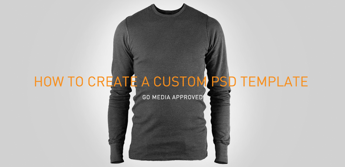
How Go Media makes their amazing mockup templates, Hamster Style!
Go Media Approved
Here at Go Media, we’re custom template creating machines.
Between our mockup sites Shirt Mockup and Mockup Everything, the mockup packs on our Arsenal and custom templates for clients, we’ve got our system down to a science.
Disclaimer: Creating these nicely organized and layered files is far from easy for that matter, even for us after all these years. So sit with us and stay awhile. We want to make sure we do this the Go Media way.
Ready?
Follow along with me as I create this custom hamster jumpsuit template, from high resolution photograph, to clean and crisp PSD file.
Ideal Conditions
A white/neutral background: This will make tracing the garment much easier.
Red Garments: Red is a great middle value color, which means it shows relatively equal amounts of shadows and highlights. * If you’re not shooting a red garment make sure there is enough contrast between shadows and highlights. In the end, we’ll want to be able to change the garment’s color while keeping it’s natural look.
Sharpness of Image: Sharper images will contain more pixel information. This is crucial editing shadows and highlights.
Duplicate your background.
This is the layer that you’ll be working on. Right click on your background layer to duplicate it then double click to rename that new layer. Once you’ve done this, hide your original background layer.
Photo Cleanup
This will save you time later. Clone tool out any unwanted fuzz, spots, creases, or tags.
Tracing Garment/Subject
Using the pen tool “Paths”, trace just inside the edge of the garment to ensure that you’re not including part of the background. Tracing every detail/fold in fabric will keep it from looking stiff. This is one of the most important steps, and it can take some time. Be patient.
Once you have traced a garment, it will automatically be saved in your “Paths” palette as a “Work Path” – double click to rename it to something more specific. this will allow you to add more paths to the garment later.
Right click on your path and “Make Selection” (click OK on the dialog box that opens). I’m a firm believer in keeping as much of the original photo in tact as possible. To do this I use “Layer Masks”. Ultimately it will make your file size larger, but will save headaches if you need to change something later.
Layer Masking
Now that you have your garment selected, go back to your layers palette and click the layer mask button at the bottom of your layers palette to isolate it. If you ever need to show or hide parts of this garment you can do so in the mask layer without actually deleting any pixels. Add a solid color background to be sure you didn’t miss anything. I usually stick with a middle value gray.
Shadows & Highlights Setup
Duplicate the garment layer twice. These will act as your shadows and highlights. Rename the layers accordingly “GarmentName – Shadows” and “GarmentName – Highlights” It’s good to get in the habit of organizing your layers. At this point I’ll create a main Garment folder, in this case “Jacket” as well as “Shadow” and “Highlights” folders.
After that, move the layers into their respective folders. Select the Shadows layer and change its blending mode to Linear Burn. This will set your shadows to show a good amount of contrast and vibrancy.
Adding Hue & Curves Adjustment Layers
At the bottom of your layers palette, click on the black and white circle to add a Hue & Saturation adjustment layer. Change the Saturation to “-100”.
Add a Curves adjustment layer above that.
Currently these adjustment layers affect the entire document. We will need to make them only affect the shadow/highlight layer they’re above by creating a clipping mask. Hold shift to select both the Curves and Hue adjustment layers then right click and “Create Clipping Mask”. You’ll see two arrows appear next to the adjustment layers to indicate that they’ve been clipped into the layer below.
Next, move onto your Highlights Layer and change its blending mode to “Screen”. This will knockout the shadows of the garment and allow you to focus on the amount of highlights that are visible
Repeat steps 4-6 to create the Hue and Curves adjustments for your Highlights Layer.
Optimizing Shadows/Highlights
One of great uses a mockup template is the ability to change the color of the garment. These next steps will ensure that shadows and highlights are consistent no matter what color you apply.
Our next step is to add a White color adjustment layer and clip it into the original garment layer. (you can also apply a color overlay blending mode to get the same result)
*Photoshop automatically adds a mask to that layer – this will come in handy should you need multi-colored sections.
Make sure your Highlights folder is hidden then move onto the Curves adjustment layer that is clipped into the Garment-Shadows layer.
On the left side of the Curves palette, click the button with the exclamation point to get a more accurate view of the histogram. This will show you the brightness values of the image.
Plot points around the three highest values in an arch as shown. From there you can adjust each point to optimize the amount of shadows will appear. Shadows will become lighter the further away from the brightness values you are. If the points are plotted too far away, you run the risk of the shadows looking pixelated and blown out.
*Every garment’s brightness values will be different, but this arch will serve as a general guide to plotting points.
Once you have the shadows to a place that looks natural, hide your Shadows folder and add a Black color adjustment above the White layer. The same rules apply to editing the curves of the highlights only they’re opposite of the shadows.
Once your shadows and highlights are set up correctly, any color you apply to your base garment layer will look natural.
*If the amount of layers you have is overwhelming and you’re confident with the shadows/highlights you have set – you can always select the Curves, Hue, and Garment layer – right click and merge those layers.
If you’re looking to customize a whole outfit just repeat all these steps for each garment and you could create your very own hamster jumpsuit.
-or clip your artwork into the base garment layer to make some wicked snowboard gear!
Great job!
Hard work, huh?
Pick your pleasure
Check out the hundreds of templates we’ve created on our sites Shirt Mockup, Mockup Everything and the Arsenal.
Shirt Mockup is a free tool used to realistically mockup your designs on tees. The Pro Version is available, offering you a larger variety of t-shirt templates. It’s super easy. Upload your art, receive a jpeg snapshot of your design. Try it free for 7 days!
Mockup Everything, similar to Shirt Mockup, provides designers with an easy-to-use platform for applying graphic designs to a growing variety of print products in multiple categories including technology, apparel, print, outdoor and food & beverage. Also like Shirt Mockup, both free and Pro versions are available. Mockup Everything is similarly super easy to use and designers receive jpeg snapshots of their designs. Try the Pro version free for 7 days!
Want the very best in Mockup Templates, wrapped up in neat and clean Photoshop files just like you saw Aaron create above? Look no further than the Arsenal. Our Mockup Template packs come in all varieties, from tees to hoodies, posters to tanks and more.
- Categorized: Graphic Design, Photoshop, Tutorials
- Tagged: art, design, design tip, mockup templates, mockupeverything.com, mockups, Photoshop, template, tutorial
Signs You’re Doing What You Love
(or Why I Love Go Media)
You hear a lot of this lately: Do What You Love.
Sounds easy enough, right? I’d disagree.
For me, the road to “doing what I love” has been a long and winding one.
Along the yellow brick road, I’ve racked up thousands upon thousands of dollars in college loans, gone to school far too many times (Masters x 2), spent years in job misery and have seen things in the workplace I am in contractually unable to speak of. (No, I’m not talking about you if you think I’m talking about you.)
Work, and the road to career happiness, has felt a little like hell.
When I was hired into the Go Media family, my life took a major turn. Everything fell into place. I mean, seriously. I was dropped suddenly into a land of rainbows, unicorns and strawberry cupcakes. I realized: this is it. I’m doing that thing called “doing what you love.”
Are you?
Signs you, too, are doing what you love:
1. You think: “My job is cooler than your job.”
There have been several years of my life where I recall avoiding small talk all together; where I avoided the ‘So, what do you do?’ and ‘Where do you work?’ chat. You know, those perfectly normal and appropriate conversations that adults have. Now, everybody I know and their brother knows of Go Media and all that we do.
In fact my Aunt Dee Dee over in Rockaway, New Jersey is probably spreading some Go Media gospel as we speak.
2. You are buying what you’re selling.
Pretty similarly, I’ve been in those positions where I’ve had to sell something, or pitch something, I didn’t believe in. I had to smile and say, “Yes, this is totally awesome” even though I’m thinking “yeah, this is totally not awesome.”
So here’s the thing: when you’re doing what you love you would actually buy that shit! It’s totally tattoo-across-your-forehead good.
3. You work more than you have to.
No more waiting in the car with Starbucks until 8:59 a.m. and dashing the hell out at 5 on the dot. I usually get in nice and early and stay later, not only because I have lots to accomplish, but because I honestly and genuinely enjoy my work.
Bonus points if your work is also your play. For instance, after I’m clocked out, I stay at Go Media and get into all sorts of trouble with my colleague and partner-in-crime.
4. You work and/or network with cool folks.
I’ve worked with some gems in my life. When I say that I mean I’ve actually worked with the type who would want to call off work on a Tuesday so badly that they’d call in with a 24 hour leukemia. (I can’t make that one up.) You know, folks that would rather spin around in their chair than lift a finger.
On the opposite end of the spectrum, here at Go Media I’m interacting with people who inspire me, who push me to step up my game on a daily basis. The kind that just make me proud in general. (Same goofy folks doing weird stuff in picture above.)
5. You are making a difference.
Gone are the days of taking more than I give in return.
Here at Go Media, I am able to contribute to a community of artists and share secrets that lead to the betterment of all.
It sound cheesy, but I feel like the cool stuff Go Media does actually changes people’s lives. And I get to be a part of it. How powerful is that?
How do you know you’re doing what you love?
Tell me in the comments below!
- Categorized: Graphic Design
- Tagged: staff
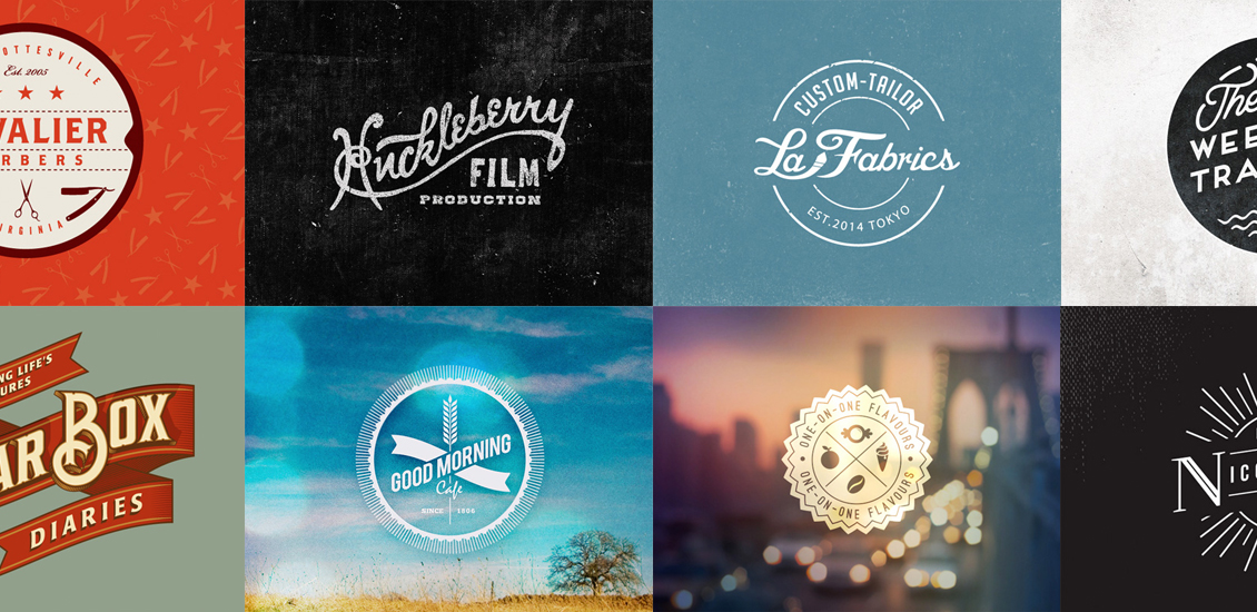
20 Excellent Examples of Retro Logo Designs
Logo Love
The logo is the visual face of the company. It doesn’t just tell you the company’s name; it helps to give you an idea of the style, tone and personality of the brand behind it. The way in which a logo is designed can affect how the company is perceived – even on a very subtle level – and great designers can make use of that brilliantly.
I’ve always been impressed by logos that manage to create an elegant, stylish and retro look. A vintage style logo can be such a difficult style to pull off, and usually involves a tremendous amount of work around getting the typography just right. This is where hand-drawn scripts come in really well, as retro logos often make use of custom, hand-written lettering – or heavily adapted typefaces. Other elements that are common to retro logo designs include the use of textures to add a level of grain or noise to the artwork. Often, shapes such as ribbons and circles to create a badge effect can help to add a nostalgic air to a design.
I’ve collected some of my favourite examples of logo designs that all make use of a vintage or retro effect, and have a touch of elegance to them as a result. If you’re about to start working on a retro design, I hope this collection helps to give you some creative ideas. And of course, if you know of any logo designs that should have been included in this post, I’d love to hear about them in the comments.
Source: http://dribbble.com/shots/1392256-Woodstyle
Source: http://dribbble.com/shots/1345169-Huckleberry-Film-Production
Source: http://dribbble.com/shots/985698-Cavalier-Barbers
Source: http://dribbble.com/shots/1131626-Modern-Retro-Badge-05
Source: http://dribbble.com/shots/1305080-Founders-Union
Source: http://dribbble.com/shots/765146-Shield-Logo-2
Source: http://dribbble.com/shots/1065675-Cigar-Box-Diaries
Source: http://dribbble.com/shots/1372467-Steve-Depino-Logo-C
Source: http://dribbble.com/shots/1377843-Dream-Machines-Logo
Source: http://dribbble.com/shots/1284798-Meget-Mere
Source: http://dribbble.com/shots/1386122-La-Fabrics
Source: http://dribbble.com/shots/1245884-Thunder-Mountain-Coffee
Source: http://dribbble.com/shots/1394912-Gif-Co
Source: http://dribbble.com/shots/1063680-The-Lost-Weekend-Traders-badge
Source: http://dribbble.com/shots/1355153-Colorado-Vintage-Logo
Source: http://dribbble.com/shots/1311170-Capitl-Co-Revisions
Source: http://dribbble.com/shots/1254273-One-On-One-Flavours-logo-design
Source: http://dribbble.com/shots/1333457-Overdrive-Pedals-WIP
Source: http://dribbble.com/shots/1394824-FPH-Copywriting
Source: http://dribbble.com/shots/1292832-Nicole-Leever-Logo-D
Which of these designs do you like best? Do you know of any other examples that you’d like to add? I’d love to hear about them in the comments!
- Categorized: Design Community, Graphic Design, Graphic Design Inspiration, Web Roundup
- Tagged: design, inspiration, logo, logo design, retro
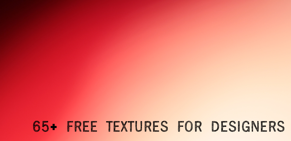
65+ Free Textures for Designers: Vibrant, Gritty and Otherwise Great
Well hello again.
You all know how obsessed I am with freebies by now.
Nothing like a delicious download that costs nada, am I right or am I right?
Hold up Go Media faithful!
Let’s be honest. There’s a time and a place for everything, so having said that, a couple of things:
1. Use at your own discretion and follow the permissions set by your fellow artists. Give credit where credit is due.
2. If you want high quality textures guaranteed to make you drool, stop here. Go directly to the Arsenal.
Here you can grab texture packs like these (including some by yours truly thank-you-very-much)
I mean, come on.
Seriously!
Okay, okay. Enough about me.
Onto the finds!
Texture 89 by Sisterslaughter on Deviant Art
Grungy Square by Mercurycode on Deviant Art
Golden Rusty Bits by Mercury Code on Deviant Art
Blue Grunge by Mercurycode on Deviant Art
Splatters by Kikariz-Stock on Deviant Art
Leaf Texture by Kikariz-Stock on Deviant Art
Rust Texture XIX by Mercury Code on Deviant Art
Texture 64 by Sister Slaughter on Deviant Art
00741 by Glass Through Skin on Deviant Art
Coffee Texture by Kikariz-Stock on Deviant Art
Wood Texture by Kikariz-Stock on Deviant Art
Wood 3 by Photoshop Stock on Deviant Art
Glass Texture by Alecca on Deviant Art
Moss on Stone II by Rockgem on Deviant Art
Psychedelic Stained Paper Texture (1 of 12) on Lost and Taken
5 Colored Grunge Textures from our friends at Lost and Taken
Texture 2 by Dirk Wüstenhagen on Flickr
Wooden Boards (1 of 5) from Stock Vault
Color Wall Texture 03 by Limited Vision Stock on Deviant Art
Old Paint 10 by Limited Vision Stock on Deviant Art
Cracks 09 by Limited Stock Vision on Deviant Art
Handstained Paper (1 of 18) on Lost and Taken
Wallpaper Decay 5 by Jay Hilgert on Flickr
Rubber 4 by en11 on Deviant Art
Glass Texture on Texture King
Concrete Texture on Texture King
Blue Wave by GreenEyezz on Deviant Art
Texture by Mat Textureonline on Flickr
Rust 6 by Caleb Kimbrough on Zen Textures
Fabric by Caleb Kimbrough on Zen Textures
Bokeh (1 of 4) by Shadowhouse Creations
Watercolor (multiple!) by Lost and Taken
Scratched Rusty Metal by Caleb Kimbrough on Flickr
Tears on my window by Aurora Wiendhold on Deviant Art
Old Paper (Single) by Jay Hilgert on Flickr
Texture 38 by Omarsuri on Deviant Art
Texture 33 by Omarsuri on Deviant Art
Texture 27 by Omarsuri on Deviant Art
Colored glass by AuroraWienhold on Deviant Art
Unaciertamirada texture 87 by Luis Mariano González on Flickr
Texture 266 by Sirius-sdz on Deviant Art
Texture 264 by Sirius-sdz on Deviant Art
Distressed Wall Texture 6 by Design Instruct
Gary Texture by The Shutterbug Eye on Flickr
Old Film from Bitbox
Paint Splatters from Bitbox
Peeling Paint (multiple!) on Design Beep
Concrete 008 by Robert Scott on Flickr
Childcare on Textures of Italy
Free Metal Texture (Rust) from Texturez
Rock texture by bstocked on Deviant Art
Brick and paint texture by super chicken stock on Deviant Art
Rust by SuziArt on Deviant Art
Rust Stains by Bea-Voyager on Deviant Art
Big Water Drops on Metal on Mayang.com
Green cracks texture by Dirk Wüstenhagen on Flickr
Texture wt2 by Angela Wolf on Flickr
Texture by David Gunter on Flickr
Texture by Steve ..”Puppy Eyes” hits… on Flickr
Origami Paper 36 by Alexabexis on Deviant Art
Head to Arsenal awesomeness…
We collect free design tools and inspiration on Pinterest! Follow us!
- Categorized: Graphic Design
- Tagged: art, design, freebie, staff, staff picks
How to Create Your Own Vector Pack – and sell it!
So you’ve seen all the crazy vector packs we sell over at the Arsenal. Today I’m going to teach you how to create your own stock vector pack and show you how you can sell it online with Gumroad!
Come up with a theme
Before you start coming up with a stock vector pack, you have to think about what would be useful for other designers. What can you make that will save them time? What are you skilled at making? A selection of cool textures you made or a set of birds? What about a set of skulls, heraldry, or ornaments? Vector patterns even zombies? Whatever you fancy, there are two or three primary ways of creating it. I will walk you through each of them.
Option 1: Live Tracing Photos
Note: You shouldn’t work with photos you do not have permission to use. You should either buy the photo with the proper rights off a stock photo website, shoot the photo yourself, or ask the photographer for permission.
The first option is the easiest. It can be as simple as taking a photo and using the live trace command in Illustrator. But often it requires some tweaking and masking in Photoshop before you run the ole vectorizer on it. This option works best for textures, abstract images, or a raw “photocopied” look. The idea is to create a usable element someone else can use in their design. In my experience, converting the photo down to just black and white is best, but of course you can do whatever you think would be most useful.
For example, take this texture for instance. We shot this photo for one of our texture packs.
Open up your texture photo in Photoshop and desaturate it by pressing Ctrl+Shift+U. Then invert it by pressing Ctrl+I. Then you end up with this:
This is getting close to be able to vectorize. But we want to boost the contrast a bit. So press Ctrl+L to bring up the levels and adjust them accordingly:
Then copy/paste or place the image into Adobe Illustrator and click the “Live Trace” button in the upper toolbar.
Then click the “Expand” button. You’ll also want to use the Magic Wand tool and select the “white” background that Adobe Illustrator had converted to vector as well. You don’t need the white part, just the black shapes.
Here is an example of how the vectorized texture will look once applied to background:
Here’s another example of placing the photo directly into Illustrator and running the live trace filter.
The final texture is below. Pretty useful for backgrounds!
Option 2: Drawing off Reference Photos
I would highly recommend reading this tutorial by William Beachy on Frankensteining several photos together. To save you some time though, I will share the most important bits relevant to creating your own vector pack. Essentially you want to find good source photos (take them yourself or get permission to use someone else’s) and then draw/trace on top. The idea is to get a simplified vector version of the photo.
In the example above, Bill uses the pen tool to illustrate directly on top of the photo. It gives it sort of a highly polished look with just a few colors. The skull below is an example of illustrating directly on top of a photo.
If you want to go for a more grungy look, then take a look at the images from the popular Gigposter Tutorial from 2007. This photo below is just an example to show you the process:
Cut out the subject from the background using the Pen Tool or your favorite masking procedure. I have seen ClippingMagic.com but haven’t tried it yet.
Here are two different settings for contrast. In this case, it was done to give you two different levels of color. One will be used for the lightest shade, a medium shade, and the full silhouette will be used as the darkest shade.
See below how each version was live traced:
Now look how each one was given a different color:
And then they are finally arranged on top of each other to complete the three color look. If you’re interested, I made a free Photoshop action quite some time ago to instantly give you a three color effect in Photoshop.
Option 3: Drawing from Scratch
Finally, if you’ve got some drawing skills, you can always draw your vector shapes by hand on paper like below:
And you can see those drawings by Dave Tevenal for our Ornate Vector Pack were Live Traced directly in Illustrator without much editing.
It’s really important to make sure your drawings have a clear distinction between black and white. Pencil drawings do not live trace well. Neither does ball point pen. We recommend using Micron pens or something similar.
Keep in mind when you scan your drawings, they should be fairly high resolution so the Live Trace works well. You might need to clean up any stray dots or mess around your image.
Here are other examples of drawing from scratch:
And the final vector version you can find in our Ornate Patterns vector pack:
Selling Your Vector Pack
Once you have a finished vector pack, you can sell it on your own website or blog using Gumroad. We are huge fans of Gumroad and they make the process extremely easy. You just upload your product and preview image, set a price and you’re done. They give you easy embed codes to copy and paste the button right onto your website.
Gumroad will handle all the credit card payments. The downside is they don’t take Paypal, but that’s ok.
I don’t really need to tell you step by step how to use Gumroad, they already do it quite well. But I’ll give you some tips – the preview image you use goes a long way in showing off your product. You only get one big image, make sure it shows off the benefits of your vector pack! Another tip is trying out the “Pay What You Want” feature for freebies!
In fact, you can see how Go Media uses Gumroad by checking out our profile page.
Another place you can sell it is on a marketplace. We are close to launching the Arsenal Marketplace which will become a curated collection of some of our favorite resources designed by us and fellow artists. Another great option is Creative Market.
Examples of Finished Vector Packs

If you make your own vector pack, post a link in the comments to where people can buy or download it!
- Categorized: Graphic Design
- Tagged: advice, arsenal, design, design tip, vector, vector art
Go Media’s 100+ Must Have Design Resources
One of the top questions we’ve been asked recently is: “What tools, resources and programs do you use in your everyday lives over there at Go Media?”
Our creative studio here in Ohio City is filled with awesome, handy tools that keep us cranking out creativity, programs that keep us organized, and treats that keep our energy pumpin.’
Here’s a list of our favs.
Physical Tools
Windsor and Newton #2 Paintbrushes and Higgins Fountain Pen India Ink: Bill’s go-to tools for work like this.
Wacom Intuos 3 Tablet: Gotta have it.
Microns: Awesome for detailed work
Strathmore Bristol Vellum paper and
Staedtler Mars technico mechanical pencil with HB leads: paper and penning
Canon Rebel T3i: Photo and video of the days of our lives
Dell Optiplex 9010 and Dell Optiplex 980: our PCs
Dual Dell Ultrasharp 24″ Monitors
Dell mice and keyboards
Targus Lap Chill Mat: Laptops stay cool with the help of this and two USB powered fans and elevated air circulation
Cisco phones: chatting with clients
Murphy Chair Co. Swivel Office Chair: vintage sweetness
Urbanears Forest Green headphones: Chris‘s favorites
Logitech h800 with customized vinyl ear pads: All of Wilson’s tunes and calls are delivered via Bluetooth or Wireless USB via these headphones
Sony MDR NC7 Noise Cancelling Headphones: When the office gets out of hand…
Field notes: Filled with brilliant ideas…
Post-it notes
Sharpies
Gettin’ Shit Done
WordPress: For every site we produce that will be updated on a semi-regular basis
Zurb Foundation: Greatest HTML/CSS/SASS/JS Framework ever
Notepad++ with various plugins: for all coding and writing needs
Netbeans: Preferred IDE of our VP Wilson Revehl
TortoiseSVN: Super easy to use
XAMPP: Free, super popular PHP dev package
FileZilla: A free FTP solution
MySQL GUI Tools: Integrated tools environment
Google + WP Codex + Stack Overflow: Used at least 50x per day. Takes up majority of our browsing history.
Chrome and Chrome Developer Tools: See bugs, fix bugs, in browser
Rackspace Cloud: For hosting applications and websites
Beanstalk: Code hosting
Amazon Web Services: Durable, reliable
Adobe Master Collection CS5: We get asked this a lot and yes, Adobe is our go-to
Final Cut Pro 7: For making nonsense like this: Make It Bigger
Audacity: for all audio editing and recording of our Go Media Podcast
Pipedrive: our #1 sales tool!
Smartsheet: For anything and everything: general project planning and organizing our lives in general.
Outlook: Our email solution
Google Calendar: Super helpful for scheduling client reviews, keeping track of deadlines
Google Hangouts: For inter-office communication
Trillian: Inter-office communication choice 2
Google Drive: This is where we hub all of my client meeting notes, proposals and more. And, it allows for easy collaboration with team members.
Google Keep: For organizing lists, notes and photos
Skype: For chatting with our Arsenal guest artists and other friends
Dropbox: Sharing is caring.
Proof Lab: For assigning projects, sharing designs with clients, & logging time (Exclusive to Go Media)
Open Office: the rival to Microsoft Office. It’s free folks!
Hightail: For file-sharing goods like Drawn to Business and Thread’s Not Dead
TeuxDeux: a great to do list app!
Quickbooks Pro: The best in bookkeeping
Basecamp: Project Management, great to-do lists
Stamps.com: Super easy postage printing
Primo PDF: PDF converter
Mailchimp: Huge fans of these guys. All of our emails are created here.
Gumroad: Super easy way to sell our products
PayPal: Easy exchange of money
Daily Vices
Flickr: Where we go to check on our Go Media User Showcase (so much inspiration!)
Design Cuts: Amazing dudes. Awesome deals.
Feedly: All the feeds we need
Sidebar: The 5 Best Design Links of the Day
Blog.Spoon.Graphics: Check in daily to this one just because we love Chris Spooner.
IFTTT: Have a recipe that any post I save to Feedly is emailed to, so I’m reminded to go back and read it.
Tweetdeck for Chrome: Allows for the seperation of @mentions, lists and important search queries
Google Now: For quick access to set reminders, check the weather and see traffic
Team Treehouse: For those of us in the office learning code
Hootsuite: The dashboard of a social media manager’s dreams
Buffer: For scheduling posts. As easy as 1 – 2.
Shirt Mockup: A Go Media resource we love
Mockup Everything: Avoid design disaster. Mockup your designs and send them over to clients in seconds.
Go Media’s Arsenal: We’re working on the Arsenal V3 daily. Making it better, smoother, sleeker. What do you think?
Behance: We not only update our page, but check out all the talent and often grab some to showcase on our social media channels and the GoMediaZine
Social Media: We love talking to the community, so we have to mention: Go Media’s Facebook | Arsenal Facebook | Twitter | LinkedIn | Instagram | Google+ | Pinterest, all of which are monitored by Google Analytics
Favorite People and Places
Jakprints: Our go-to printing company
Kelley Green Web: Sales and marketing gurus
Muse Content Group: Brand positioning and content strategy
Sharon Toerek: A reliable lawyer is an absolute must.
Straight Shooter Photography: Dan Morgan is our favorite photographer. #highlyrecommend
Reference
How to Draw the Marvel Way by Stan Lee
Logo Lounge by Catherine Fishel and Bill Gardner
Drawn to Business by William Beachy
Thread’s Not Dead by Jeff Finley
Making and Breaking the Grid: A Graphic Design Layout Workshop by Timothy Samara
Logotypes and Letterforms: Handlettered Logotypes and Typographic Considerations by Doyald Young
(for more of our favorite references, purchase Drawn to Business)
Lean Startup
Book Yourself Solid by Michael Port
Authority Ebook by Nathan Barry
Trust Agents by Chris Brogan
Drive: The Surprising Truth About What Motivates Us by Daniel Pink
How Pleasure Works by Paul Bloom
The Four Agreements by Don Miguel Ruiz
Design Currency by Jenn and Ken Visocky O’Grady
The Voice of Knowledge by Don Miguel Ruiz
Getting Things Done by David Allen
The Art of Non Conformity by Chris Guillibeau
Mindfulness in Plain English by Gunaratana Bhante Henepola
Rework by Jason Fried
Brains on Fire by Robin Phillips, Greg Cordell, Geno Church and Spike Jones
The Power of Now by Eckhart Tolle
A New Earth by Eckhart Tolle
Steal Like an Artist by Austin Kleon
The Power of Habit by Charles Duhigg
How to be a Graphic Designer Without Losing Your Soul by Adrian Shaughnessy
Good to Great by Jim Collins
Built to Sell by John Warrillow
Seven Habits of Highly Effective People by Stephen R. Covey
Hiring the Best by Martin Yate
96 Great Interview Questions to Ask Before You Hire by Paul Falcone
The Talent of Edge by David S. Cohen
Accounting Made Simple by Mike Piper
How to Win Friends and Influence People by Dale Carnegie
To Get Us Through:
LastFM: Jams
Spotify: Bryan‘s daily routine: every day, I grab new albums from Pitchfork’s Review app and add them to a “Listen Today” playlist. Slowly building a “Garvin in your ear” playlist.
And Kim has been working on an electronica playlist.
Rhapsody: Heather and Bill’s chosen music player
Numi Savory Teas: For keeping warm during these freezing afternoons
Campbell’s popcorn: We did the logo for this delicious Cleveland sweets factory and now we’re addicted.
Keurig: Keeps us trucking!
Nutella: Breakfast, lunch and dinner
Thermos Vacuum Insulated 18-Ounce Hydration Bottle: Gotta keep hydrated!
Love…
What tools are in your everyday arsenal? Please share with us in the comments below!
- Categorized: Graphic Design, Graphic Design, Graphic Design Inspiration, Web Roundup
- Tagged: advice, behind the scenes, cleveland, design, design tip, organization, productivity, staff picks, tips