Articles by Year: 2013
Modern Gigposter Design: 100 Stunning Examples – Volume II
Two years ago we put out a post showcasing some of the best posters of the previous few years before that.
Modern Gigposter Design: 100 Stunning Examples – Volume I
Today we are doing the same thing. This article contains 100 stunning posters made in the last two years.
This second collection highlights the trends and changing styles in the gigposter world. If you go back and compare the previous selection to the ones I have gathered today, there are some clear differences. Now I know that there are still posters that get produced in the same styles as they would have two or more years ago, but overall, as a scene, and as a group of designers and illustrators, you can see the evolution of the gigposter. It might not be a dramatic and sudden evolution that is crystal clear to everyone, but for the most part it is slowly and subtly changing. There are certain dynamics that have changed or appeared which you will be able to see if you go back over the years and see this evolution in play.
Here are 100 stunning poster designs that have caught my eye from over the last two years.
Which one was your favorite? Let us know in the comments below! And don’t forget to check out Volume I!
- Categorized: Design Community, Graphic Design, Graphic Design Inspiration, Web Roundup
- Tagged: art, design, poster
40+ Excellent Hand-Lettering Inspirations
What’s better than pencil on paper?
We love to drool over the work of talented hand-letterers we stumble upon on sites like Pinterest and Behance.
Here is some work that struck our fancy as of late. We hope it inspires your own creativity.
And remember to follow our Hand-Lettering and Typography board for more on Pinterest!
by Hiro Noguchi, Source: Behance
by Lex Wilson, source: Behance
by Spiros Halaris on Behance
by Zachary Smith on Behance
by Greg Coulton on Behance
by Ben Tallon on Behance
by Leandro Senna on Behance
by Xavier Casalta on Behance
by Iskra Johnson on Behance
by Sasha Prood on Behance
by Carolyn Sewell on Pinterest
by Jon Contino on Pinterest
Found on Pinterest
by BMD Design on Pinterest
by Ladyfingers Letterpress on Pinterest
by Tag Team Tompkins on Pinterest
by balabolka on Pinterest
by Tuesday Bassen on Pinterest
Found on Pinterest
Found on Pinterest
by David A. Smith on Pinterest
Found on Pinterest
Found on Pinterest
Found on Pinterest
Found on Pinterest
by Masha Karpushina on Pinterest
Found on Pinterest
by Jeremiah Hagler on Pinterest
by Erik Marinovich on Pinterest
by Raul Alejandro on Pinterest
by Ryan Hamrick on Pinterest
by Glenn Wolk on Pinterest
by Alan Cheetham on Behance
By Carly Utegg on Pinterest
by Christel Llop on Pinterest
Found on Pinterest
by Zachary Kozdron on Behance
by Jimmy Khemthong on Behance
by Kostandinos Baltzoglou on Behance
by Iskra Johnson on Behance
by Justyna Frąckiewicz on Behance
by Tünde Varga on Behance
- Categorized: Design Community, Graphic Design, Graphic Design Inspiration, Web Roundup
Handmade Love: Update
I received many kind words in regards to my recent post, Handmade Love, about my mother’s annual Christmas cards.
These cards were completed each and every Christmas beginning in 1972, the year she and my father were married, up until last year. This year, my father, brother, sister-in-law, nieces and nephew finished the Sakai family Christmas card on her behalf, as she, the glue to our family, passed unexpectedly on October 22nd.
You can read Part One of Handmade Love here.
Since sharing her story, I have been asked to share with you each of the 42 cards in her collection.
Please enjoy and have a wonderful Christmas.
Christmas Cards by Nancy J Sakai
- Categorized: Design Community, Graphic Design, Graphic Design Inspiration
- Tagged: art, cleveland, design, Flickr pool showcase, staff
How I Built a Killer Morning Routine
This post was originally written on my personal blog Maker/Mistaker and I thought I should repost it here.
So you call yourself a night owl huh? Most creative people I know (myself included) felt like they get in the zone after midnight. All is still and quiet and you can finally focus on your work. And if you’re not working, you’re doing something until the wee hours of the morning. If you’re like most night owls, you dread getting up in the morning.
That was certainly me. My wife too. Over time our bed time kept getting pushed back later and later because there was always “something to do” that we just had to do. We weren’t tired and going to bed felt like giving up on the day.
A Night Owl No More
I have been getting up at least one hour earlier for over a month now. In fact, the past two weeks I’ve been getting up two and a half hours earlier than normal. The night owl in me would ask, “Why the fuck would you ever get up before you have to?”
This getting up early habit has led to a month-long streak of wonderful habits including exercise, walking, meditation, mindfulness, journaling, and reading to name a few. Each of those has tremendous benefits on their own.
Those are all things I never “had time for” no matter how many extra hours I stayed up. Typically, staying up extra hours just meant more time on the computer. Am I right?
If I Could Only Get Up Early
I didn’t have the ambition to do all those things at first. All I started with was a desire to get up early just because. If I can regularly do that, then I’ll fill it with things to do I’m sure. So I started small with just the cue (or trigger), routine, and reward system to get my ass out of bed. Something I learned from the Power of Habit book.
Cue: Alarm goes off.
Routine: Get out of bed, crawl to couch.
Reward: Cup of coffee while I watched TV on my laptop.
I made sure to add this to my Lift habits so I could keep track. This worked great until the very next day when I forgot to set my alarm and woke up late. Dammit. I woke up early the following morning to get back on track. Then it was the weekend; which of course I slept in and stopped caring about my goal. Then I read The Miracle Morning and that changed everything.
The book stressed how it’s totally ok to be as simple and small as you need to be. The author even described how you can do the Miracle Morning routine in just six minutes! Who doesn’t have time for that?
The book refreshed my inspiration on meditation and personal development. I started following Hal’s suggested routine of waking up, chugging a glass of water, sitting in silence for five minutes, doing some mild exercise, journaling, etc. I tried it out and eventually started customizing it to suit my needs.
My Morning Routine
I use the AM Routine app to help me stay on track. You set your desired end time (like when you have to leave for work) and you add habits with time estimates to your routine. It will calculate exactly when the built-in alarm should go off to give you enough time to do your routine. It even has a handy dashboard to show you what task you should be on, how much time is left, and what’s coming up next. This is brilliant for those foggy mornings. You don’t have to think at all!
- 6:30 AM: alarm goes off. My phone is across the room and I have to get up to turn it off. This prevents me from snoozing.
- Get dressed, brush and floss my teeth, feed the rabbit: 5 minutes
- Drink a glass of water and/or make coffee: 5 minutes
- Meditate: 10 minutes
- Read affirmations: 5 min
- Watch a show on my computer: 30-60 minutes
- Write in my journal: 10 minutes
- Go for a walk and listen to audiobook: 25 minutes
- Push-ups, sit-ups, pull-ups, baby-freeze (breakdance move), lift weights: 5 minutes
- Shower and get ready: 15 minutes
- Eat Breakfast: 15 minutes
- Pack lunch, get the mail: 5 minutes
So that’s my routine. Sometimes for breakfast I’ll make a chocolate super-food smoothie that I got from The Miracle Morning book, so I sip it throughout my routine. I’m getting a little bored of this routine already and might want to shake things up. I’m adding in 10 minutes of writing in my blog and slowly eliminating my TV watching time. The beauty of this is that I can do whatever the fuck I want. It’s my morning routine.
Jeff’s 5 Tips for a Killer Morning Routine
- Start small. Remember, pick up the goddamn weight, don’t worry about lifting yet. Just do as little as possible so you can check it off and feel good about it. Small wins are the only way you’ll feel motivated to keep going.
- Do something pleasurable. For me that was watching a new episode of a tv series. It could be video games. Think of how you felt on Christmas morning as a kid, you couldn’t wait to jump out of bed. As an adult, what would give you that type of excitement in the morning?
- Don’t let yourself think. In the morning, your willpower and decision making ability is extremely low. You need to build up a routine that is dead simple especially right as you step out of bed. For me, this means turning off my alarm clock, unplugging my iPhone charger and stumbling over to my dresser where I have my morning routine outfit already ready in my top drawer. Plan out your entire morning routine in advance so you don’t have to make any decisions in the morning. Even a zombie can do it!
- Set things out the night before. I wear the same shorts and shirt every day. Deciding what to wear is hard when you’re groggy. Even my breakfast smoothie is created the night before. The glass for my morning water is always in the same place. It requires no thinking to get going. This is key!
- Focus on personal development. Do not work! Resist the temptation to check email or social media. Do not start working on a project right away without first spending time working on your own personal development. You have the rest of the day to worry about checking stuff off your to-do list. Do not feel guilty about being “unproductive” and do not feel selfish for focusing on yourself. You deserve to have time to develop the life you want to live.
- Categorized: Graphic Design
- Tagged: opinion, organization, productivity, staff
Handmade Love
Alice: How long is forever?
White Rabbit: Sometimes, just one second.
– Lewis Carroll
It was 10:33 on October 22, 2013 when my world ended.
Ushered into a special waiting room at the Cleveland Clinic by a nurse with her head held low, my father, brother and sister-in-law knew before the team of doctors even entered the room that our worst nightmare had just come true.
The days following were a blur. Phone calls, arrangements, trips to the airport to pick up family flying in. Standing at the calling hours we stood in a row, stunned.
One by one they came in. Friends and relatives, packing the room for hours. These people who were touched by my mom’s contribution to each and everyone of their lives. Each had a story about her kindness, her gentle way. As they hugged me, shedding tears and apologizing for all that we had lost, smiles crossed so many faces as they shared this one consistent message, “Heather, I want you to know that I kept each and every one of your mother’s Christmas cards.”
Ten, then twenty, then over one hundred people, I learned, had been amassing my mother’s homemade Christmas cards since she had been sending them in 1972, the year she and my father were married.
It was sweet, yet not surprising to me. As long as I can remember, my mother would sit at her desk for hours upon end, beginning every year in early October, in order to craft each and every one of her around 125 annual Christmas cards. Each was created with extreme artistry, patience and an eye for detail beyond my ability to comprehend. Each was made by way of a different medium, including origami, bent wire, stamp, embossing, watercolor, hand stitching. She made her own paper and hand lettered each and every envelope.
Anything less than perfection was inexcusable for my mom; many cards ended up in the trash. We’d always joke about her perfectionism, get on her about how the ones with color outside the lines were good enough. She’d always shake her head. She wanted each of those cards to be just right for all of her friends and family who she loved so very much.
My mom created a book of all of her 39 cards, one for my brother, and one for me. What you see here is just a small sampling of her work. This year we’ll be assembling the last Christmas card she created with the bits and pieces she’d begun to work on early, like always. We imagine her looking down, gasping at our messiness as type is misaligned and rubber cement leaves tracings of gummy on paper.
It’s almost incomprehensible to me that this Christmas will go on without her. That life is going on without her. That there is a world without my mother, my best friend, who touched so many lives with a spirit reflected in these cards: beautiful, meticulous and full of love.
All cards created by Nancy J. Sakai, beloved mother of Heather
- Categorized: Graphic Design
- Tagged: art, staff
Go Media Podcast – Episode 19: Drawn to Business Q&A With Bill Beachy
In this episode, Bill gets together with the readers and new buyers of his book, Drawn to Business, to answer followup questions.
- Categorized: Business Philosophy, Graphic Design, Video and Podcasts
- Tagged: podcast
Freebie: Mockup Everything Templates from your friends at Go Media
Hello Go Media Faithful!
I’m here with an early Christmas gift…some free mockup templates sponsored by Mockup Everything! Mockup Everything, created Go Media, provides an easy-to-use platform for applying your graphic designs to a growing number of print products in the following categories: technology, apparel, print, outdoor and food & beverage.
Our free version allows you to visually prototype your designs, saving you from a design disaster. Take it a step further and upgrade to the Pro version to gain access to over one hundred product templates and the ability to mockup snapshots twice the size of the Free Version.
Don’t Be Greedy Now…
We want to see your work! Share your designs to our Pinterest board for your chance to be featured each month here on the ‘Zine, as well as on all of our social media channels! Click on the board for more info:
Free Mockup Templates:
Ready? Just click the link following each photo and get to steppin’ my friends.
Enjoy and Merry Mockups!
– Heather, Product Manager at Go Media
Email me for template requests
- Categorized: Graphic Design
- Tagged: apparel, design, freebie, mockup everything, mockupeverything.com, mockups, productivity
Build An Engaged Social Media Following Now: Tips for Designers
How to Increase and Engage your Followers
Entrepreneur and Marketing Connoisseur Kumar Arora knows social media like the back of his hand. Fellow Clevelander and start-up wonder for ventures including Rogue Eyewear, iLTHY, Black Rose Entertainment Management Group and ICTech Ltd., Arora has an impressive history in the field. A few things in Arora’s backpocket? Developing campaigns for Coca-cola, Verizon, Redbull, Live Nation, Puma as well as starting on grassroots and viral campaigns for performers like Machine Gun Kelly, Jay Sean, DJ E-V. He is no stranger to growing communities at a rapid-fire rate.
Arora has a few suggestions for designers, like himself, who yearn to gain a following too. In an age of #followme and #tagforlikes though, he reminds, “developing a community that cares is always better than having a group of people who don’t engage.” A great way to get started for example is to use an online service that allows you to buy 50 instagram likes for all your posts, but let’s not spoil the list. Ready to attract a loyal, genuine and true following? Here are Arora’s 10 tips and tools to becoming a master of social media:
1. Keep consistency in usernames
This is a big one that I don’t always see with small startups. Maybe its because its hard to get the same name in the pool of social media platforms, but having the same name makes it easy to find or reference. Say if your name is Pepsi, you aren’t going to have an Instagram called @pepsi_co,a twitter thats @pepsico, and a Facebook username that is PepsiCola. Keeping consistency makes it easier and continues on the brand building. I always advise people that your name is equally if not as important as your message.
2. Identify your Market
People tend to forget social media isn’t always about telling the whole world what you are up to. Rather than sharing a post or an image to everyone you know, why not look to those who are actually interested? Create a community and understand your audience is the key for quick and instant success. After that, those who follow you will eventually become your influencers and help share your information. There are also other tools out there to find the right base, a personal favorite is Little Bird.
3. Develop a strategy
Good campaigns are always backed behind a full out strategy. Plan out your tweets, choose when to post, and create proper imagery to boot along side it. If you can’t think of relevant content, then you need to try to seek new material to keep the momentum going. Larger companies might plan months ahead, but a small business should at least spend a few hours a week thinking about what they can share on their platforms.
4. Don’t spam
In this day and age, we spend more and more time on the internet. Last thing we need is to see our favorite brand spamming us about something we don’t care about. That and our attention spans have only gotten smaller with the amount of information that hits us. People these days cycle through so many pages on Facebook in one minute that they don’t have time to click on something that doesn’t give them any return.
5. Content
In the end, its always about delivering meaningful, quality content. Keeping things fresh, exciting, new, and most importantly, something you can share. After that, its up to your existing base of followers to interact, contribute or spread your own information. People don’t want to hear about the same thing over and over again, and they certainly want to engage with you in some way..after all: social media is just another form of communication. It’s a two way street.
6. Offline Marketing
Your twitter handle is the new physical business card. Sometimes leaving a lasting impression with someone can get an instant follow, and possibly even a mention. While some may say this can be a slow process, its the best for any startup to get some traction. Individuals can’t continue to hammer away on a campaign solely just by sitting at a computer. It’s best to try to cover all your bases along by reeling in your physical followers along side your virtual ones.
7. Social Media Integration
Just as important as it is to keep uniformity between your usernames, its also good to connect these platforms with each other. You may find that if your Instagram followers have spiked, you can pass on some of your followers to join you on Facebook as well. A lot of companies lately have been trying to work on Instagram, so they are using their massive followers on Twitter and Facebook to lead them to Instagram. A great example is to host a contest on Instagram, which you can then share with your followers on other platforms.
8. Ads
This is an easy one, but the higher your visibility (to the right crowd) the better your chances that you’ll get some returns. You need to be careful though, as the wrong ad to the wrong audience can yield little to no engagement. It’s always best to A/B test any ads so you can to see which one works best. Always remember you can continue to change them as you go, rather than leaving the same ads up for a period of time.
9. Track your performance
Not getting any retweets or shares? Maybe its time to change things up. Always continue to seek out what works and what doesn’t can help in the long run to develop your voice. That, and its always good to check in once in a while on your performance. Some I recommend are: Cyfe, Ubervu, or some of the free monitoring tools like Hootsuite or Tweetreach.
10. Take the next step up
Besides social reach tools, there are plenty of available marketing tools out there as well for small to mid sized businesses looking to take the next level up. Managing your own social media can almost become a job in itself so it’s always great to have a few extra tools to do things one person can’t do alone. Sometimes if you have the budget it’s not always wise to just throw them into solely into social media advertising, but platforms to help drive more engagement. Some I’ve used in the past include Extole, Wildfire by Google, and Referral Candy.
Have any tricks up your sleeve that you can share? Which of these 10 worked for you? Share with us in the comments below!
- Categorized: Business Philosophy, Graphic Design, Interviews, Small Business
- Tagged: advice, design, design tip, interview, opinion, tips
Beating Busters: How to Identify and Avoid Bad Clients
Hi Go Media faithful! Bill here! I’m back to talk about beating busters, a topic I discuss in my book, Drawn to Business. This week’s piece deals with one simple fact: in business, you’re going to get ripped off. Get used to the idea. Over time, luckily, you will learn how to spot what I like to call busters, or bad clients. Here is a list of the different types of busters I’ve come across over the last 15 years in business. Hopefully my bad experiences will spare you the same headache. Look out for these guys!
For more about busters, and all I’ve learned growing my own design firm, pick up Drawn to Business.
Types of Busters
1. The Promoter.
The promoter is probably my favorite type of buster simply because they’re so entertaining (and easy to spot). A promoter is full of energy, and everything with them is bigger than life! I think of a carnival barker: “Step right up! Step right up to the greatest design project on earth! Wealth and fame beyond your wildest imagination are just behind this curtain!” They feed off your emotions, pump up your ego and make outlandish promises. They also operate with a constant sense of urgency. They’ll promise you part of their “can’t-lose” business, but there are never any contracts or lawyers, just empty promises. There is always one more problem, one more project, one more step.
Fortunately, the deposit first policy works very well with promoters. They will never give a deposit, or pay a dime. But one funny thing is that they’re so damn persistent. Even after you tell them your policy…it’s likely they’ll say something such as: “Great! No problem. I’m happy to pay a deposit. I just need this one little project done before I’ll have access to cash to pay that deposit!” Don’t get sucked in! Stick with your policy!
2. The Delegating Entrepreneur.
The Delegating Entrepreneur is also deflected easily by a deposit policy. They are a little like The Promoter except the main crux of their pitch is that you will be a part owner of the company. They will also play on your emotions and hype the dream of “your” business. But here are the problems with these types of busters.
First, “The Company” is mostly just them giving you work. They don’t do much themselves other than daydream about how amazing the company is going to be, then pile up more work on you. Second, they’re not necessarily good businesspersons, they just happen to be arrogant and overconfident, so it’s easy to believe in them. Third, if “your” company ever does start to make some money, this buster will surely keep it himself or sink it into other people to build the business more—after all, he already has you working for free.
This is not to say that there aren’t good, honorable entrepreneurs out there who need a business partner. But taking on a business partner is a serious undertaking. In my experience, nine out of ten people who will quickly offer you a portion of their business in exchange for free work are busters
3. Mr. Add-On
Mr. Add-On is the first type of buster who slips past the deposit policy. He or she will pay you for the services that they have you quote. Here’s their trick. They won’t tell you everything that they need done. Then at some point during the design process, they’ll start asking for a little more. They try to play-down the amount of work something will take and try to make it seem like it’s part of the current project. You might hear something like: “Now that you’ve finished my business card, can you just slap that information onto a letterhead? That should only take a second, right?”
If the designer in your company is not the salesman, Mr. Add-On will exploit the situation by telling the salesman as little as possible, then trying to trick the designer into doing extra work for free. It’s important that your staff knows exactly what’s been paid for when dealing with this slippery buster.
4. The Slave Driver
The Slave Driver. The slave driver is similar to Mr. Add-On with one critical difference. Mr. Add-On is at least pleasant in his approach. The Slave Driver is merciless and hard to please. He may not add-on to a project, but he’s going to squeeze every ounce of effort from you that he can. The Slave Driver is incredibly picky. He’ll make you feel like you’ve made a mistake, done a poor job or misled him in some way. He’ll lay heavy guilt trips on you. The difference between a high-maintenance client and a slave-driver is that when you’re done with the project for the slavedriver you never want to work for them again.
5. The Long-Con-Artist
This type of buster has a long term plan. He’s trying to get design services for free, or for a greatly reduced rate. Here’s his plan: pay for services, get most of my work done, then act like something is wrong, set the designer up for failure, then demand their money back. This type of buster starts out all sweet and loving, but the closer you get to completing his or her project the more difficult and demanding they’ll become. At some point they’ll start shifting deadlines or making demands that are virtually impossible to accomplish. Near the end, this con-artist will start acting inappropriately upset, start claiming that you’ve somehow hurt his business. He or she will invariably ask for a refund, refuse to pay his balance or even threaten to sue you. All of this is done as a way for him or her to steal your design services for as little as possible.
I’m sure there are many other types of busters out there, but these are the most common ones I’ve come across over the years. It takes time and experience to know how to identify and deal with these sleazebuckets. Good luck and stick to your guns!
- Categorized: Business Philosophy, Graphic Design, Small Business
- Tagged: business, business insights, design tip, Drawn to Business, Graphic Design, illustration, tips, William Beachy
How to Create a Winning Email Marketing Campaign
Email marketing is a great way to blast your brand to the millions of fans following your every move. But like anything else, there is an art to creating the perfect campaign that will not only be worth reading, but worth opening in the first place.
We asked our friend Fabio Carneiro, over at Mailchimp, to share with us some words of wisdom on this very topic. Read on for Fabio’s 7 tips to creating an email marketing campaign that matters.
7 Tips by Fabio Carneiro
1. Short and Sweet
The rule of thumb for email length is simple: shorter is better. But that’s very dependent on a few factors, like the audience you’re sending to, or the type of content you’re sending. A good example is our MailChimp UX newsletter; they tend to be quite long for an email, but they’re geared to an audience that wants to read in-depth articles; the length of each email is fine for them. An eCommerce email, on the other hand, would benefit more from being very short and focused, concentrating on, say, just four or six products instead of a long list of fifteen.
2. Analyze frequency and sending date
While sending frequency is ultimately dependent on your audience, I don’t think I’m going out on a limb when I say that many people send too often. In my personal experience, finding eCommerce emails in my inbox from one retailer more than once a week is aggravating, but that’s certainly not true of the all email subscribers. Frequency is a tricky thing to get right, but I think it helps to temper sending frequency with sending date. It might work out better to send an email once a week, but on a Tuesday, when everyone’s come off the Monday work-week email blitz. If your content is more leisurely or humorous, maybe the beginning and end of the week work well; everyone needs a break at the beginning of the week, and they’re also generally more carefree at its end, and the content suits the mood.
Ultimately, nailing down frequency takes a lot of experimentation. Many senders make a decision to send emails out on a certain day and time, and never go back to test different scenarios. It really pays (figuratively and even literally) to treat a subscriber list as a complex conversation with your readers, and then tweak what you send, when you send it, and how often you send it according to reader interest.
3. Include Images
Images in email are good. They’re often crucial to well-crafted, interesting content, and images can make a huge difference in how engaged your readers are. Is there a right number of images to try to include? I don’t think so. The proverb, ‘One picture is worth a thousand words,’ holds just as true in email as anywhere else. Where you can run into trouble is the inclusion of too many images, or images too large in size (both file- and dimension-wise).
With the meteoric rise of mobile readership, we’re required to consider how your data is received on the reader’s end. Small screens and slow cell service carriers are very real concerns that everyone should keep in mind when creating content for email. Dimensionally large images will either require a lot of awkward scrolling on the reader’s behalf or, if the email is responsive, will be difficult to make out in detail when its size is reduced for small displays. Large file sizes can clog up the works on the reader’s end as well, making an email slow to download and actually costing the reader more money if their carrier’s data rates are high and bandwidth is restrictive.
4. Create a Custom Template
There are a lot of good code bases floating around out there to help anyone get started. MailChimp provides a large selection of starter templates on GitHub, ranging from non-mobile fixed designs to mobile-friendly, responsive ones, all created with stability and ease-of-use in mind. They can all be used in MailChimp or any other email service provider. The HTML Email Boilerplate is another good resource, with code built around simplicity that’s great for newbies.
These code bases offer a great foundation, but to get the most out of an email it’s best to eventually create your own. A lot of designers see that as a daunting task, because there are so many more hurdles in HTML email design than there are in traditional web design. To help dispel some of that mystery, I’ve created a sort of one-stop reference site that guides anyone through the broad concepts of how email works, on to how to design an email, through the development of an email.
5. Create a Catchy Headline
Subject lines are a tricky thing. I’d hesitate to say there’s a “best” subject line or lines out there, because it’s very subjective and dependent on your content, your audience, and tons of other factors; The personality of your email matters and word choice matters, but something like line length doesn’t. Ultimately, it comes down to this: creating a good subject line is a craft all its own, and it’s one that requires experimentation and testing.
6. Grow your List with Great Content
Two words: great content. That’s what matters most in any email because if your audience isn’t interested, you don’t have a leg to stand on. It’s easier said than done, but it’s certainly possible – Dave Pell’s NextDraft is a perfect example. Dave is a spectacular writer, though. If you aren’t, there are a few things you can do to improve.
First and foremost: engage with readers. If your email delivers content that’s worthy of discussion, make yourself available to your readers and actually have a discussion. Humans crave interaction with others, and email is a wonderful medium for that.
Second, narrow your focus. Don’t try to please everyone using the exact same content – it won’t work in the long run. Find out what your readers are most receptive to, and segment your list based on those interests. If you send to 1,000 people, but you know that half wants to see photos and the other just wants to read, make the effort and serve both interests.
Third: personalize. The simple act of including a person’s first and last name, and making content more specific to their location will make your email meaningful to them and their immediate circle of friends, who then are more likely to share with their circles of friends, and so on.
7. Avoid the Unsubscribe
What makes people hit “unsubscribe”?
There’s no shortage of discussion on this subject, because so many things can cause people to unsubscribe. Email frequency is chief among those reasons. Too much email is a huge annoyance. Even if someone loves what you’re sending, if you’re sending it every day, it’s almost guaranteed that you’ll drive them away because of the burden you’re placing on that person to read every email, then eventually delete lots of emails. No one enjoys being nagged.
Too little email can also cause people to unsubscribe, because of a lack of engagement or even confusion; if a person signs up to receive your email, only to find one in their inbox 8 months later, it’s entirely possible that they’ve forgotten about you. At that point, an email from you can be an unwelcome sight and even thought of as spam.
People will also unsubscribe if they feel your email is irrelevant. Pay attention to their interests, and craft your content accordingly. Avoid being boring as well; don’t send the same staid content in each email – getting the sale or increasing readership is important, but maybe it’s not necessary to make it the focus of every message you send. Mix it up a little.
______________________________________
Keeping all of these factors in mind takes patience, time and dedication. However, careful attention to your audience, and their changing needs, will ensure you produce an excellent email marketing campaign reflective of your equally engaging subject matter. Good luck and let us know about your successes, and misses, below in the comments section!
Thank you to Fabio and Mailchimp for your time!
- Categorized: Business Philosophy, Graphic Design, Small Business
- Tagged: advice, design, interview, productivity, strategy, tips
5 Gigposter Process Videos You Need to See Now
There’s not much more that the artists and graphic designers here at Go Media love more than a great Gig poster design.
There is an ever growing haul of poster process videos being uploaded online. Slowly, we are seeing many designers shed some light into the way they create some of their latest work. In this article, we will focus on gigposters only, but don’t be fooled; there are plenty of process videos for other posters out there.
I have selected these five videos as they show some of the variety of different ways in which you can create a gigposter. There are other great examples out there which I hope this article inspires you to seek out for yourselves, as well as view all the other videos these designers and illustrators have uploaded themselves.
Kevin Tong:
Kevin Tong is an illustration powerhouse. If you haven’t heard of him or seen his work then we need to correct that error right now.
Here we see Kevin create this gigposter by illustrating the different sections one by one and the development of each piece. Also the equipment he uses gives us a little insight into the process of the poster. Kevin then shows us how these sections are pieced together, and he was even kind enough to show us how the color separations fit together at the end of the video.
Munster Studio:
This is a two part video for the Napalm Death poster by Munster Studio. Munster Studio is run by Dani Crust from Barcelona, Spain. This video is yet another example of how people design differently. There isn’t one specific way to do anything in the design world and these examples really do emphasize that point.
The first video is the whole design process, from sketches to final print-ready design. The second video is all about the printing process.
Army Of Cats:
This video was produced by Graham Pilling (aka. Army Of Cats), whom, like me, hails from merry ol’ England. Here he does something a little different than the other videos. Instead of going into great detail of the design process; he only briefly spends time showing us the process. Graham spends the vast majority of the video showing the printing process.
All these gig posters in this article are limited edition, screenprinted posters. The importance of screenprinting gigposters isn’t something I will discuss right now, as this isn’t the time or place, but it is important nonetheless. Screenprinting is an art form in itself and this video shows you that art form in motion.
Monkey Ink Design:
Monkey Ink Design (Drew Binkley and Alicia Waters) created this gem for The Black Keys late last year. This process video really hits home with me because it reminds me so much of when I was a kid and I used to draw out little battles like this. But here is a full blown gigposter, and considerably more professional. It really brings it to life watching the battle escalate throughout the video.
DKNG:
DKNG are the seasoned professionals in the poster process world. I have been an avid viewer of their Vimeo channel for quite a while now, and they still keep sharing their process with us constantly. So if you haven’t already, after you finish reading this, head over to their Vimeo page and check out their other videos.
I’m sharing this video with you because not only do we see the development from sketch all the way through to the final design, but we also get to see a poster design being tackled in a different way to the previous examples.
Which video was your favorite? What did you learn that was most helpful? Please share with me in the comments below!
- Categorized: Graphic Design, Graphic Design Inspiration, Video and Podcasts, Web Roundup
- Tagged: design, poster, Video
The Creation of a Fine Art Photograph with Polly Chandler
A Chat with Film Photographer Polly Chandler
Polly Chandler grew up in Southern Illinois and graduated with an MFA in photography from Southern Illinois University. She has exhibited her work nationally and her photographs have been published in magazines such as PDN, Rangefinder and B&W Magazine. Polly now lives in Austin, Texas and continues to make photographs as well as strives to challenge herself in her work. She is forever seeking to make images that filter and render her experiences, emotions and search for personal meaning through her photography.
While many, in our digital age, have strayed from the days of darkrooms, film photographer Polly has held firm. Among her favorite tools, Polly lists large format camera Toyo 45CX and Polaroid Type 55 Positive/Negative film, the latter of which she stockpiled when Polaroid’s end was imminent.
“In 2008, I got wind that Polaroid may be going out of business so I took out a credit card and bought all I could afford.”
Fascinated by Polly’s haunting beautiful, largely black and white work and her steadfast dedication to film, I asked her to discuss her process behind one of her works, entitled, “Take Back These Wings,” from her collection: You Build It Up, You Wreck It Down.
In Polly’s Words
My latest project is a series of narratives based on my personal interpretations of the music and lyrics by the singer-song writer, Tom Waits.
All of the images included in this project were taken with a Large Format Toyo CX45 View camera using Polaroid Type 55 film.
When creating a piece, first I develop a concept for an image. I begin by forming an idea. In this particular series, called “You Build It Up, You Wreck It Down”, I chose a line from a song by the singer/songwriter Tom Waits, and location scout.
These snapshots were taken at the location I had in mind with my iPhone, which allowed for me to print them out on a page and draw on top of them.
After location scouting, I get back to the sketching board to work my ideas. The wonderful thing about photography is that you can make several different frames, compositions, and re-work ideas all in one shoot.
In the field, I’ll process my film in the chemistry on location, photographing until I get the shot that is just right.
It is important to me that my decisions in my image making are done in the field. Nothing is an afterthought; everything is done in-camera.
My photographs represent, among other things, my experience and interpretation of a particular place and moment in time (ultimately representing myself). All of my images are done through the camera, there is no digital manipulation aside from some levels adjusting.
For me, part of challenging myself as a photographer is to create the image I’m looking for while in the field, creating in the camera and exposing on the negative.
Next I’ll scan in the negative using an Epson 3200 Flatbed scanner that allows for scanning 4X5 negatives. I now have to scan my negatives since I no longer have a darkroom. The printer I use is an Epson 3800 model. And it’s a great printer, but what really makes the difference is the paper. I use many different papers depending on what I am printing for. But my favorite paper is Hahnemuhle.
In the darkroom, I dodge and burn, a technique used during the printing process to manipulate the exposure of a selected area(s) on a photographic print, deviating from the rest of the image’s exposure. In a darkroom print from a film negative, dodging decreases the exposure for areas of the print that I wish to be lighter, while burning increases the exposure to areas of the print that should be darker.
Lastly, I clean up the dust and print. I only do in Photoshop what I can do in the darkroom. What you see in the final print is what I saw in-camera. I am a “straight” photographer, in other words I do not manipulate my image in post-production.
I print full frame (meaning I do not crop the edges of the negative) to show that I pay close attention to every detail within my frame; including the very edges.
Nothing is an accident. Photographing this way does slow everything down and the subject has to pay close attention to the process of making the photograph along with me, so it’s a very collaborative process, which I like.
In photography, I found my passion; which for me does not always equate to joy. It’s as close to a purpose as I will ever get, and with that can come strife, hardship and frustration. But on the other side of that hard work is a creation of my imagination, and nothing is more satisfying.
For more of Polly’s work:
Polly Chandler.com | Facebook | Flickr
- Categorized: Graphic Design
- Tagged: photography
50 Vintage Freebies for Designers
Vintage Freebies for Designers
Hello!
You all know, I’m a sucker for freebies. Add “vintage” to the mix and well, I’m totally geeked out. I hope you enjoy these vintage finds – not only fonts, but also badges, frames, PSD retro layer styles and icons!
As always, please pay attention to the license on each freebie!
Vintage Fonts
Badges and Frames
Photoshop Retro Layer Styles
Icons & Extras
Texture Packs
I Want More!
Craving more vintage action in your life? You’re in luck! We’ve got some more tools in our Arsenal to satisfy your every need.
Oh, here it is. The pot of vintage gold, aged to perfection, dusted with rainbow bits. 37 knotted puzzles of retro vector flexibility. Click on the image and view the image gallery for close-ups!
Works great on any single color logo, emblem, mark, seal, crest. Because of the great response to Jeff Finley’s Aged Type action, he took it a bit further and made a similar effect that could be applied not just to text, but to your logo to give it an authentic stamp or print effect.
- Categorized: Graphic Design, Graphic Design
- Tagged: design, freebie, vintage
Help Us Share the Love for those in Need: Go Media Launches COSE’s Warm and Bright Campaign
The designers at Go Media are proud to approach each and every project with passion. But we must admit, our ongoing partnership with COSE and specifically, our assistance with the launch of their Warm and Bright campaign, has us feeling all warm and fuzzy inside.
Not only did we have a ball coming up with the festive concepts for COSE, but more importantly, we wholeheartedly support the cause behind the designs. You see, when anyone visits COSE’s Warm and Bright landing page and clicks to share, COSE will donate $1 to families in need.
The donations, made in each visitors name, will be made through Dominion EnergyShare, a heating and cooling assistance program that helps families in need. Last year, the program donated $4 million to those suffering financial hardships related to unemployment or family crisis.
What do you say we top it this year?
Head to the Warm & Bright site and COSE will donate $1 in your name!
- Categorized: Go Media, Graphic Design, News
- Tagged: cleveland, design
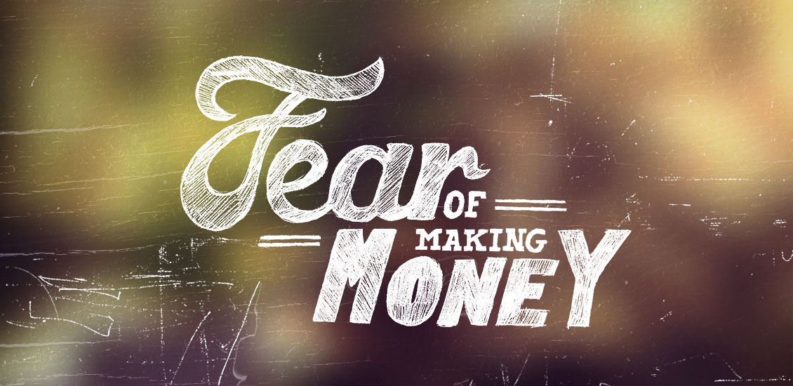
Fear of Making Money
This post was originally written on my personal blog Maker/Mistaker and I thought I should repost it here.
A while back I was having a conversation with a friend of mine Danielle Harper. We were discussing a lot of things that affect us as entrepreneurs. One of those was money. Danielle was describing a criticism she received but defended herself by saying, “and I didn’t even make any money on it.”
I stopped her right there because what she said made me realize something. She defended herself by reminding me that she didn’t make money. Why?
Check out her post on her blog about this very conversation.
So why did she resort to the “but I didn’t make money” defense? I notice this a lot with the people I surround myself with. Grown adults who grew up on punk rock that never quite fit into the system. The whole DIY movement is sort of a fuck-you to capitalism and corporate greed. There’s a certain badge of honor doing things yourself and trying to “stick it to the man.”
I’ll Just Do it Myself
In your teens and early twenties, you are filled with hope and determination. You have enough courage to start your own business and start making money doing your own thing. Maybe you tried to get a job but couldn’t and were like, “fuck it” I’ll just do it myself. Maybe you made an amazing product or had an brilliant idea nobody ever thought of before. Maybe you created something people admired and loved.
You knew you had to charge money for whatever it was, but you secretly hated that part of the business. You loved the creation. You loved the work. I can’t tell you how many times I’ve heard really talented artists say, “I can’t believe I get paid to do this shit.” As if their talents are somehow worthless and clients and customers are fools for paying them. How much more self-deprecating can you get?
Fear of Greed
The thing is, we seem to have this underlying fear of making money. Because what does money lead to? Does it lead to becoming that big fat greedy bastard we imagined when we were younger? Are we afraid of becoming the man? We don’t want to be seen by our peers as motivated by money. Being motivated by money is the ultimate evil, right? Well, that’s what we told ourselves.
Ever since I started Weapons of Mass Creation Fest, there have been many conversations about money. I heard from people who thought we were rolling in the dough with our $35 ticket price. I’ll be first to admit I was quick to defend myself with how broke we were and how much we sacrificed. “Hey look, we are doing this for the love of the music and art!” That was the truth, we did love it. We just needed enough money to cover our costs. And guess what we got? Just enough money to cover our costs. Danielle said the same about her businesses.
It can be scary imagining yourself earning money. Money is power. Having power can be scary because you’ve seen so many people abuse it. You’re scared of what you might do with that money and power.
Fear of Criticism
Why are we so afraid of making money? Is it because you can no longer be immune to criticism? You can’t fail if you’re not making money right? There’s an assumption if you’re doing anything related to music and art that any hint of commercialism taints the true intentions of the artist. An artist often does not want to be regarded as having compromised his artistic integrity to make a buck. Once you’re making a buck, you have customers. Customers who feel that you are now working for them and that they’re always right. You now opening yourself up to critique and criticisms and that can be hard to accept.
Altruism and Sacrifice
We all want to do good; to change the world. We all feel that we were granted some special ability to affect the world in our own unique way. We judge ourselves and each other by how much we sacrifice our own happiness to make others happy. Sacrifice is just another measuring stick to compare fellow humans with. Are you better if you sacrifice more for a greater good of the team or humanity?
Being selfless or altruistic is admired. It’s sometimes like a competition to see who can struggle the hardest and earn the least. Have you ever told someone a story of your hardship only to hear someone else one-up you? “You think you’ve got it bad, let me tell you!”
Change Your Perspective About Money
Sometimes we are afraid of other people feeling insecure around us. If we happen to become successful, we’re afraid it’s going to make our closest friends jealous and insecure and even hate us. Until we change our perspective on money we’re going to treat it like poison. Until we stop judging what others do with their money, we will forever be judged with what we do with ours.
- Categorized: Graphic Design
- Tagged: design, opinion, staff picks
Introducing our brand guidelines template
A few days ago, I mentioned at the bottom of an email campaign that we were working on a little something that would make delivering new brand assets to a client easier. Well, this is it.
Adding value to the brand you deliver
When you design a logo for a client, are you including a Brand Style Guide? You know, a document that tells the client how to use their new logo? If not, you should be. A well done Brand Style Guide provides tremendous value to your client and can earn you more money on logo design and branding projects.
It’s also a wonderful tool that, if respected, ensures that your client will respect that painfully crafted brand you’ve just sent him. Isn’t it frustrating to sometimes see that branding system of yours completely destroyed by a client that replaced that carefully chosen set of typefaces with Comic Sans?
But how do you know what goes into your Brand Style Guide? And designing it takes up a ton of extra time, so wouldn’t it be nice if someone like us did all the work for you so you just have to replace all the content with yours and be done with it? Yes, that’s what we did.
A simple, yet robust product
We simply set out to prepare a boilerplate version of our own brand style guidelines. We also took the time to look at various style guides released by big and small brands alike, to see how we could improve our own stuff.
We then threw all of that at our very own Chris Comella (the man behind the Freelance Survival Kit), and he created this great template. It will be the perfect starting point for a great, clean, and to the point presentation of your client’s new visual assets.
We’ve also included an example brand guidelines document, so you can see what the template can become. It’s based on Case Closed, a fake brand of handcrafted secure cases designed for our internal needs by our very own Carly Utegg.
The product itself comes in the shape of an InDesign template, and of a PDF example. The InDesign file includes 18 pages, from cover to cover. We chose InDesign because you can easily add or remove pages if your sections need to expand or contract. The template also includes notes by Chris and Jeff on each sections, and on how to make the most of each of them.
You should head over to the product page to learn more!
- Categorized: Go Media's Arsenal
- Tagged: arsenal, branding, project management, template