Articles by Month: September 2013
Roughing things up for a bit
What, yet another texture pack?
Well, yes and no. Remember Maarten Kleyne? He’s that awesome designer from the Netherlands. He’s created textures for us. We’ve already released three packs so far: the excluded rough grunge pack, the etched into dark pack, and the noisy under atmosphere pack. Well, the part of the story you don’t know yet about is that Maarten created more than these three packs. He created two full collections (but that’s another story).
Today, I’m happy to resume the release of these amazing textures Maarten crafted.
Introducing the rough surface grunge texture pack
The pack includes 15 textures. These feature noise, a bit of depth of field blur, scratches, and general grunginess.
What are they good for?
Well, remember the subtle film textures from a couple weeks ago? These are not like that. These are to obliterate stuff. Let me show you.
At the top, the original image. At the bottom, the result after overlaying a couple texture on the background, and pasting in some layer masks applied to the text.
Neat and efficient, isn’t it?
These are now available on the Arsenal! Have fun with these 15 textures, and don’t hesitate to share with us how you use them. You can tweet at me, at Go Media, or even post in the Arsenal Flickr pool.
Until next time, cheers!
- Categorized: Go Media's Arsenal
- Tagged: arsenal, Maarten Kleyne, textures
Happy Dog Illustration and Design Tutorial
A Local Cleveland Business Promotional Poster Design
Today’s tutorial comes from Weapons of Mass Creation 2013 designer and fellow Clevelander Lucy Williams. Lucy is a freelance illustrator and a recent graduate of the Cleveland Institute of Art. Follow her process as she designs a poster for local Cleveland favorite hangout, Happy Dog.
Tools and Technologies You’ll Need
Micron Pens
Clearprint Vellum Paper
Exacto Blade
Electric Eraser
Adobe Photoshop 5.5
Adobe InDesign 5.5
Scanner
Clear Your Mind and Your Workspace
I always start a new project with a clean workspace. It may not seem like an important step to mention, but I like to not only clear my head but also the space I work in. This allows me to breathe freely and get my creative juices flowing without outside clutter taking over my work area.
Reference and Inspiration
If you have good reference it usually means you’ll have a pretty good final product. I always try to do as much research as I can before I start on a project. This means gathering photos, information, and in this case actually visiting Happy Dog to take my own pictures.
Sketches, Ideas and Ideations
These are my original scanned images that were done on vellum paper with a fine tipped micron pen (my favorite materials to use). A lot of times I sketch out rough drawings that I don’t even end up using. Like the dog image here, I didn’t even end up using. I decided he was too literal and the image didn’t need him.
Draw and Scan
I wanted to have this poster pretty cluttered because the Happy Dog is full of cool old stuff, music, all walks of life, music, art and fun! After scanning my original images, I then separated each image and individually cleaned them up in Photoshop, saving each image out as a PNG file with no background.
Choosing the Right File Format
After scanning, cleaning up, and perfecting each individual image, I save them each as PNG files. I choose a PNG format because they have no background and can be easily positioned in InDesign without trouble.
Organization and Composition
When I got into InDesign I placed each image into my workspace and organized them. (Most designers might use Photoshop for this step – but I like InDesign better.) Keeping images separated allowed me to make adjustments as needed. When I was finished organizing – I saved the image out as a JPG and moved them into Photoshop.
This is what the no color version looked like in Photoshop:
Textures and Background
I am a huge fan of textured backgrounds. Mainly because I like making my work appear as if it could have been done completely tactile. You can scan textures into Photoshop or create textured brushes. I found this one on the Internet; it’s concrete. I flattened the image and did a little editing to soften it up. I then placed it behind my image to create a nice textured gritty look to my poster.
Color and Corrections
Coloring this poster was really fun! I knew I wanted a nice mixture between bright and subdued colors, so I went for bright pink and dull blue. In order to get the textured background on my colored image, I flattened the background and began to fill in the places I thought needed colored. In order to get different shades of pink, I brought the opacity down on my color swatches and used different tolerance levels to get the gritty look I wanted. Playing with different levels is also a good way to bring up the saturation of your colors. I also used the levels tool (command L) as a final step to get my colors just where I wanted them.
Color Tests:
Here is the final result!
Printed Digital Artwork!
Learn more about Lucy!
Lucy Williams | Lucy Williams Tumblr
| Lucy’s Happy Dog Project on Behance
Subscribe to the GoMediaZine newsletter
- Categorized: Photoshop, Tutorials, Web Design
Go Media Podcast – Episode 16: Recovering from WMC and Launching Drawn To Business
In this episode, Jeff and Bill get together to talk about how everyone’s been doing now that WMC Fest 4 is over. We also look forward to next year and what things need to change as Jeff’s vision continues to evolve. And shortly after WMC Fest, Bill launched his book: Drawn to Business. Since the launch, we’ve received some overwhelming feedback and talk about how we’re responding to some of the more negative comments.
Listen to the Podcast
[powerpress]
[iframe width=”100%” height=”166″ scrolling=”no” frameborder=”no” src=”https://w.soundcloud.com/player/?url=http%3A%2F%2Fapi.soundcloud.com%2Ftracks%2F112203189&auto_play=false&show_artwork=true&color=ff7700″]
Show Notes
Sponsor of this Episode
Cover art for this episode was also created by Simon Hartmann. He used Dustin Schmieding’s Dust Textures and Go Media Building Texture Collection. You can find textures like what he used at arsenal.gomedia.us. Credit Drew Rios for the photo.
Quick Tip: Form A Relationship With A Lawyer Before An Emergency
It’s inevitable that you’ll one day find yourself in a position where you need legal help to get out of a situation. It’s better to make the choice on which legal team to work with when you aren’t in need.
What Go Media Has Been Up To
- WMC Fest 4 is over. Lots of great memories. Did it change your life?
- Speaker videos will be released in bundles once we start getting them done. Videos are being put together by students at Virginia Marti.
- WMC Fest 5 is already in planning. Less bands and less stages is currently being discussed.
- Should WMC Fest be turned into it’s own non-profit business? Or does it require Go Media’s cashflow to continue to put it on?
- Bill’s Drawn to Business book was finally launched for a limited audience.
- One of the major issues we ran into is a “perception problem”. Many saw it as an e-book, so the price tag just didn’t make sense to most who left us feedback.
Links
- Weapons of Mass Creation Fest 4
- ‘Drawn to Business’ book by Bill Beachy
- Go Media Building Texture Collection
- Apparel Mockup Template Collection #1
- Dustin Schmieding’s Dust Textures
- Pete Maric’s Guide to Motion Design
- Go Media on Twitter
- Simon on Twitter
- “Good to Great” book
Credits
Hosts: Jeff Finley and Bill Beachy
Producer: Bryan Garvin
Recorded at: Go Media
Sponsorship Opportunities
Interested in sponsoring the Go Media podcast, either episodically or exclusively? Well, hit us up at [email protected] if you are interested in advertising your business, project, event, or portfolio.
What Do You Think?
We want to hear what you think about the latest episode of our podcast and what topics you would like to see covered in upcoming episodes. Comment below with your suggestions.
Join Us Live
This episode was recorded live on September 18th, 2013 at gomediazine.com/live. Next recording will be announced in the near future.
Ready for More?
Keep learning and listening to more Go Media podcasts!
- Categorized: Business Philosophy, Graphic Design, Video and Podcasts
- Tagged: podcast
Go Media + Design Cuts = training, freebies, and more!
Hey girls and lads, meet Design Cuts
Born and raised in London, England
Hello all, Simon here? I’d like to introduce you to a very skilled group of individuals we started working with. They’re called Design Cuts, and they come from across the pond.
As you can see above, the main page of the site prominently features a (sweet) video and a signup form. Let me share some more about what you’ll find after adding your address in the form.
An event!
Indeed! We’re part of a great, ten day long event, full of free stuff and of tutorials. And it starts today! Wait, did I just say, free stuff?
Freebies!
Heck yeah, that’s right! As soon as you confirm the signup on the main page, you’ll get access to the page below. It lists the tutorials that are available, and also allows you to download the corresponding freebies.
Training!
The first tutorial has been written by Chris Spooner (of Spoon Graphics fame). It’s a neat little piece, that will walk you through the various steps needed to obtain a retro type effect. It covers everything you could need to do so, from shading, layering, to aging. The associated freebies, that are integral to the tutorial, could also easily get a second life in your own projects. And you’ll already know exactly how to use them!
But let’s talk about that second tutorial a bit more, shall we?
The most observant from you have recognized the vibe here: the 1980s. Well, using a generous amount of freebies from our 80s pack, you’ll learn how to recreate one of these sweet looking ads for Atari (or any other electronic devices from the era, really), down to the neon colors and starry skies.
The tutorial is full of little tips and tricks, so you’ll learn something even if you’re a seasoned professional.
And, and don’t forget: freebies! 3d grids, cassette tape, Rubik’s cube…
General greatness!
As the title of the post can let you guess, that’s not it.Maybe Design Cuts’ twitter handle will give you a clue? You should give them a follow at @DesignCutsDeals.
We can’t wait to share more about what’s next. Stay tuned in the next weeks for additional awesomeness coming your way, courtesy of the Arsenal and Design Cuts!
— Simon, the Arsenal Manager, and Tom Ross for Design Cuts
- Categorized: Go Media's Arsenal
- Tagged: arsenal, deal, Design Cuts, freebies, tutorial
What’s Go Media Been Up To?
Hello from your friends at Go Media!
What’s Go Media been up to? Oh, just a little thing called Weapons of Mass Creation Fest…
Phew!
Don’t get us wrong, we loved every second of dreaming, planning, living and breathing the best fest in the Midwest, but, wow have our lives have been changed and we could use a breather!
Drawn to Business
We are thrilled to announce the release of our own Bill Beachy’s book, Drawn to Business. This, a nuts and bolts strategy guide to building a thriving design firm, Drawn to Business gives you a no holds barred, transparent look at how Go Media and other top firms built their business from the ground up. Bill shares with all of us his failures and successes and gives detailed advice on areas such as pricing and billing, hiring, accounting and lawyers, business sytems, marketing, selling and customer retention, so that you too can build the design firm of your dreams. Buy the digital edition now!
The Little Building that Could
Our building is still undergoing some pretty dramatic renovations! The latest and greatest is that some huge gaping holes have turned into some beautiful windows.
Now let’s see…
What The Team Has Been Up To:
Aaron Roberts
- Finished the following projects: the 2013 NEOSA CIO Symposium program booklet, invitations & signage, Branding & Website for Ditka Dash
- Finishing up the following projects: Cantine Bar & Bottle Shop, Website, Branding & Website for Law Firm Ghost Writer
- Starting Website designs for OH! Manufacturing
Bryan Garvin
- Put out Episode 13, Episode 14, and Episode 15 of the podcast and prepped for our post-fest live recording on Wednesday, September 18th, 2013.
- Launched Corporate Narratives Group, Ditka Dash, NEOMFA, Midwest Box Company.
- Worked with Simon, Bill, and Jeff to build and launch Drawn to Business.
- Volunteered at WMC Fest.
Carly Utegg
- Lots of typography: Creating custom typography for Go Media Ad, creating custom logo type for brand Rich Wonder.
- Designing Website for Law Firm Ghost Writer
- Working on direct mail piece for COSE
- Getting the amazing Go Media bowling team assembled =)
Heather Sakai
- Served as volunteer coordinator for Weapons of Mass Creation Fest
- Blogged, managed Zine posts by my colleagues here at Go Media as well as some great guest contributors
- Prepped templates for this month’s Mockup Everything releases
- Updating Go Media Facebook, the Go Media Arsenal Facebook, Go Media Instagram, Go Media Google +, and the Go Media Twitter pages
Jeff Finley
- Working on the Drawn to Business Pro Package
- A Go Media Partner Retreat with Wilson and Bill
- Gathering photos, videos and articles from WMC Fest
Kim Finley
- Arsenal customer service
- Bookkeeping
- Payroll
- Proofreading GoMediaZine posts and email campaigns
- Counting up leftover WMC merch and updating inventory on merch site (limited quantities remain, order yours today!)
- Web hosting billing
Lauren Prebel
- Sandra has dug right into her new position and is mastering both Sales and the Project Management process
- Continuing to network and prospect for new leads!
- Starting to prepare for the COSE Small Business Convention in October
Sarah Traxler
- It’s been a fun change to pace to spend some time researching and writing for my upcoming Zine article.
- Volunteering all weekend at WMC Fest was an even more fun change of pace!
- On the project management front, the team and I have been knee deep in the following activities:
- New Project Planning for:
- OH!Manufacturing – Website Design
- Young Audiences – Website Design
- Cantine – Website Design
- Live on a Limb – Rebranding & T-Shirt Design
Ongoing Support for our active projects:
- COSE – CIO Symposium Print Design
- Law Firm Ghost Writer – Rebranding & Website Design
- Ditka Dash – Branding & Website Design
- Urban Pioneer Tea – Website Design
- FMC – Website Design
- Cuff & Veil – Website Design
Website Launches
Continually Improving!
- We’re working to implement ‘Lessons Learned’ meetings at the completion of our projects, so that we can better capture valuable insights and learn from what worked and what didn’t.
Simon Birky Hartmann
- I finally launched the second part to Steve Knerem’s rockabilly poster tutorial
- Heather and I worked hard at creating the Go Media Building Texture collection, that we released as a freebie for the best part of August. We got over two thousand downloads in a month! I’ve also created a couple of tutorials to demonstrate the textures’ potential (a written one, and my first video tutorial)
- I organized a contest to celebrate WMC Fest, along with the release of the 2013 WMC Fest bundle
- I spent some time working on various WMC Fest related tasks
- I thoroughly enjoyed my experience at the Fest!
- We crunched a lot of hours of frantic work to launch Bill’s Drawn to Business guide (I’ve helped in strategy, and for the cover design)
- And there were also the usual suspects: product preparation, email blast writing, customer support and feedback, etc.
September
- We’ve spent more frantic hours towards Bill’s guide launch, and it paid off: Drawn to Business is now available for purchase!
- I relaunched the first of our apparel mockup templates collections, with updated content
- I’ve launched Dustin Schmieding’s amazing film textures set
- And finally, Pete Maric’s Guide to 3d modeling and motion design for the graphic designer got also pushed live!
Wilson Revehl
- Gone fishing! Partner Retreat with Jeff and Bill…among my other Project Management, Account Services and System Administration work that keeps us on track and online.
William Beachy
- Launching my book, Drawn to Business.
- Partner retreat with Jeff and Wilson!
- Playing catch up now that my book is out. Working on Go Media Sell Sheets, etc.
- De-cluttering the office
_______________________________________
That’s it for now from us at Go Media. Until we meet again:
- Grab Bill’s Book, Drawn to Business, a nuts and bolts strategy guide to building a thriving design firm!
- Don’t miss a minute of Go Media’s happenings! Subscribe to our GoMediaZine newsletter!
- Keep up with Go Media on:
We’d like to say “thank you” to Square Share studios for the photography provided for our header image!
- Categorized: Go Media, News
- Tagged: behind the scenes, staff
The Forsaken, a Video Game Concept
So as my experience at Go Media draws to a conclusion, I was given this final task to write my own GoMediaZine article, something as a sort of memento. There was one thing I knew I could discuss with confidence, and even though it doesn’t have much to do with design, the process isn’t too different, and it takes just as much determination; writing a story.
Forsaken
See, I may be a student of Graphic Design, but my life goal is to become a Game Designer (or at least a Concept Artist at a development company). As much as I love drawing, I love to tell stories. I’m also a huge gamer; I’ve been holding a controller for the same amount of time as I’ve been holding a pencil. For a while now, I’ve been creating my own story that I would love to see on the TV/PC screen, and I’m putting in as much time as I can on it. Its working title is called “Forsaken”, and it’s a pretty dark game… imagine Okami, except with more black (don’t know what Okami is? Look it up; you won’t be disappointed).
The Story
The story occurs during a time of darkness and despair. Life in this world consists of three main races: the Higher, a race of god-like birds that reside in the world of clouds above, the Sky. On the surface, the Higher are considered divine beings, deities that have ultimate power. Then there’s the Men; basically, the human race. However, they do not look like us in this world. Males are much more primitive looking, while females look a bit more “elf-ish”. Most Men live their lives as servants to the Higher. And lastly, there is the race of tribal felines known as the Forsaken. The Forsaken are hated by both Higher AND Men alike, being looked upon as mindless, bloodthirsty beasts. However, under the rule of their king, they live a life of tolerance and peace, wishing no ill-will on either race.
Magic, otherwise known as Hidden Powers in this story, is the main source of power in this world. Two types in particular, known by many in this new world as the original sources of magic, control all aspects of life; Benevolence (pure light) and Malevolence (darkness). Each one balances each other out, creating order and stability in an otherwise unstable era. The Higher are naturally gifted creatures, being able to perform Hidden Powers as soon as they are born. The Men and Forsaken are not so lucky, as they are forced to learn it on their own, sometimes taking years to master. Even more unlucky for them is the fact that the Higher gods have forbidden the study of Hidden Powers for either race, to prevent acts of rebellion. That did not stop most Men, however, and pretty much the entire Forsaken race have learned it (the Higher see so little of the Forsaken as a threat that they really do not care to mettle with them).
There are many types of powers that the player can learn, like launching explosive fireballs, becoming encased in an indestructible metal shell, summoning acidic rain storms, blasting through multiple enemies as a raging lightning bolt, and even calling forth a deity of pure light that eradicates enemies depending on how much dark energy they’re composed of.
You play as the King of the Higher, a monstrous-looking horned eagle named Amqueela. Amqueela’s a bit of a brute; his natural Hidden Power is Darkness, after all. He constantly performed suspicious, malicious acts that arose the attention of the Higher gods. After a meeting with a dark sorcerer of shadows, only known as the Foul Priest, in an attempt to acquire so much power that he himself could become a god, his birth-right as a Higher King was stripped from him, and he was banished from the Sky as punishment. In an act of desperation, Amqueela approached the Priest, one of his own former slaves, to ask for help. However, the Priest steals the Higher King’s soul, his “Wretched Bane”, forcing him to turn into a Forsaken, specifically a white panther.
Your journey as Amqueela is to take back your soul from the Foul Priest and reaffirm your place as king. That’s the MAIN story, anyway… this story is set to have multiple arches and side-stories, as well as alternate endings that will take your breath away. I don’t plan on making this easy for players, as I want this game to be a challenge (something I hardly see in most games nowadays), so when they reach a new segment of the story, it will reward them in a way that will convince them to keep pushing on to find out what happens next, or to play with a new power they may have discovered.
You’ll meet all sorts of strange characters along the way, both friendly and hostile, such as a six-tailed demoness fox, a militant falcon on a quest for retribution, a pair of insane puppet jesters that haunt a forest of gold, and a female warrior with the talent to bend pure Benevolent light that is revealed to be the sister of the Foul Priest. They’re all sure to leave an impression thanks in part to their eccentric personalities and bewildering back-stories.
What I’ve Learned
One thing that I’ve slowly started to understand while writing this story (as well as my previous story before “Forsaken”) is that things happen overtime; you slowly build up something, like a story, a drawing, or a talent, you’ll soon see it become an entity. Forsaken was the result of an entire year of non-stop formulating, sketching, typing, and headaches, and it’s still got a ways to go. Through it all, you just don’t stop doing it, and tell people about it. That’s it. It’s just like the world of design; ya gotta invite people into your head if you want ’em to stick around for more. If you’ve discovered a new universe in your head, why try and hide your discovery for yourself? Reveal it to the world! Let people know what you’ve found out about this fascinating new world; who dwells there, what its climate is, how’s the ecosystem, is there a superior race in this world, do they have a functioning society, or is society merely a figment of the imagination and anarchist rebellion is law? TELL US.
Welp, I suppose that this would be a good stopping point. I don’t wanna give out too much about my story yet. Thank you for taking the time to read my lengthy story. But hey, wasn’t it worth it? It’ll be that way with my game too, which you should totally buy when it comes out in I-don’t-know-how-many years. For now, go ahead and browse through my entire collection of concept art for Forsaken. Thanks again!
Subscribe to the GoMediaZine newsletter
- Categorized: Graphic Design
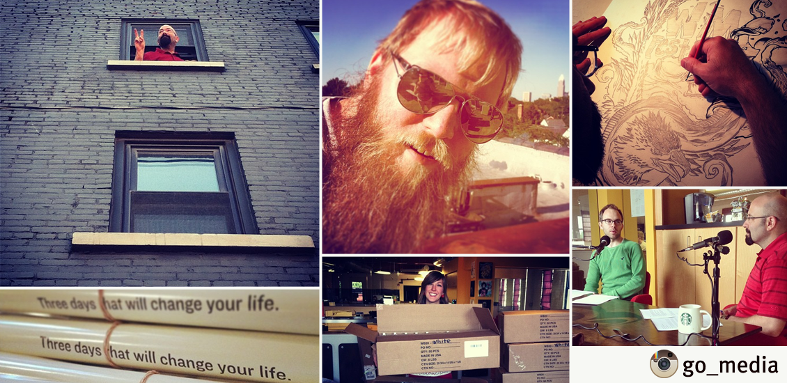
20 Designers You Should Follow on Instagram
Hello from @Go_Media
Here at our buzzing Ohio City design headquarters, we love giving you a look inside Go Media, all thanks to Instagram! Thanks to this app, we also love taking a peek into the lives and work of the designers we so admire and adore. So, we thought we’d share with you our favorite designers to follow on Instagram.
Our picks:
@austinkleon
Austin Kleon: “I’m a writer who draws.” | Austin, TX
@nopattern
Chuck Anderson: visual artist/designer | Chicago, IL
@mikeperrystudio
Mike Perry, Designer and Artist |Brooklyn, NY
@dana_tanamachi
Dana Tanamachi, designer and letterer | Brooklyn, NY
@justinmaller
Justin Maller, Illustrator and Art Director | Australia
@joncontino
Jon Contino, artist and designer | New York, NY
@andreirobu
Andrei Robu, Designer, Letterer, Artist | Bucharest, Romania
@katebingburt
Kate Bingaman-Burt, Visual Artist, Illustrator | Portland, OR
@darrenbooth
Darren Booth, Illustrator and Letterer | Canada
@signalnoise
James White, Artist, Designer, Speaker |
Dartmouth, Nova Scotia, Canada
@tadcarpenter
Tad Carpenter, Illustrator and Designer | Kansas City, MO
@willbryantplz
Will Bryant, Graphic Designer, Studio Artist | Portland, OR
@erikmarinovich
Erik Marinovich, Letterer, Designer | San Francisco, CA
@dailydishonesty
Lauren Hom, Graphic Designer and Illustrator | New York, NY
@chrisrushing
Chris Rushing, Art Director and Designer | New York, NY
@alepaul
Ale Paul, Art Director, Founder of Sudtipos | Buenos Aires, Argentina
@seanwes
Sean Wes, Hand Letterer and Typographer | San Antonio, TX
@maztrone
Maztrone, Graphic Designer | France
@zacharysmithh
Zachary Smith, Typographer, Illustrator, Designer | New Smyrna Beach, FL
@pingszoo
Ping Zhu, Illustrator | London, England
Who did we miss? Leave their name in the comment below!
Subscribe to the GoMediaZine newsletter
- Categorized: Graphic Design
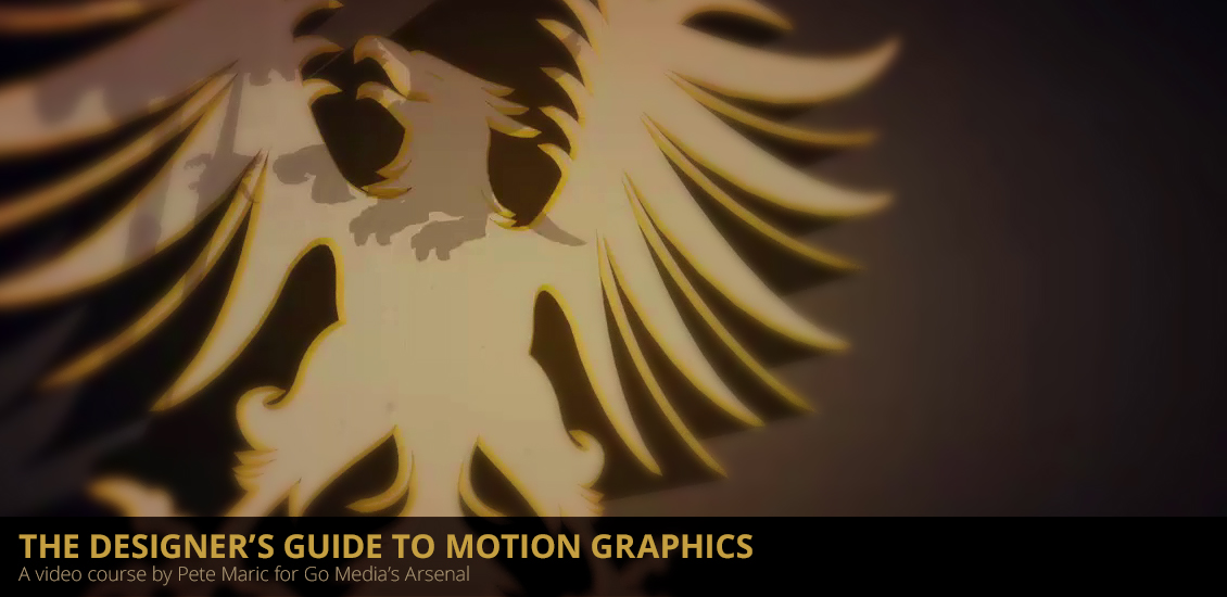
Introducing the Graphic Designer’s Guide to Motion Graphics
And now, for something completely different
If I recap the latest Arsenal releases, we have things ranging from mockup templates, vector packs, to texture sets. Which is, don’t get me wrong, great. Today, I have a different product to put in your eager hands. Behold, the Graphic Designer’s Guide to Motion Graphics (A video course by Pete Maric).
Why this video class?
We have a great number of video tutorials already on the Arsenal. They cover Photoshop and Illustrator quite in depth, either through the vintage art approach from Jeff’s Beauty is a black hole Wacom illustration tutorial, or through the clean and detailed approach from Bill’s 100 series about vector illustration. One of the types of work we’ve only scratched the surface of so far is 3d modeling and motion graphics.
Well, the wait is over. We’ve enlisted an amazing contributor in Pete Maric (the brain behind Triplet 3d) to create a tutorial that would start from some of the Arsenal vectors most of you are already familiar with, and shows you how to create this kind of end result:
Exciting, right? In case the video isn’t loading, head straight to Vimeo.
Let’s have a look at what Pete is covering
- Planning your work with story boards
- Setting up vector artwork for import into Cinema 4D
- Creating 3D geometry based on vector paths
- Materials and setting selections
- Animation techniques using manual keyframing, MoGraph cloners, and splines
- Adjusting animation parameters using Cinema 4D’s timeline
- Three-point light set-up
- Render settings
- Post-production techniques in After Effects
- Sound Design using Garage Band (obviously Mac only, sorry Windows users – but there are Windows alternatives)
You can also read the full table of contents. It basically gives you the keys to understand the basics of 3d modeling and of motion graphics to animate simple elements, using various techniques. The demo video is obviously a combination of everything that’s covered, but you can do simpler, shorter, longer, more complex, etc.
There’s more!
In order to help the people (like me) that are a bit scared by the Cinema 4D interface, he did a “Cinema 4D 101” kind of series on his blog. It’s pretty great, and well detailed. There are eight posts in the series so far. I now officially don’t have any more excuses to not learn it. And neither do you!
Where can you get it?
On the Arsenal, of course!
- Categorized: Go Media's Arsenal
- Tagged: 3D, 3D modeling, AE, After Effects, C4D, Cinema 4D, Illustrator, motion graphics, tutorial, video tutorial
GoMP016 Live Recording: Wednesday Morning at 11:30 ET
Join us on Wednesday, September 18th, 2013 as we sit down to talk about the general atmosphere after WMC Fest 4 and the launch of Bill’s Book: Drawn To Business.
Live chat and audio feed available at http://gomediazine.com/live starting at 11:30am ET this Wednesday. If you post a question in the live chat, we’ll read and respond to it during the recording.
Examples of Simple & Elegant Logo Designs
There are so many different design decisions that you can make when creating a logo that – at first – it can be a little overwhelming. Do you want something attention grabbing, colourful and brash? Do you follow the long shadow trend, or will that appear tired and overused in 6 months time? Do you go for something understated and that looks good in black and white? There are countless directions that you can go in, but my personal favourite is a logo that’s simple, clean and has a tiny hint of the brand’s personality behind it.
Designing a simple logo is actually remarkably difficult. Usually minimalist and uncluttered designs have had the same amount of work go into them as complex ones, and in many cases – even more time and effort. As Mark Zuckerberg famously said – the trick isn’t adding stuff, it’s taking away.
I wanted to bring together some examples of fresh, interesting and remarkably simple logo designs that have all been crafted with care. Hopefully this collection will give you some inspiration for your next logo project, and if you know of any other examples that should be added to this list – I’d love to hear about them in the comments.
Source: http://dribbble.com/shots/1218043-LILY-logo-design
Source: http://dribbble.com/shots/1194136-High-Risk-Giant
Source: http://dribbble.com/shots/598263-Stamp-it
Source: http://dribbble.com/shots/1214335-Fuel-Logo
Source: http://dribbble.com/shots/1128461-Semotic
Source: http://dribbble.com/shots/1184092-BigRebel-Variation
Source: http://dribbble.com/shots/1196705-Law-Office-Logo
Source: http://dribbble.com/shots/1187142-Localove
Source: http://dribbble.com/shots/1137999-anchor-travel-logo
Source: http://dribbble.com/shots/1175308-Kelly-Longorialogo-mark
Source: http://dribbble.com/shots/1091075-Juicy-Typographic-Logo-Design
Source: http://dribbble.com/shots/563707-brand-icon
Source: http://dribbble.com/shots/242424-Sixbase-Logo-proposal
Source: http://dribbble.com/shots/1193085-Rallypoint-Logo
Source: http://dribbble.com/shots/1175954-Koda
Source: http://dribbble.com/shots/1168696-Kara-Mark
Source: http://dribbble.com/shots/1211829-Level-Up
Source: http://dribbble.com/shots/1115898-Hudddle-Logo-hudddle-co-uk
Source: http://dribbble.com/shots/1195050-Personal-Branding-Minimalist-Redesign
Source: http://dribbble.com/shots/1200377-Simple-sign
If there are any elegant, clean and simple designs that you’d like to share, I’d love to hear about them in the comments!
Dan writes for gift experts The Handpicked Collection. Outside of work, he enjoys studying graphic and web design and is learning to code.
- Categorized: Design Community, Graphic Design Inspiration, Web Roundup
- Tagged: design, design tip, Flickr pool showcase, inspiration, logo, logo design
Melany Lane Script Font (full family) – only $17!
Today’s Mighty Deal
They say artists pour their hearts into their work. Same with writers. Well in the case of the Melany Lane font, Yellow Design Studio’s done both.
A beautifully fun and quirky font, Melany Lane is a pure delight to use and read. It elicits a feel-good, homey type of emotion that’s just full of flourish. And because we’re in such a good mood, you can not only get a good deal on Melany Lane, we’re offering a huge discount on the entire font family.
You can get the entire Melany Lane Font Family (that’s 5 robust sets) for 65% off! Seriously, by now there is no reason for you not to be smiling.
Melany Lane Font Family Highlights:
- 5 Font Sets
With this Mighty Deal, you’re not just getting the wonderful Melany Lane font. No, you’re getting the entire family! (Hope you cooked enough dinner for everyone!) Included in this bundle are: Melany Lane, Melany Lane Bold, Melany Lane Ornaments, Melany Lane Ornaments Bold, and Melany Lane Patterns. - Fun, Hand-Drawn Script
Melany Lane isn’t just another font. It’s your friend. It’s your buddy. It’s a hand-drawn script typeface that is just overflowing with fun, flourish and quirkiness. It’s almost impossible to look at Melany Lane without getting a smile on your face. - Go Extra Funky
The base character set for Melany Lane has your traditionally connected letters, but contextual alternates add some extra flair with their unconnected letters and additional contour options. - 1300+ Glyphs
Your purchase of this Mighty Deal gets you over 1300 glyphs and 364 ligatures in the Melany Lane font family, all of which can be used to create a variety of fascinating letter combinations, as well as handling any overlapping letter pairs. - 100+ Ornaments and Background Patterns
Fonts are so much more than just letters, aren’t they? With Melany Lane, you’ll get 118 eclectic ornaments and 14 seamless background patterns to spice up whatever project you’re working on. - Great for Print or Online
Melany Lane is the perfect font for your projects based online or offline. Use them to create a variety of professional images for websites, photographs, movie credits, T-shirts, posters, mousepads and so much more. - 25+ Different Languages
Available in both Desktop and Webfonts versions, Melany Lane supports dozens of different languages. Compatible on both Windows and Mac machines, the Desktop version arrives in .OTF format and supports: Afrikaans, Albanian, Basque, Bemba, Bosnian, Cornish, Croatian, Czech, Danish, Dutch, English, Estonian, Faroese, Filipino, Finnish, French, Galician, Ganda, German, Greek, Hungarian, Icelandic, Indonesian, Irish, Italian, Kinyarwanda, Luo, Malagasy, Malay, Manx, Morisyen, North Ndebele, Norwegian Bokmål, Norwegian Nynorsk, Nyankole, Oromo, Polish, Portuguese, Romansh, Sango, Shona, Slovak, Slovenian, Somali, Spanish, Swahili, Swedish, Swiss German, and Zulu. - Webfonts Available
Melany Lane is also available as Webfonts and are delivered in .EOT, .SVG, .TTF, and .WOFF file formats. Note: The Webfonts version does not include any opentype features or alternate letters. They support the standard Western languages including: Afrikaans, Albanian, Basque, Bemba, Cornish, Danish, Dutch, English, Faroese, Filipino, French, Galician, Ganda, German, Greek, Icelandic, Indonesian, Irish, Italian, Kinyarwanda, Luo, Malagasy, Malay, Manx, Morisyen, North Ndebele, Norwegian Bokmål, Norwegian Nynorsk, Nyankole, Oromo, Portuguese, Romansh, Sango, Shona, Somali, Spanish, Swahili, Swedish, Swiss German, and Zulu.
Pricing:
Melany Lane normally sells for $49 (for either the Desktop or Web Font), but for a limited time only, you can get either the Desktop or Web Font version of the entire Melany Lane font family for just $17! That’s a 65% savings! OR get both the Desktop and Web Font versions together for just $25!
Click the BUY NOW button to choose your preferred version and take a walk down Melany Lane to add some quirky fun to your next project!
Deal terms:
- Delivered as an instant download after completing your purchase.
- To use the opentype features, you will need an opentype friendly application, such as InDesign, Illustrator or Quark, where you can access the glyphs palette for all 1300+ glyphs. You can also use a third pary application such as PopChar for this.
- The Web fonts do not include any opentype features or the complete set of accented characters that the desktop fonts include. They DO include the basic Western language character set. Webfonts are subsetted to reduce file size and support the standard Western languages including: Afrikaans, Albanian, Basque, Bemba, Cornish, Danish, Dutch, English, Faroese, Filipino, French, Galician, Ganda, German, Greek, Icelandic, Indonesian, Irish, Italian, Kinyarwanda, Luo, Malagasy, Malay, Manx, Morisyen, North Ndebele, Norwegian Bokmål, Norwegian Nynorsk, Nyankole, Oromo, Portuguese, Romansh, Sango, Shona, Somali, Spanish, Swahili, Swedish, Swiss German, Zulu.
- The Desktop font files are in .otf format and work on both Windows and Mac.
- The Web fonts are delivered in .eot, .svg, .ttf and .woff formats.
- Licensed for one user only. You may choose multiple licenses in the shopping cart.
- May be used for personal or commercial projects.
- Desktop fonts may use the fonts to create images on any surface such as computer screens, paper, web pages, photographs, movie credits, printed material, T-shirts, and other surfaces where the image is a fixed size.
- Desktop fonts may be used to create EPS files or other scalable drawings provided that such files are only used by the household or company licensing the font.
- Desktop fonts may use the font to create an EPS file, such as a logo, which may be delivered to a client, provided that the font is converted to outlines and no longer editable.
- Licenses allow usage in static images in mobile apps (jpegs, png, etc) but do not include mobile app embedding. If a mobile app license is required, please contact the vendor.
- Categorized: Go Media, News
- Tagged: design, typography
Inspired by Weapons of Mass Creation Festival
Weapons of Mass Creation Festival
… left us all inspired. We asked you, our readers, to submit art created as a result of your experiences at the Fest. Check out the submissions from these talented folks and submit your own to Heather at [email protected] to be featured in future Go Media Facebook and Instagram posts!
Vaughn Fender
Vaughn Fender’s Tumblr | Twitter
Mary Fran Wiley
Mary Fran is a web designer at Orbit Media
| Chronic Positivity Project | Twitter | Facebook | Google+ | Dribble
Josh LaFayette
Josh LaFayette | Twitter | Blog | Instagram | Tumblr
James Graves
James | Freelance | Free Resource Blog | Dribble | Facebook
Una Kravets
Ian Baldwin
Ian Baldwin | Facebook | Twitter | Instagram
Chris Schneider
Lenny Terenzi
Hey Monkey! Custom Design | Twitter | Tumblr | Instagram | Dribble
Sarah Schmidt
Christine McCloskey
- Categorized: Graphic Design
- Tagged: cleveland, Weapons of Mass Creation, wmc fest
How to Design an Iconic and Memorable Band Logo
My new (pop punk) band Campfire Conspiracy was gearing up to play our first show and I had two weeks to finally come up with a logo and get it stenciled or painted onto our bass drum. We had a demo coming out in only one week and we still didn’t have a logo. I’d been putting it off, but now was the time. I needed to have something before we finally went live.
Side note: Check out my other tutorial on designing custom die-cut stickers.
What followed was actually a very interesting logo design process that started from absolute scratch. I had zero idea of what I wanted our logo to look like. Should it be a campfire with some grunginess to it to show that we’re a punk band? I didn’t have an answer. I thought about it for weeks, but nothing inspired me so I went to Twitter and Facebook.
But first, here is the final logo I ended up with.
Process Documentary
If you don’t want to read the post, you can always watch this awesome video made by my friend Keith at Jakprints.
Step 0: Research (Ask Facebook)
I got a reply from a fellow designer Jason Carne who suggested something minimal and occult. I was immediately drawn to this idea and when he sent me an example, I knew this was it. He even drew up a quick sketch of a campfire with a book and a tent and said, “something like this.” Hell yeah.
Ok, I was inspired. I knew I wanted something minimal and occult; but bands with logos like that tend to be metal, right? We were pop punk, how do I communicate that?
I didn’t know much about occult symbolism, hieroglyphics, sigils, alchemy, runes or anything. I went Googling and came up with all kinds of cool stuff. I started making a Pinterest board to archive my inspirations. I searched Pinterest and found even more cool images. I even looked at books referencing occult symbolism, conspiracies, the Illuminati, the Freemasons, etc.
I realized I was deep in the rabbit hole once I got to Aleister Crowley, sacred geometry, and mysticism. I even received messages from people on Facebook telling me to be careful with what I research, I might disturb something in the ether! Ok enough research, time to make something cool!
Step 1: Sketching
I had boards and boards of inspiration and I knew enough to just start drawing. I spent a few hours at a coffee shop sketching and sketching. Drawing symbol after symbol until my hands were too cramped up to go any further.
I stared at my sketches and nothing was sticking out. I was paralyzed with doubt and fear about how this symbol might be perceived. Was it clear enough? Was it too obscure? Or not obscure enough? Are people going to think we’re devil worshipers? Haha. (My Mom even expressed concern for me).
Since I couldn’t decide, I went to social media again. I posted my sketches to get some feedback, and boy did I get it. Designers and non-designers alike were offering their two cents. They tried to tell me which one they preferred and it was clear that a few different sketches were standing out. I understood what was getting a reaction out of people and this is where I decided to take the next step and go into the computer and work on cleaner vector versions.
Step 2: Refinement
I took the basic concept and worked on multiple permutations from overly detailed to extremely minimal. How much could I get away with? If I took away too many elements, did it still communicate Campfire Conspiracy clearly? Do I even need to be literal at all? I wasn’t sure. I couldn’t decide for myself. I had such a good response from posting my sketches online so I decide to post my refinements online as well. This time I made it easier for people to tell me which ones they preferred by labeling each one.
Designers’ Tip: Creating this logo was not technically hard from an execution standpoint. It’s all just one uniform stroke weight with basic circles, lines, and squares with nice alignment and symmetry. I never used the pen tool once. However, I did make sure my angles were geometrically sound. Meaning sums of 30, 60, 90, etc. Or all evenly divisible by 360. The fire was created using the Zig Zag effect under “Distort & Transform.”
I posted this to Facebook, Instagram, Twitter, and Dribbble. And after a day of feedback I tallied up the results. Over 130 votes in all and there were a few clear winners. People preferred the symbol inside a shape – whether it was a square, diamond, or circle, it didn’t seem to matter. Curiously, the more detailed it was, the more people liked it. Which went against my intuition for a logo – it felt more like a badge at that point. But still, it was very simple and iconic and not overly illustrious.
Step 3: More Refinement
So I took the clear winners from that round and posted ONE final round. I gathered the top five concepts and put them up online and people were more than happy to provide their opinion. Each of these concepts were very similar, but there emerged one clear winner. The logo with the circle around it was definitely the most popular one. And I agreed.
The Final Logo and Beyond
I went back into Illustrator knowing exactly what I needed to do. This was an amazing feeling knowing that I was working on the right logo and wasn’t guessing. Sure, putting your logo design out there for fan feedback isn’t always the best idea but I think it worked here. I was curious along with my audience. I loved having them give a hand in the process.
I made a few refinements to the symmetry and balance of the logo and voila, I was done. I added a roughen filter to give it a slightly grungy look which fit with our band. It’s so subtle you barely notice it.
Concerns
I had some doubts about the logo being too metal or dark when we play catchy pop punk songs like early Blink-182. I asked Adam Garcia, the designer who worked on the alternative hip hop artist Astronautalis (both are appearing at WMC Fest 2013) – who happened to develop some occult looking symbolism for him. He said it doesn’t matter if it crosses or bends genre stereotypes. People are too stuck into “this is what hip hop is supposed to look like” – you know, with graffiti, bling letters, or this and that. Just do whatever the fuck you want he said. That’s some advice I can get behind!
So I didn’t worry about it anymore after that. In fact, as long as I stood away from making it too black and white and made sure to use some color, I think it would steer clear from an obvious metal perception. The truth is, nobody cares about my band anyway, so does it even matter? Just do whatever the fuck* you want.
Expletives are for emphasis. Seriously, I mean it.
The Logo Makes its Live Debut!
Once the logo was designed, I literally had two days before our first show and needed to replace the bass drum head that still had the old band’s logo on it. We spray painted it black and when it dried I got some acrylic paint and a brush and went to town. I thought it would be a piece of cake painting the symbol onto the drum head. It was harder than I thought it would be!
I took a black marker after the white paint dried and touched up the sloppy edges. In the end it came out slightly imperfect, but that was ok. To me it still felt authentic and true to the cult-like idea of the logo. If a regular person (not a trained artist) was recreating this logo, it would never be perfect.
DIY Music Video
Shirts and Hoodies!
The fine folks at Jakprints demonstrated their one color silk screen t-shirts by printing this logo onto some shirts and hoodies. Here are some pics!
Sticker Time!
I sent the designs off to Sticker Robot and was hoping I could get some custom die cut stickers made. I didn’t want just one sticker on a sheet, I wanted four. In a diamond shape! So I set up my design file with how I wanted my stickers arranged. They ended up giving me feedback on my bleeds and after a few adjustments I got the spacing worked out just right. That’s how cool these Sticker Robot people are, I didn’t know how to set up my file and they were willing to help me out to make my dream come true. Awesome.
Stenciling!
I sent off the design to Jeff Nemecek at Purebuttons/Standout Stickers and he used a robotic laser cutter to make a couple stencils for us. Now the trick to making a stencil work from your logo is putting in the “bridges.” It’s kind of hard to explain, but this tutorial on Abduzeedo does it so much better.
Wrap up
A cult symbol should be intentionally easy to create but hard to forget. Something people could easily draw themselves to communicate that they were part of the cult. While our band certainly doesn’t have a cult following (yet!) it was extremely fun to experiment with something like this and equally cool printing up some band merch. I learned a lot about occult symbolism, storytelling, and not giving a fuck. I think this project was a success. I hope you can learn from it!
Connect with us:
Subscribe to the GoMediaZine newsletter
- Categorized: Illustrator, Tutorials
- Tagged: Adobe Illustrator, campfire conspiracy, jakprints, logo, occult, sketching, stencils, sticker robot, symbol, tutorial, vector
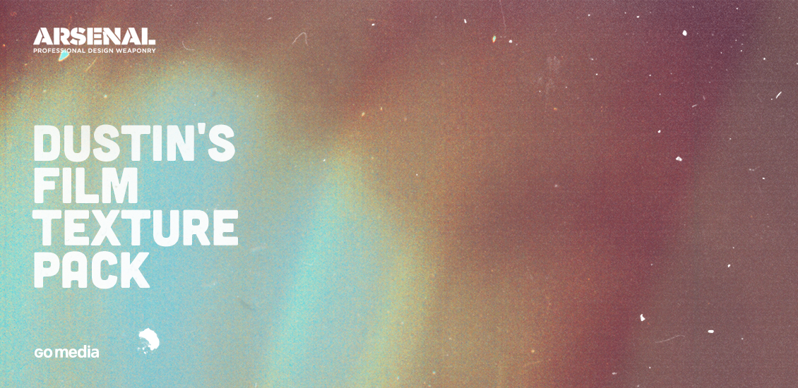
Dust, speckles, and noise
Finally!
Hello all, Simon here. The product we’re launching today is something I’ve been wanting to launch for a LONG while. Behold, Dustin’s film textures pack!
A bit of background
Why am I excited? Well, since we’ve (finally?) passed the extreme grunge trend, resources for subtle worn effects are what’s awesome. Believe it or not, quality ones are not always easy to find. Anyways. One of the ways to get some subtle grunge effects is to use these film textures. They will bring you three things at once:
- grain, from the film itself (100% analog awesomeness)
- dust, because we love anything that will make that clean, digital feel disappear
- speckles, to make things look less perfect
The other cool thing that comes with a film texture is a light effect of some sort. I’ve been scouring the web for textures like these A LOT. And I’ve found some. But for one, their licence restrictions are not the most practical. And then, always using the same three textures gets old. So I decided to tap on the shoulder of our contributors, and to see if they could help to add some of these awesome textures to the Arsenal. And Dustin Schmieding answered to the call! You know, the guy from Valleys in the Vinyl who brought us the Microscopic Fingerprints Texture Pack (among other things)?
The pack
The pack contains 23 amazing textures. Look at these beauties:
All of these could be printed at 24″x36″ and beautifully ornate a wall, don’t you think?
How to use them
There are multiple ways to use these textures. Let me show you a few of them.
Overlaying them together
Let’s have a look at the visuals I came up with for the box, Zine header, etc. This is a screenshot of my file for the Zine header: You’ll see that most of the design is made up by the 3 textures in the bg layer group. The main trick was to put GoMediaArsenal_FilmNoise_20.jpg on top of GoMediaArsenal_FilmNoise_19.jpg, and to change its blending mode to exclusion, at 25% opacity. It was also flipped, in order to orient the stripes it’s made of towards the right rather than the left. As I wrote earlier, the textures are already looking amazing on their own, so I didn’t need to add grain, other colors, or anything, really.
Blacking them out
The more observant of you will notice that there’s one last texture on top of everything, GoMediaArsenal_FilmNoise_02.jpg. Well, that one is here for added speckles, mostly visible on the right side of the image. The process for that one is quite simple. See below:
1. Desaturate (CTRL/CMD + SHIFT + U)
2. Play with levels
This is the crucial step. What we want is to isolate these white speckles, hairs, and pieces of dust present on the film. These should be as white as possible, while the rest of the image should be as black as possible. We’ll then place that on top of our two background layers, and use the screen blending mode. This will only show the white elements of the layer, while the black ones will be displayed as transparent. See my Levels palette settings and my layer palette below:
Here’s also a view of without and with the GoMediaArsenal_FilmNoise_02.jpg texture:
I hope this makes better sense to you now. I haven’t had many chances to play with these since I just got them a couple days ago, but I’m sure that the light bokehs and other halos could play nicely in many compositions, to give them that nostalgic and eerie vibe.
Where to buy?
On the Arsenal, of course!
Doing something with these textures?
Feel free to share them in the Go Media Flickr pool! We’ve brought the Flickr pool showcase back!
- Categorized: Go Media's Arsenal, Photoshop, Tutorials
Why Weapons of Mass Creation Fest 4 Changed My Life
We here at Weapons of Mass Creation Fest and Go Media are still reeling from what we feel was the most moving, inspirational, simply the best WMC Fest yet. As we strike the set, pack up the gallery and sweep the floors of the gorgeous Cleveland Public Theatre, we cannot help but to reflect on a year’s work of planning, months of preparation, and the best three days of our collective lives.
Each year teaches us lessons, makes us better, pushes us to create something greater than ourselves. We’re far from perfect but we’re passionate; we love what we do, and we believe that this festival is life-changing.
We asked, You Answered:
Why Did 
Change Your Life?
– Jeff Finley, WMC Fest Founder, Partner at Go Media
“Three days that will change your life indeed! I am overcome by a sense that what we (The WMC Team) have created is soo much larger and transcendental than our imaginations could have ever grasped. I am humbled and so very truly honored to be a part of Weapons of Mass Creation Fest! We didn’t create an event, we’ve created a movement.”
– Todd Gauman, Event Director of WMC Fest
“Though I’ve been involved for three years now, I’d have to say that this year’s WMC Fest was my all-time favorite. I feel like we really hit our stride with the combination of the new location, amazing lineup of speakers, and excited crowds. I’m like a proud parent – it’s so hard for me to pick just one favorite speaker or moment. What I’ll remember most about the weekend is the feeling of excitement and motivation I felt after it was all over. If you didn’t leave WMC Fest 2013 wanting to do big things, I don’t think you were paying attention.”
– Joseph Hughes, WMC Fest Speaker Organizer
“A creative immersion performance like no other; WMC and Go Media came out with weapons blazing! My brain was in overdrive by the time the curtain dropped, but I’m more energized and focused than I’ve been in years. I’ll be back WITH FULL FORCE”
– Scott Fuller, WMC Fest Participant
“This was my first time at WMC Fest, and it completely blew me away. There were several highlights for me. The honesty of the speakers was breathtaking. Often we can sit and listen to people talk about how successful they are and the great work they have done and they gloss over the failures, the hardships and the disappointments that all of us have experienced to a greater or lesser extent. None of the speakers that I saw did that. They were so down to earth and honest about the challenges that they have faced.
Speakers like These Are Things and Troy deShano really connected with me on an emotional level. I don’t think anyone who was in the room for those two talks were left unmoved.
Aside from these incredible moments, the thing I take away from WMC 2013 is the wonderful sense of community. Meeting people in real life that I have known on the internet for quite a while was amazing. As was making brand new friends. There was a palpable sense of togetherness and love throughout the festival. A sense that we are all in this together and that we all share the same hopes, dreams and fears. That will live with me for a long time.”
– Stewart Scott-Curran, WMC Fest Speaker
“It reminded me of why I do what I do. It reinforced my faith in humanity, artists and the creative kind.”
– Valerie Mayen, WMC Fest Speaker
“Faces and real life voices are put to twitter handles and avatars and that’s the most valuable and unreplaceable aspect of the WMC experience for me. The conversations and connections I have throughout the WMC weekend are what keep me energized and focused until the next conference or show. It’s become a yearly mile marker for me to see how far I’ve come as a designer and professional but also how I’ve still got such a long road to travel. It’s an odd mixed feeling of being spent (in the best way) but also wired by the end of the Fest.”
– Aaron Sechrist, WMC Fest Vendor, Ink Wars Participant
“Starting a magazine has been a challenging experience, oftentimes filled with doubt. Not only did the stories told at WMC Fest 4 validate all of the risks we’ve taken – but it’s kicked us in the pants to be even more convicted to our project. It’s refreshing to know that other folks have found success doing what they love, and despite any hurdles in our journey, a little hard work and perseverance is going to go a long way.
Furthermore, the inclusiveness of WMC Fest was an inspiration. Meeting folks from all over the world and from all walks of life gathered for the weekend in Cleveland really proves that there is something happening here – and that this region has a bright future.”
– Michael & Noah of Rustbelt Almanac, WMC Fest Participants
“WMC Fest more than any other summer vacation/getaway re-energizes me – came back feeling so ready to put the pedal to the metal. Just being able to talk to people who understand your language is awesome enough, but to have people whose work you admire share so much about their work, process + life…truly a gift.”
– Chrissy Jensen, WMC Fest Sponsor
“Through the week I meet with many old and new friends, some that I’ve only known online and had not yet met in person. It was great to met fellow designer/Illustrators like Jason Carne and Jessica Paoli as well as catching up with the guys from Warpaint Press and Threadbird.
It was completely epic to just hang out all weekend with legends like AngryBlue and Brandon Rike. These guys were so great and so open to sharing experiences and advice. I learned a lot from talking with these guys! And Sunday, I had the pleasure of talking with Jacqui Oakley, I’m one of her biggest fans.
Ink Wars was an opportunity for me to face my fears of “Public Performance.” It was really fun to step out on stage in a sense, and share with an audience what I do as an artist. This is a trip that I will not soon forget!”
– Derrick Castle, WMC Fest 4 Designer and Ink Wars participant
“There’s no better place that shares the willingness to connect, the stories of failure and success, and the sheer dedication to our craft. With all of the hard work and sacrifices we make, day in and day out, WMC Fest reminds us why it’s worth it. It was an honor to be a part of Ink Wars and WMC Fest, especially amongst some of the best people I’ve ever met.”
– Sean Dockery, WMC Fest Designer and Ink Wars Participant
“WMC Fest is so many things to so many of the attendees and contributors. The trip home, after WMC Fest ends, is always a memorable recollection of moments from the fest, as well as an exciting optimism about things to come. We all leave feeling inspired, and encouraged by the countless conversations that we get to have.
Personally, I was honored to be able to speak at this event, and to be able to speak open and honestly about my craft. It was humbling to step down from the podium, and be overwhelmed with handshakes and pats on the back.
As creatives, both having and being aware of a support system is crucial to our own psychological well-being. WMC left no shortage of encouragement and appreciation to a group of creatives in desperate need of a reason to push harder, and to stay positive about their work.
We don’t realize how much we need creative community until we get a chance to feel the exhilaration that the WMC community brings. If maybe only for a short while, us creatives get to feel bulletproof as we get back to work. Looking forward to next year.”
– Brandon Rike, WMC Fest 4 Speaker, Vendor
“One word can sum it up for me. Friendships. I drove over 1900 miles on an 11 day journey that ended in WMC Fest. All alone in my car with the AID Podcast to keep me company. But the second I arrived in Cleveland until I pulled out for home 4 days later I was surrounded by selfless, giving people who immediately made me feel welcome. From my friends who came from GA and FL (Mike, Scott and Mat – INK WARS FTW!) to all the new friends I made I felt part of something. Like my chosen profession was the right path for me. After 15 years of floundering and aimless wandering so much became crystal clear because of WMC Fest. Be good to people, Be good to yourself. Make cool stuff. Share it with the world. That is my to-do list going forward. Thank you Go Media, WMC Fest and Cleveland for making me feel like I was home when I was so far away from it. “
– Lenny Terenzi, WMC Fest Participant
“Our experience of speaking at WMC Fest was truly unforgettable. As we put together our talk, all we knew was that we wanted to share our full story – the ups and the downs. Little did we know that this community would embrace our story so fully. This weekend will certainly go down in These Are Things history as one of our highest highs.”
– Jen Adrion & Omar Noory of These Are Things, WMC Fest 4 Speakers
“I’ve never attended this event in the past, but I’m so honored to have been part of it this year and I can’t wait to attend next year. Not only do I feel more motivated as an artist – but getting to stand next to artists and have my work up next to people I’ve admired for years was completely life changing. I just graduated in May – and I’ve had my work shown in a few exhibitions and shows around Cleveland, but nothing as amazing as this. I can’t explain how absolutely excited and awesome it felt.
After I realized how much inspiration and awesomeness was in one building, I really came out of my shell. It’s beautiful how normal – everyday people are actually extraordinary.
I learned that comparing myself in a healthy way to people that I admire really can help me grow as a person and as a young person in this field. It’s experiences like this that make me choose to be a working artist in the Cleveland community everyday.”
– Lucy Williams, WMC Fest Designer
“I have mixed feelings about working at a design agency. I find myself in a constant struggle of balancing my life, the agencies goals and most importantly; the client’s vision. I would say, at my agency the pro’s heavily outweigh the con’s. That being said, designer burnout and personal development are topics myself and my agency take very seriously.
This is where WMC comes into play. I go to WMC to recharge my creative battery. Just because WMC is small, doesn’t mean it’s not powerful. The high concentration of creative people makes this my favorite conference, hands down. Upon return I’m ready to face personal and client challenges. Band posters by night and product keynotes by day. My Agency can see a bold change in the designers they send to WMC and consider the ROI priceless.
On a personal note, Ok Pants and AngryBlue took time to hang out with me at the event. Hearing about their processes and having actual face time with designers I admire was invaluable to my growth as a human. WMC is a place where I can talk design with designers and have no holds barred conversation with people I can relate to. Not to mention the 12 posters I came home with.”
– Ryan Flowers, WMC Fest participant, Designer at Duarte
“I’ve gotten so much more out of WMC Fest than I’ve put into it, and every year I meet someone that inspires me to do something new. WMC takes such a broad view of design, and encourages so many different perspectives, it makes the community bigger. It makes the community stronger.”
– Caroline Moore, WMC Fest Speaker & Photographer
“There is so much I love about WMC Fest that keeps me coming back year after year. It has been particularly awesome to develop real relationships with kindred spirits. Those who were once internet connections became acquaintances and now real live friends.
This year WMC Fest was very special because it offered me the chance to rediscover how much I love public speaking. It had been many years since I’d been able to share my story with a large audience, and the energy in the room was intoxicating. I’ll be actively pursuing more opportunities to speak from here on out, and can only hope future audiences will be as gracious and positive as the WMC Fest crowd.”
– Troy DeShano, WMC Fest Speaker
“I loved seeing everyone’s hard work come together to pull off an awesome event! Some of my favorite moments were definitely Ink wars, photobooth fun, and watching the breakdancing battles! Such great energy!”
– Sarah Traxler, WMC Fest Volunteer
“I work at Duarte, where we help amazing speakers craft their stories every day so I was looking forward to the lineup of talks at WMC. I was simply blown away. The willingness and courage to be honest and open, the sincerity, humor and the diversity of presenters was quite an experience. As a designer and as a person this was a refueling event.”
– Fabian Espinoza, WMC Fest Participant, Senior Designer at Duarte
“Interacting with young designers at the Ask A Pro Table was extremely rewarding. It’s fun to interact with enthusiastic bundles of talent that are pointed slightly askew. I give them some feedback ranging from design advice to interviewing/career advice. I see a lightbulb go on in their mind – they have an “a-ha moment.” It’s fun to witness that.
They are usually so thankful that I had an inbox full of thank-yous from everyone that talked to me.”
– William Beachy, Go Media President
“This was my first time at WMC Fest, so I thought what better way to get the full experience then to not only attend all 3 days, but volunteer as well. It was an experience beyond my expectations; from the people I met to the talent I observed and the the inspiration that followed. I laughed ( a lot ), cried just a little, but mostly I think I gained some valuable friendships and advice that will help me grow as a designer. It was thus far the highlight of the year… and I’m already looking forward to next year.”
– Christine McCloskey, WMC Volunteer
“It’s the people! I met a group of inspiring and aspiring people at WMC Fest. Talking about ideas and techniques really makes my world go around. I’ve made the type of connections with people that you have to be in this sort of fertile grounds to experience. WMC Fest builds a community around Cleveland and across the country.”
– Christen Carter, WMC Fest Speaker and Owner of Busy Beaver Button Company
“This was my first year working ‘inside’ the Fest, coordinating the 123 volunteers who selflessly gave their time and energy to seeing that things ran smoothly. I was overcome by the kindness and enthusiasm these individuals brought to the event and loved embracing them as a part of our WMC Fest family.
I left the event proud, humbled and forever inspired by the movement that is WMC Fest.”
– Heather Sakai, WMC Fest Volunteer Coordinator
“Beyond meeting new friends, seeing old friends, and the opportunity to share our story on-stage this year, the greatest take-away for us is the new perspective on work and life that we gained after the weekend. We learned to focus on making work that we want to make and not stress about whether or not the work is the best, or if it will be well-received by our peers, but to judge it solely based on whether or not working on it makes us happy. And that’s enough.”
Jessica Karle Heltzel and Tim Hoover of Kern and Burn,
WMC Fest Speakers
“Some of my favorite WMC moments included working at the merch table, seeing Campfire Conspiracy play, watching Ink Wars, talking to Astronautalis, meeting new people and seeing a lot of familiar faces.”
– Kim Finley, WMC Fest Volunteer
“Finally being able to put real faces on avatars I’ve been exchanging with over the interwebs, sometimes for year, is awesome.
Omar and Jen from These are Things deserve at this point “the best talk I’ve seen” title. Their simplicity, honesty, and openness about their success but also their failures was amazing.
Brandon Rike is probably the second on the podium. The main message I got from his talk was “Stop bitching and get back to work.” A proper and motivating kick in the nuts. Ah, and also, to work hard, and to take pride in what we’re doing as designers. The blue collar ethic is strong with this one.
Jon Contino’s talk was great. It was my first time hearing a NY accent, and being able to recognize it as such. Filled with amazing anecdotes about his ups, but mostly downs, in his career, and how he got to where he’s at now.
Then, I got the privilege to listen to the third of my top talks of the weekend. Troy DeShano’s honest, open look at his life’s hard moments and decade of setbacks was as touching as These are Things. How this guy still finds the energy to smile and move forward is an amazing way of putting my own little problems in perspective. They aren’t as bad as they sound.
Bands were also super sweet! I was stoked to finally see Metavari on stage, and despite a dead laptop and a last minute iMac popping on stage, their set with a specially written dance piece was amazingly unique. And finally, Tristen, man. She and her band completely rocked it out.
And then, Ink Wars, man. The concept in itself is awesome. But between Derrick Castle, James Flame (and his loud support team in the person of Mark Brickey), and the awesome sauce OK Pants, what was a cool design contest turned into the most entertaining shouting match of all. And all of the while still producing super awesome pieces of art.
There’s also the gallery I haven’t talked about. After four years of going to the fest, it’s amazing to see that I can still nerd out over shaking hands with people like Angryblue and Miss Happy Pink (they finally made it!), Jason Carne, Derrick Castle, etc. The Adobe table crew was also awesome, and their hands on demonstrations of Ideas and Muse were super fun. It’s always a pleasure to throw money at people who you support directly, without passing through a proxy that holds part of the money you want to give them. Let’s not forget to mention the cool crew of the Organization of Black Designers, and their awesome caricatures.
And let’s not forget the rest: the impromptu encounters, handshakes, discoveries, friendships, and other unique moments to treasure. In a Fest which seemed to have “letting the barriers down and open the gates” as its central theme, the ongoing feeling of genuine exchange was a very refreshing moment.
Not to be forgotten either, the talented, amazing, and all around crazy guy Mark Brickey. Without him, I don’t think the Fest would have been so fun.
All in all, a fantastic weekend I’ll be treasuring for a very long time.”
– Simon Birky Hartmann, WMC Participant
“WMC Fest inspired me to create a job I love. Making pinatas may not be the conventional road, but I was born to surprise people. WMC Fest brought all the things I knew I was to be to the surface. Now I can just be myself.”
– Erin Barnhart of Monster Mache, WMC Fest Participant
How did WMC Fest change your life? Share your comments below or email your testimonial to Heather at [email protected]!
- Categorized: Graphic Design
Modern-Yet-Retro Thirsty Script Font Family – only $9!
Today’s Mighty Deal
You always hear about starving artists. But what about thirsty ones? Not so much.
That’s probably because Web designers (hey, they’re modern day artists) are in on a little secret. They already know about YellowDesignStudio’s Thirsty Script font family.
Retro.
Modern Sans Serif.
All with a shot of caffeine.
That’s Thirsty Script for ya, and it’s also 80% off for a limited time thanks to the cool cats at Mighty Deals!
Thirsty Script Font family highlights:
- Contemporary Meets Retro
Yellow Design Studio has certainly done it again. The fabulous font factory has created this contemporary script by mixing vintage signage scripts, Deftone Stylus, Wisdom Script and even Lobster. It all blends perfectly for a retro-yet-modern sans serif typeface. - 6 Different Weights
Sometimes you need a font to be bold, powerful and in your face! Other times, you’d like to be a bit more subtle. With the Thirsty Script Font Family, you’ll get a total of six different weights: Light, Regular, Medium, Bold, Extra Bold, and Black. - Shadow Style
You can easily add some depth to Thirsty Script and really make your words pop by duplicating your text layer and switching it to Shadow. You can even adjust the color and offset it to suit your needs. - Alternate Styles
As a bonus, the Thirsty Font Family includes a couple of alternates. The Contextual Alternates offer a slightly more traditional feel with more squared-off edges, while the Stylistic Alternates add a touch of elegant flair to your words. - Speak Your Language
The Desktop version of Thirsty Script supports nearly 50 different languages so no matter who you’re talking to, you’re sure to get your point across. Supported languages include: Afrikaans, Albanian, Basque, Bemba, Bosnian, Cornish, Croatian, Czech, Danish, Dutch, English, Estonian, Faroese, Filipino, Finnish, French, Galician, Ganda, German, Hungarian, Icelandic, Indonesian, Irish, Italian, Kinyarwanda, Luo, Malagasy, Malay, Manx, Morisyen, North Ndebele, Norwegian Bokmål, Norwegian Nynorsk, Nyankole, Oromo, Polish, Portuguese, Romansh, Sango, Shona, Slovak, Slovenian, Somali, Spanish, Swahili, Swedish, Swiss German, and Zulu. - Multiple file formats
The Thirsty Script Font Family is available in both Desktop and Webfonts versions. Webfonts come delivered in .eot, .svg, .ttf and .woff formats. Desktop font files are provided in .otf format and are compatible with both Windows and Mac systems.
Pricing:
The Thirsty Script Font Family isn’t the only thing retro. Thanks to your friends at Mighty Deals, you can pay retro prices on this instant classic.
You’d normally pay $49 for the entire Thirsty Script Font Family.
You won’t even pay half that.
Not $25.
Not even $15.
For a limited time only, get either the Desktop or Web Font version of the entire Thirsty Script Font Family for only $9! OR get both the Desktop and Web Font versions together for just $16!
Click the BUY now button to choose your prefered version and send your typefaces back to the future.
Deal terms:
- Delivered as an instant download after completing your purchase.
- The Web fonts do not include any opentype features or the complete set of accented characters that the desktop fonts include. They DO include the basic Western language character set.
- The Desktop font files are in .otf format and work on both Windows and Mac.
- The Web fonts are delivered in .eot, .svg, .ttf and .woff formats.
- Licensed for one user only. You may choose multiple licenses in the shopping cart.
- May be used for personal or commercial projects.
- Desktop fonts may use the fonts to create images on any surface such as computer screens, paper, web pages, photographs, movie credits, printed material, T-shirts, and other surfaces where the image is a fixed size.
- Desktop fonts may be used to create EPS files or other scalable drawings provided that such files are only used by the household or company licensing the font.
- Desktop fonts may use the font to create an EPS file, such as a logo, which may be delivered to a client, provided that the font is converted to outlines and no longer editable.
- Licenses allow usage in static images in mobile apps (jpegs, png, etc) but do not include mobile app embedding. If a mobile app license is required, please contact the vendor.
- Categorized: Go Media, News
- Tagged: design, typography