Photoshop
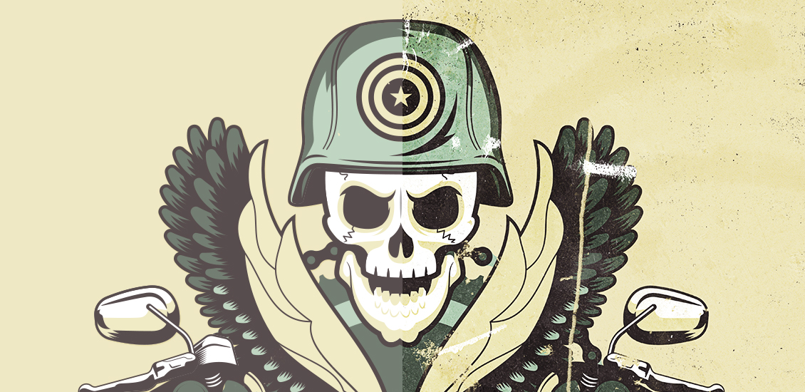
Texture Tutorial: using metal and rust textures to destroy a design
Hello all!
Simon from Studio Ace of Spade here again, ready to show you how to use my latest textures, the metal dumpster texture pack, to destroy and weather out the crap of your designs.
- Categorized: News, Tutorials
- Tagged: Photoshop, go media's arsenal, Adobe Illustrator, Illustrator
Texture Tutorial: Aged poster design with the Photocopy Noise Texture Pack
Hello there! Simon from Studio Ace of Spade here. Long time no see. I’m here to introduce you today to a texture pack I’ve created, called the photocopy noise texture pack. I’m delighted to announce that it’s finally on sale at the Arsenal!
- Categorized: Graphic Design
- Tagged: Photoshop, go media's arsenal, Adobe Illustrator, Illustrator
Must-Have PSD Mockups: The Paper Mockup Templates Pack is Here!
I’m going to teach you how to bring your logo to life in 5 easy steps.
(This is a trick used by actual Go Media designers. A good lookin’ crew, huh?)
- Categorized: News, Graphic Design
- Tagged: Photoshop, go media's arsenal
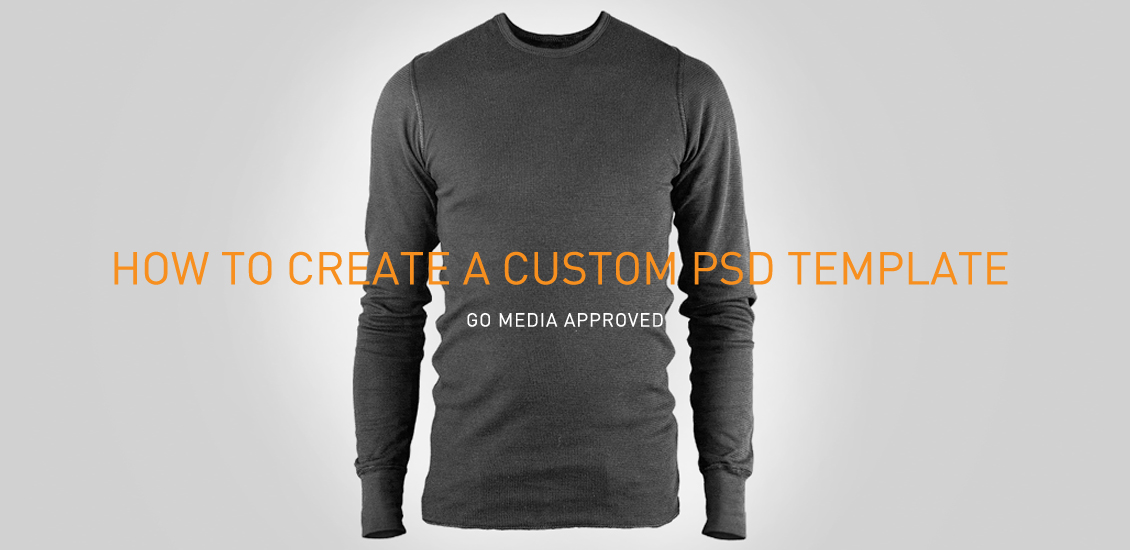
How Go Media makes their amazing mockup templates, Hamster Style!
Here at Go Media, we’re custom template creating machines.
Between our mockup sites Shirt Mockup and Mockup Everything, the mockup packs on our Arsenal and custom templates for clients, we’ve got our system down to a science.
Disclaimer: Creating these nicely organized and layered files, for ease of mockup, is far from easy.
Follow along with me as I create a custom template, from high resolution photograph, to clean and crisp PSD file.
- Categorized: Graphic Design, Tutorials
- Tagged: Photoshop, Graphic Design
Tutorial: The Making Of An Editorial Illustration with These Are Things
Flip through your favorite newspaper or magazine and you’re bound to find a lot more than just words on a page. Alongside many articles, you’ll find art that helps to illuminate key concepts from the text. These pieces are called editorial illustrations.
From tiny spot illustrations to multiple page spreads, these informative works of art are sprinkled throughout each issue. Political cartoons are a classic example of editorial illustrations, but today’s publications use the work of contemporary artists to visually interpret a wide range of topics.
As editorial illustrators, our job is to create an engaging visual that both supports and explains the accompanying text copy. A successful piece carefully balances the art director’s vision with our own ideas, all while clearly communicating the article’s core idea to the reader.
These projects an exercise in creative problem solving. From the super-quick turnaround to the varied subject matter, each assignment is a new visual puzzle for us to solve.
Today, we’re going show you how we created an editorial illustration for Southwest Airlines’ in-flight magazine, Spirit. We’ll walk you through the entire illustration process, from our first client conversation to seeing our work in print.
- Categorized: Graphic Design, Tutorials
- Tagged: Photoshop, Graphic Design, Adobe Illustrator, Illustrator
Life Without Limits: Constructing Creative Realism with Cinema 4D
When Barton Damer was given a tour of the manufacturing facility belonging to Tennessee-based Malibu Boats, his imagination went into high gear immediately. His design company, Already Been Chewed (ABC) had been tasked with creating and implementing a rebranding effort across numerous media platforms for Malibu and its sister company Axis Wake Research. The goal was to illustrate the slogan “Life Without Limits” and accentuate the active lifestyle that Malibu and Axis can offer their customers.
- Categorized: Graphic Design
- Tagged: Photoshop, Graphic Design
Photoshop Tutorial: Easy to accomplish VSCO Cam effect in Photoshop
Hello all, Simon here. Welcome back to the design blog built by Cleveland’s finest graphic designers. You know me as a designer that loves to create posters with a lot of textures. I mean, just check the Lost and Taken poster tutorial, or the Do androids dream of electric sheep one. I’ve also used similar techniques in the tutorial I wrote when we released the Go Media building texture collection.
Happy Dog Illustration and Design Tutorial
Today’s tutorial comes from Weapons of Mass Creation 2013 designer and fellow Clevelander Lucy Williams. Lucy is a freelance illustrator and a recent graduate of the Cleveland Institute of Art. Follow her process as she designs a poster for local Cleveland favorite hangout, Happy Dog.
- Categorized: Web Design, Tutorials
- Tagged: Photoshop, web design
Dust, speckles, and noise
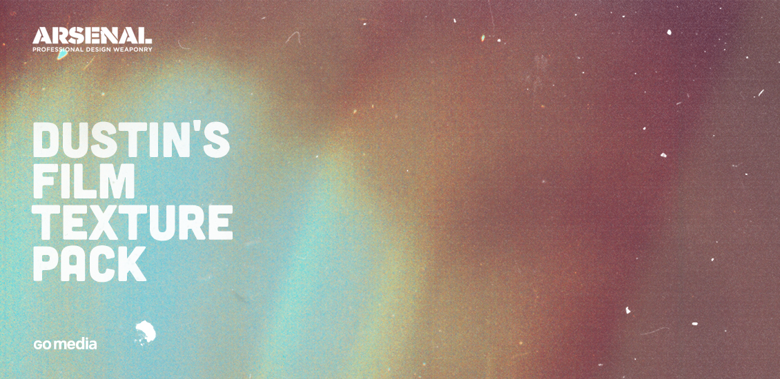
Finally! Hello all, Simon here. The product we’re launching today is something I’ve been wanting to launch for a LONG while. Behold, Dustin’s film textures pack! A bit of background Why am I excited? Well, since we’ve (finally?) passed the…
- Categorized: Tutorials
- Tagged: Photoshop, go media's arsenal
Announcing the Go Media building texture collection!
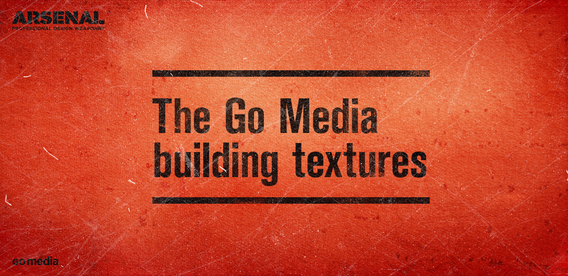
Textures. You said textures? That’s textures! Hey folks, it’s Simon here. To say that I’m excited to share what I’m about to write doesn’t even begin to cover it. Heather and myself have been hard at work to release a…
- Categorized: News, Tutorials
- Tagged: Photoshop, go media's arsenal
Why a Custom Website is so Expensive (Part 1 of 2)
In short, because it takes a lot of time. More time than most outsiders can imagine. But why?
Web 1.0
Go Media’s founders started building custom websites in the 90’s. In those days, a typical website was comprised of the standard Home, About, Services & Contact. This is commonly referred to as a brochure site. It was often static html and rarely changed in a year. There was very little thought going into SEO. There were rarely contact forms. It might have had five graphic images, total. Publicizing your email address was considered perfectly safe. Javascript, on the other hand, was feared by the industry.
- Categorized: Graphic Design, Business Insights
- Tagged: business insights, Photoshop, small business
A new Arsenal release: the Fractal Space texture pack
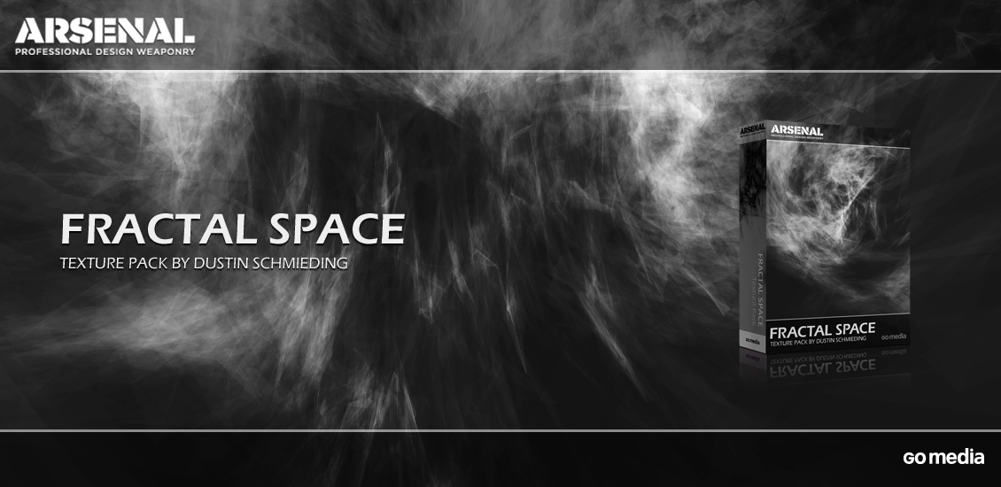
The texture pack Hello all! Simon here today to introduce you our latest Arsenal release, the Fractal Space texture pack. It’s a set of 20 textures, created by the man behind our amazing microscopic fingerprints texture pack, Dustin Schmieding (Valleys…
- Categorized: News, Tutorials
- Tagged: Photoshop, go media's arsenal
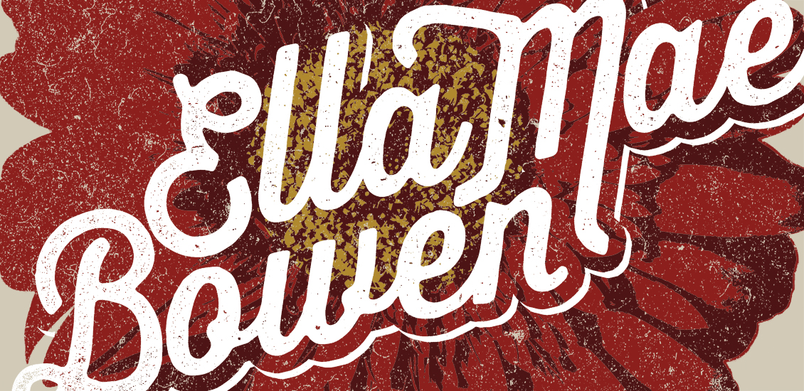
How to Create Vintage T-Shirt Designs with No Drawing Ability
Forewords Chad Tibbits is a super talented apparel designer, WMC Fest alum, and all around nice guy. As for Chad, we’re super happy to have him join the patiently growing, curated list of Arsenal contributors. His first halftoned texture pack…
- Categorized: Tutorials
- Tagged: apparel, Photoshop, go media's arsenal
Create a grindhouse-inspired background with the Microscopic Fingerprint texture set
A note from the editor Dustin is someone I’m super pumped to finally have writing for the Zine, and as an Arsenal contributor. As a designer, his countless free texture contributions to Lost and Taken, Bittbox, and his own site,…
The Age of Instagram: An Interview with Dan Morgan
Filterstorm, PhotoGene, Camera+, iDarkroom, Instagram.
With a flick of a finger, a simple effect, a toasty filter can bring your dull, camera photo to life.
In the age of the iPhone, such easy access to the camera itself, combined with photo-editing software gives us power and confidence we’ve never had. But do all of these apps with their seemingly unlimited textures, brushes, filters and overlays come at a cost? Do they overshadow the true art of professional photography?
Professional Cleveland photographer Dan Morgan of Straight Shooter, who has been in the business for over 30 years, has embraced the recent explosive advances in his field. Go Media sat down with Morgan to talk about Instagram and related software programs.
- Categorized: Graphic Design
- Tagged: Photoshop
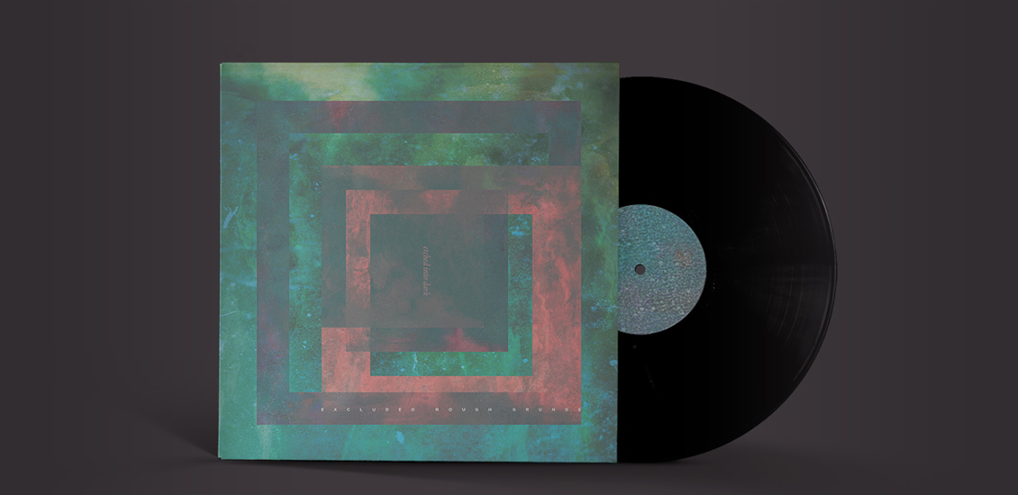
Tutorial: Creating an abstract vinyl sleeve with graphic textures
Maarten Kleyne, a freelance graphic designer from the Netherlands, feels music. Kleyne believes wholeheartedly that music is a key element in the creation of his final product. Inspired by the works of Steven Wilson and Lasse Hoile, his portfolio is filled with images including cd packaging, posters and collaboration artwork. Recently, WMC Fest alum Maarten cranked up his stereo, picked up his camera and created some texture packs for Go Media’s Arsenal. We are so proud to add his texture packs into our resource library.
We’ve asked Maarten to create a tutorial based on these textures, in order to demonstrate how you might like to apply them.
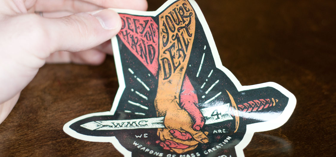
Tutorial: How to Design and Print Custom Silk Screen Die-Cut Stickers
This post is a revealing walk-through behind the design, illustration, and sticker printing process. I’m proud to show off the new artwork I created for the upcoming Weapons of Mass Creation Fest 4 event. The artwork below is going to be…
- Categorized: Tutorials
- Tagged: illustration, Photoshop
Illustrate & Design an Alternative Gig Poster in Photoshop
Last year, I was commissioned to create a poster/flyer for a heavy rock venue in the UK. The instructions I got were that they wanted something “edgy” and “hardcore”. Punk rock artwork is something that I typically do and I had created similar images for bands in the past, so it was the perfect project for my particular skillset.
Creating an Architectural Illustration Using Reference Photography
Note from the editor: This post was written by Pete Maric. Pete designed Go Media’s beautiful studio in Cleveland, Ohio. What else do you want to know? Well, he’s also worked with three of the top 50 retail design firms…
- Categorized: Tutorials
- Tagged: Adobe Illustrator, Photoshop
Some Like it Dirty: Comic Book Inking and Coloring Tutorial
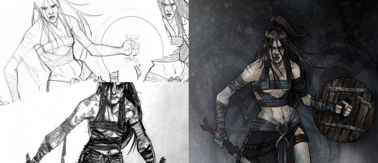
Comic Book Inking and Coloring Tutorial Earlier this year I was commissioned to come up with a series of character illustrations for Cohort Pictures new film project; ‘The Northern Mist‘, a suspense horror set during the Roman occupation of Briton.…
- Categorized: Tutorials
- Tagged: illustration, internet marketing, Photoshop
Photoshop Action: Stamp/Print Effect
Works great on any single color logo, emblem, mark, seal, crest. Because of the great response to my Aged Type action, I took it a bit further and made a similar effect that could be applied, not only to text,…
- Categorized: Graphic Design
- Tagged: Photoshop
Thick Line Art: Creating Iconic Vector Art
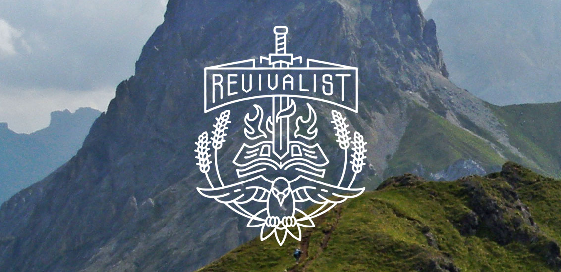
I recently posted a new illustration on Dribbble called “Revivalist” and it got quite a lot of likes. I thought I’d write a tutorial about how I created it. So let’s do this! Introduction One of our clients Disciple Clothing…
- Categorized: Tutorials
- Tagged: illustration, Adobe Illustrator, Adobe, Photoshop
Do androids dream of electric sheep PSD breakdown
Introduction Hello dear Zine readers. Simon and Jon from Studio Ace of Spade here. Today, we’ll have the pleasure of walking you through the making of our entry for an old installment of The Fox Is Black’s Recovered Books contest.…
- Categorized: Tutorials
- Tagged: Adobe Illustrator, Illustrator, Photoshop
Screen-Printed Movie Poster Tutorial by Pale Horse
Before we get started Hey everyone, Chris Parks (AKA Pale Horse) here for Go Media. Today, I’ll be outlining my recent experience working with The Indomina Group, a global entertainment company who produce and distribute movies, television, music and interactive…
- Categorized: Graphic Design, Tutorials
- Tagged: illustration, Adobe Illustrator, Photoshop
