Articles by Month: October 2013
Photoshop Tutorial: Easy to accomplish VSCO Cam effect in Photoshop
Hey designers, attend our all-inclusive soul-fulfilling three-day design retreat, WMC: Off-The-Grid, this October 5 – 7th. To learn more, head to wmcfest.com.
A little bit of context
Hello all, Simon here. Welcome back to the design blog built by Cleveland’s finest graphic designers. You know me as a designer that loves to create posters with a lot of textures. I mean, just check the Lost and Taken poster tutorial, or the Do androids dream of electric sheep one. I’ve also used similar techniques in the tutorial I wrote when we released the Go Media building texture collection.
Well today, I want to talk about another one of my hobbies: photography. More specifically, iPhonography. I’m an avid Instagram user. But even better than Instagram is VSCO Cam. Purchasing the whole set of filters in that last app was so worth it. I’m a sucker for these often over-the-top film vibe images. Knowing that I don’t shoot too much film these days (despite owning a couple of Polaroids and an old Fujica ST 705), it’s kind of the closest I’m getting to it.
Been living under a rock for the past few years and don’t know what Instagram and VSCO Cam are and what they do? Here’s my Instagram profile, and my Grid™ profile. I’ve also shot images at the Cleveland Zoo, at the Aquarium, and during Signal Midwest’s WMC Fest set.
But editing images on a small screen isn’t always the best and most practical. So, our quest today will be to create an editing workflow that brings us similar results, but by using Photoshop. I personally use Photoshop CC, but I’m fairly certain that you’ll have access to the same tools than I do starting with Ps CS3.
Oh, and it looks like the folks at VSCO Cam like it:
@simonhartmann Thanks for sharing Simon! Loving your #VSCOgrid & your support! Very appreciated & nice work on this! Keep it up!
— VSCO (@vsco) October 30, 2013
Let’s have a look at what kind of effect VSCO Cam produces
I’ll use some of my own images here as examples:
As you can see, we get a “faded” look (“crushed” colors), some grain, and some strange saturation mixed with cross-processed tones.
The faded look is the signature feature here. We’ll be exploiting the power of curves to accomplish some of that stuff. The grain can be either generated by Photoshop’s noise functionality, but we’ll probably use a real film grain and/or dust texture for added realism, and the saturation and cross-processing will be done using adjustment layers. The adjustment layer bit is crucial in order to keep a non-destructive workflow. This will allow us to, by turning a few layers off, to always get back to the original image.
Let’s get to it, shall we?
Source images
I’m using three images that I’ve grabbed from sxc.hu. They’re called Path in forest, Misty morning, and Tuscany farm and fields. I’ll start with the Tuscany image. After that, I’ll apply the same effect to the two others to see how transferable it is.
Step one:
This is very straight forward: open your image, and double click the background layer to make its own layer.
Step two: lightening the image a bit
The second step consists of lightening the image a bit. You could use a Brightness/Contrast adjustment layer, but I decided to use a Curves layer instead. Curves are much more flexible and powerful.
Just click on the center point of the curve, and drag it upwards. I’ve dragged it until my input value reads 130, and my output value reaches 140.
Step three: boosting the contrast
The contrast adjustment might not be necessary, depending on your starting image. Doing it here allowed to bring more intensity in the hay, and in that building in the left of the image. I could have used a curve adjustment layer to execute this step, but since I didn’t need much refinement, the Brightness/Contrast one works just fine.
Step four: let’s spruce up the colors
In my opinion, here’s where we really start to “cheat” with the digital image. A lot of cheaper digital cameras have sensors that don’t render a color spectrum as extended as, say, a pricey high end DSLR. By adding a Vibrance adjustment layer, we can fix this a little. I pushed the slider to 35. If you feel happy with the color rendition of your image, feel free to skip this step.
That being said, the various films brand that became iconic rendered colors differently as well, and the specific way some of them reacted (more saturated, more green, more blue, etc.) got them really sought after.
Note: you can read much more about the vibrance functionality over here, along with visual examples.
Step five: emulating the “color profile” of film
This fifth step is where we twist the colors around to give them the film feel. We’re using a Selective color adjustment layer. We’ll be touching up the yellows, the greens, the blues, and the blacks. See the values below:
- Yellow: magenta +75, yellow +25
- Greens: yellow +50, black +100,
- Blues: black +25,
- Blacks: black +10
If you know how certain type of films render colors (shadows greener, highlight yellow-ish, etc.), this would be the step to apply their “color profiles.” Looking at my result, I’m going to venture that we’re trying to emulate the M4 or M5 preset of VSCO Cam. But you should experiment here. For instance, try reducing the magenta to -25 or so in the blacks. You’ll see that your shadows will take a green-ish hue. Following that logic, you could easily recreate a lot of different color palettes.
Step six: the all powerful fade
As we saw when we looked at the example images earlier, the “faded” look, with the washed out and “crunched” colors is key to emulate a VSCO Cam image. After tinkering with using the Exposure/Gamma correction adjustment layer and a Curve adjustment layer, it seemed that using a fill layer (Layer > New fill layer > Solid color) of the color #4e4e4e put on Lighten for the blending mode gave me the best result.
Want more fade? Duplicate the layer, and toy with the opacity of the copy. Want less fade? Reduce the opacity of the original layer.
Step seven: a hint of cross-processed colors
Cross processing “is the procedure of deliberately processing one type of film in a chemical solution intended for another type of film. As particular chemical solutions are optimized for specific kinds of film, you will get unpredictable and interesting results when they are combined differently” (read more about real cross processing on the site of the same name or on Wikipedia).
Luckily for us, the Curves adjustment layer has a “Cross process” preset. Select it.
As you can see, the effect is quite strong. But it brings that interesting green hue in the dark and black zones of the image. To make this a bit more presentable, I just lowered the opacity of the layer to 10%.
Step eight: a bit more saturation
After all this color craziness, I’m going to add a Hue/Saturation adjustment layer to my layer stack. The slider is at 5, but this is enough to give a little “kick” to our image.
Step nine: let’s amp the temperature up
Another trick that VSCO Cam lets you do is to toy with the temperature of your image. So I went ahead and added a Photo filter adjustment layer, using the Warming filter (LBA) preset. I’ve left mine as is, but there’s plenty of head room in the Density slider and layer opacity to refine the effect. Just make sure that the Preserve luminosity checkbox is checked.
This is technically it
This is it! If you’ve followed the tutorial until now, you’ve emulated the look and feel of (one of the presets of) VSCO Cam. Just look at the source image, and at the result side by side:
But you know me. I love texture, grain, and dust speckles too much to stop there. The next two steps, that are absolutely up to you, will show you how I added some grain and dust speckles to my image.
Step ten: grainy
As I wrote earlier, you could just fill a new layer with white or a neutral gray, and add noise to it (Filter > Noise > Add noise). But real analog grain will be so much better. So after scouring the internets for cool grain textures, I found this fantastic, high resolution one (9000 x 7200 pixels @ 300ppi) on DeviantArt, called Grain explosion. It’s been provided to us by JakezDaniel. Careful though, as it’s apparently only for non-commercial use (unless you get his permission).
The process is quite simple: import the texture in your design (File > place), and size it appropriately to cover your whole canvas. This one is so high resolution, that even at 26% percent of its size, it did the trick. Put the layer on Soft light at 15% opacity, and you’ve got yourself some sweet film grain.
Step eleven: dusty
Another bonus step is to add dust, scratches, and other artifacts to the image. Well, JakezDaniel strikes again, because he has another sweet texture in his library called Film 400TMY. Same restrictions on its use, so don’t come and pretend you’ve not been warned. This texture features some subtle grain, and plenty of speckles of all sorts of dusty goodness. I also placed it in my document, sized it at 45%, put the blending mode of the layer on Screen, and tadaa!
And there you have it! First with textures, and then without them.
Now what?
Well, the whole point is to see if this is an editing workflow that could be reused for a whole set of images. See below the before and after comparison of the other source images I’ve mentioned at the beginning. The layer stack has been moved as-is to them. The only thing that changed is how much I’ve resized the grain and dust textures. Their opacities and blending modes remain the same. These are at 100%. Just click on the image to see it in very big.
On that foggy landscape picture, you can see that the result is very satisfying. The fade works wonders, probably even too well. I suppose that the color edits could be different to fit the mood of the image better.
For our second image, the result is a bit more intense, if not too intense. So I think that the color manipulation step is going to be the one step to adapt every time to the source image.
Note: this image had to be resized down to be able to upload it through WordPress. You can see the full size image over here.
Bonus: “tilt-shift” blur
Editing images using VSCO Cam is great, but only Instagram allows you to do that quick blur effect. It can be used either to recreate that sweet “tilt-shift” effect, or to highlight a specific part of your image. After a little bit of play time with the lens blur effect and documentation reading, I think I managed to create a satisfactory Ps equivalent. In our Tuscany fields scene, we’re more going to highlight a part of the image rather than do some tilt-shift goodness.
Step one: preparing the document
The first step I’ve taken is to create a composite of all my layers so far. The shortcut for this is CTRL + ALT + SHIFT + E (CMD + OPTION + SHIFT + E if you’re on a Mac). This creates a new layer at the top of your layer stack with a merged copy of what your document looks like so far. This is an immensely useful shortcut. You’ll notice that I renamed my layer “composite.”
Step two: adding a layer mask
This is pretty straight forward. You can either add the layer mask from Layer > Layer mask > Reveal All, or from the handy little layer mask button at the bottom of your layer palette, with the correct layer highlighted.
Step three: painting the layer mask
This step is where you decide what will be blurry in your image, and what won’t. You can either use the gradient tool to paint on your layer mask, or a big, soft brush.
The gradient tool will help you to nicely emulate real depth of field. Just be remember to choose the right gradient type for the shape of blur that you’re looking to accomplish (radial or reflected). The brush will allow much more control in zoning where the blur will happen. Since my image doesn’t have a very straight line of things I’d like to highlight, the brush made sense for me over the gradient. My brush is 250 pixels wide, and its hardness is at 0%.
Time to paint away! Note that what will be white, will be blurry, and what will be black will be left as-is. I’ve chosen to highlight that zone at the middle of the image, and to make the sky and field right in front of us blurry. I followed roughly the hills’ edges. The brush’s soft edges allow to somehow emulate a gradient. The second image highlights where the blurred out areas will be.
Step four: lens blur!
This is where the real fun happens! Go to Filter > Blur > Lens blur. You’ll see the following screen:
The following image shows my settings. I’ll explain below what they mean.
You obviously want to have Preview checked. It’ll allow you to see the effects of your tinkering.
The depth map part is why we actually created that layer mask before. You’ll want to use the drop-down menu to highlight Layer Mask. And at that point, you should see the blur starting to follow what you’ve painted in the layer mask. If you’ve painted in reverse (it happens often when using the gradient tool), you check the Invert box to reverse how the filter will read your layer mask.
The Blur Focal Distance slider should be set at 0. This one works as follows: 0 is in focus, 255 is fully blurry. Since we have a predefined depth map, we do have to worry too much about it.
The Iris set of settings is where you can how the blur will look like. I chose my shape to be an octagon, but I noticed that an hexagon works as well. I do believe that this emulates the shape of the shutter in a real camera, but don’t quote me on this. The Radius slider is where you’ll determine how blurry the blur gets. For this example, 15 seems just right. The Blade Curvature and Rotation sliders produced very subtle changes when I played with them. I assume that would be where you could recreate the “profile” of a lens and/or of a shoot’s circumstances by matching its physical characteristics.
The Spectacular highlights settings are where to tinker if you want to play with bokeh. They seemed to me to react exponentially rather than in a linear fashion, so I’d say they are to be used with caution.
Noise is pretty straight forward. It adds noise to the blurry part of the image. I chose to put that slider to 2, and to have the distribution set on Gaussian. You could have some RGB noise in there, but Monochromatic looks better in my opinion.
Once you’re happy with the settings, time to hit that OK button at the top and to render the lens blur effect.
Tadaa!
And we’re done. Let’s not forget to turn the layer mask off (Right click > Disable layer mask) to truly appreciate the result.
One thing that I’m noticing now is that the blur also blurred the dust and other film artifacts that I’ve added to the image with the help of the textures from JakezDaniel. The solution is quite easy: let’s recreate my composite layer in order to only include the stack of adjustment layers, and not the two texture layers, copy the layer mask over, and re-apply the lens blur effect with the same settings. And here you’ll have a lens blur effect and preserved textural effects.
Something to note is that how the layer mask looks like is really what makes or breaks the effect. My painting was really rough and quick, mostly to demonstrate the effect. A more refined job would have made things a bit more subtle and believable. A gradient truly is what will emulate depth of field the best. Here’s a visual demonstration of this:
It’s a bit softer, and much more believable.
On that note…
That’s all for today folks! If you have suggestions, comments, or ideas to perfect this, please let me know in the comments. And don’t forget to share the results of your experiments in the Go Media Flickr pool!
Lastly, make sure to check out our Arsenal Membership, which hooks you up with our huge product library for only $15 per month. Yes, seriously.
- Categorized: Photoshop, Tutorials
- Tagged: iPhonography, photography, Photoshop, VSCO Cam
Go Media Podcast – Episode 17: Advice for a Graphic Design Student
In this episode, Jeff, Bryan, and Bill get together respond to an email we received from Sarah, a graphic design student who wanted advice on how she should step into her career when she graduates. We’ve also been working hard on the release of all of the supplemental resource for Bill’s Book: Drawn to Business.
Listen to the Podcast
[powerpress]
[iframe width=”100%” height=”166″ scrolling=”no” frameborder=”no” src=”https://w.soundcloud.com/player/?url=http%3A%2F%2Fapi.soundcloud.com%2Ftracks%2F117598765&auto_play=false&show_artwork=true&color=ff7700″]
Show Notes
Sponsor of this Episode
Cover art for this episode was also created by Bryan Garvin using the Go Media Building Texture Collection and design assets from Drawn to Business. You can find textures like what he used at arsenal.gomedia.us.
Quick Tip: Follow Your Vibrations
Let your heart decide how to move forward when you’re stressing over a decision or trying to decide what to work on.
What Go Media Has Been Up To
- Jeff’s been working with Heather, Simon, and Bill to produce and write all of the bonus materials for Drawn to Business.
- We are hopeful that Arsenal V3 will be launched before Black Friday.
- The windows are in and the blade sign is now up at the Go Media studio. There’s still quite a bit of work to do, but we’re all really stoked about how things are coming.
Links
- Weapons of Mass Creation Fest 4
- ‘Drawn to Business’ book by Bill Beachy
- Learn The Secret Handshake
- Go Media Building Texture Collection
- Go Media on Twitter
Credits
Hosts: Jeff Finley and Bill Beachy
Producer: Bryan Garvin
Recorded at: Go Media
Sponsorship Opportunities
Interested in sponsoring the Go Media podcast, either episodically or exclusively? Well, hit us up at [email protected] if you are interested in advertising your business, project, event, or portfolio.
What Do You Think?
We want to hear what you think about the latest episode of our podcast and what topics you would like to see covered in upcoming episodes. Comment below with your suggestions.
Join Us Live
This episode was recorded live on October 22nd, 2013 at gomediazine.com/live. Next recording will be announced in the near future.
Ready for More?
Keep learning and listening to more Go Media podcasts!
- Categorized: Business Philosophy, Graphic Design, Video and Podcasts
- Tagged: podcast
40 Fresh, Free Fonts for Graphic Designers
There’s something I have to tell you. There is nothing I love more than a free font.
Tall ones, short ones, skinny ones too. Serif, sans, straight up silly ones. I can’t get enough. Here is a collection of my recent * free * favorites organized in the following categories:
- All Caps
- Quirky
- Cool
- Old School
- Hand-Written
Be warned, some are to only be used for personal use only. And some, well, are just for kicks.
Enjoy and don’t forget to head over to our Arsenal for some Go Media font-y goodness!
Norwester by Jamie Wilson
Langdon Shadow by Steven Bonner
Mohave by Gumpita Rahayu
Fat Boy by Matt Braun
Kenzo by Frank Hemmekam
Canter Typeface by Christopher J. Lee
Tracks Typeface by Gumpita Rahayu
Blyth by Nick Slater
Sequi by João Andrade
Baffled by Michael McMillan
Look Up by Filiz Sahin
Lousiane by JuanJo Rivas del Rio
Rhyder by Adrian Candela
Sketch Gothic Light by Lukas Bischoff
Dense by Charles Daoud
Barketina Typeface by Kiril ZZlatkov
Knubi by Matt Vergotis
Piron Free V.2 on Type Depot
Sifonn Font by Rafa Goicoechea
Dekar on Font Fabric.com
Infinity by Tarin Yuangtrakul
Farewell Regular by Marianela Grande
Baron by Frank Hemmekam
Deco Neue by Jonatan Xavier
Magna by Hendrick Rolandez
Font by Rich McNabb
True Love Font by Davide Cariani
Tenso by Jos Buivenga
Vincent by Ben Suarez
AC Mountain by Adrian Candela
Cheap Wine by Austin Eidson
League Script by A Good Company
Amatic by Vernon Adams
Salt and Foam by Anna K.
Skinny on DaFont.com
Aracne Ultra Condensed by Julia Martinez Diana
The Little Sparrow on dafont.com
Blackboard Ultra by Alex van Galen
Doodleista by Filiz Sahin
Hillyard on Chank Fonts!
Want more?
Sure you do! I know the perfect place! Head over to our Arsenal for the best fonts around! (Biased?)
Here are a few of my favorites!
Engineer Reject
Celest
Go Gothic Grunge
Enjoy and see you next time here on the GoMediaZine!
- Categorized: Graphic Design
16 Ways to Become a Master of Marketing
Whether you’re fresh out of the gate or an experienced designer, you’ll need effective marketing to keep the leads coming in. If you’re like us, you’ve experienced the ‘chug chug effect’ – waves of being booked solid followed by scrambling for work. It’s easy to get so entrenched in design that marketing strategies fall by the wayside.
We’ve learned through the years that marketing is an ongoing process, something we have to make a concerted effort to do. Yes, it takes time and money, but it’s essential for a sustainable business.
In this article, we’d like to share some of the techniques we’ve found to be effective through our experience as a small graphic design firm here in Cleveland, Ohio – some traditional, some not so much. We hope you find this information insightful and please share any ideas you have in the comment section!
1. Throw a bash. Make sure your party is not about you but honors the company or companies you want to work with! This method 1/ ensures they show up excitedly and 2/ enables them to see the best of your work. Here’s how we did it. Find the way that works best for you.
2. Ask your family and friends. We’re not talking getting down on your knees and begging here. We’re talking about being resourceful. It’s both efficient and smart to reach out to your inner circle for leads. Who do you know who / who do they know that has a need you could fulfill?
3. Find a vehicle for self-promotion. For example, choose a high-profile client and offer to design something epic for them on a volunteer basis. Make sure your company name is featured in your design.
4. Give your free two cents! We offer a complimentary 30-minute assessment, or ‘our two cents’, to clients who want our expert opinion on their brand and where it’s headed. This gets your foot in the door and establishes you as their go-to. Who knows when they might need some design help!
5. Screen your clients. Customers often think that they’re the one in the driver’s seat by selecting the right company for their needs, but make sure the potential client is a good fit for you! Have a qualifying set of questions that they must meet at the onset of a potential project. As Jenny Kelley of Kelley Green Web, and contributor to Drawn to Business, puts it – “Life’s too short to work with difficult people”. End the nightmare before it begins.
6. Partner up! At Go Media, we collaborate with a network of specialists who extend our capabilities by enabling us to fulfill a wider range of project requirements, called our Extended Family. Partnering with firms who offer complementary products and/or services can be a great lead generator as you can be their go-to for any design needs.
7. Network regularly. Get away from your desk and start shaking hands with the people out in the community, whether it be at business functions, charity events, volunteer opportunities or really, any activity or organization you’re genuinely interested in – bowling, rowing, break-dancing. When you’re involved with something positive, you’re bound to run into other professional people who will benefit from what you have to offer.
8. Sponsor events. If you choose wisely, sponsoring industry and community events can generate tremendous cross-promotional awareness. Be sure to attend any events you sponsor for networking opportunities – put a face to the name!
9. Send a short, informal email to a client you want to work with. Assure you are writing to the “right” person within the company. (If aiming at a huge, pie-in-the-sky client, start with an art director from their internal design team rather than the head of their marketing department).
10. Knock on doors. It never hurts to go straight to the source and pitch your services. Come on now, don’t leave a message with a secretary. Face-to-face with an owner is best.
11. Go through an Artist Rep or Advertising Agency. Many of our leads have come by way of agencies who provided us with sub-contracted work.
12. Check in with your existing customers. Referrals are one of best sources of work. And, if you’ve done amazing work for yours, you can expect the same. Take some time to regularly check in with past clients. Send a warm, fuzzy non-salesy email. Be subtle, but do inquire about their future needs.
13. Sign up for speaking engagements. Further expand your network and show your expertise by signing up for speaking engagements in your professional community. You never know who you will meet who will be impressed and need your services one day.
14. Be willing to work on spec (if necessary). If you’re aiming high and want to land that dream client, you may consider working on spec. Go in knowing full well that you may spend time and money on the project, yet money is not guaranteed.
15. Create content marketing. Get your work seen! Create a blog, tutorials, write articles, eBooks – anything awesome that will give your work wings!
16. Invest in pay per click advertising. Consider allocating a small portion of your budget every month for pay-per-click advertising, keeping your company name from getting buried beneath piles of other companies keywords in search engines like Bing, Google and Yahoo. Traditional but effective, none the less.
Want more insights into how you can increase profits while doing the work you love?
Check out our book, Drawn to Business, to learn proven business systems and processes for designers.
- Categorized: Graphic Design
Advice For A Graphic Design Student: Live Podcast Recording Tuesday, October 22nd, 2013 at 11:30am ET
Join us on Tuesday, October 22nd, 2013 as we sit down to answer an email we received from an aspiring Graphic Design student.
Live chat and audio feed available at http://gomediazine.com/live starting at 11:30am ET this Tuesday. If you post a question in the live chat, we’ll read and respond to it during the recording.
- Categorized: Go Media
15 Stunningly Beautiful Landing Page Designs
David writes for Radley, who create beautiful handbags and purses. When he’s not working, he enjoys studying product and user interface design.
It’s particularly difficult to design and build landing pages because they often need to appeal to several different types of people, as well as fulfill several different goals. Often they need to inform visitors, get them excited and interested in a product and help to show off the product in the best light possible. Not everyone looks at a landing page in the same way – some are extremely visually oriented and will respond better to imagery and bold headings, while others want to get down to the nitty gritty and will study everything you have to say. An effective and well-designed landing page will be built in a way that appeals to everyone. Of course, that’s significantly easier said than done.
I wanted to bring together a collection of some of my favourite landing pages for products. One thing I love about these designs is that they’ve done a great job of explaining the product, building excitement and hype for them, and have managed to look good while doing so.
MailChimp

Source: http://mailchimp.com/
Brace

Source: http://brace.io/
Squarespace

Source: http://www.squarespace.com/
Harpoon

Source: http://harpoonapp.com/
Inc

Source: https://sendtoinc.com/
Rdio

Source: http://www.rdio.com/
Ghost

Source: http://ghost.org/features/
Scrapd

Source: http://scrapd.nl/
Slik

Source: http://slik.io/
Leap Motion

Source: https://www.leapmotion.com/
Sennheiser Momentum

Source: http://en-us.sennheiser.com/momentum-on-ear
Tutor Universe

Source: http://www.tutoruniverse.com/
Transbunko

Source: https://www.transbunko.com/
Placeport

Source: http://global.placeport.net/
Flutter

Source: https://flutterapp.com/
Have you come across any creative, interesting and beautiful landing page designs that you’d like to share? Which of the collection do you like best? I’d love to hear what you think in the comments!
Subscribe to the GoMediaZine newsletter | Get Goodies
- Categorized: Graphic Design Inspiration, Web Roundup
- Tagged: design, web design
How to Launch your Freelance Business: 9 Simple Tips
Doing It Alone
So, you’ve been fantasizing about taking the big leap in the freelance world. Maybe the three days at Weapons of Mass Creation Fest was just the little push over the edge you needed. Maybe the current job market looks so grim, that making it on your own seems like the best solution. Or is it that you just cannot stand living to create something you don’t believe in one minute longer?
You’re not alone. We chatted a bit with freelance designer Dan Stiles, known for his vibrant, bold and bright screen-print art prints and rock music posters honoring such acts as The Decemberists, Death Cab for Cutie, Ray Lamontagne and Sonic Youth, about his decision to dive in head first. Rena Tom, of Makeshift Society in San Francisco (a sweet co-working space and clubhouse for creative freelancers), also contributed. And lastly, we drew some gems of knowledge from both our experience here at Go Media and Bill Beachy’s book, Drawn to Business.
Deciding to go the freelance route was a no-brainer for Dan, as he cherishes his creative freedom: “My career goals don’t really fit with being an employee,” he notes. “If you look at any project I’ve done in the last 5 years you won’t find many that I could have done as an employee somewhere. I want to make the best work I possibly can. I want to make work that excites me and excites other people. In order to do that I need creative control. I can’t make exciting work as a Senior Designer at Wells Fargo, or as a Production Designer at NBC. There are too many limits. Too many cooks in the kitchen. Too many guys in pleated khakis telling me what art is. Blame it on the DIY ethic I picked up as young punk, but my goals and my attitude are best expressed on my own. Creativity is more of a shamanistic pursuit, not a team sport.”
Ready to take the leap? Be advised. Ahead of you is, according to Dan, a “complete and total lack of long term financial visibility,” continuing, “If you have a job you have a pretty good idea of how much money you will make next month, or next year. Working for yourself is a constant roller coaster ride. Additionally in order to succeed you will have to put in a Herculean amount of hours.”
Succeed and “you’re in charge of your own destiny, and you finally get to do work that is 100% yours. Not some amalgamation of what the client and the art director and the CEO’s wife like.”
How to Survive As a Freelancer
1. Complete a Business Plan
We recommend grabbing the Drawn to Business’s Business Plan Workbook or to download one you’ve found online to brainstorm, establish goals and parameters for your new business.
Do your research and be sure to ask yourself questions like:
What are the personal and professional goals for your business (1 month, 6 month, 1 year, 5 year marks)? What will success look like to you? What is your mission, vision, purpose? What is your unique value proposition? What will your brand represent to your client? What is the current demand for your services? What are other firms charging for their services?
2. Don’t Quit Your Day Job…Immediately
Sure you’re excited to jump in with both feet, but before you get in over your head, Dan recommends that you “don’t quit your day job.”
“The best way to get going is to put in your 8 hours at the office, then come home and do work you think is good for clients you like. No clients? No problem, do excellent self-directed work. Start a blog, a zine, a YouTube channel. Just make good work and lots of it. Don’t spend your evenings doing work you don’t like. Remember, you’re building your base. Don’t start out making more of the kind of work you’re hoping to escape. At some point you’ll have enough projects to quit your day job. It will be scary to cut the cord, but you’ll have to do it.”
2. Do Your Legal Research
Make sure to do your research to make sure you’re running your freelance business legally and following all laws. Consult a lawyer as needed. Here are a few things to consider:
- Establish the legal form for your business from the following: partnership, LLC, S Corporation, Corporation, Sole Proprietor.
- Research whether or not there are state or local licenses that you need to operate a freelance graphic design business.
- Look to your state’s website for their Department of Revenue or State Treasury Department regarding the need to charge sales tax for design services.
- Get an EIN (Employer Identification Number).
2. Make Yourself a Schedule.
Visualize what your days will look like. Will you dedicate a certain number of hours to your work everyday? Will you integrate work into your life more that you are on your own?
Dan recommends flexibility. “This notion that you work from 9 to 5, have a life from 6 to 11, and sleep from 12 to 7 went out the window 20 years ago for me. I am always on, but also always flexible to do what needs to get done. If I want to go snowboarding on a Monday I can do that, but if I have work to do I’ll be up until 3am getting it done. This whole notion of dividing work and home is a 18th century construct based on selling your labor to a factory during the day. Ever heard of a farmer who clocks out at 5? The farmer lives his work, so does the creative. You need to own your life and your career.”
Try this: start off on the right foot by waking up to your alarm on day one, dressing up and showing up on time for work, even if you’ve set up in your home office. Whatever it is that you decide, begin to develop a nice rhythm for yourself. We use apps like TeuxDeux, Omnifocus and Smartsheet to schedule our days and organize our projects.
3. Save, save, save
Assess your current living space and equipment. Can you get by without fancy new equipment and that hip office space?
For Dan, it does not make much sense to spend the extra money. “My life and my work are entirely intertwined. I can’t picture it any other way. I don’t stop at 5 and turn into not-working Dan. My mind is always working, even if I’m mowing the lawn. Working from home allows me to hang out with my kids at 3 in the afternoon, or make a sandwich and eat it on my front porch then go back to work until 2 am. On the bad side, I can’t really have employees or clients over, it’s just too weird. If you need space from your work, or some neutral zone for other people to be in then move out of your house. For me, I am my work, so having to drive 25 minutes to pay to sit somewhere else and do it just seems a little silly.”
In your first years as a freelancer, stick to the plan to save as outlined in your business plan. Now is not the time to break the bank.
4. Establish Your Rates
“Figure out what you need to make an hour and start there,” suggests Dan, “If you’re drowning in work raise your prices. Working out pricing is always hard. You don’t want to leave money on the table, but you don’t want to price yourself out of the job either.”
Have downtime? Keep working. Volunteer for high-profile jobs, assuring that your name is tagged on the project.
5. Be Everywhere
Get yourself out there! The more opportunity for connection with fans, followers and fellow designers the better. Once you have created your online presence, be genuine, humble and interactive. Create positive connections with your followers on Twitter, Facebook, Pinterest and the like. Not only promote yourself, but others as well. This not only builds relationships but also establishes you as an expert. When sharing what you love, be genuine.
Regarding those designers selling their wares online, Rena notes, “I think a retail presence is made up of many components these days: visual interest boards like Pinterest and Tumblr, and social media like Twitter, Facebook and Instagram, to name the biggest sites. Also, a freelancer needs to think about blogs and newsletters still, as well as maintaining their own portfolio and retail site. That’s quite a lot!
Basically, any venue where you can show your chops, or your taste, is important to your business. You don’t need all of these accounts but you should be aware of, and therefore in control of, the ones you do have. You never know which “door” someone will walk through to discover you.
I think attacking on all fronts, a little at a time, is going to be easiest to execute for some people. For others, focusing on one task only is more effective. It depends on your personal work style, and there’s no one correct answer. That said, as long as measurable progress is being made *somewhere*, that’s important. I sometimes write a weekly status update for myself. It’s not exactly a diary but you just recap all of the things you’ve done the previous week. It can be really useful to prove to yourself that you were indeed moving ahead and getting stuff done. Be authentic, be forthcoming, and show your interest(s). Participate. It’s hard to get a following if you don’t make a splash so participate and be heard!”
6. Create a Marketing Plan
Shake hands, get involved in the community, start building relationships with clients you admire through LinkedIn/Twitter, consider selling to family and friends.
“I think that’s what is hardest at the beginning – consistently marketing yourself while trying to do your work,” reports Rena, “Scheduling activities to happen on certain days, even certain hours was pretty useful in getting a lot of different activities done.”
Making time for marketing, thus, is key. Set a specific number of hours per month where you’ll be up and away from your monitor.
7. Set Up Your Metrics
Track hours logged, followers, costs, income, profit, loss. Every month review. What’s working? What isn’t? Are you hitting your goals?
8. Do Great Work and Make Sure that it is Seen
“The internet is magic,” notes Dan, “If you do good work it will sprout wings and fly off all over the interwebs. Which is why, once again, you can’t just churn out more grade B corporate design product. Make work that people want to look at and it will take you places.”
Consider starting a blog, writing tutorials and articles which will serve to not only get your work out there, but establish you as an expert. When putting your work out there, make sure it’s epic!
9. Embrace Mistakes.
“Make crappy stuff and keep working until something good comes out. It can be a stressful process, but it’s almost never a waste of time. Eventually you’ll produce something good, you will have learned a few things along the way, and you might have generated a few extra ideas that you can put in your pocket for later,” shares Dan.
More Dan:
Dan Stiles | Blog
More Rena:
Rena Tom | Makeshift Society | Twitter | Facebook | Pinterest | Flickr | Instagram | AngelList | LinkedIn
_____________________________________________________
Ready to Spread Your Wings?
Introducing the Freelance Survival Kit.
Not too scared yet by Dan and Rena’s cautionary tales? Are you maybe a bit unsure of where to start to tackle all of that to-do list? Well, we happen to have just the thing.
Our own Chris Comella, along with the rest of the staff, created this Freelance Survival Kit that would fit your guidance needs perfectly.
The Kit contains a series of white papers on getting your business set up legitimately, billing clients, and becoming a social media powerhouse. But that’s not it.
We’ve also included templates for contracts, project questionnaires, project agreements, and more. On top of that, we’ve also added some of our mockup templates (CD case and shirts), grunge vectors, design articles, grid kits, and Jeff’s Wacom illustration tutorial.
Being a one person shop can be hard. That’s why we crafted this product, for all of you eager to learn the tools of the trade. This is packed with years of experience. And it’s available for just under 150 bucks.
Wanna learn even more? Consider having a look at Drawn to Business, which is like the Freelancer Survival Kit on steroïds. Bill Beachy, the big chief here at Go Media took two years to write this extensive guide on how to run a design firm. It’s the result of more than 15 years in the field. And there’s plenty of additional content available too.
Still have questions? That’s what the comments are there for!
_____________________________________________
Subscribe to the GoMediaZine newsletter | Get Goodies
- Categorized: Business Philosophy, Graphic Design, Interviews, Small Business
- Tagged: advice, business, design, opinion, tips
Introducing vector set 23: oh the horror!
Boo!
Ladies and gentlemen, the long awaited successor to vector pack 22 is out! And we do have something very new to share. Set 22 was Steve Knerem’s take on a lot of elements of the 1950s and 1960s: cars, pin-ups, rock ‘n’ roll, greasers, etc. It was done in his signature, detailed, illustrative style (you can see much more about set 22 in this Zine post, and you can buy it on the Arsenal).
We teamed up with Steve again for this new release. But this time, we wanted to bring something a bit different. You see, one color vector elements are great and all, but what if we could provide elements that are as detailed if not more, and in color? Well, we did it!
Meet set 23: 7 packs of horror-themed awesomeness!
This new set is comprised of of the usual 7 packs, plus one. Steve focused on an horror theme, with big nods to the zombie and mummy culture. The “plus one pack” is for an experimental pack of vector brushes. They are as follows:
Let’s have a closer look, shall we?
The zombies and mummies vector pack
These are 8 highly detailed and scary zombies, mummies, and other un-dead things. We’ve also added the scrolls and the skull of the sexy zombie as a separate element.
The witches and wolves vector pack
These 8 witches and (were) wolves will make your designs howl (I apologize in advance to the bad pun police). The vectors are constructed in such a manner that makes isolating some of the elements possible, like these scrolls and circle patterns.
The weapons vector pack
Now, there are obvious classics in that anti-zombies weapon pack. The chainsaw and the cross-bow are just a must have in case of an invasion (don’t forget the explosive or incendiary arrows). But for people that would like to be creative, the bear trap, the (probably acid-filled) water gun, and the banjo should expand the horizons quite nicely. And I bet that Brad Pitt wouldn’t have said no to the shotgun in World War Z.
The tombstones vector pack
What’s a horror movie without a cemetery scene? Drop a couple of these tombstones in the background of your scene, and the mood is set. Also, these are made in a way that should allow the more adventurous of you to extract some of that marble grain for other uses. Just saying.
The survival kit vector pack
There you have it! The ultimate package to survive the Zombipocalypse. The compass to plan your route in the wasteland, the everlasting fast food fries and industrial pastries to last until you can replenish the rations, the lighter to start a fire of get your molotov cocktails going (see above), the multi-tool knife, the gourd to hold water or high proof booze for when the hand sanitizer runs out (we don’t want these wounds to get infected), and the backpack to hold it all. And the noose for when everything is lost.
The animals, reptiles, and skeletons vector pack
Now, we can love animals and still be freaked out by some of them. And what would a witch be without a black cat? And bats. Bats are important in the event of a vampire showing up, even if just for ambiance purposes.
The textures vector pack
These textures will be perfect to add some grime to your backgrounds. Or to anything, really. I don’t know about you, but snake skin, while beautiful, gives me the creeps. And I don’t want to know to what creature that fur belongs to.
The brushes vector pack
Now, this is much more experimental for us. Steve wanted to take a stab at vector brushes. Apply these to paths, and you quickly get lines of hair, scratches, stitches, blood drops, and more.
All of these vectors are fully layered elements, which means that you can change colors to adapt them to you own project at will. There are also elements here and there you can extract for other uses. I mentioned a marble texture before, but there are many more: scrolls, banners, small skull, crack texture, etc.
The genesis of the pack
This one was a long time in the making. Because we haven’t done color vectors too much before, we wanted to get it right. Let me show you some of the progression.
See how the level of details evolved over the past couple of months to get from pencil sketch to the final piece? And a similar process happened for all of these! See a couple more sketches and progress images below:
And where can you find it?
On the Arsenal, of course!
Last thoughts
It’s Halloween in less than two weeks! An horror-themed tutorial seems in order, don’t you think? More information soon…
In the meantime, get the set!
- Categorized: Go Media's Arsenal
- Tagged: arsenal, Steve Knerem, vector set, vector set 23
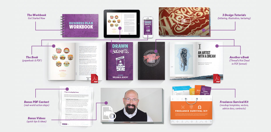
Learn How to Build the Design Firm of Your Dreams with Drawn to Business!
Disclaimer: Boasting Ahead!
We have to be honest with you.
We are gushing!
Our President, Bill Beachy, has just made us very proud.
So please excuse us while take a moment to tell you about what Bill’s been working on, head down, nose to the grindstone, for the past 2 years…
Introducing Drawn to Business!
Drawn to Business is a brand-new book by illustrator, designer and lifelong entrepreneur William Beachy; it’s an insiders guide into how he built and runs Go Media, our graphic design firm here in Cleveland, Ohio. Bill details his experiences working as a one-man firm from a bedroom in his father’s house and guides the reader through each lesson learned that allowed him to build Go Media into an internationally recognized 15 person firm with clients including Adobe, Progressive Insurance, Pepsi and Nike.
What’s Inside?
Well, have you ever wondered how design firms, like ours, start, stumble, and become successful?
Want to learn how to:
- Raise money?
- Charge for your design services?
- Find the perfect business partner?
- Take the appropriate legal steps when starting your business?
- Track your company’s performance?
- Hire the best employees?
- Organize your company’s files?
- Implement effective marketing strategies?
- Land projects and stay profitable?
- Battle burnout?
- Deal with ebbs and flows?
- Negotiate?
- Retain clients?
- ….just get started???
You’re in the right place.
Everything You’ve Always Wanted to Know about Business But Have Been Too Afraid To Ask
In Drawn to Business, Bill simply gives it all away.
Chock full of Bill’s anecdotes, real-world practical guidance, business principles, inspiring design and legal and accounting advice, you’ll learn to increase profits while doing the work you love.
Let’s Do This Thing!
A variety of Drawn to Business packages are available, so choose your own adventure.
1. The Pro Package: $397 – Buy Now
Includes EVERYTHING you need to transform your design business. You get a physical and digital copy of Drawn to Business plus bonus PDF content and videos, the Business Plan Workbook, 3 design-focused video tutorials, Thread’s Not Dead: The Designer’s Guide to the Apparel Industry, and all the goodies inside the Freelance Survival Kit.
2. The Plus Package: $197 – Buy Now
Includes a physical and digital copy of Drawn to Business, plus a collection of advice docs, videos, and a business plan workbook.
3. Just The Book: EBook and Paperback options
Buy the PDF for $37 or the paperback for $47
What Are You Waiting For?
Grab your copy of Drawn to Business now! Once you’ve purchased the book, leave a comment below for your chance to win a free upgrade to the Drawn to Business Pro Package! Winner will be announced on Friday, October 18! * Winner must have purchased a copy of Drawn to Business by 5:00 p.m. ET on 10/18/2013 to be qualified.
Subscribe to the GoMediaZine newsletter | Get Goodies
- Categorized: Contests, Graphic Design, News
- Tagged: advice, art, business, cleveland, design, design tip, drawn, Drawn to Business, illustration, staff, staff picks, tips, William Beachy
The Home of Art & Soul: Why Cleveland Designers are Here to Stay
Cleveland Proud
With our headquarters in Ohio City, one of our city’s most culturally rich and diverse communities, we here at Go Media are proud to call Cleveland home.
Living in the home of rock and roll, music, design, and art are in our collective soul. Why leave our great city to pursue a career in the arts when Cleveland has so much to give? Our favorite hometown designers tell the world why they’re here to stay.
Aaron Sechrist
“NY and LA are awesome but they are their own worlds, they’ve already been ‘built’. Those stories have been told. Cleveland is a work in progress, it was once a titan generations ago and now it’s this weird and wonderful town that is on the rise again. It feels like someone hit the reset button on this city and it’s a story that I and a lot of other people are helping to write with what we’re all doing in our respective walks of life.”
______________________
Jeff Finley
“It’s easier to stand out in Cleveland because not everyone is trying to be an artist or rockstar. You have room to build something and actually get noticed.”
______________________
William Beachy
“I started my art training here in Cleveland at the Museum of Art and Cleveland Institute of Art, then got a BS in Industrial Design from The Ohio State University. I recommend all of these institutions because there is a rich history of art and design in Northeast Ohio. These institutions are among the top in the world.
I stay in Cleveland because this is where my heart is. Also, I know happiness comes from the people, not the number of your skyscrapers. And when it comes to great people – Northeast Ohio has a bounty.
Cleveland has an amazing mix of humility and pride. We don’t need other’s approval – we know deep down that we rock. That’s what’s always driven me as an artist – quiet confidence.
Big city amenities, with a small town comradery. It’s Cleveland vs. the world – and we’re winning.”
______________________
Derek Hess
“Sheephead and pop are two things that inspire
me about Cleveland, America.”
______________________
Craig Winzer
“Cleveland offers more than enough artistic influences, and is much more affordable than NY or LA.”
______________________
Steve Knerem
“What inspires me as a Cleveland artist is not as much the “sights” of the city but the people. I am born and raised in Cleveland, grew up living and dying with the sports teams, LTV Steel and The Flats.
This meant good times and bad times.
I have seen a crazy amount of city pride in people’s eyes, hearts and speech. We that live here love it, hate it, but most of all defend it.
How this translates to me as an artist is I have the opportunity to do some work with local businesses that have caught the “city pride” bug.
They understand it and are doing what they can to grow it. What that means for me are tee designs usually. One example is a current client, “Old School Iron Gym.” This is a body builders gym, the dudes and chicks in there mean business. The owner is tapping into the city pride by incorporating his logo with various catch lines such as “CLEVELAND STRONG” that surround his company logo or we had an image that has a skull in the middle of the state of Ohio.
People in Cleveland definitely stand strong, stand out represent their city.
The piece above is one I did for a gallery show earlier in 2013. It represents my linear line art style. I call it “The Eye of the Storm.”
In life we are in the center and all around us is life, death, love, sadness and everything in between. Maybe this represents Cleveland’s history. The good thing is I believe we are in a rebirth.”
______________________
Sean Higgins of The Bubble Process
“I really love the randomness of Cleveland. The city celebrates its current quirkiness and its dense history of art and music in a way only people who live here can understand. I mean, there is a story about a sea monster in Lake Erie named Bessie…which is pretty awesome if you ask me. People here can generally create for the right reasons and a community like that is really satisfying and attractive to be a part of.
I also feel that the size of our city is really a blessing. There is a nurturing sense of community within the arts scene here that makes it both approachable and accessible to everyone. Plus we don’t take ourselves too damn seriously. Which makes art more approachable for everyone. Plus we have Sokolowskis (best restaurant ever).
Cleveland is home and always has been. After college I thought about possibly moving to other bigger cities. Most of my friends and roommates from school all moved away taking the next step that was logical for them, but I knew I needed more time to develop as an illustrator and designer and soon realized this is a great place to mature as an artist. I was fortunate to do some freelance and part time work with a few different non-profit arts organizations and had a visibility to the vast arts community here and many of the available opportunities the region has for the arts as a whole. In addition the cost of living is a huge plus for any artist.”
______________________
Oliver Barrett
“I suppose the inspiring thing about Cleveland is the city’s slow but steady progress. The production of a project is something that always grabs my attention. Seeing the potential of what something can end up being is always exciting for me. Admittedly, I can every once in awhile, fall short of my own expectations on the final execution of a piece, but there’s always a part of the process that says ‘hey, this could end up being something pretty great.’ There’s no guarantee about a project becoming the next big amazing thing, but the potential is there. I think Cleveland’s recent development/improvements/progress is a lot like that part of working on something where you realize ‘hot damn, maybe I’m onto something.’ I guess this is sort of a backhanded compliment about the city, but it resonates with me.”
______________________
John G.
“I’m mostly inspired by the ebbs and flows of Cleveland’s history. It’s an odd, tragic, triumphant place. I suppose I aspire to contribute to the narrative in the present. I also like to think about the big picture of this place. I like watching it change and dig its heels in deeper at the same time.”
Subscribe to the GoMediaZine newsletter
- Categorized: Graphic Design
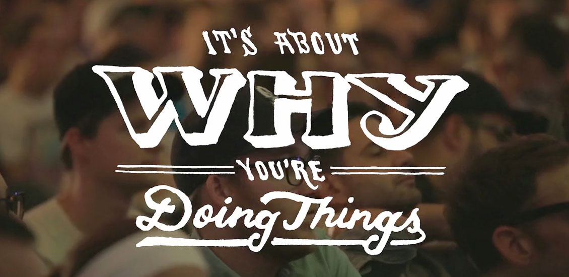
Weapons of Mass Creation Fest short documentary film
Three Days that Changed Our Lives
Weapons of Mass Creation Fest 4 went down in the summer of 2013 in Cleveland, OH at the historic Cleveland Public Theatre and inspired us greatly. Over 1,500 dreamers, doers, makers and mistakers joined together with common goal: to be challenged like nothing else before, to question ourselves and not let fear and failure stop us from loving what we do.
Highlights included soul-baring speeches from some of the industry’s best, wall-to-wall art, music from over 40 bands, break-dancing and our first annual artists battle, Ink Wars (sponsored by our friends over at Adobe). Through it all, a sense of togetherness, kindness and community was palpable.
We truly created a movement.
Director: Aaron Freeder
Produced by: Go Media
Creative Director and WMC Fest Founder: Jeff Finley
Custom Lettering: Brandon Rike, Jon Contino, Jeff Finley, Mary Kate McDevitt, Jillian Adel, Alonzo Felix, Troy DeShano
Animation: Zach Christy
Missed out on WMC Fest goodies?
It’s okay! Leave a comment below telling us why you love WMC Fest and on 10/25 we’ll choose one winner at random. That lucky winner will receive a WMC Fest prize pack including a WMC Fest t-shirt, button pack, sticker and journal. Good luck!
WMC on Facebook | Twitter | Tumblr
__________________________________
Subscribe to the GoMediaZine newsletter
- Categorized: Design Community, Graphic Design Inspiration
- Tagged: documentary, Video, wmc fest
What Your Business Can Learn From the Failed Launch of the ObamaCare Enrollment Website
On Oct. 1, the federal government formally rolled out the Affordable Care Act, also known as “ObamaCare,” beginning with the launch of online healthcare exchanges.
It was disastrous.
I’m referring not to the federal government shutdown that ensued as part of the bitter politics involved, but rather the system design and hosting failures that led to the site to crash. Millions of people were staring at an “error” message, causing many to offer further criticism of the healthcare initiative itself.
According to various media reports, the Obamacare website received 7 million unique visitors in the first two days of its launch. Some 4.6 million of those arrived in the first 24 hours.
While some have commented that a glitch-free unveiling of the site was an “impossible task,” given the scope, intensiveness and concrete deadlines involved, I disagree.
The complications that arose from the launch of this site were foreseeable and avoidable. Those behind the controls should have planned properly and effectively leveraged the modern cloud.
The truth of the matter is, there are countless websites that manage daily traffic volumes far exceeding what the healthcare site was required to handle – and they do it without a single hiccup.
With proper planning, any firm can effectively tailor their website to fit all their capacity needs, both at the time of launch and well into the future. Any experienced web developer will tell you that there are a number of well-tested methodologies and approaches that are effective in shouldering major spikes in traffic – so long as they are done correctly.
Part of it is the responsibility of the business. Business owners and operators should have a solid grasp on the consumer base, which will allow a fairly accurate estimate of traffic volumes.
Of course, you want to be prepared for the unexpected too. If Oprah one day decides you’re one of her “favorite things,” you want your site be ready!
There was a time when this might have seemed an extreme challenge. Historically, companies basically had two options: dedicated servers and commodity hosting. The first option limited users to the amount of computers to which it could connect. The latter involves shared hosting. There are limitations to that option as well because any one of those users had the potential to bring down large swaths of that network.
In the last decade, we’ve seen a game-changer in the form of something called cloud computing. It’s a complex form of technology that allows vendors to offer highly-advanced hosting that can expand and shrink as necessary. The software and hardware is specifically designed for maximum elasticity with regard to traffic volumes.
The beauty of cloud computing is that in addition to being superior technology, its developers also made the system available to “pay-as-you-go.” That makes it accessible to those with smaller budgets too.
Compare that to dedicated hosting. For that, companies were on the hook to pay for whatever capacity they had estimated they might need, even if those estimates turned out to be inflated.
As great as cloud computing is, it still isn’t everything. It won’t replace good design when it comes to a smooth launch. You still need experienced system administrators who can put into place the proper design and configuration to ensure your website will be ready.
At Go Media, we offer managed cloud hosting and system design as a value-added service for our clients. We’re not a public web hosting firm – and we’re not trying to be one. We do, however, want to make sure our web customers are housed on a stellar system that’s going to perform well at every turn.
Many of our clients have praised this as a major benefit during a launch because it helps to eliminate surprises. When we’ve designed the stack, we know what’s in it. We know its capabilities. We know we’ve got certain monitoring systems in place to be able to react immediately if there is a problem with high volumes. We design our systems so that the mission-critical components are going to operate without a hitch, regardless of how many people flood your site. It’s a process we’ve been perfecting for well over a decade.
Choosing a competent web design and management firm is the first step toward ensuring a problem-free launch of your new website.
There are other steps your firm can take too.
As I mentioned earlier, proper planning is essential. Know your consumer base. Know the kind of capacity you can generally expect. Make sure you clearly communicate this with your web developer. Also inform your developer if at any point you anticipate a marked increase in web traffic. There may be preemptive ways the developer can address these potential issues.
Another thing I’ve learned over the course of unveiling hundreds of web applications and campaigns for a variety of brands is this: Go to market with the most basic version of what you consider a viable product. This is particularly important if you are on a deadline.
If you try to shoot for the moon and get every single thing in there and do it on an extremely limited timeline, you may find yourself, your staff, and your consumers disappointed.
It’s worth noting that many clients ultimately come to the realization within the first year of launch that many of the bells and whistles they considered to be “must-haves” were not truly necessary.
Know that more can always be added later.
Deadlines should be realistic. However, good system design need not take an inordinate amount of time if you are working with a skilled web developer who already has good tools in place.
One of your primary goals in launching your new site should be to avoid alienating your users. Establishing a positive first impression will go far in keeping your consumers coming back again and again.
Subscribe to the GoMediaZine newsletter | Get Goodies
Troy DeShano: No Great Story Comes without Difficulty
If you attended this year’s Weapons of Mass Creation Fest, you’ll remember Troy DeShano. Artist, illustrator, speaker, Troy stepped up to the Artists in Residence stage podium and told a story part trying, part terrifying, totally triumphant: his own.
Troy is known for Strong Odors, an editorial illustration, art and essay blog, he began in the spring of 2009. Strong Odors began after a conversation with friend Kelly Nogoski, whom shared with Troy the concept of earning a living through blogging, a thought he found ridiculous, awesome and enjoyable, quite perfect as he was attempting to exit the magazine industry anyways.
Also the creator of the Old & New Project, a growing biblical art and design collection he runs with fellow artist and designer Jim Lepage, Troy spends his days in marketing, designing websites and managing social media for clients.
Humble, down-to-earth and unassuming in every way, Troy took the time to tell me a little bit about how he got into design, what tried to derail him, and how he fought back.
In his words…
I am a Michigan native currently stationed up-north in Traverse City, which is actually a pretty cool little town for being relatively off the grid. It is a really beautiful place to live, with Lake Michigan and Sleeping Bear Dunes just minutes away, along with hundreds of acres of state forests across the street from my house, and at least a dozen different species of trees literally right in my own backyard (decent Chinese food is a little hard to come by though).
My wife Noël and I were married in 1999, and have three kids (our oldest just started middle school—yikes).
My education was geared toward ministry work, and both Noël and I planned on some sort of career in ministry. But no matter what jobs I ever landed, I always ended up creating visual components for the work at hand. I regularly spent way too much time creating posters or videos or announcements to hang on the bathroom door. I kind of became a designer by accident.
Diagnosis Meets Design
My first cancer diagnosis was when I was just finishing school. I had big plans to move to Michigan that summer to start what I hoped would be a career in youth camps, but instead I ended up spending it in the hospital for chemotherapy, which shifted the trajectory of my life’s next decade.
What is really interesting is that when I finally did end up working at a camp, it started me on this path toward art and design. While creating all those random videos and bathroom signs, my boss recognized there was value in what I was doing and hired me as their Media Director.
I’d never even opened Photoshop or any pro video editors before and had been hacking Pinnacle Studio to make the raddest promo vids I could, but when my position became “real” I had to pick up those tools and learn to use them.
Of course just when things were finally looking up, with a real job and a chance to make a living creating cool stuff for an organization I loved, I was diagnosed with testicular cancer for the second time.
A second testicular cancer diagnosis is actually quite unusual, and my second bout was much more serious. We’d managed to have a few babies before I lost the last of my balls that year, and our family spent much of 2006 travelling back-and-forth from northern Michigan to the Cleveland Clinic for treatment. Over the course of that year I endured a bunch of chemo, a couple lung surgeries to remove tumors, and one big retroperitoneal lymph node dissection, which basically means they sliced open my abdomen—from sternum to pelvis—and scraped out lymph nodes to prevent cancer growing and travelling around my body.
I used to lug my big Dell laptop along when I’d check in for chemo. I’d spend the week in my hospital bed creating work that I think had much more emotion because of where I was and my circumstances at that very moment.
It’s pretty difficult to explain the magnitude of my cancer’s impact on my work. Having survived days and nights that I thought I might not has taught me (among many things) how precious every single moment of life is, how to open up and share pieces of myself I’d prefer to keep stowed away inside, and how to invest intimate pieces of myself into my work.
Since then I’ve been blessed with great health, and the odds are supposedly in my favor. At this point, however, I’ve been on the low end of the statistics too many times to put any stock in statistics. I have to spend the day leading up to each annual check-up mentally preparing for what could be the worst possible news, but I spend every single other day grateful and happy to be alive.
I have learned, that life isn’t something to be endured, it is an adventure.
Sometimes it is ugly, sometimes beautiful; sometimes wretched, sometimes sweet.
More often than not I get knocked down by the waves, but I head back toward the breakers over and over hoping the next one will be totally bodacious.
If life isn’t tossing me into adventure, I’ve learned to make some for myself. So I now try to take little adventures every day (whether taking the stairs rather than the elevator, or trying new foods, or wearing bike shorts), and big adventures regularly (like backpacking and mission trips and art shows).
I honestly believe that cancer saved me in a lot of ways. My marriage, for example, may not have endured had we not been thrust together into survival-mode for the first decade. There’s also a good chance I might have never started doing fine art without having first been forced to allow the world into the innermost recesses of myself from which the best art ultimately comes. It’s possible I’d have always been creating, but might never have developed the courage to display my work to anyone outside my home.
Many of the emotions that I experienced might be a surprise. I often felt guilty actually, that my wife had to spend so much energy taking care of me and the babies and wondering what her life might be like if I die.
There were a lot of things I didn’t even realize I was experiencing until years later when I started regular counseling. The greatest of these is how fear was at the center of my life. My failure to make decisions or relationships or take risks in my work all had fear at the center.
I’m working on that now. Each year I try to find ways to face specific fears. This past year I really made an honest effort to tackle my fear of dancing. I actually got out on the dance floor at several weddings for a little head-bobbing. It may not sound like much to most, but…
Dancing is quite possibly my Everest.
Ultimately, recognizing what fears I have is an effort to be honest with myself about myself. And the truth—so they say—will set you free.
For more Troy >
Strong Odors:
Strong Odors | Twitter | Facebook | Dribble
Etsy | Society 6
Old & New Project:
Old & New Project | Twitter | Facebook | Society 6
Subscribe to the GoMediaZine newsletter
- Categorized: Design Community, Graphic Design, Graphic Design Inspiration, Interviews
Japanese Vintage Design Inspiration
When I was growing up, I’d play the Japanese card game Hanafuda with my grandparents. Mesmerized by the stunning yet simple designs on each card, I memorized each combination: ribbon, maple and deer, geese, moon and sky, boar and butterfly. At the kitchen table we’d play and snack on senbei, and at these moments I felt so happy and loved. I still remember my grandmother’s Japanese plates upon which she’d serve me tiny treats and tea. Surrounded deep in my family’s culture, I gained an appreciation for everything Japanese.
When I see vintage Japanese design, I feel warmly reminded of my grandparents and the love we shared. The gentle simplicity still embraces and inspires me. Via Pinterest, here are:
25 Vintage Design and Illustrations inspired by Japan
Subscribe to the GoMediaZine newsletter
- Categorized: Design Community, Graphic Design, Graphic Design, Graphic Design Inspiration, Web Roundup
- Tagged: art, design, staff picks
We Asked, You Answered: My Biggest Challenge Running a Design Business
Here at Go Media, we’re buzzing about the release of Bill Beachy’s book, Drawn to Business including new extra goodies! This nuts and bolts strategy guide highlights the successes, failures, the in and outs of growing a design firm: namely, ours.
It made us think: What challenges do our friends and colleagues face? Which are universal? Which are unique?
We asked, You Answered:
What is your biggest challenge running your design firm or freelance business?
“My biggest issue is time management. No matter how organized you are, you can never predict when a project will go long and make all your other deadlines a hundred times more stressful. I don’t know if I’ll ever be able to crack that one. Burning out is always a concern, but I know my desire to create isn’t disappearing any time soon, so it’s more about exhaustion than anything else. When you combine tough timelines and too many late nights in a row, it could potentially spell disaster. Well, short-term disaster anyway. There’s always a light at the end of the tunnel.” – Jon Contino
| Jon Contino |
“The biggest problem that I have running my freelance operation is maintaining a balance with my social life, and happiness level in general. We assume, early on, that if we work hard enough, we can achieve a certain level of success. It is also our assumption that that level of success will bring us a wealth of happiness.
It doesn’t.
Achievement of our goals only prompts us to set a new goal, instead of taking any time to enjoy reaching a milestone. After doing freelance design for over a decade, I have set goals and achieved them – only to set a higher goal for the following year, and thus put myself right back to the grind – glossing over any chance to pat myself on the back.
It’s possible that continued success in a creative field has an adverse reaction to one’s happiness. Being creative all day, every day, gets more and more taxing. The well of ideas threatens to dry up, and we put more and more pressure on ourselves to stay afloat. The quest for “better” is admirable, but also tortuous.
This grind keeps me in my cave, churning out work, giving myself little to no interaction with the outside world. More success, for me, has led to a very reclusive lifestyle. On paper, I’m experiencing the most successful time of my life – in reality, I can’t remember the last time I sat down with a friend for coffee.
The solution? Move happiness to first on your priority list. Meeting with people you enjoy or doing things you love can put you in a positive frame of mind that’s more equipped with managing a heavy workload. This positive outlook instantly manages stress better, and is more effective at calculating an otherwise chaotic and overwhelming to-do list.
Days may look less like a row of fires to put out, and more like the privilege that we began these careers with – that, while others toil through jobs that they hate, we get to be creative for a living.” – Brandon Rike
| Brandon Rike |
“The biggest problem I have running a business is
“running a business”.
Design and illustration work is no problem at all outside of solving those creative problems, but handling growing and maintaining a business on top of that is almost an extra job.
One that can consume entire days at a time doing bookwork, communicating with clients, putting proposals together and promoting and marketing my brand.
I prefer that that’s the obstacle relative to what I do
if I have to choose one.” – Aaron Sechrist
| OKPANTS Design Co. |
“The biggest problem I have running my business is the constant balancing, though I imagine that’s just a life problem that everyone has, at least to some degree. Also it’s been apparent to me for awhile that I am not a financial planner and my bookkeeping is sloppy, so I am making that a big priority and am hiring some help so I can learn better habits. Cash Rules Everything Around Me, around all of us, so the saying should go.” – Margot Harrington
“The biggest challenge for me is not knowing: not knowing if you’ll have work in 6 months, not knowing if you’ll stay relevant, and not knowing if you’ll have the courage to keep fighting for the work you really want. Coincidentally, that’s also the greatest part too.” – Timothy Goodman
| Timothy Goodman |
“Being a Freelance artist and holding a full time in house design position during the day, as well as having a family with small kids, I have a hard time finding a balance. It’s been a real challenge building my freelance career to the point where I feel like I could take the plunge to self-employment.
From a freelance perspective, I never lack for work, it’s the lack of jobs that have a large enough budget to sustain a family. It makes it even more of a difficult decision when you love your full time job. Wouldn’t it be easier if I hated what I was doing?
I always question, would it be worth it for me to work 80 hours a week for myself just to make ends meet? Would I be potentially picking projects that I don’t really enjoy, just to be self-employed? At this point, because I don’t have to worry about the bottom line, I have the opportunity to be selective in the work I take on; I only pick up projects if they sound fun or if I feel like its an opportunity to propel me to the next level.
So, my biggest problem is questioning, am I making the right decisions for myself and for my family? I don’t know…! ” – Derrick Castle
| Straw Castle |
“Our biggest battle is perhaps the pigeon hole we made for ourselves as “poster designers”. We are fully capable of so much more, do it for a handful of clients, are dying to do more, but need to get some larger clients to recognize that we do so much more than just gig posters. I get the feeling that people think we wouldn’t want to do corporate work, because our poster work is so edgy. However, we know what is appropriate and when, and really get a thrill strategizing long term and sustainable design projects.
So, this has created a bit of a wall, dividing us from getting invited to bigger pitches or bids.” – Jason Teegarden-Downs
“Perhaps the biggest issue running our business is being pulled in too many directions at once. Managing a startup has one true base concern – making money. Our approach to that has always been a client-first mentality, and assuring satisfaction is a key part of that. With such a heavy focus on that, we work daily to refine our processes in what we’re doing to ensure a high level of quality. But, by doing that, it leaves little time to focus on the little moving parts in a business – guaranteeing cash flow with new projects, completing current projects on schedule, revisions to bring projects up to proper quality, payroll, accounting, taxes, and managing employees are just a few of the balls to juggle.” – Jon Savage and Simon Birky Hartmann, partners at Studio Ace of Spade
“I’d love to be a household name, but as a sole business owner who can’t yet afford an employee, I struggle with the age-old ‘It’s hard to work on your business while you’re working in your business.’ My days aren’t really my own to plan – I can have a plan, but customers and visitors have their own agenda. Money is also an issue. I’d love to get out from under my start-up costs – I’d be so less stress-y. I had a business partner when I started but it didn’t work out (which is OK), but I took on some debt that I can’t seem to get paid off fast enough.” – Chrissy Jensen
| Domestica |
“My biggest problem running my freelance business is figuring out a relaxed way of doing active acquisition. Thus far I’ve been blessed with a steady and stable income of clients that reached out to me. I know that at some point I have to reach out and start doing some active form of acquisition myself. In fact, I probably should do it regularly just to personally ensure a continued flow of work. But I can only muster the time and energy to focus on the great workload still in front of me.
On the one hand I feel great about still having more than enough work, on the other hand I know that there might/will come a point when things slow down a bit. Money buffer aside, there will be a point when I’d have to do outreach myself. Which is not something I’m scared of, I just haven’t figured out a way to make that part of my freelance career feel less nerve-wracking. I still need to find a way that feels more relaxed to me or rather; not as forced and “sales-y”.
Perhaps this is caused by my inexperience in it and my current luxurious position in which new clients continue to ‘knock on my door’. Not having a smoothly paved down outreach method from my end actually isn’t so much of a problem. It’s just a part of my freelance business that doesn’t feel extremely comfortable to me yet, but (at some point) it has to be done regardless.” – Maarten Kleyne
| Maarten Kleyne |
“On a daily basis I struggle with staying on top of the BUSINESS part of it. Being a solo shop for 12 years I have failed miserably at that part and it is a big goal for me in wrapping up 2013 into 2014.
As far as reaching the next level, I struggle with getting out of my own way. Realizing that I can indeed do this. I have been on a somewhat self-destructive path creatively and recent events (including WMC Fest!) have really turned me around and shown me the way along with my own desire to be what I have always wanted to be but either a) never thought I could, or b) made excuses to not push forward and grab hold of life and do something with it!” – Lenny Terenzi
“I have been concentrating on developing a presence here in this city, and I feel like I am making strides, but taking my brand into a new market is the current challenge I have set for myself. I set up an online store, and I’m developing multiples so that I can get my stuff into the hands of more people in an affordable way. It’s also really important for me to make personal connections with people, so I don’t want to lose that aspect of my business.
I also have run up against my own time limits. I rarely say “No” to anything. Maybe later in my career I will be able to afford to pick and choose, but I feel like right now I have to hustle and take on everything and anything that comes my way.” – Angela Oster
| Angela Oster |
“There’s no single issue. The problems and challenges are different every day, and you have to face them. HEAD ON.” – Scott Fuller
| Studio Temporary |
“Staying original in your work, especially when clients want generic work that looks like everything else. Teaching them that it’s good to have a unique design in their products, and to stand out!” – Zach Reed
| Zach Reed |
What’s your biggest challenge?
We want to know! Share with us in the comments below!
Pick Up Drawn to Business…
to learn about the challenges President Bill Beachy faced growing Go Media and the everyday hurdles (and successes) that keep us on our toes always.
Subscribe to the GoMediaZine newsletter | Freebies!
- Categorized: Business Philosophy, Graphic Design, Graphic Design, Small Business
- Tagged: advice, design, drawn, William Beachy
4 Lessons In Minimalism
Because minimalism is so spare and simple, it’s a common misconception that it would be easy to do it well. But if you really take a look at why good minimalist designs make such an impact, you come to realize that a sophisticated use of the style takes even more experience and understanding that the most maximal of designs.
The layout and aesthetic choices should all be made so that the content shines and the user experience is clear and simple. At its core, minimalism puts a premium on communicating ideas and creating experiences in the simplest way possible. Take the minimal music quiz as an example; not only is the layout minimal in design, so is the imagery that accompanies it. Every part of the site demonstrates how interesting and versatile simplicity can be. It looks effortless, but in order to pull it off, you need to make sure that you’ve learned these essential lessons:
1. Simple doesn’t mean easy or plain.
To the novice, one of the most confusing characteristics of minimalism is the idea that the end result is the product of just as much (or often more) thought than any other type of aesthetic. But the truth is that refining a concept down to a visually pleasing and multifunctional minimum takes a lot of work. This process is what enhances the effectiveness of the visual and interactive experience, and what makes minimalism such an important style to learn more about.
For example, it’s the smallest details used in Teacake’s site that make it such a pleasure to interact with. There are several uses of a flat, round elements, which a user will subconsciously but quickly learn are indicators of interactive possibilities. There’s the scroll to top indicator that pops up with just enough emphasis on the right-hand corner to take note of it without it disturbing your experience. There are the buttons for revealing and hiding further information about each project, and the arrows for scanning other images. They are all immediately understandable, and their sleek design brings the site to life, as well as directing focus where it needs to go.
Similarly, simplicity should be used to highlight the innate purpose or elements of the design. For example, take a look at this uniform quiz. Design’s like these don’t need to be complex to communicate their message.
2. Designs should be cohesive and tell a story.
Despite the recent popularity and many advantages of minimalism, no one should just jump on the bandwagon because they want their designs to be on trend. Minimalism isn’t the best idea for every type of site or target audience; the choice needs to be made based on practicalities as well as trends. This is why there are so many design portfolios, specialized eCommerce sites, and blogs that are done in the minimalist style. Because their topics are usually restricted and visually engaging, and their audiences are often more attuned to aesthetics than the average user, it makes sense to choose minimalism for these types of sites.
Apart from being simply the right choice for your site’s direction, minimalism also works best when it’s used to tell a story. This interest in giving an overarching experience is probably why so many minimalist sites use same-page scrolling effects, rather than breaking up their content into multiple pages. By creating a consistent experience throughout the site, businesses like the Josh Cohen School of Music make their products or services (along with their company) feel more specialized, personal, and appealing.
3. Focus on the user experience and the design will follow.
You’ve already seen a few examples of minimalist sites that have a very unified color scheme, which shows up in the use of a consistent color on all objects of interest, like logos, links, and rollovers. Code ComputerLove is no exception; a bright persimmon color is used to highlight every important piece of information throughout the site. The large fields of the color that pop up to identify a grid of rollovers make for a particularly eye-catching and satisfying user experience. The reason why this example and many other minimalist sites often put such an emphasis on just one color is because this provides a wonderful user experience; there are no other bright hues to distract users from the goals the site wants them to achieve. But it’s a welcome side effect that the site also benefits aesthetically from these restricted color choices.
4. Achieve a balance of alignment and contrast.
Although the previous lesson shows what makes the solid backbone of a good minimalist design, sometimes a little more spark is needed to really ignite the design. Often it’s as simple as adding great imagery or type (or both) into your layout. But the best minimalist designs would look great even if these dramatic effects were stripped away.
Take a website like Peter Hook and the History of Joy Division; it is completely monochromatic, and has utterly simple typography and iconography. But the layout achieves a wonderful balance of historical and modern elements, in the textured background and serif typeface and the flat icons and line treatments. And the contrast between black and white and large and small elements is quietly enticing. Despite having absolutely no flashy elements, the site draws you in and makes you want to explore.
With all the advantages that well-executed minimalism can confer on the right kind of website or portfolio, it’s no surprise that the style has exploded in popularity of late. The design community should look forward to seeing work that really pushes the envelope and continues to make the web a more robust and mature medium.
Subscribe to the GoMediaZine newsletter
- Categorized: Graphic Design