Articles by Month: August 2013
The Top 5 Lessons I Learned About Design from my Five-Year Old Nephew
My nephew loves to draw
As soon as a pencil fell into his tiny hands, he began crafting the most intricate masterpieces I have ever seen. A proud aunt, I have watched from the wings. Watched him skip the scribbling stages and get right to the good stuff. Watched lines turn into shapes, shapes turn into scenes, scenes turn into stories. Head cocked and lips pursed, he works feverishly, passionately.
Forever planted at the kitchen table nurturing his craft, days later he hands them over for collection in his own special binder. The best moments shared include when he whispers the background stories behind their detailed nature. His dedication unwavering and instincts innate, I sit as a witness to an artist in the making. Here are:
The Top 5 Lessons I Have Learned About
Design from my Five-Year Old Nephew
1. Draw Everyday.
Forever surrounded by mounds of old Go Media letterhead, Benjamin knows the importance of practice. He oftentimes spends hours at the kitchen table, hands stained by marker and eraser bits scattered about. But every single moment he gets better, reminding me to work daily on what I love. “Why do you think you’re so talented at drawing?” I ask Benjamin. He turns his head, drops his pencil and simply replies, “Oh, that’s because I draw everyday.”
2. Details Matter Most.
Highly intricate, Benjamin’s pieces are each crafted with love and dedication. Upon discussion of each work it’s evident that much thought has gone into each expression, every exclamation. These little details, the ones that will catch the eye and make you smile, think, wonder, those are the ones that turn an illustration into art.
3. Cultivate Your Own Personal Style.
Benjamin not only knows that he loves to draw, he knows what he loves to draw, what he can draw best and how to do so. His art reflects his passion and personality: quirky, witty, devious in the most wonderful way. At five, he confidently expresses his personality on paper, reminding me how important personal style is to honest, awesome design.
4. Know Your Customer.
Benjamin regularly presents his work to me, just because.
Though off the beaten path from the superheroes he usually sketches, Benjamin knows what I, his “customer” loves, and he never fails to deliver. It’s really quite simple.
5. Activate Your Imagination.
Sit with him for a moment and Benjamin will take you into his world, characterized by ninjas, angels, rocketships and dancing skeletons. Benjamin’s pencil is guided by his flourishing imagination, allowing him access to a world of wonder at any given moment. Sitting besides him, sketching, I suddenly believe in Santa Claus again; the possibilities seem endless.
Benjamin flips through his special binder and breaks from his storytelling, “Why are you taking pictures of me again, Aunt Heather?” I explain and he smiles. He looks down, points to his work and continues on.
He has so much more to teach his biggest fan.
______________
What has a child taught you about your craft? Share with me below!
- Categorized: Graphic Design
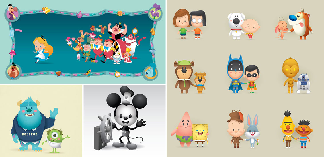
Attack of the Super Cute! Kawaii Creations with Jerrod Maruyama
Super Kawaii!
I was born to know Hello Kitty. The first toy to hit my crib was a Hello Kitty plush, her bright red bow hypnotizing me into a lifetime of adoration. I slept on Hello Kitty sheets, wrote with Hello Kitty pens, told time with my Hello Kitty watch, hauled my books in a Hello Kitty backpack. You can see where this is headed.
Being Japanese, loving all things kawaii* is just in my blood.
*Kawaii (かわいい [kaw͍aiꜜi], “lovable”, “cute”, or “adorable”) is the quality of cuteness in the context of Japanese culture.
So when I was making my picks for this month’s Flickr Pool Showcase, you can imagine my reaction when I saw:
THIS.
Insta-fan!
I clicked over to Jerrod Maruyama’s Flickr pool and gobbled up his work. I contacted him immediately; I needed more! Here are a few moments with:
Jerrod Maruyama
Freelance illustrator and designer Jerrod Maruyama embraces the kawaii style I so adore, often using it to describe the breadth of his work.
“I would use the same word – and I do, often,” Maruyama exclaims. “ To me kawaii means cute in a very Japanese way. I always come back to Hello Kitty and the world of Sanrio as the ultimate definition of “kawaii”. It is a simplification of features and design. But it’s not a baby style. It’s hard to nail down the exact characteristics of a kawaii creation but you tend to know it when you see it.”
Much like me, Maruyama was introduced to the world of kawaii early on, shaping the style he’d later adapt.
“Growing up, I always liked Sanrio products. I was attracted to all the different characters and the small size of all the products. I loved Robbie Rabbit, Tuxedo Sam, Little Twin Stars, Jimmy and Patty, etc. I think that influenced my kawaii design sense.“
Cute may describe his design sense, but Maruyama’s background is hard-core. He holds a degree in Illustration from San Jose State University and has a long history working for well-known clients including Disney, DreamWorks, Facebook, Nickelodeon, Mattel and Lisa Frank.
Valuable lessons have been learned working for these big name clients, which Maruyama has taken into his now full-time, freelance career.
“While I am very passionate about what I do, I have to remind myself that it is a job – I am creating images for someone else’s purpose. I am fortunate enough to work from home, but I am constantly dealing with clients over the phone, through email, on Skype, etc. With bigger companies you tend to deal with many more layers of approval. Feedback comes in waves and versions come and go quickly. Entire concepts can change in a single meeting. You can’t take feedback personally. That is always the challenge when working with any clients. You have to go with it. You have to find a way to look at the revision requests constructively. That’s the real work. Being grumpy about comments or pushing back on revision won’t get you very far. Win the battle but lose the war. The sooner you can accept revisions as part of the process and embrace that as the challenge of working in this industry, the better you will do with big companies and projects. Being pleasant to work with goes a long way when working freelance.”
Always working, constantly creating, Maruyama makes use of feedback from his peers to fuel his work. Besides the world of Sanrio, he gains inspiration from colleagues, as well as Disney movies and Disneyland, the films and characters of Pixar and music.
“I put my work out there and learn from the feedback I receive. I look at other people’s art and constantly look for inspiration online. Sites like Tumblr and Pinterest have made it so easy to view the work of others – and it’s also a lot of fun,” Maruyama notes. “A host of fellow artists inspire me on a daily basis and push me to do better work.”
He reports, “Fellow artists like Joey Chou do some really amazing work and really elevate the kawaii style. He brings a storybook aesthetic to the genre. His work is beautifully crafted and rooted in good design. I love the conceptual work of the animation industry. Disney artists like Brittney Lee and Lorelay Bove do amazing work – a modern take on Mary Blair. There are so many others – Bob Staake, Kevin Kidney, Andrew Kolb, Pascal Campion, Mike Yamada, Victoria Ying, Jeremiah Ketner, Leo Espinosa to name just a few. “
Once inspired, Maruyama gets straight to work, creating his own, original super cute creations.
How does he view the world of kawaii in the realm of art history? “ I’m not sure I really think of it as a movement in art history. I think it’s more part of the design world – and within that world, closely tied to product design. I might even think of it as a specifically Japanese philosophy on appealing design. Time will tell if this approach to characters and merchandise fits into the overall scope of art history as we think of it today. Pop culture is certainly playing a larger and growing role in our modern concept of art. I think eventually it will all get wrapped up in one big, consumer driven movement.”
To me, kawaii superfan, and others pursuing design, Maruyama, says that to go after your dreams, “You have to just do it.”
He notes, “I have a long way to go in my own career as an artist. I certainly haven’t figured out any shortcuts or tricks to getting work or being successful. I am figuring it out everyday I work on a new project. So, don’t wait around for someone to let you in on some secret to success. Don’t waste your time looking for answers – just do it. Work hard. Keep trying to get better at what you do. Show your work and get feedback. Engage with other artists. Look at as much artwork as you can. Be passionate and sincere about what you do and the work will come.”
Jerrod Maruyama | Twitter | Flickr | Facebook | Dribble
- Categorized: Graphic Design
Tutorial: Exploring the World’s Original Take on the Art of Printing
With a foundation laid by VCU’s School of the Arts and with the experience I’ve gained from Go Media, I am excited to present a tutorial on one of the oldest art forms in history: block printing. The procedure for creating printed art has been streamlined and reinvented for over a thousand years. Technological advancements of the 20th century especially have revolutionized the process to the point where few people are willing to engage with their work in such an involved way as with block printing. With this tutorial, I’d like to help people reacquaint themselves with the organic pleasures of custom, handmade artwork.
This traditional printing technique is extremely versatile. It can be used for anything from business cards, to posters, to T-shirts, to swing tags. Whether you work for a small clothing company or whether you’re a freelance designer, being familiar with block printing is a great way to refine your style.
Inspired by Go Media’s roots in illustration and design I wanted to develop a tutorial that highlighted small businesses, specifically in the clothing industry. The goal was to give my work a vintage flair using distinctive elements of illustration and typography. So, without further adieu lets get started:
Step 1: Concept
It should go without saying that you must have an idea before beginning any work. Because I am focusing on swing tags, which are used primarily for labeling clothing, I’ve come up with a fictional company that specializes in hand-stretched, quality leather shoes for both men and women. This company is called Sole Mate Co.
Step 2: Sketches
I have created two illustrations for the purposes of this project. I wanted the front of the swing tag to feature the name of the company with the back containing a custom image of a shoe, one that could potentially be used in other promotional materials. The size of the design is critical – since mine will be fairly intricate, it needs to be on the larger side.
Step 3: Materials
Once you’ve finalized your sketches, you will need to gather the necessary materials. Most of these items can be found at any craft store or hardware store.
– Linoleum block (I’m using a 2 ¾ by 4 inch block)
– Chisel (tip sizes: 1, 2, 5 or equivalent)
– Brayer/roller
– Plastic pan or flat plastic surface (styrofoam also works)
– Water-soluble ink
– Cardstock paper (which will become the swing tag)
– Hole puncher/X-Acto knife
– Tracing paper
– Bone folder or scissors
– Yarn/string
Speedball makes a wonderful kit for block printing that includes all the essentials listed above. Unit price – $20.00
Step 4: Transferring the Design
Using tracing paper, draw over your final design, making sure to correct any lines that may have been skewed during your sketching process. Once you’ve finished tracing, take the paper and place it IN REVERSE on the linoleum block. Transfer the drawing by firmly holding the design in place and rubbing the back of the paper with either a bone folder or the scissors handle. (You can also use your hand). The transfer may not come out perfectly, so be sure to draw over any lines that don’t come out clearly.
Step 5: Carving
Use the chisel to carve all the negative space away—basically everything you don’t want to be printed. This should be a methodical process. An easy way to make sure you don’t carve away the wrong section is to use a marker to indicate which areas should be cut off. TAKE YOUR TIME – taking your time during this stage is essential. Put on your headphones and just focus on what exactly you are cutting away.
Also, be careful! Always carve away from your hand. Remember that larger chisel tips should be used for larger areas and smaller tips should be used for detailing. The amount of pressure you should apply depends on what blocks you use. Some are very stiff, which requires more pressure. I’m using 4 soft linoleum blocks. They’re easy to cut and put less strain on the hand.
Step 6: Prepare Your Surface
I’m printing on cardstock which has been cut, dyed (with black tea), bent, and stressed. In order to get a more vintage feel, you can sand down the edges with either an automatic sander or just a regular piece of sandpaper.
Step 7: Ink
Prepare your surface for inking. Block printing at this size does not require a ton of ink, I’m applying just enough ink to coat the brayer. Next, take your brayer/roller and roll the ink using a horizontal and vertical motion. Get a thick amount of ink on the entire surface of the roller. Finally, roll the block. Because this is a relief print, only the protruding surfaces will have ink on them.
Step 8: Print!
Apply the block to the surface of the paper. The first print will have an excess amount of ink on it; don’t worry, every time you print, the ink will show up less and less. Some prints will be more even than others. Re-ink your brayer as desired.
Conclusion:
Congratulations! You have just made a custom block print. Punch small holes and attach string for final presentation. This design can be used as many times as necessary for a wide variety of things. I hope this tutorial was informative and enjoyable. Now go attach the finished tag to a lovely pair of shoes or a shirt or whatever it is you want to show off.
To see more of Kyle Saxton’s work check out his online portfolio.
Article by Alex Rendon and Kyle Saxton.
What you can do with your design:
1) Patterns
2) Branding
3) Vintage Effects
4) Identity
Thank you!
- Categorized: Graphic Design, Tutorials, Typography
Flickr Pool Showcase – August 2013
Hey Everyone! We’ve been super busy here around the GoMediaZine, but we’re happy to bring back the ever popular Flickr pool showcase! We promise to make it a monthly staple if you promise to keep your designs coming! Here’s how to join, followed by our picks for the month of August. Enjoy!
Interested in Joining
If you are new to the Flickr Pool Showcase, check out the instructions below for how to sign up.
- Login to your Flickr Account (sign up if you don’t have one)
- Join the Go Media User Showcase Group (only group members can contribute)
- Upload your designs to your own profile
- Click on your newly uploaded designs then click the button “send to group” above your image and choose the Go Media group.
The August Showcase
Bryan
Brooklyn Spin by Jay Roeder
Space Oddity by Robert Williams
Monstro do dia by Cláudio Soares
Untitled by Simon Walker
Queen of Hearts by Dennis Bennett
Fly by Marcus Williamson
Win? by vaughnfender
Rasta Lion by Marcos Torres
Adrift by Donna Coburn
Heather
Set the Lion on fire by Raxon Rex
Industry by Matt Lyon
Contos | Tales by Dalt’s
A World of Cute by Jerrod Maruyama
Summer Sun by Nico Nordström
Mamut Party by Oscar Ospina
Three Little Hyenas by Pavel Fuksa
Simon
Out there #2 by Ricardo Freire
Devil 3 by Miguels Little Corner
Day and Night by Addu
Keep Growing by Ines Jakovljević
The Joker by No
Rain Rain by Jason Stanley
Gatástrofe, como era de esperarse, digna, ni me maulló, y seguía agachada bajo el mueble by Innita
Dead Threads by Michael Spitz
Torino by shiko
Torino 2 by shiko
Torino 3 by shiko
Spitfire by Michael Spitz
TSAW/2013.28 by Jean Mosambi
Shadow’s Ruin by Hector Mansilla
Heart in a Cage by Jaaaiiro Souza
Lemon Millenium Falcon by Justin Van Genderen
21 by Gilang Purnama Jaya
Marlin Stippling by Cory Jones
I can feel my mind going dave by Chris Thornley
Panther 1 by miguelsLittleCorner
Johnny D by Jerrod Maruyama
Direwolf 5 by miguelsLittleCorner
Teen Angels by Neal McCullough
The Burn by Marcus Williamson
Mase by Maxi Vargas
Inglourious Basterds Movie Poster by Mark Hylan
Wolverine by Jaaaiiro Souza
Black Swan Illustration by Geordan Moore
The Great Gatsby by Daniel Norri
Road Trip by Laurie McCall
Light Shards by Jim Keaton
Le Dottore by Jaaaiiro Souza
Untitled by Simon Walker
Cafe Racer by Michael Spitz
Ugh! by blaquemoose
The time is now! Login to your Flickr Account, jump onto our Go Media User Showcase Group and get going! We want you to be a part of our next showcase! See you soon!
- Categorized: Design Community, Graphic Design Inspiration
- Tagged: Flickr, Flickr pool showcase, tweet
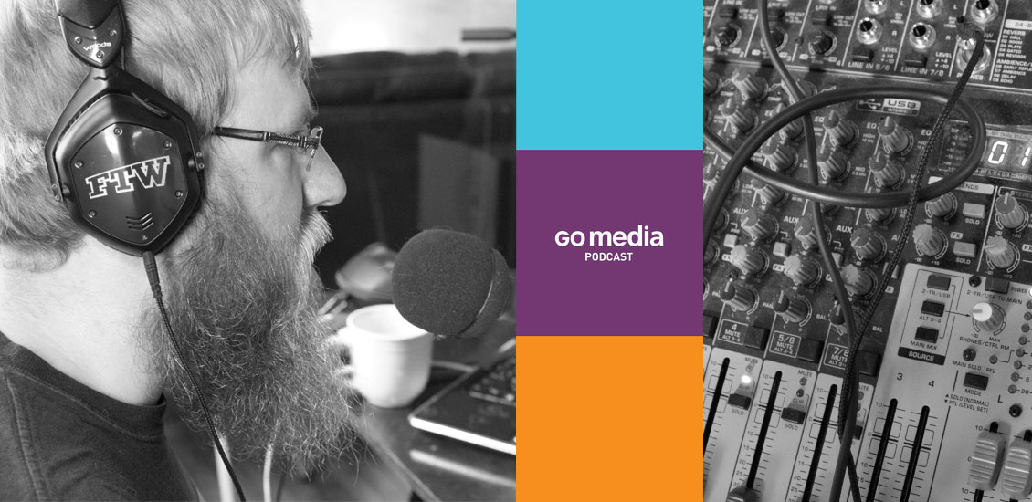
Tools We Use To Produce The Go Media Podcast
Ever wonder what kind of tools you need to put together a great podcast?
I don’t know about great, but I can at least tell you about the tools we use to produce the Go Media podcast. If you aren’t familiar, the Go Media Podcast is dedicated to tips, tricks, and tales of the business-minded artist and designer. It’s our way of letting you inside our studio to learn about the ups and downs we face here at Go Media and how we’re dealing with them.
Every episode deals with at least one topic that we’ve run into head first and how we solved the problem or at least, how we’re currently dealing with it. So far, we’ve talked about how and why we price projects, how we adjusted methods to land more projects, as well as how we keep momentum going when inspiration (and finances) aren’t in the best of shapes.
So far, we’ve recorded just over a dozen episodes. The process has changed dramatically from where we were at episode one. So, instead of going through the entire history of our setup, I’ll just explain how we put together each episode now.
The Process
We set up the studio in our conference room.
We wanted to put something together that was in the office, but offset from the staff so our loud, on-air antics aren’t interrupting their day. Plus, we wanted to be able to capture some of the staff background sound to add a bit of atmosphere to the recording.
The main piece of hardware we use is a Behringer X1204USB Mixer. It’s a 12-channel mixer, which allows for up to 6 mics or line-ins. During a normal episode, we run 3 mics in tracks 1-3. The mixer runs just under $200 on Amazon. This also gives us the flexibility to mix the audio while recording. We run the mixer into a laptop through a USB input to record.
The mics we chose to use are Samson Q2U. They can plug directly into the mixer or can even be used as a desktop mic through USB. We wanted something versatile that we could use with or without a mixer. Those ran about $50 a piece. We also have Onstage Boom mic stands, but the mics came with desktop stands as well, which we use depending on the situation.
Bill and Jeff currently sit across from one another on one side of the table, and I sit behind the mixer and laptop. We use a similar set up when it’s just Simon and I talking about the Arsenal.
For WMC Fest Speaker Interviews, we used an Ipad and Skype. We ran the Ipad audio out into track 4.
To prepare for an episode, we use Google Docs. Every episode, we create a new doc where we can collaborate on the pre-show show notes. We then use those show notes in our final post on the Zine. Jeff and Bill normally bring a printout of those notes into the studio with them, however I tend to access the doc through my tablet.
To record, we use Audacity. Audacity is a free, open source, cross-platform software for recording and editing sounds. We bring the audio in from the mixer through a USB input, directly into Audacity. We also use Audacity to edit and use 4 basic effects on the final export:
- Noise Removal – This one is no longer as important as it was when we first started, but every once in awhile, it’s nice to take out the crashing of plates from the kitchen, or the faint sound of sirens in the neighborhood, or the door slamming shut on a windy day. I normally apply this first, before making any other changes, that way we can get a good sample of “white noise” to choose from. Plus, it easily eliminates excess static and fuzz that you generally get when recording audio.
- Chris’s Dynamic Compressor Plugin – I use this to make sure everyone is, generally speaking, talking at the same levels.
- Truncate Silence – Once we clip the ends and remove the unnecessary bits, I run a truncate silence to close some of the gaps. It beats doing it manually.
- Fade In/Out – This is how we accomplish the fade ins/outs of all music we use during the episode.
Starting with Episode 10, we decided to start streaming live every time we record. To do this, we use two apps: Mixlr for streaming the audio and Tlk.io for chatting with our listeners.
- Mixlr lets us stream high quality, live stereo sound across the internet. It also records the stream and allows us to download a 128kbps audio file through a Dropbox account. They have an iOS app so that you can also listen while on the go, with an Android app in the works. The premium version of Mixlr also gives us a direct download link and the ability to embed the stream on our site.
- Tlk.io gives us an embeddable chatroom that can be accessed from any device that can access the web. We’ve embedded it at http://gomediazine.com/live so that, when you’re listening to the conversation, you can also add your thoughts, which we can then bring into it on-air.
We plan on taking all episodes live after WMC Fest. Hopefully, we can get a regular schedule going.
In short, here are the tools we use to produce the podcast:
Tools
Software
- Audacity for single track recording and editing
- Mixlr for live streaming
- Tlk.io for live chat
- Google Drive for show note collaboration
Hardware
- Behringer X1204USB Mixer
- 3 Samsung Q2U Mics and cables
- 3 Onstage Boom Mic Stands
- iPad for Skype calls
So yeah, that’s the gist of the what we use to record, edit, and produce the Go Media Podcast. Haven’t listened to it yet? Take it from me, you should.
- Categorized: Graphic Design
- Tagged: behind the scenes, podcast, staff, staff picks, tips
How to Extract a Budget from your Client
Hi Go Media faithful! Bill here! I’m back to deliver another teaser article from my book, Drawn to Business. This week’s piece looks at how to extract a budget from your client. Ready? Here goes.
Extracting a Budget from your Client
It’s a commonly held belief that giving a vendor your budget upfront is a fool’s approach. Because of this, many clients will play dumb when you ask them for a budget. That’s fine. Don’t be a jerk. It’s still important to have a money conversation early on. You need to qualify your clients before you spend a minute working on a proposal for them. In those cases where a client doesn’t give me a budget, I’ll give them my ballpark pricing. This starts with me asking enough questions to get a general sense of their project. Then I might say something along the lines of: “OK, Bob, this sounds like a fairly typical website design: Homepage with slideshow, About, Services, Contact Us and the whole site to be responsive, correct? Great. Obviously, we’re going to need to get into the nitty-gritty details about your website in order for us to provide you with an accurate time and cost estimate. However, just so I can make sure our firm will be a good fit for you, my very rough estimation on a website like this will probably be somewhere between $15K and $30K. Does that sound reasonable to you? I just want to make sure we’re not wasting each other’s time.”
This approach works almost every time. If this ballpark is significantly more than they were expecting, they’re going to let you know. They might say something like: “Whoa. OK. Yeah, I was hoping to get a website built for about $2K.” Well, there ya go—you just got their budget! It’s funny how they will suddenly give you their budget after they said they didn’t have one. Or they might say something like: “Well, that’s a little higher than I was expecting, but I think we can get something done.” I would interpret that to mean that their budget probably starts lower than my range, but definitely is within the lower part of my range. Maybe their budget was $12K to $17K.
Of course, if they say that they’re comfortable with the range, I will proceed. If the client falls out of their chair and/or faints, I know I need to adjust the options I offer. Hopefully, I do have a solution for them if they cannot afford me. My follow-up with a client whose budget was well below my range might sound something like this: “OK Bob, I certainly understand you’re on a tight budget. Many clients don’t fully understand the work that goes into building a website. We have a few options here. I have a pre-built website template that can be customized for you at a fraction of the full cost. Or we could break your website development into phases and just scale back the project scope of the first phase so we’re within your budget. If that doesn’t work, I know a few freelancers you can talk to. How would you like to proceed?” Obviously, this is just one possible response.
You don’t want to be thinking of solutions and writing proposals in the dark. Get that financial conversation going early. It’s perfectly OK to talk money. Just make sure you do it in a very friendly way. Take the time to explain that you have website options that range from $10K to $100K, and you just need to know what’s going to be a realistic range. You’re still going to do your due diligence and present a complete solution and pricing upfront before they will have to make a decision. There will still be an opportunity for them to negotiate with you if they feel the need.
______________________________________________________________
- Categorized: Business Philosophy, Graphic Design, Small Business
- Tagged: business, business insights, design tip, Drawn to Business, Graphic Design, illustration, tips, William Beachy
Go Media Podcast – Episode 15: An Interview With Jon Contino, WMC Fest Is This Week!
In this episode, we sit down with WMC Fest Speaker Jon Contino. We talk to him about starting his design career, where he pulls his inspiration from, and what he feels about people using his techniques in their work. Plus, we touch on what he’ll be speaking about at WMC Fest. Bill and Jeff also talk about the general atmosphere in the Go Media office as we enter the week of the fest.
Listen to the Podcast
[powerpress]
[iframe width=”100%” height=”166″ scrolling=”no” frameborder=”no” src=”https://w.soundcloud.com/player/?url=http%3A%2F%2Fapi.soundcloud.com%2Ftracks%2F105254145&auto_play=false&show_artwork=true&color=ff7700″]
Show Notes
Sponsor of this Episode
Cover art for this episode was also created by Simon Hartmann. You can find textures like what he used at arsenal.gomedia.us
Quick Tip: Get negative people out of your life.
It doesn’t matter if it’s an employee with a ton of talent or a customer who’s giving you a lot of money. Negative people affect your entire workflow and overall motivation. One bad employee can bring down the entire office. Time spent with negative people is wasted time.
What Go Media Has Been Up To
- WMC Fest is this weekend. Seriously. We’re here. And Jeff has been engulfed in every aspect of the fest.
- We’re looking for volunteers for WMC Fest.
- The release of Bill’s book will be after WMC Fest. The deadline of selling it at the Fest was great for motivation, but not great for the overall strategy.
Links
- Weapons of Mass Creation Fest 4
- Go Media on Twitter
- JonContino.com
- Jon Contino on Twitter
- Simon on Twitter
- The Go Media Building Texture Collection
Credits
Hosts: Jeff Finley and Bill Beachy
Producer: Bryan Garvin
Recorded at: Go Media
Sponsorship Opportunities
Interested in sponsoring the Go Media podcast, either episodically or exclusively? Well, hit us up at [email protected] if you are interested in advertising your business. Or, take part in our blind auction.
What Do You Think?
We want to hear what you think about the latest episode of our podcast and what topics you would like to see covered in upcoming episodes. Comment below with your suggestions.
Join Us Live
Moving forward, we’ll be recording every edition of the podcast live at gomediazine.com/live. Next recording will be Thursday, August 8th, 2013 at 11am ET for Episode 15. There’s a chat, so join in the conversation.
Ready for More?
Keep learning and listening to more Go Media podcasts!
- Categorized: Business Philosophy, Video and Podcasts
- Tagged: podcast
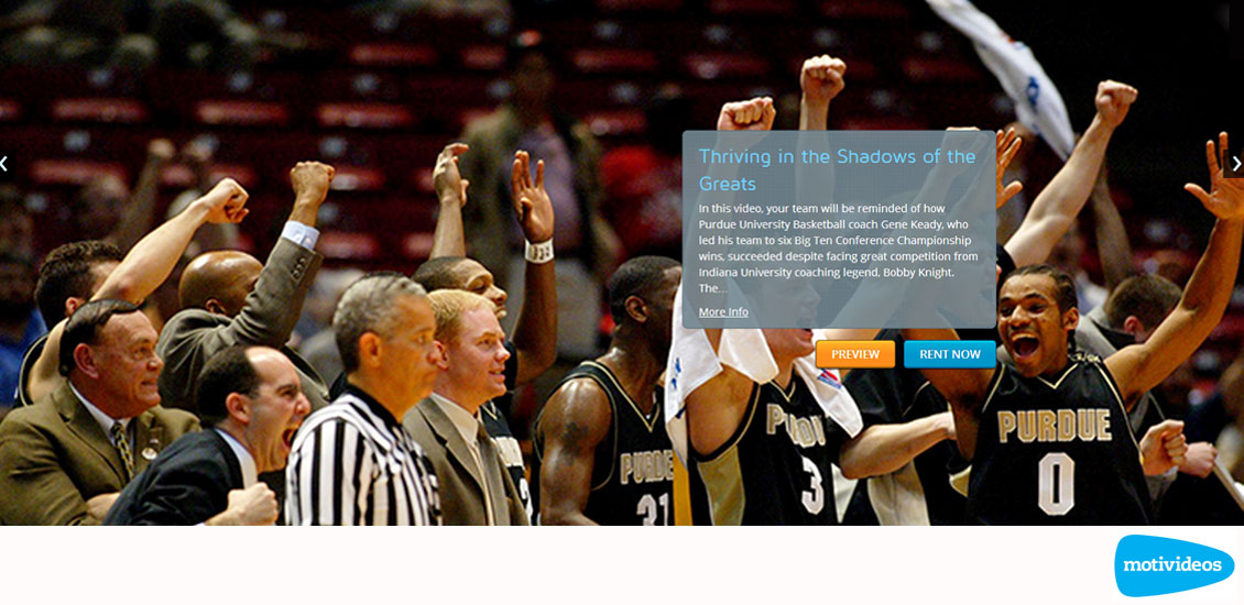
Go Media Launches Motivideos!
Motivideos, Version 2, is now live!
Go Media has been honored to work with the lovely people over at digital video production and marketing company, Motivideos. Version 2 of their site is now live! One of the first producers to self-distribute leadership content online, Motivideos relies heavily on their site to create and distribute original pay per view Leadership Videos. Motivideos also helps clients tell their own stories, generating greater brand awareness through custom video. Go Media’s website design and development team have been thrilled to help Motivideos achieve their vision.
Some of the features include:
Full width slideshow & video dock carousel written with
Google’s Angular JS
Responsive website design and development written with
Zurb’s Foundation 4
Content Management System powered by WordPress and extended using Go Media’s WordPress Framework
Check out more of our work here and subscribe to our Go MediaZine newsletter for the latest and greatest in all that is Go Media!
Learn more about Motivideos: Twitter | Google+
Why a Custom Website is so Expensive (Part 2 of 2)
This is Part 2 of a 2 part series, Why a Custom Website is so Expensive? Check out Part 1.
The Big Ticket Why
So, why can’t you just have what you want, for cheap? Your website idea seems simple. Maybe it is simple in the grand scheme of computer science. Or maybe it is a truly difficult problem you’re trying to solve. Either way, Go Media is being tasked with getting you there. For us to be able to do so at a world-class level, in a reasonable amount of time and stand behind our work, we have honed a process over the years. It has become so defined, it almost much delineates the departments of our firm.
- Account Services
- UX Planning
- Design
- Development
- Deployment
- Payroll
The teams at Go Media have become highly specialized. They’re not bogged down by having to juggle all of the above like a freelancer. This allows us to engage with many clients, at once, in various stages of their projects. Each process in this system is devised to ensure quality, client satisfaction and accountability.
To give you an idea of how time and costs add up, I’ll touch on what each project phase entails.
Account Services
The Account Services team interfaces with our clients from inception to completion. They’re on the front lines in the battle for customer satisfaction. When a client reaches out for their next campaign, the Account Managers work up an assessment, make recommendations and conclude a project outline. They collaborate with department managers to communicate client expectations, identify solutions and analyze feasibility. We are then able to provide a comprehensive proposal and fee estimate. Negotiations and changes to the scope of work are common until we find the best alignment between client goals and budget. It isn’t unusual for this process to take several hours a day for days or weeks at a time.
Once an agreement has been reached, Account Services kicks things off with the production teams. Meetings and conference calls bring all parties up to speed as to the project details and any noteworthy items that may deserve additional scrutiny. Here, Account Management reiterates timelines, deliverables and gives you a good understanding of what to expect from us. From this point forward, your Account Manager keeps everyone focused and on point. This includes things like cross departmental communication, tracking asset needs and serving as the client advocate. And then there is the proverbial cracking of the whip.
UX Planning
Now that we have a full sense of what you need accomplished, we begin with the end in mind. What are your business objectives? What are your user’s objectives? How do we align your goals with theirs in a way that is intuitive and engaging? All this and more is fleshed out during User Experience (UX) Planning. We identify your priorities and allow them to inform the user experience. We achieve this through Storyboards, Use Cases, Sitemaps, Information Architecture, Wireframes, Effects Planning, Interactive Prototypes and more. The results provide a nearly complete visual representation of what we’ll be designing. This process helps clarify many things for our clients and the designers. In many ways, it becomes like a roadmap of how we’ll get there.
Design
With all of the UX directives in hand, the design team is able to begin concepts quickly and not let nuanced business objectives stifle their creativity. They get to focus on branding, themes, concepts, UI, photo manipulation, typeface selection and all sorts of other visual concerns that make your custom website or web application design stand out. Designs are crafted to meet the specifications for how they’ll be delivered and proofs are provided as each piece comes to life. Clients are given ample opportunity to provide feedback on each version along the way. The design team makes revisions accordingly until awesomeness is achieved. High fives are then exchanged.
Development
By and large, development is always happening. It starts almost as soon as your deposit check clears. Modern Web Development is essentially Software Engineering, a discipline of Computer Science. It seems to become more complex by the day. The expectations of the marketplace typically mean most custom web development projects include features or functions that don’t exist yet, or don’t quite exist in the way you have in mind.
Web Development typically includes two major workloads, Frontend Development and Backend Development. The Frontend portion is what you see in your internet browser. It is predominantly HTML, CSS, Images & Javascript. This is the User Interface (UI) and UX you interact with. Often our clients are presented with static versions of the frontend as it comes together. Static means it isn’t “wired up” to the Backend yet.
The Backend resides on the server. It is the logical brains and database that give your site functional value and allow it to scale. The Backend is the software behind Content Management, Ecommerce and just about every purpose-driven system online. Web Software, more commonly referred to as Web Applications, are built to leverage Databases. They access the data using Programming Languages, such as PHP. Each special feature of your website may require a new component to be developed. Each new component might entail a handful of files and a few hundred lines of code or potentially hundreds of files and thousands of lines. This code must be carefully crafted to serve its purpose.
Every component of the Frontend and Backend must play well with others as they’re typically only a part of the bigger application. This requires immersive, critical thinking every step of the way. The development portion of custom web projects is almost always the most workload intensive. It isn’t unheard of for development of one project to take thousands of hours. Innovative websites like Facebook or Zillow, spend thousands of hours in development every single month, year after year.
Deployment
“Going live” may seem like a trivial matter after everything we’ve mentioned, but it is another one of those steps that adds time to your project. You’ve likely heard it said; You never get a second chance to make a first impression. This concern is a big deal when it comes to your new website. Everything has to be just right. If you have features like News, Ads, Products, Ecommerce, Video, Blogs, Slideshows, Carousels, or something new, it can mean a lot of brand messaging, photography, multimedia or any number of other assets need to be prepared. This equals hours of content population. We also may have to concern ourselves with a launch strategy such as a marketing campaign. Even something as simple as welcoming your new visitors or inviting them with a newsletter can take a bit to put together.
Next, the servers and domain need to be ready. They must be properly configured to ensure a seamless migration. If this is replacing an existing site, proper considerations need to be given so systems like Email aren’t interrupted. We continue to stand ready after deployment because you never know what may be in store. Oprah could name your product one of her favorite things and throngs of fans could trample your website. It will sink or swim in success only if it is done right. And to do it right takes a lot of time and care.
Payroll
When you boil this all down, what you’re really financing to have a custom website designed & developed is payroll. Service business’ most significant overhead is paying their professionals. Creative and Technical Knowledge workers command wages in the upper spectrum of income. You’re buying chunks of their expertise and that time is money. For example, a nice custom website with relatively common features, such as a CMS with custom component integration, takes between 150-300 hours from start to finish. This is real, nose-to-the-grindstone production time specifically applied to your project. In addition to those hours, there are people who indirectly contributed by allowing our specialists to focus on serving you better and faster. These are the team members behind the scenes who handle IT, HR, processing, bookkeeping, marketing and other expenses of doing business. All said, the operating costs for a service business like ours might be around $75/hr. If we were to only break-even on a 200 hour custom website, we need to command $15,000 for it. And if you know anything about the ebb and flow of business, you can’t just charge enough to break-even.
So there you have it. Like I said in the beginning, it is because these things take a long time. I touched on a lot in this piece and really only skimmed the surface. There are many talented individuals that play a part in producing an attractive and functional custom website. Each phase is riddled with nuance and obstacles that have us starting early and working late. It is really about the people who care enough to do exceptional custom work and stand behind it. The very talented and dedicated team at Go Media embrace the challenges of each day and do so with poise and professionalism. That’s really what this is about. You may pay a lot more to have exactly what you want, but when you hire the right people, they get it done right.
- Categorized: Business Philosophy, Graphic Design, Small Business
- Tagged: advice, business, design, staff, tips
Essential Tips for Success from Designers We Trust
From Designers Who Know Best.
It’s a big, bad world out there. We asked some of our favorite designers, what is your #1 tip for success?
Dan Stiles: “Hustle. Always be hustling new work, new angles, new products. If you’re working for yourself there’s no other way to stay alive. And if you’re working for someone else there’s no other way to get ahead, so you can quit and hustle for yourself. And keep some money in the bank, for when the hustling isn’t working.”
Chuck Anderson: “I’d say my #1 tip for success is to always do what you feel most passionate about. That should always be the driving force behind everything you do in order to have long term success on top of the short term joy that doing what you love brings. It’s easy to get off track and do things for the money or get caught up in projects you’re not super thrilled about. That’s fine every now and then, but ultimately you should be pursuing the things that you most lose yourself in.”
James Flames: “Sleep. The busier my days get, and the more crammed my schedule becomes, I realize that there’s one of two ways to get it all done: let my work day bite into my sleep time slowly until I become a zombie and never sleep again, or make my work day more efficient so that I can always get the same amount of sleep. Lately I’ve been choosing the latter, and it’s working wonders.”
“What I’ve found is that when my brain and body have a consistent amount of sleep each day, the efficiency almost takes care of itself. My clarity on my day and the tasks at hand are immeasurably better, and my instincts become more true. All because I’ve recharged my batteries – instead of draining them to the last drop each and every night like I used to. And the thing is that sleeping a few extra hours doesn’t mean I’m working any less, per se. I can get more work done in 10-12 hours now then I used to at 16-18, and the work is way better too – because I’m not halfway dead during my time working.Yes, easier said than done – old habits are hard to break (especially for all of us night owls) but I can almost guarantee it’ll make folks’ design work better.”
Mary Kate McDevitt: “My #1 piece of advice to designers, specifically those just starting out, is something we were all told growing up and that is to be yourself. Have honesty in your work. When you are finding what you are passionate about don’t let others, or Pinterest determine what or how your work should look. You will drive yourself crazy trying to be as good as someone else, but you will be crazy awesome if you approach your work from an honest place. ”
Brian Jasinski: “My number 1 tip for success would be: Go out of your way to make the client happy, be it driving a proof over personally in a last minute crunch. Asking them about their weekend. Being open and honest. Simply being real. It allows you to have an open conversation with them that garners trust and makes working together easy and natural and positive.”
Julia Kuo: “My #1 tip for success is to work hard! For freelancers and those with flexible schedules, keep your hours professional (for instance, starting your 8 hour workday at 9am everyday) and maintain productivity when you’ve got a lighter workload. The product of your hard work will be transparent through the quality and amount of work you do.”
Blanca Gómez: “My tip for success is to have your own particular voice; what I mean by this is not necessarily a unique style, but a strong personality behind your body of work that can help you to become noticed. Also, work hard, being patient while waiting for the outcomes, and have a good online presence.”
______________________________________________
Have a tip for success? Share it with us in the comments section below!
- Categorized: Design Community, Graphic Design, Graphic Design Inspiration
- Tagged: advice, design, design tip, tips
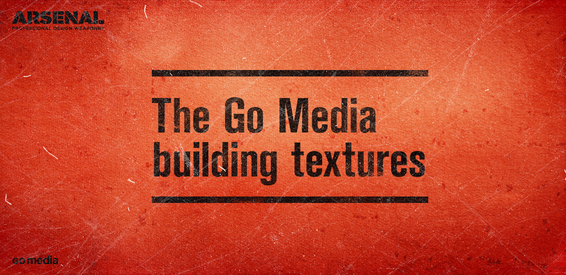
Announcing the Go Media building texture collection!
Textures. You said textures? That’s textures!
Hey folks, it’s Simon here. To say that I’m excited to share what I’m about to write doesn’t even begin to cover it. Heather and myself have been hard at work to release a super thing for you guys, before WMC Fest. It’s the Go Media building texture pack!
A bit of context
So I don’t know if you’ve been following along, but here’s the thing: Go Media is housed in this super bad-ass old warehouse building. I won’t go in too many details, but you can read a lot more about it in past Zine articles (Home sweet home, Designing the Go Media HQ workspace) or see some photos of the office floor renovation process. Our fearless leader Bill also tracked down this circa 1960 photo of the building:
Anyway, there has been a lot of work done on the building’s facade in the past 3 months. Just check this out:
All of this fixing-up work revealed a lot of amazing things to look at. I’m obviously talking about textures here. After capturing a few images for personal references, we decided to share them for all you guys too!
So what?
So after a couple of hours of shooting, at least as many in editing, and some selection process, we’re ready to introduce you to the Go Media building texture collection. It includes 122 textures, divided in five categories: fabric, dust, grunge, noise, and wood grains. The whole things weighs 629 Mb.
Let’s have a quick look at some of these
As you can see, the collection covers a pretty wide array of texture types, and goes from super subtle to sledgehammer.
The best is to come yet: let’s talk price
That’s the most awesome part: we decided to release the full collection for free! 0¢. Nada. Zilch. You get the picture.
Well it’s free, for a limited time only, as part of the general craziness surrounding WMC Fest and its preparation. We will probably put the whole collection back at a normal price sometime after the Fest when we’ll have time to do so, between catching up, tearing stuff down, and settling back in a normal rhythm. So, obviously, you know what to do: get the damn collection now.
The good times of the free texture collection have passed, but we decided to sell it for a very low price: only $37! I’ve calculated that’s around 30¢ a texture.
A few case studies
I wanted to demo the potential of the pack, and to unveil some of the ways to use these.
1. The fake product box
For a start, you can see the textures in action (and a few other ones) on the digital product boxes. Let me quickly walk you through the PSD in the video below.
http://www.vimeo.com/71507521
Sorry for the background noises, but the Go Media office is busier than a bee hive!
Resources
Grab these resources to re-create the design:
- gma-go-media-building-texture-set-misc-noise-008.jpg
- gma-go-media-building-texture-set-misc-noise-005.jpg
- gma-go-media-building-texture-set-grunge-049.jpg
- photocopy_by_clarisaponcedeleon_-_deviantart.jpg
- gma-go-media-building-texture-set-grunge-047.jpg
- gma-go-media-building-texture-set-dust-001.jpg
- gma-go-media-building-texture-set-dust-002.jpg
- gma-go-media-building-texture-set-fabric-004.jpg
2. Some advice on how to manipulate the textures for use
It’s the first time I’m shooting photos to create noise textures. I have developed a workflow to use them, but it might not be the most obvious. Let me show you below. We’ll create a wallpaper in the process, using some art I’ve developed for a recent contest on Dribbble as the basis. You can use whatever you see fit though. Call it your procrastination project of the day, but don’t cry if your boss catches you.
1. Let’s create a new Ps document sized at 1920×1200 px.
2. Let’s have a look at the art in my Ai file.
The color scheme is as follows: #EA3E24 for the background, #200D10 as my near black dark color, and #F4D6CB as my highlight color.
3. Let’s fill the background of our wallpaper with #EA3E24, and paste our brand lock-up in the frame.
You could go simple and just center it, or align it at the bottom right corner, in order to spice things up a bit. This will also allow people to appreciate the textures we’ll be working with in your design against that dark orange background.
Following my initial intention to center the art, I placed guides at the center of the frame (960 px vertically and 600 px horizontally). But since I’ve decided to shift things around a bit, I also placed guides at 50 px of the bottom right corner. Now that that’s done, time to work some texture magic.
4. Let’s choose a few noise textures, and a few dust textures from our collection.
I’ve chosen the following:
- gma-go-media-building-texture-set-misc-noise-007.jpg
- gma-go-media-building-texture-set-misc-noise-009.jpg
- gma-go-media-building-texture-set-dust-001.jpg
- gma-go-media-building-texture-set-dust-002.jpg
- gma-go-media-building-texture-set-grunge-048.jpg
5. It’s time to place and edit the first noise texture, gma-go-media-building-texture-set-misc-noise-007.jpg
I’d suggest placing the textures at the top of the brand lock-up. That way, the texture application will unify everything together visually. To place the first noise texture, I’m just sliding it in my Ps window, and sizing it to recover my whole canvas. I’ve highlighted the values I’ve used in red.
Once you’re happy with your texture placement (notice how mine is slightly off-centered), just validate the transformation. Now, we have two options: either we rasterize the smart object created when we slid the texture in our document, or we leave it as is. I’m going to rasterize it to gain time, but you could still follow this tutorial if you didn’t. You would just need to use adjustment layers to apply the saturation and level changes to the textures, and make sure these are properly clipped. See the box PSD breakdown above for more information.
For a noise texture to, what we want is to bring these subtle dust and noisy elements visible in white or off-white over our design. We’ll be using the Screen blending mode (which shows anything black as transparent) to accomplish this. So the goal now is to use our levels to darken as much as possible of this texture, and to lighten only the noisy bits up.
First, let’s desaturate the texture (CTRL/CMD + SHIRT + U). Then, time to bring our levels palette up (CTRL/CMD + L), and to start playing. After a bit, it looks like the areas that we can impact with the texture aren’t very interesting. A potential workaround is to invert the texture and see what we can do with that “new” work surface. But even after doing that, alas, no luck. So I’m simply not going to use this texture this time.
Let’s slide in our second noise texture, gma-go-media-building-texture-set-misc-noise-009.jpg, and repeat the same process.
And here, we’ve got some better luck at just keeping parts of that texture that make these little noisy elements we’re after.
I’ve used 75 for my dark tone, 1.5 for the mid-range, and 150 for the light tones. Time to change the blending mode to Screen, lower the opacity of the layer to 35%, and to admire the result of that first texture pass.
Another little thing I’ve done is to sharpen (Filter > Sharpen > Sharpen) my layer once, as it enhances the little noisy details we’re after.
6. Dusting things up
It’s time to include and manipulate our dust textures in here. Let’s start with gma-go-media-building-texture-set-dust-001.jpg. If you want your dust speckles to look white, the process will be very similar to the noise textures. Here are the values I’ve played with for that:
And here’s the result:
In the event you want the dust and speckles to be black, here’s what I’d suggest:
The next step is to invert your texture (CTRL/CMD+I), which should give you a result similar to this:
Finally, I just switched the texture’s blending mode to Multiply.
To get an idea of the detail from up-close, here’s a 100% crop:
Now comes the time to choose which direction to go. Given how the next texture, gma-go-media-building-texture-set-dust-002.jpg, has reacted when I was designing the box (see above), I’m going to select my white dust speckles.
Time to place and edit the texture in the canvas. After rasterizing the layer, I decided to invert the texture, to get its effect to show in dark rather than light elements.
After some sharpening, it was time to get our level palette again. Here are my values:
And this is what happened once I switched the blending mode to Multiply, and the opacity to 75%:
7. Last but not least, let’s add our finishing touch
The last texture I have listed in the resources list above is gma-go-media-building-texture-set-grunge-048.jpg, a grunge texture featuring what could be a stained and moldy ceiling panel. This will be the last texture we’ll add. It shows a bit of grain and a stain.
I’ve place the texture at the center of the canvas, and increased its size at 125%. After placing, rasterizing, sharpening, and desaturating the texture, we’ll use the levels to bring out the details of that texture.
Once that was done, I could have just put the blending mode on Multiply, and lower the opacity. Multiply is a blending mode that “multiplies” the color values of stacked pixels together. When you put a grayscale texture atop a design through this process, your colors will look lifeless and muddy. This is why I went with Soft light instead:
We still get the stain pattern, as well as the moldy dots, but they do not overpower the colors. If anything, it boosts the saturation a bit. We could call it a day here.
But that clean logo was bugging me. See a 100% detail below:
It’s too clean compared to the rest of the wallpaper. So I decided to age it a bit further.
For a start, let’s turn off the branding layer and copy-merged the content of our canvas. To do so, select everything visible (CTRL/CMD+A), and use CTRL/CMD+SHIFT+C when copying. This will copy everything that’s visible in your selection, rather than just the content of the layer that’s highlighted in your layer palette.
After that, add a layer mask to the brand lock-up layer. ALT+CLICK this new layer mask, which will allow you to see and edit its content, and paste in front (CTRL/CMD+SHIFT+V) the information we copy-merged just earlier. Notice also that I’ve unlinked the layer mask and its layer, which will allow me to move/resize them independently from one another.
Time to use our trusty levels once more to fine tune the effect. My values are below. The goal was to mimic what we did with our second dust texture: to just keep the most interesting elements of our texture, and to wash out the rest.
And here we have a grunged out logo!
This 100% crop shows the result more in details. This is already a bit more fitting. We could obviously aged the logo further, but that will be the object of another tutorial (but feel free to apply some advice from Simon Walker in the meantime if your brand lockup is a vector element).
Some other things you could play with to refine the grunge effect (other than the levels step values) would be to move the content of that layer mask around, to select the spot you like the best. Or you could rotate of 180°. Or you could paste a completely different texture in… So many things to try, so little time. The advantage with this technique being that the grain and texture elements will match the grunge elements of your logo. Don’t hesitate to share your results in the Go Media Flickr pool and/or in the Go Media Pinterest gallery.
You can download both versions of the wallpaper straight from my Dropbox, in a convenient zip file.
Let’s recap
This is a free $37 texture collection, that includes:
- 122 textures
- Spanning 5 categories (fabric, dust, grunge, noise, wood grains)
- Over half a gigabyte of data = high resolution files
What are you waiting for? Get it now from the Arsenal!
Oh, and since next week is WMC Fest, I hope to see you all there!
- Categorized: Go Media's Arsenal, Graphic Design Freebies, News, Photoshop, Textures, Tutorials
- Tagged: arsenal, freebie, textures
Go Media Podcast – Episode 14: An Interview With Adam Garcia
In this episode, we sit down with WMC Fest Speaker Adam Garcia. We talk to him about starting his design career with his friends in the music industry and how he overcomes fear in his everyday design life. We also sit down with Simon to recap and react to the Go Media Arsenal Survey results and what they mean for the future.
Listen to the Podcast
[powerpress]
[iframe width=”100%” height=”166″ scrolling=”no” frameborder=”no” src=”https://w.soundcloud.com/player/?url=http%3A%2F%2Fapi.soundcloud.com%2Ftracks%2F104243946&auto_play=false&show_artwork=true&color=ff7700″]
Show Notes
Sponsor of this Episode
Cover art for this episode was also created by Simon Hartmann using The Go Media Building Texture Collection. You can find this texture pack and more at arsenal.gomedia.us
This episode has been brought to you by Simeon Hendrix.
An Interview With Simeon Hendrix
Go Media: Can you tell us a little bit about yourself, your background and why you decided to start this project?
Simeon Hendrix: I toured the US from 2000 – 2009 as frontman for the experimental rock band DOWN-STARES. I was creating all the artwork for the band, T-Shirts, CDs, posters, etc. Fell in love with graphic design. Other’s saw my work, asked me to do it for them, etc. The band dissolved, I went full time into learning and progressing as a graphic artist. Through my educational training is how I found out about Go Media in 2010, that led me to Jeff Finley and WMC Fest… I reached out to Jeff Finley last spring before WMC 3, told him I wanted to document his festival, he gave the blessing.
Through last year’s WMC 3 documentary, I met Mike Jones, founder of Creative South, he loved our WMC doc and requested we please go to Columbus to document his Creative South 2013 Festival. That’s how I found out about Creative South.
We raised $400 for our local Meals on Wheels organization during our campaign to secure funds to create this documentary. Meals on Wheels provides meals for elderly people who might otherwise not receive a regular meal.
Go Media: What do you want people to feel, learn or take away when they watch your documentary?
Simeon Hendrix: I want people to see what a great time we had in Georgia. I want people to laugh, be engaged and interested, excited, hyper, joyous, inspired, curious, full of optimism and possibility. I also what it to pump people up for WMC Fest which is in a couple weeks. WMC is the father of Creative South and it’s an honor to know these people and interview and learn from and be inspired these who are heros of mine.
Go Media: Any chance of a second documentary when you make the trip up again?
Simeon Hendrix: I feel like this Creative South 2013 documentary IS a sequel to our WMC 2012 documentary. It was a tremendous honor for Mike Jones to invite us to Georgia, it was an honor to interview Jeff Finley and William Beachy and hear their excitement about the upcoming WMC 4. I would have loved to make it to WMC 4 to make the TRILLOGY, but it didn’t work out. I plan to attend CREATIVE SOUTH 2014 as well as WMC 2014.
I love the graphic design community and look forward to growing with it and broadcasting about it for years and years to come. This is such a warm and welcoming community, we love it.
Go Media: Is there anything else you want people to know about yourself or this documentary?
Simeon Hendrix: We just recently wrapped up on a Mini-Documentary series that chronicled the Historic Undefeated Inaugural Season of the minor-professional football team the Wichita Falls Nighthawks. That was a great time. Friends, family and fans can find that series on our YouTube Channel. Stay tuned to SimeonHendrix.com or Simeon Hendrix on Facebook or Twitter for more details on the Creative South Documentary or tune into Creative South on Facebook and Twitter. Big thank you to Jeff Finley and Mr. William Beachy for the interviews they gave, for letting me guest blog on GoMediaZine.com. I wish we could be in Cleveland for WMC4, but guys it just didn’t work out this year. I hope everyone is inspired by the Creative South 2013 Documentary and it gets you so pumped up for WMC4 that you can’t sleep and you stay up all night writing, drawing, singing, and creating.
Links
- Weapons of Mass Creation Fest 4
- Go Media on Twitter
- The Go Media Building Texture Collection
- The Pressure
- Adam Garcia on Twitter
- Simon on Twitter
Credits
Hosts: Jeff Finley and Bill Beachy
Producer: Bryan Garvin
Recorded at: Go Media
Sponsorship Opportunities
Interested in sponsoring the Go Media podcast, either episodically or exclusively? Well, hit us up at [email protected] if you are interested in advertising your business. Or, take part in our blind auction.
What Do You Think?
We want to hear what you think about the latest episode of our podcast and what topics you would like to see covered in upcoming episodes. Comment below with your suggestions.
Join Us Live
Moving forward, we’ll be recording every edition of the podcast live at gomediazine.com/live. Next recording will be Thursday, August 8th, 2013 at 11am ET for Episode 15. There’s a chat, so join in the conversation.
Ready for More?
Keep learning and listening to more Go Media podcasts!
- Categorized: Business Philosophy, Video and Podcasts
- Tagged: podcast, podcasts
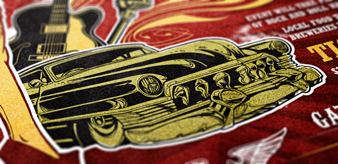
Create a Rockabilly Poster With Vector Set 22 – Part II
A bit of background information
Hello all! Simon, the Arsenal manager here. Today, I finally have time to release the 2nd part of the vector set 22 inspired poster tutorial Steve Knerem poster a while back.
<Fair warning> the post is fairly long (6000+ words), but I deemed it necessary to take the time to meticulously explain the process I went through to re-design this poster. For instance, I took the time to detail my research and mood-board steps, which are often overlooked in tutorials. I also detailed as much as possible my “trial and error” style approach to choosing typefaces, and to constructing typeface arrangements. If you are a seasoned veteran, these extra steps will definitely seem boring, if not frustrating. Just skip them!</fair warning>
For those of you that haven’t been following, we released our 22nd vector set a few weeks ago. Steve Knerem, the artist behind the set’s content, decided to create a rockabilly themed poster to demonstrate the set’s potential. He then proceeded to write a tutorial about it. We said that we would expand a bit on Steve’s tutorial to bring his design to the next level, and to make it a tad more truthful to the rockabilly vibe.
What are we going to do?
First, we’ll be doing some research. There’s plenty to be learned from gig posters of the 1950s and 1960s, in terms of typefaces, composition, color palettes, etc. Our goal will be to identify some design elements and patterns from that era, and to improve Steve’s design based on them with the tools we have available now in the second decade of the XXIst century.
Second, we’ll see how we will recreate the patterns we’re seeing in our research to improve Steve’s original composition, while respecting his original concept. I’m anticipating mostly type work at this stage.
Finally, Steve’s original goal was to work towards a screen printed poster, hence his limited color palette and work primarily in Illustrator. I’m going to show you some of the techniques I use to texture and weather artwork, to make our clean and digital vector art look a tad more analog, and just like if you had pulled the poster out of your parents or grand parents’ attic after all these years. Sounds fun? Then let’s do this!
Research, research, research
Well, the easiest way to search for something these days is to google it. So I went ahead and researched using the following keywords:
Follow the links to see the results I encountered. I was hunting in the first couple links of the web search, as well as in the image search results.
There are already a few things that jump right to my face just by looking at these:
- The vibe difference between the 3 styles (rockabilly, 50s, and 60s) is pretty strong
- The rockabilly posters draw a lot on the Kustom culture
- The crazy gig posters with a bunch of colors and eerie designs started more in the 60s. This probably comes from psychedelic rock starting to be mainstream, printing techniques improving, and full color printing becoming cheaper
- Condensed, bold or extra bold sans-serif are among the most readable typefaces
- And Steve’s poster is even showing up in the search!
A look up-close
Let’s start with the rockabilly search. I ended up also exploring some of the links the web search turned up. There’s a pinterest board in particular called Rockabilly, Greaser, Pin Up, Posters & Art that was pretty rad. Just look at these:
While the Go Johnny go poster is cool, I prefer the Gene Vincent/Eddie Cochran one. This was a rather cheap poster to design and print: I count only 2 colors (black and red), and there’s no custom illustration. The eye gets attracted by the typeface relationships and color variations. One of the ways to add a few graphical elements is to use that star symbol. I see you coming already by saying that there are some other, way cooler looking other pieces on that page. There’s that Coney Island rockabilly festival poster, that Viva Las Vegas poster, and these 2 Social Distortion pieces. Well that’s the whole problem: a lot of the Rockabilly art that we see nowadays is contemporary art with a flair that’s inspired by the culture behind that music, the Kustom culture, etc. And the faithfulness of their emulation of the original design codes of the gig poster artists of the 1950s and 1960s varies greatly. That being said, looking at the typefaces they use, we can still see the affinity for either the hand painted sign type vibe, or the whole Sailor Jerry/tattoo vibe, or the condensed, cheaply printed, sans-serifs I was talking about earlier. Steve’s art matches the Sailor Jerry tattoo vibe pretty well, so that’s definitely a direction we can explore.
A look at the 1950s posters
These have a bit more color, and feature performers portrait. The “vintage diner” style of type seems to come from there. Looks at the BB King or T-Bone Walker type treatments. There are frames and not-quite-accurately-square color rectangles used as supports for content blocks, among other little design elements that immediately make us associate these posters with that era (stars, horizontal dividers, etc.). More to keep in mind.
1960s posters
And here are the 60s! Enter the psychedelic scene… There’s also that cut paper look. These are getting away from the style we’re trying to emulate for sure.
Let’s recap
So, it looks like we’re trying to find a happy medium between the boxing style posters of the 1950s and the modern interpretation of the Rockabilly/Kustom/Sailor Jerry approach. We’ll pay a special attention to type, and might modify or add to the borders already put in place by Steve in his original art. Finally, we might give some hierarchy to thew type with some box elements or dividers. And let’s go!
First: the type elements
Here are the type pieces from Steve’s design:
The title features a type midway between western and country. That’s the good part. The main issue I have with it are these pre-made grunge scratches on it.
The band names features some solid options (The Blue Storm, Hail Hail Hellstorm, maybe Jack is coughing), and some less solid ones (Home Grown Heroes, The Billies, Sound of Thunder, Young Turtles, 1950s Alive).
The gig information space is written in that condensed slab serif. I like it, but maybe we can find a more fitting one. And here are type pieces from our references:
I think it’s time to start looking at our typeface collection, at the Lost Type Co-op, and at Dafont.com. Working at Go Media as its perks, as they’ve accumulated a solid type library over the years. But since it’s not the case for everybody, let’s see what we can find before digging into the secret vault here.
The Lost Type Co-op
Lost Type has quite a few candidates: Mission Gothic, Dude, Mission Script, Sullivan, Bemio, Arvil Sans, Oil Can, Outage, Aldine Expanded, Duke, Onramp, and Tightrope. The cool thing is that you can get a personal license (and sometimes even a commercial one!) for these typefaces for free. But you should totally give a few $$$, as these are so amazing.
(Images via Lost Type Co-op and its various contributors – © all rights reserved)
Dafont
Let’s be honest, Dafont is a place listing cool typefaces but also some very lame ones. That’s why I’m very wary of using that site anymore. But maybe just for today we can find some good surprises. Remember, not all of these are free! Most of these, in fact, are free for personal use only. You’ll need to get in touch with the font creator if you want to use them on a commercial basis. The two categories I focused my searches on are western and retro fonts. And I have quite a list there too. Anderson Four Feather Falls, Anti Hero, Laredo Trail, Pointedly Mad, Regulators, Alpenkreuzer, ARB-218 Big & Blunt, ARB-66 Neon JUN-37, Franklin M54, HFF Sultan of Swat, NPS Signage 1945, Phat Phreddy, Super Retro M54, and Tattoo Ink.
(Images via Dafont.com – © all rights reserved)
But aren’t we supposed to design something at some point?
Agreed! But at the same time, all that research process is necessary to make sure that you’re producing relevant concepts. A rockabilly poster wouldn’t look rockabilly with the Matrix typeface on it.
There, it starts
So, now that you have downloaded and installed all the typefaces, that you tracked down the file you created when following the first part of the tutorial, and created a mood board with all your references, let’s do this. I wrote earlier that I only wanted to improve on what Steve did. So the pinup, the car, the guitar, and the microphone are going to stay. They form the core of Steve’s composition, and while they’re not really looking like a vintage multi-act gig poster, I think their impact is undeniable. First step: track down your Ai file from the first tutorial, and save a copy with a name clearly labeling the fact that you’re going to alter your design. For example: if my first file was named gma-vector-set-22-rockabilly-poster-tutorial-c1r1.ai (Go Media’s Arsenal – Vector set 22 rockabilly poster tutorial – Concept 01, revision 01), my new file will be named something like: gma-vector-set-22-rockabilly-poster-tutorial-c1r2.ai. You get the idea.
Now might also be a good time to clean out and to organize these layers, groups, etc. This will make your life so much easier in the long run, I promise.
I mean, check this out: isn’t the sight on the right a bit more pleasant?
Also, since we’re going to move elements around, I can tell that having them properly labelled is super helpful to keep track of them. Also, I’d like to point our something in my newly organized file: I have created 3 layers: art, color palette, and type experimentation. Art could end up getting some sub-layers (which allows to add hierarchy without having to group elements together). Color palette is a layer that just features 5 squares, one of each of the colors we’re using. It’s super useful to quickly switch an element or series of elements to the same color, since even when the layer is locked you can still use the eye dropper on its elements.
Type experimentation is obviously where the fun is going to happen. Let’s tackle the title first, shall we?
The rockabilly throwdown
Let’s start by pointing out the typefaces we’re going to try from that bigger list of contenders we’ve assembled. I typically start by typing the text I’m trying to format in uppercase, lowercase, and in a mix of both to see what character combinations look like. I’ll also add the typeface name in there for you to follow. And make sure you’re on the right layer and that it’s unlocked.
Once that’s done, we can start eliminating a bunch of these. It’s pretty clear to me that we should keep that western vibe in the title. Think about the Coney Island Rockabilly Festival poster vs. the Destination Unknown poster. The tattoo type looks great, but the sailor/pirate vibe is too strong and gets us away from the rockabilly feel in my opinion. Let’s weed out whatever doesn’t fit this declaration of intent.
We still have too long of a list, but it’s better. Other than the obvious western typefaces, I’ve also kept Bemio (both regular and italic), because it has the retro vibe we’re after, and a very dynamic quality. Combining these two (italic for “the” and “throwdown,” regular for “rockabilly”) would be swell. Phat Phreddy has also that distinct retro feel, but it doesn’t seem to sit well with that restrained list. Phat Phreddy is then out. Anti Hero is sweet, but it has a “raw” hand drawn vibe that doesn’t match Steve’s clean and detailed hand drawn vector pinup. Out. Tightrope looks sweet, but feels like too much. Out. Regulators seems a bit plain. Out. Aldine is a tad too expanded, but I’ll leave it in to try. Pointedly Mad seems perfect (think of the Coney Island poster again). Dude is simply too much. Laredo Train seems a tad bland, like Regulators. Out. Anderson Four Feather Falls seems like a solid candidate too. This leaves us to the final four (well, five, but I’ll combine both Bemio styles together).
It’s now time to create title treatments based on these typefaces. I used Steve’s as a base, as his was solid. I just didn’t like the typeface he chose. The other thing I’ve kept in mind is the treatment of “rockabilly” on the Coney Island poster. All of the work happens on the type exploration layer, and outside of the main canvas. I’ve also locked my art layer, just in case. I typed each word individually, and moved them around as needed. I’ve also used the effects arc lower and/or arc upper quite a few times (Effects > Warp > Arc upper/Arc lower – use a negative value for arc lower). The stars are just simple 5 point stars, straight out of the shape tool (radius 1: 25px, radius 2: 50px).
Don’t hesitate to heavily rely on your alignment palette to go faster, and to fine tune the overall feel by nudging the words and elements little bit by little bit. Finally, to make sure that my star groups would be well spaced all the time, I made a proficient use of blends (Object > Blend > Make and Object > Blend > Options). You can read more about the blend tool on Vector Tuts+ and on Bittbox.
The results
Letting a little bit of time pass between these iteration and the moment of having to choose which one I will go ahead with is helpful. I realized along the design process that the Pointedly mad typeface is the one used on the Coney island festival poster. While I don’t want to recreate what the designer of that poster did, I’m currently more attracted by the iterations made with that typeface. There’s also one made with Anderson Four Feather Falls that could be a contender.
I’m going to tinker a tad more these 3:
- For the Pointedly mad option (left), I’ll make sure to visually center the stars, and that the spacing is consistent all around
- For the Anderson Four Feather Fall options (top and bottom right), I’ll make sure to
- Mimic the layout of the Pointedly mad option (add a divider, change were the stars are, etc.)
- Add a divider to the current layouts
Bemio alone wasn’t rockabilly enough. Mix it in with either Pointedly or Anderson, and you have a way stronger result. Aldine looks super rad, but it doesn’t nail the vibe right on the head. It’s somewhat there, but there’s a better option available.
Ah also, I’m going to quickly create a new layer and archive the unused type experiments there. I’m just selecting the type combos I don’t want, and cutting them (CTRL/CMD + X) and pasting them in front on the newly created layer (CTRL/CMD + F). Like that, they’ll stay at the same visual spot, but not on the same layer. Once that’s done, just lock and hide the layer.
After playing a bit, I’m once again in front of quite a few variations on the same theme. My goal is to choose the final one out of the group (minus the final alignment adjustments and other touch ups). If I were to be designing this poster for a client, I’d have to be much more careful about how much I’m spending on just that text piece, in order not to blow the budget. Let’s have a look at the options I came up with.
While the choice is difficult, a winner seems to emerge. First, it looks like option based on a type combo have more impact. Exit for options 2, 4, and 5. The lines are way too thick in option 3. This leaves us with options 1 and 6. I wrote earlier that I didn’t want to recreate my Coney island poster reference, but it looks like my preference goes to the Pointedly mad/Bemio based option. Four feather just looks too complex with all the carved out shapes, and more “western” than rockabilly to me.
After a little bit of clean up (alignments, centering, expanding the typefaces to object, etc.), I have my final title element!
And here’s a comparison with the concept I quickly jotted down:
The concept is on top, the final at the bottom. You see that the spacing isn’t the same, the dividers are thicker and extend further, etc.
Time to remove the old title, and to put the new one in place:
Steve’s title (visible above my art board) used 2 colors (our green and our yellow), as well as outlines and shadows to stand out. Time to get some of that magic working.
Steve used a black shadow behind “rockabilly”, and multiple outlines on “throwdown.” Let’s see what a similar treatment would give. But before that, the first thing you want to do is to create a sub-layer on your Art layer, and to call it title. Then cut and paste your title object in front in that “title” sub-layer. It’ll make the editing much easier, as it will separate the title from the rest of the art. To create the sub-layer, just select your art layer, and click on the new sub-layer button. Label it properly, and place that title in there. We’ll that process of separating elements as we go through the edits, and we’ll have a wonderful layer structure at the end.
Let’s start by doing the black shadow.
Let’s have a look at the layer palette to understand how I created the effect (once again, please label your layers and groups!). I have 2 instances of “rockabilly” there, a yellow one and a black one. I simply copied (CTRL/CMD+C) and pasted in front (CTRL/CMD+F) to get my copy of it. I renamed the bottom one, switch its color to our black, and manually offset it with my arrow keys (6 taps down and 6 taps to the right to be exact). I’m pretty happy with how it makes rockabilly stand out. Next up, the treatment of “throwdown.”
First, we want to switch the word to green. Then, if we look at Steve’s original treatment, there’s a red outline, then a white outline to be able to overlay “throwdown” over “rockabilly” and neutralize what would be a clashing color combo (the green of “throwdown,” the red outline, and the yellow and black of “rockabilly”). I’m not overlaying the words on each other, but for the sake of sticking to Steve’s layout, I’ll redo both outlines.
Let’s paste a copy of “throwdown” in front of itself. Switch the bottom copy to the red of the background, and relabel the layer properly. Then, let’s offset the path to accomplish the outline (Object > Path > Offset path). I used 0.1 inch as the value, and left my joins on “miter” to keep their sharp edges.
Then, by using the pathfinder (the unite function, first option of the top row), I made sure to just keep the outlines of the letters. This simplifies a bit the paths the computer has to calculate.
I followed the same process to get my white outline.
And here’s our result, compared to Steve’s treatment:
Let’s be honest, it’s not great. We loose a lot of the dynamism of Steve’s angled words. And his multiple outlines were motivated by overlapping words, which we don’t have here. So I decided to experiment in a different direction. I selected my top, yellow copy of “rockabilly,” and applied a 4 point black stroke, aligned to the outside of the shape. This gives a lot more punch to the word.
Since I liked the effect a lot, I went ahead and removed the outlines and switched back “throwdown” to yellow. I then gave it the same treatment.
The result is nice, but slightly overpowering the rest of the title’s elements. Time to unify everything.
Four points of stroke on the stars and on “the” was too much. Same of a 6 by 6 arrow taps offset. And the offset on my horizontal dividers was too much too.
After tinkering, my final values are as follows: the offset on “the” and the star group is of 4 by 4 arrow taps. I have them configured to be of 0.1″ in Ai’s preferences. The stroke thickness I used on both is of 3 points. I nudged the stars a bit for a better visual alignment, and grouped my elements together for a cleaner layer hierarchy.
And finally, I’ve decided to switch “throwdown” back to green instead of yellow. It’s closer to Steve’s original title treatment, and puts “rockabilly” forward.
Taa-daa, we have our title in place. The reason why I’ve spent so much time detailing the process for the title is that it’ll be the foundation for the treatment of the rest of the text elements. We’re going to use similar values for offseting what will be offset, similar stroke values, and so on.
The date, time and place
These elements are secondary to the title in the original design.
I’m going to make my version close to the original design, I’ll just be using Pointedly mad for the typeface instead. I might also change the layout of the words a tad.
The layout and typefaces are very similar. I chose to make the date more preeminent than the town. I’ve also used resized stars taken from the title to space “USA”, it’s a cool little detail. In terms of sizes, I started with “August” written at 72 points, and “28” written at 144 points. The other sizes come from there. As you can see, I also gave the date and place their dedicated sub-layer. Time to place the date block in the poster.
And here it is. This updated version takes a bit less room, which I don’t mind. Note the object organized in their sub layer, which you can lock (at least for now).
Featuring…
Time to tackle one of the most important piece of the puzzle, the band list.
I’m going to tap in the typeface list we got on Dafont and Lost Type, as most of these have the vintage qualities we’re looking for, and will probably fit better than the ones Steve used.
Here’s a side by side view of the current version of the list, and of my work-in-progress list. I just copied, pasted in front, and slide on the side the original one. I’ve also created the band list specific sub-layer.
Step one, the “Featuring” title. Like I wrote above, I’m going to take my cues from the main title type element. I used Pointedly mad, and went through the same duplication, outline adding, and offseting processes to get the type element. I then quickly unlocked my title sub-layer to steal one of the dividers over, and just switched its color to green rather than yellow. I resized it using my direct selection tool (A) to fit the width of our band list, and taa-daaa.
Time to tackle the band names themselves. I first started by switching the old list to gray, like that I can write the new version above and use the former as a guide.
Here’s my first complete draft. I’ve used Pointedly mad for Home Grown Heroes, Mission Script (Lost Type) for The Billies, Anti Hero for Jack is coughing, ARB-66 Neon JUN-37 for the Blue Storm, Bemio Italic (with a custom line height value) for Hail Hail Hellstorm, Alpenkreuzer (center aligned, with a custom line height value, as well as a slightly bigger second line) for Sounds of Thunder, Aldine Expanded (with a custom line height value) for Young Turtles, and Sullivan Fill for 1950s Alive. Now, it’s time to remove the old list for good, and to clean up the alignments.
I know for a fact that this list is going to be aligned on the right edge of my poster. So I’m going to cleanly align to the right all of the band names that are on the right side of the list, make sure that the vertical distribution is a bit better, and manually place the names on the left of the list to make a visually compelling band name group. Finally, I’ll make sure that the divider under “Featuring” extends a bit more than all the way to the left of the list (cf. how the dividers of the title block extend).
Here’s my almost complete take on the band list. I’ve moved the name around a bit more, but as you can see, there’s still a weird gap at the bottom right. It looks like I’m going to have to add a band name to visually balance stuff out.
Let’s call them the Hot Rods. I’ll use that Oil Can typeface (Lost Type). I sized “Rods” bigger, centered the text, and used a custom line height value to make sure it looks not too spaced out.
Once you’re happy with the placement, it’s time to switch the text to outlines (make sure there are no spelling mistakes!), and to switch our brand new lineup for the evening with the old one.
And it’s pretty clear that we’re having a problem here. Not only is the list too close to the border on the right, but it’s also obliterating the guitar and the microphone on the left. One remedy: let’s take the size of the band names down a notch. I still want to keep the “Featuring” title and divider to the size they’re at right now, to match the main title better.
And voilà, we have a better fitting band list! There’s a little bit of room won at the bottom of the list, which is where I’ll be sticking the “Gates open at 9pm” information. To stay consistent with the original design, I wrote it in Pointedly mad. My type is sized at 42 points, with the kerning set on “optical” (like most of the text blocks throughout this poster). I also switched the “AM” mention to superscript on the character panel’s options. Time to also remove the old “gates open at (…),” and to move forward.
A check-in point
Where are we at?
With this super long tutorial, it seemed a good idea to take a quick step back, and to see what else we are going to finalize. We’re so close to the end I can feel it, but there are still a few details here and there.
- Finalize and touch up the look and feel of the “tickets” text block
- Check if downsizing the pinup just a bit to give more breathing room to the title is a good idea
- Maybe move the “Gates open at 9AM” mention back where it originally was?
- Potential background simplification
- Potential borders touch-ups
Now that the road map is set, let’s go for the final stretch.
Tickets and other miscellaneous information
The main change I want to make happen here is the typeface. I haven’t used a slab serif at all in the design so far, and I think it feels a bit out of place. I might use Sullivan or Bemio from Lost Type to have a certain sense of unity. Sullivan appeals more to me at this stage, but we’ll see as I go.
Here’s my first draft. The type is Sullivan Fill, set in 24 points. The line height is set at 24 points as well. “Tickets” is set at 60 points.
Just to make sure, I made an alternate version in Bemio. You can see the Sullivan version in light gray underneath. Given the somewhat condensed nature of Sullivan, I think it’s a better fit given the space I have available. Bemio looks clean and good, but it would take so much more room.
So Sullivan it is. It’s also time to align my copy to the right, since these text blocks will be aligned in the same fashion than the bands list. I also did some minor adjustments to the pricing block. Let’s put this in place in the poster, and remember to switch the “Tickets” title to our yellow.
Well, just placing the new type above the old one made me realize than my potential layout correction for the pricing section will look too weird. Time to revert that.
Much better, isn’t it? Let’s align everything the way it’s supposed to be (location information on the bands list, the ticketing information on the “Ticket” word), and delete the old type.
I also made a minor alignment alteration for the ticketing information, as it seems to fit the contour of the car better than way.
I decided to also move the gate information back down. The colors are switched over. The ticket and miscellaneous information block is done!
The pinup’s size
Next on our list is the pinup’s size issue. In its current state, I believe her head is a tad close to the title. That’s the only thing I want to act on: the width of the stroke around it, the colors, the placement of the halftones, all of these are good.
First, we need to select all of the pinups layers: the line art, the colors, and the outline. Thankfully for ourselves, we already grouped all of the elements together at the beginning. We can see that we included one of the halftone elements (bottom left, under the shoe) with the group.
I’m going to move the pinup on her own sub-layer, and un-group everything there, for better control. It’s just a game of cutting and pasting in front.
Once the pinup is in its own layer and the elements are un-grouped, we can have a better understanding of what needs to move and what can stay as is. I also managed to track down the halftone element as hidden in the outline group. I just slid it, out of there, on the main art layer for the time being.
What we want to do now is to select all of the pinup’s element, and to slowly size her down to leave something like half an inch of extra space. And sizing the pinup down by holding the SHIFT key and from the center top handle allows us to size the element down proportionally, while keeping it in a very similar spot. This avoids me to have to replace the pinup manually afterwards.
When checking in closely, it also looks like the outline is sensibly similar to the other outlines in place (see around the car, the guitar, and the microphone). So we don’t even need to worry about adjusting it.
Last little thing about the pinup: I used the same pathfinder technique than when creating the first version of the title’s outlines to clean up the shapes composing the pinup. The white shapes, once united, becomes a clean silhouette shape, rather than a shape made of multiple shapes. Grouping the inner shapes of the same color also helps to clean things up.
If you feel like it, and while you’re at it, why not applying the same cleanup process to the car, guitar, and microphone?
Background cleanup and simplification
Steve’s background (shown here without any of the type or main illustrative elements) features a star burst, flames, and the borders. First, I’d like to clean up and organize my layers further. Then, it looks like we have to simplify this background, as we’ve added a color (the burst’s light red) to our original color palette, and this will explode the budget of the hypothetical project. Finally, I think we can touch up the borders to make them visually centered.
Removal of the background burst
Select the burst shape, and hit delete on your keyboard. Done. Time to bust out the “That was easy” button.
We have a problem, and it’s the flames. They are also in the light red, and don’t fit there anyways since we removed the burst. Let’s remove them as well.
More cleanup and organization
Now that the extra elements have been removed, we can organize our leftover visual ornaments into a sub-layer as well. I choose to create one for the borders, one for the halftones, and one for the pinstripes.
Border fixes
The borders aren’t fuller centered, and it seems that some of the spacing could be enhanced as well (see my highlights below). I’m going to use my direct selection tool (A) and the alignment palette to make sure the yellow and white borders are horizontally centered, and to make the bottom gap between the white and yellow borders identical to the one side gap between.
While I was at it, I’ve also made sure to center and align the top yellow pinstripe and the wings.
Taa-daa, we have a fixed background!
Last overall touch ups
I’m pretty happy with the changes so far. Last but not least, the background still seems empty, or missing something. This is because we removed the burst and the flames. Elements like the halftones were arranged around these, and they left gaps.
Instead of putting the burst back in place, I’m going to use the halftones already in the design, as well as some new ones, to “fill” the gaps. The trick for the new arrangement to fit is to keep a maximum dote size consistent with the dot sizes already in the design. Unless you start the halftones placement from scratch. Finally, some halftones elements can be found through your symbol panel.
The button I’ve highlighted in red will give you access to an option menu. From there, navigate to Open symbol library > Dot pattern vector pack.
I created a new sub-layer named “New halftones,” colored the old ones in gray (to keep them visible as a non-intrusive reference), and started placing my new ones.
Symbols are super easy to place: just drag and drop them from the palette into your design. Here’s my first draft after tinkering a bit with placement and sizes. You can see which ones of the pack elements I’ve used in the layer palette. It’s time to turn the old ones off, and to switch the new ones to white.
Since these are symbols, we’ll have to expand them before we can change their color to white. Let’s do so by selecting them all, and going to Object > Expand.
And here are our white halftones.
I don’t think I’ve accomplished the consistency I’m looking for. The one I’m happy (in terms of scale particularly) with is the little one in the back of the pinup. Let’s see if we can reuse it to fill the other gaps.
I’m happier with this second attempt. I basically used Dot Pattern Vector Pack 12 multiple times, after grouping it. In order to not break the scale consistency, I only sized it up very cautiously (check the bottom left corner, under the left shoe). It’s time to shuffle our layers a wee bit to make sure that the halftone at the bottom left covers the void left were we hid the back of the car. I just created a “Halftones #2” sub-layer, and placed it above the car layer. I then proceeded to cut and paste in front the halftone that’s behind the shoe in that sub-layer.
Once that’s done, I moved my “borders” layer up, in order to have the border above the halftone. Time to delete the halftone that’s outside the limits of the borders. Just use your direct selection tool to select the part you don’t want, and hit delete on your keyboard to remove them.
It seemed clear that the gap between the yellow and white borders needed to be cleaned up as well, both from the halftone and from the outline of the pinup. To do so, I created two red rectangles that I placed high enough in my layer structure to be above the girl and the halftone, but not over the borders. I also made sure to size them properly to not go over the edge of the artboard, and gave them their own sub layer.
A bit more layer clean up, and we’re done! Delete the unused halftones, delete Steve’s old halftones, get the type explorations and color palette layers hidden and tucked underneath everything, and taa-daa, you’ve got yourselves a cleaner Rockabilly Throwdown poster.
What’s next?
The next step will be to take this design in Ps to add texture to it. Imagine yourself in your parents’ or grandparents’ attic, and finding it after all these years. We’ll manipulate paper textures, aging Ps actions, noise, stains, fake folds, etc.
Until it’s written, cheers!
- Categorized: Go Media's Arsenal, Illustrator, Tutorials, Typography
- Tagged: Adobe Illustrator, Ai, poster, poster design, process, rockabilly, tutorial, type, typography, vector set 22
Why a Custom Website is so Expensive (Part 1 of 2)
Why is a custom website so expensive? In short, because it takes a lot of time. More time than most outsiders can imagine. But why?
Web 1.0
Go Media’s founders started building custom websites in the 90’s. In those days, a typical website was comprised of the standard Home, About, Services & Contact. This is commonly referred to as a brochure site. It was often static html and rarely changed in a year. There was very little thought going into SEO. There were rarely contact forms. It might have had five graphic images, total. Publicizing your email address was considered perfectly safe. JavaScript, on the other hand, was feared by the industry.
Web 2.0
Times have changed. Today, content is king, JavaScript is required and sites are more complex than ever. Each new one is competing for attention in a field of nearly 1 billion. Did I mention the internet is everywhere? For all you know, I might be writing this from my phone… at a cafe… in Timbuktu. Or, at the least, someone in Mali might read this article and hundreds of others on gomediazine.com. Articles made possible by dynamic, database driven content management systems that no longer require a ‘webmaster’ to deploy. Desktop publishing has a new meaning thanks to the internet. The lines between broadcast and the web continue to blur. Nearly every form of communication is being virtualized for websites, and everyone wants it for their own.
How Much for a Website?
We often muse at Go Media about folks who call wanting a new site, saying things like “Ya know, like Ebay but with that Facebook feature but more like how Google does it…”… ‘Um, yeah that’s a great idea. Did you have a budget in mind?’ “Oh, well… we were thinking in the $1,000-$2000 range.” Hmmm, well… CLICK! Ha, no, we don’t actually hang up on people. We courteously try to explain that computer science is complex and those examples provided spend millions of dollars on research and development every year to make those features possible.
We can imagine some jaws drop when they receive a quote from us. We have had people become irate, as if we were trying to bamboozle them. Why the confusion? Or rather, why would anyone assume what they’re asking for wouldn’t cost tens of thousands or even hundreds of thousands of dollars? The internet products and services marketplace is almost an anomaly in the way it skews perspectives about what things should cost. I’ll explain some of the reasons why.
First, computers are systems and systems can be automated. For example, you can find e-commerce platforms, such as Shopify or BigCommerce, for which you pay a small monthly fee, fill out some forms and have your own store in no time. Or you can sign up on WordPress.com and start publishing your own blog in minutes, for free! You could do any number of things online with services like these, all without ever talking to a single human being. These are known as software-as-a-service or SaaS. Many can be quite robust. Their business model is built upon a one-to-many equation where they need a volume of customers to spread the costs of developing this one service.
Not unlike automation, templatization is reusing the same parts over and over again. Here, a website developer has to sell their templates enough times to cover the cost of production. You can find website templates AS-IS, typically cheap file downloads with little-to-no technical support. You can also find SaaS services where you pick the template for your website and go live for a nominal monthly fee. This is a huge segment of the marketplace because a lot of entrepreneurs are thrifty and cavalier enough to be “DIY” and do the work.
Then there is the amalgam of commoditization. This is where companies give away a “free website” as a value-add to their actual product or service. You’ll find this offered by major hosting companies, search engine providers, telecoms, publishers, etc. where their primary revenue comes from elsewhere. They’re willing to eat the cost of producing SaaS systems like the aforementioned as a way to keep their customers hooked into them. These offerings are typically ugly and the service abysmal, but you can’t complain for the price.
Free, inexpensive and nominal monthly fees for “a website” make for a conflated marketplace riddled with confusion, bordering on delusion. However, we can’t blame the lay observer. People have no idea how much time goes into developing a great website. Consumers have unprecedented means to publish their thoughts, photos, videos and more online. It all seems so easy to them. But it is far from the reality. The technical complexities and demands of the modern website only continue to expand. I’d love to say my job as a web developer has never been easier, but it is quite the opposite. Those SaaS offerings and templates continue to become more powerful and competition in general is fierce. The internet is global, meaning my competition has no borders. We must always be innovating.
With all these options, why would anyone need or want a custom website built anyway? And with all that competition, why the heck is a custom website still so expensive?! For starters, one-size-fits-all doesn’t necessarily mean it fits your organization’s needs. With almost a billion websites online, businesses don’t want to show up to the party wearing the same thing as everyone else. A lot of companies also value control. You’re different. You want to exude that. You might have a niche or some market differentiator you want to emphasize and need the right platform to do so. Maybe you need a system that suits the way you operate. Perhaps you have devised a unique new way to engage with your audience. There is so much out there, but that doesn’t mean everything already exists. This is where the real work begins…
___________________________________________
Continue – Why a Custom website is so Expensive, Part 2
- Categorized: Business Philosophy, Graphic Design, Small Business
- Tagged: advice, business, Photoshop, tips
Why This Will Change Your Life: An Insider’s Guide to Weapons of Mass Creation Fest
The Countdown is On
With this year’s Weapons of Mass Creation Fest only 14 days away, we here at Go Media are gearing up to bring you the premier art, design and music festival in the Midwest. An event growing in size and strength, this year’s WMC Fest will overtake the Cleveland Public Theatre from August 16 through 18. Early-bird tickets have already sold-out and remaining tickets are going fast. (Psst! Stay tuned to the end of this post to see how you can become a WMC VIP!)
Attendees of this year’s fest will be treated to over 70 performances, including speeches from 20 of the industry’s best, a gallery with 20 designer’s work and intimate shows from over 40 bands. New, special events will include a live recording of the famous Adventures in Design podcast, workshops, and an artists battle called Ink Wars sponsored by Adobe.
The coordination of all of these performances, special events and locations, as well as gathering sponsors, vendors, volunteers, has been an exciting albeit exhausting undertaking.
Let’s take a look inside the Fest through the eyes of the hard-working team who is making this all possible.
Inside the Fest with Jeff Finley, founder
Go Media designer, partner and founder of WMC Fest, Jeff Finley started the Fest back in 2010 when he was compelled to start an event in his own hometown dedicated to his three passions: music, art and entrepreneurship. Each year has been special and has presented its own unique challenges, and WMC Fest 2013 is no different.
“With our goals to simplify the experience for the attendee, it’s created more complexities on our end,” states Finley, “So our collective stress level is higher and it makes it tougher on our personal friendships and families. We hope we can continue to simplify the process of throwing the event while making it better every year for attendees.”
As the minutes tick by, Finley’s time has been spent wrapping up the nitty gritty, prepping vendor and gallery layouts, designing WMC Fest posters and flyers, touching base with sponsors and planning last minute logistics. Pumping up his fellow staffers and the WMC community, he is confident that this fest will be the best yet.
“WMC is going to change your life,” Finley states with passion. “I used to think that was a brave statement, but my experience throwing three festivals so far has shown me that attendees walk away with a newfound outlook on their life and their career. The cost of the festival is extremely undervalued and makes traveling from out of state totally worth the cost. That’s why so many of our attendees are not from Ohio. The fact that we are under one roof makes it so easy to go from a eye-opening talk to an exhilarating musical performance. All the while navigating a funhouse of inspiration. Your mind will explode with what to do next!”
Inside the Fest with Todd Gauman, Event Director
Event director Todd Gauman is thrilled to announce that, for the first time, the over 1,200 in attendance will experience the event under one roof, at one time experiencing all that WMC has to offer: art, design, music, inspiration, collaboration and celebration without the worry of traveling to multiple buildings.
“There are many components to the event that in previous years due to venue logistics we were just not able to achieve. Now in the historic and majestic space that Cleveland Public Theatre is, we’re able to fully integrate all three event components under one roof. Having the design gallery, the speakers, and the bands in one complex, attendees will be able to take even more in without missing that special speaker or band they wanted to see. Just exploring this historic venue that was built in 1912 will be an experience unto itself, as it is a sprawling complex made up with many “nooks” that span almost two city blocks and two stories. On site we are going to have a cafe that will feature food from neighboring restaurants including Gypsy Beans and Baking Co., Happy Dog, and XYZ Tavern, as well as the return of the outdoor beer garden!”
His second year with the Fest, Gauman is excited to turn things up a notch. He exclaims, “We are really trying to raise the bar in terms of creating a unique, creative, fun and inspirational environment that will not only provide someone with a positive experience, but make them want to go out and become a Weapon of Mass Creation themselves!”
Simply put, per Gauman, “The attendee experience is going to be amazing!”
Inside the Fest with Joseph Hughes, Speaker Organizer
Joseph Hughes has been hard at work, lining up this year’s 20 stellar speakers. As the days wind down, the bulk of his planning comes with making sure all of the final details are handled, including hotel bookings, technical questions about the presentations and solidifying the workshop schedule.
“We’ve got a very exciting, very well-rounded group of speakers coming,” Hughes notes. “Illustrators like Jon Contino, Jacqui Oakley, and Lisa Congdon who are at the top of their game. Entrepreneurs like Christen Carter and Rena Tom who are blazing a trail for so many creative people. Go-getters like Ann Friedman and Nick Disabato who are showing us all how to remake a working life by charting their own course.
Like Finley, Hughes is confident that attendees will be more than pleased with this year’s lineup, stating, “From top to bottom, this is a speaker slate that’s not to be missed. No matter how you’re approaching WMC Fest, we’ve got something for you on that stage. Trust me, even if I weren’t working for the fest, I’d be right there with you, in the front row, nodding and note-taking with every speech.”
Inside the Fest with Jesse Sloan, Band Organizer
This year’s WMC Fest music roster divulges deeper in creative weaponry and is more distinctly diverse than any other year before, reports music organizer Jesse Sloan, who makes it his goal to “keep an ear to what’s relevant in up-and-coming and underground music while avoiding cheap frills.” Involved with WMC since the beginning, it’s Sloan’s love for music that drives him to volunteer every year, taking on such a hefty position as to construct a 40+ band line-up.
Making it his goal to create a line-up that caters to all age groups and genres, Sloan’s wish is that WMC Fest audiences also “get a taste of something out of their comfort zone and challenge their roots and musical palate at the same time.”
Sloan is thrilled for WMC’s new home, reporting, “I’m really excited for the gorgeous aesthetics and acoustical engineering to be experienced in our new venue home, the Cleveland Public Theatre. The Artists in Residence at Cleveland Public Theatre’s Gordon Square Theater has held its ground for about 100 years and is used very scarcely as a “music only” venue, adding to the uniqueness of our event this year. Every band has something unique to offer, and we are a bit pretentious in who we select so the level of sheer musical genius and inspiration has a high bottom shelf.”
Assisting Sloan is Melissa Olson, whose experience with booking, too, has been a positive one. “Bands have been really enthusiastic this year about participating,” says Olson, “We’ve gotten emails and requests to be considered from regional and national bands. I am really excited to see the music portion of the festival grow and create such a buzz.”
Continuing, Olson reports, “This year Jesse and I are very proud to be hosting Braid and Appleseed Cast. Both of us grew up listening to these bands, and we are personally looking forward to those performances. They’re the kinds of groups that other bands reference as inspiration. Some bands we have playing this year could even say that, and they’re actually sharing the stage with those they’ve been inspired by. That really seems amazing to me and really plays up the whole idea behind the festival.”
Sister act ShiSho will hit WMC Fest stages, who are according to Olson, “a teenage duo that will sing you songs about evil clowns, a man who hides in a ceiling fan and the U.S. House of Representatives.” Quirky and fun, they always leave Olson feeling better about the future of the music industry. “If there are kids out there making music like this,” she says, “I’m less worried about the future only producing auto-tuned pop songs.”
Sloan is more than proud of this year’s bands, stating, “We’ve put together a line-up of “headlining” bands that have a legacy to their name and are well-established, but we’re also showcasing a lot of newer faces that have pushed to the front of the line in music headlines because what they create is pretty friggin’ special, including William Tyler, Tristen, F.Stokes, Astronautalis, Whirr, and Outer Spaces. I could go on about every band though, really. We are showcasing a lot of new faces locally (Filmstrip, Extra Medium Pony) as well as keeping true to some of the staples in the WMC community (Signals Midwest, Annabel, Ohio Sky) and we are working with new labels (Mayfly, Flannel Gurl) and making new friends every year!”
Lastly, Sloan gushes, about series new to the fest this year, called “Disarmed”, featuring intimate unplugged sessions and short interviews with the bands, noting, “We’ll also open up the Parish Hall, which will be an absolutely free stage with some of the brightest bands playing as well as the B-Boy battle on Saturday. I’ve been antsy for August for quite some time now, come hang out and get inspired with me! Let’s do this!”
Want In?
Weapons of Mass Creation Fest is two weeks away, and the only way to guarantee your way inside is by purchasing your ticket before the event. To make the deal even sweeter, we’d like to give away a VIP ticket to one lucky WMC attendee, guaranteeing you special access inside the event. All you have to do is purchase a ticket to the event, then leave a comment below telling us why you are coming to the best fest in the Midwest! On Monday, August 12, we’ll choose one lucky winner and upgrade their pass to VIP status granting them:
- Admittance to our invite-only Friday night happy hour
- Invitation to our VIP only breakfast on Saturday, August 17
- Front-row, VIP seating to the WMC speakers
- WMC swag
Best of luck everyone!
Continue to follow our story:
Facebook | YouTube | Flickr | Vimeo | Twitter | WMC Fest Blog
- Categorized: Graphic Design