Graphic Design
Japanese Vintage Design Inspiration
When I was growing up, I’d play the Japanese card game Hanafuda with my grandparents. Mesmerized by the stunning yet simple designs on each card, I memorized each combination: ribbon, maple and deer, geese, moon and sky, boar and butterfly. At the kitchen table we’d play and snack on senbei, and at these moments I felt so happy and loved. I still remember my grandmother’s Japanese plates upon which she’d serve me tiny treats and tea. Surrounded deep in my family’s culture, I gained an appreciation for everything Japanese.
When I see vintage Japanese design, I feel warmly reminded of my grandparents and the love we shared. The gentle simplicity still embraces and inspires me. Via Pinterest, here are 25:
Vintage Design and Illustrations inspired by Japan
- Categorized: Graphic Design, Inspiration
- Tagged: Graphic Design, go media's arsenal
We Asked, You Answered: My Biggest Challenge Running a Design Business
Here at Go Media, we’re buzzing about the release of Bill Beachy’s book, Drawn to Business including new extra goodies! This nuts and bolts strategy guide highlights the successes, failures, the in and outs of growing a design firm: namely, ours.
- Categorized: Graphic Design, Business Insights
- Tagged: Graphic Design, small business, illustration, internet marketing
4 Lessons In Minimalism
Because minimalism is so spare and simple, it’s a common misconception that it would be easy to do it well. But if you really take a look at why good minimalist designs make such an impact, you come to realize…
- Categorized: Graphic Design
How to Land the Design Job of Your Dreams
You’re knee deep in loans. You dream in Adobe. You crafted the-most-memorable video resume of all time.
Or so you think.
You’re knocking on doors and they just seem to be closing.
Slamming, really.
What is it that you’re missing?
We asked Dan Weiss, Talent Acquisition Specialist, from American Greetings and Taryn O’Bra, division director for the Creative Group in Seattle, to share with us some sure-fire ways to get hired at a creative agency.
- Categorized: Graphic Design
- Tagged: internet marketing, Graphic Design
Roughing things up for a bit
What, yet another texture pack? Well, yes and no. Remember Maarten Kleyne? He’s that awesome designer from the Netherlands. He’s created textures for us. We’ve already released three packs so far: the excluded rough grunge pack, the etched into dark pack, and the noisy…
- Categorized: Graphic Design
- Tagged: go media's arsenal
Go Media Podcast – Episode 16: Recovering from WMC and Launching Drawn To Business
In this episode, Jeff and Bill get together to talk about how everyone’s been doing now that WMC Fest 4 is over. We also look forward to next year and what things need to change as Jeff’s vision continues to…
- Categorized: Graphic Design, Business Insights
Go Media + Design Cuts = training, freebies, and more!
Hey girls and lads, meet Design Cuts Born and raised in London, England Hello all, Simon here? I’d like to introduce you to a very skilled group of individuals we started working with. They’re called Design Cuts, and they come…
- Categorized: Graphic Design
- Tagged: go media's arsenal
The Forsaken, a Video Game Concept
So as my experience at Go Media draws to a conclusion, I was given this final task to write my own GoMediaZine article, something as a sort of memento. There was one thing I knew I could discuss with confidence,…
- Categorized: Graphic Design
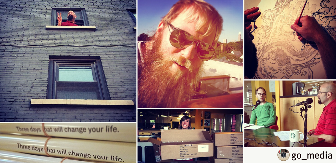
20 Designers You Should Follow on Instagram
Hello from @Go_Media Here at our buzzing Ohio City design headquarters, we love giving you a look inside Go Media, all thanks to Instagram! Thanks to this app, we also love taking a peek into the lives and work of…
- Categorized: Graphic Design
Introducing the Graphic Designer’s Guide to Motion Graphics
And now, for something completely different If I recap the latest Arsenal releases, we have things ranging from mockup templates, vector packs, to texture sets. Which is, don’t get me wrong, great. Today, I have a different product to put…
- Categorized: Graphic Design
- Tagged: Illustrator, 3D, go media's arsenal
Inspired by Weapons of Mass Creation Festival
Weapons of Mass Creation Festival … left us all inspired. We asked you, our readers, to submit art created as a result of your experiences at the Fest. Check out the submissions from these talented folks and submit your own…
- Categorized: Graphic Design
- Tagged: cleveland
Why Weapons of Mass Creation Fest 4 Changed My Life
We here at Weapons of Mass Creation Fest and Go Media are still reeling from what we feel was the most moving, inspirational, simply the best WMC Fest yet. As we strike the set, pack up the gallery and sweep…
- Categorized: Graphic Design
The collections strike back!
They’re back! Now, I wish I could write in yellow on top of a starry space scene, but… I was very tempted to make more Star Wars jokes, but I have to admit that there are people way more qualified…
- Categorized: Graphic Design
- Tagged: go media's arsenal
Athlete Originals: Connecting Designers with Pro Sports Stars
I was contacted by Chris Dey, the founder of Athlete Originals with an earnest request on how to build a crowd-sourced design website that professional designers actually liked. He had a great idea and it was cool that he was…
- Categorized: Graphic Design
The Top 5 Lessons I Learned About Design from my Five-Year Old Nephew
My nephew loves to draw As soon as a pencil fell into his tiny hands, he began crafting the most intricate masterpieces I have ever seen. A proud aunt, I have watched from the wings. Watched him skip the scribbling…
- Categorized: Graphic Design
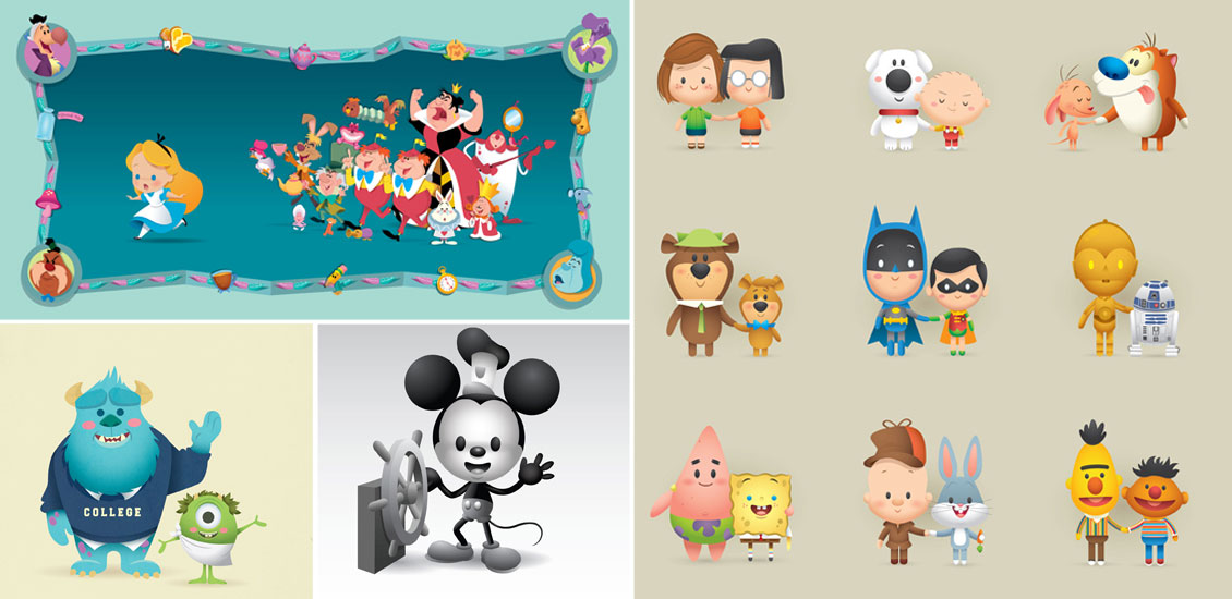
Attack of the Super Cute! Kawaii Creations with Jerrod Maruyama
Super Kawaii! I was born to know Hello Kitty. The first toy to hit my crib was a Hello Kitty plush, her bright red bow hypnotizing me into a lifetime of adoration. I slept on Hello Kitty sheets, wrote with…
- Categorized: Graphic Design
Tutorial: Exploring the World’s Original Take on the Art of Printing
With a foundation laid by VCU’s School of the Arts and with the experience I’ve gained from Go Media, I am excited to present a tutorial on one of the oldest art forms in history: block printing. The procedure for…
- Categorized: Graphic Design, Tutorials
Tools We Use To Produce The Go Media Podcast
Ever wonder what kind of tools you need to put together a great podcast?
I don’t know about great, but I can at least tell you about the tools we use to produce the Go Media podcast. If you aren’t familiar, the Go Media Podcast is dedicated to tips, tricks, and tales of the business-minded artist and designer. It’s our way of letting you inside our studio to learn about the ups and downs we face here at Go Media and how we’re dealing with them.
Every episode deals with at least one topic that we’ve run into head first and how we solved the problem or at least, how we’re currently dealing with it. So far, we’ve talked about how and why we price projects, how we adjusted methods to land more projects, as well as, how we keep momentum going when inspiration (and finances) aren’t in the best of shapes.
So far, we’ve recorded just over a dozen episodes. The process has changed dramatically from where we were at episode 1. So, instead of going through the entire history of our setup, I’ll just explain how do we put together each episode now.
- Categorized: Graphic Design
How to Extract a Budget from your Client
Hi Go Media faithful! Bill here! I’m back to deliver another teaser article from my book, Drawn to Business. This week’s piece looks at how to extract a budget from your client. Ready? Here goes.
Extracting a Budget from your Client
It’s a commonly held belief that giving a vendor your budget upfront is a fool’s approach. Because of this, many clients will play dumb when you ask them for a budget. That’s fine. Don’t be a jerk. It’s still important to have a money conversation early on. You need to qualify your clients before you spend a minute working on a proposal for them. In those cases where a client doesn’t give me a budget, I’ll give them my ballpark pricing. This starts with me asking enough questions to get a general sense of their project. Then I might say something along the lines of: “OK, Bob, this sounds like a fairly typical website design: Homepage with slideshow, About, Services, Contact Us and the whole site to be responsive, correct? Great. Obviously, we’re going to need to get into the nitty-gritty details about your website in order for us to provide you with an accurate time and cost estimate. However, just so I can make sure our firm will be a good fit for you, my very rough estimation on a website like this will probably be somewhere between $15K and $30K. Does that sound reasonable to you? I just want to make sure we’re not wasting each other’s time.”
- Categorized: Graphic Design, Business Insights
- Tagged: small business, Graphic Design, illustration, business insights
Why a Custom Website is so Expensive (Part 2 of 2)
In short, because it takes a lot of time. More time than most outsiders can imagine. But why?
Web 1.0
Go Media’s founders started building custom websites in the 90’s. In those days, a typical website was comprised of the standard Home, About, Services & Contact. This is commonly referred to as a brochure site. It was often static html and rarely changed in a year. There was very little thought going into SEO. There were rarely contact forms. It might have had five graphic images, total. Publicizing your email address was considered perfectly safe. Javascript, on the other hand, was feared by the industry.
- Categorized: Graphic Design, Business Insights
- Tagged: internet marketing, small business, Graphic Design, business insights
Essential Tips for Success from Designers We Trust
It’s a big, bad world out there. We asked some of our favorite designers, what is your #1 tip for success?
- Categorized: Graphic Design, Inspiration
- Tagged: Graphic Design, go media's arsenal
Why a Custom Website is so Expensive (Part 1 of 2)
In short, because it takes a lot of time. More time than most outsiders can imagine. But why?
Web 1.0
Go Media’s founders started building custom websites in the 90’s. In those days, a typical website was comprised of the standard Home, About, Services & Contact. This is commonly referred to as a brochure site. It was often static html and rarely changed in a year. There was very little thought going into SEO. There were rarely contact forms. It might have had five graphic images, total. Publicizing your email address was considered perfectly safe. Javascript, on the other hand, was feared by the industry.
- Categorized: Graphic Design, Business Insights
- Tagged: small business, business insights, Photoshop
Why This Will Change Your Life: An Insider’s Guide to Weapons of Mass Creation Fest
The Countdown is On With this year’s Weapons of Mass Creation Fest only 14 days away, we here at Go Media are gearing up to bring you the premier art, design and music festival in the Midwest. An event growing in…
- Categorized: Graphic Design
Design Tools I Can’t Live Without
We asked our favorite designers…What design tools can’t you live without?
- Categorized: Graphic Design, Inspiration
- Tagged: go media's arsenal, Graphic Design


