Blog

Have an eCommerce Site? Make Sure it has these 3 Key Elements:
You Asked, We Answered.
How Do I Improve My eCommerce Site?
We all want to see more traffic and conversions on our ecommerce sites, right? Of course! This even includes all of us at Cleveland Design firm, Go Media.
With numerous tricks and tips swarming the web, knowing what, when, and how to make those improvements can be overwhelming.
Today, let’s start from square one and make sure we all have these three fool-proof elements, all of which can be accomplished this afternoon. Let’s get to it!
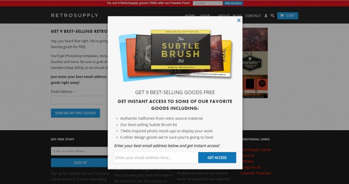
1. A Very Obvious & Enticing Email Sign-Up
Did you know that only 1 to 3% of people that land on your website will actually make a full and complete sale? Frightening, huh?
Panic not, dear friends. As they say, “Rome wasn’t built in a day.” In order to build trust and, in a sense, convince customers that your product is worth what you claim it is, add a simple email sign-up to your page.
Think of this simple email opt-in as a customer’s small commitment to you. A baby step if you will. The next step may be reading your email, the following step considering a purchase. Then, perhaps, after days, weeks, even months, a final sale. These are all very important baby steps in what will hopefully be a long and happy relationship between you and your customer.
Now, many of you have an email sign-up on your page – but today, let’s make it both:
- Obvious and
- Enticing
Offer up an incredibly irresistible reason for your visitor to want to enter their name into the “Enter your email address here” box. This could be a freebie of which dreams are made or an exclusive coupon.
We recommend using:
- Mailchimp or
- List Builder from Sumo.com to build your list and add a download or redirect as necessary
———————
2. A Clear Call to Action
Call to Action is another phrase for, “This is what the heck you are supposed to do here.” Or, as Wikipedia more eloquently states, a banner, button or some type of graphic or text on a website meant to prompt a user to click on it…an essential part of marketing…that actively strives to convert a user into a lead and later into a customer.”
Here are some really effective Call to Action Examples >


Today, ensure that:
- You have a Call to Action to begin with
- Your Call to Action is dummy proof (People will undoubtedly click on it.)
- It is above the fold (ie. the portion of the site immediately visible when the page first loads).
To test that your call to action is working, use a heat map, through:
to make sure your visitors are really clicking that “big red button,” so to speak.
———————
3. Live Chat!
Interact with your customers live and in the flesh (well, almost) when you install live chat on your ecommerce website. Live chat serves as a great customer service tool, allowing you to know your customer and their needs on a more intimate level. Live chat also connects you with your customer so that they can view you as a real live human being, instead of a nameless, faceless entity. Once they know you and come to understand your product, they’re more likely to buy from you. It’s as simple as that.
We recommend:

What tips and tricks have you used to improve your eCommerce site? Please share your knowledge with me in the comments below!