Articles by Month: October 2014
How to Ace Your Next Creative Job Interview – What We’re Dying to Know About You
Now that we’ve covered the major do’s and don’ts of the creative interview process, let’s dive into the most nerve wrecking aspect of the interview: the tough questions headed your way.
Remember, you don’t have to be nervous, you just have to be prepared!
And even more than that, you have to be yourself.
Here at our Cleveland design firm, one of the most important aspects of the interview is getting down to the core of who you are. Since we’re a super small, and really tight-knit group, the biggest nightmare is finding a candidate who doesn’t vibe with our crew.
So take a deep breath, relax, and tell us who you are.
(Speaking of hiring, we are. Details here.)
1. Tell me your life story.
Yep, number one is spilling it. Tell us who you are – start to finish. Were you born on a farm with cows and chickens? Or were you raised in the big city? Were you the star quarterback or a band geek? We want to take a glimpse into your life. Keep it concise, but be revealing in your own charming way. This gives us some good insight into your character and honestly, it’s just a good icebreaker for all parties.
2. What are your hobbies?
As above. I mean, we have to find out if you’ll enhance our recreational sand volleyball team or not. Kidding. (Sort of).
We’re also curious to know whether or not your love of work spills over to your non-work life. Designers, do you seek out design projects outside of school or work? Do you design night and day just for shits and giggles? That kind of passion speaks volumes about what you’ll likely do here at Go Media.
3. Tell us something weird or quirky about you that not many people know.
Here at Go Media, we are anything but pretentious. We want to make sure you are comfortable fitting in with our weird and wacky bunch. Not only that, but this question often reveals qualities that may not otherwise be uncovered in other interview questions. Are you a competitive dart player? A trapeze artist? Do you make YouTube cat videos? Hmm, sounds to me that you’re one fun and dedicated creative to me! Let that freak flag fly!
4. If you were having a really bad day, how would we know?
We work hard and play hard here at Go Media. So while we know how to have a good time, we do experience our share of stress.
We want to know how you’ll handle it. Will you flip your lid or hold it all in and explode like a cannon weeks down the line?
5. Who is your favorite designer or brand? / Who are your biggest inspirations? / What inspires you in the creative process?
As a creative person, you should be prepared for questions you won’t find in interviewing books/websites that are specific to your field/industry so we can get further insight into your creative side! Be prepared to answer these questions honestly – but always keep in mind the audience. Give an answer, and explain why.
6. What really makes you geek out?
Everyone here at Go Media is completely obsessed about their job in the coolest, geekiest way possible. We want to know what gets you all hot and bothered (in a work sorta way). We want to be 100% sure that day-in and day-out, you’ll be happily improving processes and doing your absolute darndest to push the Project Management envelope or be the most bad-ass designer there ever was.
7. What do you think about “the Arsenal” (insert other appropriate website, product, store, company here). What do you love? What would you change?
Be prepared with examples and thoughts. Tell us how you think we can improve. We want to know that you got in there, did your research, and put some thought behind how you can make an immediate impact once (hopefully) hired.
8. Do you spend time with your coworkers outside of work?
Here, we find out how you gel with your current coworkers and thus, how likely it is that you’ll fit in with our crew. And since we’re so strangely social here at Go Media, this is of the utmost importance.
9. What makes you really stand out / why should we choose YOU?
This is your chance to tell us why you’re a great fit for the company. (Hint, you should know as much as you can about the company so that you can answer this one.)
If it’s a position at Go Media you’re after and you know someone here, ask us to tell you everything there is to know about the company. If not, come to meet us at one of our events like On the Map or Weapons of Mass Creation Fest. Then let us know what you will bring to the company.
Experience, character, passion, geekery should collide here. Blow us away.
10. What questions do you have for us?
This one is obvious for any interview, but really keep in mind that this is your chance to find out if you like us as much as we like you. All of the things we grilled you about? Well, you get to ask us those questions, too. So give us a taste of our own medicine if you like.
Good luck out there you crazy kids!
- Categorized: Graphic Design
How to Create Custom Stickers: Keys to Success
Creating Custom Stickers with StandOut Stickers
Today, Even Leake, Art Director at StandOut Stickers here in Cleveland, Ohio (home to yours truly, Graphic Design firm, Go Media), is here to share some of his wisdom with us. After all, ya’ll have been asking for some tips about creating your own custom stickers. Since Evan and crew pump ’em out perfectly on the daily, they know their stuff.
Take it away, Evan!
– Heather, ‘Zine editor
Keys to Custom Sticker Greatness
When creating art for custom stickers, it is best to create artwork at a minimum 300dpi. You may use photoshop or illustrator, or a free alternative like Gimp. What’s most important is that your artwork is submitted as a high resolution file and converted to CMYK. A good understanding of the limitations of cmyk printing is helpful but the most important step is to create high resolution artwork. Resolution is not usually a concern when using Adobe Illustrator to create vector artwork.
When you create a sticker design, you can fill our standard templates with any design you want. Things get a little trickier though when you decide to purchase custom die cut stickers. We can help you create a custom cut line, but if you’d like to do it yourself, there are a few things you should consider.
1) Clean cuts, simpler cuts are better. They cut out smoothly and faster. A lot of overly complicated edges will not only take longer to produce, but they may cause issues with storing your stickers. Fine points and thin parts of a die cut can complicate application and storage. Thin pieces of sticker don’t stick as well as large pieces, and thin pieces often get bent when handling your stickers. If you can keep your design’s custom die cut shape simple, you’ll enjoy the results more. If you require a very complicated cut with interior cuts or thin pieces, I’d recommend using a kiss cut on a standard shape like a square or rectangle. This lets you have a sticker that looks great when applied, but has more durability against bends in storage. A kiss cut is a light cut on the surface of the sticker that lets you peel off a section of the sticker, like on a sticker sheet. We can create very complicated kiss cuts.
2) Your bleed should extend 1/8″ beyond your cut line. A lot of custom cut designs have a white outline. Some people wish to have a colored background to the edge of their custom cut line. This requires bleed color to extend past your cut line. We can help you set this up, and bleed is a standard that you should be familiar with when setting up cut lines for any custom job. Bleed is part of all of our standard templates.
3) Make sure your black values are rich. We recommend rich black cmyk values of 60/40/40/100. Or you can use photoshop’s standard black settings. One thing to be cautious of though, is when selecting the black swatch in illustrator you are often given 0/0/0/100 which sometimes prints lighter than expected. This layering of ink helps give you black values a ‘rich’ dark appearance.
A good sticker design is a subjective thing, but but most are bold and relatively easy to see or read from a distance. Our custom stickers have been used in every scenario, from machinery labeling, on beauty products, insecticide, bumper stickers, and clothing hang tags. Everyone loves stickers and more companies have been including them with orders since they are an affordable way to promote your brand. Even Apple does it!
Ready to design your own sticker?
Follow Jeff Finley’s “Tutorial: How to Design and Print Custom Silk Screen Die-Cut Stickers”
- Categorized: Graphic Design
- Tagged: Adobe Photoshop, Illustrator, Photoshop, stickers
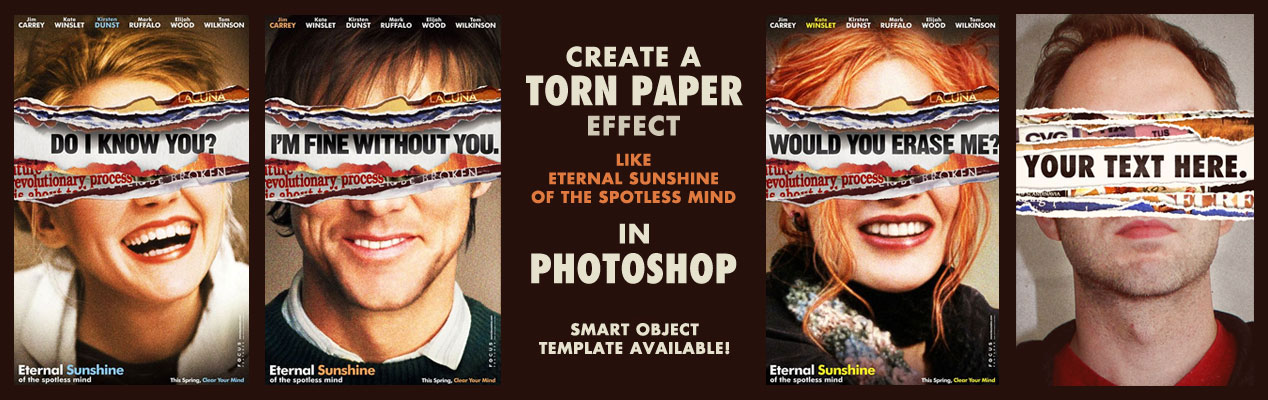
Tutorial: Create a Torn Paper Effect like Eternal Sunshine – Smart Object Template Available
One of my favorite movies of all time is Eternal Sunshine of the Spotless Mind. I also really love the movie posters that featured a torn paper effect across the person’s eyes with some text underneath. Nice job by BLT on the original posters. I thought it would be cool to make my own version and show you how I did it.
If you want to skip this whole thing and make it easy, I’ve made a Smart Object Photoshop Template so you can easily add your own photo and text. Just double click the smart object layers, paste in your photo, save, and voila! You can even swap out the torn paper images if you’d like. This message brought to you by the keen minds behind digital marketing in Cleveland, Go Media.
Purchase Torn Paper Effect – Smart Object PSD Template – $2.99
On with the tutorial! You’ll need Photoshop CS5 or newer for this.
1. Set up your Photoshop Document
I just started with new document at 486×755 pixels. It’s not high res, but I have no intentions on printing this. It’s mostly just to display on the web.
2. Create your torn paper layers
You can create these from scratch, but I found it easier to just find some torn paper vectors online. If you create your own, you can use the pen tool in Photoshop or Illustrator and draw your own torn paper edges. Be sure to create several variations. Create two parts for each torn paper piece. One will be the “edge” and the other will be the “mask.” The edge is white part with the drop shadow and the mask is the grey part of the paper that will act as a clipping mask for the graphics we want to place on the paper itself.
3. Paste in each torn paper layer into Photoshop
I copied the white part of the torn paper first into Photoshop and enlarged it to fill my document size. Then I copied and pasted the grey part of the torn paper and enlarged it enough to look good with the edge. Place them a little bit apart so there is enough white edge visible. Do this for each “piece” of torn paper. Remember, you want a “mask” and an “edge” layer. Then add a drop shadow to each of the edge layers.
4. Create a top and bottom piece for your portrait photo
You will take one of the pieces of paper (2 layers each: mask and edge) and use it for the TOP layer. The TOP most layer, you’ll need to extend the paper to the edges of the document. It is within THIS mask you will add your headshot photo. Notice how I arranged the paper pieces so they are closer together? See below:
5. Paste in your own photo!
Now this is the fun part. You can paste in your headshot photo above the top piece’s “mask” layer. And then right click on the mask layer and select “create clipping mask.” See how I have my layers set up below. I have also put in a paper texture for a more textured effect.
6. Paste in more photos for each piece of torn paper
I wanted to go for the “torn magazine” look so I sought out some old vintage ads online. I pasted them in each piece of paper group and set the clipping mask just like I did for my top photo above. This is the effect I get below:
7. Do the same for the bottom part!
You’re going to repeat the steps to the same for the bottom section. One quick way is to simply duplicate all the top layers and flip them vertically. Then swap out all the photos with new ones so they are different. One suggestion is to rearrange the order and positioning of the torn paper pieces so it looks different from the top.
8. Add text
See the space in between? That’s where we will add our text! I also added a dark paper texture set to “screen” to and some additional shadows using the paintbrush tool so I could get a more realistic effect. See my layer structure below:
9. Add textures and final effects
One thing that will tie the whole thing together is some colorizing and textures. You’ll notice I have a dark reddish brown layer set to “screen” to color my darks. And a tan color to colorize my lights. Those are set to a reduced opacity to not have an overpowering effect. I also had a couple vignetting layers to bring more of a framing/focus to the image. There’s a levels adjustment layer to brighten and boost the contrast of everything all together. And finally there is a film grain layer set to “overlay” and reduced to 40% opacity. A film grain layer is just a layer filled with 50% grey color with a noise filter put on it. Tweak the settings to what you think looks good.
10. You’re done!
Bonus: Download the PSD
Or just download the PSD template and make it easy on yourself. Again, you don’t have to go through all these steps if you don’t want to. Just download the PSD file yourself. I set it up with Smart Objects so you can just double click on the layers that you are supposed to swap out with your own photos. Purchase Torn Paper Effect – Smart Object PSD Template – $2.99
Here are a few examples!
Have fun!
- Categorized: Photoshop, Templates, Tutorials
- Tagged: eternal sunshine of the spotless mind, photo effect, Photoshop, template, texture, torn paper, tutorial
Create a Brand Bible for your Business with our Brand Bible Adobe InDesign Template
Brand Bible Adobe InDesign Template
Do you have an internal document that communicates your brand’s vision and mission to your team? We call it a Brand Bible at Go Media. It’s combines elements of the Brand Guidelines Template with more messaging about why your company exists.
This Brand Bible Template includes a 35-page InDesign File with suggestions to help you write and create your own Brand Bible for your business. We have also included an actual copy of Go Media’s Brand Bible for reference so you can see what we did.
Note: This document does not include the fonts used for legal reasons. You are encouraged to use your own fonts.
How to Use the Brand Bible:
- Consider this a starting point for your own Brand Bible
- Open the Template InDesign file in Adobe InDesign CS5 or higher
- Replace the Dummy Text (lorum ipsum) with your own copy
- Use our example PDF for reference and ideas on what to write
- Add your own images and adjust the colors to suit your brand
The document includes sections like:
- Cover
- Letter from the President
- Company Story
- Company Purpose, Vision, Values, and Mission
- Advocacy Document
- Company Core Services
- Key Triggers
- Brand Positioning
- Audience Association
- Slogans and Mottos
- Tonality and Voice
- One Minute Elevator Pitch
- Logo Guidelines
- Typography Guidelines
- Color Guidelines
- Photography Guidelines
- Icon Guidelines
- Product and Collaboration Branding
- Marketing Collateral Guidelines
- Contact
Partner the Brand Bible with the Brand Guidelines Template as well as resources like Drawn to Business and its supplemental material to grow your own million dollar business.
Need help with your brand? Go Media is a Cleveland Logo Design company that can help you create the brand you need.
- Categorized: Go Media, Go Media's Arsenal, News
Girl Power: Follow These 34 Female Creatives Now
Having just taken on the position of Weapons of Mass Creation Fest Event Organizer, I feel a pride in my heart and an overwhelming sense of girl power more than ever. So today, I’d like to highlight some lady creatives I’m obsessing over as of late. You know, the ones inspiring me to be brave, create and go forth and do great things like cool, confident chicks do. I know I’ve missed some greats, so please, please share your favorites with me in the comments below or email me their names so I can shout-em-out in the future.
Obsessed.
To keep up-to-date on women designers who rock, check out our Pinterest board dedicated to this topic brought to you by Cleveland graphic designers, Go Media.
Lotta
Lotta Nieminen | Twitter | Instagram
Illustrator, Graphic Designer, Art Director
Lisa
Lisa Congdon | Twitter | Facebook
Artist and Illustrator known for her colorful paintings and drawings
Nicole
Nicole Dominguez | Twitter | GitHub | Dribbble | Medium
Designer
Jillian
Jillian Adel | Twitter | Instagram | Tumblr | Dribble
Letterer, Art Director, Designer based out of LA
Alyssa
Alyssa Yuhas | Twitter | Facebook | Pinterest | Instagram
Art Director, Designer and Founder of DesignerVaca
Promise
Promise Tangeman | Facebook | Twitter | Blog
Graphic and Web Designer, Founder of DesignerVaca
Andrea
Andrea Pippins | Twitter
Designer, Illustrator
Mary Kate
Mary Kate McDevitt | Twitter | Instagram | Pinterest | Dribbble | Tumblr
Hand Letterer and Illustrator
Chanelle
Chanelle Henry | Twitter | Medium | Tumblr
UX Practitioner, Advocator and Defender
Keetra
Keetra Dean Dixon | Twitter
Designer, Director, Artist
Margot
Margot Harrington | Twitter | Pinterest | Instagram | Dribbble
Designer of all things Margot is the head honcho at Pitch Union Design, where she makes websites, books, brands and custom lettering.
Alesha
Alesha Randolph | Behance | Dribbble | Twitter | Facebook
Graphic and Web Designer, Art Director
Meagan
Meagan Fisher |Twitter | Dribbble
Designer
Siedah
Siedah Mitchum | Twitter
Graphic and Web Designer
Danielle
Danielle Evans | Twitter | Instagram | Dribbble | Pinterest
Hand Letterer and Typographer
Dana
Dana Tanamachi | Vimeo | Instagram | Dribbble | Twitter
Graphic Designer and Letterer of Tanamachi Studio
Laura
Laura Baisen | Instagram | Twitter
Illustrator and Printmaker
Jessica
Jessica Walsh | Twitter | Instagram | Facebook
Designer, Art Director & Illustrator
Carolyn
Carolyn Sewell | Twitter | Dribbble | Flickr | Instagram | Society 6
Doodler and Designer
Jen
Jen Myers | Twitter | Tumblr | Dribbble | Instagram | Pinterest
Jen is a web designer and developer, speaker, teacher and writer.
Tuesday
Tuesday Bassen | Twitter | Tumblr | Dribbble | Instagram
Tuesday is a designer, illustrator and ceramics artist.
Jacqui
Jacqui Oakley | Dribbble | Twitter | Instagram | Pinterest
Designer, Illustrator, Instructor
Jessica
Jessica Fortner | Facebook | Twitter | Tumblr | Behance
Illustrator
Allison
Allison Glacey | Flickr | Dribbble | Twitter | Facebook | Pinterest
Designer, Illustrator, Screenprinter of Strawberry Luna
Erin
Erin Barker | Twitter | Tumblr | Instagram
Illustrator
Melissa
Melissa Buchanan | Twitter | Instagram
Designer and Printmaker
Erin
Erin Anacker | Twitter
Designer, Connector
Jessica
Jessica Hische | Twitter | Instagram | Rdio
Letterer, Illustrator, Type Designer
Krystle
Krystle Rowry | Facebook | Twitter | Instagram | Pinterest
Graphic Designer
Linzie
Linzie Hunter | Twitter | Flickr | Facebook | Pinterest | Instagram
Illustrator, Hand Letterer
Claudia
Claudia de Almeida | Twitter | Instagram | Tumblr
Art Director, Designer, Educator
Jing
Jing Zhang | Twitter | Dribbble | Behance
Illustrator, Typographer, Designer
Teagan
Teagan White | Tumblr | Twitter | Facebook | Behance | Instagram
Designer, Illustrator
Yuko
Yuko Shimizu | Twitter
Illustrator
Who did I miss? Tell me in the comments below!
– Heather @sakaipower :)
Header photo thanks to Patrick Chin
- Categorized: Design Community, Graphic Design Inspiration, Web Roundup
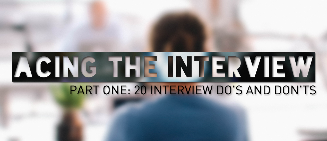
How to Ace Your Next Creative Job Interview – Part One: 20 Interview Do’s and Don’ts
Creative Job Interview Tips
Whether you’re out there, seeking a job in a creative field, or just want to keep your ninja interview skills sharp as knives, read on as we receive advice from interview expert Ann Walter.
Having interviewed hundreds of people over the years, Ann knows her stuff. Cleveland native and Kent State University School of Fashion Design Merchandising alumni, Ann is a retail consultant and college instructor specializing in professional development/job search coursework for the creative fields. She spent the last eighteen years as a fashion designer and creative leader in the apparel industry at companies including Liz Claiborne, Gap, Walmart, Sears Holdings, Dots, and Justice managing design teams of fashion designers, graphic designers, and CAD designers. She currently serves as adjunct college instructor at KSU Studio in New York City.
Take it away, Ann!
– Heather, Go Media’s Zine Editor
Interview Do’s and Dont’s
We’re all pretty familiar with the basics involved in an interview. Let’s talk about some important specifics and details regarding the three parts of the interview process including:
1. Pre-Interview
2. Interview
3. Post-Intervew
As you review the following do’s and don’ts, here’s something important thing to keep in mind – just because we may be “creatives” doesn’t mean the interview process is any easier or less serious.
And remember, you don’t have to be nervous – you just have to be prepared!
Ready? Let’s go!
The Pre-Interview: “Do your homework!”
DON’T forget this often overlooked yet critical part of the interview process.
DO keep detailed notes/an interview journal (digital or notebook). This could include your thoughts on the company, important dates, and location of interview. Also a great place to keep your answers to top interview questions.
DO research the company!
Google them for news articles, earnings, new business ventures, etc. If this company has a retail component – visit the store and take notes! If they sell online or business-to-business spend time on their website and be familiar with their product, designs, campaigns, etc. It’s a deal-breaker in a creative industry to not have an opinion on the product/aesthetic of the company you are interviewing for. They will ask your opinion, what looked good and what opportunities you see for them. They’ll want to know what you think of their competition, etc.
DON’T be afraid to do a little ‘light stalking!’
Research the interviewer themselves if you can. If you are working with HR and have already met the HR team, ask them for what to expect from the interviewers. Ask your friends who work there. I like to see the interviewer’s picture on LinkedIn if I can! The more information you have the better and the more comfortable you’ll be when you arrive at the interview!
DON’T show up in the wrong outfit! Research the culture and dress code. Be prepared in an appropriate way.
DO be prepared by practicing your answers to typical interview questions.
DO a dry run to the location of interview!
Literally dry run the commute/walk etc. to know how long it will take you. Know where the building is, etc. You will feel more comfortable the day of.
DO allow yourself time to walk in the door of the reception area/lobby 10 minutes early!
If you get to the building too early kill time at a Starbucks or hang out in your car! Remember, you may have to park far away or go through building security and sign in. In these cases, make sure to allow extra time. Being late is a big no-no. If you do run late, let the interviewer know in advance and apologize when you arrive without going overboard.
During The Interview: “Bring Your A Game!”
DO introduce yourself professionally with a strong and self-confident voice, good eye contact, and a firm handshake! This is not the time to be shy or girly. Be assertive and confident!
DON’T forget that first impressions are KEY! The interviewer probably reaches some sort of decision about you in the first 2 – 5 minutes.
DON’T forget to have 10 copies of your resume with you. Use good quality paper!
DO keep your answers to 2 minutes or under! Don’t ramble.
DON’T use slang.
Creative folks can get away with slightly more casual language and behavior, but it even if you’re meeting at the local coffee house, it is still a job interview where they are assessing whether or not to hire you at their company. Be very careful of the top offenders UMM, LIKE, YOU KNOW. If you find you use slang, a good way to catch yourself is to just pause instead of saying your usual filler.
DON’T bad mouth a previous employer!
The creative fields are small industries and people are very connected. Plus, it makes you look like a small-minded person who gossips and is unprofessional – if you are forced by a direct question to give an example of a tough relationship you’ve had in the past – take a negative situation and describe it as a challenge and how you overcame it, keep things proactive.
DO have a few questions prepared for the interviewer.
These could be about the company, about the position
“What are you looking for in this “assistant graphic designer” role?”
“How long have you been with the company”
“What keeps you excited to be here?”
Etc.
DO be prepared to be flexible.
If an interview goes well, they might have you stay and meet more of their colleagues.
After the Interview: “Leave A Good Impression!”
DO stand up, thanks the interviewer for her time, look her in the eye and shake her hand again!
DON’T be afraid to ask about next steps in the interview process or when they will be making their decision on the position.
Reiterate that you are very interested in the position.
DON’T forget to send a thank you note within 12 – 24 hours!
Handwritten, not email. Don’t use a card covered with glittery butterflys from Papyrus. This is not a thank you note for your grandmother! Use simple, chic, cool stationery.
DO follow up.
Assess the best form of contact. This is usually email so it’s less invasive. Check in if you haven’t heard anything in the timeline that was mentioned. Again, an appropriate level of assertive follow-up (light stalking!) here shows your interest in the position.
And that’s it!
Best of luck with your interviews and stay tuned to Part Two of How to Ace Your Next Creative Job Interview, “Tough Interview Questions and How to Answer Them”
- Categorized: Business Philosophy, Graphic Design
- Tagged: advice, interview, job interview, jobs
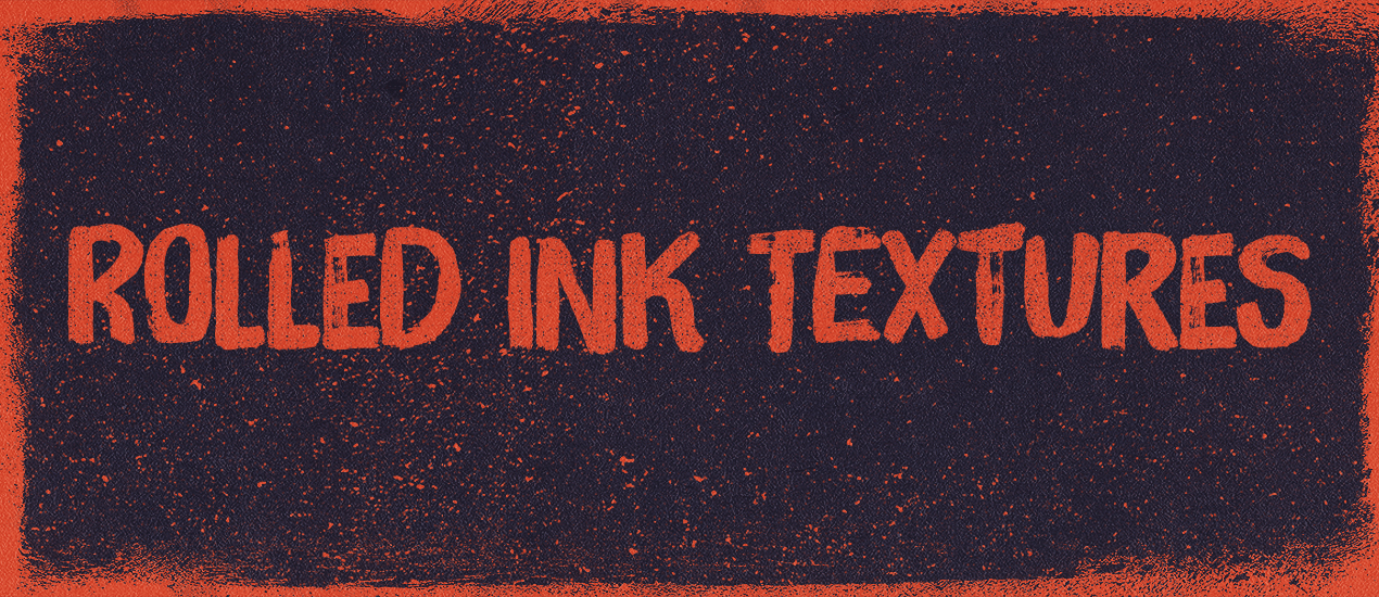
Texture tutorial: How to apply our rolled ink textures to your design for that old-time print shop vibe
Introducing The Shop’s rolled ink texture packs, volume 01 and 02
Ladies and gentlemen, drum roll please. I’m happy to announce that my rolled ink texture packs are finally available on the Arsenal! Simon from The Shop here, and I’ll be walking you through both texture packs, as well as through a few techniques to make good use of them. On to the texture tutorial!
BUY THE SHOP’S ROLLED INK TEXTURES, VOLUME 01
So, what is it about these textures that makes them awesome?
Well, for a start, they have been created by hand. I used both a foam and a rubber roll to execute them, and lots of rich, deep, black ink.
The result is that series of 28 textures in total (14 in each pack). After experimenting with pressure, ink quantity, roller motion, and paper types, the textures were left to dry for a few days. After the drying was complete, they were scanned in at very high resolution (800 dpi and more). Following the scanning process, they were carefully, and minimally edited to produce a set of textures sized at 5000 x 7800 pixels on average.
Both sets are delivered in the form of flat RGB .jpg images in a ZIP archive.
BUY THE SHOP’S ROLLED INK TEXTURES, VOLUME 02
Cool story, but how do I use these textures?
Oh boy, am I glad you asked. I precisely prepared a quick piece showcasing these textures, so we could experiment a little bit. We’ll use both Photoshop and Illustrator for this tutorial, but you should be all right with just Photoshop.
Step 0: Assets gathering
Before we get started, you’ll need to put your hands on a few assets.
The first asset is an old envelope texture, courtesy of our very own Dustin Schmieding.
The next asset is a blue soft grunge texture, also from Dustin (through his Valleys in the Vinyl blog)
Finally, I prepared a small freebie pack for you guys.
GET THE TUTORIAL ASSETS AND FREEBIES
It includes the vector type element used in my piece. I crafted it using a typeface called Felt Noisy, made by the awesome folks at PintassilgoPrints. Consider buying that amazing, messy brush style font! You won’t regret it one bit. The file is available in Ai (CC), EPS (CS3), and PDF formats. It includes a black and white and pre-colored version of the artwork.
Talking about colors, here’s a palette I’ve established for my piece, based on the colors of WMC Fest!
Color by COLOURlovers
The freebies we’ve included in the pack are two of the textures from the Rolled ink textures, volume 02 pack. They are #4 and #12. They will be used in the tutorial.
Finally, the last asset you should have at hand is a useful set of Photoshop actions by Media Militia. They allow you to turn white pixels to transparent ones, with a single mouse click.
I’d like you to also quickly read the post – it includes some background on how the actions work, and instructions to install them.
Step 1: file setup
The first step is to create the canvas we’ll be working in. I’m using an 24″x18″ file @ 300 dpi.
I’ve also created a few guides to give a loose structure to work from. I’ve placed my vertical guides at 1″, 2″, 12″, 22″, and 23″. My horizontal guides are placed at 1″, 2″, 9″, 16″, and 17″. This “grid” gives me a quick indications of my piece’s center, as well as marks a nice border zone around it.
Step 2: the background
Start by filling your background layer with our bright yellow (#fbfbd9).
Feel free to double click on it so it becomes an unlocked layer.
Create a new layer above the yellow layer, and fill it with our dark green (#337061).
You know have two layers, one being completely invisible.
We’re going to leverage rolled-ink-texture-pack-volume-02-sbh-007.jpg from the second volume of the rolled ink textures. Pasted into a layer mask, this texture will allow us to reveal the hidden yellow layer. Visually, this will translate into a bright border around our dark piece.
Open the texture in Photoshop.
Select its content, and copy it (CTRL/CMD+C). Head back to our piece. Add a layer mask to our green layer.
Make sure the layer and the layer mask are “untied” to each other (no chain link). This will allow us to move/transform their content independently from each other.
Now, ALT/OPTION+CLICK on the layer mask to access its content. Simply paste the texture in there (CTRL/CMD+V).
In a layer mask, black pixels represent the parts of the image that will be hidden, and white pixels the ones that will be shown. The various gray levels represent the various degrees of transparency. With that in mind, we’re going to place our texture so it will allow a bit of the yellow layer to show at the edges of the piece. We’ll obviously have to invert the layer mask’s content to achieve our effect.
You can see that I’m slightly distorting the texture to fit the project/goal at hand.
Once the texture is in place, invert it (CTRL/CMD+I).
Click back on the layer’s thumbnail to admire our result. This is the perfect moment to further tweak the layer mask if the result isn’t quite where you’d like it to be.
I’m personally happy with the texture overall, but I think some of its artifacts (paper folds and creases) are showing too strongly. I’m going to use the levels panel (CTRL/CMD+I) to fix this. With the layer mask selected, bring up the levels. Tweak the various sliders until you reach a level you feel comfortable with. My values bring a stronger contrast to the texture, “washing off” some of its detailed creases, folds, etc.
And here’s our cleaner, and better defined result.
And we’re done with our background. Proceed to some house-cleaning (or else!), and let’s get ready to move on to adding the type element to our poster.
Step 3: bringing the type in
It’s time to move on to Illustrator, and to open one of the files containing the type element.
You have a couple options from here:
- Grab the pre-colored element, copy it, and paste it into your Photoshop document
- Use the monochrome element, tweak the colors to your liking, copy it, and paste it into your Photoshop document
- Get the Felt Noisy typeface, and use the many alternate characters available to tweak the type element to fit your tastes just right (and then paste it into your Photoshop document)
Because I’m already happy with my current color scheme, I’ll settle on the already colored type piece. Simply copy it, and paste it in your Photoshop document. I HIGHLY recommend keeping the type as a smart object, as this will retain its vector properties within your raster file. This could come in handy should you decide to tweak the type’s placement or size later.
Size the type to your liking.
Once you’re happy with the type, proceed to organize things a bit.
It’s now time to finally use our rolled ink textures.
Step 4: using the rolled ink textures to create ink noise
If you haven’t done so yet, it’s time to grab Media Militia’s actions, and to get them installed. Next, open rolled-ink-texture-pack-volume-02-sbh-012.jpg from your asset pack.
You can use levels to tweak the texture to your liking (lighter or darker).
Once you’re done with that, it’s time to run one of the actions to obtain a version of our texture with a transparent background. Make sure that your colors are reset to the default (you can press “D” for that), and run the “maximum opacity” action. This will ensure the best result for the following steps.
You’ll end up with a file looking like this
Simply drag it into our main file.
Turn it into a smart object (Filters > Convert for smart filters in Photoshop CC).
Once the layer is a smart object, resize it and position it so it covers as much of our piece as possible. It should also not have an overwhelming effect.
Once the texture is in place, proceed to give it a color overlay of our bright yellow (#fbfbd9).
Open rolled-ink-texture-pack-volume-02-sbh-004.jpg, and follow the same process. The only difference is that you’ll give it a green color overlay (#337061).
Once you’re happy with your ink effects, it’s time to organize things a little bit. I renamed my layers to reflect the textures that were used to generate them, and grouped them properly.
Step 5: textures!
It’s time to add a little bit of textures to our piece. This will tie things together, as well as add extra depth.
I’ll be using a texture workflow that’s as non-destructive as possible. I wrote extensively about following such a process for the good folks over at Design Cuts:
Adjustment layers, clipping masks, and clipped layers will become your new best friends. While it might seem cumbersome at first, such a workflow has many advantages. You could go back to your original piece of content in a heartbeat, by simply turning layers off. You could quickly change the intensity of an effect used during the making of the piece, to make it stronger or more subtle.
The gist of it is to use clipped adjustment layers to your textures, so you can revert your changes at all times. Makes sense? Alright, let’s get going.
The first texture is BB_AntiqueEnvelope_04.jpg.
Place it in your document so no seams are visible.
Desaturate it (the Saturation slider of the Hue/saturation adjustment layer is set at -100).
Next, use a Levels adjustment layer to bring the texture’s artifacts and grain out.
Finally, change the layer’s blending mode to Soft light @ 75% opacity.
The next texture is VV_ColoredGrunge_02.jpg. The interesting feature of this texture is that it features a soft vignette. We’ll make advantage of that to focus the viewers’ attention to the center of the piece, where the type is.
We’ll repeat the same process: place the texture as a smart object, desaturate it, use levels to enhance it, and switch its blending mode.
Blending mode: Soft light @ 35% opacity.
This concludes the texture part. Here’s what my layer stack is looking like.
Step 6: finishing touch
In our case, the finishing touch will be a subtle halftone effect. This will allow us to give the piece a tactile feel, as if it were printed.
Start by creating a merged copy of all your visible layers (CTRL/CMD+SHIFT+ALT/OPTION+E). I’ve renamed my copy Halftones.
Convert the layer to a smart object.
Proceed to add a Color halftone effect to your layer (Filter > Pixelate > Color halftone).
The result is obviously not adequate.
Start by changing the effect’s blending mode. You can do so by clicking on this little button, on the right of the effect name in the layer palette.
Change the blending mode to Soft light @ 100% opacity.
From there, change the actual layer’s blending mode to Lighter Color @ 75% opacity.
Because of the effect’s nature, the colors in the piece have slightly shifted. You can fix this if you don’t like the result by adding a hue/saturation adjustment layer, clipped to the halftone layer.
And we’re done! Isn’t it looking nice?
Concluding thoughts
Well, we’re done. I hope you had as much fun following along as I had writing this tutorial. I also hope that this short write-up helped you to see the potential these ink textures have to quickly bring some ink elements in your designs, to be used as masks, or as textural elements.
Don’t hesitate to reach out if you have any questions! I’ll be watching the comments below, but you can also tweet at me @simonhartmann.
We’d love to see your tutorial outcomes! Don’t hesitate to post them on the Go Media facebook page, or in the Go Media Flickr pool, or in the Go Media Pinterest galleries.
Finally, don’t forget to get your hands on both volumes of The Shop’s Rolled ink textures!
BUY THE SHOP’S ROLLED INK TEXTURES, VOLUME 01
- Categorized: Go Media's Arsenal, Illustrator, Photoshop, Textures
- Tagged: arsenal, grunge, rolled ink, textures, The Shop, tutorial, vintage, worn
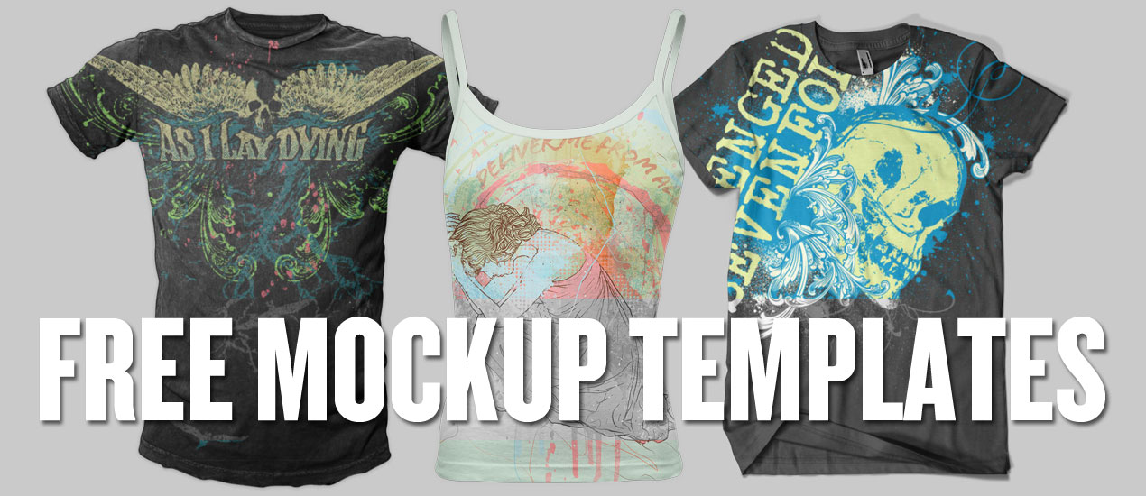
Free T-Shirt Design Mockup Templates from Your Friends at Go Media
The Power of the Mockup
Hello there Designers!
As you know, we absolutely love and believe in the power of the mockup here at Go Media. After all, we’ve dedicated our two realistic mockup subscription sites, ShirtMockup.com and MockupEverything.com, as well as our digital marketplace, the Arsenal, to this, one of the most important steps in the design process.
We believe that mockup templates are your best friend if you want to:
- Present your design to clients in a realistic, 3D setting on an actual product
- Test your product’s market potential as well as explore how it might look before going through the expensive manufacturing process
- Impress and entice family, friends and future clients who’ll drool over your designs
- Fully customize the appearance of your design and end product
- Completely revamp your portfolio
Sharing is Caring
Another one of our loves is the sharing of resources among the design community. So, today we thought we’d share some of the free t-shirt design mockup templates we offer on ShirtMockup.com and MockupEverything.com, as well as a sample Photoshop mockup template from our Arsenal.
Standard T-Shirt jpeg snapshot available free on ShirtMockup.com:
Distressed T-Shirt jpeg snapshot available free on ShirtMockup.com:
Men’s Crew Neck T-Shirt jpeg snapshot available free on MockupEverything.com:
Men’s Distressed T-Shirt jpeg snapshot available free on MockupEverything.com:
Women’s Crew Neck T-Shirt (Modelshot) jpeg snapshot available free on MockupEverything.com:
Women’s Deep V-Neck T-Shirt jpeg snapshot available free on MockupEverything.com:
Free Download
Free Photoshop Template Download from the Arsenal
Instant Download here: Ladies Ribbed Tank Top from Go Media’s Arsenal
For many, many more templates, visit us at ShirtMockup.com and MockupEverything.com, where we offer realistic mockups for designers looking to apply their designs to templates quickly and easily (without fancy software like Photoshop).
For those looking for more customization, head to our Arsenal to check out our Photoshop mockup templates. We’ve got the World’s Best, you know.
- Categorized: Graphic Design Freebies, Templates
40+ More Free Fonts To Download Immediately
Free Fonts for Designers.
Sorry guys. I know it’s a bit of a guilty pleasure – this free font thing, but here at Go Media, we love providing designers with products they need.
I learned really early on that I can’t please everybody all of the time. If this ain’t your cup of tea, kindly look away. Mmkay?
_______________________________
Phew! They’re gone.
Ok. Let’s get to the good stuff. First off, check out my previous posts:
50 Totally Free Fonts for Designers 2014 and 40 Fresh, Free Fonts for Graphic Designers
Now onto more free font-age:
Remember to proceed with caution and use fonts as directed!
WMC 5 Free Font Pack by Andrew Hochradel
Cigarettes & Coffee by Fabian De Lange
Bushcraft Free Font Family by Bowery Studio
Docker Free Font by Slava Krivonosov
Nexa Rust Free by Fontfabric and Radomir Tinkov
Hello Sans by Fredrik Staurland
Adam.CG Pro by Shrenik Ganatra
Big John | Slim Joe Font by Ion
Cute Punk by cute punk and flou
Graham Hand by Inspiration Hut
Dilem Handwritten Display Typeface by Dilem Akiner
Broken Records by Timo Kuilder
Feral by Marcus Lien Gundersen
Close Font Family by Bowery Studio
Tracion by Marcus Lien Gundersen
- Categorized: Fonts, Graphic Design Freebies
Daily Inspiration: The Typography of Cedar Point
Rockin’ Roller Coast Me.
Guys. If you know me, I bleed Cleveland through and through. And although Sandusky is an hour away, I still consider it part of our great city (just give it to me, will ya?) I mean, I grew up piling into the minivan heading up to the roller coaster capital of the world, Cedar Point, and just loving the hell out of life.
I haven’t stopped. I won’t stop.
Cedar Point, to me, represents everything great about America, about summer, about life. Inside those golden gates are thrilling rides, elephant ears, cheesy singing & dancing shows and questionable fashion choices. I mean, be still my beating heart.
Well, I recently had yet another adventure with my Cleveland Design compatriots at Go Media and we went balls to the wall as usual, which included such memorable moments as this:
Typography Inspiration
We also admired the wealth of typography Cedar Point offers, which I have collected via Pinterest and Flickr. Which one is your favorite? Want one to be the jump off point to your new logo design? Share with me in the comments below.
See you next year, Cedar Point!
- Categorized: Graphic Design Inspiration, Web Roundup
- Tagged: inspiration, typography
Why Getting Away from Your Computer Screen Matters More Than You Think
On December 2nd of last year, I embarked on a project that would take me from coast to coast and open my eyes to just how incredible this little country of ours truly is. Dubbed, The Great Agency Adventure, this journey has seen me working at a different ad agency in a different city ever since. By the time I return home to Cleveland in February, the final number will balloon to a grand total of 14 agencies in 14 cities—all in the span of 14 months.
So, why would I leave the comfort and security of a 9 to 5, just to rack up mountains of debt and offer my creative services for pennies on the dollar? That’s the million-dollar question. It’s a story I’ve told countless times since I first left Cleveland last winter and it’s one I’m sure to tell again and again for years to come. I won’t bore you with the details here, because I’ve already written about it several times on my own blog—thegreatagencyadventure.com. No, I instead wanted to take a moment and discuss one of the greatest insights I’ve absorbed on my travels.
[Tweet “A computer screen is no substitute for an open window.”]
A computer screen is no substitute for an open window.
In a world where it’s all too easy to leave comments, Tweet grievances and snark at the next big trend, we often forget to take a moment and appreciate things for what they are. That’s because a computer screen only allows you to see what’s in the pixels—whether it’s an image, article, review or video. It’s become far too easy to reduce the blood, sweat and tears of an individual down to a 15-second gif; the delicate brushstrokes of an artist down to a thumbnail; the years of studying fine cuisine in Europe down to a snapshot. Don’t get me wrong; none of these things are bad. They simply become bad, when we stop demanding more from our lives and stop seeking these experiences out for ourselves.
‘Doing’ is a dying art form and we’re too comfortable with simply ‘viewing’.
That’s why I’m currently sitting on the banks of the Colorado River in Austin. I realized I was in a position where I could not only help people see what’s out there; but I could hopefully instill in them the courage to go out and experience it firsthand. When you venture out into the real world and see the art, shops and eateries that line our streets, you can actually feel the dedication behind them. You can taste the artistry and appreciate the unparalleled talent. It’s a sensory experience you won’t find on any electronic device. After all, a new phone may seem nice at the time, but it’s bound to become obsolete within the year. A trip to Iceland, though? That’s a memory you’ll never call outdated.
To actually go eat slow-cooked Texas BBQ; watch the skaters at Love Park in Philly; tag your name on the St. Louis graffiti wall; it all instills a new sense of wonder and accomplishment. It motivates you to become a part of something bigger and opens your eyes to the fact that there are creative people all over the world. It’s a feeling that can’t be expressed in 140 characters or through the lens of an Instagram filter. Yet, it’s something that will stay with you regardless of where you live, where you work or how much money you make. It’s a reminder that what you do is never regulated to a cubicle or office, despite how it may feel at times. The world is a canvas; you just have to go looking for the right brushes.
[Tweet “Happiness breeds the very best work.”]
Happiness breeds the very best work.
To me, travel always yields one of two positive outcomes. On one hand, you may come across a city that immediately acquires your love—a place that calls your name and invites you in with open arms. Somewhere that stimulates your talents and rouses your very best creations. But, on the other hand, you may feel underwhelmed, only to return and fall in love with your home all over again. Armed with a newfound enthusiasm and a mind full of memories, you’ll feel motivated to improve your city and finally devote enough time and passion to doing so. That’s what Sam McNulty did and I’d say his worldly knowledge has served him rather well over there in Ohio City.
On a personal level, I’m ready to embody all of the knowledge I’ve consumed on this trip and unleash it through my work. I don’t know what’ll come next for me. Yet, for the first time in my life, I’m not afraid to venture into that mysterious unknown. I just hope that some of you will decide to throw caution to the wind and join me for the ride, because our world could use a few more adventurers.
More about Steve and the Great Agency Adventure:
Twitter | Instagram | Facebook | LinkedIn
For more about Cleveland Graphic Design Firm Go Media visit our website. We’re your trusted partner for website design and development, branding & logo design and Graphic Design.
- Categorized: Graphic Design
- Tagged: design, opinion
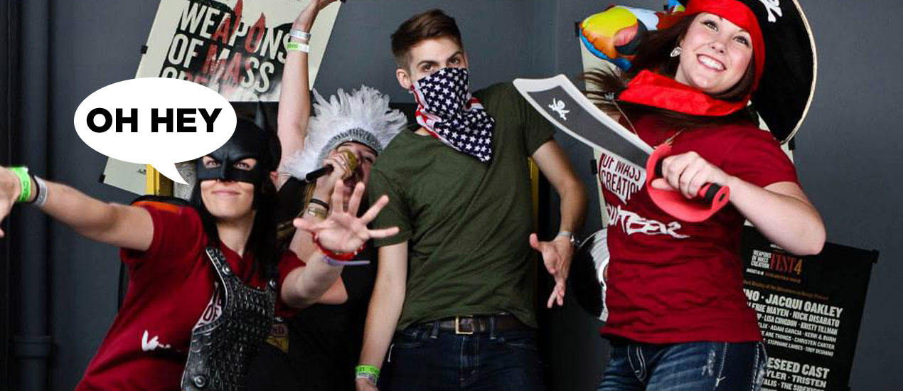
An Open Letter To My Fellow Weapons of Mass Creation: A Hello from New Fest Organizer Heather Sakai
(Waving)
By now, you’ve all heard the news. My colleague, mentor and friend, Jeff Finley is taking his talents to South Beach, break-dancing bravely into the great unknown.
After a tear or two, I pulled myself together and realized that this wasn’t a time for sadness but of celebration. Not only was Jeff being granted the ability to pursue his next dream, but I mine. Thanks to Jeff, I have been been offered what I consider to be the biggest and best opportunity of my life – to be the director of Go Media’s Design conference Weapons of Mass Creation.
With this fiery torch a blazin’, I’m already off and running. I hope you’ll come along.
Let’s Back Up.
My Stance on Weapons
& The Future
A Little Background on WMC for me & Why I Love it So Darn Much
Two years ago, my friend and Go Media President Bill Beachy asked me to help volunteer at Weapons. “Three Days that Will Change Your Life,” he said. I thought, ‘Okay, sure, I’ll do a good deed and help a friend out.’
When I stepped onto the scene, I soon realized that this was not just any festival and that those involved weren’t just any other folks. I knew right off the bat that this was something special. I felt an electric energy in the air and immediately I felt as if I belonged in a very authentic way. Experiencing this was a breath of fresh air for me. In a dead-end job, I had all but completely given up on myself. I had, like Jeff, battled depression and was stumbling way more than successfully getting up on my feet.
I left the Fest completely envious, wishing I could live the lives of those happy, creative, seemingly ballsy people I met at the festival. Days later it hit me. I could be one of them. I mean, as a creative myself (I hold a Masters degree from Case in Modern Dance), I had part of the equation, I just needed to get the other part nailed down.
Hit with a sudden spark of determination, I realized that it was time for me to turn this thing around.
With a new fire in my belly, I asked Bill for a job at Go Media. Having no graphic design experience, he was hesitant to say the least. But, thanks in part to busting my ass as a Fest volunteer (dawn to dusk) and other random, continued and relentless efforts to join the team (spending weeks painting the entire second floor of Go Media, for one), they finally gave the underdog a shot.
As I had never opened Photoshop, I was relegated to cleaning the back office during my first week. Fair enough.
Well, you know what? Inspired by the Fest and with unbridled passion, I cleaned that back office until you could eat off of the floor. I quickly moved from the back office to the front and I got my very own desk. I thought I won the lottery. I put in time purchasing supplies and answering phones. Day after day, I showed that I was capable of handling more, and thus I was given more. And more. And more. With each responsibility, I grew prouder, more confident, more inspired.
Fast forward to a year and a half later, I am now responsible for all of Go’s social media, for running sites MockupEverything.com and ShirtMockup.com and for managing artists and launching all products on our ecommerce site, the Arsenal. I have even met the pen tool and spend a good portion of the week doing some basic design. And now, I’m adding WMC Fest to my list. Bill jokes that I’ll one day just take over Go Media completely.
I have truly defied the hand I felt I was dealt.
Nailed the Slogan, Jeff.
Here’s what I’m trying to say. This “Change Your Life” thing – well, that hasn’t just been a slogan for me. Weapons of Mass Creation Fest has transformed my life in so many ways – giving me the confidence to pursue the career of my dreams, for one. Further, I look at the world differently since Weapons of Mass Creation Fest 3. My ability to survive an extremely tough year, including my mother’s passing and brain surgery for my one year old niece, I credit to the sense of hope and fortitude I gained, not to mention the friendships formed during the Fest.
I believe wholeheartedly in Weapons of Mass Creation Fest because it has given me so much and continues to do so. It also allows me to feel at home and be my true authentic self. This is not something I feel often, so when it happens, I hold it dear.
If you couldn’t tell, I believe the Fest is life-changing and love everything it represents. I am beyond honored to carry the Fest torch. I know that I’ll make Jeff proud, and I have promised to lead the charge for as long as I have the 100% drive and enthusiasm to do so.
Where it’s going
As mentioned, Weapons of Mass Creation Fest has served me so well, so I do not see it changing in any major way. Why mess with a good thing?
I will, though, bring my own spunk and fire into the Fest. I have my own personality and ideas and I hope that you contribute too. I want to include each and every one of you in the Fest. After all, it belongs to all of us. Please always feel open to email or tweet me your thoughts, opinions and suggestions.
I really do hope that you’ll give me the chance to lead the way, because I have all the passion in the world for everything it represents.
Stay Tuned
Stay tuned to wmcfest.com in the coming months for announcements about next year’s date, team members and line-up. It’s sure to be exciting for us all. I look forward to your support as I embark on this exciting adventure. Chat with you all soon!
- Categorized: Design Community, Graphic Design Inspiration
- Tagged: inspiration, Weapons of Mass Creation, wmc fest