Blog
Tutorial: Pro Tips On Preparing Artwork For T-Shirt Printing
Pro Tips On Preparing Artwork For T-Shirt Printing
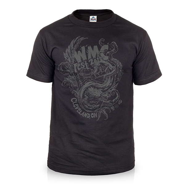
Hey designers, attend our all-inclusive soul-fulfilling three-day design retreat, WMC: Off-The-Grid, this October 5 – 7th. To learn more, head to wmcfest.com.
We are Go Media, Cleveland brand designers (and more), and we hereby decree that best way to ensure fast turnaround times on your custom printed t-shirt order and keep a happy, healthy relationship with your print partner is to deliver correctly prepared art files every time. By following the guidelines in this article, you can avoid unnecessary delays in the process that occur due to common artwork errors.
Tip #1: Start by planning out your color schemes.
This might seem like a strange place to start, but by planning your color palette first, you can avoid details that are often overlooked until it is too late. When creating an apparel order from scratch, it doesn’t necessarily matter whether you pick garment or ink colors first. However, there is an undeniable link between the two that is reflected in the final product. Always simulate every ink and garment color combination by creating mock-ups ahead of time to proof the results on screen.
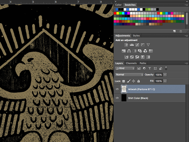
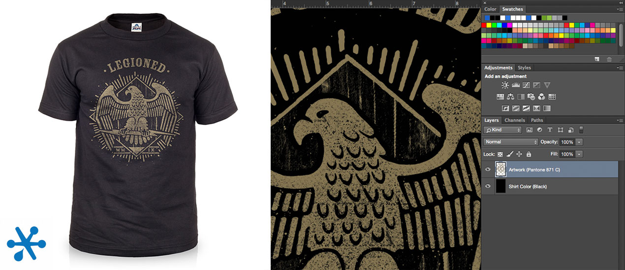
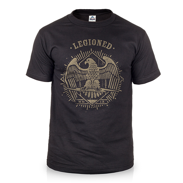
If designs are already created and you just need to add them to garments, the process is a little easier. It’s important to check if your graphic contains the same color as your shirt. If so, those areas can be used as negative space – the space around and between the subject of an image – in the middle of your print only, as matching colors along the outside edge will not be visible.
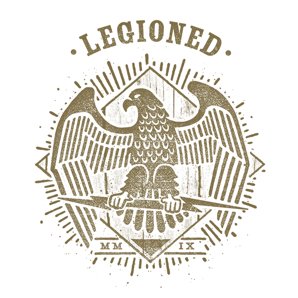
Similarly, ink and garment colors close in value will result in low visibility. Sometimes this can produce a cool effect, like when using tonal colors. However, if your intent is to have a logo that is readable from far distances, you may want to consider otherwise. To guarantee your logo can be seen from across the room at corporate events, make sure that you have maximum contrast between the two colors.
If starting from scratch with the ability to choose garment colors before inks, you can design with color harmony in mind. This requires a little more groundwork, but there are tools and resources available to help make this advanced technique easy even for the novice designer. First, you will need to determine the RGB values of the garment color that you have chosen. For our example, we will use the Alstyle 1301 shirt inline (92, 193, 81). Next, plug those values into a Color Palette Generator such as Kuler by Adobe. From there you can apply the different color theory rules to create additional ink color swatches.
With whatever colors you end up choosing, add them to your ”swatches” palette and save them. Create a separate folder for this color scheme, and label each color in a way that makes sense to you. Use these presets as a guide to how you will paint each area of your design and do not stray from your original plan. Just think of this process as if you were picking “paint chips” from the hardware store in preparation to paint the exterior or interior rooms of your house.
Tip #2: Choose Pantone colors (only if you possess a physical color book).
One of the biggest mistakes is improper use of Pantone references. Many times designers will select PMS colors from their graphics applications like Adobe Photoshop or Illustrator and expect to see the results as they appear on their screen. This defeats the entire purpose of calling our Pantone references due to the differences in color calibration from one computer monitor to the next. To get an idea of how drastic color, brightness and contrast controls vary on screen, walk the television aisles of any electronics superstore.
The only way that your printer can guarantee a color match is if you both are looking at identical references. This requires both parties to be holding the exact same physical color book in their hands. The Pantone book that you will need for screen printing inks is called the Solid Coated Formula Guide. This color library is generally sold with an Uncoated version and costs around $150 for the pair. So, unless you need to guarantee exact color matching on a regular basis, this may be a bit of an investment for a part-time designer. The good news is that your printer will generally not require PMS colors with your order and will choose the closest available Pantone based on what they see on screen. Count on your local print shop to have correctly calibrated monitors and ideal lighting conditions for viewing color. Just remember that there may be slight variances from your “out of the box” computer that you are working from in your office.
Remember to include your PMS references in your written order submission. If the Pantones are only included in your files, they may be overlooked or assumed as non-pertinent information.
Tip #3: Design in Adobe Illustrator when possible.
If you can control how your graphic assets are created, always do so in vector format, created with Adobe Illustrator. Unlike .JPG, .GIF and .BMP image formats, vector graphics are not made up of a grid of pixels. These files can be resized indefinitely without sacrificing print quality, so if you want to use the same logo for business cards, postcards, t-shirts, banners and billboards, each one of them will print clearly and without the blurriness or pixelation that occurs when resizing images that were created in Photoshop.
When you create your graphics in a raster–based application, such as Photoshop, you are more or less stuck with the original dimensions. Always start your documents from scratch at the intended print size with a resolution of 300 pixels per inch. If you then copy/paste low resolution elements into that workspace, you will notice that it will resize the graphic and will appear much smaller. DO NOT scale these elements any larger, or they will become blurry and will print with poor quality. When in doubt, always create your artwork larger and at a higher resolution than needed, as you can always scale the art down without causing issues. Transforming files to be larger can get you in trouble.
On the condition that your artwork was hand-drawn and you need to digitize the illustration, be sure that you have scanned your artwork at the correct resolution. The general rule of thumb is that if you have drawn the artwork at actual size, then scan it at 300 dpi. If your artwork was created an 50% scale, then you will need to scan the artwork at double the recommended resolution (scan at 600 dpi).
Tip #4: Leave the separations to the professionals.
For t-shirt graphics, your print shop will be creating spot color separations themselves, so there is no need for you to try and divide the ink colors up on your own. Regardless of which program you use, set your color mode to RGB. CMYK, also known as full color, is for process color printing only, where the Cyan, Magenta, Yellow and Black halftones are blended on press to optically create the full color gamut. Instead, think of screen printing inks as pre-mixed paint colors that go straight from the bucket to your t-shirts.
Where a full color image is reproduced on t-shirts, your printer may use 8-12 spot colors printed as halftone screens to reproduce the spectrum of color in your file. This technique enables them to replicate photorealistic prints with more vibrancy, even on black garments, and with greater color consistency from one piece to the next. If the graphic is instead made up of all solid areas of color, the print may not contain any halftones at all.
The color separations that the pre-press department will create from your artwork will be specific to their equipment and workflow. Sometimes, creating your own separations will just be creating extra work for pre-press, as they might have to make corrections. If you are trying to achieve a particular effect, try to mock it up first. Always include instructions in addition to submitting your original untouched print file, and consult your printer ahead of time before submitting your order to confirm that they can produce the results you are looking for.
Tip #4: Save an editable copy for yourself and a second copy for print.
When you have finished your final design, be sure to save an editable file for yourself, just in case you need to make adjustments later. If your printer has issues with any of the things that you have done within your file, you want to be able to go back and make amendments without having to recreate them. Or worse—start from scratch.
Once this safety net is in place, save a final print file to send to your printer using the following guidelines:
Illustrator:
-Outline all fonts (convert to vector shapes)
-Embed all raster links
-Save as AI, EPS, PDF
Photoshop:
-Rasterize all text layers
-Merge all printable layers
-Save as PSD, TIF, PNG, PDF
*Create a separate layer for your garment color and label it. DO NOT flatten your artwork to your garment color.