Blog

The Fundamentals of Great T-Shirt Design
What makes a good tshirt design?
Sometimes it just feels like, well, you know it when you see it. But how do you quantify that feeling?
Despite a good, solid understanding of design, many are stumped and come looking to Jeff Finley, partner here at Go Media and author of Thread’s Not Dead, The Designer’s Guide to the Apparel Industry, for answers.
Jeff shares some not-so-obvious fundamentals of great t-shirt design in Thread’s Not Dead, so we’ve decided to share some of them with you today. We’ve also asked a few of our friends, t-shirt greats Brandon Rike, Dan Mumford, Glenn Jones and Anthony Hall to weigh in.
Keys to Great T-Shirt Design:
Wondering, how do I design a great tshirt?
1. Hit your Target.

“The bottom line is that a good t-shirt design is one that catches the idea of the intended target so much that they want to wear it. Not only will they wear it, but they will love it so much that they will never throw it away.” – Brandon Rike
“The great thing about t-shirts is that everyone has different taste so you’ll find a market in whatever you create. You just need to link to the audience.” – Glenn Jones

2. Design for your Client.
“I design for the audience, no questions asked. Designing with your own agenda is only your way to let the client know that their needs are secondary, and you’re gonna do whatever you want to do with the project. This wastes your time and theirs, and is disrespectful to the people offering to pay you for your services. It takes a better designer to work with the client, and make sure they are happy, and get out of the exchange with a better end product than they had anticipated. If you can’t design within someone else’s parameters, then I’m afraid you’ve misunderstood your occupation.” – Brandon Rike

3. Color is King.
“Colors sell, first and foremost. Whether it’s a one-color white graphic on a black tee, it’s that initial connection that the buyer wants to make. Some people like plain t-shirt graphics, some want super colorful graphics, some want a vintage look. Either way, knowing who the target is, and predicting what they will be drawn to is of utmost importance. While this information is heartbreaking to designers and illustrators, the design itself is secondary to the colors it’s presented in. Many designers spend so much time on an impressive illustration, only to cloak it in an uninspired colorway at the end. We have to look at t-shirt designs as the whole garment, as opposed to just the graphic printed on it. Will the ink cover too much of the shirt, making the garment feel heavy? Does my illustration work better as a print than on a t-shirt? Do the focal points of the design draw your attention to odd parts of the torso?” – Brandon Rike

4. Compose Yourself.
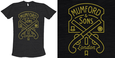
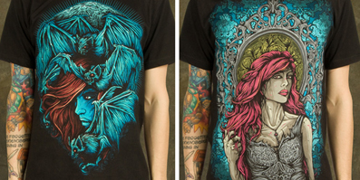
“Its all about composition, especially when you have a tee design with a lot going on it, like most of my designs. The lines have to flow nicely together and the type has to fit comfortably all within the design, if the basic shapes and outlines work nicely together then I know I have a good tee design, its only then that I will fill in most of the detail. When it comes to colour, you have to know how to use it sparingly, especially with screen-printed tees, being able to work with a limited palette is an incredibly powerful way to get the most out of a tee design.” – Dan Mumford
“My idea of what is ”good t-shirt design” has changed as I’ve improved as an artist. Generally speaking, for me, a good design usually involves keeping the weight of the design near the top/center of the shirt (more flattering on a customer), keeping my colors balanced and limited, and using the shirt color as a part of the design. I know I’ve got a good design on my hands if I can revisit my finished design after a couple of days and not see any flaws or things I’d want to change.” – Anthony Hall

4. Consider Wearability.
This is a simple, but important question to ask yourself. “It’s a pretty simple concept and I know it doesn’t apply when you’re designing tees for a client whose audience might be twice your age and of the opposite sex. But as a rule of thumb, ask yourself “would I wear this?” Put yourself in the wearer’s shoes and try to imagine what it’d be like to wear your shirt.” – Jeff Finley, Thread’s Not Dead.

5. Thoughtfully brand (details matter).
“Branding is important throughout, if you have a tag or a logo that can be found on everything you do, then it will get imprinted on people that see your work, and it also starts to become a brand of quality. I try to have my small ‘M’ icon on most pieces of my work, its nothing special, but it definitely holds everything together under one larger umbrella of work.” – Dan Mumford
6. Consider the costs.
“I try to create designs with a 3 color max. Many bands watch the cost of a tee go way up as they add more colors, thus, watching their profits go down. Since I was fitting the bill for the very first tees that I designed, I try to be realistic about costs of printing. While the color choices are of utmost importance, simply adding more colors does not make a tee better. Challenge yourself to make 1-3 colors go a long way.” – Brandon Rike
“I think just having a good idea of how screen-printing works is the most essential thing. Being able to separate colours for print means you can supply things print ready, not only does that make you easier to work with for the clients, but it gives you an edge over designers that might not know much about the process. As far as detail goes, its again just about being able to provide clean files that are easy to work with.” – Dan Mumford
7. Be innovative.
“These days, the trends in graphic tees are getting more and more loose. You can find anything printed on a tee. Whereas when I came into this industry, we were trying to create solid graphic lock-ups that would sit in the middle of the chest, you will now find a single photo covering a tee, or one word filling up all of the space. Any tangible trend has completely disintegrated, and now, frankly, anything goes.
For me, it’s exciting to see where my skills are and know how fit into these trends. While I would prefer to concentrate on more concrete graphics, I know how to make a good t-shirt, even if that means using the right photo or word to completely cover the shirt with. It’s become less about the skills that I have, and more about being creative in general, and being able to apply it to what I’m doing.” – Brandon Rike

“Good design will blaze new trails in what people are wearing. Adding foil into your design wasn’t something your average designer six or seven years ago thought of. Foil or printing a full color image isn’t really cost-effective but it might be worth it if that’s what people are buying. A good design pushes boundaries and does things differently. It starts new trends, forges new printing solutions, and advances the industry. A good example of this is the Bold is Beautiful shirt that I designed that people said could never be printed. The design featured a full spectrum of colors and took up a large area on a black shirt. I imagine it was costly to print, but the team at DesignByHümans pulled it off with flying colors, pun intended.” – Jeff Finley, Thread’s Not Dead
8. Create substance.
“A good design has a solid idea and purpose behind it. Sure there are top selling t-shirts that exploit the popularity of stylistic trends like ornate flourishes or SFSS (skulls for skulls sake). But the point is, designs with a solid idea that mean something to your client or customer favor better.” – Jeff Finley, Thread’s Not Dead
Glennz Illustration Process – Modern Entry from Glenn Jones on Vimeo.
“As far as putting meaning behind my designs, I like problem solving; I like to come up with gadgets, or solutions to problems that don’t really need solutions. If that makes people laugh too, thats a bonus.” – Glenn Jones
_______________________________
Great design is really made up of so many elements. Not only do you have to have a solid grasp on design principles, but also understand your audience, wearability, cost effectiveness and the importance of branding. Combined with pushing the envelope, you as a t-shirt designer have a huge hill to climb. Cultivate good instincts, as outlined by our experts, and your chances of success will increase ten-fold.
Heart and passion, too, can go a long way. If you love your design, chances are your audience will too. Hall sums it up with one last thought: “Honestly, I have no ability to predict how popular a design will be. I just make shirts about things that I really love, and hopefully customers will be on board with whatever I designed. The worst thing that can happen is that you made a great design that you’re really proud of.”
For more information on great design and other areas on dominating the t-shirt industry, check out Thread’s Not Dead.
Share your successes and challenges of t-shirt design in the comments below!
________________________________________
Thank you to our guest contributors!
More Anthony Hall: Facebook | Twitter | Instagram | Tumblr | Behance
More Brandon Rike: Cargo | Dribbble | Flickr | Instagram | Tumblr | Twitter | Vimeo
More Dan Mumford: MySpace | Twitter | Facebook | Mintees |Skull & Heart | Mumford Clothing | Instagram
More Glenn Jones: Twitter | Facebook | Behance | Flickr | Dribble | Vimeo | Instagram
More Jeff Finley: Twitter | Dribbble | Vimeo | Pinterest | Facebook | Instagram | YouTube | Gimmebar | Last.fm
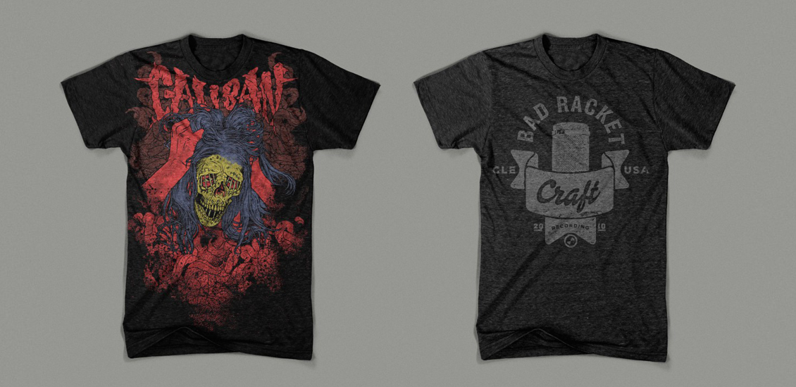
Header image t-shirts by Jeff Finley.
