Blog

6 Tips When Using Graphics and Boosting Engagement
Using Visuals and Boosting Engagement on your Site
Getting your site visitors to engage with your website often means the difference between developing a loyal customer and losing that person to a competitor. There are many factors to consider when boosting engagement, but one area you can directly control is how and where you utilize graphics on your website.
About 63 percent of marketers state that improving customer engagement equals customer retention and repeat purchases. It costs more to gain a new customer than to retain a customer you already have, so boosting engagement through strategic use of graphics is a smart way to grow your revenue. Keeping the customers you have allows you to focus on developing stellar customer service and refining processes. Below are six tips to get the most from the graphics you add to your page:
1. Where to Place
There are many schools of thought about the best placement for graphics, how many you should have on a page (too many can reduce page speeds) and even what size those graphics should be. One place to consider putting a graphic is across the top of your post in place of a headline. It’s been said that a picture is worth 1,000 words, and apparently, this is true because using a graphic above or below a headline can be quite effective.

Mashable is a good example of using a big graphic under the headline to help tell the reader what the story is about. In the screenshot above, the article is about Amazon’s new ability to deliver Whole Foods groceries to some customers. The image makes it clear that the article is about Whole Foods. Providing a quick graphic that helps the user process what the piece is about is particularly useful to mobile users who are likely to skim through articles.
2. What Graphic to Use
Figuring out what type of graphic to use is just as important as including graphics to break up some of the text. When it comes to using graphics, you have several options. You can include an infographic, a smaller data visualization that shows just one key statistic or fact, a photograph or a drawing.
Your best bet as you learn your audience’s preferences is to try different types of graphics and do some split testing to see which performs best for your particular industry.
3. Provide Information
A good graphic choice enhances the content on your page. It provides additional information or presents the information in an easy-to-understand way. Researchers have discovered that the brain processes an image in as little as 13 milliseconds. If you want to get a message across fast and effectively, then using an image to provide information is your best course of action.

Take a look at the way The Exterior Company uses a graphic to provide information to the user. The user can quickly check the area they are interested in learning more about and then find the matching key on the list to gather more information. This is helpful because the user can enhance their knowledge visually.
4. Reduce Load Times
It is important to remember that when you use graphics, you don’t want to allow them to slow down the load times on your page. The time it takes your page to load impacts everything from conversions to bounce rates. For example, mobile users indicate they’ll wait six to 10 seconds for a page to load and then abandon a site. You can help your images load more quickly with image resizing, compression and using CDN technology.
5. Use Unique Images
One of the trends for 2018 is using custom images instead of stock or generic photos. A custom image fits the topic perfectly, rather than being a general image. Since people form an impression of your site within the first 10 to 20 seconds of landing on your page, you can see why every single element must work seamlessly to draw the user in and engage them. Using custom images shows the user immediately that you’ve put thought and care into which images will have the most impact.
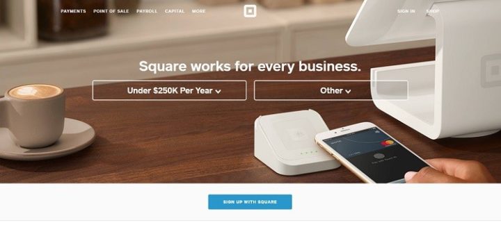
An example of a site utilizing custom images is Square. When you go to their landing page, you see a very specific image in the background of the header showing a point of sale system that works with a smartphone. However, if you change the options for the type of business, then the image changes. If you choose food, the image changes to a cashier and customer. Choose service, and the image changes to a person in home construction. This engages the exact target audience that lands on the page.
6. Optimizing for Mobile
Ninety-five percent of adults in the United States own a cellphone, and 77 percent of them own smartphones. More and more people are using those smartphones to access the Internet. However, the way a mobile browser looks at your site is a bit different than the way a desktop user does. The screen is smaller, so they typically aren’t doing in-depth reading but are skimming through material. You have an opportunity to present condensed material in a graphic form.
Make sure those graphics resize appropriately for mobile devices. You don’t want an image to take over the entire screen, but you also want the user to be able to decipher what the image is. You can use options such as only loading select images on mobile or resizing images so they load more quickly.
Visuals Tell a Story
Remember that people process visual elements much faster than text. Making sure the images on your site are highly relevant and optimized for all types of users will create stronger engagement. The right graphic can add to the message you are trying to convey and draw the user into your site. Visuals tell your site’s story much faster and better than even words can.