Blog

Line Variation in Illustrator | Tutorial
Line Variation in Illustrator Tutorial
In a previous Design Tip of the Week, we mentioned the increasing trend of icons and simplistic, geometric illustration. While their minimal, clean aesthetic is perfect for some situations, there are other times when an illustration needs to have more personality and be more dynamic. Line variation can add that extra flavor.
In this tutorial, I’ll show you how I personally add line variation in Illustrator (there are, however, many different approaches and methods). Let’s begin!
We’re going to use this guy for our first example. (He may look familiar, but he is in fact a different blob-person than the one I previously introduced in an other tutorial.)
Take a look at the Stroke Panel, you’ll notice that the (line) profile is uniform – consistent all the way through. (Also the line weight is 3 pt. – this will come into play later.) We want to change that. After all, our friend here has some lovely curves that need to be accentuated. With a monotonous line weight, no wonder his expression is rather plain.
Illustrator offers an array of line treatments.
We’re going to select one that has more variety.
Alright! Now we have something going on. However, I am not so sure if I want the line to be as thin as it is where it tapers.
This is a crucial part in fixing line weights that are too thin. You’ll want to…
1. Click on the original line
2. Copy it
3. Paste IN PLACE (Shift+Command+V or Shif+Ctrl+V).
4. Set the newly pasted line weight to a lower value (than your original, dynamic line). Our original line was at 3 pt., so I’ll make this one’s line weight set to 1.5 pt.
5. Change its Profile to Uniform
Ta-da! Just by those simple changes, our blob friend now has more personality. He even now has a charming mustache!
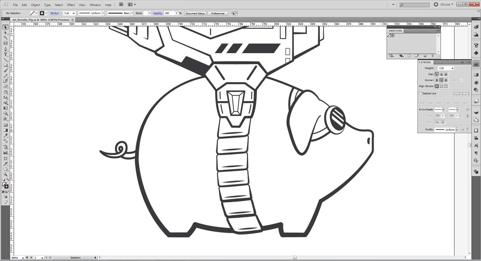
Now let’s take a look at an example that is a more complex illustration. And what better imagery than a pig with a jet booster strapped to its back!
As you can see, the illustration on the right has more complexity and character with its linework than the version on the left. The varying thick-to-thin lines play off the curves of the rounded forms and the angular lines of the more streamlined shapes.
Now give it a shot! Go transform those boring vectors into lively illustrations! In addition to this one, we have TONS of tutorials on illustration in the Arsenal. Check ’em out and start creating masterpieces!
Thanks for reading!


