Blog
Learn to Create Collage Typography

Ever been asked to come up with a type driven design but still wanted to use imagery? Creating text through collage can be an awesome solution. Here’s what you’re going to need to create a successful piece:
1. An open mind. I always find that being noncommittal toward the placement of objects allows you to easily rearrange the elements into a better composition.
2. A solid sense of composition. When you’re looking at the elements you’re going to use, it helps to have a rough idea of where that element will go and how it relates to the elements around it.
3. Lots and lots of royalty free stock photos. You don’t want to just pull images off of Google. That’s always a bad idea. The original photographer may somehow see that you’re using his/her work without permission and seek legal action against you. I find that using sites like istockphoto or sxc.hu are good places to start. Also, flickr can be a great resource if you ask the photographer’s permission.
4. Patience. It can take a long time for the forms to take shape in the way that you want them to. The important thing is to not get frustrated and to keep working until something strikes you.
5. Basic understanding of Photoshop. This tutorial uses the pen tool, blending modes, transformation tools, and other filters and effects.
Before we get started, you need to think through the project and determine whether or not that collage typography is appropriate for your project. It should only be used in a situation where you can use full color or four color process printing. There may be situations where a good color separator can get it down to 10 colors or so if you’re printing silkscreen, but that could be quite expensive.
Preproduction: Type Layout & Editing photos

Okay, let’s get started. First thing we’re going to do is rough out the composition, which basically is just laying out the type that the image is going to be based on. In this case, I’m going to be using Sign Painter, a typeface by House Industries. Let’s go with something short. Fly is an easy three letters. Bird imagery makes sense here, so let’s stick with that.
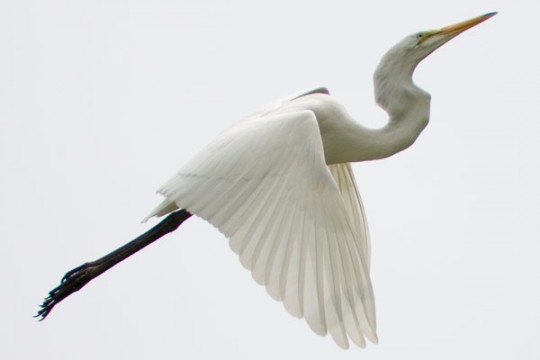
The next thing you’re going to do is find imagery and remove the background. I’m only going to show one here, but I’m probably using around 30-40 images total for the whole collage. For this pelican image, I’m going to use the pen tool to outline the shape of the bird.
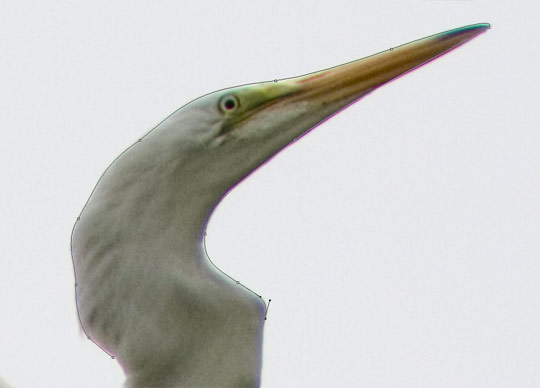
Now I’ve got the outline finished, and I’ve used the right click (ctrl click on mac) -> Make selection to get our pelican selected.

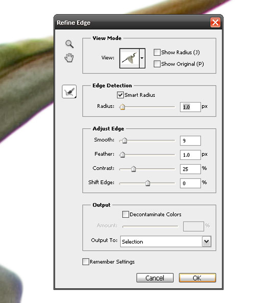
Next, I’m going to go up to the top menu and go Select -> Refine Edge. I want to make sure that the edges of the bird are clean and crisp and don’t get weird edges.

These are the settings that I used for this photo, but it’s going to be different for each photo, so you’ll have to try out each setting on your own to see what photo will work for you.
So now that I’ve refined the selection, I want to make the pelican its own layer, separated from the background. Ctrl/cmd+J will create a new layer for your selection. Now, we’ve got the pelican on it’s own layer, lets see how clean the edges are. Make a layer under the pelican and fill it with a bright color. This helps to see how your edges turned out. I’m not looking for them to be absolutely perfect here because the layering of images will help hide any imperfections in the edges, however you don’t want them to look too weird.

Building the letterforms
I’ve gone ahead and cut out a bunch of bird shapes from various images and dragged them onto the collage canvas. I like to have them all visible, away from the text so that I can see what I have to work with. It’s similar to having a palette of paint. Also, I prefer to make all of my images smart objects so that I can scale them as I please. It increases file size, but keeps your options open in terms of composing the images.
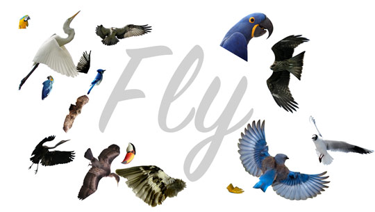
Now I can start to create the letterforms using the images. Analyze your photos, see if there’s a shape that will fit perfectly as part of a letter. For example, using a wing as an arm on the F. Again, don’t marry yourself to a particular image in a particular spot. You may end up finding a better image to use down the line. Also, don’t be afraid to edit the images. You can use just a part of a bird if it fits better. Also, for this image, I’m not worrying about color. I think the random splashes of color from the various birds will result in a colorful image. We’ll talk more about that later in the tutorial.

As I said in the previous step, don’t be afraid to edit the images. The warp tool is a great way to manipulate an image into fitting into part of a letter. Here, I’m using the warp tool (Edit -> Transform -> Warp) to bend a feather into the L shape.
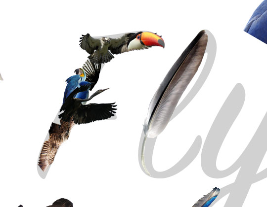
Keep forming the letters using the images, paying attention to how the images are layered on top of each other. You don’t want too many images just floating without something on top of them. Also, I prefer to use larger images to create the letters, but there are always going to be gaps. I like to feel those gaps with colorful pieces layered behind the larger shapes.
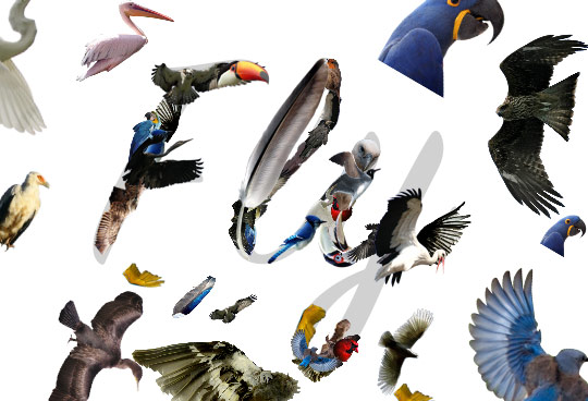
You should always be looking for images that will fit a specific space in the letter. For example, the head and beak of this toucan forms the counter of the lowercase Y.

From here, I’m filling in the spaces with images. I’m paying attention to the layering of images, the shapes of the images, and the relation of images to each other.

I’m also keeping an open mind the entire time and thinking if each element is in the best place. I’ve moved a few of them into new places, deleted a few, made a few bigger, etc.

Post Production: Additional Elements & Vintage Effects
So I’ve finished the collage. At this point, I want to clean up and organize the file. I’ll delete layers I’m not using and put the layers of each letter into a group so that I can adjust the placement of each. So now that I’ve got my file cleaned up and saved, it’s time to move onto some post production. I’m going to put some clouds in the background of the image. First, make a layer behind the word and fill it with a light blue. Next, find an image of clouds.

Now we’re going to separate the clouds from the background. It would be insane to try to do this with the pen tool, so we’re going to use the channels instead. First, desaturate the image – ctrl/cmd+shirt+U. Then bring up the levels – Image -> Adjustments -> Levels, or ctrl/cmd+L and make sure that there is very high contrast between the clouds and the sky. It should look like this:

Next, go to the channels palette, it’s next to the layers palette. Ctrl/Cmd click on the thumbnail to the left of the RGB/CMYK channel. This will select the lighter parts of the image, so in this case it will select the clouds.

Next, we need to see how the selection worked. Make a new layer and fill it with a lighter color. Then make another layer, fill that with black and put it behind your new cloud layer.

Now we can drag the clouds over to the collage and color them white. Mess around with the placement, find something that works for you.

To help unify the colors, we’re going to use a color balance adjustment layer. You can access this at the bottom of the layers palette. Because the background is blue, I’m going to slightly shift the colors of the collage towards blue. I’m not saying to make the whole collage blue, just to give it a hint of blue to help bring those colors closer together.

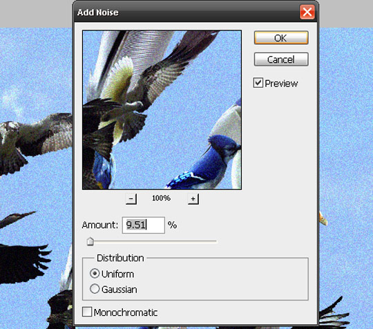
Let’s add in some noise and stuff to give it a slight vintage/aged feel. Yes, it’s super trendy at the moment, but we’re not gonna go crazy with it. It’s just an added flavor. First, you’re going to need to copy all of the layers and merge them together. This is going to be your filter layer. Next, lets add noise. Filter -> Noise -> Add Noise. These are the numbers I used, feel free to mess around with it.
Next, use gaussian Blur. Filter -> Blur -> Gaussian Blur.

Onto smart sharpen. Filter -> Sharpen -> Smart Sharpen. Again, these are the numbers I used. Feel free to experiment. Make sure the Remove: is on Gaussian Blur.

This is the result.

It’s a bit too much for what I’m looking for, so I’m going to knock down the opacity to around 40 or so.
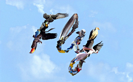
I’m going to make another layer, fill it with a pale yellow, set the blending mode to multiply, and move the opacity down to 60 or so:

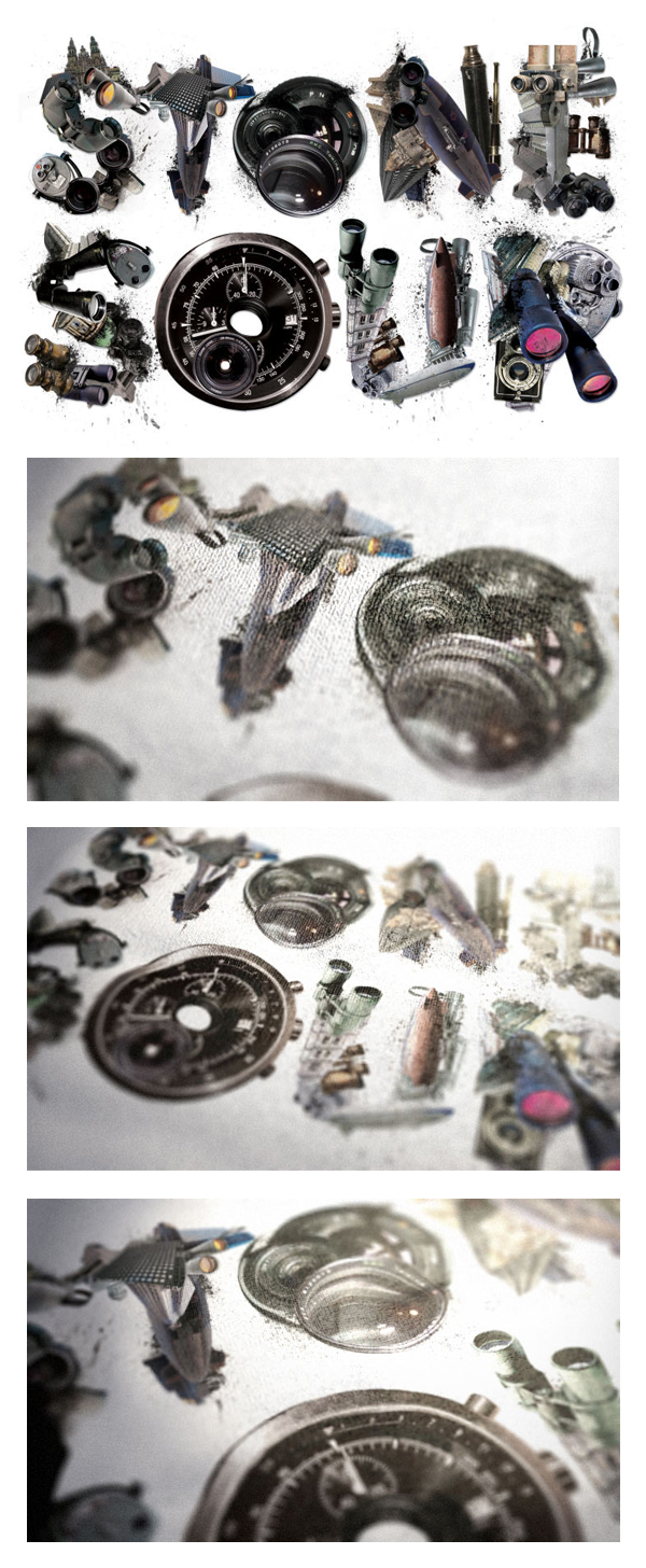
And that should do it. Here’s some other examples of collage type:
