Blog

Go Media’s 1st Annual Best of Cleveland Design Awards
Best of Cleveland Web and Graphic Awards
Here at Go Media, we totally geek out about design. It’s all that we do and all that we dream about.
We love not only getting our hands dirty every single day, but also recognizing great design when we see it. And living in Cleveland, we are proud to be surrounded by many companies equally obsessed with impeccable design. We’re proud to be surrounded by companies and clients who go out of their way to dedicate time, money and attention to ensuring their brands, logos, websites and design experiences are top-notch.
Our challenge was paring down a long list of such companies whose design was on point in 2014.
Here are some of our favorites (in no particular order).
We award these companies with our first annual Go Media 1st Annual Best of Cleveland Web and Graphic Design Awards.
To these companies, we say: well done!
Cleveland Museum of Art
Nominated by Chris Comella
“My favorite design experience in the city, hands down. The Cleveland Museum of Art’s newly finished renovations have brought the whole experience to a new level.”

Trentina
Nominated by Chris Comella
“Team Sawyer’s new restaurant has such a nice, tight visual identity. A lovely combination of art, textiles, and graphic touches create a very unique and sophisticated brand for the new restaurant.” Hats off to Jonathan Sawyer, Amelia Sawyer, Jason Radcliffe, Matt Sweeney and Christine Wisnieksi

Jeni’s
Nominated by Chris Comella
“All the attention to detail adds up to a really fun, and appropriate visual identity for Jenis ice cream. Not only is the ice cream my personal favorite, but when you want to actually drive to the eastside town of Chagrin Falls just so you can also take in the vibe at the shop, you know the design is working.”

Market Garden Brewery
Nominated by Lauren Hudac
“The MGB brand depicts a wonderful balance of bold, industrial chic design. They’ve mastered the art of a brand identity system with the a library of graphics for various applications.”

Campbell’s Popcorn
Nominated by Lauren Hudac and Aaron Roberts
“Campbell’s business continues to grow as it opened its newest “factory” store in Lakewood last year. New awnings and window decals make the whole brand experience just that much sweeter.”

Rustbelt Reclamation
Nominated by Lauren Hudac
“The logo almost has that hand-crafted appeal, which reflects what the company offers through their up-cycled materials. A clean website, beautiful photography, and moving brand video round out the circle for a strong brand.”
Access Shelter by Form
Nominated by Wilson Revehl
“Form’s branding and site design for ACCESS, a homeless women & children advocacy and assistance organization, is perfect. The new identity and color palette is approachable, while vibrant, and well curated for the demographic.
The ACCESS homepage greets you with bold, full screen HTML5 video vignettes which cycle through succinct personal stories scrawled on cardboard. It’s completely engaging and effective without making a sound.
The rest of the site boasts a beautiful, spacious layout. The site does a great job fully leveraging the color palette in a tasteful way. A lot of care went into photo selection & treatments. Focal panels and calls to action are well thought out. You can tell Form carefully considered the information architecture and brand messaging when they approached each key page design. Well done.”
Duct Tape Festival
Design and Development by Aztek
Nominated by Bryan Garvin
“Single page, responsive, and just straight beautiful. Scroll through the Duct Tape Festival website and you’ll see why it’s one of my favorites. Bright, whimsical and warm are just a few characteristics that makes this one of the best sites in the region.”
Cleveland Public Theatre
Website and Event Materials
Nominated by Bryan Garvin and Carly Utegg
“Let us give a big high-five to Sean Higgins for his illustration work on all of the CPT event posters. His work is beautiful and engaging, doing it’s job of attracting an audience.” – Carly
“The CPT Event Posters set them a part. Quality work and the site works with them. The site allows the posters to thrive without overwhelming you. Just a great presentation.” – Bryan
Ohio City
Nominated by Aaron Roberts
“It’s no surprise that Ohio City is on the rise. With all the new shops, bars and restaurants opening up, the new identity & website speaks to its approachability and continued prosperity.”
CAN Journal
Nominated by Aaron Roberts
“It’s always exciting to see the new CAN issue on the racks. Every page is not only eye catching, but thoughtfully designed. This is by far our favorite local arts publication.”
NEOMFA
Nominated by Aaron Roberts
“Go Media gave the Northeast Ohio Masters of Fine Arts in Creative Writing (NEOMFA) program a fresh new look in 2013. We’re so happy to see how it has been implemented and enhanced since then.”
Spice Kitchen and Bar
Nominated by Aaron Roberts and Renee Gabella
“Every part of the Spice experience has been executed with design in mind. No matter if you’re dining at the restaurant, checking out their website, or having food catered by Spice of Life Catering Co., all their touch points seamlessly speak to their mission and personality.” – Aaron
“Their website, is very informative, holistic – exposing, and expressing the brand without too much clutter, or loosing the interest of the viewer. A++” – Renee
Bad Racket Recording Studio
Nominated by Heather Sakai
“Bad Racket’s site is a Cleveland music lover’s dream. Photos, videos, interviews, articles. Plus, design-wise, it’s crisp and clean. Easy to navigate. All around, a win.”
Jakprints – Designed and Directed by Ted Barnes and Justin Carolyne
Nominated by Heather Sakai and William Beachy
“Everything Jakprints does – from their website, to logo, to trade show display – is downright solid. They just know who they are and how to express that to the world.” – Heather
“Marketing Materials, Print Ads, Tradeshow Displays – you name it, JakPrints is KILLING IT. Nevermind that we’re super close friends of theirs…their designs rock.” – William


CLE Clothing
Nominated by William Beachy
“There are a LOT of Cleveland Apparel brands, but the quality of CLE Clothing’s designs is unrivaled. The concepts are more clever and the style is spot-on.”
Sherwin Williams
Nominated by William Beachy
“From their clean, well designed stores to the amazing animated color swatch TV commercials, SW’s design is absolutely top notch – and BEAUTIFUL. And hat’s off to them for not changing their politically incorrect logo of a paint can dumping paint over the entire world – how easy it would have been for upper management to shy away from from this classic logo.”
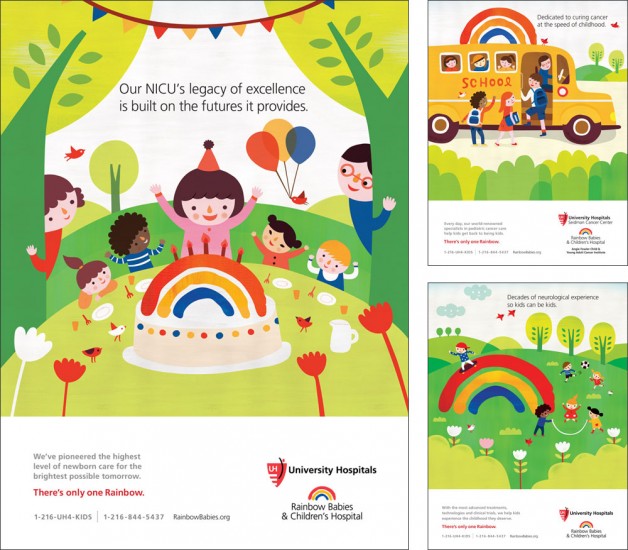
University Hospitals
Rainbow Babies & Children’s Hospital
Nominated by Heather Sakai
“University Hospital’s “There’s Only One Rainbow” brand campaign by Brokaw is simple yet engaging, warm and inviting.”


___________________________________________________________________________


