Blog

Tutorial – Lines & Dots: How to Make Quick and Easy Patterns in Illustrator
How to make patterns in Illustrator: Lines and Dots
Patterns can be a wonderful visual element. They can create form and show depth in an illustration, or add more visual interest to a large color field of a graphic. Below are step-by-step instructions on how to easily create two patterns in Adobe Illustrator: line and dot.
Line Pattern
Step 1: Create a rectangle and diagonal line going through the center. Begin and end the line from the top-left corner anchor to the bottom-right anchor, then select and scale it up proportionally.
Turn off the fill in the rectangle and set it and the line at 1 pt. stroke weight. The crucial part of this is that the line must be aligned perfectly in the center, shooting diagonally from the top-left corner to the bottom-right. Smart Guides (View > Smart Guides) is a huge help.
Step 2: Duplicate the objects (the rectangle and line), aligning the one copy at the top-right corner and the other at the bottom-left corner.
Again, Smart Guides will make life easier. Make sure things are perfectly aligned: the corners of the original rectangle are touching the centers of the duplicates.
Step 3: Delete the two duplicate rectangles and the line of the original rectangle. Turn off the stroke of the original rectangle.
Step 4: Select the two lines and in Blending Options (Object >Blend > Blending Options), set the Spacing to Specified Steps along with an desired increment, which MUST BE AN ODD NUMBER*.Then click Okay.
*This number will determine how many lines are repeated in your pattern.
Step 5: Go to the Blend option again and select Make.
Step 6: Select the two lines that are forming the pattern AND the rectangle in the center. Drag these to the Swatch Palette, resulting in a newly created swatch.
Step 7: Select the lines and rectangle and drag it outside the artboard.* Test the pattern by creating a new shape and setting its fill to the new swatch.
*Keep these original objects off to the side in case the pattern needs to be edited: the color of the lines, stroke weight, increasing or decreasing the repetition. If changes are made, a new swatch must be created ( objects again dragged to the Swatch Palette) in order to use the new pattern.
The reason behind testing the swatch pattern in a shape is to ensure the elements are lining up correctly. However, there are times when the pattern looks misaligned or distorted. Zoom in and out to double-check, it could just be the monitor depicting the pattern in a funky manner.
Dot Pattern
Step 1: Make a square (with a 1 pt. stroke) and dot. Align them at their centers.
This is the spacing between each dot in the pattern.
Step 2: Turn the stroke off on the square. With that and the circle selected, drag it to the Swatch Palette.
Step 3: Create a shape and then select the newly created swatch pattern for the fill.
The amount of dots is dependent on the size (and spacing) of the original dot. If the pattern needs to have more dots, simply shrink down the original dot (with its square) and create a new swatch pattern.
Things to consider
Because patterns add another level of visual interest, it is often easy to throw them on everything. Like any element, they don’t work ALL the time. Take the time to really consider if something needs a pattern or not. Also, in regards to Illustration, consider the form that is being depicted. A line pattern would make more sense on straight-edge surfaces, where a dot pattern may best fit with an organic, rounded form. Patterns are super cool, no doubt, but use them deliberately to elevate your illustrations and designs.
We love Patterns!
Check out these Arsenal Products that will add patterns to any project with ease!
Circle Pattern Vector Pack

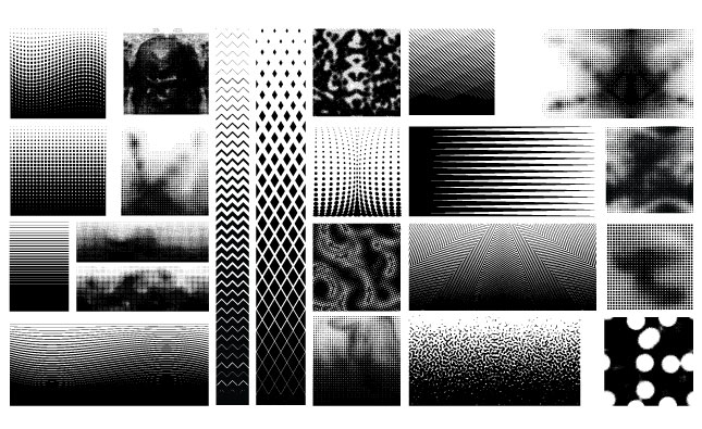
Halftone Pattern Vector Pack

Op Art Vector Pack

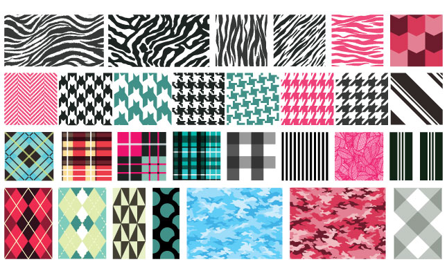
Textile Patterns Vector Pack

Propaganda Patterns Vector Pack


