Blog
Game On! Our Favorite Game App Designs
Naturally, we all love wasting time. Procrastination is something all human beings can relate to and are notorious for. But if you are going to procrastinate, you might as well be looking at some good design while you are at it!
Flat design takes the crown!
There are lots of games out there for our time wasting aficionados, however some of my favorites are the ones that attract me to the design qualities, and there are other games as dadu online if you like to play Casino games as well. Illustrative characteristics and flat design always seem to capture my interest, therefore many of our examples are ones that caught my eye derive from those qualifications. Game app design can be any number of styles, all of which have their own strengths that should be appreciated.
Examples, why they are the bomb.com…

Gotta love the designers here. Not only is this game addicting (I am ashamed to admit what level I am currently wasting time on), the illustrative design style fully captures its audience as well. The game takes you through multiple environmental realms as you pass up a collection of levels. The design itself takes you through a continuous scrolling page that changes with the environments.
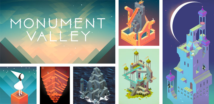
Take M.C. Escher’s impossible shapes and make it into a game, you’ve got Monument Valley. Now, unfortunately, I am not super familiar with how this game works, however the clean design has already got me hooked. Plus, it is sort of mind boggling that Ken Wong, artist and designer behind it all, was able to make these shapes and environments believable within a moving, digital realm. Bravo!
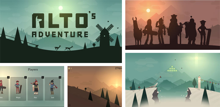
Sure, the premise of the game has a tad of ridiculous attached to it, but the design is simply gorgeous. In this game you are a snowboarding llama herder (don’t say I didn’t warn you). The backdrop showcases snowing mountain peaks and and geometric design. One of the most elegant elements of this design involves the use of silhouettes. Two thumbs up to designer Harry Nesbitt on this app!

As to be expected, Bicolor revolves around only using two colors. Yet even with these limitations, the puzzles go beyond expectation and are visually very successful. Limiting colors allowed for a nice, clean design in this case. Hats off to the designers at 1Button software studio for this one!
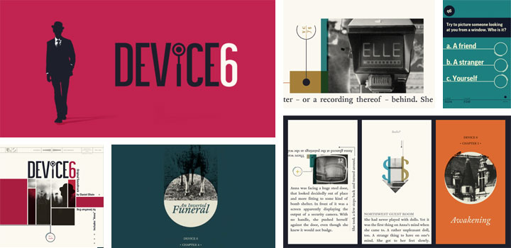
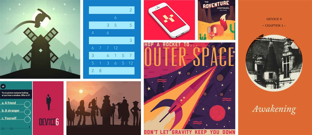
The app intertwines the love of literature with the love of puzzles. If you are a mystery novel kinda person, then this one is for you. If you’re not, well…the design itself might just be enough to persuade you. The use of typography, color schemes and photography set this game app from Simogo apart from the competition.
A special thanks goes out to all of the designers responsible for these creations. We salute you in your endeavors. Enjoy all of the beautiful designs, fellow procrastinators!