Blog
Tutorial: How to Create a Decoder Design in Illustrator
Secret Decoder Illustrator Tutorial with real Cleveland Graphic Designers
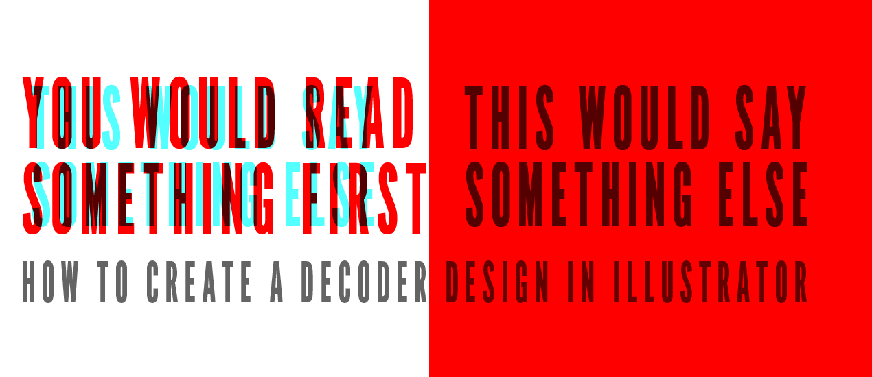
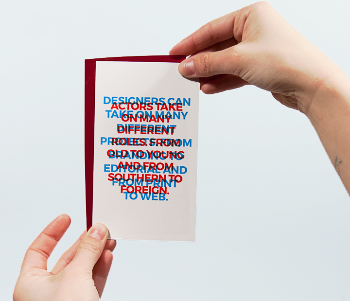
I think one of my favorite things about being a theatre person is discovering ways I can incorporate some aspect of theatre into my projects. Recently, I created a self-promotional piece that incorporates my three favorite things – Theatre, Graphic Design and Typography. It’s a play off of the old super-awesome decoder glasses and hidden messages and all that awesome stuff I remember getting in cereal boxes. Using stage lighting gels and layering type, I managed to do something like this:

This process is super easy so don’t worry! And I’ll be right here with you to guide you through this. *cue angelic music*
The difficulty is knowing what colors work well together and what light gel you need to reveal those colors. I know because I have done this already, that Red and Cyan will work and I will get a result that I am looking for…but let’s take this step by step instead of jumping ahead.
First: We’ll have to set up the new Illustrator (or Photoshop, it will work in either program) document. The cards that I was making were 3.5 in x 6 in, but for this guide we’ll make slightly larger cards – 5 x 8 – in CMYK mode at 300 ppi. Though we will be using additive color theory, the piece is still going to be printed (well, I printed these, so I’ll be in CMYK RGB will work but you won’t be seeing the same thing as I am.) Now we’ll have a little better idea about how the colors are going to look like printed.

Next, I’m going to create a text box that says what I want my viewer to read first. In lieu of coming up with something witty and interesting for the sake of being witty and interesting, I think I’m going to use a couple lines of lyrics. Let’s start with what’s playing in my headphones…or wait until something a little more interesting than the movie score of “Interstellar,” and has lyrics to type.

Sweet, some Maroon 5. I suggest using a bolder typeface. You’ll get some pretty rad shapes when we get through the next couple of steps. I am going to also have my text centered and aligned to the center of the card. I personally think centering it this way gives some nice shapes in the negative space. It’s also how I did my cards and I had a lot more content then some lyrics. Moving on….
After I set in the type, I went to get the highest value red that I could get, and since we are working in CMYK it was 100% Magenta and 100% Yellow. Boom. I’m ready to move on to the next lyric of whatever is playing in my headphones now. This text is going to be set to 100% Cyan.

Prince. Also nice. A guilty pleasure I suppose, but it works! I should have mentioned I copied my original red block of text so I knew the leading, type size, and all that was similar. Then I changed the color. Then I moved my red layer back to ye-ol’center. Oh no! What’s this? I can’t see anything…AHHH!

Is what one might say if they didn’t complete this tutorial. Of course we can’t see what’s overlapping. The blending modes are normal and opacity is set to 100%. We need to fix that…Now I’m going to change the blending mode to multiply on the red layer. If you are in Illustrator and have a hard time finding the blending modes you have two (maybe three) options: 1) Click on Opacity in the top bar and click on the drop down. 2) Click on the Appearance panel (if you don’t see that, go to Window / Appearance). 3)There is no third option to my knowledge. This will darken the overlapping areas and give the lighting gel information to complete the text..

So, this is a little hard to read the red text. My goal is to read the red text first, then apply the light gel to read the cyan text. I’m going to bring the opacity of the cyan down a bit until I get something that works.

I brought the opacity down to 45%, I think this works better. The red text can be read and the cyan cannot – for now. You might not want the text to be placed on top of each other. If you go back to my example, the text is offset a little from each other. That is more of a personal preference.

If you want to check out if the colors you selected have potential to work there are two options. 1. You can make a box and fill it with the color of the color you want to get rid of. In this example, we want to absorb the red and darken the cyan to make it legible. So I made a red box and set it to multiply (seen above). Option 2 is, if you’re like me and have a Roscolux Stage lighting gel swatch book, you can hold up different swatches to the screen and see what’s working. In this case it’s Rosco #26 Light Red.
Fun Facts with Phil: You can order the gels online, so I’m also sure you can get a swatch book online as well. So there’s that.
Here are a couple other color solutions:

