Blog

Designing a Kick-Ass Logo? Here are 7 Mistakes to Avoid
Mistakes to Avoid When Designing a Logo
When you think of great products or companies, the visual image that forms in your mind is probably that of their mark; McDonald’s golden arches, Nike’s Swoosh and Coca-Cola’s wave. The inherent value of a quality brand is well established. At Cleveland graphic, web and logo design agency Go Media we’ve perfected the process of building memorable brands that last.
Our Cleveland logo design experts will ensure that your business stands apart in a competitive marketplace. We love helping folks through their entire branding process, one aspect of which is your logo – the mark or shape you’d use to represent your company.
A logo speaks volume about your brand, so what can you do to ensure it doesn’t fall flat on its face?
Here are 7 Mistakes to Avoid When Designing a Kick-Ass Logo
Mistake #1: Not trusting your designer.
It’s absolutely imperative that you choose a solid design firm (*cough – Go Media – cough*) with a great reputation (*cough – Go Media – cough*) for the job. Once you’ve chosen the firm and meet your designer – trust them. Their life’s work is to recognize great design (and the opposite). Heed the advice you receive and remember why you’re paying good money for it.

Mistake #2: Not trusting your instincts.
Now that we’ve told you to trust your designer – understand that this is a collaborative effort. Just as your designer is the expert in their field, you are the expert in yours. You know your customer base better than anyone. Educate your designer about your audience, the environment the identity will live in and your industry before they put pencil to paper. Once proofs are being send out, give your honest feedback. Trust your instincts and feel free to be honest.
Mistake #3: Being Too Emotionally Attached
Already have an existing logo? Recognize the difference between familiar and good. If you’ve established that your logo needs a facelift, work with a firm that can maintain your brand equity while bringing you the update you deserve. Unsure if your long-time logo is good or not? Talk to your customers, collect candid feedback, reassess.
Mistake #4: Imbuing all of your company traits onto your mark (that’s the symbol that represents your company).
In other words, don’t try to jam-pack your logo with everything you think your company does or represents. Remember that your logo is meant to be a symbol that represents your company. If your branding is done right*, your customer will fully experience your company in a wide variety of ways (for example, via your website, packaging, commercials and more), so no need to fit it all in here. Trying to bake in all of your brand values, personality, services, etc. and still have a strong mark is nearly impossible.
Learn the difference between logo design and branding here*

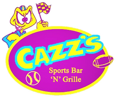
Mistake #5: Overly complicating your mark with shapes, color gradients, etc.
Your mark is not a piece of artwork, so hold back on the temptation to add pieces of flair. Avoid too much detail, pull back the reins. The best logos are simple, yet memorable due to their quiet strength. Aim for something unique or unexpected instead of packing on extras that will pull focus away from the heart of the matter.


Mistake #6: Using Insufficient Contrast
We want to see your logo without going cross-eyed. Don’t destroy a good thing by choosing the wrong colors for your logo. Learn about contrast and apply the rules appropriately.

Mistake #7: Being Overly Artistic in your Typeface
The number one goal of your typeface is for it to be legible. While it’s tempting to get creative with type, hold back and again, remember to keep it simple. If you’d like to infuse a strong sense of style into your logo, do so in your imagery.

Remember: There are many well-meaning, but not-so-hot logos out there in the world.

Remember, your company’s livelihood relies your branding, so make sure your logo game is tight. There are no shortcuts to greatness!
Check out out Go Media’s Logo Design Portfolio and contact us so that we can discuss your logo design needs.