Blog

What Is Your Navigation Bar Lacking and How Can You Improve It
A navigation bar is common across nearly every site on the Internet today. It is the way that site visitors orient themselves to what is on your page and where to find it. It can set the tone for your entire landing page. One could argue it is one of the most important elements on your website.
Upon reaching a company website via referral, about half of site visitors use the navigation menu to figure out where they are and where they want to go next. There is no denying your site’s navigation is one of the most important features of your website.
However, your nav bar might lack in a few key things. Below are six possible ways in which your navigation might lack and how to fix any issues. Your site might be lacking:
1. Search Box
The search box is a handy tool for those who know specifically what they are looking for and don’t want to go through several steps to get there. Around 59 percent of website visitors state they use a site’s internal search engines to look for something specific. A search box keeps the site visitor on your page instead of them hopping away to Google or some other search engine.

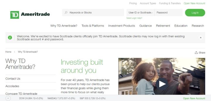
TD Ameritrade offers a search function right at the top of their landing page. This is an excellent way for users to find information on a specific stock. Think about some of the big websites you visit and how they use the search function to help you navigate their site. Some big ones that come to mind include Facebook and Amazon.
2. Simplicity
It might be tempting to add all types of fancy designs and tools into your navigation bar, but for something that should simply be functional, the basics are often the best. Place the bar in an easy to locate spot and keep the colors and designs simple. Even the font you use should be easy to read and should translate well on different screen sizes. You’ll also want to narrow your categories down to as few as possible. You can always add sub-categories under your main category headers.
3. Easy to Find
As people navigate through your website, they’ll want to know they can count on a couple of elements to move back to previous pages or to choose other options. Your navigation bar should be located in the same location every single time and quick and easy to find. Things such as linking up your logo to your homepage or adding a sticky bar work well to keep the user organized as he or she navigates your site.
When people read on the Internet, they use an F-pattern where they scan across the top of the page horizontally and then down the page on the left before returning to the middle of the page. This means your navigation bar needs to be near the top of your page at all times.

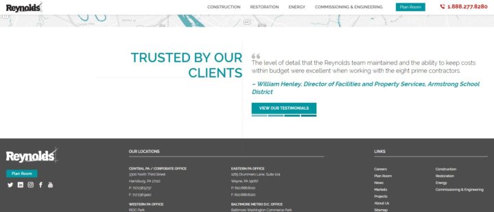
Take a look at the Reynolds’ website navigation menu. Not only does the website and their 24-hour emergency services toll-free number appear at the top, but as you scroll down the page, it becomes sticky and follows along making it easy to find as you navigate through various elements of the website.
4. Distinct Wording
It can be tempting to try to turn to words that are creative and cute. Naming different areas of your site might seem like a fun way to draw in users, but the truth is that not everyone will get your humor or sense of style. It is better to stick to the basics when choosing the words you use for your navigation headings.
Instead of calling your online shopping area, the “Fashion Zone,” simply title it “Shop” or “Products.” Once the user lands on that page, you can show off your sense of style and creativity, but until the user navigates to where you want it is best to keep things simple and to the point.
5. Mobile Responsiveness
Ninety-five percent of Americans today own some type of cellphone, and 77 percent own a smartphone. That means more and more people use their mobile devices to browse online. When designing the navigation for your website, have you considered how that navigation will function for those using smaller screens?
Ideally, your navigation will become condensed. This will likely mean limiting yourself to a couple of categories and then adding a hamburger menu that the user can expand if needed. This type of style allows even those on very tiny screens to move around your website easily.

Disney’s website is a great example of taking the same information and condensing it for mobile. At the top of their mobile website, you will simply find three choices and a search function. There is a link to each major theme park in the United States and a link to shop. They then present the hamburger menu at the top left, near the logo, so you can make additional choices. Or, you can use the search function to navigate where needed.
6. Images Paired with Words
When a relevant image is added to words, 65 percent of people remember that information as much as three days later. If you can add images to your navigation, not only will the overall affect be visually appealing, but your site visitor may be more likely to remember your site and return again. Consider adding a small flat icon along with the words for your content areas, for example.
Improving Your Navigation Bar
Even though it is smart to try new colors, designs, different wording on your call to actions and other elements within your navigation bar, it is equally as important to be a bit predictable and simplistic with this important feature. Place the navigation where it is easy to find and make it as intuitive as possible for that user.
Always test any changes side-by-side with the old version to see how they are converting with your target audience. With a little forethought and care, your navigation bar will serve its purpose and help drive conversions.