Blog

Finding Inspiration for Your Next Poster Design (& a Few Freebies to Help You On Your Way)
How to Design an Inspiring Poster – 5 Tips from Go Media
Hey designers, one of the topics you come to us most about is finding inspiration for your next graphic design poster. So today, we are giving you five of our favorite tips for those of you scouting ideas for your next great design. Inside are a few freebies from our Arsenal – home of the World’s Best Design Resources – that will help you along the way – keep your eyes peeled.
Before you start design, ask yourself a few questions:
-
- What size will the poster be?
- Do I need to design for multiple sizes?
- What restrictions do I have?
- What’s my budget?
- What, if any, are the brand standards I need to follow?
- Where will the poster live?
- Who is my audience?
Tip #1: Find Image Inspiration from Sources Related to Your Poster
Designing a poster for an 80’s throwback band? Gain some color inspiration from 80’s mix tapes, cassette tape art and posters. Let Jesse and the Rippers be your guide. Start a Pinterest board and collect all the reference material you can and get loaded up with inspiration!
Example: 80’s Poster – Inspiration Examples


Product Example – 80’s Inspired Posters

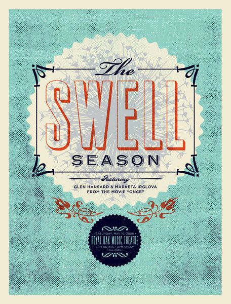
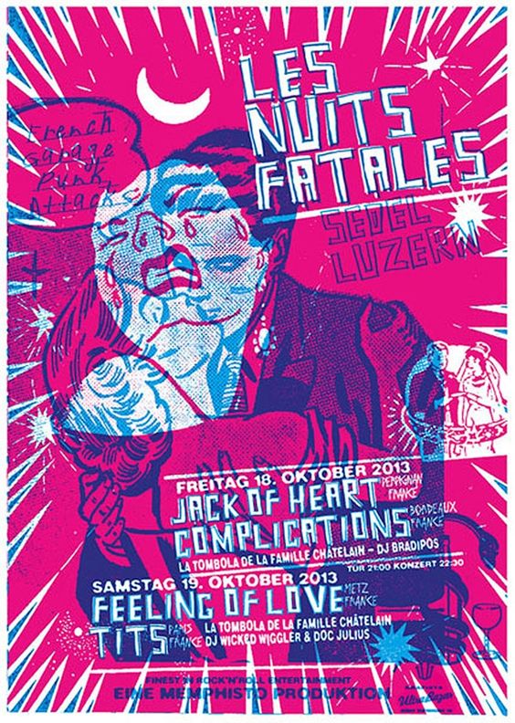
Tip #2: Play with Color
A poster is an opportunity to work with color in a new and exciting way. Instead of starting with a white canvas, how will you explore color as it relates to your theme? We love using tools like Adobe Color CC to begin to explore color themes and combinations. You can go three ways here – go high contrast / try a color combination that may be considered “out of the box,” go strictly black and white, or explore muted tones. Here are some of our favorite posters which explore each of these three options.
Go Bold!


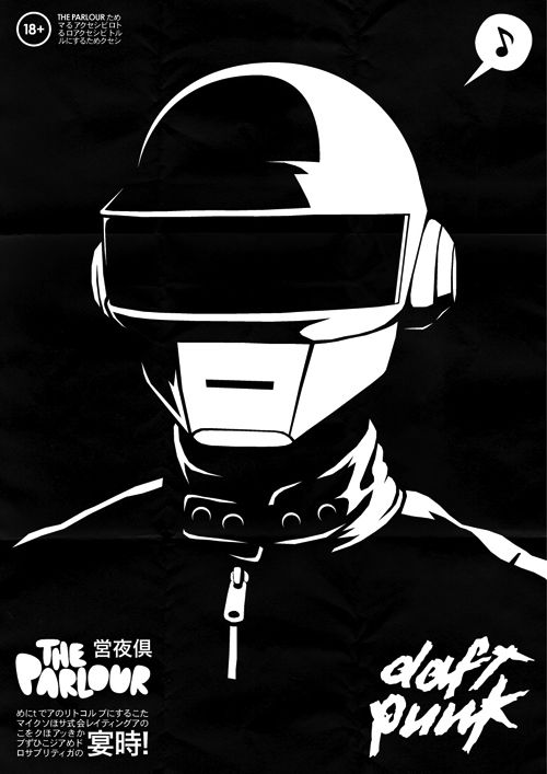
Stick to Black and White

Muted Color Palette


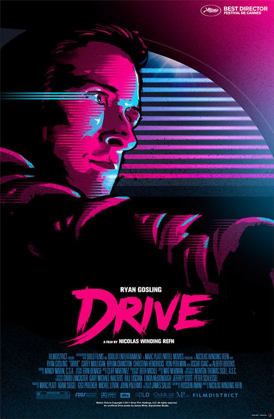
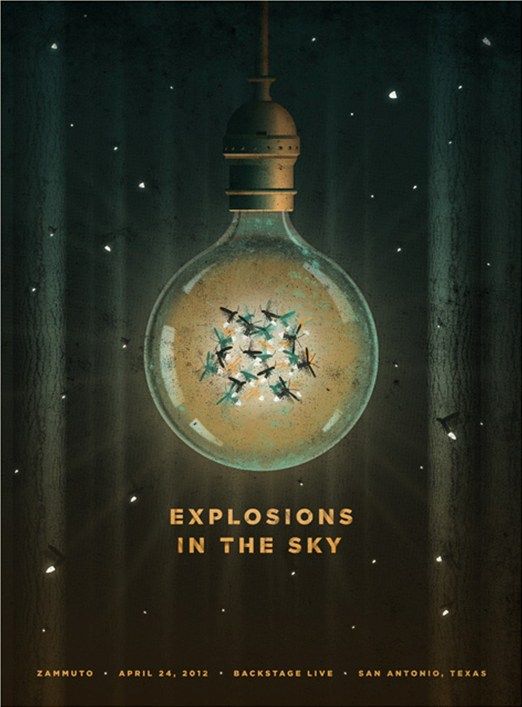
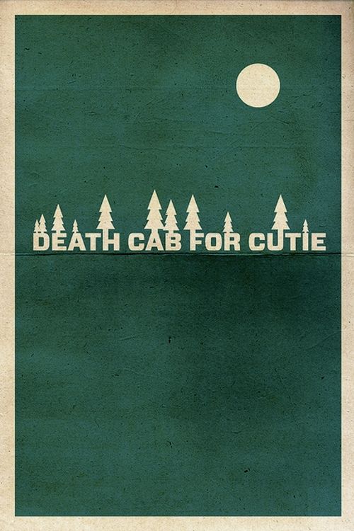
Tip #3: Find a Really Great Focal Image
As you’ll see on our Posters Pinterest board, many of our favorite posters have one really great focal image that draws the captivates the viewer and delivers a strong message about the posters theme or message.
Here is a great example that reminds us to keep the poster simple in order to make it easily digestible for the viewer.

We can help:
If you’re not an illustrator, you can create your own poster design using royalty-free vectors and fonts (from the Arsenal). You can gain access to our entire product library for only $15 now by the way.
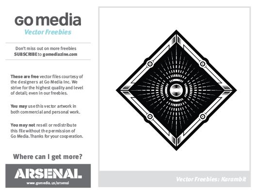
We have vector packs like this one, Karamit, that provide you with a full vector design – as well as its individual elements, that easily assist you in creating your own original design.
Feel free to play around with creating your own focal point using this vector sample from the Karambit Decorative Illustration Vector Pack provided in the download below.
Download >> GoMedia_Vector_Freebie_Karambit
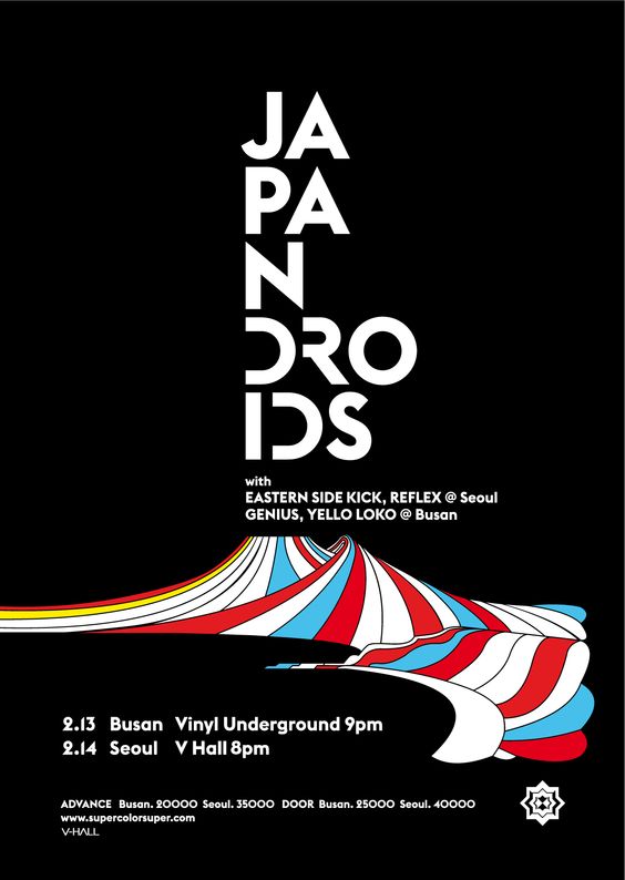
Here are a few additional simple designs that have inspired us lately:


Tip #4: Use Texture to Add an Extra Layer of Intrigue
Texture adds an extra layer of depth to a posters. We love to add texture for a little extra grit, to age the poster a bit, or just to add that extra bit of rock and roll.
Here are some of ours to play around with >> Crumpled Paper Freebie | Grime Texture Freebie | Rust Texture Freebie
You can find more outstanding textures on our Arsenal.
Here are some posters where texture was used really nicely:

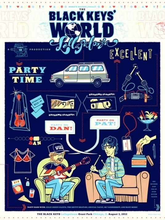
Tip #5: Use Your Sense of Humor/Subtle References to Make an Impact
Posters should be enjoyable – both for the designer to make and the viewer to take in. Use your sense of humor and references from the movie or tv show you are highlighting (or from song lyrics, etc.) to engage with your audience and make the poster memorable and impactful. There’s nothing better than seeing a poster for a movie or band you love and thinking that the designer totally gets you.
Now go have fun!