Blog
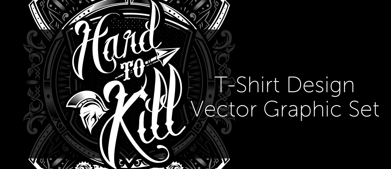
Let’s create a striking history book cover about antique war stories with the Hard to Kill Vector Pack
How to Create a Book Cover Design
Well hello there dear readers! Simon here, ready to walk you through my process to create a striking book cover with our latest vector pack release, the hard to kill vector pack. We’ll look at the pack elements, how to pick, choose, and arrange them to craft a design.

The brief
Our role today is to create a book cover for a collection of ancient warrior stories. The collection includes stories from antique Athens and Sparta. We’ll need to have a good centerpiece graphic element, as well as include the two parts title: “Ancient warrior stories – Vol. 01: Athens & Sparta.”
Building our concept
While the pre-made designs included in the pack are striking, they don’t quite fit the intent. They are more suited for apparel applications.


We need something striking, but less focused on a lettering element, and more on a visual element. The Spartan helmet will do just fine for that.

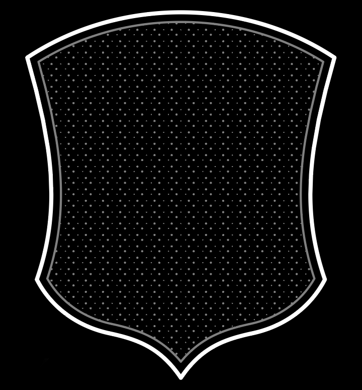
The shield will provide a good supporting visual element to anchor the helmet in the frame.
The two circular frames elements will provide additional ornamentation.


We’ll probably add another thing here and there, to tie everything together, but these will be the core of our piece. We’ll also use League Spartan, from the League of Moveable Type, to set our title.

Oh, and for the color scheme? We’ll stick to the white/dark gray/light gray of the pack itself. It’ll challenge us to keep things efficient to maintain legibility, and impact.
Let’s get this show on the road
Step zero: document setup
We’re working on a book cover, assembled from vector elements. We’ll work in Illustrator, in a 6″x9″ format. Note that the color mode has been switched to RGB, to match the color mode of the vector assets.


Step one: background elements!
That one is easy. We need to create a rectangle in a dark gray (#231f20) that covers the whole canvas.


Step two: the warrior helmet and shield
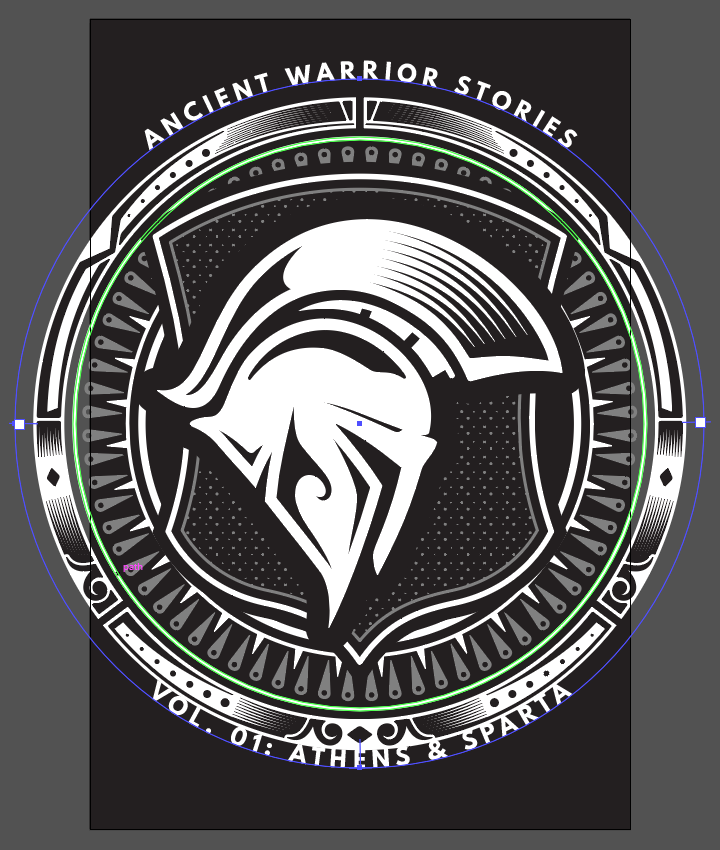
Let’s start with the helmet. Let’s paste it at the center of our document (X: 3″, Y: 4.5″), sized at 4.5″ wide. Let’s reflect it on a vertical axis so it “looks” to the right (right click > Reflect).


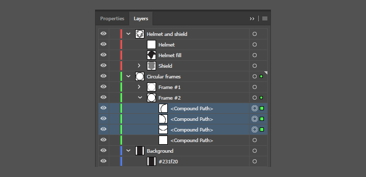
Let’s remember to organize/rename our layers, and groups, right away to keep our document clean.

Let’s add the whole shield element (including pattern) into our document. It should be pasted behind the helmet, centered in the document, and sized at 4.9″ wide.


Once the shield properly in placed, we need to adjust the color of its background fill to match the color of our document’s background color (#231f20). The shape in question is the black path at the bottom of the group.

Here’s the result after a quick shot of the eyedropper tool (I).

We’re moving forward, nicely, but the shield’s pattern showing through the helmet’s open areas creates visual tensions. To remedy that, we are going to create a background fill shape by using offset path. With the helmet highlighted, let’s head to Object > Path > Offset path. The dialog box will allow us to create the shape that matches the helmet with an extra 0.25″ added to its edges. Note the round joins for a softer feel.

The function creates a new path, that is the same color than the one used a base. We need to change the color of that path to our background color as well (#231f20).

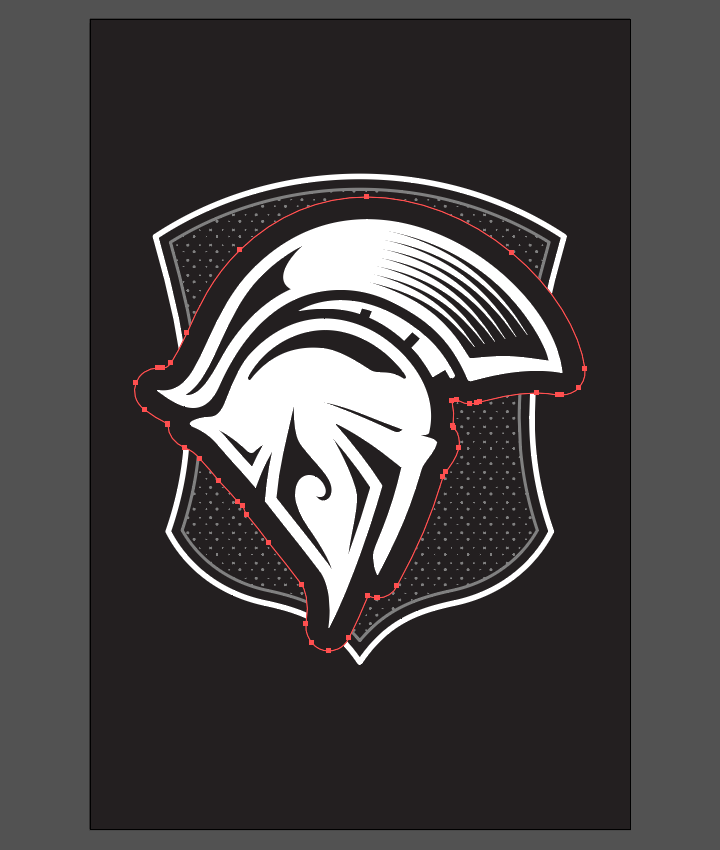
With that done, and with some layer clean-up later, this is where we’re at.

Step three: the circular frame elements
Adding these in is nothing trickier than giving them their own layer, proper size, and proper order. Let’s start with the more complex of the two, with the pointy elements.
After creating a layer for them placed below the helmet and shield one, it needs to be pasted in centered, and sized at 6.383″ wide.


The second frame is to be pasted behind the first one, centered, and sized at 7.25″ wide.


The various black areas of that second frame need to be changed to our background color (#231f20).


Step four: the text
Adding the text is a walk in the park, thanks to the type on a path tool. Let’s start by creating a centered circle with a diameter of 7.65″ in a new layer.

We’re typing our first part of the title (“ANCIENT WARRIOR STORIES”) on that circle. It’s set in white-colored League Spartan, sized 18 points tall, centered, and tracked at 250.


After creating a second circle, we can add the second part of our title (“VOL. 01: ATHENS & SPARTA”).


The issue we have is the alignment of the text object on its circular path.
The good news is that after double-clicking on the type on a path tool icon in the main toolbar…

….we get access to this option panel, that allows us to change the alignment to ascender, which in turns makes things look a lot better.

With that done, we’re almost done with our cover, as the main elements are in place.


Step five: some fluff for good measure
While our cover’s main elements are in place, the corners are slightly empty at the moment. It can give the impression that our content is floating in the middle of the page. Let’s add some corners elements to visually close the frame around the center piece. The corners of this element will do.

After ungrouping the piece/releasing the compound path, we’ll be able to select the corners in question separately from the rest.
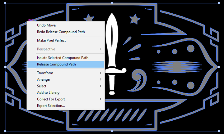
After a bit of clean-up, and selective grouping, we obtain each individual corner element.

They should be pasted at 0.25″ in each direction of the corners, and sized at 1″ wide.

And because we’ve properly named our layers/vector objects, this is what our file organization looks like.

Step six: leveraging our texture library to add a final layer of substance to the mix
To properly wrap this piece up, we are going to add three textures to it to give it some “meat.” First, let’s save a high resolution PSD file of our piece (File > Export > Export as). Note the checked Use artboard box, to trim the elements that are outside the bounds of our canvas.


A few technical notes and reminders
As we embark on the texture side of things, it’s a good time to remember a few base rules, and processes:
- Don’t know what a clipped layer is? Glad you asked! This means that the layer is only visible/applies to the layer directly below it. You can very quickly do this by holding ALT down on your keyboard and clicking between the two layers. Here’s a quick demonstration.
- Every time we’ll work with textures, we’ll follow this simple process: place as smart object, sharpen1, desaturate, enhance contrast with levels, and modify the blending mode.
- Placing the textures as smart objects, and using adjustment layers to tweak them, allows us to stick to a non-destructive workflow. We’ve explored in depth the numerous pros and few cons of such a workflow in this past tutorial: “How to Use Textures The Right Way.”
Notes: 1 – accessed through the Filter > Sharpen > Sharpen menu.
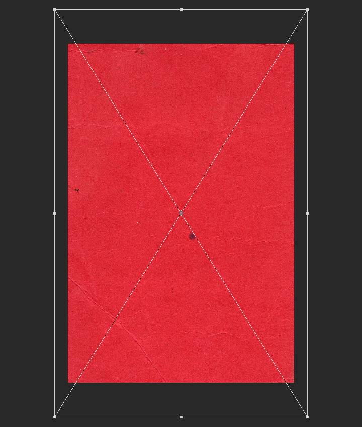
Let’s start with a texture from our vintage paper texture, vol. 01 set.

The texture is vintage-paper-textures-volume-01-sbh-001.jpg.

It’s placed in our PSD file as a smart object, sized up to 165%, rotated 90°, and sharpened.
After being desaturated with a clipped hue/adjustment layer, we’ll be enhancing its contrast with a clipped levels adjustment layer.


And after changing the texture’s blending mode to soft light @ 75% opacity, we’re achieving the first part of our texture effect.

Next is a vignette. I strongly recommend using this lossless vignette technique, found via Design Panoply (#6). The color of my shape layer is our trusty dark gray, #231f20.


Note the 150 pixels feathering value.

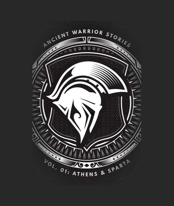
After changing the vignette shape blending mode to soft light @ 50% opacity, our effect is achieved.

The last texture we’ll add to the piece is from our photocopy noise texture set.

The texture is the first one in the pack, photocopy-noise-textures-001-sbh.jpg.

That texture is placed centered, and sized up to 100%.

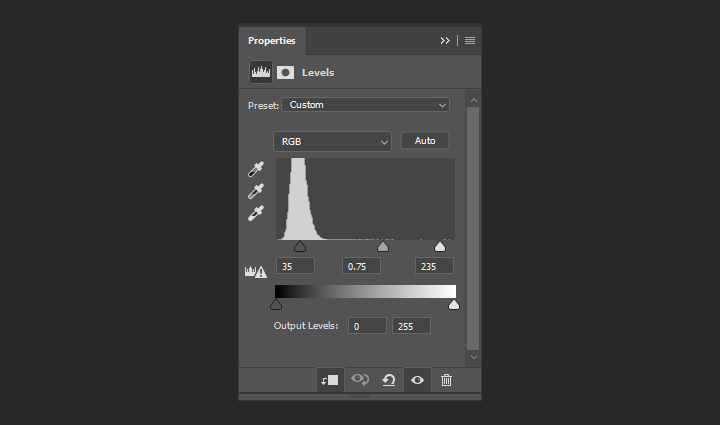
We’re using levels to make the white specks of dust really “pop.”

The result, after changing the texture’s blending mode to screen @ 100%, is quite satisfactory.

And here’s a last look at our layer palette in Photoshop.

Let’s wrap this party up!
Phew, we’re all done! Look at this cover. Let’s mock it up for the client presentation.

I hope that you enjoyed following along the tutorial as much as I enjoyed creating it, and that your outcome matches the goals you set for yourself before diving in.

Did I leave anything unclear? Any suggestions? Don’t hesitate to reach out in the comments below! I’ll be happy to help.

The hard to kill vector pack is now available! Go grab it! If you already have, I hope you enjoy it, and that this tutorial gave you a sense of what you’ll be able to accomplish with it.
And on that note, I’ll see you next time. Cheers!