Blog
Typography Shortcuts: ‘Custom’ Type Treatments for the Lazy Designer
‘Custom’ Type Treatments for the Lazy Designer
Custom hand-drawn type treatments are quite popular these days. Nothing says hipster-cool like hand lettering your client’s chalkboard coffee shop menu. But let’s face it – hand lettering requires a certain amount of artistic skill. And time. Lots and lots of time (and we all know not every client has a big budget).
So, what do you do? You want a custom type treatment for your client but you lack either the skills or time to do it right. You need a shortcut. You need a cheat. You need the gurus of Cleveland graphic design services Go Media’s (semi-) patented Custom Type Treatment for Lazy Designers technique!
Here’s how it’s done:

Step 1. Select a font.
This is where all our time savings comes in. Your final product is going to be 85% font, 15% customization. While selecting the font will feel like the easiest step, it’s also the most important. Don’t rush through this step of the process! I will often times spend over two hours just trying to find the perfect font. Remember the font you select is 85% of the final product and picking a font will be SAVING you tons of time hand lettering – so go slow!
In this case, the project was for a close friend of mine who asked for a tattoo of the word “Unvanquished.” While I’m a great illustrator, I’m not great at hand drawing type, so I knew my best result would be to start with a font. I probably spent about three hours finding this one font (Anha Queen VMF Pro).

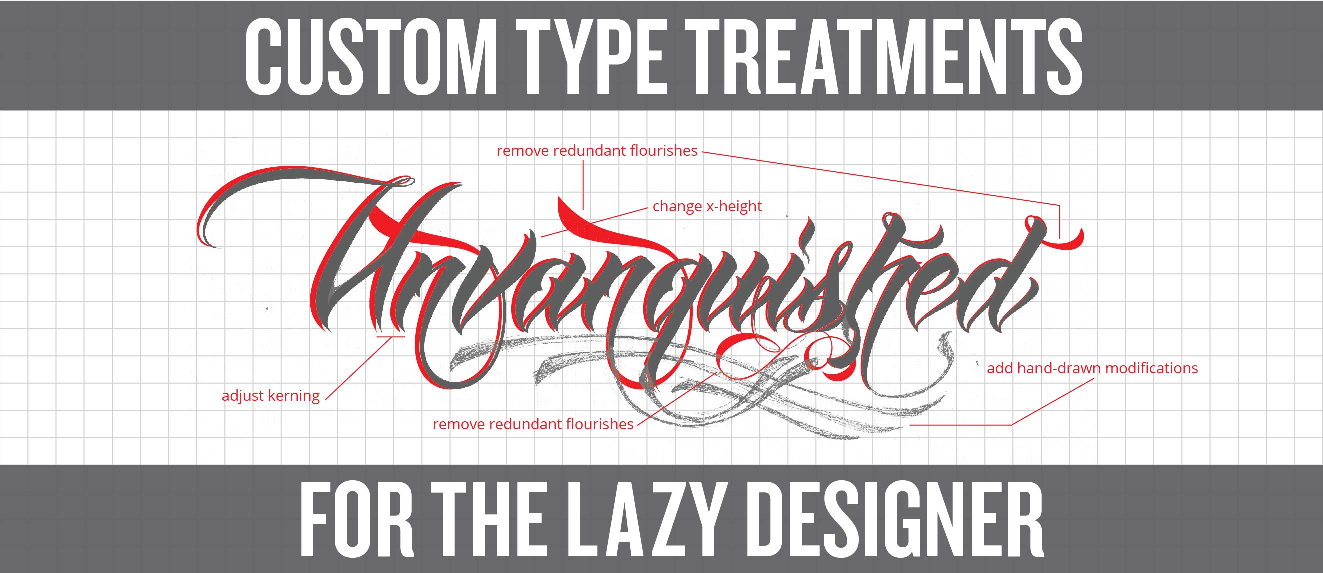
Step 2. In Computer Modifications: Kerning
At this point I start by converting my type into ‘paths’ in Illustrator. I will be modifying my letters as vector shapes from here on out.
In my experience, no font’s kerning is perfect for every single word. So, once I’ve typed out the logotype I’m going to make, I fine-tune the letter spacing. When creating a word-mark I’ve found that you generally want the kerning tighter than what is comfortable for reading – this changes the word into a mark. You can see the adjustments I made with the kerning above.

Step 3. In Computer Modifications: Eliminate Redundancies
Frequently fonts will include lots of repeating shapes. Sometimes these can be ugly and a dead giveaway that your type treatment is a font and not original. It’s ok if you keep one of these shapes, but remove any redundancy that stands out. I’ll also usually use this step in the process to clean out anything that I don’t like. This font has a lot of messy flourishes, so I’ll clean those up too.

Step 4. In Computer Modifications: Play with Ascenders, Descenders and Letter Size
Fonts tend to have a certain-size perfection. All lowercase letters are pixel-perfect height, line thicknesses are exactly the same, etc. I like to play with all of this stuff to give the type treatment a bit more originality.
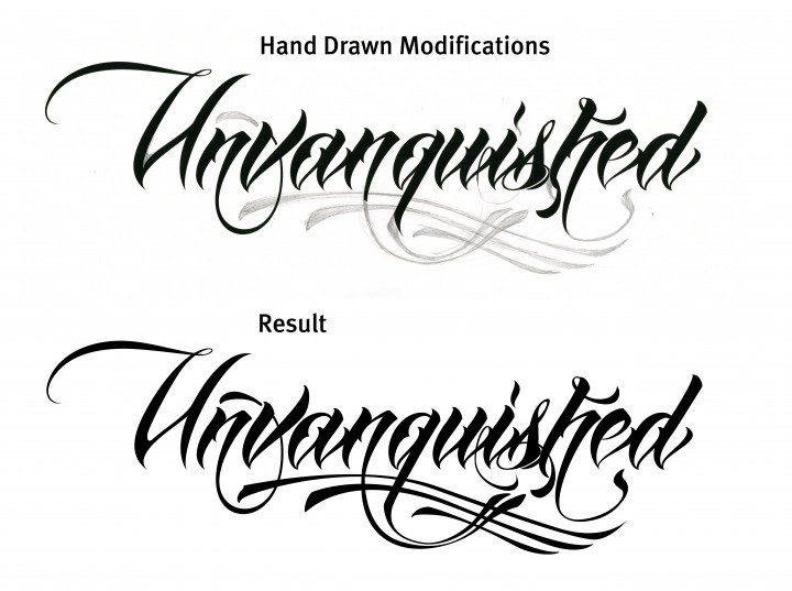
Step 5. Hand Drawn Modifications
While hand-drawing this font from scratch was beyond my skill level, adding some hand-drawn modifications is a fun and easy way to further refine your type treatment. For this step, I simply print out my type onto an 11×17” sheet of paper, pull out a pencil and start playing! If you mess up, just throw it away (sorry, I mean recycle it) and start over. Once I’ve got something I’m happy with I will scan that back into the computer and ‘vectorize’ the elements that I drew.

In this particular case, all my flourishes made the art a little too tall for my friend’s arm, so his tattoo artist modified my design a bit.
Step 6: Sit Back and Enjoy the View
After you’ve finished vectorizing the elements you’ve lazily hand-drawn, sit back and enjoy the view. Sarcasm aside, appreciate how, relatively quickly, you’ve been able to construct a pretty hip custom type treatment. Your client will be equally impressed and their pocket book will thank you, too.