Blog

Tutorial: The Making Of An Editorial Illustration with These Are Things
A These Are Things Tutorial:
Flip through your favorite newspaper or magazine and you’re bound to find a lot more than just words on a page. Alongside many articles, you’ll find art that helps to illuminate key concepts from the text. These pieces are called editorial illustrations.
From tiny spot illustrations to multiple page spreads, these informative works of art are sprinkled throughout each issue. Political cartoons are a classic example of editorial illustrations, but today’s publications use the work of contemporary artists to visually interpret a wide range of topics.
As editorial illustrators, our job is to create an engaging visual that both supports and explains the accompanying text copy. A successful piece carefully balances the art director’s vision with our own ideas, all while clearly communicating the article’s core idea to the reader.
These projects an exercise in creative problem solving. From the super-quick turnaround to the varied subject matter, each assignment is a new visual puzzle for us to solve.
Today, we’re going show you how we created an editorial illustration for Southwest Airlines’ in-flight magazine, Spirit. We’ll walk you through the entire illustration process, from our first client conversation to seeing our work in print.
Ready? Let’s get started!
1. Discussion & Research

Each editorial illustration is a collaboration between the client and the artist, so the first step of every project is to have a conference with the magazine’s art director.
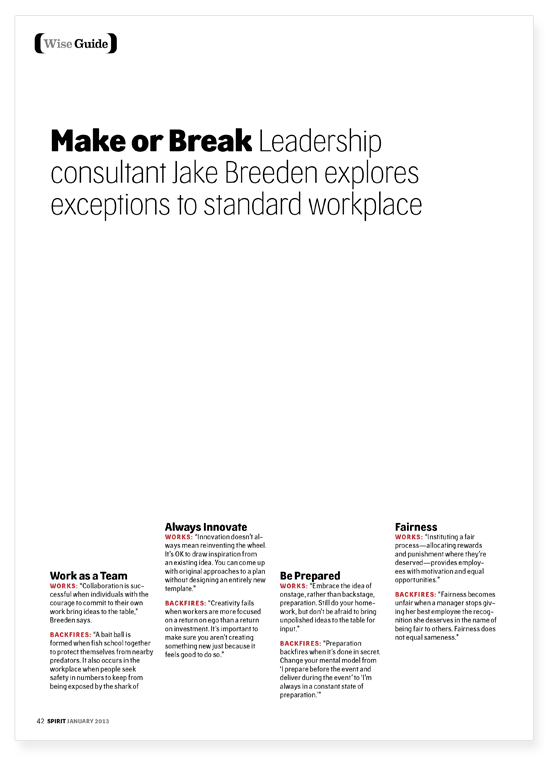
First, we discuss the topic of the piece. We’ll be creating art to accompany an article about four business tips. We’re given a preliminary page layout along with rough copy to refer to during the design process.
Next, we talk about the creative direction of the piece. After conferencing with the art director, we’re given some specific guidelines. The piece will consist of four individual illustrations, each mirroring the tall, elongated shape of the four existing columns on the page. The art director also has a fun idea: to model each individual illustration after a classic motivational poster, like these. This information, along with the article itself, gives us a great starting point as we begin the process.
2. Initial Sketch

It’s time to start drawing! Since the “motivational poster” concept for this piece is already set, our goal is to come up with one solid sketch to present to the client. For projects that are more open-ended, we’ll usually come up with 3-5 different concepts during the sketch phase.
Working with the actual page layout as our guide, we use a Cintiq 13HD pen display to start laying down rough ideas for each component of the illustration in Adobe Photoshop. Using a pen display allows us to work directly inside the page layout, ensuring that our sketches are drawn at the correct size and proportion. For a more budget-friendly option, simply print the page layout on paper and use it as a template with tracing paper.
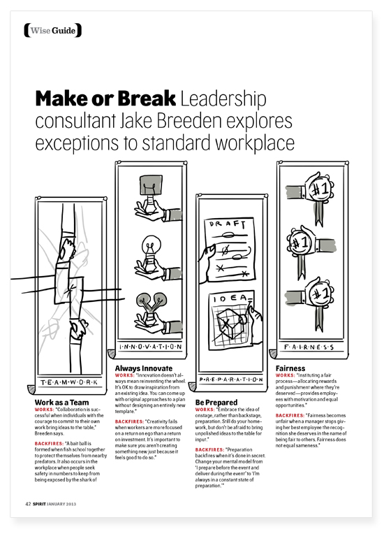
After working through a number of ideas for each individual poster, we land on this sketch as our initial concept. Each poster visually depicts the concepts of teamwork, innovation, preparation, and fairness. The article talks about the benefits and disadvantages of each business concept, so each poster will show an example of the idea both working and not working.
3. Revised Sketch

Before submitting the sketch to our client, we sit down and review our work. At this stage, our primary goal is to create a piece that is both visually and conceptually strong.
During our internal review, we notice that two of the four “poster” concepts involve hands. We like that the hands introduce a human element without showing a face. Incorporating hands into all four posters also creates continuity throughout the entire piece.
We revise the drawing to reflect our new and improved concept. Each poster now feels more similar in complexity and is visually easier to read. Once we’re happy with the sketch, we paint in a few layers of gray to explore the value structure of the piece and help the client envision the final piece.
4. Client Feedback & Revisions

Next, we send our sketch off to the client for review. The feedback is positive. We’re on the right track! The magazine’s art director has a suggestion for the first poster. Instead of drawing pointing fingers, what if we create a network of intertwining handshakes to represent the benefits (and pitfalls) of teamwork? We love the idea, so we hit the drawing board to create a new sketch for the first poster before we move on to the linework stage.
5. Linework

Once the revised sketch is approved, it’s time to turn our rough drawing into a finished illustration. Using the sketch as a guide, we begin to draw individual elements in Adobe Illustrator. Using many of the standard shape tools coupled with the Pathfinder palette and pen tool, we begin crafting geometric hands, lightbulbs, and other items.
Where our sketching process is fluid and loose, the linework stage is methodical and meticulous. It’s a balancing act of capturing the energy of the initial sketch while cleaning it up for it’s final form.
6. Color

With the linework completed, we begin to add color. In this case, the client had a rough color palette to work with, so we jumped right in and started applying color. With other projects, choosing colors is up to us, so we’ll typically do a few exploratory color studies before deciding on a final color scheme.
You’ll notice that some of the design elements changed at this stage. When we start working with color, we almost always find a few things that can be improved upon from our first pass at the linework. In this case, we changed the positioning of the lightbulb hands, added some editing marks to the papers, and drew some fun trophies to go with the medals.
7. Texture

After the color is finished and we’ve made our final tweaks to the design, we jump into Photoshop to add our signature texture treatment. This final step adds dimension, contrast, and interest to the flat vector artwork.
To bring our vector art in from Illustrator, we copy and paste major element groups into a new Photoshop document as Smart Objects. Next, we use various selection tools to isolate individual colors. Finally, we use a dissolve brush, multiplied layers, and our Cintiq pen display to paint in areas of shaded color.
Here’s a before and after view of our texture treatment. The effect is subtle, but goes a long way towards making the piece feel finished.

8. Submit & Wait

With the texture treatment complete, we export a high-resolution version from Photoshop and send it off to the magazine, where they’ll drop it into the page layout along with the final text copy.
Now comes the hard part: waiting! Editorial deadlines tend to be a few months in advance of the publication date, so it’ll be a while before we get to see our masterpiece in print. Eventually, when the day comes, we run to our favorite bookstore, crack open that new issue, and see our work right there on the page. There’s nothing quite like it!
Psst!
Editors note: If you haven’t yet, we highly suggest you watch their highly acclaimed talk from WMC Fest!
More These Are Things | Shop | Blog | Facebook | Twitter | These Are Things Instagram | Jen’s Instagram | Omar’s Instagram
On the GoMediaZine:
WMC Fest 4 Speaker Videos Release
An Interview with Jen Adrion & Omar Noory of These Are Things
Episode 9: Myths of Owning Your Own Design Firm plus an Interview with These Are Things