Blog
Thick Line Art: Creating Iconic Vector Art
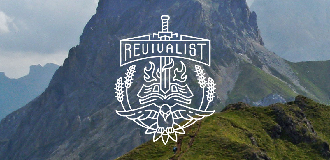
I recently posted a new illustration on Dribbble called “Revivalist” and it got quite a lot of likes. I thought I’d write a tutorial about how I created it. So let’s do this!
Introduction
One of our clients Disciple Clothing needed a “logo” and business card designed for a ministry they are a part of. The Ashish Mubarak Ministries to be exact. They sent me their current business card along with the illustration they are using as their “logo.”


Wow! That’s technically an illustration and not a logo. As an illustration, it’s gnarly 90s gold and obviously in need of an update. Lauren Kusant from Disciple recognized this and asked me to simplify this into a logo, modernize it and add the word “Revivalist” to it. But in my professional opinion, if I reduced this entire scene into a a logo (what is and what isn’t a logo), it would ultimately lose all the different messages its trying to communicate. There’s a lot going on here!
Sidenote: If you’re interested, I suggest reading the article A Logo is Not a Brand.
You can’t fit a flaming sword, a bible, mother Earth, a dove, a scroll, and some stalks of wheat in what is traditionally called a logo. Sure you could take ALL of those elements and identify its core message and communicate that single message with a single mark. Sometimes when I do this, the client often feels that it’s too simple and too far removed from their vision. It loses some sort of wow factor. Now, a logo is meant to be a placeholder for a brand. A simple icon or wordmark that represents the brand that can be resized and repurposed for any application you can think of. It should be easy to spot, easy to recognize and easy to reproduce. Sometimes, clients will incorrectly ask for a logo, when what they really mean is “a cool looking graphic design that represents them.”
I once had a client ask for five different “logos” for their apparel line. What!? After talking more with them, they really wanted five different t-shirt designs. Specifically, five different typographic t-shirt designs. In other words, cool ways of writing their name mixed with other graphics.
So how was I going to tackle this project? I felt the best solution would be to maintain the integrity of the elements but simplify the illustration entirely into more basic shapes and iconic forms. I decided to go with a thick line art style. It won’t be a “logo” per-say, but it will still be a simple and iconic design that can be used on a variety of applications to represent the ministry. So without further ado, let’s get into the design process!
TIP: For this style, stick with ONE line weight for a uniform look. We aren’t going for “realistic” here. Don’t over-illustrate. Simplify and keep things spaced evenly.
Step One: The Sword
Since we’re aiming for iconic and simple, always start with basic shapes and add detail from there. If you start going crazy with the pen tool, you’ll have a harder time making things “perfect”. You’ll see what I mean later. For the sword, I started with a box and used my pen tool to add a point. Then I used my Direct Selection Tool (white arrow) to select the three points at the tip of the sword. To make sure they are evenly spaced and my midpoint is exactly in the middle, I used the align tool “Horizontal Distribute Left.” Make sure “align to selection” is checked and not “align to artboard.” Otherwise you’ll spread out your points all across your artboard and you don’t want that.
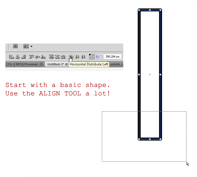
To make the tip, I wanted a perfect 45 degree angle. Why? Because I feel it’s more iconic when angles are in good harmony with each other. Angles like 45, 90, 60, 30 are all good angles to use. To get the 45 degree angle, I held shift when creating my line. I lined it up with the left point and then selected and repositioned the “tip” to match. There might be a more exact way of doing this, but this way gets me close. I also drew another vertical line down the center of the sword and aligned it with the rest.

To create the handle, I did a lot of the same techniques as above. I started with a basic rectangle, created a midpoint, and moved it upwards slightly. I used a 15 degree reference line instead this time. How did I get it exactly 15 degrees? I started with a horizontal line, then used the Transform palette to rotate it exactly 15 degrees. Get used to this tool because it comes in handy!
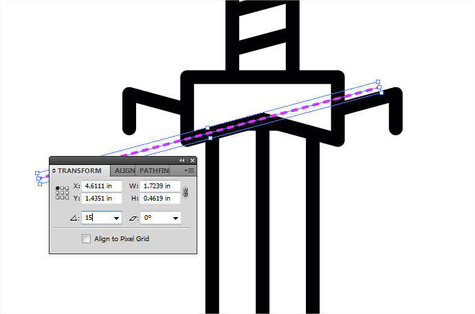
I gave the handle guard a white fill in addition to the black stroke so I could position it on top of the blade and cover up parts I don’t want people to see. To create the rest of the handle I did more of the same. For the pommel (bottom tip of the handle) I made a rectangle and used Warp > Bulge to get it a slightly bulbous shape.

Step Two: The Book
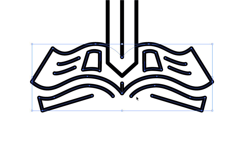
For the book, in this case The Bible, I kept things simple by illustrating only the essential elements. The page, stuff on the page, and the dimension or thickness of the book. I started with one half first and then mirrored it.

I’ll create temporary vanishing point guidelines to make sure I get my perspective angles correct. You can fake this of course but I wanted to make sure. And one technique that’s very common is designing one half first and then mirroring it so each side is symmetrical. Then center it up perfectly with the sword using the align tool.

Step Three: The Fire
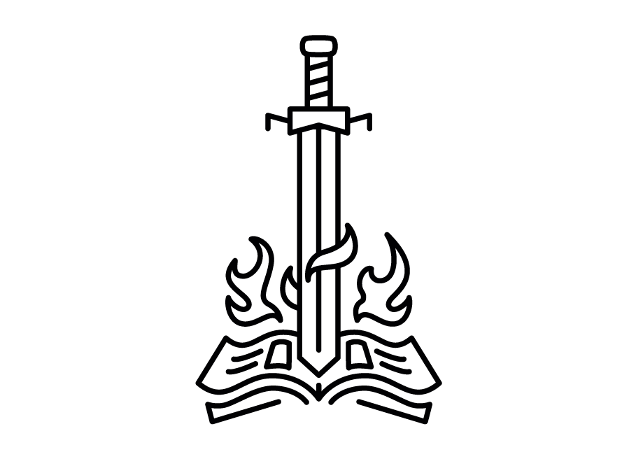
Truth be told, this took me many attempts to get right. I had to imply the sword was on fire without over illustrating it. The fire had to look like fire and not a leaf or some other decorative doodad. And it had to be symmetrical, but I didn’t want to have the same flame on both left and right sides. The challenge was to make it FEEL symmetrical without actually being exactly the same on both sides.

I started with a flame on the left side. I made sure the bottom part of the flame followed the contour of the book below it. To communicate a flame instead of a leaf, you need to have a few tendrils. You don’t need a lot, but if you have just one (like a candle flame) it doesn’t look like a flame. Unless of course a candle is underneath it. But I didn’t want any more than three tendrils or points to keep it simple.
Once I got one I liked, I mirrored it for the right side. I used my pen tool and adjusted points around until I had something different but still similar. I kept the bottom part the same which helps create the illusion of symmetry. I only adjusted the top two points. Once I was satisfied with my flanking flames, I put in the smaller whisps on top of the sword and behind. These don’t need a lot of tendrils because there are other flames around it that communicate “this is fire”. Without the more complex flames to the left and right, you can’t be sure whether it’s fire, wind, or some other decorative swoosh.
Step Four: The Banner
I purposely left room at the top for the banner. This is where the text “revivalist” is going to go. I started by using the font Modula Sans as a base. Since I want everything to have a consistent line weight I’ll need to create new lines from scratch. Before I did that, I roughly set things up how I wanted it using the Warp > Arc Lower tool and distorting the text into position. Once it’s close, I lower the opacity of my reference and start drawing lines as simply as possible. It doesn’t have to match up exactly with my reference and it’s ok to adjust later. For the A, I actually used an upside-down V.

I positioned the banner on top of the sword and made sure it was perfectly centered. I also added the back “flaps”.

Step Five: The Wheat Stalks
I knew I wanted the wheat stalks to circle the design in some way. Instead of trying to draw a curve by hand, I started with a circle as reference and added a single point at the top of my stalk and then deleted other parts of the circle until I was left with the part I needed. To create the head of the wheat stalk, I took two overlapping circles and used the Intersect tool in my pathfinder palette. That gave me a perfect shape. I rotated it 30 degrees and mirrored it so I would have a symmetrical shape to work with. I then duplicated this shape vertically by holding Alt+Shift while I dragged it down some. After that I pressed Ctrl+D five times to repeat the last action and duplicate the shape. I added one more of those shapes on top. For the sprout-like things coming out the sides, it’s just a simple path that was duplicated and mirrored on both sides. Easy.

I moved the head into position on the stem and then individually rotated the shapes along the curve slightly. Just to make it look like it was bending along with the stem. When I was satisfied with the position, I copied it, rotated it, and positioned a second wheat stalk to the left of it. And finally I grouped the two of those together and mirrored it on the other side while making sure my wheat stalks were perfectly aligned to the center of the design.

Step Six: The Dove
Since I am not a pro at drawing a dove, I wanted to make sure I was close! So I grabbed a reference image from iStockphoto. It’s more of an illustration, but I liked the position and symmetry. I thought it would be an excellent starting point for my design.
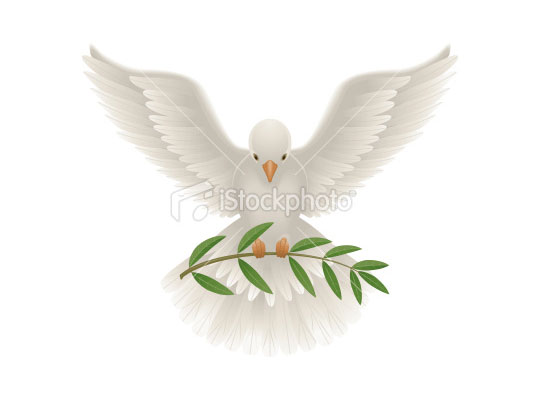
I started out with extreme basic shapes. Circles, ovals, ellipsis, whatever you want to call them. I tried to make as few lines as possible while still capturing the essence of the bird’s body. When they are properly layered, you can create the illusion of depth very easily! Make sure the head is on top of the body, the feet on top of the wheat. The body behind the wheat, etc.
For the wings, I made one on the left side before I mirrored it to the right. Here’s a good rule of thumb for creating vector illustrations: Use as few points as possible for the cleanest curves. It’s so much easier to manipulate that way. For my wings, I made sure they were behind the body but in front of the wheat. This gives the illusion that the bird is kind of leaning forward.
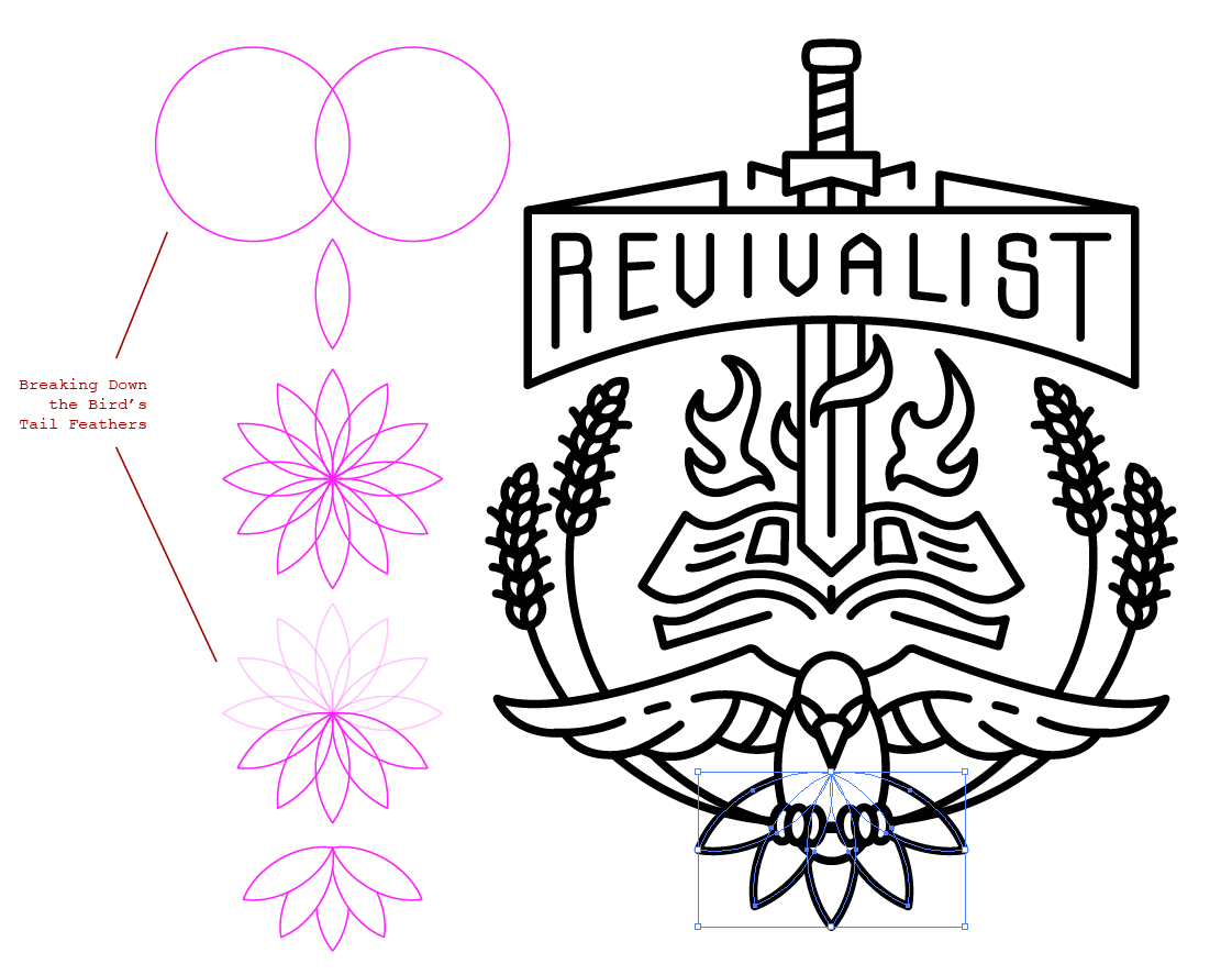
For the tail feathers, I used the same technique I did in creating the head of the wheat stalks. I used two overlapping circles to cut out a basic feather shape. I used the rotate tool and held down ALT while I clicked the bottom of point of my shape to set the new pivot point. When the rotate dialog box pops up, I used 30 degrees and checked the preview button to make sure. Instead of hitting “ok” I clicked “copy” to duplicate the shape instead. And then I pressed Ctrl+D to repeat this process a bunch more times until the shape copied itself in a full circle. Pretty cool technique!

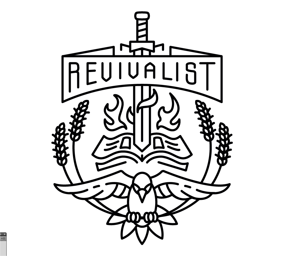
I deleted the shapes at the top that I didn’t need and set the fill color to white just so they overlapped and didn’t look transparent. I also adjusted the layering of the feathers to keep it symmetrical on both sides. With the bottom feather being furthest behind, the next two features being second, and then the top feathers being in front or on top. Does that make sense? See the image below for a breakdown.
Step Seven: Fine Tuning
In reality, there was a lot more trial and error in the process of this illustration. There was a lot nudging lines around, moving and rotating, and asking “does this look right?” Use your eye and keep the shapes and lines in harmony. And my final design was inverted (white on black) to match the colors the ministry was using on its old business card and website.
But before I made the color change, I wanted to “naturalize” the illustration a bit. Make it slightly rougher and analog. Here is a simple technique for making your vector art look a bit more natural.
Roughen it up a bit.
I selected all my strokes and went to Effect > Distort and Transform > Roughen. This took some tinkering to get to look just right! I was aiming for a subtle wobble to my linework, but not too much.

Photoshop Trickery
This looks pretty good, but I want to take it a step further. I’ll copy my entire design and open Photoshop. I’ll start a new document at about 2500 x 2500 and paste my artwork as pixels. Make sure it takes up most of the document.
After you’ve got it pasted in there, merge it with the background layer. Then go to Filter > Add Noise to about 15%. Then give it a Gaussian Blur of 2%. And finally apply a Smart Sharpen to about 140% with a 34 px radius. Now adjust the levels to eliminate the grey noise in the background.
Repeat this process about 3-4 times tinkering with your settings to get the best effect.

Aside from the fact that the lines are slightly rougher than before, notice the joints between lines. The areas where lines meet up are now a bit more blended together. It doesn’t look extremely precise and perfect. More natural. Now this isn’t always appropriate for every situation. If you wanted to keep the clean look then don’t do this. But in my case I like the analog look and felt like it worked for this project.
Back to Illustrator
At this point, I will copy and paste this back into Illustrator and give it a live trace to convert it back to vector art. I’m ok with some amount of smoothing or “quality loss” here. My image is 2500×2500 so it is pretty high res. A Live Trace will work fine. But if I wanted to keep a lot of those rough details, there is the “lettering” preset under Live Trace Options which works wonders for keeping your rough details, but is terrible for CPU performance. Your resulting vector art is often loaded with thousands of points and that’s not really good here. So I just keep the default settings.

Step Eight: Finish!
That’s it. That’s all there is. I hope you learned a bit about creating iconic vector art in Illustrator. It’s really about being able to simplify the elements as much as possible, using basic shapes as starting points, and keeping things simple, balanced, and consistent. Everything in this design has one stroke weight. Even my text. That’s the beauty of this style. This won’t work for a logo, but this illustration can be just as versatile in many situations.
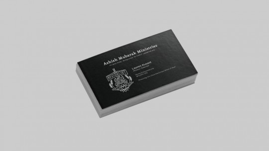
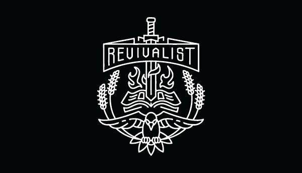
Here’s my final design on black and then the finished business cards.

Mock it up!
Here are the designs mocked up on some of our templates. You can buy this tri-blend template pack from Go Media’s Arsenal. These other mockups are from our site Mockup Everything.
