Blog
Shading with Watercolor Textures

This tutorial will try and show an alternative way of using the watercolor texture files (as most of you know, you can download Go Media’s watercolor texture pack here, or you can try and make some of your own by painting them and scanning them into a digital format) in order to give some color to your line-art.
The usual approach when using these textures is to make them into a background of sorts for the line art. And that is great with some pieces, but less effective in some other cases. This method will focus more on giving the line art another dimension by shading it and creating some volume, while using the watercolors for a more original effect.
But, let’s start with the beginning. First, we need some line art. I usually start with a rough sketch, be it on paper or directly in PS, AI, or other design software. For this particular piece I used a sketch I drew in blue ball-pen…So, after scanning it, this is what we got.

It’s of little importance how good or bad the sketch looks at this stage, since now comes the inking…and in this case, along with the inking, I added some elements to my composition, while removing others – what can I say, it’s not like this composition was that good to keep all of its pieces.

A good reading is provided by this tutorial on how to ink a sketch.
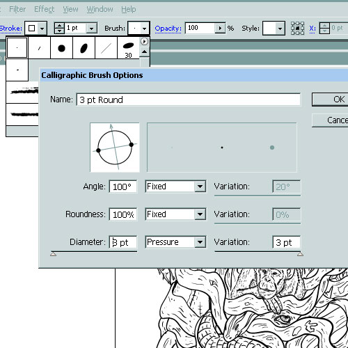
I used AI, with a 3 point brush, with the sensitivity for the pen pressure set to 3, then expanded everything.

If you are using AI CS4, you can also use the Blob Brush, which has the major advantage of letting you draw shapes directly, and, also, it lets you use the Eraser tool just as you would use it in a raster graphics software, such as Photoshop. This is how the finished inked piece turned out.
As you can see, I tried to vary my line-weight in order to suggest different places of focal interest. Also, I added some more elements in the upper sides of the design – as it was meant to be a t-shirt design. I noticed that using such a shape actually makes the shoulders look wider in contrast with the waist-line, which gives a pleasant effect for both men who get to look more manly and women, who get to look more slim. Win-win situation, don’t you think?
Fun stuff left aside, now we have a vector line art that can be exported/scaled/ colored etc.- if you have the possibility, try and use a vector-based software for your line-art, as it will save you a lot of trouble later on.
My “weapon of choice” for the next part is Adobe Photoshop, and this is where the watercolor textures come into play!
Now, create a new document (don’t forget to use a proper size for t-shirt printing purposes, I would recommend at least a 2400px X 3200px X 300 dpi) and let’s get that line art into the new document.
Use File/Place, then select the saved .ai file and resize/place it according to your needs on a new layer.

Next, I filled the background layer with white, in order to have better contrast with the line art and also because this was the color I intended the t-shirts to get printed on. Also, you can rasterize the line art layer and adjust its color to full black.
Now, create a new layer under the line-art layer but above the background layer. Select a hard brush, pick a nice color and start shading. Yes, actually, that’s the main part of the process. You need to select a lighting source (I picked the top-left corner) and draw the shadows on each element of the composition. This can take a while, but after we’re done with this, it’s easy as pie! Here you can see the way it looks after I added those shadow strokes, and you can also see the way I marked the light’s direction, in order to have consistent shading throughout the piece.

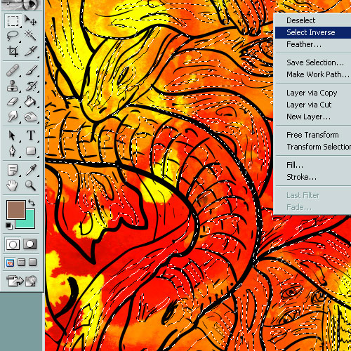
Now, there are two ways of bringing the watercolor texture into our piece. One uses selections, the other one uses masks. I will show you the one that uses selections for this tutorial –those of you who are proficient with Photoshop can clearly see how the mask could be used to achieve this, and, considering the fact that the result is similar, either way works!
First thing’s first, so we need to get the watercolor texture in the document we’re working on. I used Go Media’s freebie watercolor texture and copy/pasted it into my document, on a different layer. Then, because the texture was too small to cover the whole area of my document, I just pasted it all around, on different layers set on multiply. This way, the white became transparent and I got one big watercolor splat. After I merged all the watercolor layers, I had something like this:

Next, an important step follows: In order to select all the contents of the “shadows” layer (the bright blue one), you need to hold CTRL (CMD for Mac users) and click the layer in the Layers box. Now we have a selection that contains all the shaded area, and in order to fill that area with the watercolor texture, we pick one of the selection tools (any one of them works, be it Rectangle Marquee tool, Magic want tool, Lasso tool, etc.) and right-click on the document. Then, we need to pick “Select Inverse”, which will select the area around the shadows.
We’re almost done. Now, we make sure that we are working on our watercolor texture layer in the Layers box, and then we press Delete. That gets rid of all the excess watercolor texture and leaves only the parts that coincide with our shaded areas. Now, you can go wild and change the colors of your shading. Using CTRL+U, the hue/saturation correction tool, we can now pick from a huge range of hues and nuances.

The results can vary a lot, depending on how you position the watercolor texture, depending on the colors you choose and you can even combine more watercolor textures in order to get more colors in the mix – you could say this is a great procedure for getting unexpected results. I opted to convert my piece to 3 colors only for easier/cheaper printing, using halftones (but that’s a whole different tutorial) and this is what I got:
Don’t forget to mock the design on a T-shirt template for extra-presentation points!
I hope you learned something new from reading this and I want to thank you to those of you bearing with me until the end!
My t-shirt is up for voting at Design by Humans, so give it a vote!