Blog
Do androids dream of electric sheep PSD breakdown
Introduction
Hello dear Zine readers. Simon and Jon from Studio Ace of Spade here. Today, we’ll have the pleasure of walking you through the making of our entry for an old installment of The Fox Is Black’s Recovered Books contest.
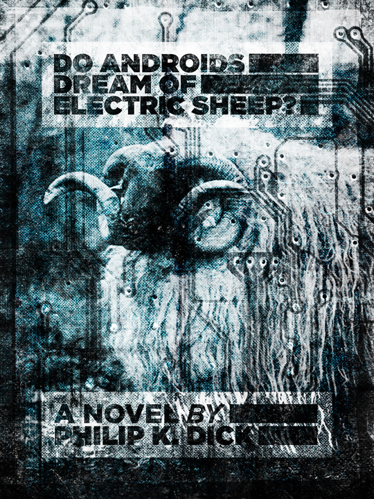
Our goal with this walk-through/PSD break down is to provide some insight on the concept behind the poster, and on the various techniques that helped during the execution phase of it.
Let’s be clear: we don’t think we’ll give you any magic recipe to create a cool poster, but rather a detailed look at what our workflow for this one was, and a look at some of our favorite techniques when manipulating images and blending them with type elements and textures. We hope you’ll be tempted to actually play with the various values we used in our level editings and filters as well as the different textures in the packs we used, in order to make this piece your own.
How it came to be
The contest on The Fox Is Black
Like we said earlier, what became this poster was an entry for The Fox Is Black’s Re-covered book contest.
The Fox Is Black, formerly Kitsune Noir, was started in April of 2007 as a way of sharing interesting ideas with likeminded people.
The contest is quite simple. Bobby and his team of authors choose a book, provide some background inf, cover examples, and a deadline. Here’s some of the announcement post:
Well, it’s been a few months since our last Re-Covered Books contest, so I figured it was time we get back to creating some awesome work, don’t you think? I decided that I wanted to pick a book that was newer, something that could really inspire a lot of bold ideas and not be marred with clichés. Browsing through our library at the TFIB HQ I came across a copy of Do Androids Dream of Electric Sheep?, and realized that’s exactly what I was looking for.
It’s important to remember that this was the book that inspired Blade Runner, the emphasis here is on the word inspired. That means I don’t want to see any Harrison Ford looking guys on your covers, or anything that’s borrowed from Blade Runner. Try and use your imagination and come up with some crazy, sci-fi imagery.
And here are the examples of (beautiful) vintage covers he provided:
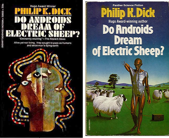
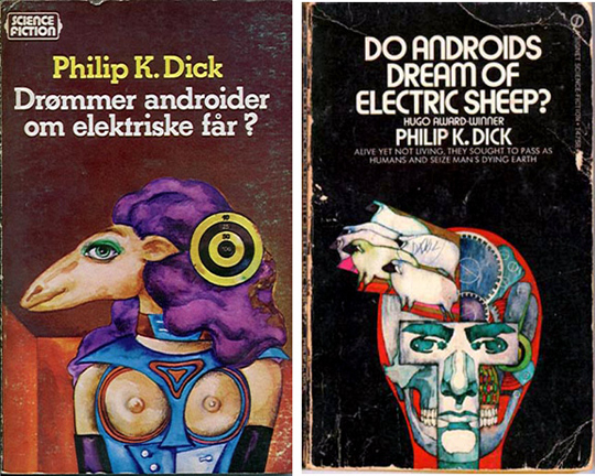
Having read excerpts of that book a long time ago and not seen Blade Runner yet, we quickly proceeded to do so in order to understand the difference between the 2. After some research, we also discovered a comic book version of the book, edited by Boom Comics!
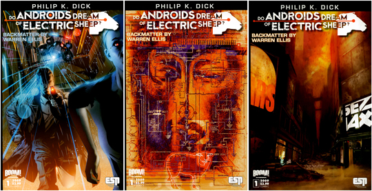
After all that research and armed with our best memories of sci-fi movies (from Metropolis to The Matrix), we felt like we could go ahead with conceptualizing a direction that would be ours, even if not totally unique.
Conceptualization
The title gave us the most obvious visual direction. There are androids, sheep, electricity, dreams that are mentioned. The story includes robots that are so close to look like humans that they might not be recognized by an untrained person. It’s also happening in a society devastated by a global nuclear war, and Earth is in a shape so bad that most of the people left to colonize the stars.
In short, we want robots, electronic elements (circuit boards…), sheep, and a gloomy atmosphere.
From there, we started to gather reference photos and some other visual to create something close to a mood board.

This mood board includes a WPA poster with 2 bighorns sheep, a 1890s photo of the National Galleries of Scotland of a sheep named MacGregor, one of Hannes Beer’s ADED project installment, a photo of sleeping sheep, and the Bighorn sheep print designed by Mark Weaver.
After the mood board, we embarked on a quick texture research, to find circuit board textures we could use. As usual, Caleb from Lost and Taken got us covered, with this pack of circuit board textures, published on WeGraphics.net. Bittbox also has a series of circuit board textures up, but we ended up not using them. We’ll explain why a bit later.
After some quick sketching on paper, it became clear that trying to draw a robot sheep wouldn’t work as efficiently as using a photo as the base of our poster. We did some posters including hand drawn elements before, but this one just didn’t seem to work. Instead, we decided to use the 1890 photo of MacGregor the sheep as the base element of our poster.
Once the base of the poster was determined, we also knew we wanted to have the circuit boards present in the image as well, probably overlayed on top of it. We also knew we had to have the author name and book title on it somewhere.
A lot of the things that happened during the execution of that cover/poster were happy accidents, as it often happens with an organic design process. This means one thing: EXPERIMENTATION IS KEY. It also means that what we sometimes consider as mistakes can actually be more interesting than the original direction you planned for.
With all that said, let’s dive in the execution part of this piece, shall we?
First, some useful resources
Most of these resources will be textures. It goes from paper to stone and other grunge elements. They come from all over the internets: Lost and Taken, Bittbox, DeviantArt, sxc.hu…
The very first file you’ll need to get is the picture of MacGregor the sheep. Don’t forget to grab the biggest size available.
Let’s look at our layer palette to see what we used and what you’ll need to emulate it. First, the background.
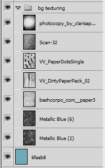
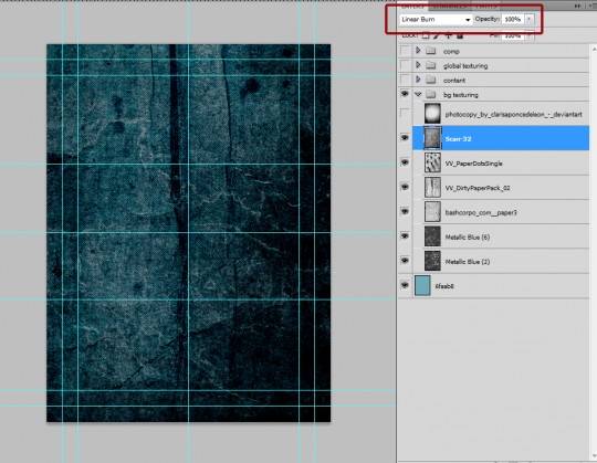
In here, we have, from top to bottom:
- A photocopy texture made by clarisaponcedeleon and available on DeviantArt
- Scan-32 is a vintage paper texture part of a pack done by Caleb of Lost and Taken called Vintage paper textures vol. 1 (published at Design Kindle)
- VV_PaperDotsSingle is a paper texture with some heavy grain, published on Flickr by Dustin of Valleys in the Vinyl
- VV_DirtyPaperPack_02 is from a series of dirty paper textures collected by Dustin of Valleys in the Vinyl
- bashocorpo_com__paper3 is a paper texture from Bashocorpo
- Metallic blue (6) and Metallic Blue (2) are both from a pack called 7 blue grungy paper textures from Lost and Taken
You’ll also see a color layer (in blue #6faab8), but more on this later.
The next set of resources will be useful for the global texturing process:

Here’s where to grab these ones:
- Tape borders and tape borders copy are constituted of pieces of tape coming from Fuzzimo’s Flickr stream and from Lost and Taken and combined on a layer.
- Splash 3 comes from a pack of textures made by Andre Meca and published on PSD Fan
- grunge_-_dust_-_deviantart_-_too_dusty… is a film texture with dust and speckles I found on DeviantArt
- texture_from_film_-_05_-_4298403252_6b4b31470a_o_d is a grainy film texture, coming from a set by m. r. nelson on Flickr
- 4439092868_c299e91a19_o – subtle grunge – LT is part of a set of subtle grunge textures made by Lost and Taken
- Old Film 02 has been found on DeviantArt
- noise2_7 is part of the second set of noise textures put out by WeGraphics. If you don’t want to buy the set, use the free sample
- circuit board – BB is one of the textures taken from BittBox’s circuit board texture pack
- c_b_2 – BB is wrongfully credited to BittBox here, and can be found in that free set of circuit board textures at WeGraphics
Phew. That’s all the resources you’ll need in terms of textures. In addition to that, you’ll need the 2 aged effect actions, created by the good folks here at Go Media (Aged Effect One and Aged Effect Two).
Note: in order to save the actions, just do a right click on the links above, and choose “Save link as…”
Let’s make this piece
Step 1: creating a new document
Let’s remember that at first it’s supposed to become a book cover. So we could just go ahead and decide on a cover format based on one of the most common book sizes. Since we weren’t sure we’d make it through the contest and just in case we’d want to turn this into a print, we decided to design our submission as an 18×24 inches poster.
So let’s create a new 18×24 inches document in Ps. As you can see, our document will be in RGB mode since some of the filters we’ll be using in the final phases are available in RGB mode only.

Other than that, since we might end up getting this to print, don’t forget to put the resolution of your document to 300 ppi. We’ve also added guides, as they help us to structure the composition. On a 18″x24″ print, we have them typically set up at 1, 2, 9, 16 and 17 inches vertically, and 1, 2, 12, 22 and 23 inches horizontally. Then, you can also add some as needed.

Note: you might want to create a similarly set up document in Ai, and leave it open in the background. We’ll use that one for creating the type elements a bit later.
Step 2: let’s place MacGregor
We could have started with the background texture buildup, but we wanted to make sure we’d place the main element of our poster without the distractions of background textures. We already knew that our type would mimic a typical book cover layout (title at the top, author at the bottom), so a somewhat off-centered placement for MacGregor was what made sense.
Drag the sheep image in your document. Desaturate it, then, convert it to a smart object (right click on the layer). This allows to keep “access” to the original file, even though you’re going to resize it and/or apply filters to it. Beware, this state has some limitations. Once it’s a smart object, place and resize it as you see fit.
The image the National Galleries of Scotland are making available is fairly small. We’ll need to think about sharpening and other enhancements. In terms of sharpening, one method I like to use a lot is based on the high pass filter. It’s been explained very well on this blog by Oliver Barrett, so I won’t go over it too much in detail.
You’ll need to make a copy of your correctly placed sheep layer. Then, right click on the layer and rasterize it. Once it’s rasterized, apply the high pass filter. I used the highest value possible for the filter, 250, because the base image is so small. Switch the blending mode of the high-passed layer to soft light and play with the opacity to adjust the intensity of the effect. You can see I actually have my base layer (not high passed) on hard light, to let the color and background effects play through, then the high passed layers are set on soft light at 25% opacity. The second copy is here because I needed to make the sheep a bit more present once the background was done.
The background textures
Since we wanted to create a dark and digital mood but not fall into a Matrix style, we opted for an electric, kind of muted, blue as our base color: #6faab8. After that, we wanted to start with a paper grain and rusted metal background. As you’ll see, it evolved into something a bit different.
First, a layer filled with the base blue (#6faab8).
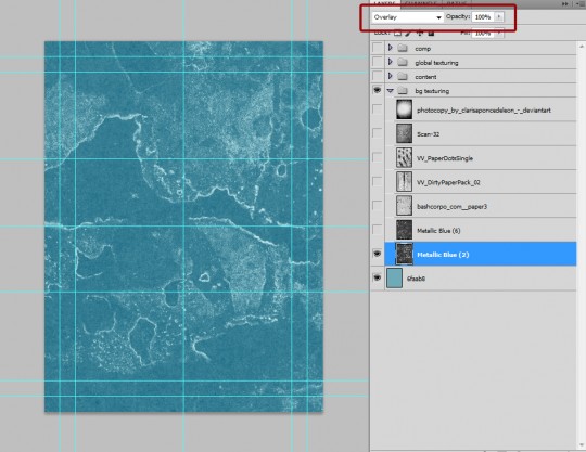
Then, our first texture: Metallic Blue (2). Open it, drag it in your document and place it at the center. Resize it in order to cover the full extent of the canvas (or even to go beyond its limits). Then you want to desaturate it (CTRL/CMD+SHIFT+U) and adjust its levels (CTRL/CMD+L), to bring the details of the texture out. Then, sharpen it a couple time by using the sharpen filter found at filters > sharpen > sharpen. Just compare your original Metallic Blue (2) file with the one I have here. You’ll also notice that I placed the blending mode of this texture on Overlay @ 100% opacity.
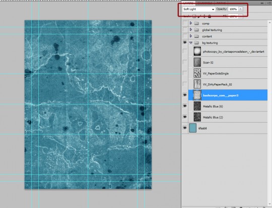
Now, by following a similar process, let’s build up all the other layers used for our background. Here, Metallic Blue (6) has been placed on Soft light @ 100% opacity, after being leveled and sharpened.
bashocorpo_com__paper3 is bringing us the splatters we wanted. It also lightens the piece.
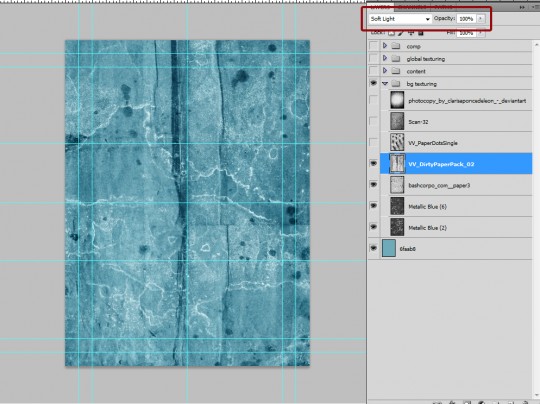
VV_DirtyPaperPack_02 adds folds and other worn effects.
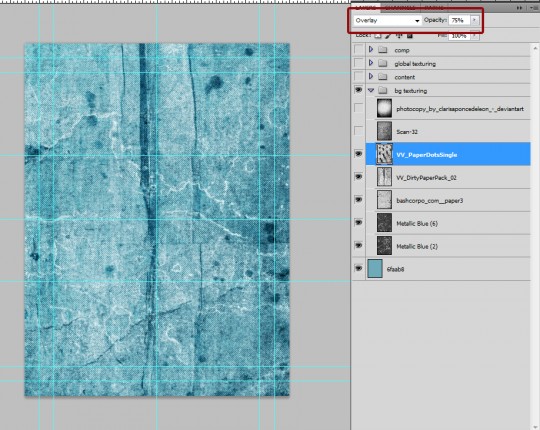
VV_PaperDotsSingle is probably the texture that has the most impact throughout the piece. It’s what makes the final piece’s halftone effect so strong. Now that we have a chance to look back on this, maybe we would have put it on Soft light instead of Overlay, and also down to 50% opacity instead of 75%. Yet, as said before, it’s what brings most of the main feel to the piece. It’s bringing these great lines of worn folds.
Scan-32 is part of the Vintage paper textures Vol. 1. We edited the levels to make it really dark (the black is at 125, the mid-tones at 0.5 and the white at 200). Using Linear burn as a blending mode brings a lot of dark back into the piece.
Finally, ending up with the photocopy texture on Soft light @ 75% opacity helps to restore some light in the center zone, where MacGregor awaits some further treatment.
This concludes the background. If you’ve read our tutorial/case study of our Lost and Taken poster on this very blog, you’ll see that the process to play with the textures and combine them together is pretty similar.
Adjustments to MacGregor
Once you turn back on the layers for MacGregor, this is what your piece should resemble. All the texture work of the background is hidden! So, instead of leaving your base sheep layer on normal @ 100% opacity, let’s switch it to hard light.
The result of this blending mode switch lets the background show through pretty well. We’re definitely hitting the grunge vibe we wanted the piece to have.
We’re not having much of a technological feel to this, but that’s where the global texturing process will play. For now, it’s time to create our type elements.
The type elements creation
As a rule of thumb, when working on a piece like this one where there aren’t too many type elements to manage, we like to create them in Ai. It offers more control on the type, and allows to adjust scaling at will before applying textures and other effects.
Here are the final elements we used in the piece.
You’ve probably all recognized Gotham. We decided to use it because it’s a really legible typeface, but also because it has that great vintage feel. Because of the overall dark piece, we wanted the type to be white. In order to make sure it would be legible, we included it within these black blocks that act as a separation between the busy texture of the piece and the type. Finally, the white rectangles help to structure the type elements a bit better.
If you look closely at our type elements, you’ll notice they’re looking worn out. To achieve this effect, we’re using the roughen filter in Ai (Effect > Distort and Transform > Roughen). You can see the values we’ve used on the screenshot. We need to give credit here to Simon Walker (aka Super Furry) and to Dan Cassaro (aka Youngjerks) for the tips and tricks on how to use this filter. Simon did a great post over at Method & Craft detailing his use of it.
When placing our type back in the piece in Ps, we realized that white type in a black rectangle wasn’t that efficient. We then decided to invert the type elements to black text in white rectangles, which has much more visual impact.
Once both type elements were placed, it was time to start adding texture to them. Instead of adding another set of texture layers specifically to them, we decided to just place their blending mode on Soft light @ 100% opacity. When stacking copies of the layer, you’ll give it more opacity, with the textures below still playing through it. In our case, we stacked up 3 copies of the layer of each type block.
You’ll also notice a Hue/Saturation adjustment layer for both elements, and here’s the reason why. This is what happens without the adjustment layer:
The colors are just way too “hot”, too saturated by places. Sometimes, this can be a sought after effect. James White (aka Signalnoise) explained in his broadcast about his Dagger Woods poster that his really flashy colors are often obtained that way. But this time, we weren’t pursuing this route, so we added that adjustment layer, and turned the saturation down to -75.
Which gives us the following result:
Much more subtle. Also, remember we’re designing in RGB, and that when printing, these really bright colors don’t translate all that well (unless you add a spot color and work with some really talented pre-press guys).
The last thing we added to the type was a layer mask in which we pasted a grunge texture to add some extra grunge. Demonstration:
Without the grunged layer mask, this is what we get.
Here’s what the content of my layer mask looks like:
The texture was probably taken from this grungy lamp post texture pack from DesignInstruct, but we could be wrong. To paste a texture in a layer mask, it’s quite easy. Start by opening the texture you’re interested to use. Copy all its content (CTRL/CMD+A, CTRL/CMD+ C). Then go to your main document, and ALT+CLICK on the layer mask. You’ll be switched to see the content of the layer mask. You then just have to paste the texture you previously copied in there, adjust its placement, size and levels, maybe use the sharpen filter, and you’re all set. This technique allows to use elements than are bigger than brushed, which are limited to a 2500×2500 pixels size. And here’s the result of our manipulation:
Here’s a shot of the current state of our piece:
Now that the type is in place, it’s time to add some global textures on here.
Global texturing
This step is important, because it helps us to bring coherence to the piece by unifying all the elements together. The technique behind it is the same than when building the textures for the background, except this time you have to take the legibility of everything you have underneath into account. What’s the point of adding more to the composition if it takes your original work away?
Let’s start by adding something we’ve been talking about from the start, the circuit board textures.
We’ll start by using c_2_b, which comes from that WeGraphics free texture pack. We placed it vertically and made sure it would cover all the design. After the typical desaturation, sharpening and level editing, we switched its blending mode to Overlay @ 100% opacity.
Thinking the effect wasn’t as strong as we wanted it to be, we duplicated the texture, which gave us the following result:
We were happy with the added intensity. We just put the opacity of the copy a bit down to 75%.
If you looked well, you’ll see we have a layer mask on part of the board textures. The reason for that layer mask is to soften the board texture on the text blocks. Let’s look closer at our text without the layer mask:
And now, here’s the text with the layer mask being active:
It’s really subtle on the top part, more obvious on the credits, and helps quite a bit. The layer mask content consists of the text blocks surface filled with #d4d4d4 gray.
Next texture in line is one of the circuit board textures from Bittbox’s set. It’s on Soft light @ 100% opacity. It adds some really soft lines.
Next, we have noise2_7 (or you can use the free sample, spot the link under the download button). It’s placed on Screen @ 50% opacity. Screen makes the black parts of the image transparent, which just leaves the white speckles and dust appearing. This ages your piece in a heart beat.
For the same reason we duplicated the circuit board texture, we’ve duplicated that one too. The other thing we did to the duplicated layer is to rotate it 180°, to add some more visual variations.
Next texture in line, Old_Film_02. Placed on Soft light @ 50% opacity, it’ll had some soft hints of more dust and speckles.
The next texture is taken from Lost and Taken’s subtle grunge textures. Placed on Soft light @ 100% opacity, it brings some brightness back in the piece.
m. r. nelson’s texture_from_film_05 brings some of that film grain into the piece. Soft light @ 100% opacity.
too_dusty, the film texture from Miss Alienation’s DeviantArt gallery, is yet another dust speckle texture. You’ll need to apply some pretty harsh levels to make the speckles come out. Place it on Soft light @ 50% opacity.
Andre Meca’s splash texture adds another layer of subtle variations. Its blending mode should be Soft light at 50% opacity.
The tape border layer has been created using the various pieces of tape of the packs I listed above. If it’s too long and painful for you, you could also use these great brushes released by Chris Spooner. Combine your tape elements to create a frame that would go around the edge of the piece. Then, put the layer on overlay @ 100% opacity. Since we didn’t think it was creating a strong enough frame, we duplicated it and tuned down the opacity of the copy to 75%.
Phew. Almost done! Bear with me for the finishing touches, and you’ll have yourself a great finished product!
Finalizing the piece
So far, here’s what we have:
What we’ll do now is to gain time in the following steps. First, select the whole piece (CTRL/CMD+A) and then crop it (Image > crop). The reason we do that is to clear the file of the excess of texture that goes beyond the limits of the canvas. You don’t see them, but Ps does and it slows it down when applying filters and inflates your file size.
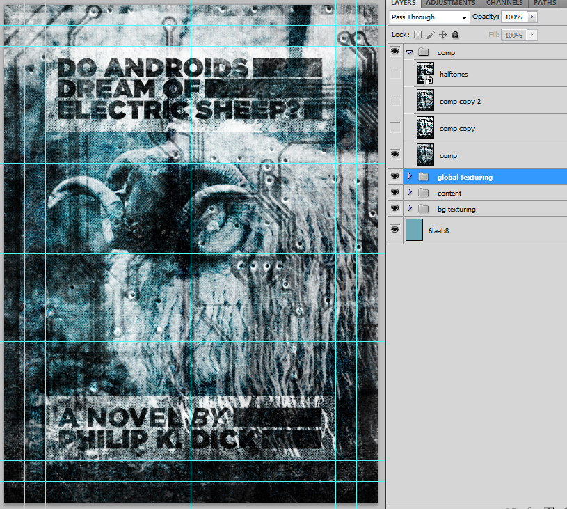
Once the cropping is done, let’s create a new layer that will include a merged copy of all the content of our piece so far. There’s a shortcut for this, it’s SHIFT+CTRL/CMD+ALT/OPTION+E. Once that’s done (and it can take a while, so go grab a warmer for your coffee mug), make 2 copies of that layer.
This is where the actions we’ve asked you to download will get useful. Get them loaded in Ps, and let’s play with them a little (Addicted to design wrote a quick how-to).
Run the first aging action on on the first copy of the comp layer. Here’s a preview of the result:
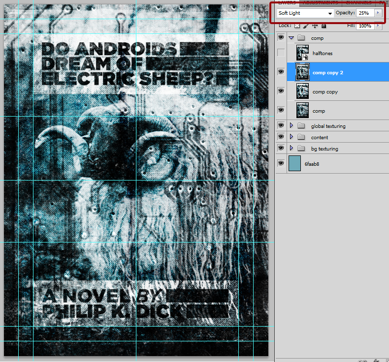
The action effect is a really harsh, almost xerox like (but with color) rendition of the piece. Let’s switch that to Soft light @ 25% opacity, for a less aggressive result.
Let’s turn back on the second copy of our comp and run the 2nd aging action on it:
For the same reasons as before, let’s switch this to Soft Light @ 25% opacity, and it’ll already look much better.
These 2 actions help to enhance the contrast, while still adding something of an aged look to the piece. Now the last piece, the halftone effect.
The halftone effect we use to finish most of the posters we do is greatly based on this tutorial written by Adam Levermore. Mad props to him. Let’s create another comp layer (once again, the shortcut for that is SHIFT+CTRL/CMD+ALT/OPTION+E). Once it’s done, rename it halftones and make it a smart object. Reset your color palette to black as your foreground color and white as the background color. We do this because your active foreground color will be used as the color of the dots of the halftone effect. Go to Filter > Sketch > Halftone pattern. Here’s what you should see:
The first thing you should go is head over to the zoom menu, and hit the “Fit in view” option. Now you’ll see what you’re doing. After that, we choose to emulate a pretty realistic halftone effect, with a minimum dot size of 5. We set the contrast at 15, like that it’s high enough to still show highlights and dark areas, but it’s also low enough for the brightest areas to how some of the halftone dots in them. Here’s the result:
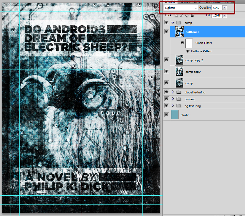
Now, it’s time to use to our benefit some of the smart object status of our halftone layer. First, let’s change the blending mode of the actual halftone effect. Double click on that symbol, noted 1.. Then, in the drop-down menu (2.), choose Soft light @ 100%.
And then, finally, we can put the blending mode of the layer on lighten @ 50%.
Now, hit File > save! Save it as a PSB, as the final file is over the PSD file format size limit. Our file weighs a whopping 2.5+ Gb. And here you are, with a neat grunge, Do androids dream of electric sheep?-themed, poster.
Conclusion
Thanks again for sticking with us to the end of this rather long tutorial. We hope we’ve given you some insight on how we do things. If you have questions, suggestions, love/hate messages, let’s get the discussion going in the comments! Also, if you want to follow the progress of the poster as we made it, you can check the stream of Dribbble rebounds associated with it.
Simon H. and Jon Savage, Studio Ace of Spade.


