Blog
Texture tutorial: How to apply our rolled ink textures to your design for that old-time print shop vibe
Introducing The Shop’s rolled ink texture packs, volume 01 and 02
Ladies and gentlemen, drum roll please. I’m happy to announce that my rolled ink texture packs are finally available on the Arsenal! Simon from The Shop here, and I’ll be walking you through both texture packs, as well as through a few techniques to make good use of them. On to the texture tutorial!
BUY THE SHOP’S ROLLED INK TEXTURES, VOLUME 01
So, what is it about these textures that makes them awesome?
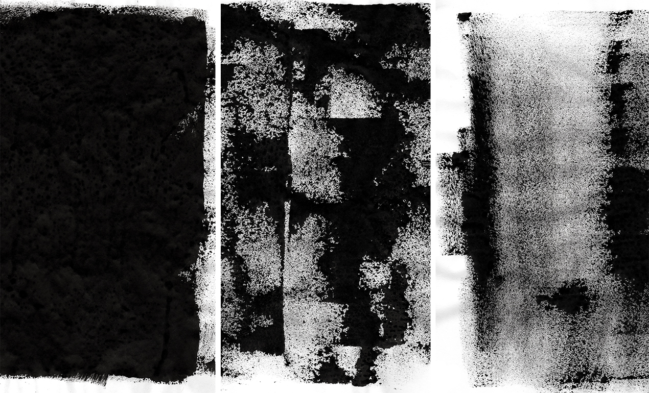
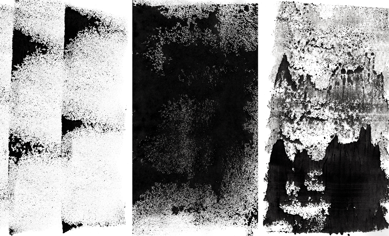
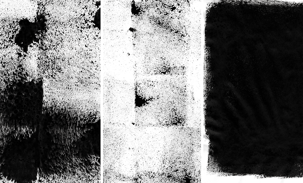
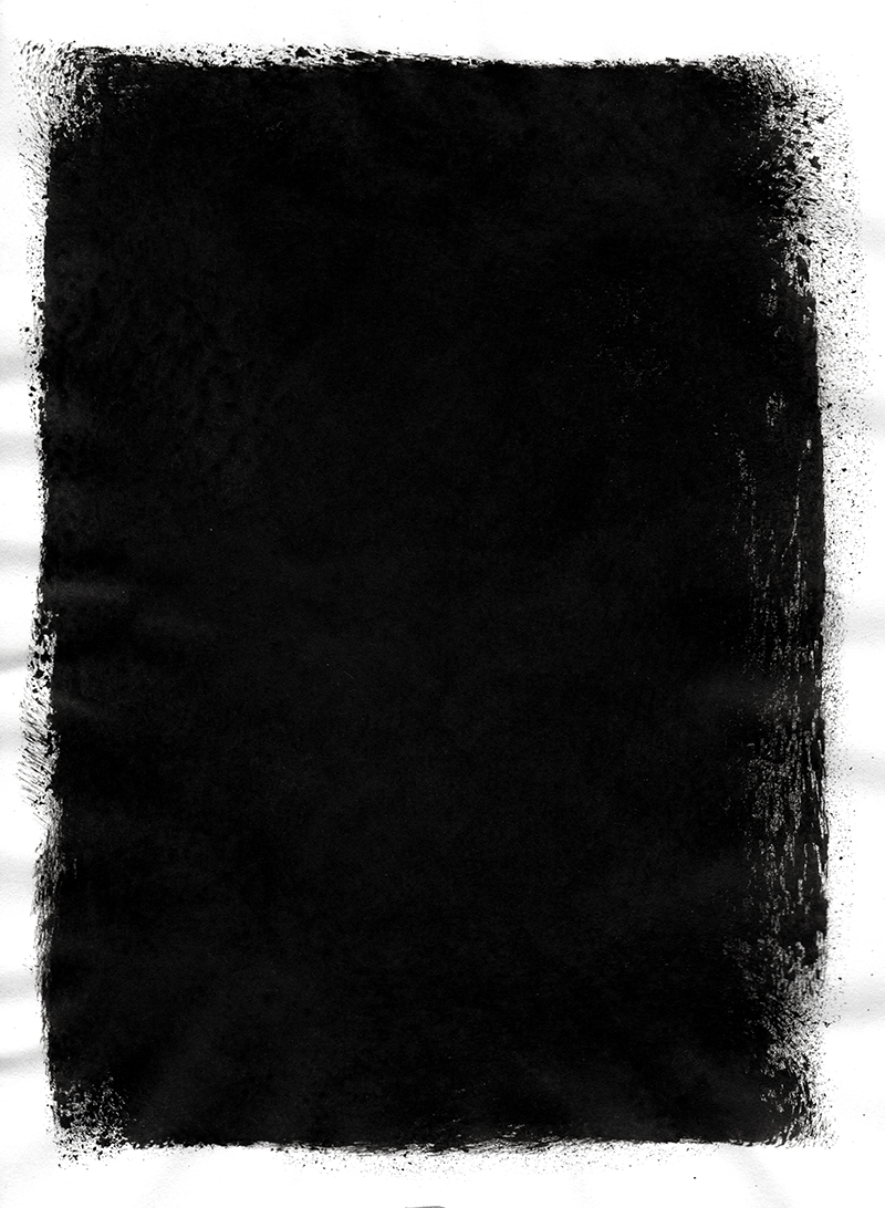
Well, for a start, they have been created by hand. I used both a foam and a rubber roll to execute them, and lots of rich, deep, black ink.
The result is that series of 28 textures in total (14 in each pack). After experimenting with pressure, ink quantity, roller motion, and paper types, the textures were left to dry for a few days. After the drying was complete, they were scanned in at very high resolution (800 dpi and more). Following the scanning process, they were carefully, and minimally edited to produce a set of textures sized at 5000 x 7800 pixels on average.
Both sets are delivered in the form of flat RGB .jpg images in a ZIP archive.
BUY THE SHOP’S ROLLED INK TEXTURES, VOLUME 02
Cool story, but how do I use these textures?
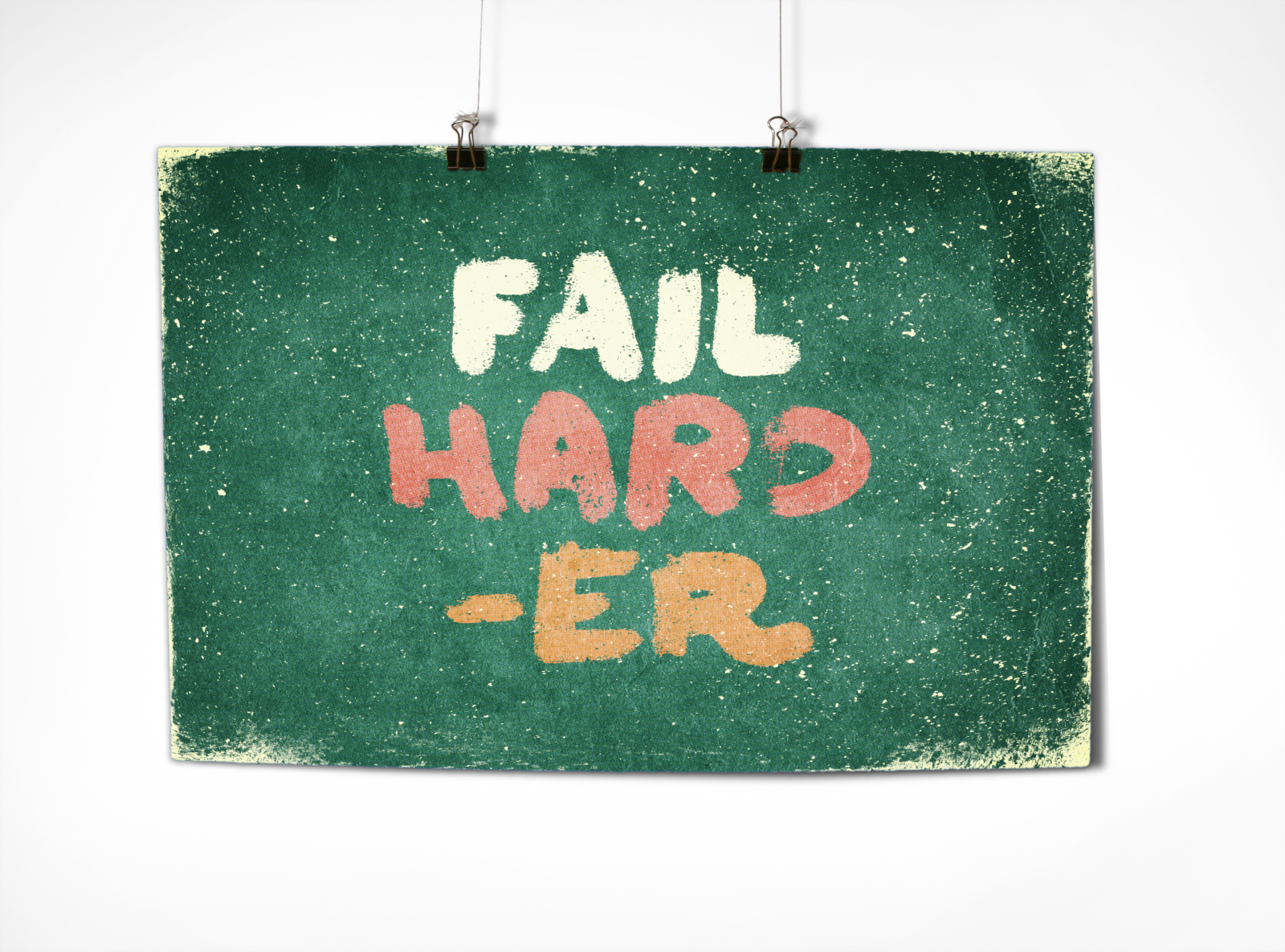
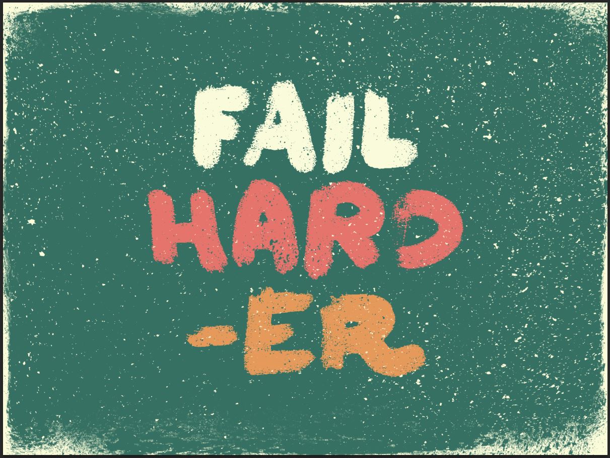
Oh boy, am I glad you asked. I precisely prepared a quick piece showcasing these textures, so we could experiment a little bit. We’ll use both Photoshop and Illustrator for this tutorial, but you should be all right with just Photoshop.
Step 0: Assets gathering
Before we get started, you’ll need to put your hands on a few assets.
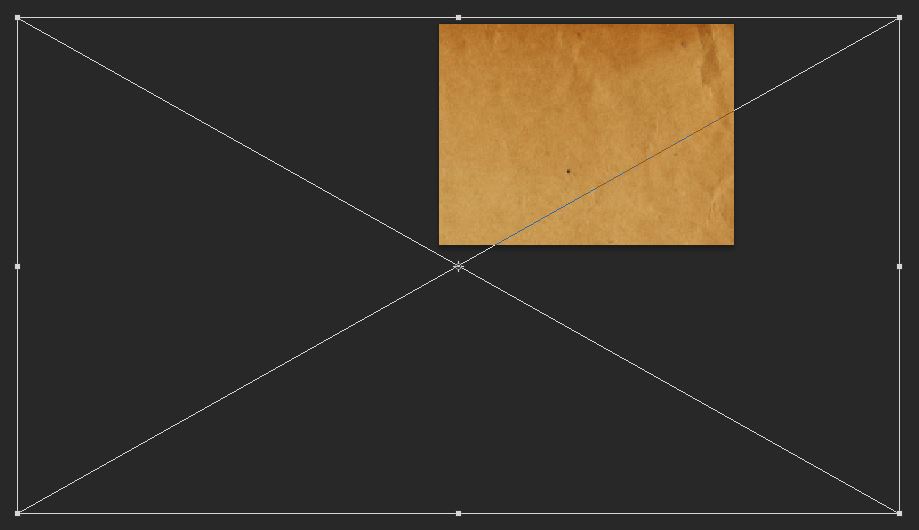
The first asset is an old envelope texture, courtesy of our very own Dustin Schmieding.
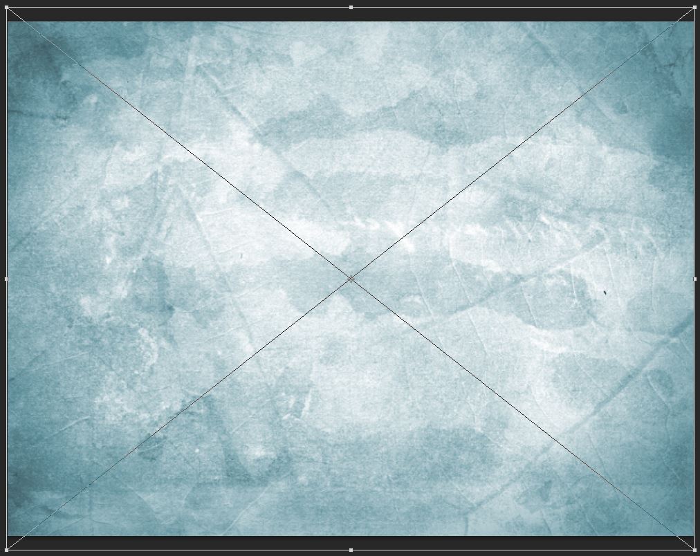
The next asset is a blue soft grunge texture, also from Dustin (through his Valleys in the Vinyl blog)
Finally, I prepared a small freebie pack for you guys.
GET THE TUTORIAL ASSETS AND FREEBIES
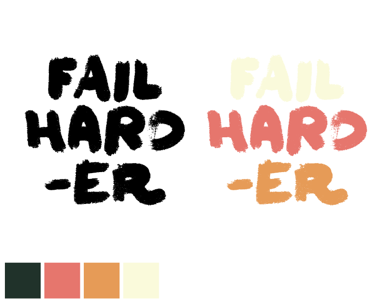
It includes the vector type element used in my piece. I crafted it using a typeface called Felt Noisy, made by the awesome folks at PintassilgoPrints. Consider buying that amazing, messy brush style font! You won’t regret it one bit. The file is available in Ai (CC), EPS (CS3), and PDF formats. It includes a black and white and pre-colored version of the artwork.
Talking about colors, here’s a palette I’ve established for my piece, based on the colors of WMC Fest!
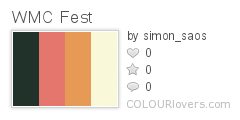
Color by COLOURlovers
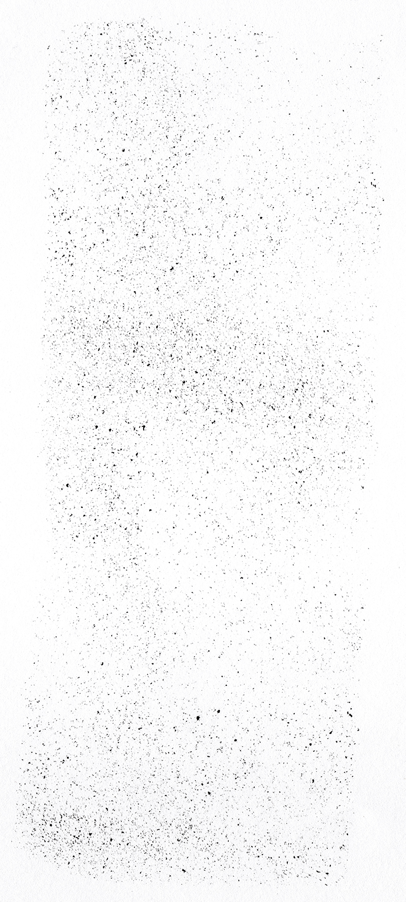
The freebies we’ve included in the pack are two of the textures from the Rolled ink textures, volume 02 pack. They are #4 and #12. They will be used in the tutorial.
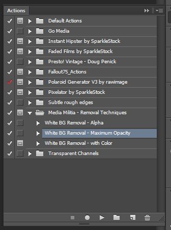
Finally, the last asset you should have at hand is a useful set of Photoshop actions by Media Militia. They allow you to turn white pixels to transparent ones, with a single mouse click.
I’d like you to also quickly read the post – it includes some background on how the actions work, and instructions to install them.
Step 1: file setup
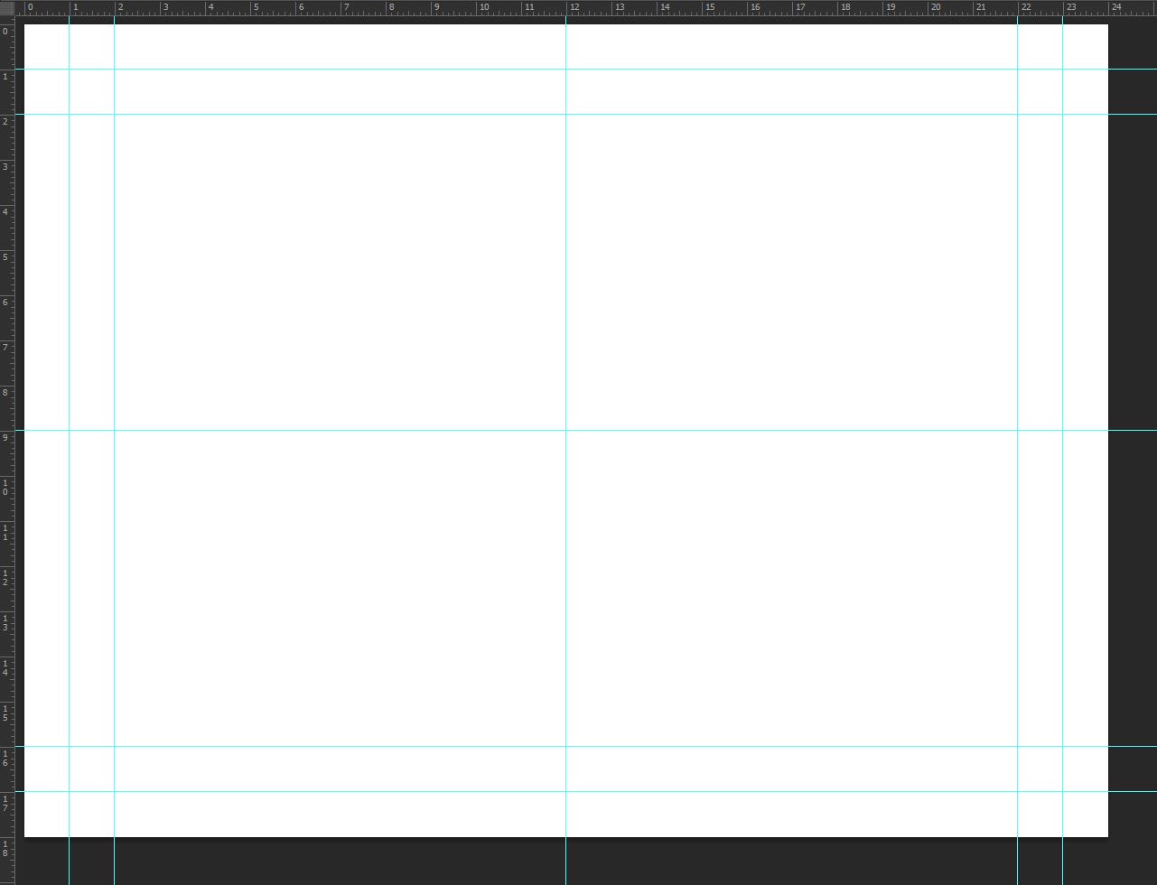
The first step is to create the canvas we’ll be working in. I’m using an 24″x18″ file @ 300 dpi.
I’ve also created a few guides to give a loose structure to work from. I’ve placed my vertical guides at 1″, 2″, 12″, 22″, and 23″. My horizontal guides are placed at 1″, 2″, 9″, 16″, and 17″. This “grid” gives me a quick indications of my piece’s center, as well as marks a nice border zone around it.
Step 2: the background
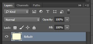
Start by filling your background layer with our bright yellow (#fbfbd9).
Feel free to double click on it so it becomes an unlocked layer.
Create a new layer above the yellow layer, and fill it with our dark green (#337061).
You know have two layers, one being completely invisible.
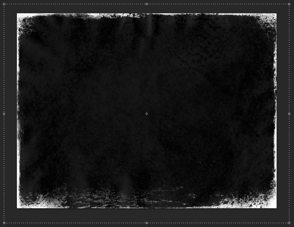
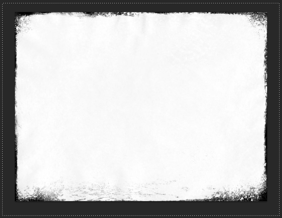
We’re going to leverage rolled-ink-texture-pack-volume-02-sbh-007.jpg from the second volume of the rolled ink textures. Pasted into a layer mask, this texture will allow us to reveal the hidden yellow layer. Visually, this will translate into a bright border around our dark piece.
Open the texture in Photoshop.
Select its content, and copy it (CTRL/CMD+C). Head back to our piece. Add a layer mask to our green layer.
Make sure the layer and the layer mask are “untied” to each other (no chain link). This will allow us to move/transform their content independently from each other.
Now, ALT/OPTION+CLICK on the layer mask to access its content. Simply paste the texture in there (CTRL/CMD+V).
In a layer mask, black pixels represent the parts of the image that will be hidden, and white pixels the ones that will be shown. The various gray levels represent the various degrees of transparency. With that in mind, we’re going to place our texture so it will allow a bit of the yellow layer to show at the edges of the piece. We’ll obviously have to invert the layer mask’s content to achieve our effect.
You can see that I’m slightly distorting the texture to fit the project/goal at hand.
Once the texture is in place, invert it (CTRL/CMD+I).
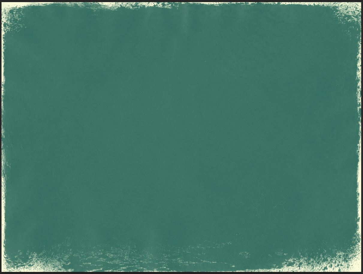
Click back on the layer’s thumbnail to admire our result. This is the perfect moment to further tweak the layer mask if the result isn’t quite where you’d like it to be.
I’m personally happy with the texture overall, but I think some of its artifacts (paper folds and creases) are showing too strongly. I’m going to use the levels panel (CTRL/CMD+I) to fix this. With the layer mask selected, bring up the levels. Tweak the various sliders until you reach a level you feel comfortable with. My values bring a stronger contrast to the texture, “washing off” some of its detailed creases, folds, etc.
And here’s our cleaner, and better defined result.
And we’re done with our background. Proceed to some house-cleaning (or else!), and let’s get ready to move on to adding the type element to our poster.
Step 3: bringing the type in
It’s time to move on to Illustrator, and to open one of the files containing the type element.
You have a couple options from here:
- Grab the pre-colored element, copy it, and paste it into your Photoshop document
- Use the monochrome element, tweak the colors to your liking, copy it, and paste it into your Photoshop document
- Get the Felt Noisy typeface, and use the many alternate characters available to tweak the type element to fit your tastes just right (and then paste it into your Photoshop document)
Because I’m already happy with my current color scheme, I’ll settle on the already colored type piece. Simply copy it, and paste it in your Photoshop document. I HIGHLY recommend keeping the type as a smart object, as this will retain its vector properties within your raster file. This could come in handy should you decide to tweak the type’s placement or size later.
Size the type to your liking.
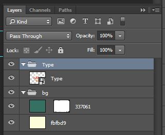
Once you’re happy with the type, proceed to organize things a bit.
It’s now time to finally use our rolled ink textures.
Step 4: using the rolled ink textures to create ink noise
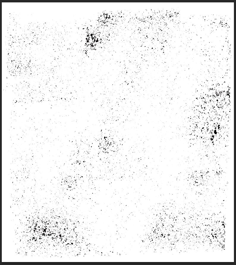
If you haven’t done so yet, it’s time to grab Media Militia’s actions, and to get them installed. Next, open rolled-ink-texture-pack-volume-02-sbh-012.jpg from your asset pack.
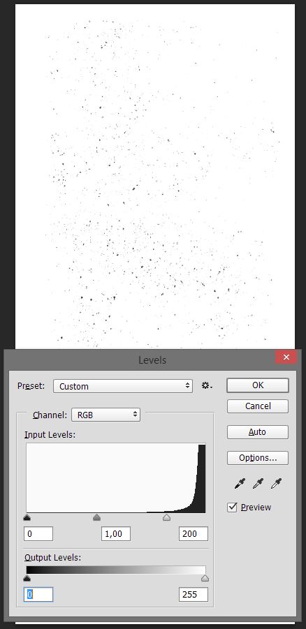
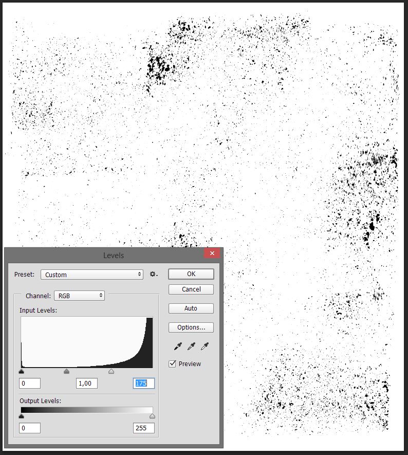
You can use levels to tweak the texture to your liking (lighter or darker).
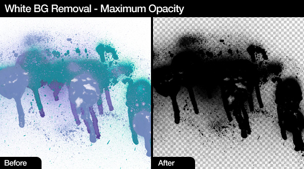
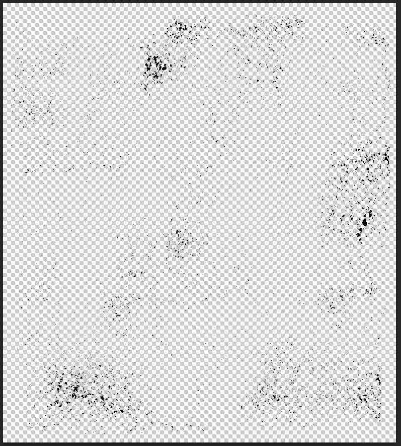
Once you’re done with that, it’s time to run one of the actions to obtain a version of our texture with a transparent background. Make sure that your colors are reset to the default (you can press “D” for that), and run the “maximum opacity” action. This will ensure the best result for the following steps.
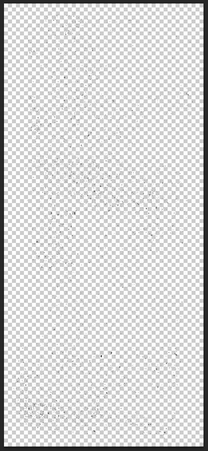
You’ll end up with a file looking like this
Simply drag it into our main file.
Turn it into a smart object (Filters > Convert for smart filters in Photoshop CC).
Once the layer is a smart object, resize it and position it so it covers as much of our piece as possible. It should also not have an overwhelming effect.
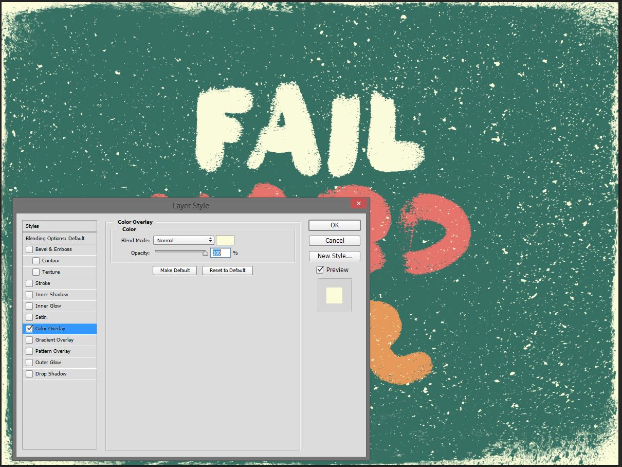
Once the texture is in place, proceed to give it a color overlay of our bright yellow (#fbfbd9).
Open rolled-ink-texture-pack-volume-02-sbh-004.jpg, and follow the same process. The only difference is that you’ll give it a green color overlay (#337061).
Once you’re happy with your ink effects, it’s time to organize things a little bit. I renamed my layers to reflect the textures that were used to generate them, and grouped them properly.
Step 5: textures!
It’s time to add a little bit of textures to our piece. This will tie things together, as well as add extra depth.
I’ll be using a texture workflow that’s as non-destructive as possible. I wrote extensively about following such a process for the good folks over at Design Cuts:
Adjustment layers, clipping masks, and clipped layers will become your new best friends. While it might seem cumbersome at first, such a workflow has many advantages. You could go back to your original piece of content in a heartbeat, by simply turning layers off. You could quickly change the intensity of an effect used during the making of the piece, to make it stronger or more subtle.
The gist of it is to use clipped adjustment layers to your textures, so you can revert your changes at all times. Makes sense? Alright, let’s get going.
The first texture is BB_AntiqueEnvelope_04.jpg.
Place it in your document so no seams are visible.
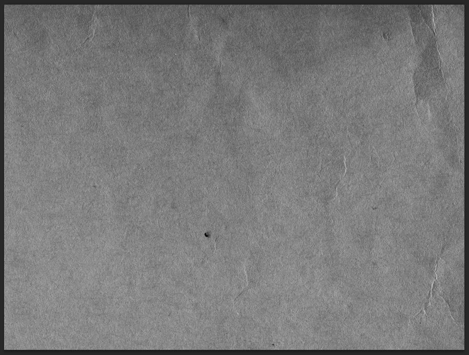
Desaturate it (the Saturation slider of the Hue/saturation adjustment layer is set at -100).
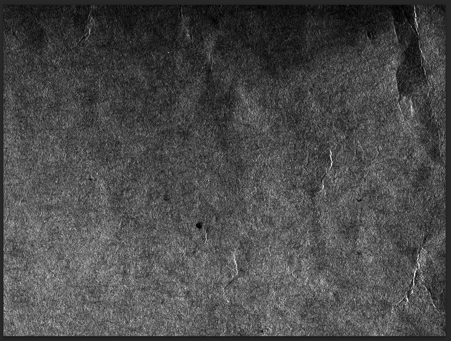
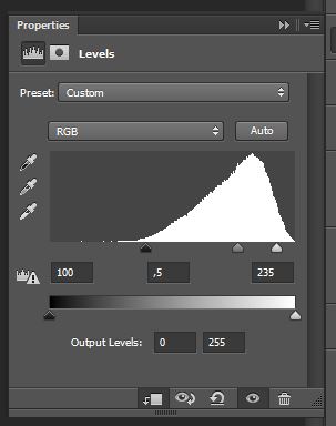
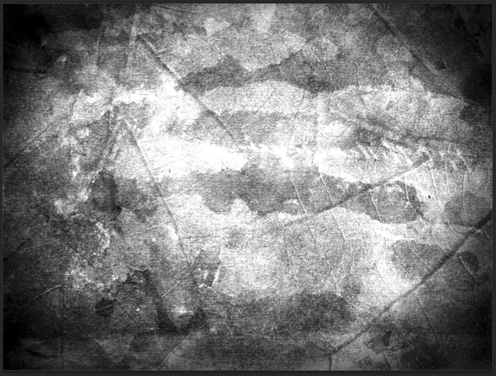
Next, use a Levels adjustment layer to bring the texture’s artifacts and grain out.
Finally, change the layer’s blending mode to Soft light @ 75% opacity.
The next texture is VV_ColoredGrunge_02.jpg. The interesting feature of this texture is that it features a soft vignette. We’ll make advantage of that to focus the viewers’ attention to the center of the piece, where the type is.
We’ll repeat the same process: place the texture as a smart object, desaturate it, use levels to enhance it, and switch its blending mode.
Blending mode: Soft light @ 35% opacity.
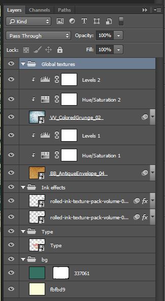
This concludes the texture part. Here’s what my layer stack is looking like.
Step 6: finishing touch
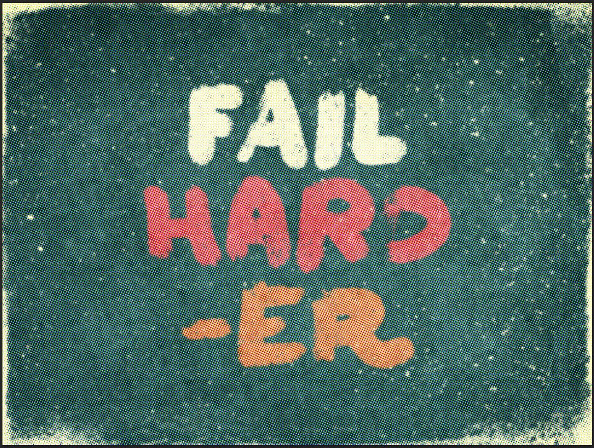
In our case, the finishing touch will be a subtle halftone effect. This will allow us to give the piece a tactile feel, as if it were printed.
Start by creating a merged copy of all your visible layers (CTRL/CMD+SHIFT+ALT/OPTION+E). I’ve renamed my copy Halftones.
Convert the layer to a smart object.
Proceed to add a Color halftone effect to your layer (Filter > Pixelate > Color halftone).
The result is obviously not adequate.
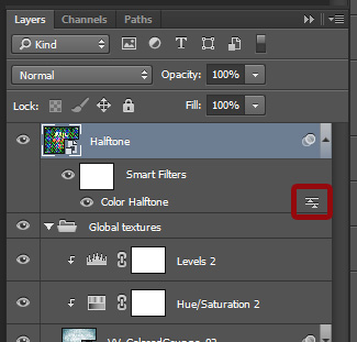
Start by changing the effect’s blending mode. You can do so by clicking on this little button, on the right of the effect name in the layer palette.
Change the blending mode to Soft light @ 100% opacity.
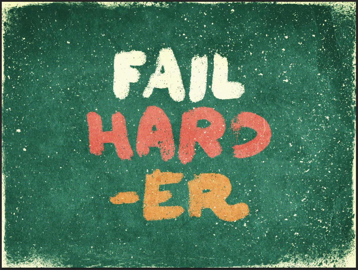
From there, change the actual layer’s blending mode to Lighter Color @ 75% opacity.
Because of the effect’s nature, the colors in the piece have slightly shifted. You can fix this if you don’t like the result by adding a hue/saturation adjustment layer, clipped to the halftone layer.
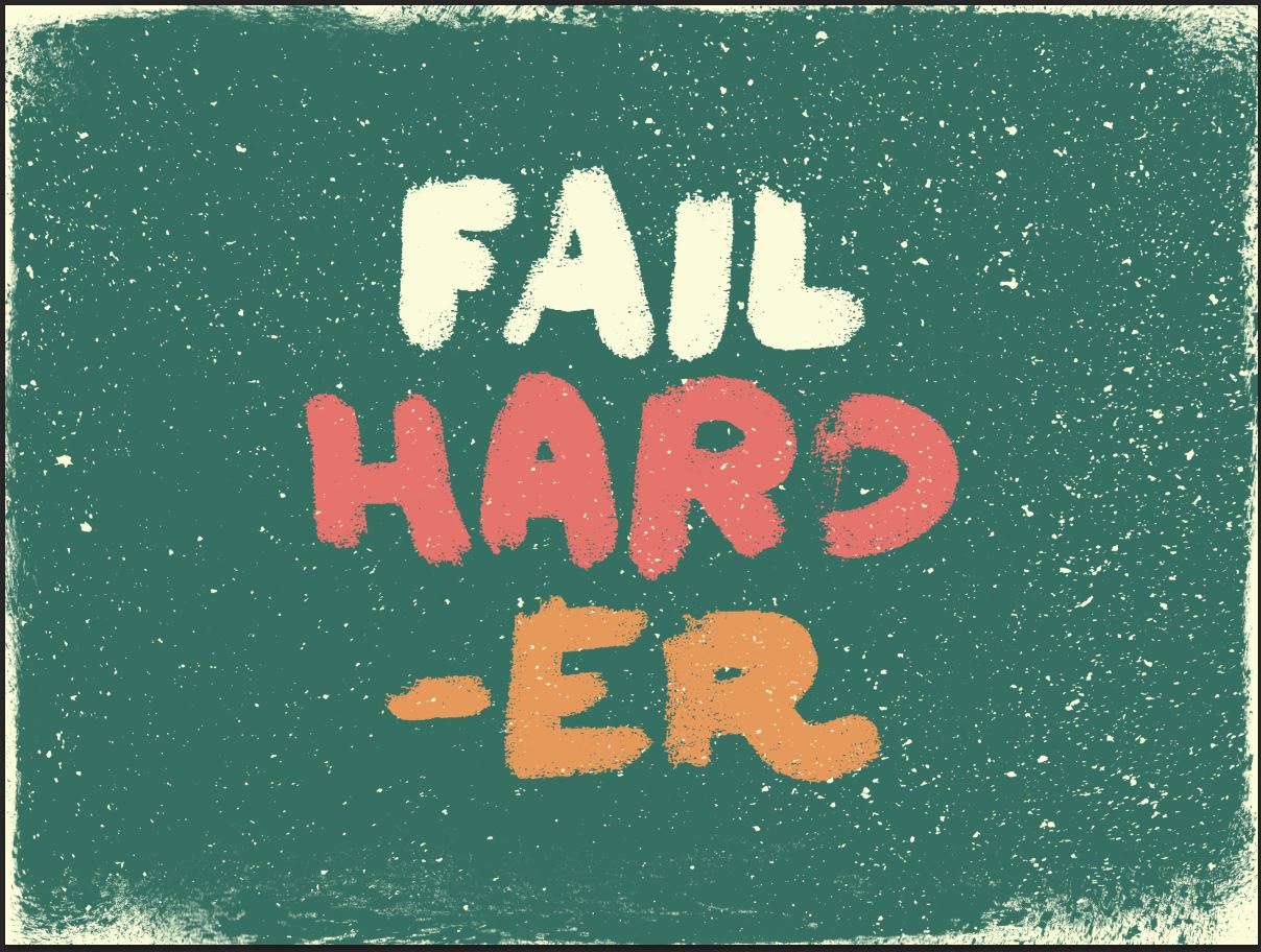
And we’re done! Isn’t it looking nice?
Concluding thoughts
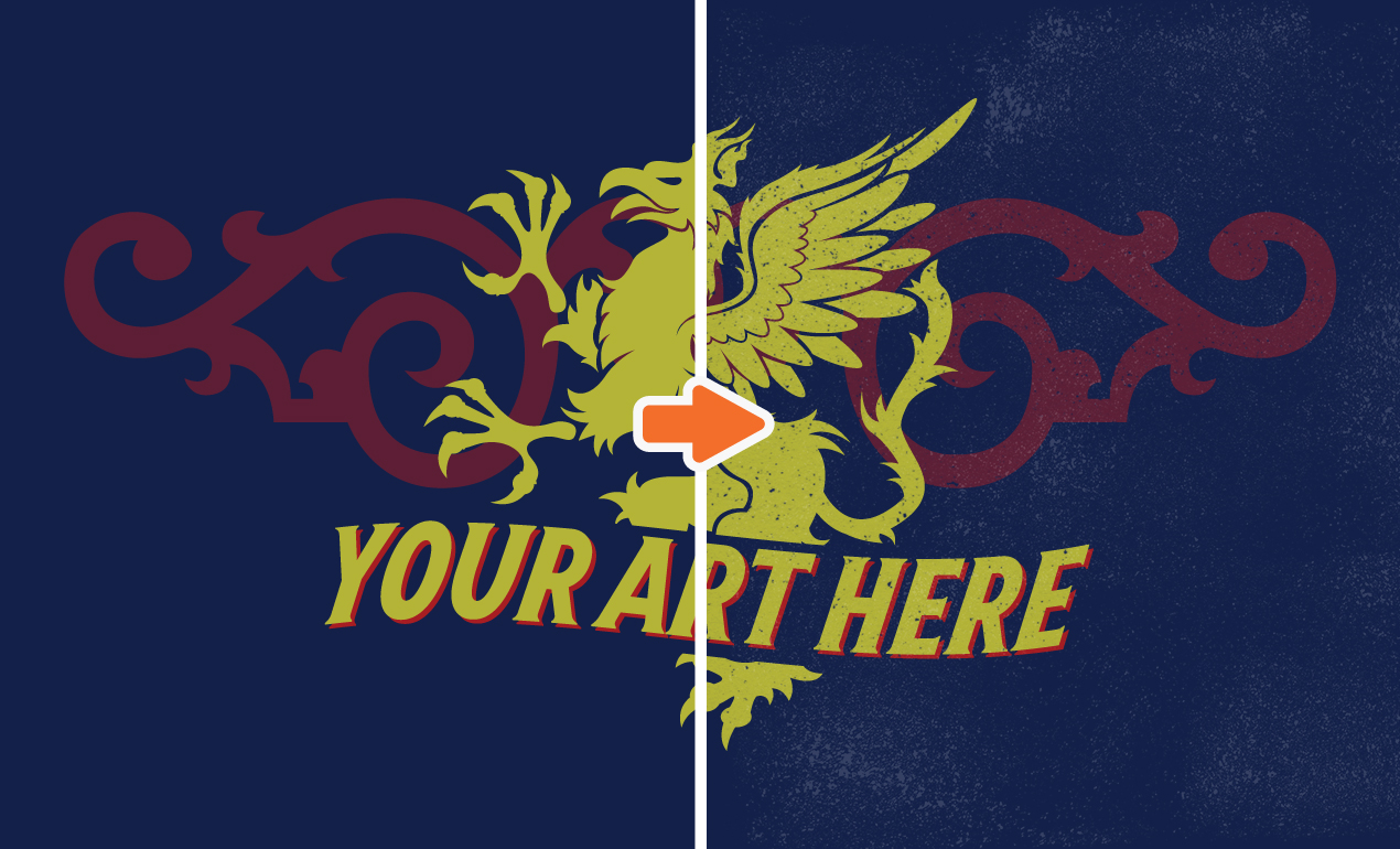
Well, we’re done. I hope you had as much fun following along as I had writing this tutorial. I also hope that this short write-up helped you to see the potential these ink textures have to quickly bring some ink elements in your designs, to be used as masks, or as textural elements.
Don’t hesitate to reach out if you have any questions! I’ll be watching the comments below, but you can also tweet at me @simonhartmann.
We’d love to see your tutorial outcomes! Don’t hesitate to post them on the Go Media facebook page, or in the Go Media Flickr pool, or in the Go Media Pinterest galleries.
Finally, don’t forget to get your hands on both volumes of The Shop’s Rolled ink textures!
BUY THE SHOP’S ROLLED INK TEXTURES, VOLUME 01
