Blog
Ornate Lettering Process

I’m going to show you the process as to how I do my ornate lettering. This is a new design I did for Stone Sour that utilized this technique. Now right off the bat, this is not a step by step tutorial. It’s more of a look behind the scenes into how I work. The very core of this process is having a solid drawing ability and a good understanding of letterforms, typography, spacing, composition, yada yada. Also, I assume you know your way around Illustrator, Photoshop, and 3D Studio Max. There is no simple process to this – so yep, that means it actually takes work! So for those of you who are only interested in a shortcut to get this look, you can probably just skip reading. Because there really isn’t anything short about this. It’s good old fashioned hand lettering that’s tweaked and finalized on the computer for a vector final result. Here is how I do it:

Start with a Sketch:

No of course, it took lots of bad sketches to get to this point. I probably went through about 4 or 5 sheets of paper with lots of various concepts. Once I had one I liked, I scanned it into the computer and placed it into Illustrator. Then I started creating my first letter using the Pen Tool.
Start Forming Letters with the Pen Tool using Sketch as Reference

I started placing basic geometric shapes (like circles) in place of where some of my major smooth curves are going to be. For me, it’s hard to get such perfect curves using the Pen Tool alone, so I give myself some help by putting circles in. I plan to clean this up later.
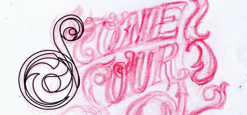
You can see I started getting a little more detail in there. Just creating shapes with only the Stroke Color on and not the fill. I’ll use the Pathfinder tool and subtract or add shapes together as I need to. Again, I will clean up this mess as I go.
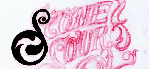
I started making my letters solid fills now and used the subtract tool to knock out some of the circles.
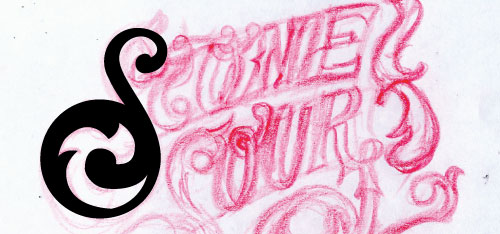
You can see now that the S is cleaned up. The basic form is down and I am happy with it. I will add more fancy frilly stuff to the S later. At this point, I move onto the other letters. I will skip some of the redundant steps, but I basically do the same thing. I trace out the shapes with the Pen Tool or use basic geometric primitives to give me a good base. And tweak and tweak. I’m not afraid to merge shapes together and then tweak the points.
Continue to build the rest of the letters
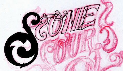
Here is the rest of word Stone in its basic form. You can see each shape I created with the Pen Tool. Some of the perfect circular shapes were just circles that were merged with the other shapes.
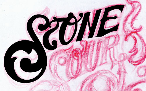
This is what the basic form of the word “stone” looks like. Let’s move on to the other letters.

Adding Swashes

I added a swash underneath the letters to fill the negative space there and balance things out. I created this by making a custom brush in the shape of a tall triangle. This way the brush starts thick and ends in a point as it progresses down the path.
Adding Details
Now that all the basic letterforms are finished, now it’s time to add in details. Smaller swashes, frills, flourishes, ornaments, etc. These are kind of improvised based on what I’ve already created. I just eyeball it and see what might look good where. I might see an area that is begging me to put a flowery type shape there. Or a certain place that might look cool with an ornate swirl. I also duplicated my S and mirrored it and put it on the right side. I dressed it up with some cool detailing and arranged it in the piece until I was happy. This isn’t a science here, it’s just about what you think looks good. This is where I can experiment and I usually try some things that I don’t like and move things around until I am happy. This is my final piece after all the details were finished:

I think it looks very cool at this point, but I know there is more I can do to give it some extra kick. I will merge all the shapes into one path and import the path into 3D Studio Max. From there I can make it a solid 3D object and can get some cool effects that I cannot get in Illustrator. Well, it’s sort of possible with Illustrators 3D engine but in my opinion, it’s not as accurate and creates weird shapes. And I just like working in real 3D anyway.
Import paths into 3D Studio Max
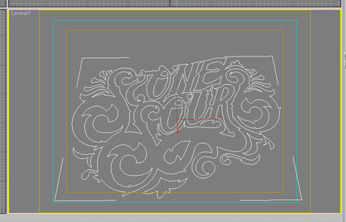
You can use whatever 3D program you want if you are trying this at home. But I grew up using 3DS Max. So here are my paths in 3D space. I set up a camera exactly how I want it, which is perfectly centered and in front of my object. I also moved it slightly down to sort of “look up” at my object from underneath – just a tad. This will give it more of a “big” feel.
Extrude the Shapes

I used the Extrude Modifier to give my text a 3D shape. In most cases I would use Bevel to give my shapes a more realistic edge to them (because real life objects always have at least some sort of bevel on the edges and are not perfectly flux together). Bevel gives edges an accurate highlight along them and can really add to the realism of the piece. But in this case, since our final output is vector and NOT a photo realistic 3D piece, extrude is the tool to use. So while extruding, I simply tweaked my settings to my liking. Now it’s time to choose my materials that will best help me export this beast in a format that I can live trace easily.

Pick Materials

I want my letters to be white and the sides of them to be black. This way the letters will really pop. To do this, I applied an Edit Mesh modifier to the stack and sleceted only the front faces of my letters. I made a material that was white and self illuminated. This is guaranteed to be white with no shadows. I applied this to my letter faces and then selected the inverse. As a result, everything else was selected. I gave the remaining selection a black material that was self illumincated to prevent any odd shadows or highlights from affecting my final output. This is good if you plan to live trace your 3D rendering which I am about to do.
Render a high res image

Once I have the materials applied the way I like them, I render out a high res image – usually bigger than 2500 pixels. This gives me a nice size image to live trace. Also, render using a TGA file extension with an Alpha Channel. This is so you can easily cut your image out of the background.
Live Tracing
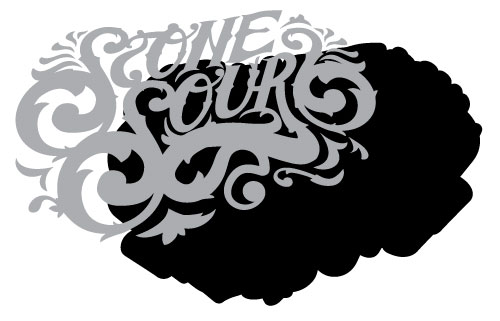
Before I Live Trace in Illustrator, I must go into Photoshop and separate my colors. For the whites, I select my highlights and invert them and copy and paste the now “black” letters into Illustrator. They’re ready to be live traced. For the black shapes, it’s a bit different. I make a copy of my render layer and use it’s Alpha Channel to make a selection and delete the background away. I make a selection around my rendered image and fill it completely with black. Then I give it a good sized stroke to give it some extra thickness. Then I take that into Illustrator and live trace it using the default settings. Here are the two pieces as you see them in Illustrator after they have been live traced:
Final Result

I hope you enjoyed a look behind the scenes into the creation of Ornate Lettering.
Here are some other examples using this technique or similar:


