Blog

Tutorial: Creating an abstract vinyl sleeve with graphic textures
Excluded Rough Grunge and Etched Into Dark Texture Pack Tutorial with Maarten Kleyne
Maarten Kleyne, a freelance graphic designer from the Netherlands, feels music. Kleyne believes wholeheartedly that music is a key element in the creation of his final product. Inspired by the works of Steven Wilson and Lasse Hoile, his portfolio is filled with images including cd packaging, posters and collaboration artwork. Recently, WMC Fest alum Maarten cranked up his stereo, picked up his camera and created some texture packs for Go Media’s Arsenal. We are so proud to add his texture packs into our resource library.
We’ve asked Maarten to create a tutorial based on these textures, in order to demonstrate how you might like to apply them.
— Heather, GMZ Editor
Thanks for the introduction Heather and hey everyone! A while back I was wearing my crazy ear-to-ear grin the entire day, because the lovely people from Go Media asked me if I was interested in doing “some stuff” for them again. It’s no secret that I’m a huge fan of everything Go Media so I obviously said yes.
The first parts of my work have recently launched on Go Media’s Arsenal as the two texture packs: “Excluded Rough Grunge” and “Etched Into Dark”. Now – like the introduction said – I’d like to show you one way to apply these in a design through a quick and simple-to-follow tutorial. There are many other ways you can utilize the textures we’ll be using. This tutorial simply highlights one of those; a way I personally use textures quite often when creating a design.
Note: If you want to follow along with this tutorial, you will need to purchase the new packs. If you don’t you will probably still get something out of the tutorial, because I’ll try to keep it general. You will, however, get the best results from using textures from the set(s). Grab the “Excluded Rough Grunge” and “Etched Into Dark” texture packs while they’re still hot!
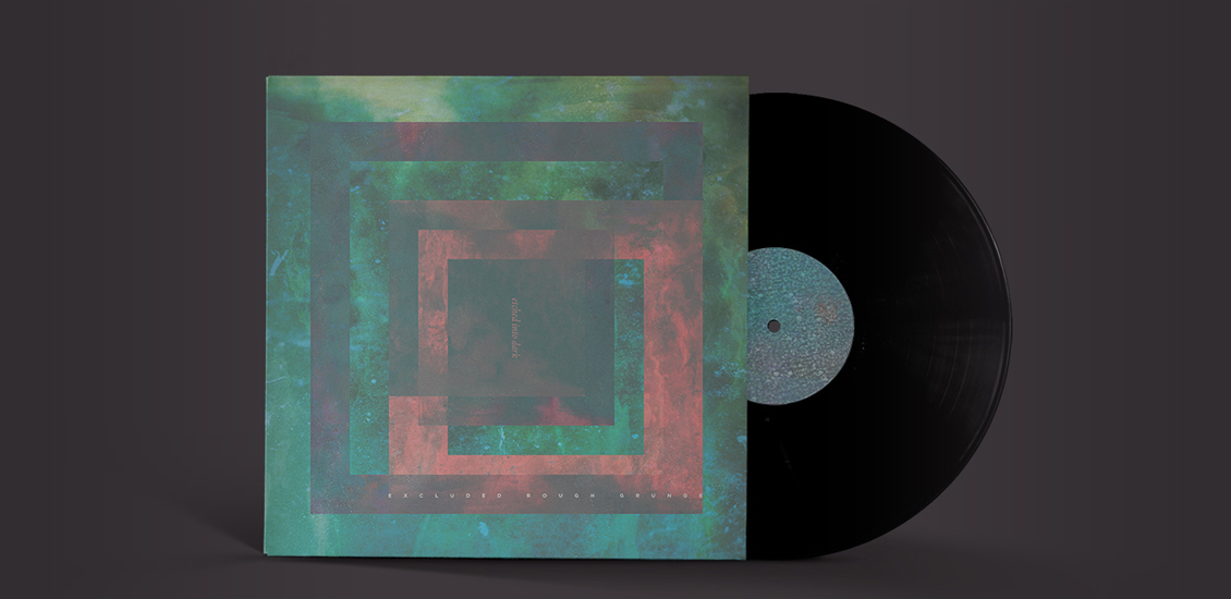
For this tutorial I chose to go for a 12 inch vinyl cover format. I’m truly stoked to see the vinyl record make something of a comeback, if only for the bigger canvas space we designers have! Now, back on-topic: In order to keep a focus on the texture usage, we’ll be creating an abstract – perhaps somewhat psychedelic – front cover. Here’s a preview of the final design we’ll be creating in this tutorial:
Good to know: Throughout this tutorial you can click on most of the images to enlarge them.
We’ll take our time and go through this step by step. Don’t worry, I’ve kept it a simple-to-follow tutorial. (I just use a lot of words, sorry. It really is simple though.) There’s a whooping total of 10 steps we’ll go through.
Some steps only cover the essential basics because I advocate experimentation, I want you to go beyond just following the steps if you don’t mind. Just try and experiment with the things that’ll pass along and I’m sure you’ll get a truly amazing and unique design because of it.
Feeling reluctant to experiment? You can still create the same thing by following the steps. I would, however, like to emphasize that you should try and experiment with things to create something different. It’s one of the best ways to learn, in my opinion.
Ok, so here it goes:
Step 1: Set up your Photoshop document
Open Adobe Photoshop. I’m using version CS6, but I’m sure any version will do for this tutorial. Now go to File > New and setup your new vinyl sleeve document with the following dimensions: 12½ x 12½ inch on a 300 DPI resolution. The ½ inch is just some safety bleed space I’m keeping. You can use CMYK or RGB color mode for now. I find RGB easier to work with at first, you can always convert it to CMYK at a later point. If you go to print that’s obviously something you shouldn’t forget.
Step 2: Purchase and download one or both new packs
If you haven’t already, take a minute to purchase and download the texture packs we’ll be using from Go Media’s Arsenal. Download the “Excluded Rough Grunge” and/or “Etched Into Dark” packs. We’ll use both, so in order to get the best results I’d advise you to get both too. You can skip this step if you already have some textures you want to use. However, this tutorial is meant to show you a way to apply those from the Arsenal.
The benefit of using the premade textures from the Arsenal is that it saves you time and can help you achieve professional results. I frequently use textures myself. Basically, there’s not a single design that I make without the use of textures. Sometimes I’ll use textures in a very subtle way and sometimes quite heavily to form a complete design. That first case will be the thing I will highlight in this tutorial; the subtle addition of textures. What you’ll hopefully come to see is that the vinyl sleeve we’re making couldn’t go without those subtle additions. They’re essential.
Step 3: Create a ‘foundation’
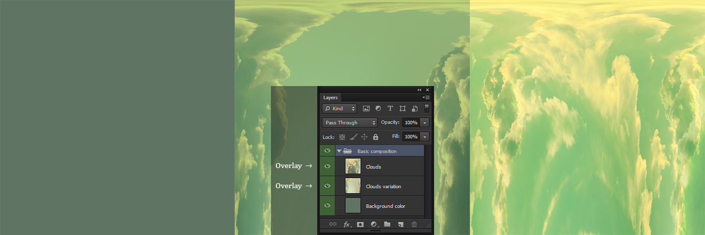
Before we actually start using textures we’ll need to make a basic ‘foundation’, or ‘composition’ if you will. First, fill the background with a color of your liking. I chose to go for a darker greenish (#5f7463) color.
Next, place or paste a photo/texture of clouds on a new layer and have it fill the entire canvas. Then use the filter: Filter > Distort > Polar Coordinates > Polar to Rectangular (yes you can actually find a use for this).
Place or paste the same original photo/texture of clouds on another new layer. This time flip it a 180 degrees before applying “Polar Coordinates”.
Set the blending modes of these two cloud layers to: Overlay.
Step 4: Add the “Excluded Rough Grunge” textures
In this step I’ve used “Excluded Rough Grunge” textures 7 and 13. Place them into the document and have them fill the entire canvas. Add texture 7 first and set its blending mode to: Screen.
This is something I often do with greyscale/black and white images. It only pops the whites. This way we quickly start adding roughness to the artwork.
Add texture 13, canvas filling and blending mode set to Screen as well. Duplicate the texture 13 layer and rotate it 180 degrees. Perhaps move these 3 layers around a bit to find a suitable spot for the white rough spots. Add other/more textures if you feel like your design needs them.
Step 5: Bring in another color
Next, add a contrast color, something truly opposite from the green you have chosen. I used some orange colored clouds. Don’t worry, this color will not be seen later. The point of that will become obvious.
Add this color in whatever way you prefer, just make sure it’s not a solid color. It has to have a bit more variation to it. A good choices here could be to use water color, lens flare or colorized clouds textures. Or you can go mad with a brush yourself. Just make sure it has some dynamics to it. Don’t overthink it though, because like I said: it’ll be used in such a way that the colors itself will not be shown.
Place this new color layer on top of the others and set its blending mode to: Difference. (Doing this will directly show you why the color did not appear)
Step 6: Add the first “Etched Into Dark” textures
In this step I’ve used “Etched Into Dark” textures: 1 and 10. Place them into the document and have them fill the entire canvas. Add texture 1 first, invert its colors by pressing CTRL/CMD+I or by going to Image > Adjustments > Invert. After that set its blending mode to “Overlay” and its opacity to 30%.
Now add texture 10 and invert that as well (CTRL/CMD+I). Set its blending mode to “Divide” and its opacity to 35%.
Try experimenting with other/more textures and opacity levels to see which result you like best.
Now we’re going to add a ton of minor details by placing texture 1 all over the canvas, multiple times. See those little dotted spots on this texture? Add this texture with inverted colors to your document again. Set its blending mode to: Overlay.
Add a layer mask to it and brush away all the white parts until only those dotted spots show. In order to make it blend into the background well, remove all the white stuff surrounding it. You can also try using different opacity levels.
Now scale it down a large bit to make those spots turn into little dots, or stars if you will. I call them “sparks,” and I’ve added them about 25 times all over the canvas.

Step 7: Transform the ‘foundation’ to several blocks
Ok, so now we have quite a nice ‘foundation’, right? Let’s copy it around and transform it into “something more”. Merge a copy of all visible layers into a new layer by pressing: Ctrl/CMD+Alt+Shift+E.
Now you have a new layer that’s an exact copy of what you’ve (visibly) made so far. Resize that layer to about 80% of the canvas size by pressing CTRL/CMD+T and changing the width to 80% at the top menu bar. Be sure to check the chain icon to have the transform maintain the aspect ratio. After that set the blending mode of this layer to: Exclusion. (Yes, this can also turn out pretty neat for a change. Right?)
Duplicate this newest layer (CTRL/CMD+J). Transform the duplicated layer to 80% of its original size as well. Re-select the original block layer, the one you made before this newest one. Now make a selection of the duplicated layer by holding CTRL and pressing on it in the layers panel. (Still following? I do hope so.)
Invert the selection (CTRL/CMD+I) and add a layer mask to the original block layer (that you should’ve selected). This should cutout the duplication layer from the original.
Now invert the colors of the duplicated layer by (selecting it and) pressing CTRL/CMD+I.
Go through this process a few times. Duplicate the duplication, cutout a part of it that’s smaller and invert it or not. Why “or not”? Well, sometimes the non-inverted results look better. I’ll leave that up to you to judge.
While going through this process be sure to rearrange the duplicated blocks here and there. Or not. Also, don’t cutout all the blocks. Keep some of them entirely visible. You can also try and delete the first duplication after you’ve cut it from the original. Then, you can duplicate the cutout version and re-size it as you see fit. Also, try different percentages to decrease the layers with.
There are plenty of ways to go here, all resulting in different compositions. Play with it, experiment!
Step 8: Add even more “Etched Into Dark” textures
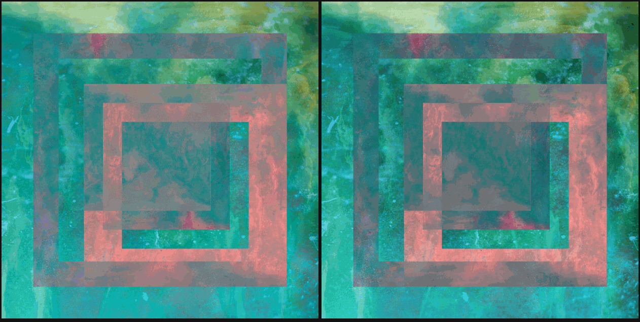
Remember those spots/stars/sparks/whatever we added back in step 6? Well, if you like things “rich with details”; add a whole bunch more. Add them on top of all the rest though. So not inside the basic composition, but on top of the block copies. By doing so you’ll enhance the blocks themselves some more as well.
Here’s about 25 more of them added, however subtle they may be:

Step 9: Add some final touches
Most of the time I use adjustment layers to add a certain “final touch” to a design. In this case I added three to enhance the artwork an extra bit. The adjustment layers I added were: “Curves”, “Gradient Map” and “Vibrance”. See the image below for the settings I used.

Now, add some text to it in whatever way and font you see fit. It will be a vinyl cover after all! Of course you don’t have to do this. When you’ve done that (or not) and you deem the design ready, do one last thing. This is something I always do to bump up the sharpness of a sleeve and to make all the little details pop out just a wee bit more. In print that might be lost a bit, which is exactly the reason why I do the following:
Merge a copy of all visible layers into a new layer by pressing: Ctrl/CMD+Alt+Shift+E. Use the filter: Filter > Other > High Pass with a radius of 5,0 (or any other value). Set the blending mode of this layer to “Overlay” and change the opacity to something more of your liking. I changed it to 50%. Try experimenting with this little technique. Try different radius values and opacity levels.
Step 10: Present it
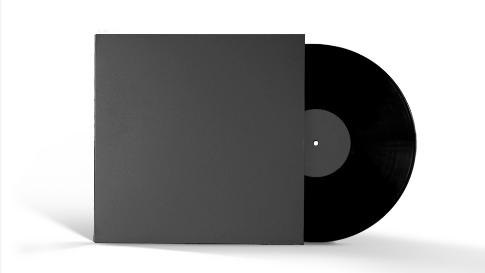
To help place this vinyl sleeve into context, try creating a mockup for it in order to make it look like a physical sleeve. You can easily do this via Go Media’s vinyl record mockup templates or their online mockup creation tool at MockupEverything.com!
Creating a mockup preview is an awesome way of presenting your design for a lot of reasons not stated here. It could even help you persuade clients about a design. It gives them an idea of how their product will look like as a real-world product, in this case the vinyl sleeve.
So what should you use, templates or the web tool? It’s a personal decision, yes. On one hand, the vinyl record mockup templates will give you a (near) print-ready image. You could print it out and show it to a client while meeting. If you’re sending the preview over via email or a website then http://mockupeverything.com/ is probably best for web-ready presentation. It also keeps the file size lower. Clients might like that. It saves them some space, and makes sure it won’t max out their inbox quotas (and yours!).
In case you don’t know how to use Mockup Everything or the templates, Go Media has put some neat demo material together on how to use Mockup Everything.
Mocking up the artwork we just made – in my case – results into this:
That’s it, you’re done!
You should now have applied some quick techniques while using the textures from the new “Excluded Rough Grunge” and “Etched Into Dark” texture packs to create an abstract 12 inch vinyl sleeve.
Hopefully this tutorial was simple to follow, helpful and even inspirational. Aside from that, I hope the textures will prove of great use to you in many designs. If you create(d) your own sleeves, or something else, using these textures, I’d love to see it. I’m very curious to find out and see how you apply them, so feel free to share those designs. There’s actually a special Go Media place for that!
Show off your results
On the Arsenal Facebook Page, you can post the images you created using Arsenal vectors, textures, fonts, etc. Please show me how you’ve used these products in the real world. It’s not often that we – as in Go Media – see the work you create with Arsenal products, so take this as a call to action to share it with us on the Facebook page.
For even more exposure, you can post your image in the GoMedia User Showcase on Flickr and/or comment on this tutorial below and link us to it!
Thanks for your attention and time! It’s much appreciated.
— Maarten


