Blog
The Lost and Taken Poster: A case study and texturing tutorial

Before We Get Started
Hello dear readers!
Simon and Jon from Studio Ace of Spade here. Today, we have the chance to write a tutorial about one of the Studio’s recent projects, the poster we did for Lost and Taken. What’s great about this particular project is that it gives us the occasion to do a tutorial we’ve wanted to write for a long time: texture, texture and more texture.
We already had a writeup including some tips and tricks about textures published recently, but it was web oriented. Web is a world were subtlety is a key word, so we had to restrain ourselves quite a bit. This time, we can use the full extent of our texture repertoire on a print project.
Throughout this tutorial, we’d like you to keep in mind that we don’t want to give you a “recipe” that you’ll follow exactly and religiously, but rather a open-ended answer to a creative problem. It will give you room to adapt and improvise in your own ways. We want to nurture your creative process by sharing ours, not to kill it or to “dry it out.”
It’s hard to reconstruct the design process sometimes as for most designers it’s really organic and trial-and-error based. But, we’ll do our best. We’ll try to link to the resources we used as much as we can, and to reference other articles that might have been helpful in our process or that could expand your reflection.
If you have questions, want to share what you came up with while following this case study and tutorial, want to suggest different techniques, want to suggest ideas on how to make this better, please do so in the comments! Also, we’d like to precise there is a complimentary article to this tutorial posted on the Studio Ace of Spade blog that details much more the case study part. We decided to split the original post in half (-ish), as we thought 6000+ words would be a bit intense for people to go through.
Here’s a preview of what we’re going to be doing, beautifully mocked up:

With all of this said, let’s get started, shall we?
The Design Specifications
At the start of this project, here’s what we knew:
- The poster will be 18″ x 24″
- The focus should be on a strong type element
- There’s plenty of creative freedom
As this poster was being designed for Caleb of Lost and Taken fame, we were certain to keep him as involved in the project as possible. Through further discussion, we further defined our constraints:
- Utilize “nature,” green and forest scenes, or something similar
- Cut-out shapes are something he’s interested in
- Geometrical shapes should be inlcuded in the design.
The Resources
As this poster was to promote Lost and Taken, we decided to use only L&T made textures. Here’s a list of the packs you’ll need for this tutorial:
- Vintage paper textures vol. 1 (published at Design Kindle)
- 42 vintage paper textures
- 15 vintage stained paper textures
- 19 block print textures
- Old film textures: color edition
- Black and white grunge vol. 2 (published at StockVault)
- Apple Rainbow inspired textures
- 10 experimental noise textures
- White grunge + snow textures
Download and install Massive Dynamite.
We’re also users of two Photoshop actions created by the good folks of Go Media. The actions age your artwork in two different manners.
The first action (“Aged 1“) has been created by Jeff to specifically distress and age type. You can grab it in the post he introduced it in.
The 2nd action (“Aged 2“) is from a two parts vintage poster tutorial written by Tim Boesel. The tutorial is awesome, you should read it too. But if you just want the action, its in part 2.
To install Ps actions, read this quick tutorial written by Addicted to Design.
Lastly, download the color palette used for this project.
Note: this resource is provided “as-is.” It’s been made by us, for our own use. Learn how to install the color swatch via this About.com post.
Selecting a Font
Here’s where the tutorial part of this begins.
Start by selecting a typeface. To narrow down our font choices, we opened Illustrator and went through our font library to select the some which fit the ‘vibe’ of the project. This is something that we strongly encourage all of you to try as it’s a wonderful way to ‘feel’ your font choices.
We’d like to point out The Lost Type Co-op, Hydro74’s Legacy of Defeat, Dafont, Font Squirrel and Abduzeedo’s Friday Fresh Free Fonts as great starting spots to find interesting typefaces. Most of the time they are free and/or donationware, which means that if you like the font a lot you can show some financial support to its creator.
After we received feedback from Caleb on his font preferences, we narrowed our search down to slab-serif fonts, as well as vintage sans-serif fonts.
We finally settled on a font named Massive Dynamite, created by imagex.
You may notice that Massive Dynamite is pre-grunged – something that we don’t necessarily like. Let’s clean that up a bit.
Cleaning up Massive Dynamite
The next steps were clear:
- Write “LOST AND TAKEN” in Massive Dynamite
- Create outlines (right click on the type object > Create outlines) of the type, to convert it to fully editable vector objects
- Switch the font from solid black to a transparent object with a black stroke
- Then comes the tedious part. By using the direct selection tool (the white arrow, A on your keyboard), I selected the paths corresponding to the grunge elements and deleted them, thus creating a “clean” font
We made a quick video summarizing this process. You’ll see it’s really simple.
Creating the Type
Well, now that the font is cleaned up, let’s complete the typelock.
Step One: Create a new 18″x24″ document in Ai.

Step Two: Put some turn on the rules (CTRL/CMD + R) and put some guides in place to determine how big that typelock is going to be.
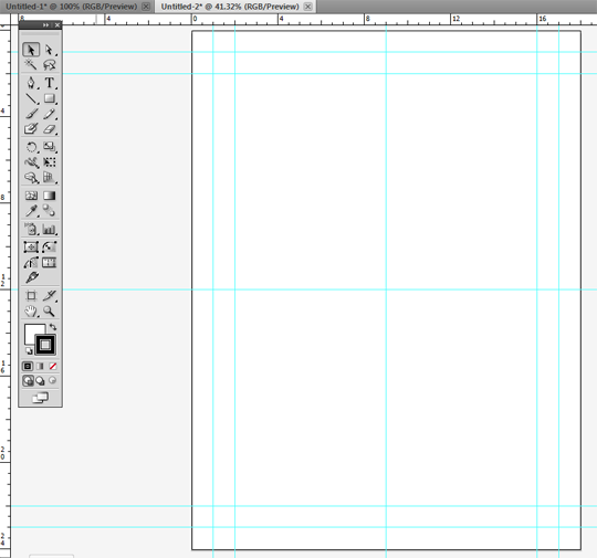

When we design in 18″x24″, we like to have guides at 1, 2, 9, 16 and 17 inches vertically and 1, 2, 12, 22 and 23 inches horizontally. Turn on “Snap to grid” (View > Snap to grid or CTRL/CMD + SHIFT + “) when placing the guides. Then, you’re sure they’ll be placed accurately.
Instead of locking the guides, lock the layer they’re on and rename it “guide“. As you’re designing, place the guides in the bottom layer. It’s a habit we developed after consistently moving guides by accident while designing.
Once the guides are placed, go back to our previous document with the type elements. They should still be one object. Copy and paste it (CTRL/CMD + C and CTRL/CMD + V) in the main document.
Step Three: Set line height and complete the type with geometrical shapes.

Select the type. Ungroup the object (right click on the selected type > ungroup), and then regroup the words separately. You just have to select the letters; use the CTRL/CMD + G keyboard shortcut to do so (or go to object > group). Once that’s done, move the three words closer together as shown.

On this image, you can see the type with its default settings, centered in document in black, and the typelock I used in the poster in gray.
At this point, what we’d suggest is for you to come up with your own typelock organization. Show your creative side! Our goal when creating this type object was to have something compact, bold, and impacting. We sized the type following that logic.
The rectangles have roughly the same height as the type they’re facing. To ensure this, we copied and pasted the values in the object size box.

The Final Step: Develop a ‘worn’ look for the geometric shapes we added to the type. In order to achieve the desired effect, use the roughen filter, in Effect > Distort and Transform > Roughen. Mad props to Simon Walker (he did a great post over at Method and Craft about that) and Dan Cassaro aka Young Jerks for tips and tricks when using this technique!

A point of advice: start by applying the effect to one shape, check if it matches the type you’re using, and then apply it to the remaining shapes. The appearance panel in Ai CS5 makes this a no-brainer. You can also use the Effect > Apply roughen menu (SHIFT + CTRL/CMD + E) to apply the effect with the same values to the remaining shapes.
Once that’s done, the type manipulations are done! Make sure the typelock is at least roughly placed as you will place it in the final poster, and preciously save that Ai file, just in case.
Choose a main image
We still hadn’t settled on the “base” image of the poster. We went to the Flickr Commons collection, and dug some images out. We were specifically targeting large files — big enough to be used at a print resolution (300 dpi).
The neat thing about the Flickr Commons is that a big part of the collection comes from the Library of Congress (LoC) and the U.S. National Archives (USNA).
These organizations have a policy to provide a relatively high resolution documents on Flickr. For instance, a train picture we used in a recent gig poster is available at a whopping 3000×2019 pixels. And sometimes, when following the permalink to the web collections of the LoC or the USNA, you can find ultra-high resolution .tiff scans of the originals (an example: 8000×7000 pixels @ 1800 dpi).
We chose a photo from the LoC collection over the other forest scenes because it was the biggest (6041×7839 pixels). The only downside was that we had to download a 135+ MB .tiff. But with an image chosen, it was finally time to switch to Photoshop for real!
Starting to manipulate the textures
This is where the fun begins! This is where we’ll work our texture magic on both the type and the background photo, blending them together in the best possible way. We’ll cover our main texturing technique, some tips and tricks, and additional goodness below.
Step One
The first step is easy. Let’s fire up Ps and create a new 18″x24″ document at 300 dpi.

“Print, you said? Then why the RGB colors? Isn’t print always in CMYK?” We’ll be using some effects and filters available only in RGB, so we’ll have to use RGB. The thing to know is that the CMYK spectrum is not as extended as the RGB one. It basically excludes some of the brighter and louder colors. As long as you keep this in mind while designing and you work with printers who know what they’re doing, you should be good.
You could also save your flattened PSD/PDF at the end in CMYK to be sure. But we would leave that to the professionals as they know what they’re doing with color. Once the document is created, you should also place the basic guides in it (we used the same measurements than when working on the typelock).
Open the forest picture along with your new document. You’ll notice that ours is a .jpg copy of the .tiff file as it’s a smaller file.

Step Two
Place the source image. It features the frame of the slide it’s been scanned from, which we decided not to keep in our poster. First, slide the photo in your document. Then, once it’s in there, close the original.
Back to the poster. Before resizing the image, right click and convert it to a Smart Object. This allows to keep “access” to the original file, even though you’re going to resize it and/or apply filters to it. Beware, this state still has some limitations. Once it’s a smart object, place and resize it as you see fit.

Step Three
After placing the image, sharpen it by using the high pass filter (Filter > Other > High Pass). Oliver Barrett explains the process for the unfamiliar. Use a value of 50 as it’s a big image, and put the high-passed layer’s blending mode on soft light.

Apply a black and white adjustment layer on the high-passed layer to increase contrast and depth.

Set the adjustment layer to Red filter. Group the black and white effect to the high passed layer by using CTRL/CMD + ALT + G.
Once this is in place, make sure your layers are properly named and group the original image, the high pass layer, and the black and white adjustment together in a group called “forest.”
Step Four
We decided that just adding textures on top of the photo would be a bit bland. So, what could we do to spice it up? We remembered a book cover we designed which had a similar starting point: a forest view. We also remembered a photo manipulation from Luke Beard. We decided to try something in a similar spirit.
Step 4.1: Create a merged layer of our current poster (CTRL/CMD + SHIFT + ALT + E). Desaturate it (SHIFT + CTRL/CMD + U),and press CTRL/CMD + T to transform and rotate it 180°.

Step 4.2: Open Ai and created an 18″x24″ document. You can also use the one from the typelock as long as you hide or lock the type piece to be sure not to damage/lose it. In our new document we created the following pattern:

We’re displaying it in Ps, but you can see the little smart object icon on it showing it has been imported from Ai. To create the pattern, do something along these lines:
- Turn the grid on (CTRL/CMD + ‘)
- Draw a 1.25″ diameter circle
- Copy it 8 to 10 times to create a line of evenly spaced black circles (the align and distribute tools can be of great help here), that go across the width of the poster
- Group the line you just drew together (CTRL/CMD + G)
- Copy it and paste it in front (CTRL/CMD + F). Repeat until you form a grid covering the surface of the poster
- In order to bring some variety in, just offset each other line (cf. the pattern we drew)
Once the pattern is done, group it together and copy it. Paste it in front in Ps (SHIFT + CTRL/CMD + V) as a smart object. Pasting it in front (or “in place“, as they call it) ensures that it will be sensibly in the same place as in Ai. Pasting it as a smart object will enable you to resize the pattern at will without losing its vector state. You can still edit it in Ai by using right click on the pattern layer > Edit contents. The changes will transfer to Ps.
Once you’re happy with the pattern you created, use it as the content of the layer mask for the black and white forest image.
- In Ps, you should have the smart object of the pattern looking similar to what we show above. Turn off all the layers you have in the document except for the pattern layer
- Drag it at the bottom of your layer list
- CTRL/CMD + click the pattern layer. Doing this will select the content of the layer. Once it’s selected, copy it
- Let’s add a layer mask to the black and white forest layer
- Let’s ALT + click the layer mask we just created. This will switch you to view and edit the content of the layer mask, and not of the layer anymore (just click back on the layer to exit the mode)
- Just paste (or paste in front) the pattern in there! You can slightly adjust its placement if you feel like it. Note that the content of the layer isn’t a vector smart object anymore, so be careful about resizing it, you might loose sharpness and/or details


That’s the concept. You’ll notice the layer mask getting that ‘cross-hair’ focus icon when you’re in layer mask editing mode. We weren’t sold on the result shown above.

Go into the layer mask editing mode, and simply invert its content (CTRL/CMD + I).

Further tweak the content of that layer mask, notably by adding a worn aspect to it. In order to do so, here’s the first time where we’ll use these Aged actions. Go back to that layer mask content, and zoom in a little bit.

Open your action palette (ALT + F9), and play the Aged 1 action.
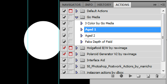

Aged 2 works along the same lines, but with different values which produces a different output. Our rule of thumb is to use Aged 1 on white and light objects, Aged 2 on dark and black ones. But we’ve also proved that rule wrong countless times.

This is what your layer mask will look like after the action has been played. Because we’re working on the content of a layer mask, you’ll also have to validate the levels panels. You could tweak the values, but I wouldn’t worry too much about that.

Now it’s a tad less sharp, less clean – much more organic. Let’s move onto a second pattern.

This one is built in Ai as well. Start with one black circle, and then start copying and pasting in front and increasing the size of each copy.

We applied the aged effect on it to make it look less perfect and digital.

And here’s the result! Time to texture that thing.
Background textures and coloring

Go back to that background: we’ll use the files paper41.jpg from the 42 vintage paper textures pack, vintage_stained_texture_5.jpg from the 15 vintage stained paper textures pack, and scan32.jpg from the Vintage Paper Vol. 1 pack.

The first one is used because of its beautiful paper grain. The second features some interesting dirt spots, speckles and intensity variations. The third has some folds and worn marks on it that will help to give the aged feel we’re looking for.

This is the current state of the poster, without the textures and the color overlay.

And here it is with them. So how do we do this? Rather simple actually.
- Open the texture file you’re interested in
- Drag it onto the poster
- Size and place it according to what you want to achieve
- Desaturate it (SHIFT + CTRL/CMD + U)
- Use the levels (CTRL/CMD + L or use a levels adjustment layer for non destructive editing, just think about using CTRL/CMD + ALT + G to make the adjustment layer apply only to the texture layer) to increase the contrasts and really bring the details you want to use out
- Sharpen the result a few times (x2 or x3), according to taste (Filter > Sharpen > Sharpen)
- Change blending mode according to taste
So where can you make the most impact in this process? The texture you’re choosing is important for sure, but also at steps 5 and 7.
The levels
Here’s a quick demonstration of how we use levels to bring out the texture goodness. We’re using scan32.jpg as the support for this example.

The values you see in the Levels dialogue box can be explained as such: the 100 on the left is the value of the dark tones, the 0.50 on the middle concerns the mid-tones (one of the most interesting ones to play with) and the 200 on the right impacts the light tones. You can also adjust visually with the little arrows under the diagram (black for dark tones, gray for mid-tones and white for light tones).
The Output levels section can also be useful. It defines the darkness of the darkest pixel and the lightness of the lightest pixel. It’s a good alternate for overall contrast control.
The blending modes
For a detailed blending mode explanation, we’ll invite you to go through this Visual guide to layer blending modes, done by Franz of FudgeGraphics’ fame.
These are the blending modes we settled on:
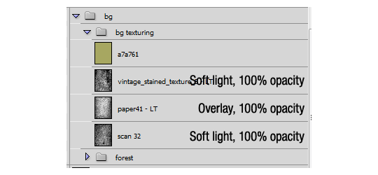
Let’s say it now: we are big fans of overlay and soft light. These 2 modes allow the details of the texture to translate on the design, without being overbearing (at least most of the time) or dampening color too greatly. When placing a texture in a design, we tend to go quickly through the full list of blending modes and choose the best.
Black and white textures
Using black and white textures utilizes the textures for the grain and detail they’ll bring without color correcting the piece all the time along the way. Sometimes, we won’t desaturate a texture, but it’s really rare and accomplishes a really specific purpose (the texture’s colors match or complement the color scheme of the project you’re currently working on).
This is actually why we have that color layer on top of our textures. Even if we felt the design was good with the contrast of the black forest, we wanted to bring at least a hint of color into these black spots.
The color overlay
Load the color swatch you installed earlier. Locate the Laurel green (#a7a761) on the swatch. Add a layer on the top of the textures, and fill it with color. Choose a blending mode for that layer to still be able to see the design underneath. We played with just the opacity of the color layer, Multiply, Overlay and Soft light.

It looks neat, but we lose a lot of contrast, and we want the background to be much more discernible.

This is what happens typically while using multiply: everything becomes darker. Not a fit for our goal either.
Here’s where the awesome happened. We were ready to switch to overlay, when we made a wrong click and the blending mode that got selected was darken. Admire the result:

Because of darken‘s properties, the color was applied to the black and white elements from our upside-down forest image, and the rest of the background stayed mostly untouched. Mistakes can show you the way. Also, if you haven’t grouped your layers into a bg group, now might be a good time to do so.
Texturing the type
Step One
Now that the background is done, add the type. You just have to copy your type in Ai, and paste it in place in Ps. Let’s look at the structure of the type layers:

You can see that there’s a bunch of typelock smart objects stacked together, with a Hue/Saturation adjustment layer and a layer mask. Let’s deconstruct how the effect works:

This is the type on overlay, with just one of the layers turned on. The nice thing about overlay is that it lets a lot of what’s behind show. But with just one layer, the type isn’t really readable. Let’s start by stacking copies, still on overlay…
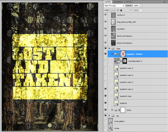
As you can see, the type is getting sharper. There’s still too much background showing up. Let’s add some more.

Step Two
After five copies on top of the original smart object, the type is legible enough. Now, as you can see, it’s overly saturated. Hence the Hue/Saturation adjustment layer:

Now, the type blends in way more, with a more natural “fall” color. Oh, before we forget: the original color we applied to the type in Ai was #faf9a6. The color is called “Crocus yellow” in that Chevy color swatch.
You’ll notice also that the adjustment layer is applied only to the type. To do that, we just CTRL/CMD + clicked one of the type layers to select its content before creating the adjustment layer, which creates the appropriate layer mask revealing only the selection you just made and hides the rest.
Step Three
There’s also a layer mask with some grunge effect on the typelock’s group. Here’s a before/after shot:
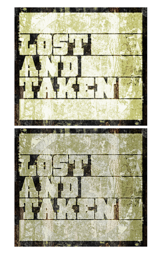
Let’s look at the content of the layer mask:

Guess what will help you to accomplish this? The Aged actions, of course!
- Create a new layer mask for the typelock group
- Go into the layer mask content edition mode (ALT + click), and CTRL/CMD + click one of the type layers to get the outline of your type selected
- With the selection active, select the layer mask again
- Fill the selection with black (SHIFT + F5 > Black)
- Let’s play the Aged 1 action
- Now, you need to invert the result (CTRL/CMD + I). Make sure the selection is still active! The layer mask now simulate the edge of the type having received a lot of ink, while the center of the shape not so much (think ink trap)
- Let’s run Aged 2
- Deselect
Some screenshots of the process:


Experiment with levels and other contrast adjustments to make yours unique.
Global Texturing
What, more textures?
Yup. This next step, while really fun, is also critical. The background texture manipulations set the “support” you want to emulate. The global texturing adds more grunge, but also the speckle, dust and other dirty effects. Lastly, it will help to give visual coherence and unity to it.
Let’s look at my global texturing group:

So, there are (from bottom to top): some block print textures, a film texture (it features a bunch of scratches and a frame), one of the black and white grunge vol. 2 texture, one of the rainbow grunge, some noise textures (think dust and speckles) and another white grunge + snow texture.
We followed the same process as when we textured the background. It’s a combination of carefully selected textures, desaturated, leveled, sharpened, patiently experimented blending modes that does the trick here. Let’s look at the details for the later:
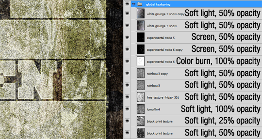
As you can see, these are mostly on soft light. I played with the opacity as some of these textures were way too strong. Some notes per layer:
- The 2 block print textures are different ones, amongst the last ones in the texture pack
- Rainbow3 and Rainbow3 copy are the same texture. The one above has been rotated of 180°
- The first Experimental noise 6 has been inverted on top of being sharpened, the 2 following ones are just sharpened and the above one of the pair rotated of 180°
- Same scenario for the 2 top ones (same texture rotated)
Feel free to add more textures! Feel free to change the blending modes! Feel free to change the opacity! We decided to stop here, because we reached that “I think it’s complete” point. Also, as said in the beginning, this project was to showcase what’s possible to do uniquely with Lost and Taken’s textures. We have some sweets ones of old, dusty film, scratched metal and more we would have added (cf. this image).
Finishing touches
Cropping the excess out
This is not mandatory, but will save you both time for the following steps and hard drive space. During the design process, you’re likely to have sized some elements beyond the limits of your canvas. You don’t see them, but each time you save the file, Ps remembers they’re here and includes them. Pretty useless. Also, when applying an effect, they’re taken into account too, which can make the effect take longer to be calculated.
What you have to do is simple: select your whole canvas (CTRL/CMD + A), and go to Image > Crop. Then, while it’s calculating, you might want to refill that coffee cup of yours for the last stretch of manipulations.
Creating a Comp and Aging It
If you’d look at our top layer group, called comp, here’s what you’d find:

We started to create comps because we were occasionally experiencing color shifts when saving without them. This seems to either solve it, or to show the shift on the comp layer, which you can then correct with adjustment layers. There’s a shortcut for it, it’s SHIFT + CTRL/CMD + ALT + E. This is an operation that will take a bit of time.
Once it’s done, place it in its group and create two copies of that comp layer. The bottom copy should get the action Aged 1 applied to it. The top copy should get Aged 2 applied to it. Switch the blending mode of both layers to soft light and their opacity to 25%.

The Halftone Effect
We perfected our halftone effect over time, after reading a couple tutorials that were including it (the main one being this one, written by Adam Levermore).
Create another comp. Right-click the new comp layer and convert it to a smart object. This is also going to take some time.
Once the layer is a smart object, let’s halftone it!
Press D to reset your color palette to black as foreground color and white as background color. We do this because your active foreground color will be used as the color of the dots of the halftone effect. Go to Filter > Sketch > Halftone pattern (make sure your layer is selected). This is what you’ll see:

A couple things about this screen:
- First thing first, look at the bottom left of the screen and switch the zoom level to “Fit in view.” Now you can see what you’re doing
- On the right side, “Pattern type” should be set to dots, as we’re trying to emulate that offset print effect
- “Size” and “Contrast” are to be played with to your liking. We used a minimum dot size quite big (8), since the poster is of decent size. We usually keep the contrast low enough to still have some dots in the whitest areas of the image
You should now see something close to this:

Let’s double click on the one that’s highlighted:
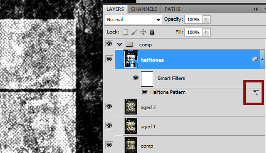
This opens a dialogue box that helps you to choose a blending mode for the halftone effect itself.
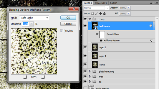
You should switch the blending mode to soft light via the drop-down menu, and hit OK.
Almost there…: Switch the blending mode of the layer. Change it to lighter. Lower the opacity some. We settled on 50%.

LAST STEP: SAVE YOUR HARD WORK. Tadaa, you’re done! You deserve a beer while the file saves. We suggest you save the poster as a PSB file (Photoshop Big), as it’s likely to be bigger than the 2 GB file size cap of the PSD format.

Conclusion
After seeing this, Caleb approved it. If you go back to the email conversations, you’ll realize that we’re fitting the scope we established at the beginning. We’re giving Caleb something that’s nature-themed, while still having our own stamp on it.
Well, it’s truly been a blast! We hope you enjoyed the post and that we could shine a little bit of light on how we do stuff.
Let us know if you have any suggestions, comments, or ideas on how to improve; or, you can send us love mail, hate mail, or ask us to design posters for you by letting us know in the comments below or just get in touch!
Sincerely yours,
Simon H. and Jon Savage, Studio Ace of Spade and Editors of the Zine