Blog
Design a Vintage Poster with Vector Pack 16

Introduction
When you think about the design process, what comes to mind?
I believe it is the combination of thoughts, mixed with emotions and pure forms that capture a person’s attention. We are all part of this thing called “madness. ”
The definition of Madness:
- 1. The state of being mad; insanity.
- 2. Senseless folly: It is sheer madness to speak as you do.
- 3. Frenzy; rage.
- 4. Intense excitement or enthusiasm.
In this tutorial, we’ll be modifying vector elements from Vector Set 16 to create a retro-vintage poster. Along the way we’ll uncover tips in Illustrator and Photoshop that can lend your designs a little extra TLC. I tend to work in both Illustrator and Photoshop. Both programs have their strengths and weaknesses, but together they’re unstoppable.
Phase one
Collection of assets and file setup in Illustrator
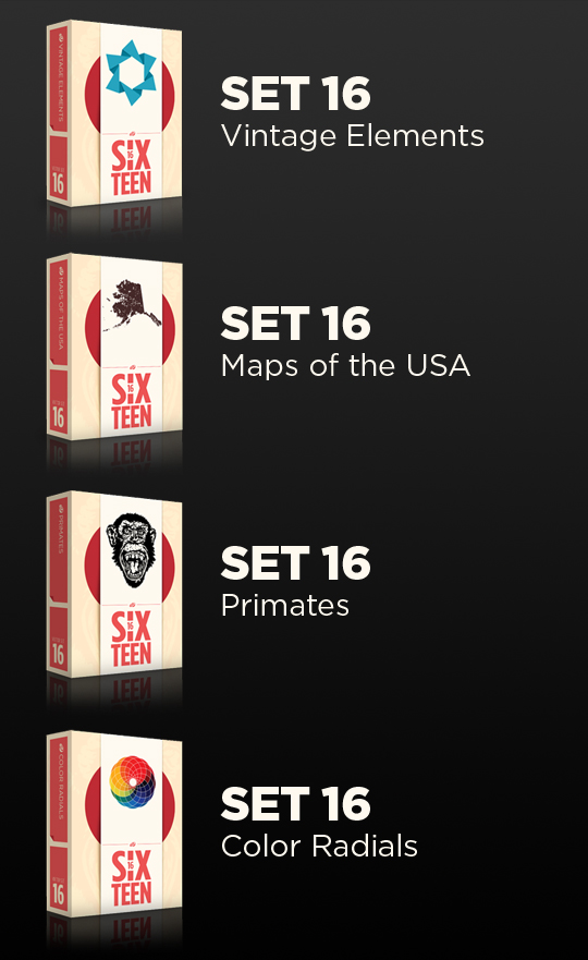
Before we start we need to gather our assets. We will be using a few pieces from the fresh release of Vector Set 16.
I’ve looked through the Set and selected the images that I think are best suited to create a vintage, retro looking poster. The use of vintage pieces mixed in with some color radials will really bring the madness together!
I choose these vectors to show how flexible they can be. Please, go ahead & have fun! Experiment, tear them apart, change their color and size to make them yours.

Picking the right background for your vintage poster is vital. Paper, cardboard, and grunge textures can really bring your poster to life. This is a good time to look for some inspiration, so take a look at a few Bauhaus poster designs.
Author’s Note: Experiment with different paper textures. Here are some free options.
DeviantArt
Zen textures
Lost and taken
If you’d rather just use the background that I did, you can download it and get started.
Step one
In Illustrator create a new document. Set the color mode to RGB and set the size to 15×20 inches. Next, import the background texture file.
Author’s Note: If you use another background image make sure to re-size it to 15×20.

Step two
Copy the retro loop image from Vintage Elements and paste it into your document. You will notice these are very flexible, you can change colors and re-size different individual sections of the shape.
Using the Direct Selection Tool (white arrow), select the top end of the four lines and drag upwards to lengthen the loop. Repeat this on the left side.

If you’re having trouble editing this shape, take a look at this video overview.
Step three
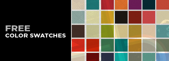
The color palette plays an important role in setting the mood for a retro poster. If you’d like to use the same colors that I’m using, download these color swatches for free.
Now lets change the color of the segments in the loop image. With the Direct Select Tool, select a line that you’d like to change.
Hold down SHIFT and select all the segments of the line. Now select a color swatch to change the color of the line segments.
These are the ones used above: Blue-green #66A9A6 Tan #D9D5A9 Red B93826 Black 000000
Author’s Note: Experiment with colors, you’ll surprise yourself sometimes. For added inspiration in the color selection process, visit Colourlovers.com – a great community site with all sorts of color schemes and patterns.

Step four
Let’s add a drop shadow, this will help create some separation from the background.

Step five
Now it is time to bring in other vector elements to round out the poster. I added one mean-looking Ape from Primates and the state of Alaska from Maps of the USA to the eye of the loop.
Make sure these new shapes are arranged underneath the loop that we just altered in steps 1-4.
Author’s Note: I added some quick homemade ink drops for fun right under the chin.

Step six
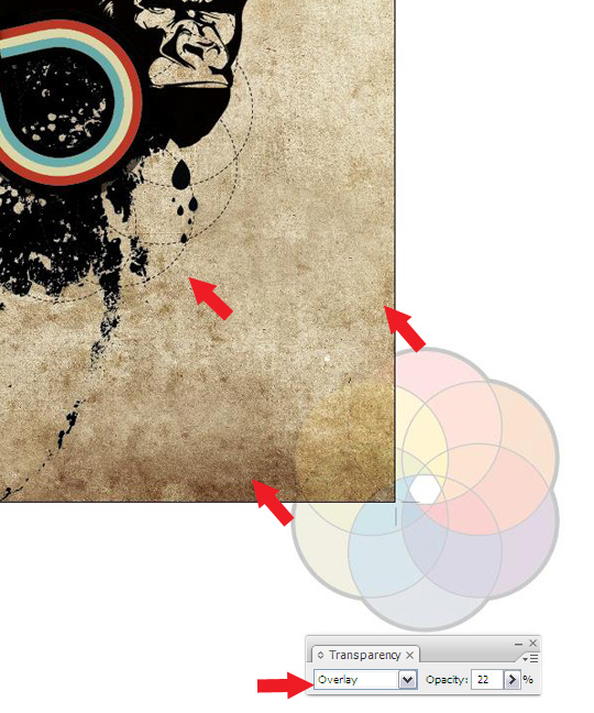
Lets use this color wheel from Color Radials to give the background some color. Set the blending mode to overlay and opacity to 22%. Now select and drag from the corner to make it larger.
Step seven
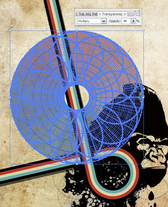
Oooo, that looks good. In fact, lets add another Color Radial and place it just above the primate below the vintage element as shown above. Make sure the blending mode is set to multiply and opacity is 49%.
Author’s Note: Use your best judgment for size and placement of vectors.

Step Eight
Now select ctrl+c and ctrl+f to place in front, select and expand it till the center is filled with the smaller circle. Make sure the transparency is set to multiply and opacity is 49.
Step nine
We’re using the same color radial so re-size and place below the chin of the ape.

Step Ten
Add a compass rose from the Maps Vector Pack, and lets set the transparency to multiply and place it over the color radial as pictured above. Now we’re done with adding the vectors and creating the poster’s composition.

Phase Two
Adding Text

Used the font Blockhead and played with the color and transparency to give it a washed out feel. Simple but effective.

- 1. Font size 120 set the AV to 50
- 2. Change color to 66A9A6
- 3. Now go to effect and choose style inner glow. Set mode to screen, opacity to 84 with a blur of 15.2
- 4. Go to filter, click on style and add a drop shadow. Set mode to multiply, opacity to 75
- 5. Make sure the font transparency is set to multiply.
Phase Three
Creating a vintage pattern background
Alright. We’ve finished the foreground elements, but I think the poster is still missing something. Let’s add in a retro background pattern and see where that takes us. To make the background, we’ll grab a simple shape from the Vintage Elements Vector Pack.

Select the shape and change it’s color to FCBA63. Next, change it’s blending mode to Multiply, and lower opacity to 38%. Now we’re ready to stretch Adobe Illustrator’s legs a bit. Drag the shape to the right, holding Shift (constrain movement) and Alt (drag duplicate). Now, without clicking anything else in between, hit Ctrl+D to duplicate this move eight times. Ta-da! A row of eight vintage shapes.
Watch the video below to get caught up and see Ctrl+D used to finish out the background.
The end of Part I
Congrats! You’re done with your layout and work in Adobe Illustrator. From this point on we’ll be working in Photoshop to add fairy dust & final touches. Get a load of the image below for a sneak peek at the final piece. We’ll be covering these techniques this Friday, so stay tuned for part II.
Share your thoughts, questions, and comments with us below. If you take the challenge to follow this tutorial yourself, post the results in our User Showcase and link to it in the comments.
