Blog

Making Perfect Curves in Illustrator | Design Tip of the Week
Making Perfect Curves in Illustrator
Hello, hello! Last week, I gave some tips on designing faster in Illustrator, but this week, we’re going to focus more so on quality. In Illustrator (as you all know,) you have super-tight control over line weights, shapes, etc. and can produce incredibly crisp visuals. The best creatives who make the most stunning vectors are those with a sharp eye for detail. Having a hawk’s eye (both the animal and the Marvel character) that can pick up on subtle changes in line work and curves of a shape is pretty crucial for creating awesome illustrations. For this Design Tip of the Week, we’re going to focus on curves.
Here is our example:
As you can see, this little blob dude is not happy. He feels insecure of his imperfectly smooth form*. Let’s help him out.
*Note: you do not need to have a perfectly smooth form to be a strong, independent, beautiful blob thing.
If you can already see where some touch-ups need to be made, then you, my friend have a good eye! For those that haven’t picked up on the areas that need working, hey, no sweat! That’s why I’m here, to help and walk you through it.
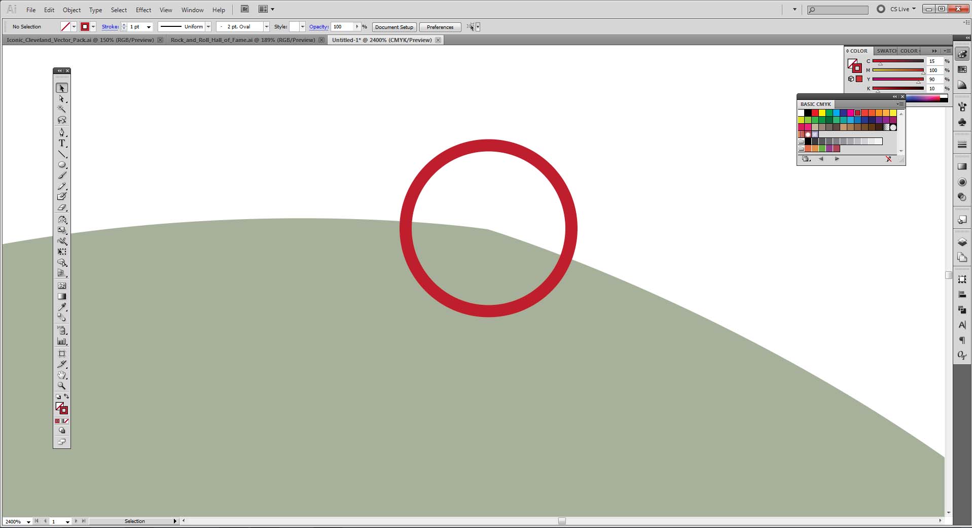
 Okay, first problem. As you can see, there’s a bit of a point where the two curves are not aligned perfectly. This is very common and can easily be overlooked. Let’s smooth that out.
There we go. Take advantage of those curve handles, they will indicate the direction and sharpness of the curve. When the handles are aligned and create a perfectly straight line, you’re curve is good to go. Remember to always zoom in and out to see how your changes affect the overall shape.
Hmm…something is still off.
There it is. Cases of super, super subtle misalignment are what you really have to watch for. Be relentless in going through your illustration and checking for any places that need refined.
Awe, he looks so much happier. Getting into the habit of really examining your illustration, finding the places that need some polishing and making those improvements will only result in your work becoming better and better. So, roll up them sleeves, zoom in at 6400% and make that shit flawless.
Just to let you know, we actually have tons of tutorials on Illustration that you should definitely check out!
Until next time!


