Blog
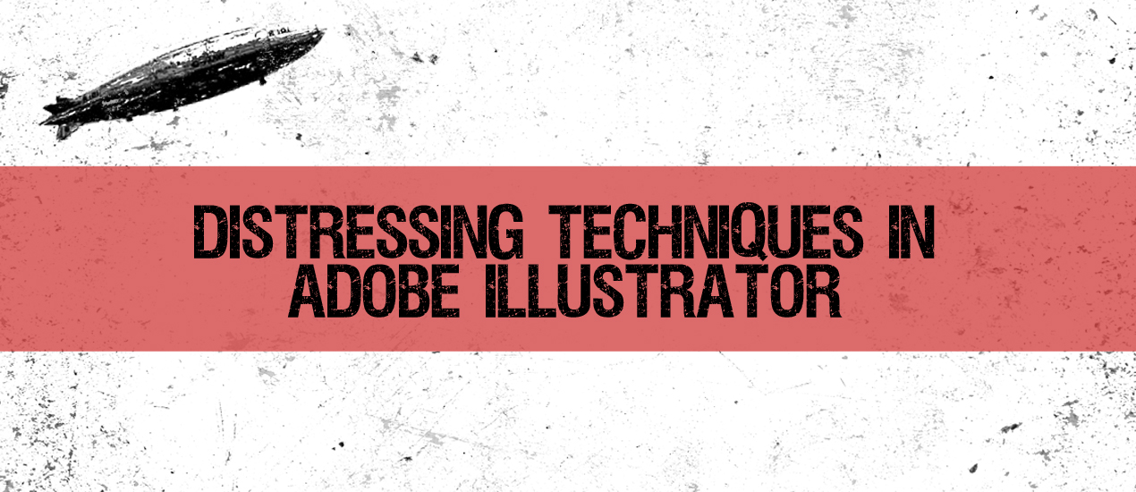
Distressing Techniques in Adobe Illustrator
Hey designers, attend our all-inclusive soul-fulfilling three-day design retreat, WMC: Off-The-Grid, this October 5 – 7th. To learn more, head to wmcfest.com.
Simon from Studio Ace of Spade here. Jeff Finley asked me to compile a list of some common distressing techniques as a supplement for his eBook “The Designer’s Guide to the Apparel Industry.” Distressing graphics is a pretty integral part of designing t-shirts. This tutorial will demonstrate three easy to understand and easy to apply techniques for adding a distressed or grunge look to a design using Adobe Illustrator.
Be sure to check out some other tutorials the graphic designers at Go Media have whipped up as well!
Adobe Illustrator Technique #1: The Grunge Brush
For the first technique, we’ll learn how to take advantage of Illustrator’s brush tool and of some of the brushes that come bundled with it. Our subject will be a vector of a blimp I created a few weeks ago and used for one of my Studio’s entries for Signalnoise’s retro poster competition, “Air traveling”.
The Step 1 is easy: open your vector file.

Step 2 is easy as well: make sure your vector object or group is expanded.
To do this, select all (CTRL+A or CMD+A, depending if you are using a Windows or Mac box), then go to the menu “Object” then “Expand”. You might be prompted to select what you want to be expanded. Check all the boxes.

Once this is done, we’ll move to step 3: select the brush tool and get the brush that interests us. Don’t forget to de-select your vector art or else you will apply the brush to it.
Open the brush panel from the left toolbar (or with F5), then click on the menu icon at the lower left corner.
 Make your way through the menus to pick the “Artistic – Chalk / Charcoal / Pencil” brush set.

 Then pick the first brush and the brush tool.
Step 4
Now, we’ll have to pick a random color that is not used at all in the design element we’re planning to grunge out. The reason for this is because we’ll use the magic wand tool later to select the brush strokes we are about to make, and we don’t want anything else but these brush strokes to be selected. Here I picked a really loud blue (something like #3FE6FF).


Now it’s your call. Play with the brush tool and make a couple brush strokes in order to cover your vector element. In my case, 2 strokes were enough.

Experiment with different thicknesses, placements. You should play with how you position/draw the paths with the brush tool, with the stroke thickness… For instance, I was hesitating between a 2 pt. thickness and a 4 pt. one before settling on 3 pt., because it looked the best. I would also not be afraid of editing the paths afterwards with the direct selection tool (keyboard shortcut: A) to modify their directions.
You want to cover most of your design, but also make sure that you won’t go overkill with it. Also, watch how I tried to leave out of the blimp the big chunks at the top left of the top stroke. These would have been over the top in my opinion, and wouldn’t have looked so realistic.


Quick tip: to quickly toggle the brush stroke on and off, switch the stroke color to your background color by tapping the X key repeatedly.
Once you’re satisfied with the result, time to move towards step 5.
Here, we’ll expand the brush strokes like that we can merge them with the design using the pathfinder tool. To do so, select your vector object and your brush strokes (I used CTRL/CMD +A since these are the only things I have in my art board).


Then, go again to Object > Expand in order to expand everything.
Step 6: the pathfinder. Now comes the time to merge everything.
Go to the pathfinder (Shift + CTRL/CMD + F9 by default in Ai CS3) and click the merge option. Depending on the complexity of your design, that can take a few seconds.


The 7th and last step is to use the magic wand tool (shortcut: Y) to get rid of the blue we don’t need in our final design.

 Click anywhere on the blue strokes to select all of them. Delete (DEL key) and…
 … And it’s distressed! Victory?
 No. Ai sometimes leaves some transparent elements that need to be cleaned up too. To see them, select everything (CMD/CTRL +A), then use the magic wand once more (Y) to click on one of these left over points. Once they’re all selected, you can delete them.
 And here it is, our distressed blimp.
Adobe Illustrator Technique #2: the grunge vector element
The grunge brush technique is easy and convenient (the brush comes with Illustrator), however it might not look very realistic — especially if you have to make the brush really thick, big or to repeat it a lot to cover the design. Real distressing looks more or less random and doesn’t repeat itself.
One of the tricks we have up our sleeve then is to use resources that are specifically made with the distressing purpose in mind. Head over to the Go Media Arsenal and grab some grunge vector resources.
For this one, I’ll use a texture of the Destroy I vector pack (first one of the preview actually). It’s subtle enough, yet you can duplicate it for more intricate effects (as will be demonstrated).
Step 1: Open the files you will need: the blimp vector and the grunge vector. As I explained previously, the grunge vector is from the Go Media Arsenal.

Step 2 is similar to what we did previously with the brush strokes: change the color of the grunge vector to a color that has not been used in the element you want to distress. Again, I choose a bright blue.

Step 3 is where it becomes fun: it’s sizing and placement time. I chose to center the vector, then to size it big enough to cover my vector blimp. But then I realized that the single instance of the texture wasn’t enough distressing for my taste.


So what I did as a 4th step was to copy the texture and then paste it in front (CTRL/CMD +F)

After that, I just had to rotate the top copy a bit to accentuate the grunge feel. I rotated it of 90° for that tutorial, but remember that experimenting is the key and that you should find what suits you.

Step 5: Expand the vector grunge elements (Object > Expand).

Step 6: Merge using the Pathfinder palette.


Step 7: Cleaning out. Like earlier, we are going to delete the grunge vector(s) used to distress the blimp in order to keep just the distressed blimp in the final art.

Here I used the magic wand (Y) to select the blue grunge vectors…

And deleted them selection (DEL)…

 Selected the transparent leftovers, deleted.

And there you have it, another distressed, grungy looking, blimp!
Adobe Illustrator Technique #3: using a texture
Like in Photoshop? No, no. We are going to live trace it.
For this distressing last technique in Illustrator, I’ll use one of the free textures from Lost and Taken. The texture I’m going to use is taken from his 20 subtle and simple grunge textures post.
 (Don’t grab that one, go grab the high resolution file, it’s going to look much better)
It’s going to be really simple and share a few common steps with the previous techniques. Our experimentation subject is going to be this vintage radio vector I did a few weeks ago as part of another entry to Signalnoise’s retro poster competition.
Step 1: open your file.

Step 2: let’s place (File > Place) that grunge texture in our document. The process is really similar to opening the file.


Now, our 3rd step is to live trace it. It’s going to be easy, as when you place and select the texture, the live trace button appears on the top toolbar of Illustrator. We could use some of the presets, but I believe we can get better results by experimenting with the values a bit. So instead of selecting them, click on Tracing options at the bottom.

I always set Path Fitting, Minimum Area and Corner Angle to 1 when using Live Trace. It’s supposed to give the most details from the object I’m using as an input. I also checked Ignore White since I just want the grunge of the texture to come out. Then I also check the Preview box to see what those settings are producing.

I bumped the Threshold to 160 in order to get a darker texture (more pixels are converted to black). Once you’re happy with the result, click Trace and don’t forget to hit the Expand button.
Then, step 4 is to place, size and change the color.


Step 5: Expanding. It’s crucial to be sure that it’s correctly done, or else it simply won’t merge.

Step 6: Merging.


Step 7: Cleaning up!


Hey Designers, make sure to check out our Arsenal Membership, which hooks you up with our huge product library for only $15 per month. Yes, seriously.