Blog
Gigposter Design Tutorial: The New Sex

Tutorial Introduction:
//
A lot of people are making them. A lot of people suck. The graphic designers here at Go Media don’t suck, and neither do you. This tutorial requires NO drawing talent… so don’t trip folks. You will however need Adobe Photoshop 7.0 or higher and Illustrator CS2 or higher. My name’s Dave, and this is my first ever solo tutorial. I’m very unorthodox and direct… so forgive me if I lose you guys during any part of this. I’ll do what I can to answer questions for people who think my tutorial is too confusing. So we’re going to make a gig poster! Subject matter: Deftones and The Fall of Troy in Cleveland, Ohio at the House of Blues on May 30th. Why are the Deftones not first, you ask? Because I like The Fall of Troy better and this is an unofficial poster, who cares?

Those winged scrolls are new from Vector Set 16. They would look great in this design!
Let’s get to business.
So what to make? Hmmm… something fierce. Maybe something militaristic? Considering the legendary event of the fall of Troy… we’ll go that route. After searching through some public domain photos from WWII, I found a picture of Dwight D. (Ike) Eisenhower on D-day lecturing some troops.
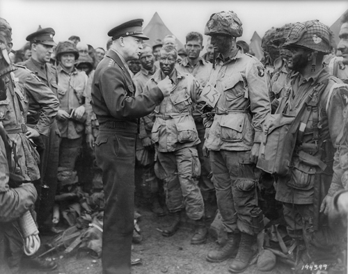
We’re going to use this as the base of our initial illustration… but the hand, it lacks emotion. It’s ok. We’re all designers and we can fix this, right guys?
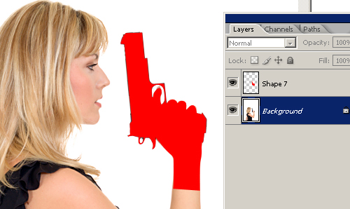
Istockphoto.com (a lifesaver for all stock photo needs) will be our resource. If you do not have an account, get one. If you would rather go the free route – www.sxc.hu, better known as Stock Exchange, has a slick selection of free stock photos. You’ll still need an account, but it’s free.

I found this chick holding a gun on istock. We’re gonna get the cheapest one because the resolution doesn’t matter so much in this tutorial yet. Her hand will become Ike’s hand… holding a gun.
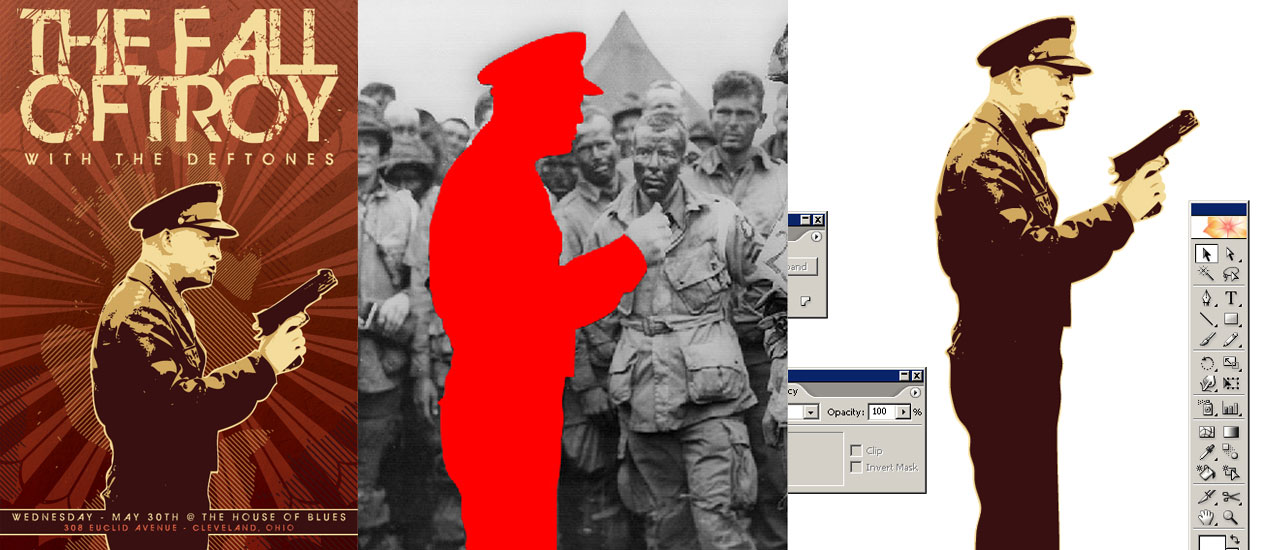
Next we have to cut out Ike and the girl’s gun so we can combine these different pieces into the same image. We’re going to use the pen tool to cut these out. I trust we can all accomplish this through knowledge gained in previous tutorials. WARNING: Using the pen tool in Photoshop is tricky… to keep your anchor points from drifting off into oblivion, you have to alt+click them (The same way you would click your anchor points in Illustrator). Make sure your shapes fill color is an obnoxious color so you don’t lose it in the photo.

Once you have the shapes made to cut them out (and it’s ok if it took 3000 shapes and layers to make it) you’re going to merge them all to one layer. Ctrl+click your “shape layer” to make a selection and then click the actual image’s layer. Press Ctrl+C to copy and then press Ctrl+V to paste it into it’s own layer. Do the same for the girl’s gun. Save your PSD’s in case you fumble up. The hardest part is over.
Now take both shapes and tastefully combine them on a fresh canvas. Some airbrushing or cutting may be needed to make it look real. It’s up to you. The rotating of the hand will be needed to make it fit on Ike’s arm. Make your image 300 dpi (image>image size) and don’t worry about the image quality. Merge the hand layer with the Ike layer and make it gray scale.

You now have Ike pissed off and holding a gun.
Here is where it gets a little interesting and it might be hard to follow here. Create three files in Photoshop that overcompensate in size for the Ike-shape – you don’t have to save them or anything. They’re there for copying purposes only. Throw a copy of Ike into each of them. Make sure they all remain on their own layers. We’ll be playing with the contrast next.


Above are the setting you’re going to make Ike the first two files. The third will be -100% on both Brightness and Contrast. It will result in just a shape of him in solid black. Now open Illustrator and make a new file at 11×17 portrait orientation.
Size down the Photoshop window and drag over each of the layers that have been brightness/contrast-adjusted into Illustrator. Line them up horizontally and start Live Tracing them one-by-one using the “Black and White logo” option. The option is located on the top tool bar once your photo is selected. Copy these attributes in the photo below.

Live Trace is basically Illustrator’s tool for deciphering and creating graphics into vector art automatically. It was a new feature in CS2 and it’s way cool, but can have some backlashes. Like all automated solutions to things done best by hand, there are sacrifices made with the result. A lot of times, your Live Traced images get lossy. Having them at a high resolution most times solves this but not always. In our case though… the dirtier, the better.

Now make sure each image is expanded. Use your magic wand tool and select the white areas that Illustrator assumed when you dragged in the Photoshop layer. They’re there, trust me. Once all selected – delete them. They’re not needed. Now’s your time to start figuring out a color scheme for this big project. Here’s what I chose.

Having 1 dark color, 1 to 3 medium tones, a light color, and a wild-card color is pretty mandatory when making 4 to 6 color prints. They work better. Although this wouldn’t be a silk screened poster, following this limited color rule assists in giving it an authentic gig poster appearance.
Doodads are always the hot ish in your designs, so we’re using some from our arsenal, the Go Media Vectorpacks. Along with a few we’ll be making from scratch. Below is what we’ll be using from the packs. (side note: we’ll be using a bunch of stuff from Go Media’s Arsenal. If you haven’t any cash to purchase some of the packs, we’ve got some samples here).
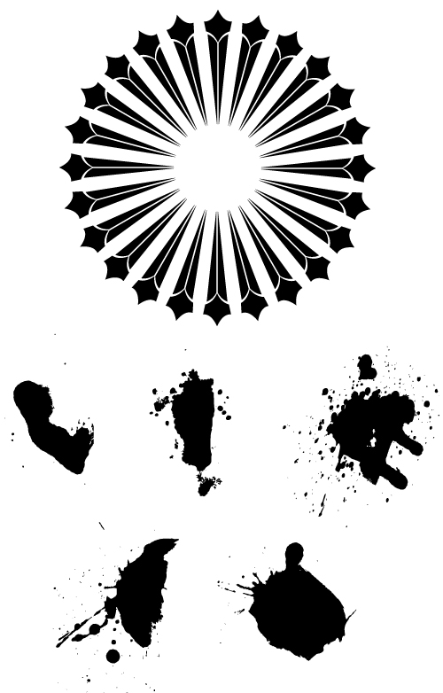
We’re using 5 splatters from the various Splatter packs and one wheel-type doodad from Set 5’s Decorative Ornaments pack. Now we’re going to get all these shapes ready and drag em over into our Illustrator file. Mind you we have not touched Ike yet… don’t worry about him or the colors. Let’s get trendy.
Make a long, skinny rectangle and duplicate it about 80 times (alt+click and drag it to copy it once, and then press Ctrl+D over and over again until you get a lot of bars) or more depending on your preference. Align them to the center and space them evenly. Now use the add function in your pathfinder box and expand the selection. Now that it’s own shape – rotate it 45 degrees (holding shift + rotate will rotate the shape in increments of 45 degrees). Duplicate that shape about 3 or 4 times.


Now duplicate/take a splatter from the vector art we’ll be using and place it on top of that shape you made. Select both objects and intersect them (it’s an option in the pathfinder box as well). Expand the appearance of your object.
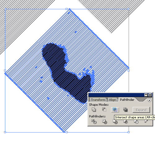

You now have a distressted pattern of diagonally running lines. It’s a pretty neat trick to add some organized distress to your designs. Do this a few times with different splatters. That is why I’m encouraging duplicating your objects and not just dragging and dropping. A lot of these shapes need to be kept preserved because they’ll be used over and over again throughout this project.
Now make sure your actual poster area is clear of any objects. Moving them to the sides of the artboard and separated is always a good thing to do so you can just drag in what you need when you need it. Make a rectangle in the 11×17 area. Bleed of the edges a little bit for good measure. Now fill it with a gradient of color 1 and 2. Throw a medium color in there if you want it to blend smoother (I added some earthy-red in the middle). It might help, or it might not, who knows. Experiment and be different.
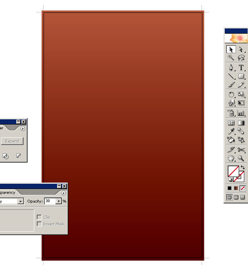
Now we turn to the Go Media Texture Packs. I want a concrete-looking surface to start this off with. We’re going to use Concrete8.jpg. It’s a nice and has lots of good grainy tones. Place it into your file (file>place).

Stretch the image to fit the poster size. Now go to your transparency settings and choose the multiply setting. All the dark ridged areas of the texture are now accented onto the gradient. Drop the opacity down to like 30% or so. Lock these two objects in place at the very bottom and we’re onto designing the focal piece of the poster.

So now back to good ole’ Ike. Make the Solid shape of his body Color 3, The medium-detailed shape Color 4, and the least detailed shape Color 2. Align them in this order – Color 3, Color 4, Color 2. You have your focal image almost intact. Add a stroke of the same color to Color 3’s shape to bring it all in. Expand the stroke if you need to, in case we do any abnormal sizing to the figure. Group the three objects, and there you have Ike.


Take the wheel object we chose from Set 5’s Decorative Elements pack and place it right in the middle of the poster (above the gradient/texture combo). Size it up huge if you have to. It will accentuate Ike’s figure in the design. Fill it with Color 1 and drop the opacity down to 30%. We’re done with that.

Grab all those crazy diagonal line objects we made and fill them with color 3 or 4′ (your call, color 3 was too strong for my liking – I chose 4). I duplicated them and threw them in the middle-area of the poster, kinda outlining where Ike will be. Grab Ike and throw him in the mix. Make sure he’s the top layer. We’re almost there.
Let’s play with our text options. I want something nice and organized, but already beaten up with some grunge. I don’t want it a grungy impact font because those are way too common for post-hardcore bands nowadays… Luckily we created the Affliction font (located at our Arsenal site). It’s styled well and beat up tastefully. We’re using it!

So we’re gonna play with the font and sizing. After a few options, I think stacking the text all the same size by breaking up “THE FALL” and “OF TROY”and adjusting the tracking and leading should do it. Check out the settings I used below.

Duplicate that in case it gets messed up and right click the text and create outlines. Color it with color 3 and place it right above Ike in the poster. Add the Deftones with a larger tracking size and smaller font size and we’re in business.
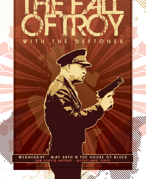

I added a rectangle at the bottom for the venue information. I applied a stroke to the rectangle, broke up Ike’s group, and wedged it between the Color 4 object of him and the Color 2. Since we won’t be moving Ike at this point, we’ll leave him ungrouped, but the effect just created makes Ike’s figure look almost like a part of the rectangle; eliminating the look of the area being an afterthought. Now add your venue’s information and all that good stuff. Adjust your bleeds, save it out… and you are DONE!
Thanks for reading my first tutorial, I hope you learned something. I’m now going to go eat a hot dog.
-Dave