Blog
PS and AI Tutorial: Designing Ultra SceneXCore Apparel!

Introduction
This is a tutorial or a simple “how-to” guide to help you with your design projects. This is not the end-all, be-all way of doing things. We will try to make what is normally a long and detailed process of creating commercial art into a simple and easy-to-follow guide. We encourage your use of artistic license and creative vision to make high quality work for your clients.
I wrote a brief tutorial on Apparel Design roughly a year ago for Go Media, the source for web development in Cleveland and it received a lot of good response. But it’s a bit outdated now. We’ve done lots more apparel work, including stuff for Avenged Sevenfold, Red Hot Chili Peppers, Evanescence, Atticus Clothing, Strhess Clothing, and tons more notable bands and clothing companies.
Needless to say, we’ve learned a lot about what’s hot in today’s “underground” fashion market. And when I say underground, it’s actually not so underground. Just take a peek into your local Hot Topic or Pac Sun and you’re going to see some great apparel graphics. And this tutorial will show you just how it’s done.
Everything you see in Hot Topic or Pac Sun these days features some combination of skulls, flourishes, splatters, and miscellaneous grunge effects. Why? Don’t ask me, but I’m sure it’s got something to do with the recent rise of popular screamo, metalcore, and hardcore bands into the mainstream. With bands like Avenged Sevenfold and My Chemical Romance paving the way for that ultra sceneXcore aesthetic. Which can look ultra lame if done bad, but hella cool if done right. And I’ll show you how it’s done right.
Before You Begin
How do you make all those flourishes, splatters, and other design elements? Well, some do it by hand and draw their own flourishes, wings, skulls, etc. But what most t-shirt designers are doing these days is using stock design elements and clip art. Old floral graphics and whatnot. It’s a quick and easy way to get that cool look without actually doing a lot of custom work.
We at Go Media prefer to create our own elements. But to make it easy on you, we’ve created a bunch of stock vector elements for you to get started right now. We’ve created custom shapes to destroy and beat up your designs at the highest quality possible. And just about every trendy element today is covered such as wings, crests, tech shapes and more. And they’re freakin cheap as hell. So if you want to skip the hard part and go straight to designing kick-ass apparel graphics, then check out our kick ass stock vector packages – for that ultra sceneXcore aesthetic!
On With the Tutorial!
You’ll need these:
— Photoshop
— Illustrator CS2
So with that said, let’s get on with the tutorial! First you need to open up Photoshop and Illustrator, as you’ll be using both. Mostly Illustrator. So get that Pen Tool ready!
1.) You need to decide what your client wants. Or if this is a personal project, what YOU want. Your client should give you some ideas. But I find that quite a few just want something “dark” and “scary.” So that’s what we’ll give them.
2.) Come up with an original idea! You’ll be tempted to use skulls or other typical dark imagery, but you really should try to come up with something new. If you want to sell shirts however, skulls are so trendy right now it might make you some cash. Skulls never seem to go out of style. In fact, they are becoming “pop” ular if you know what I mean. Little girlie skull underwear, etc. But anyway, think of an original concept and go with that. That’s the best way.
3.) Get out your sketchbook or open up Firefox. Once you have an idea, start sketching around. For those who can’t draw, search the internet for a stock photo. Or take your own photos, whichever works. Chances are, you aren’t a photographer, so manipulating stock photos is always an option. I’d draw something in this tutorial, but I’ll save that lesson for another time. For the sake of this tutorial let’s stick to photos. We can make that work!
4.) Find a photo. I found this one. It helps a lot if you find an image that’s fairly large. Preferably over 1500 pixels. I just searched Google images for this one. Now some may ask about copyright laws and whatnot. For the sake of this tutorial, it’s just learning. But if you want to use these images in your client projects, then it’s always good to ask the owner of the photo. But most times you can get away with it if you are manipulating it beyond comparison which is what we are planning to do. And I’m only using a snapshot of a wrecked auto. If you are worried about it, then purchase a stock photo or take your own photos. I use stock photos because I don’t call myself a photographer. I’m an artist and designer. So here’s the one I found:

5. Cut out the image you want to use. Copy the image and paste it into a new Photoshop document of the same size. Use the Pen Tool and create a path around your image. After you are done, right click and “make selection.” Select the inverse and press delete.

6.) Convert it to 3 colors. Here are the steps. I’ve created an action to make this easier
— Make a new layer – name it “highlights”.
— From the Select Menu: Select » Color Range » Highlights (this selects all the light parts of your image)
— Fill the selection with White (Press “D” to reset the colors to black and white, and the press “Ctrl+Backspace” to fill your selection with white.)
— Make another new layer – name it “shadows”
— From the Select Menu: Select » Color Range » Shadows (this selects all the dark parts of your image)
— Fill the selection with Black
— Make another new layer underneath those two – name it “midtones”
— Fill the entire layer with a grey color
— Ctrl+Click on the LAYER with the original photo you cut out to make a selection around it.
— Select » Inverse
— Select each layer and press delete. You are now deleting any extra color or pixels outside of the object you cut out.
You should end up with something like this:

7.) Live Trace (Vectorize) each of those layers. This is where we take this into Illustrator. And the newest version CS2 has a handy tool called Live Trace. This will save you lots of time! Open Adobe Illustrator and make a new document if you haven’t already. Here are the steps to do this:
— In Photoshop, select the “Highlights” layer and press Ctrl+I to invert it. You should have just made it black. Now with that layer selected, click on your art (not the layer) and physically drag your art (not the layer!) to your Illustrator button on your Windows task bar (keep holding the mouse down until the Illustrator window is active). With the mouse button still down, you should see a little [+] plus sign next to your cursor. You should now be able to drop your art onto the artboard. Release the mouse button and your “highlights” layer should drop right into your empty Illustrator document.
(Note: If you are having trouble with this, try copying and pasting it in. Or saving out a JPG of your highlights layer and “placing” it into your Illustrator document)
— In Illustrator, select what you just dragged in and click Object » Live Trace » Make and Expand (default settings for Live Trace are fine). You will get something like this:

— After you Live Trace something, it will have created a group of vector shapes out of both the black and the white parts of your image. Right click and ungroup it.
— Draw a big dark grey square around your shape and send it to the back. This will be your background or shirt color.
— Now you should see both the black and white shapes. Click on a white shape.
— With a white shape selected, click Select » Same » Fill Color.
— Press Delete. You are removing all of the white shapes and you are leaving just the black ones.
— Select all the black shapes and change their fill color to white. You should now see the “highlights” portion of your art now in vector form!
— Go back into Photoshop and drag the “shadows” layer over to Illustrator and do the same thing you did for the white layer. Except keep it’s color black.
— Go back into Photoshop and select your “midtones” layer. Use brightness and contrast to get your layer to look black.
— Now drag it into Illustrator and repeat the same steps as you did with the “highlights” and “shadows” layer. Except make this one grey.
— Now put the grey shape in behind the white and black layer. You should end up with this in Illustrator:

8.) Add more stuff. Now that you have your primary image Live Traced and converted to three colors, you can now start adding more design elements. So for this tutorial, we’ll use some of the design elements in the Go Media Vector Packs. You can use your own design elements or you can purchase our vector packs.
— Now this is the point where I begin to experiment with different shapes, different arrangements, etc. Just use your imagination. In our vector packs, you’ll find a large amount of different elements that you can be creative with.
9.) I just flipped around the design and started choosing colors.

10.) Added some miscellaneous shapes to give the design some direction and motion. I put them behind the car.

11.) Opened up our Splatter Set from our Vector Packs

12.) Added a few splatters in the background.

13.) Used our destroy set to blend things in and add some dirt to my design

14.) I used a skull from our Skull Vector Set and duplicated it a few times.

15.) Add some flourishes!


16.) I drew some random curvy lines with the Pen Tool.

17.) Used another vector piece from our Tree Set (not yet released).

18.) Added the text

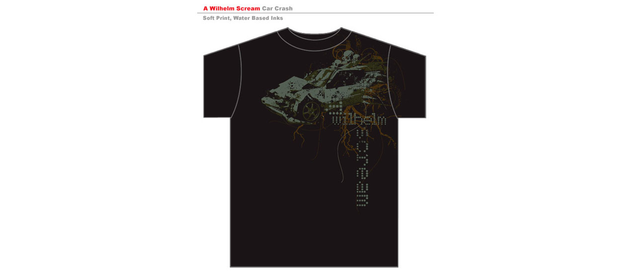
So to get to this point, you need to just play around with your design elements and arrange them in a way that satisfies you. This particular example was a concept I did for a band called A Wilhelm Scream. I highly recommend them!
Once your design is done, it’s best to mock it up on a shirt for your client so they can get a good idea of how it will look when printed.
Head to our Arsenal for the World’s Best Mockup Templates!
Conclusion:
Part of being a graphic designer in today’s time, is all about finding resources and using them to your advantage. There are plenty of stock vector packs and other elements out there for those of you who have trouble or simply don’t want to create them yourself. I admit that it takes time to create your own flourishes and whatnot. Your clients may sometimes want things quickly and do not want to pay for you to create these kinds of things yourself. And that’s why stock photos and vector art have become such a hot commodity these days.
There comes a time when clients will prefer you create completely original artwork and we love those jobs. We wish we could get more of those! And we will come up with original artwork or illustration and mix in our design elements for a really cool look.
So it’s fairly easy to get a high-end looking piece of apparel pretty quickly with these kinds of resources at your fingertips. Thanks for reading the tutorial and I hope you learned some new things. If you have any questions, feel free to ask. I am sure I may have skipped a few things here and there that I take for granted. Thanks!
Resources:
Go Media Vector Packs
Go Media’s Apparel Portfolio