Blog
How to Halftone Photos | Design Tip of the Week
Halftones are a fantastic method of achieving lovely tonal values through a flat, graphic look. From the time of Andy Warhol to the present, they are still being stylistically used in art, illustration and design. Don’t know how to do them? You’ll find this week’s design tip to be quite useful then!
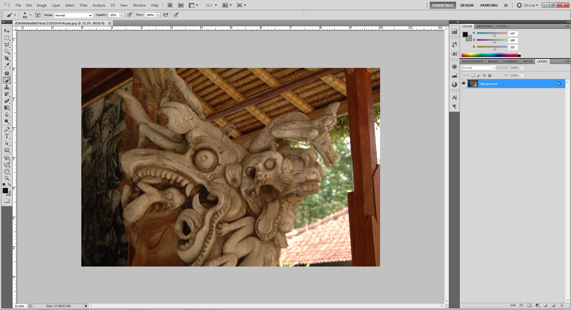
I’ll be using this photo as an example. (Pretty sweet, huh? Look at those gnarly-looking monsters.)
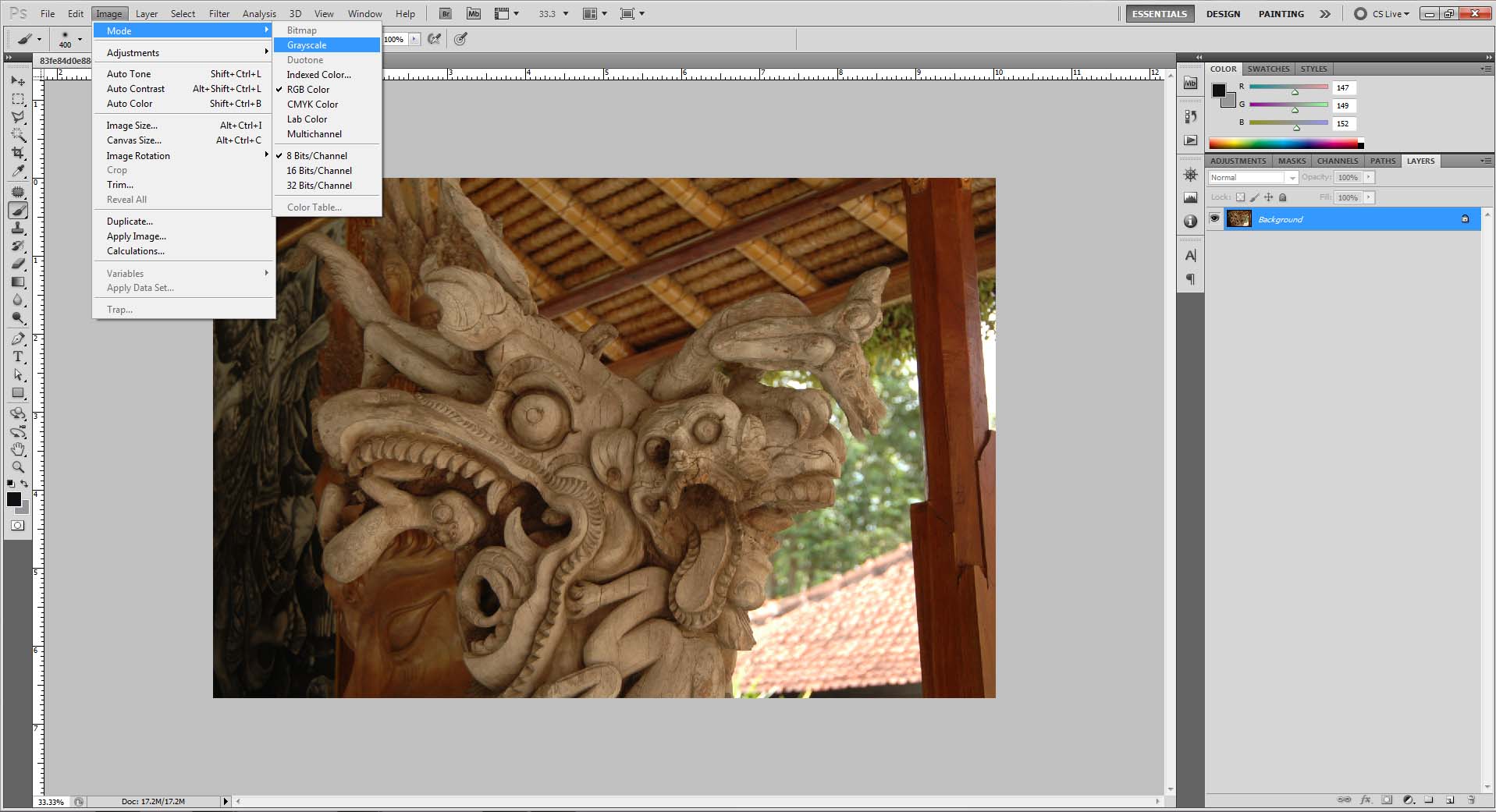
Step 1: Convert the photo to grayscale and up the contrast
Do this by going to Image > Mode > Grayscale. Then increase the photo’s contrast in either Levels (Image > Adjustments > Levels) or Curves (Image > Adjustments > Curves).

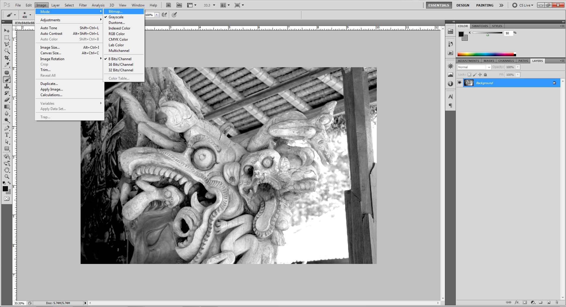
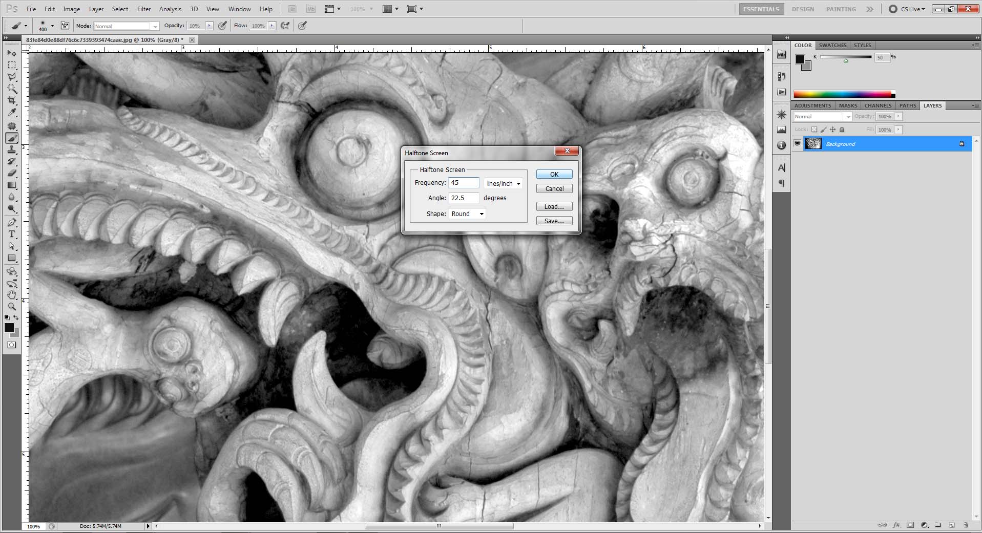
Step 2: Covert the grayscale image to bitmap (halftone )
Similar to the last step, go to Image > Mode > Bitmap.
• Output Resolution should match the image’s input.
• Method: Halftone screen
• Frequency option is really based on preference. The higher the number, the more dots will be used to translate the photo’s tonal values. However, a lower input will produce a result with less dots and a more stark appearance. The result of the frequency is also dependent on size and resolution. I recommend 25 lines/inch to 45 lines/inch for images that are between 150 and 300 dpi. If the dpi is at 72, I prefer 12 lines/inch. Slight adjustments through trial and error may be needed in order to get the desired halftone look.
• Shape: Selecting “Round” will produce a halftone that utilizes dots to translate the photo’s values – the typical “halftone look.”
• Angle: I would keep this input value on default (22.5°). It pertains more to “Line” option (Shape).

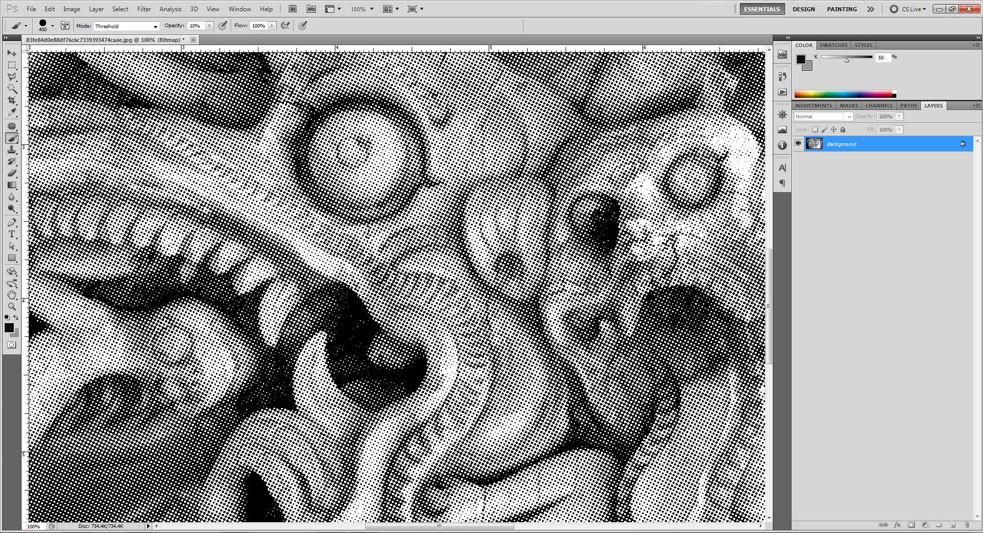
Step 3: Marvel at its beauty
Boom! Hafltone complete!
Screen Display Discrepancies
There are times when a halftone image may look odd or plain crappy on a monitor. I do not know the reason for this, but after experimenting I found the frequency, size of the image and its resolution can affect the result displayed on screen. I recommend zooming in at 100% for a more accurate visual outcome. Checking printed proofs is never a bad idea either.

Dropping it into Illustrator
Because the image has been converted to Bitmap, you can select its Fill in Illustrator and easily change its color. Just save it as a .Tiff from Photoshop and re-open it in Illustrator to do so.

You now know how to halftone photos! This concludes this Design Tip of the Week, but speaking of halftones, did you know we offer a Halftone Pattern Vector Pack? There are also more resources and tutorials in the Go Media Arsenal, so definitely check them out! Finally, keep your eyes peeled. We’re working on something big, which may or may not be halftone-related…
Anyways, God speed!
