Blog
Tutorial: How to Design and Print Custom Silk Screen Die-Cut Stickers
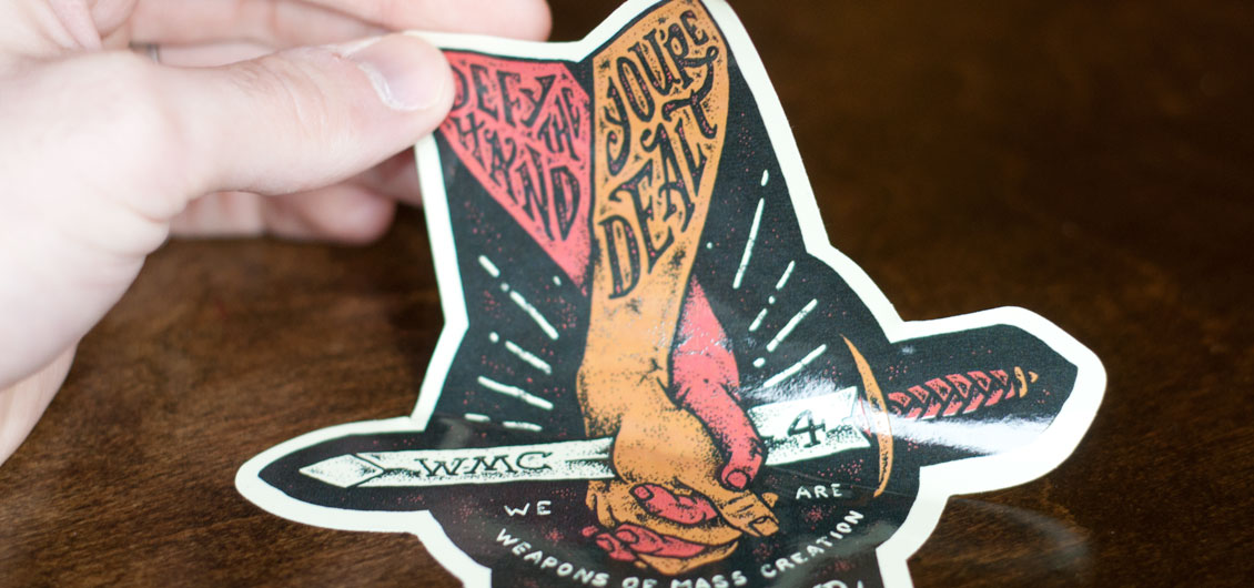
This post is a revealing walk-through behind the design, illustration, and sticker printing process. I’m proud to show off the new artwork I created for the upcoming Weapons of Mass Creation Fest 4 event. The artwork below is going to be used for stickers, t-shirts, posters, etc. In this post I’m going to show you how I created it and how I set it up to become a die-cut sticker. I got these custom die cut stickers printed at Sticker Robot and they did a great job! Let’s do this. Strap yourselves in, this is going to be a fun ride.
Related: Check out this other article I wrote about how to design custom Kiss Cut Stickers for your Band.
Step 1: Sketches!
Way back when I started WMC Fest I used the phrase “defy the hand you’re dealt” quite a bit. I wanted to bring that back this year. A couple years ago Brandon Rike created an image for WMC that featured a hand stuck with two arrows. It’s a clever way of illustrating the idea behind the phrase. I wanted to expand upon that and combine it with images of friendship, togetherness, and community. Those are frequent ideas people have when they think about WMC. I started sketching and I came up with a pair of holding hands with a sword through them. You know, like we’re fighting this struggle together!

Step 2: Photoshop Prep
Since this artwork is going to be used in lots of ways, I created my Photoshop document at 18″ x 24″ at 300 DPI. Why didn’t I use Illustrator you ask? Just personal preference mainly. This design could have been done in either program to be honest. Since we are setting up the files for CMYK sticker printing, I chose the CMYK color mode. Once I got my new document set up, I copied and pasted my sketch in the document and sized it accordingly.


Step 3: Gathering References
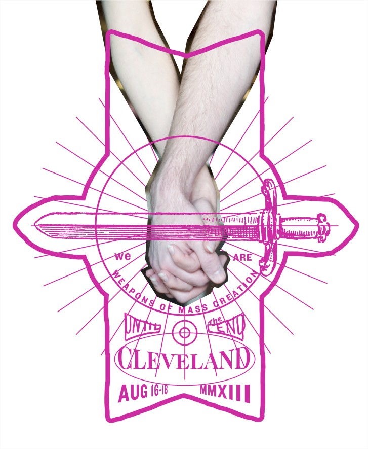
Before I start illustrating, I need to find a reference image for my holding hands. While my sketch is OK, I want the proportions to be accurate. I asked Bill to shoot a photo of my wife and I holding hands. It doesn’t have to be perfect, but I want to at least get the pose correct so I can manipulate and illustrate it in Photoshop to my liking. Here is our reference photo:

Step 4: Blocking it Out
After I placed my reference photo into my document, I rotated it and cut out just the arms and hands. The rest of the photo is unnecessary. I also went ahead and blocked in some additional reference like perfect circles, real fonts, starburst lines, and framing for the die-cut sticker.
Step 5: Start Illustrating
I reduced the opacity on my reference to something like 25% so I could start drawing on top to create the illustration. I use my Ye Ole Wacom Intuos 3 tablet and my brush settings are below. There are better drawing tablets out there, but this has served me well since 2006!


Step 6: Hand Lettering
Once my outlines are created, it’s time to start drawing the type. Now it took me many tries to get the letters correct for “Defy the Hand You’re Dealt.” My sketch itself wasn’t detailed enough so I had to improvise a lot. I knew I wanted “defy the hand” on the left arm and “you’re dealt” on the right arm. It was just a matter of making the letters fit! It was a lot of trial and error. Some tips for your own lettering would be to block in the letters first. Try a rough draft and get the letters in there how you want. Then you can turn that layer’s opacity down and draw it again over top while being more creative with the letter forms. Since I don’t have a very steady hand (often a little jittery from coffee and anxiety) my letter forms are not perfect. They’re a little wobbly, which is ok considering my entire design will be slightly imperfect.

The rest of the lettering was easier because I had a font to base it off of. For the words Cleveland, I set my reference type up with ITC Caslon and warped the type and got it into place. Then I drew over top of it my own custom version of it. For the dates, I loosely based my letters on the font, I drew it in rather quickly. Check it out:


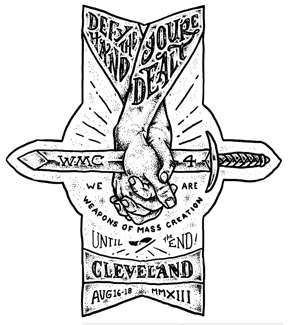
Step 7: Shading and Stippling
Once the drawing was complete, I printed it out and used a good old fashioned light box. I placed my outlined drawing down first, then placed a blank sheet of paper directly on top. The light box allowed me to see through the paper so I can have precise detail when stipple shading. I used a set of fine-detail Micron pens. There is no shortcut to stipple shading, believe me I’ve tried! I actually tried using my Wacom tablet to do this, but I didn’t get as natural and consistent results. So I went analog for this! To be honest, stipple shading is much easier using Micron pens and doing it on real paper than trying to do it digitally. My intention was to scan my shading into Photoshop onto a different layer. Then I could do whatever I wanted with it!


One trick to note: I did a separate scan for any stippling that would be “highlights” or “distressing” on my image. For example I did the stipple shading on my text on its own piece of paper and scanned it separately. That way I could change its color easier. I did the same for all the abstract dots that fill the background. In the end those were going to be lighter than the background, but it is still nice to have it on its own layer.
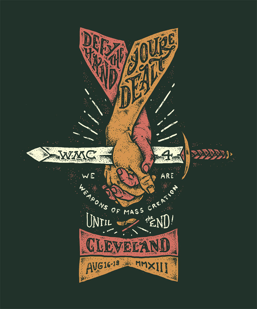
Step 8: Coloring!
Now that I had my outlines and shading complete, it’s time to fill it with color! I knew I wanted to go with my tried and true WMC Fest color palette. With my outlines and shading layers on top, I made a new layer underneath everything for each element. I started with the left arm first and colored it with the WMC pink color. Then I made a new layer and started coloring the right arm an orange color. By having the outlines on a layer above your colors, all you have to do is get close and color between the lines. It doesn’t matter what kind of brush you use, I’m just painting in solid colors. To make sure I’m using the same consistent colors throughout the design, I use “color overlay” layer style on each layer.
Also, since I made my background dark, notice how I changed the colors of “we are weapons of mass creation” and “until the end” to something brighter. Also, take a look at how I colored the little flag in the middle and the rays shooting out from the center. I just selected those layers and changed the “color overlay” setting to the color I wanted. No additional coloring needed.
Here is what our design looks like without any outlines on top.
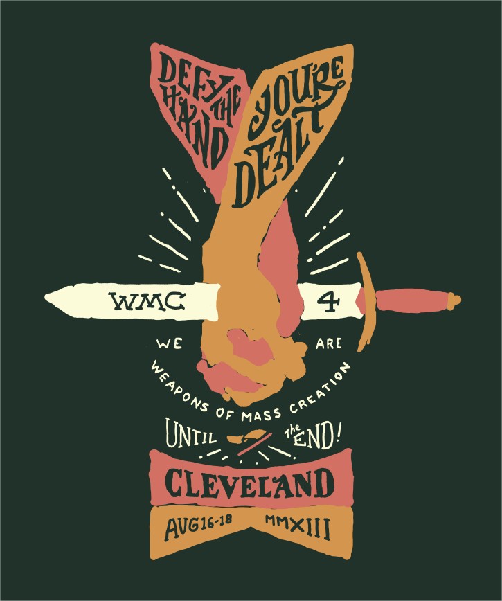
And here is our finished design when we turn back on the shading and outline layers. Note: you might see some subtle distressing on the type. What I did for that was duplicating some of my stipple shading layers and placing them strategically on top of the type. Since the shading layers are the same color as the background, I was able to achieve a slightly distressed look.
Step 9: Prep for Die-Cut Sticker Printing!
The design is done! Now I just need to send it to print! But before that I had to make sure I was adhering to the specs that Sticker Robot calls for on their website. They actually screen print their stickers, but use a CMYK simulated process print. They literally screen print tiny dots of Cyan, Magenta, Yellow, and Black to get the exact colors in your design. So all I had to do was send them a high res CMYK .tif file and they did the rest. No complicated color separation work for me!
The trickiest part in setting this up for print was creating the die-cut layer. This was just a single color outline that on a separate layer that tells the printer where to cut the sticker out from the background. Since we aren’t going for traditional square-shaped stickers here, you need to specify the shape of your sticker!
It’s pretty easy. See below:
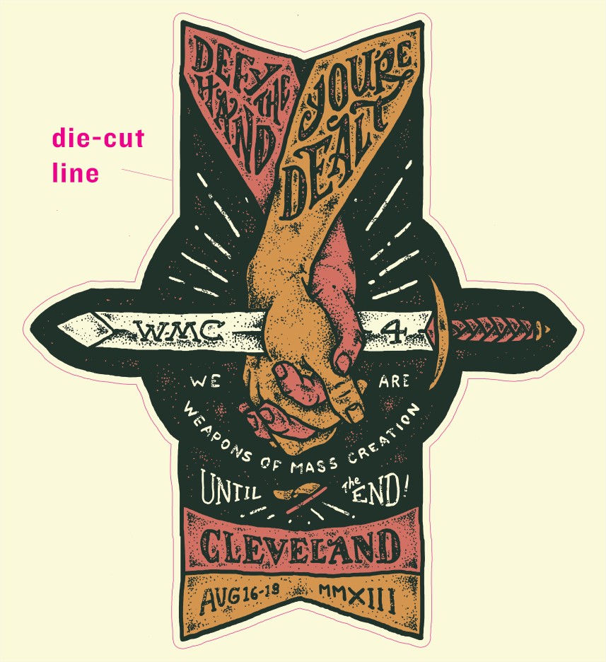
One thing to note was that there should be at least a 1/8″ safety area separation from your artwork to your die-cut line, and an additional 1/8″ bleed area beyond your die-cut line. This will ensure your sticker has enough room to move around slightly on the press.
Another cool thing with Sticker Robot is they are one of the few sticker printers that allow you to print a grayscale design on the back of your sticker! To set this up with my custom shape sticker, I mirrored my sticker shape horizontally and designed the sticker back. I used a collage background I designed for the festival last year as my background and added our website URL. The only catch is the design had to be black and white. Check it out:

Step 10: Print up the Stickers!
The design was sent off to Sticker Robot and here’s a few photos they took of the sticker printing process, from film to packaging:
Film for the black plate.
Film is printed for each color. Cyan, Magenta, Yellow and Black. The film will be used to expose the screens.

The film is exposed.
A bright light is used to expose the film through the emulsion to the silkscreen itself. Each color will have it’s own screen.

Silkscreen Sticker Printing
A squeegee pushes ink through the screen onto the vinyl substrate, one color at a time, one sheet at a time.


Cyan and Magenta Ink
The cyan and magenta ink have been laid down. Next will be yellow, then black and finally 3 coats of clear UV protective ink.

Silkscreen Quality Ink
Silkscreen ink is notoriously thick and durable, typically 10-20 times thicker than digital ink. This is magenta:

Magenta, Cyan and Yellow
The basic colors are coming together… we’re just missing the final color, black.

Black ink is laid down…
Now it’s starting to look like a sticker!

Sticker Diecutting
This is a tedious process, where each sticker sheet is literally cut one at a time – a truly custom sticker. See the video below that shows the process on creating die cut stickers.

Sticker Packaging!
Here are the final stickers. WMC here we come!


Conclusion
So there you have it, that was how I created the artwork for the 2013 Weapons of Mass Creation Fest and how the stickers were created. You can get your own screen printed, die-cut vinyl stickers created with your designs through Sticker Robot. If you want to attend the upcoming WMC Fest and see a ton of great bands, speakers, and designers, tickets go on sale soon at http://wmcfest.com.
