Blog
A Pseudo-Sugar Skull: From Start to Finish.

Hey people! It’s Dave again giving you all yet another excuse to get your knowledge on. This isn’t as direct as my previous Gigposter Tutorial (by the way – thanks to everyone who found that helpful!) because I’m actually covering a piece of my own artwork, and as we all know, there are just some things that are hard to explain during the process. Hence why I’m condensing it down to the nitty gritty. Kinda like a walk through my process if you will.
Oh, I almost forgot! I STRONGLY suggest you guys read our previous tutorials that deal with “start to finish” subject matter, especially anything involving Illustrator. If I re-wrote how to do everything we’ve already covered in previous tutorials in this one, I’d be up way past my non-existent bedtime. Now let’s start!
First I drew a half of a skull. Why half do you ask? Because we’ll be inking the outlines in Illustrator. Why do more work for yourself when you can just flip half of what you’ve already traced, connect them, and then run with it? Then I scanned it in.


I opened Illustrator and placed the image in a new file (once the new file’s been created – go to file, then place and browse for your image). I enlarged it to my liking, turned the opacity down, and locked into place.
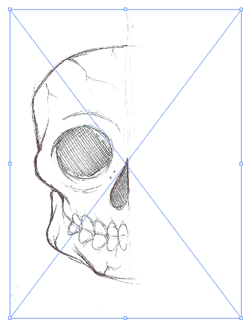


Alright, now I began to trace out the half of the skull. I kept the skull outline and eyes in black and made the teeth and nose in separate colors. This way I can edit them in case they don’t merge properly (which happens alot when I do skulls). If you’re lost as to how inking is done in Illustrator – we have a tutorial all about it here. Once everything lined up good and looked nice, I added them together then unlocked and ditched the placed file/ I was left with a clean outline.

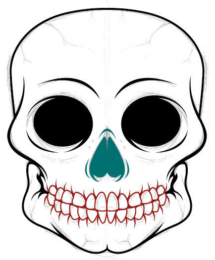
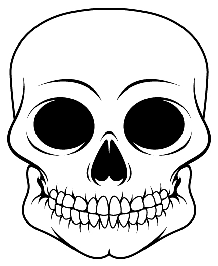
Now I wanted to add some decorations to the skull. I was feeling like adding some tattoo-esque flourishes around the contour of the skull. So I grabbed some I had made from the upcoming Set 10 VectorPack release and carefully placed them in neat spots all around our skull’s face until I was satisfied.

So I go into Photoshop, and start a new file. The size I used was 4×6 @ 300 dpi. I made the background a muted pinkish/red so the coloring I’ll be doing won’t be obstructed by loud-ass background colors. I pasted the outline of the skull into the piece as a vector smart object (copy and paste from Illustrator) and used the magic wand tool to make the selections of the portions that I wanted to color. Mind you, I kept the coloring done on layers I made below the inked outline. You never know when you can fumble up, so always keep your layers separate. In this case, I used a layer for the color of the skull and it’s teeth. HINT: If you encounter weird lines bordering your inked layers and your colored layers – try expanding the selection you made with the magic wand about 2-3 pixels. This way the color will bleed beyond the lines and look alot cleaner when sitting below the inked layer.

Now with these layers separated, I ctrl+clicked the thumbnail in the layers box to make the entire contents of the layer a selection (keeps myself from coloring outside the lines), grabbed my wacom tablet (a mouse will suffice, we’re only airbrushing minimally), selected the airbrush tool, used a blurred edged brush at anywhere from 70 pixels to 170 pixels and went to town! I added shadows and I added highlights. Getting these exact results is hard because everyone colors differently, BUT YOU MUST KEEP THE FLOW DOWN ON YOUR BRUSH OPTIONS AND MAKE SURE YOU’RE NOT GOING PAST 30-40% OPACITY. This is crucial because it lets you gradually see the darkness as you apply brush strokes and make it feel real.


I wanted to add texture at this point, so I opened a concrete image that i liked from our Texture Packs and dragged it over to the piece we’re working on (keep it below the inked layer so you can see what you’re doing. I moved it and sized it to where there wouldn’t be too many blemishes in the skull’s face from the concrete. I used the magic wand to select everything outside of the skull on the inked smart object’s layer, expanded the selection about 3 pixels, and deleted the excess off of the concrete photo’s layer.
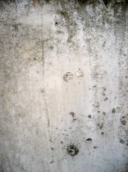
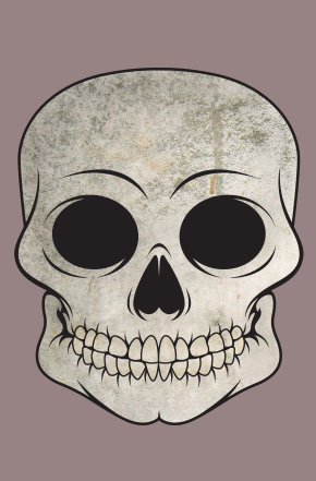
As you see in the last image I posted, I toned the opacity down a bit. But with this next image, I played with the layer mode and the one that suited my fancy was Linear Burn at 36% opacity. It burned the skull enough to give it a weathered feel but not over done.

I made a new layer, added some white for highlights in certain portions of the skull, and changed the layer mode to soft light @ 100%.

Now it was time to add the tattoo flourishes. I pasted them in, sized them according to the AI file’s placement, cut the excess off the same way I did with the concrete, and changed the layer mode to Multiply @ 70%.


So now, I added some eyes to it from our Anatomy pack, colored them in, added a tint of red around the edges to make it look realistic and we have this result: The Finished Skull!

So now to the background. I chose one of the watercolor textures from The Arsenal, a paper texture from Stock Exchange, we doctored up the solid background layer with some funky greens and we got to playing with the layer modes. The watercolor texture’s coloring was changed to a more blue-friendly scheme with the hue/saturation tool. I layered it in Multiply mode @ 100%. I slapped the paper texture over that because it wasn’t quite doing the trick alone and layered it also in Multiply mode @ 100%.
Combined result with the aforementioned layer modes (sans paper)

And with a few more doodads in the background and skull, the paper added to the background, and the airbrushed layer brightened…

we have…….


