Blog
Tutorial: Killer 3D Poster Design with 3DS Max & Photoshop
Introduction
Hello again! I was recently asked to do a flyer for a promotions company by the name of inFamous Productions; a very popular promotion movement in Western NY mainly stationed in Buffalo.
My main objective was to create something unique that would serve as a creative campaign for a nightclub. Long story short, one thing led to another, and I came up with a poster which led to the flyer design. For this tutorial I will be teaching you guys and letting you all get ahold of the process in which I used to create this Galactic Title in Photoshop.
The tutorial will be 80% Photoshop intensive and 20% 3DS Max. Somethings to keep in mind are: 3D letters can be made in any program, be it Adobe Illustrator, 3DS Max, Cinema 4D, Xara 3D, Photoshop, etc. The great thing about this technique is that it can be translated into any 3D generating software.
I will shed light on the basics of lighting, mapping and Render Setup in the robust package that Autodesk has to offer. I don’t want this to predominantly be a 3D tutorial, thus I will not go into extensive detail on everything I do. Feel free to shoot me an email at [email protected] if you have any questions and or concerns. I can also point you into the right direction if you are interested in pursuing a design career in 3D.

Lets Have At It!
Begin by finding a great font. I like to browse around this site for inspiration and possible font purchases. I find that rounded san-serif texts tend to work well with this technique.
Step 1 – Setup
We can begin by launching 3DS Max and create our preferred slogan. For this, I chose “Stand Up”, since it was the name of the event. Go the Create Tab, marked by red, chose splines, then hit text. Type in what you like and line up the text as shown in the front viewport.


Step 2 – Extrusion
Perfect. Now with the text spline selected we will go ahead and hover over to the modifier stack and apply a bevel modifier. Follow the settings displayed below.
NOTE The bevel settings will vary between text sizes so don’t depend on solely on mine. Mine are generally smaller because I exported my splines from illustrator. Just scroll down the arrows until you get something that looks like the preview below.


Step 3 – Mapping
Lets add some materials to this text by hitting the M key on the keyboard to bring out the material editor in Max. I am using VRAY, which is a physical based rendering engine and I HIGHLY ENCOURAGE all to purchase it or at least try it out.
This is definitely one of the best rendering solutions for any platform. Although 3DS Max and many other 3D software come with their own G.I. Solution, in my opinion, VRAY surpasses them all. For this reason, I chose to use this engine for the tutorial. You can get a hold of a demo from here.
Without further ado, lets continue on. Let’s give the text a semi-glossy white material. I absolutely enjoy white text but you can change the color to match your creative ambition.

Step 4 – Lighting
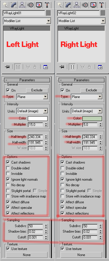
Lighting. I promise, this will be easy. Vray is the way my friends. We will simulate a rig for a studio lit scene without using a 3 pt. Lighting system. Find the Vray Lights and click and drag on the viewport to create the rectangular Vray lights. Feel free to experiment with different lights and shadow parameters. Remember, experimentation is key to success when using software.**


Step 5 – Position Text for Renderer and Create Camera
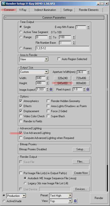
Follow the picture below. After you are done creating the camera, press F10 to bring out the render settings window:

Step 6 – Render Setup | Low-res and Hi-res
Rendering—one of the essential parts of finishing a project in any 3D platform. These settings are very critical, as they determine how long a render task will take and how good a quality the engine will put out. It’s always essential to set up test presets so that you can get relatively quick renders without losing too much quality.
After you are done plugging in these settings, save them as a preset. Name the preset ‘Test High’. This will now help you save time when testing out scenes.
Low-Res Setup
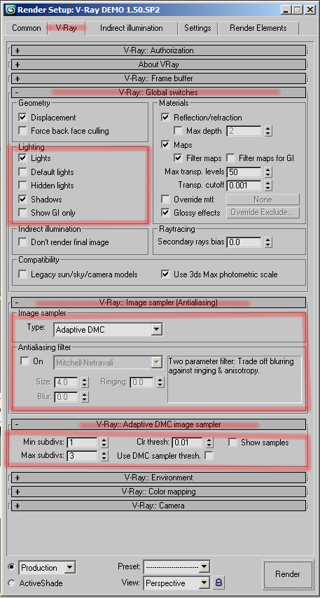


This actually looks OK to go ahead and use for a small production. However, I assume you would like to make this project in large prints. Therefore, I will also show you how to set up a great quality render that will probably take up about 1 hr to 45 minutes to render depending upon what hardware you are working with. Sorry—for great quality you always have to pay the price of render times.
If you really hate render times and want to get a great quality realistic looking render with max’s built in scanline render, I suggest you Google “dome light rigs for Max”. This is basically an array of lights in a scene with multiple settings that are used to fake G.I. With an ambient occlusion pass……whoa, I hope I did not lose you there. Nevertheless, the technique is out there—it’s just up to you to fish it out. Now follow the settings:


**NOTE** if you are a 3DS and Vray Junkie like myself, I would actually ignore the “X” I put on the Mode settings for each GI engine. If you are a beginner, please follow the pictures exactly. I just don’t want to cause confusion and more complexity; therefore, I chose to ignore those options. However, if you are interested in finding out what they do, Google ‘Vray Mode Settings’ and follow the online instructions. Basically what they do is help avoid flickering and lessen calculation times during animation renders by referring to the same map in every frame.
Step 7 – Saving Files for PSD
No that we have that out of the way, we are going to save out PNG’s—not jpgs, not exr’s, not tiffs, but PNG’s. We will also need to mask out the Face of the type because we are going to add a texture later on. I’m very lazy, and rather than wasting 30 minutes of my time tracing a mask of the text face in Photoshop, why not generate one from 3DS Max? Here’s how:
Step 8 – Finding the Resources
OK—now that we are done with 3DS Max, shut the program off and launch your preferred browser. Let’s look for some stock images. The picture above shows a lot of galactic activity, therefore we want to look for nebula stocks, cosmos brushes and the whole nine yards.
Here is a list of places where you can go to find amazing resources for this tutorial.
…and the list goes on. However, Google ‘nebula’, or space brushes and try to find high res brushes. I got lucky a while back and got a hold of some amazing, free royalty space brushes. I would love to share with you guys however, I don’t remember where I got them. Also, you will need to watch a brief tutorial in order to create cloud brushes:
We will use them as erasers to get nice dynamic “cosmic” clouds.
Step 9 – Setup
We have everything we need. If you downloaded brushes make sure to install them before you launch Photoshop. Lets setup our document size. I encourage you all to make this a large file because when printed large on a poster, this design really turns heads.

Step 10 – Mapping and Coloring
Lets begin by adding a semi dark background. Go to blending options and create a radial gradient:


Now snag this stock image and place it behind the text like so, and set the blending mode to screen. Feel free to use the cloud brush (from the tutorial above) and erase off anything you don’t want to keep from the stock. Like I did below:

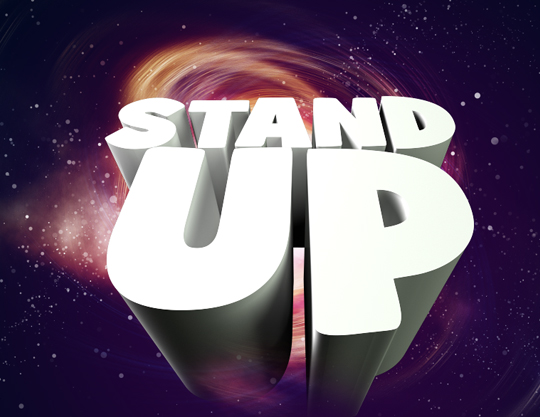
So far so good. Now let’s go further. Lets begin to add our texture and color map to the extruded text. First add the Color Map:


Now we are going to do the same but with a texture map. Snag this texture from bittbox’s Flickr Pool. Lets make all the white ares pop out my bringing up the curve editor and raising the curve. Now set the blend mode to soft light and opacity of 75%. Now give it a clipping mask on top of the gradient map:


With the same texture and following these same steps, lets now do this to the mask layer we generated from 3DS Max:

Step 11 – Lighting
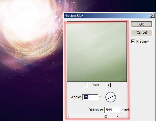
As you may see, with this mask layer, we have a lot more control of what we can do to the face of the text. 3DS Max is absolutely the best. Now lets create more cosmic distortion by duplicating the first stock image we used, which is the swirl fractal. Hit Ctrl + U to bring out the Hue/Saturation settings. Now go to Filter > Blur > Motion Blur. We will use this technique to create light streaks. Duplicate this layer and set blend mode to soft light to both:



Step 12 – Using Brushes
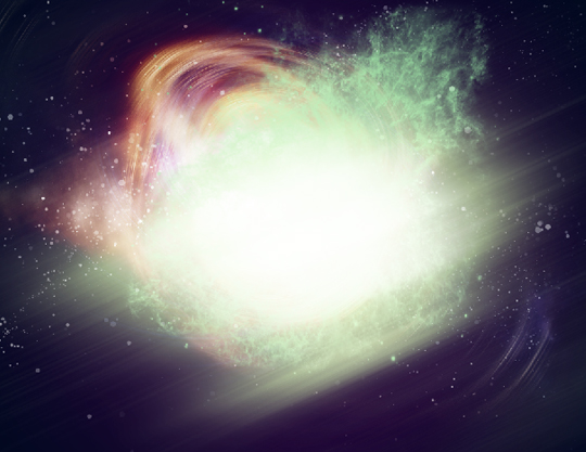
Now with the space brushes loaded, create an array of new layers. In each layer you will place a different space brush. Trust me, you do not want to go ahead and paint all the different brushes in one individual layer. We want to create a dynamic collage, therefore, we need every element in their own individual layer.
Experiment with different shades of green and yellow to create more harmony. You’ll want to switch from brush to cloud eraser in order to get rid of hard edges in a non-destructive way. Watch as I do it:


Step 14 – Adding Lights
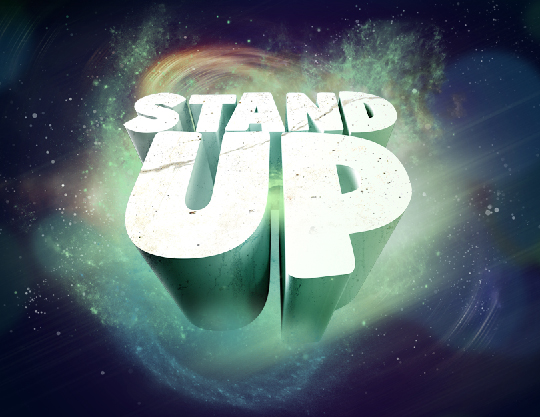
Now lets create an array of circles with different hues. Blur them using Gaussian blur with a setting of 97.4:

Continue adding lights to the comp. Try differentiating the blur densities.

Step 15 – Brushing Continued…
Lets keep on brushing more cosmic relief. Now lets add depth by brushing in front of the letters since we have spatial design behind the words. This will create a sense of interaction among the elements and will make the text seem as if it is part of the composition rather than look like it was pasted on. Use your creativity and imagination to determine size and colors of the brushes. Continue brushing:


Step 16 – Fades
Next I will show you how to create fading designs:
OK now that I have shown you how to do this. Repeat this step until you are happy with your light streaks.


Step 17 – Line Design…
Now we are going to create the intricate line pattern behind the letters. As complicated as it may seem, in reality it is fairly easy. Choose the Line shape tool, with an empty path selection as shown in the video below. While holding shift, create continuous lines from left to right. Go to Brushes and create a simple scatter brush by following along with the video below:

Step 18 – Background
Now lets add a final texture to the background layer. Google watercolor textures. When you find one that you like, import it into your comp. and set the blending mode to soft light and the opacity to 75%. We are all set!

Step 19 – Topaz Filter
Ha….I lied, we are not all set yet. We have one final step. You can skip this if you like, however this will give your final piece more continuity. After you have downloaded the lovely trial version I posted above, go to Filter > Topaz Adjust and scroll down to the presets and click on Portrait drama. Apply the preset and you are finished.
Voila—now instead of doing the various techniques I showed in my previous tutorial, you can now perform them with the click of a button, but at a monetary trade off.
I hope you all enjoyed the tutorial, and hope it wasn’t too complicated. Comment please and let me know what you think before I move on to the next tutorial.


I am once again providing all of the files used in this tutorial: Stand Up tutorial source files [Go Media]
I hope this tutorial was helpful. Lets see some submissions of this technique in the Go Media User Showcase. Thank you for your support and happy designing.
Also, be sure to check out my portfolio and my previous tutorial.
